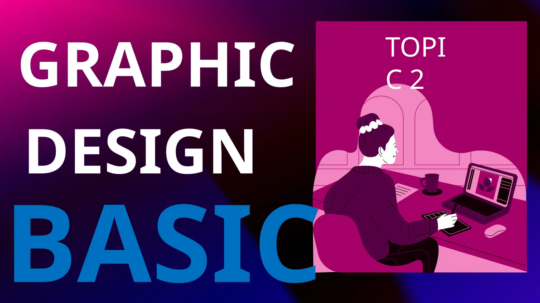
Graphic design isthe art and practice of planning
and projecting ideas and experiences through visual
and textual content. It combines creativity, strategy,
and communication, often used in branding,
advertising, web design, and more. Understanding
the basics helps build effective, engaging designs.
การออกแบบกราฟิกคือศิลปะและการปฏิบัติในการวางแผนและ
นำเสนอแนวคิดและประสบการณ์ผ่านเนื้อหาภาพและข้อความ
โดยผสมผสานความคิดสร้างสรรค์ กลยุทธ์ และการสื่อสาร ซึ่ง
มักใช้ในการสร้างแบรนด์ โฆษณา การออกแบบเว็บไซต์ และ
อื่นๆ การทำความเข้าใจพื้นฐานจะช่วยให้สร้างการออกแบบที่มี
ประสิทธิภาพและน่าดึงดูด
WHAT IS GRAPHIC DESIGN?
15.
Color theory explainshow colors interact and the
visual effects they create. It includes the color wheel,
relationships like complementary and analogous
colors, and how color impacts mood, emotion, and
visual harmony.
ทฤษฎีสีอธิบายถึงปฏิสัมพันธ์ระหว่างสีและเอฟเฟกต์ทางสายตา
ที่เกิดขึ้น ซึ่งรวมถึงวงล้อสี ความสัมพันธ์ เช่น สีเสริมและสีที่
คล้ายกัน และสีส่งผลต่ออารมณ์ ความรู้สึก และความกลมกลืน
ทางสายตาอย่างไร
WHAT IS COLOR THEORY?
16.
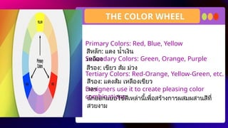
Primary Colors: Red,Blue, Yellow
Secondary Colors: Green, Orange, Purple
Tertiary Colors: Red-Orange, Yellow-Green, etc.
Designers use it to create pleasing color
combinations.
สีหลัก: แดง น้ำเงิน
เหลือง
THE COLOR WHEEL
สีรอง: เขียว ส้ม ม่วง
สีรอง: แดงส้ม เหลืองเขียว
ฯลฯ
นักออกแบบใช้สีเหล่านี้เพื่อสร้างการผสมผสานสีที่
สวยงาม
17.
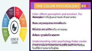
Color affects perceptionand emotion. For
example:
Red: urgency, excitement
Blue: trust, calm
Green: growth, health
Understanding color psychology helps create
meaningful connections with audiences.
THE COLOR PSYCHOLOGY
การทำความเข้าใจจิตวิทยาของสีช่วยสร้างการเชื่อม
โยงที่มีความหมายกับผู้ชม
สีส่งผลต่อการรับรู้และอารมณ์ ตัวอย่างเช่น:
สีแดง: ความเร่งด่วน ความตื่นเต้น
สีน้ำเงิน: ความไว้วางใจ ความสงบ
สีเขียว: การเติบโต สุขภาพ
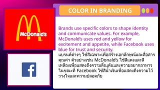
18.
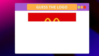
Brands use specificcolors to shape identity
and communicate values. For example,
McDonald’s uses red and yellow for
excitement and appetite, while Facebook uses
blue for trust and security.
COLOR IN BRANDING
แบรนด์ต่างๆ ใช้สีเฉพาะเพื่อสร้างเอกลักษณ์และสื่อสาร
คุณค่า ตัวอย่างเช่น McDonald’s ใช้สีแดงและสี
เหลืองเพื่อแสดงถึงความตื่นเต้นและความอยากอาหาร
ในขณะที่ Facebook ใช้สีน้ำเงินเพื่อแสดงถึงความไว้
วางใจและความปลอดภัย
19.
Typography is thedesign and arrangement of
type. It includes choosing fonts, setting sizes,
adjusting spacing, and ensuring legibility.
Good typography enhances readability and
reinforces the message.
INTRODUCTION TO TYPOGRAPHY
การจัดวางตัวอักษรเป็นการออกแบบและจัดเรียงตัว
อักษร ซึ่งรวมถึงการเลือกแบบอักษร การกำหนดขนาด
การปรับระยะห่าง และการตรวจสอบความชัดเจนใน
การอ่าน การจัดวางตัวอักษรที่ดีจะช่วยเพิ่มความ
สามารถในการอ่านและเน้นย้ำข้อความ
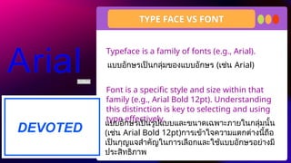
20.
Typeface is afamily of fonts (e.g., Arial).
Font is a specific style and size within that
family (e.g., Arial Bold 12pt). Understanding
this distinction is key to selecting and using
type effectively.
TYPE FACE VS FONT
แบบอักษรเป็นกลุ่มของแบบอักษร (เช่น Arial)
แบบอักษรเป็นรูปแบบและขนาดเฉพาะภายในกลุ่มนั้น
(เช่น Arial Bold 12pt)การเข้าใจความแตกต่างนี้ถือ
เป็นกุญแจสำคัญในการเลือกและใช้แบบอักษรอย่างมี
ประสิทธิภาพ
21.
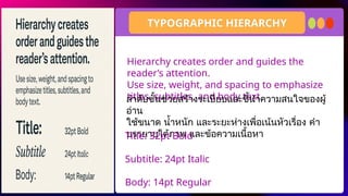
Hierarchy creates orderand guides the
reader’s attention.
Use size, weight, and spacing to emphasize
titles, subtitles, and body text
TYPOGRAPHIC HIERARCHY
ลำดับชั้นช่วยสร้างระเบียบและชี้นำความสนใจของผู้
อ่าน
ใช้ขนาด น้ำหนัก และระยะห่างเพื่อเน้นหัวเรื่อง คำ
บรรยายใต้ภาพ และข้อความเนื้อหา
Title: 32pt Bold
Subtitle: 24pt Italic
Body: 14pt Regular
22.
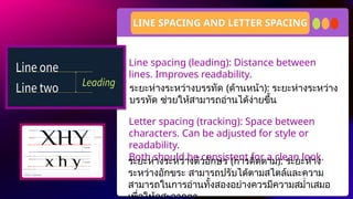
Line spacing (leading):Distance between
lines. Improves readability.
Letter spacing (tracking): Space between
characters. Can be adjusted for style or
readability.
Both should be consistent for a clean look.
LINE SPACING AND LETTER SPACING
ระยะห่างระหว่างบรรทัด (ด้านหน้า): ระยะห่างระหว่าง
บรรทัด ช่วยให้สามารถอ่านได้ง่ายขึ้น
ระยะห่างระหว่างตัวอักษร (การติดตาม): ระยะห่าง
ระหว่างอักขระ สามารถปรับได้ตามสไตล์และความ
สามารถในการอ่านทั้งสองอย่างควรมีความสม่ำเสมอ
23.
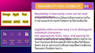
Readability is howeasily a text can be read
and understood.
Legibility refers to how easy it is to distinguish
individual characters.
Use appropriate fonts, sizes, and spacing for
clarity, especially in long texts.
READABILITY AND LEGIBILITY
ความสามารถในการอ่านออกได้หมายถึงความสามารถ
ในการแยกแยะอักขระแต่ละตัวได้ง่ายเพียงใดใช้แบบ
อักษร ขนาด และระยะห่างที่เหมาะสมเพื่อความชัดเจน
โดยเฉพาะในข้อความยาว
ความสามารถในการอ่านได้หมายถึงความสามารถใน
การอ่านและทำความเข้าใจข้อความได้ง่ายเพียงใด
24.
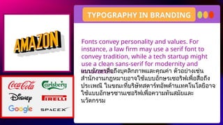
Fonts convey personalityand values. For
instance, a law firm may use a serif font to
convey tradition, while a tech startup might
use a clean sans-serif for modernity and
innovation.
TYPOGRAPHY IN BRANDING
แบบอักษรสื่อถึงบุคลิกภาพและคุณค่า ตัวอย่างเช่น
สำนักงานกฎหมายอาจใช้แบบอักษรเซอริฟเพื่อสื่อถึง
ประเพณี ในขณะที่บริษัทสตาร์ทอัพด้านเทคโนโลยีอาจ
ใช้แบบอักษรซานเซอริฟเพื่อความทันสมัยและ
นวัตกรรม
25.
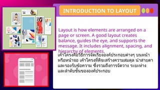
Layout is howelements are arranged on a
page or screen. A good layout creates
balance, guides the eye, and supports the
message. It includes alignment, spacing, and
hierarchy of elements.
INTRODUCTION TO LAYOUT
เค้าโครงคือวิธีการจัดเรียงองค์ประกอบต่างๆ บนหน้า
หรือหน้าจอ เค้าโครงที่ดีจะสร้างความสมดุล นำสายตา
และรองรับข้อความ ซึ่งรวมถึงการจัดวาง ระยะห่าง
และลำดับชั้นขององค์ประกอบ
26.
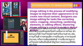
Image editing isthe process of modifying
images to improve their appearance or to
create new visual content. Designers use
image editing for tasks like correcting
colors, cropping, retouching, combining
elements, or adding effects. Mastering
image editing is crucial in modern digital
design
INTRODUCTION TO IMAGE EDITING
การแก้ไขรูปภาพคือกระบวนการปรับเปลี่ยนรูปภาพ
เพื่อปรับปรุงรูปลักษณ์หรือสร้างเนื้อหาภาพใหม่ นัก
ออกแบบใช้การแก้ไขรูปภาพสำหรับงานต่างๆ เช่น
การแก้ไขสี การครอบตัด การปรับแต่ง การรวมองค์
ประกอบ หรือการเพิ่มเอฟเฟกต์ การเชี่ยวชาญการ
แก้ไขรูปภาพถือเป็นสิ่งสำคัญในการออกแบบดิจิทัล
สมัยใหม่
27.
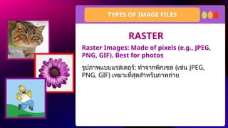
Raster Images: Madeof pixels (e.g., JPEG,
PNG, GIF). Best for photos
TYPES OF IMAGE FILES
รูปภาพแบบแรสเตอร์: ทำจากพิกเซล (เช่น JPEG,
PNG, GIF) เหมาะที่สุดสำหรับภาพถ่าย
RASTER
28.
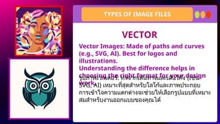
Vector Images: Madeof paths and curves
(e.g., SVG, AI). Best for logos and
illustrations.
Understanding the difference helps in
choosing the right format for your design
work.
TYPES OF IMAGE FILES
รูปภาพเวกเตอร์: ทำจากเส้นทางและเส้นโค้ง (เช่น
SVG, AI) เหมาะที่สุดสำหรับโลโก้และภาพประกอบ
การเข้าใจความแตกต่างจะช่วยให้เลือกรูปแบบที่เหมาะ
สมสำหรับงานออกแบบของคุณได้
VECTOR
29.
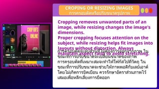
Cropping removes unwantedparts of an
image, while resizing changes the image's
dimensions.
Proper cropping focuses attention on the
subject, while resizing helps fit images into
layouts without distortion. Always
maintain aspect ratio to avoid stretching.
CROPING OR RESIZING IMAGES
การครอบตัดจะลบส่วนที่ไม่ต้องการออกจากภาพ ใน
ขณะที่การปรับขนาดจะเปลี่ยนขนาดของภาพ
การครอบตัดที่เหมาะสมจะทำให้โฟกัสไปที่วัตถุ ใน
ขณะที่การปรับขนาดจะช่วยให้ภาพพอดีกับเลย์เอาต์
โดยไม่เกิดการบิดเบือน ควรรักษาอัตราส่วนภาพไว้
เสมอเพื่อหลีกเลี่ยงการยืดออก
การครอบตัดหรือปรับขนาดรูปภาพ
30.
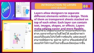
Layers allow designersto separate
different elements within a design. Think
of them as transparent sheets stacked on
top of each other. Each layer can contain
text, images, shapes, or effects. Layers
make editing easier and more flexible.
INTRODUCTION TO LAYERS
เลเยอร์ช่วยให้ผู้ออกแบบสามารถแยกองค์ประกอบ
ต่างๆ ออกจากกันภายในดีไซน์ได้ ลองนึกภาพว่า
เลเยอร์เป็นแผ่นโปร่งใสที่วางซ้อนกัน แต่ละเลเยอร์
สามารถมีข้อความ รูปภาพ รูปร่าง หรือเอฟเฟกต์ได้
เลเยอร์ทำให้การแก้ไขง่ายขึ้นและยืดหยุ่นมากขึ้น
บทนำสู่เลเยอร์
31.
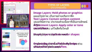
Image Layers: Holdphotos or graphics
Text Layers: Contain written content
Adjustment Layers: Apply color or tone
corrections
Shape Layers: Include vector shapes
Organizing these effectively helps
streamline your workflow.
TYPES OF LAYERS
เลเยอร์รูปภาพ: เก็บภาพถ่ายหรือกราฟิก
เลเยอร์ข้อความ: ประกอบด้วยเนื้อหาที่เป็นลายลักษณ์
อักษร
เลเยอร์ปรับแต่ง: แก้ไขสีหรือโทนสี
เลเยอร์รูปร่าง: รวมรูปร่างเวกเตอร์
การจัดระเบียบเหล่านี้อย่างมีประสิทธิภาพจะช่วย
ปรับปรุงเวิร์กโฟลว์ของคุณ
ประเภทของชั้น
32.
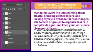
Managing layers includesnaming them
clearly, grouping related layers, and
locking layers to avoid accidental changes.
Use folders or groups to organize layers in
complex designs, and keep your workspace
clean and efficient.
WHY LAYERING IS IMPORTANT
การจัดการเลเยอร์ประกอบด้วยการตั้งชื่อเลเยอร์ให้
ชัดเจน การจัดกลุ่มเลเยอร์ที่เกี่ยวข้อง และการล็อก
เลเยอร์เพื่อหลีกเลี่ยงการเปลี่ยนแปลงโดยไม่ได้ตั้งใจ
ใช้โฟลเดอร์หรือกลุ่มเพื่อจัดระเบียบเลเยอร์ในรูปแบบที่
ซับซ้อน และทำให้พื้นที่ทำงานของคุณสะอาดและมี
ประสิทธิภาพ
ทำไมการแบ่งชั้นจึงมีความสำคัญ
33.
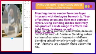
Blending modes controlhow one layer
interacts with the layers beneath it. They
affect how colors and light mix between
layers. Using blending modes creatively
can produce a wide range of effects like
light flares, textures, or color
enhancements.
INTRODUCTION TO BLENDING MODES
โหมด Blending จะควบคุมว่าเลเยอร์หนึ่งจะโต้ตอบกับ
เลเยอร์ด้านล่างอย่างไร โดยโหมด Blending จะส่งผล
ต่อการผสมสีและแสงระหว่างเลเยอร์ การใช้โหมด
Blending อย่างสร้างสรรค์สามารถสร้างเอฟเฟกต์
ต่างๆ ได้มากมาย เช่น แสงแฟลร์ พื้นผิว หรือการเพิ่ม
สีสัน
การแนะนำโหมดการผสม
34.
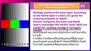
Multiply darkens thebase layer according
to the blend layer's colors. It’s great for
creating shadows or depth.
Darken compares the base and blend
layers and keeps the darker color. Both are
useful for creating moody or dramatic
effects.
MULTIPLY AND DARKEN MODE
การเพิ่มความเข้มให้กับเลเยอร์พื้นฐานตามสีของ
เลเยอร์เบลนด์ เหมาะอย่างยิ่งสำหรับการสร้างเงาหรือ
ความลึก
การเพิ่มความเข้มจะเปรียบเทียบเลเยอร์พื้นฐานและ
เลเยอร์เบลนด์ และคงสีเข้มไว้ ทั้งสองวิธีนี้มีประโยชน์
ในการสร้างเอฟเฟกต์ที่ดูหม่นหมองหรือดราม่า
โหมดทวีคูณและมืดลง
35.
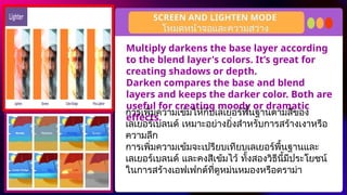
Multiply darkens thebase layer according
to the blend layer's colors. It’s great for
creating shadows or depth.
Darken compares the base and blend
layers and keeps the darker color. Both are
useful for creating moody or dramatic
effects.
SCREEN AND LIGHTEN MODE
การเพิ่มความเข้มให้กับเลเยอร์พื้นฐานตามสีของ
เลเยอร์เบลนด์ เหมาะอย่างยิ่งสำหรับการสร้างเงาหรือ
ความลึก
การเพิ่มความเข้มจะเปรียบเทียบเลเยอร์พื้นฐานและ
เลเยอร์เบลนด์ และคงสีเข้มไว้ ทั้งสองวิธีนี้มีประโยชน์
ในการสร้างเอฟเฟกต์ที่ดูหม่นหมองหรือดราม่า
โหมดหน้าจอและความสว่าง
36.
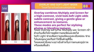
Overlay combines Multiplyand Screen for
a high-contrast, vivid look.Soft Light adds
subtle contrast, giving a gentle glow or
enhancement to textures.
These modes are perfect for stylizing
photos or blending textures.
OVERLAY AND SOFT LIGHT MODE
โหมด Overlay ผสานรวม Multiply และ Screen เข้า
ด้วยกันเพื่อให้ภาพดูมีความคมชัดและสดใส
Soft Light ช่วยเพิ่มความคมชัดแบบละเอียดอ่อน ช่วย
ให้แสงนุ่มนวลหรือทำให้พื้นผิวดูดีขึ้น
โหมดเหล่านี้เหมาะอย่างยิ่งสำหรับการตกแต่งรูปภาพ
หรือผสมพื้นผิว
โหมดโอเวอร์เลย์และแสงนุ่มนวล
37.
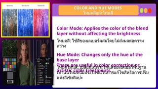
Color Mode: Appliesthe color of the blend
layer without affecting the brightness
Hue Mode: Changes only the hue of the
base layer
These are useful in color correction or
artistic color treatments.
COLOR AND HUE MODES
โหมดสี: ใช้สีของเลเยอร์ผสมโดยไม่ส่งผลต่อความ
สว่าง
โหมดสีและโทนสี
โหมดโทนสี: เปลี่ยนเฉพาะโทนสีของเลเยอร์พื้นฐาน
เท่านั้นโหมดนี้มีประโยชน์ในการแก้ไขสีหรือการปรับ
แต่งสีเชิงศิลปะ
38.
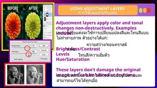
Adjustment layers applycolor and tonal
changes non-destructively. Examples
include:
Brightness/Contrast
Levels
Hue/Saturation
These layers don’t damage the original
image and can be edited at any time.
USING ADJUSTMENT LAYERS
การใช้เลเยอร์ปรับแต่ง
เลเยอร์ปรับแต่งจะใช้การเปลี่ยนแปลงสีและโทนสีแบบ
ไม่ทำลายภาพ ตัวอย่างได้แก่:
ความสว่าง/คอนทราสต์
ระดับ
โทนสี/ความอิ่มตัว
เลเยอร์เหล่านี้จะไม่ทำให้ภาพต้นฉบับเสียหายและ
สามารถแก้ไขได้ทุกเมื่อ
39.
Adjustment layers applycolor and tonal
changes non-destructively. Examples
include:
Brightness/Contrast
Levels
Hue/Saturation
These layers don’t damage the original
image and can be edited at any time.
USING ADJUSTMENT LAYERS
การใช้เลเยอร์ปรับแต่ง
เลเยอร์ปรับแต่งจะใช้การเปลี่ยนแปลงสีและโทนสีแบบ
ไม่ทำลายภาพ ตัวอย่างได้แก่:
ความสว่าง/คอนทราสต์
ระดับ
โทนสี/ความอิ่มตัว
เลเยอร์เหล่านี้จะไม่ทำให้ภาพต้นฉบับเสียหายและ
สามารถแก้ไขได้ทุกเมื่อ
40.
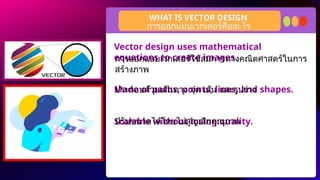
Vector design usesmathematical
equations to create images.
Made of paths, points, lines, and shapes.
Scalable without losing quality.
WHAT IS VECTOR DESIGN
การออกแบบเวกเตอร์คืออะไร
การออกแบบเวกเตอร์ใช้สมการทางคณิตศาสตร์ในการ
สร้างภาพ
ประกอบด้วยเส้นทาง จุด เส้น และรูปร่าง
ปรับขนาดได้โดยไม่สูญเสียคุณภาพ
41.
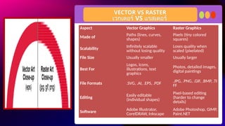
VECTOR VS RASTER
เวกเตอร์VS แรสเตอร์
Aspect Vector Graphics Raster Graphics
Made of Paths (lines, curves,
shapes)
Pixels (tiny colored
squares)
Scalability Infinitely scalable
without losing quality
Loses quality when
scaled (pixelated)
File Size Usually smaller Usually larger
Best For
Logos, icons,
illustrations, text
graphics
Photos, detailed images,
digital paintings
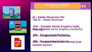
File Formats .SVG, .AI, .EPS, .PDF .JPG, .PNG, .GIF, .BMP, .TI
FF
Editing
Easily editable
(individual shapes)
Pixel-based editing
(harder to change
details)
Software
Adobe Illustrator,
CorelDRAW, Inkscape
Adobe Photoshop, GIMP,
Paint.NET
42.
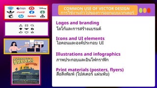
COMMON USE OFVECTOR DESIGN
การใช้งานทั่วไปของการออกแบบเวกเตอร์
Logos and branding
Icons and UI elements
Illustrations and infographics
Print materials (posters, flyers)
โลโก้และการสร้างแบรนด์
ไอคอนและองค์ประกอบ UI
ภาพประกอบและอินโฟกราฟิก
สื่อสิ่งพิมพ์ (โปสเตอร์ แผ่นพับ)
43.
Scalability – canresize without distortion
Editability – easy to modify individual
elements
Clarity – sharp and clean visuals at any size
KEY FEATURES OF VECTOR GRAPHIC
การออกแบบเวกเตอร์คุณสมบัติหลักของกราฟิกเวกเตอร์อะไร
–
ความสามารถในการปรับขนาด ปรับขนาดได้โดยไม่
เกิดการบิดเบือน
–
ความสามารถในการแก้ไข ปรับเปลี่ยนองค์ประกอบ
แต่ละส่วนได้ง่าย
–
ความสามารถในการแก้ไข ปรับเปลี่ยนองค์ประกอบ
แต่ละส่วนได้ง่าย
44.
Essential skill indigital media and graphic
design
Useful for both print and web projects
Enables precision and flexibility in design
work
BENEFITS OF LEARNING VECTOR DESIGN
ประโยชน์ของการเรียนรู้การออกแบบเวกเตอร์
ทักษะที่สำคัญในสื่อดิจิทัลและการออกแบบกราฟิก
มีประโยชน์สำหรับทั้งงานพิมพ์และเว็บไซต์
ช่วยให้มีความแม่นยำและยืดหยุ่นในการทำงาน
ออกแบบ
45.
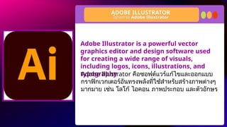
Adobe Illustrator isa powerful vector
graphics editor and design software used
for creating a wide range of visuals,
including logos, icons, illustrations, and
typography
ADOBE ILLUSTRATOR
โปรแกรม Adobe Illustrator
Adobe Illustrator คือซอฟต์แวร์แก้ไขและออกแบบ
กราฟิกเวกเตอร์อันทรงพลังที่ใช้สำหรับสร้างภาพต่างๆ
มากมาย เช่น โลโก้ ไอคอน ภาพประกอบ และตัวอักษร
46.
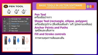
Pen Tool
Shape Tool(rectangle, ellipse, polygon)
Anchor Points and Paths
Fill and Stroke controls
BASIC TOOLS IN VECTOR SOFTWARE
เครื่องมือพื้นฐานในซอฟต์แวร์เวกเตอร์
เครื่องมือปากกา
เครื่องมือรูปร่าง (สี่เหลี่ยมผืนผ้า วงรี รูปหลายเหลี่ยม)
จุดยึดและเส้นทาง
การควบคุมการเติมและเส้น
A logo isa visual symbol representing a
brand or message.
It should be simple, memorable, and
versatile.
Often used in business cards, websites,
and posters.
WHAT IS LOGO
โลโก้คืออะไร
โลโก้เป็นสัญลักษณ์ทางภาพที่แสดงถึงแบรนด์หรือ
ข้อความ
โลโก้ควรเป็นแบบเรียบง่าย น่าจดจำ และใช้งานได้
หลากหลาย
มักใช้ในนามบัตร เว็บไซต์ และโปสเตอร์
49.
A logo isa visual symbol representing a
brand or message.
It should be simple, memorable, and
versatile.
Often used in business cards, websites,
and posters.
WHAT IS LOGO
โลโก้คืออะไร
โลโก้เป็นสัญลักษณ์ทางภาพที่แสดงถึงแบรนด์หรือ
ข้อความ
โลโก้ควรเป็นแบบเรียบง่าย น่าจดจำ และใช้งานได้
หลากหลาย
มักใช้ในนามบัตร เว็บไซต์ และโปสเตอร์
50.
Imagine you havestarting business of a Milktea shop and
you want to create facebook page so you need to make a
business logo for display picture for your fb page.
.
DIRECTION:
Choose your partner and create simple logo of Milk Tea shop
and think your own business name. You can use canva for
editing.
ACTIVITY TIME
ลองนึกภาพว่าคุณเพิ่งเริ่มทำธุรกิจร้าน Milktea และต้องการสร้างเพจ
Facebook คุณจึงต้องสร้างโลโก้ธุรกิจเพื่อใช้เป็นรูปภาพแสดงบนเพจ
Facebook ของคุณ
เลือกพันธมิตรของคุณแล้วสร้างโลโก้เรียบง่ายของร้าน Milk Tea และคิด
ชื่อธุรกิจของคุณเอง คุณสามารถใช้ Canva เพื่อแก้ไขภาพได้
51.
Resource Page
Use theseicons and illustrations in your Canva
Presentation. Happy designing! Don't forget to delete this
page before presenting.
set:nAFdH5rSwYk
52.
Try this backgroundfor online class.
*Please delete this section before downloading.