Good website design
/
BadWebsite design
Zahid Hussain
Roll #: F18BSCS00248
Subject: Human Computer Interaction
Global institute Lahore
 Incoherent design choices
 Key information that is buried
 Difficult navigational structures
 Unconventional colors
 Low-quality graphics
 Unreadable fonts
 A lack of mobile compatibility
 The website is designed for 200 percent
zoom, and clicking on the book covers on the
homepage does nothing.
 As a matter of fact, there’s a surprise word
doc that readers can download containing a
list of Children’s Choice Award Nominations.
 We simply do not understand the point of
keeping a downloadable word document
when it could easily have been just another
page!
 This website simply does not work on mobile.
Statutory warning – do not go in there if you
are having a bad day.
 This website ushers in brutality in website
design. It looks and feels far from professional,
and the content is simply below par.
 It is evident that except the website designer,
everyone knows the importance of a “Title” tag
in SEO.
 The worst issue is that the registration form for
the upcoming conference is a PDF. So you
cannot edit it online.You need to download it
and mail it.
 The name surely does grab a lot of eyeballs,
but the website will make your senses scream
in physical pain.
 They may be thinking about waking people
up from the slurry of conspiracies, but
honestly, the designers should have woken
themselves up completely before publishing
such a worst website.
 The color combination makes you wish that you
had your RayBans on right now.
 The grey and black interspersed with bright red
and white makes us wonder if the designer was
colorblind.
 This website has no sense of minimalism.
 The pages are overcrowded with content and
low-res pictures, which make browsing a pain.
 Also, the logo on the main page does not match
the logo on the rest of the pages.
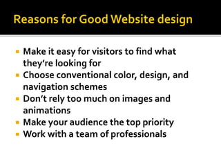
 Make it easy for visitors to find what
they’re looking for
 Choose conventional color, design, and
navigation schemes
 Don’t rely too much on images and
animations
 Make your audience the top priority
 Work with a team of professionals
 It's easy to consume.There is much debate on
whether short or long homepages work better. If you
choose to do the latter, you need to make it easy to
scroll and read -- and that's exactly what this site
does. It almost acts like a story.
 There's great use of contrast and positioning with the
primary calls-to-action -- it's clear what the company
wants you to convert on when you arrive.
 The copy used in the calls-to-action "Get Started for
Free" is very compelling.
 FreshBooks uses customer testimonials on the
homepage to tell real-world stories of why to use the
product.
 It's a super simple design with a strong, no-
jargon headline and sub-headline.
 The homepage gives off a secure but easy-
going vibe, which is important for a product
that handles financial information.
 It also contains simple, direct, and compelling
call-to-action copy: "Sign up free."The CTA
design is also brilliant -- the secured lock icon
hits home the safety message once again.
 Dropbox carries over its simple design and
branding. It includes only what is important: A
large, relevant image with supporting copy, and
a "Try free for 30 days" call-to-action button
 Dropbox's homepage and website is the
ultimate example of simplicity. It limits its use of
copy and visuals and embraces whitespace.
 Its sub-headline is simple, yet powerful: "The
secure file sharing and storage solution that
employees and IT admins trust." No need to
decode jargon to figure out what Dropbox really
does.
 Combined with great photography, the
headline "Brisket. 18 years to master.Yours to
savor." sounds like an experience worth
trying.
 The parallax scrolling guides you on a tour
through the services, menu, and people
having a great time -- a great use of this
popular design trend.
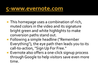
 This homepage uses a combination of rich,
muted colors in the video and its signature
bright green and white highlights to make
conversion paths stand out.
 Following a simple headline ("Remember
Everything"), the eye path then leads you to its
call-to-action, "Sign Up For Free."
 Evernote also offers a one-click signup process
through Google to help visitors save even more
time.
Good Website Design vs Bad Website Design

Good Website Design vs Bad Website Design

  • 1.
  • 2.
    Zahid Hussain Roll #:F18BSCS00248 Subject: Human Computer Interaction Global institute Lahore
  • 3.
     Incoherent designchoices  Key information that is buried  Difficult navigational structures  Unconventional colors  Low-quality graphics  Unreadable fonts  A lack of mobile compatibility
  • 4.
     The websiteis designed for 200 percent zoom, and clicking on the book covers on the homepage does nothing.  As a matter of fact, there’s a surprise word doc that readers can download containing a list of Children’s Choice Award Nominations.  We simply do not understand the point of keeping a downloadable word document when it could easily have been just another page!
  • 5.
     This websitesimply does not work on mobile. Statutory warning – do not go in there if you are having a bad day.
  • 6.
     This websiteushers in brutality in website design. It looks and feels far from professional, and the content is simply below par.  It is evident that except the website designer, everyone knows the importance of a “Title” tag in SEO.  The worst issue is that the registration form for the upcoming conference is a PDF. So you cannot edit it online.You need to download it and mail it.
  • 7.
     The namesurely does grab a lot of eyeballs, but the website will make your senses scream in physical pain.  They may be thinking about waking people up from the slurry of conspiracies, but honestly, the designers should have woken themselves up completely before publishing such a worst website.
  • 8.
     The colorcombination makes you wish that you had your RayBans on right now.  The grey and black interspersed with bright red and white makes us wonder if the designer was colorblind.  This website has no sense of minimalism.  The pages are overcrowded with content and low-res pictures, which make browsing a pain.  Also, the logo on the main page does not match the logo on the rest of the pages.
  • 9.
     Make iteasy for visitors to find what they’re looking for  Choose conventional color, design, and navigation schemes  Don’t rely too much on images and animations  Make your audience the top priority  Work with a team of professionals
  • 10.
     It's easyto consume.There is much debate on whether short or long homepages work better. If you choose to do the latter, you need to make it easy to scroll and read -- and that's exactly what this site does. It almost acts like a story.  There's great use of contrast and positioning with the primary calls-to-action -- it's clear what the company wants you to convert on when you arrive.  The copy used in the calls-to-action "Get Started for Free" is very compelling.  FreshBooks uses customer testimonials on the homepage to tell real-world stories of why to use the product.
  • 11.
     It's asuper simple design with a strong, no- jargon headline and sub-headline.  The homepage gives off a secure but easy- going vibe, which is important for a product that handles financial information.  It also contains simple, direct, and compelling call-to-action copy: "Sign up free."The CTA design is also brilliant -- the secured lock icon hits home the safety message once again.
  • 12.
     Dropbox carriesover its simple design and branding. It includes only what is important: A large, relevant image with supporting copy, and a "Try free for 30 days" call-to-action button  Dropbox's homepage and website is the ultimate example of simplicity. It limits its use of copy and visuals and embraces whitespace.  Its sub-headline is simple, yet powerful: "The secure file sharing and storage solution that employees and IT admins trust." No need to decode jargon to figure out what Dropbox really does.
  • 13.
     Combined withgreat photography, the headline "Brisket. 18 years to master.Yours to savor." sounds like an experience worth trying.  The parallax scrolling guides you on a tour through the services, menu, and people having a great time -- a great use of this popular design trend.
  • 14.
     This homepageuses a combination of rich, muted colors in the video and its signature bright green and white highlights to make conversion paths stand out.  Following a simple headline ("Remember Everything"), the eye path then leads you to its call-to-action, "Sign Up For Free."  Evernote also offers a one-click signup process through Google to help visitors save even more time.