feedback
•Download as DOCX, PDF•
0 likes•76 views
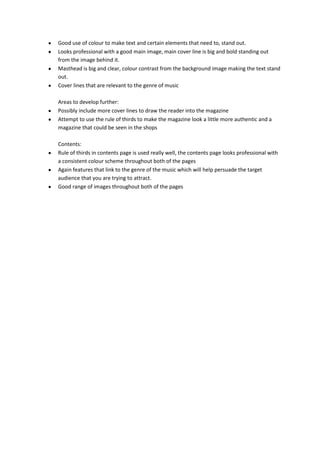
The document summarizes a music magazine cover design, noting its professional appearance with a large, bold cover line standing out against the main image. It effectively uses color contrast to make the masthead and text stand out from the background image. Suggested areas for further development include including more cover lines to engage readers and using the rule of thirds technique to make the design look more like an authentic magazine.
Report
Share
Report
Share
Recommended
Question 4
This document discusses how the magazine front cover, content page, and double page spread used or challenged conventions of real music magazines. The front cover followed conventions like the masthead, barcode, and price but had fewer cover lines. The content page included images and color but in a more scattered layout. The double page spread featured the title, artist photos, and house colors but in a more colorful style with a photo background, breaking from typical white backgrounds. Overall, the designs drew from real magazine conventions while also experimenting with conventions to suit the genre.
Comparison of 'Tilt' and NME
The document compares music magazines 'TILT' and NME by describing their common layout features. Both magazines have a banner along the top advertising articles, a bold masthead with the magazine name, and large cover images featuring artists. Inside, they include other articles and band features with headings, pictures, and information. The magazines also contain contents pages organizing sections, band indexes, editor's messages, and subscription offers.
Front cover feedback
The document provides feedback on a magazine cover design. It compliments the central band image, use of individual band member posters, and consistent color scheme. Areas for improvement include making the font clearer, placing the masthead behind the image instead of over it, adjusting the font style, repositioning and lowering some text, making the main cover story more prominent, and ensuring the background image fits the magazine's conventions.
Magazine contents page 2 (music)
The document summarizes the key elements and purpose of a magazine contents page. It notes that the images are of people starring in the magazine who appear to target an older audience interested in classical music. The subheadings organize the different sections covered in the magazine and draw attention to major articles. Advertisements also promote upcoming classical music concerts, demonstrating how the magazine advertises the industry.
Evaluation question 1
This document discusses how the media product both uses and challenges conventions of magazine design. It analyzes the forms and conventions seen in existing music magazines like Clash and Mixmag. While some conventions are followed, such as placement of the masthead and main image on the cover, others are challenged to better suit the target audience and genre. For example, bold colors and more edgy designs are used on the front cover compared to traditional magazines. The contents page and double page spreads also follow and adapt some typical magazine conventions discussed. Overall, the document examines how the magazine both draws from common conventions but makes adaptations to appeal specifically to its intended pop music readers.
Evaluation question 1
This document discusses the forms and conventions used in the media product of a music magazine. It begins by explaining that all magazines have codes and conventions that are generally followed to meet audience expectations. However, some magazines like Clash break conventions to better convey their genre.
The author analyzed existing music magazines Clash and Mixmag to understand conventions. Their magazine follows some conventions, like the masthead and main image on the front cover, but challenges others to seem more fun and edgy for their target audience of pop music fans.
Double page spreads in Clash magazine inspired the author's style, with a large central image and minimal text. Typography and layout are also discussed in relation to conventions used and challenged in the
Question 1
This document contains annotations of different elements from a mock music magazine, including the cover, contents page, and a double page article spread. The annotations describe how each element uses conventions of real music magazines, such as a masthead with the title across the top of the cover, cover lines and images to entice readers, a contents page with sections and photos, and a double page spread with a large leading image, columns of text, and a drop capital to start the article. Overall, the annotations show how the mock magazine follows standard forms and layout conventions used in real music magazines.
Evaluation question 1
This document summarizes how the student's media product follows conventions of real music magazines while also challenging some conventions. The front cover follows conventions like the masthead at the top and cover lines on the side. The contents page keeps a similar structure to examples but adds some of the student's own style. The double page spread challenges conventions by including more information and images than typical while still highlighting the main artist.
Evaluation question one
This document discusses the typical conventions of magazine design and how the student's media product incorporates or challenges these conventions. It covers conventions for the magazine cover, contents page, and double page spreads. For the cover, it uses a masthead, central image, partition colors, main coverline, photos and captions, consistent colors, and band names. The contents page includes columns, images, page numbers, magazine name, date, editor's letter, and consistent colors. The double page spread features a central image, direct quotes, consistent colors, and columns. The student challenges some conventions by spreading information across both sides of the cover and placing the largest image on the right page of the double spread.
Codes and conventions
1) Music magazines use consistent branding elements like logos and fonts to establish themselves and guide readers through relevant content.
2) Covers draw readers in with large images of subjects and bold headlines about main articles while also listing other pieces to entice purchase.
3) Inside pages continue consistent branding and use additional images, text boxes, and article layouts to highlight key people and themes while guiding readers through the magazine in a cohesive manner.
Codes and conventions
The document describes the codes and conventions used across the layouts of three different music magazines. Some key similarities include large photos of the featured artist, prominent mastheads displaying the magazine title, and references to articles on the contents pages. Double page spreads typically contain photos of the artist alongside introductions to the main article. One difference is that one magazine offers free gifts, while price is only listed on two of the magazines.
Codes And Conventions
Codes are signs that create meaning and can be technological or symbolic. Conventions are generally accepted ways of doing something and are genre specific. This links to music magazines, which use codes and conventions like banners, mastheads, datelines, images, cover wraps, and more. These codes and conventions are found across different pop music magazines and appeal to target audiences by catching readers' eyes with consistent layouts that feature the same codes month after month.
Elli's AS Media codes and conventions presentation
This document discusses the key elements found on magazine covers and contents pages. Magazine covers typically feature the masthead, issue information, cover lines around images that don't cover faces, and a main cover line in larger text. Contents pages contain the issue information, masthead, columns of headlines and page numbers for navigation between related images and articles. Both covers and contents pages utilize the magazine's house style and color scheme for branding consistency.
Q magazine contents page analysis
The document summarizes key elements of a magazine contents page layout, including:
- Page numbers are placed randomly throughout the double-page spread
- The masthead is located in large font in the top left corner, matching the style on the front cover
- The main heading "Contents" draws attention in bold font near the masthead
- Dates are included at the top left above the masthead and bottom right of each page to indicate the issue
Presentation1
The document analyzes the cover designs of three music magazines: Q Magazine, Kerrang!, and Vibe. Some common elements identified across the magazines include the masthead placed prominently but not obscuring the cover image, cover lines providing information on stories inside, and sell lines in bold text designed to attract customers. Based on this analysis, the author decides their own magazine cover will include a large central image making eye contact with the reader, color coordination between the image and magazine theme, the masthead and issue number placed above the image, website information, a barcode with pricing and date, and an attention-grabbing sell line at the top.
Evaluation Question 1
The document discusses conventions used in real music magazines that are employed in the media product. These include limited color schemes to appear professional, overlapping images on the front cover to connect image and text, and freebies or promotions to attract readers. The contents page also mirrors conventions like the masthead spanning both pages, balancing text and images, and using promotions. Images are used to introduce articles and connect visually to the written text.
Contents 1
The document discusses the various design elements of a magazine contents page and their purposes. The masthead displays the magazine's name consistently throughout and aids brand recognition. The page title informs readers of the page number and helps those searching for the contents. The main image, often of an artist, promotes them and creates excitement for fans. Additional text provides more details on articles to further interest the target audience. Together, these visual cues and information help organize and guide readers through the magazine.
Evaluation presentation .
The document discusses conventions used in magazine design. It positions the masthead at the top for visibility and to indicate genre. The main image uses a mid-shot and direct gaze to engage the audience. Color scheme and font make elements stand out. The main coverline is larger to highlight the primary story. Blank space is minimized so elements are easily seen.
Contents 1
The document discusses the various design elements and their purposes on a magazine contents page. The masthead displays the magazine's name consistently throughout and aids brand recognition. The title of the page informs readers of the section and is prominently displayed. The main image, usually of an artist, promotes them to appeal to fans. Additional text provides more details on articles to pique readers' interest. Together these visual cues follow magazine conventions to effectively guide readers and market content to the target audience.
Flat plans
This document contains flat plans for the front cover, contents page, and a double page spread for a music magazine. The front cover features a large central image with smaller images down one side and a title that overlaps the images and masthead. The contents page has a right-side image, smaller masthead, and content list taking up most of the page. The double page spread is dominated by one large left-page image connected to a large right-page image and text box by a graphic spanning both pages.
Evaluation
The document discusses ways in which the author's magazine has used, developed, and challenged forms and conventions. It notes common magazine elements like the masthead, barcode, price, and headlines. It also details how the author adapted graphics from another magazine title and used varying colors and orientations for cover lines to develop and challenge conventions.
1st question.
This document provides an analysis and evaluation of a mock music magazine front cover and contents page created by the author. It examines how the mock magazine uses and develops conventions found in real music magazines. The front cover includes elements like a large masthead, sell lines promoting interior content, barcode and price, and subscription offers that conform to industry standards. The contents page similarly displays interior articles in an organized manner, includes the date and social media links, and reuses the masthead. The double-page feature article format draws from examples in Q Magazine with its layout of text, images, headlines and page numbers.
Evaluation q1
The document describes how the author's media product, a magazine, uses conventions from real music magazines. Some conventions included are a barcode, price, and date on the cover, as well as a line of bands at the bottom of pages. The magazine also uses double page spreads with full page pictures, cover designs with the main image behind text, and a contents page with page numbers and subheadings. Layout and design conventions like placement of images, titles, and text are also replicated from other magazines. Colors schemes and cover lines are also used in conventions from other music magazines.
Contents 1
The document discusses the various elements that make up a typical magazine contents page and their purposes. The masthead displays the magazine's name consistently throughout and aids brand recognition. The page title informs readers of the section and is prominently displayed. The main image, often of an artist, promotes them and draws interest from fans. Additional text provides further details on articles to entice readers. Together, these visual codes and conventions effectively guide readers and market content to the target audience.
Question 1
The document provides an evaluation of a media product (a magazine) based on 7 questions. It summarizes the ways the magazine product uses and develops conventions of real magazines through its cover design, masthead, images, and other features. It also analyzes the represented social groups, potential distributing institutions, intended audience, and technologies learned. Comparisons are made between the magazine product's conventions and those found in actual published magazines.
Contents page reasearch
The document summarizes research on magazine contents pages. It finds that most contents pages feature a large picture highlighting the main article, have a clear "Contents" label, and list articles under categories on one side of the page. Other common elements include smaller pictures and summaries of additional stories, boxes promoting subscriptions or other content, and color schemes that brand the publication. The research indicates these design choices effectively deliver an overview of a magazine's stories and help readers quickly find content of interest.
Step by step of my music magazine contents
The document describes the process of creating a contents page for a music magazine. The creator originally used the front cover font and colors but later changed the font as it did not look good. Page numbers were made red to stand out and match professional magazine styles. Sections for features and regular content were added, as well as a subscription box, to follow conventions. The final contents page incorporated changes made along the way and the creator felt it had a professional look that clearly presented the indie/rock genre.
Music magazine research 2
The document analyzes the layout and design of the content pages from a music magazine. It discusses several key aspects of the content pages, including the use of photographs to advertise articles, bold colored text for readability, and sections dedicated to the editor. Overall, the document examines how the magazine's content pages are visually presented through design elements like color schemes, fonts, images, and column layouts to clearly guide readers to content and engage them visually.
Media contents page research
The document discusses the codes and conventions of contents pages from three magazines: Q, NME, and Clash. It analyzes layout features like use of imagery, grid structure, fonts, and color schemes. Key points the document takes away for its own magazine's contents page include using a masthead in bold font, multiple relevant images, and an organized column layout for text. Consistency across issues is also important.
Evaluation Q1
This document evaluates how a media product uses, develops, and challenges conventions of real magazines.
It summarizes that the magazine cover uses conventions like a masthead, cover lines in two colors, and a tag. However, it only uses one color for the cover lines instead of two. The main image on the cover is a medium close-up edited similarly to real magazines.
The contents page conforms to conventions like using various artist images but challenges conventions by having a two-page menu and atypical "contents" typography.
The double-page spread uses conventions such as pull quotes, a large central image, and three columns, but challenges conventions by using only black and white like some artist-
More Related Content
What's hot
Evaluation question one
This document discusses the typical conventions of magazine design and how the student's media product incorporates or challenges these conventions. It covers conventions for the magazine cover, contents page, and double page spreads. For the cover, it uses a masthead, central image, partition colors, main coverline, photos and captions, consistent colors, and band names. The contents page includes columns, images, page numbers, magazine name, date, editor's letter, and consistent colors. The double page spread features a central image, direct quotes, consistent colors, and columns. The student challenges some conventions by spreading information across both sides of the cover and placing the largest image on the right page of the double spread.
Codes and conventions
1) Music magazines use consistent branding elements like logos and fonts to establish themselves and guide readers through relevant content.
2) Covers draw readers in with large images of subjects and bold headlines about main articles while also listing other pieces to entice purchase.
3) Inside pages continue consistent branding and use additional images, text boxes, and article layouts to highlight key people and themes while guiding readers through the magazine in a cohesive manner.
Codes and conventions
The document describes the codes and conventions used across the layouts of three different music magazines. Some key similarities include large photos of the featured artist, prominent mastheads displaying the magazine title, and references to articles on the contents pages. Double page spreads typically contain photos of the artist alongside introductions to the main article. One difference is that one magazine offers free gifts, while price is only listed on two of the magazines.
Codes And Conventions
Codes are signs that create meaning and can be technological or symbolic. Conventions are generally accepted ways of doing something and are genre specific. This links to music magazines, which use codes and conventions like banners, mastheads, datelines, images, cover wraps, and more. These codes and conventions are found across different pop music magazines and appeal to target audiences by catching readers' eyes with consistent layouts that feature the same codes month after month.
Elli's AS Media codes and conventions presentation
This document discusses the key elements found on magazine covers and contents pages. Magazine covers typically feature the masthead, issue information, cover lines around images that don't cover faces, and a main cover line in larger text. Contents pages contain the issue information, masthead, columns of headlines and page numbers for navigation between related images and articles. Both covers and contents pages utilize the magazine's house style and color scheme for branding consistency.
Q magazine contents page analysis
The document summarizes key elements of a magazine contents page layout, including:
- Page numbers are placed randomly throughout the double-page spread
- The masthead is located in large font in the top left corner, matching the style on the front cover
- The main heading "Contents" draws attention in bold font near the masthead
- Dates are included at the top left above the masthead and bottom right of each page to indicate the issue
Presentation1
The document analyzes the cover designs of three music magazines: Q Magazine, Kerrang!, and Vibe. Some common elements identified across the magazines include the masthead placed prominently but not obscuring the cover image, cover lines providing information on stories inside, and sell lines in bold text designed to attract customers. Based on this analysis, the author decides their own magazine cover will include a large central image making eye contact with the reader, color coordination between the image and magazine theme, the masthead and issue number placed above the image, website information, a barcode with pricing and date, and an attention-grabbing sell line at the top.
Evaluation Question 1
The document discusses conventions used in real music magazines that are employed in the media product. These include limited color schemes to appear professional, overlapping images on the front cover to connect image and text, and freebies or promotions to attract readers. The contents page also mirrors conventions like the masthead spanning both pages, balancing text and images, and using promotions. Images are used to introduce articles and connect visually to the written text.
Contents 1
The document discusses the various design elements of a magazine contents page and their purposes. The masthead displays the magazine's name consistently throughout and aids brand recognition. The page title informs readers of the page number and helps those searching for the contents. The main image, often of an artist, promotes them and creates excitement for fans. Additional text provides more details on articles to further interest the target audience. Together, these visual cues and information help organize and guide readers through the magazine.
Evaluation presentation .
The document discusses conventions used in magazine design. It positions the masthead at the top for visibility and to indicate genre. The main image uses a mid-shot and direct gaze to engage the audience. Color scheme and font make elements stand out. The main coverline is larger to highlight the primary story. Blank space is minimized so elements are easily seen.
Contents 1
The document discusses the various design elements and their purposes on a magazine contents page. The masthead displays the magazine's name consistently throughout and aids brand recognition. The title of the page informs readers of the section and is prominently displayed. The main image, usually of an artist, promotes them to appeal to fans. Additional text provides more details on articles to pique readers' interest. Together these visual cues follow magazine conventions to effectively guide readers and market content to the target audience.
Flat plans
This document contains flat plans for the front cover, contents page, and a double page spread for a music magazine. The front cover features a large central image with smaller images down one side and a title that overlaps the images and masthead. The contents page has a right-side image, smaller masthead, and content list taking up most of the page. The double page spread is dominated by one large left-page image connected to a large right-page image and text box by a graphic spanning both pages.
Evaluation
The document discusses ways in which the author's magazine has used, developed, and challenged forms and conventions. It notes common magazine elements like the masthead, barcode, price, and headlines. It also details how the author adapted graphics from another magazine title and used varying colors and orientations for cover lines to develop and challenge conventions.
1st question.
This document provides an analysis and evaluation of a mock music magazine front cover and contents page created by the author. It examines how the mock magazine uses and develops conventions found in real music magazines. The front cover includes elements like a large masthead, sell lines promoting interior content, barcode and price, and subscription offers that conform to industry standards. The contents page similarly displays interior articles in an organized manner, includes the date and social media links, and reuses the masthead. The double-page feature article format draws from examples in Q Magazine with its layout of text, images, headlines and page numbers.
Evaluation q1
The document describes how the author's media product, a magazine, uses conventions from real music magazines. Some conventions included are a barcode, price, and date on the cover, as well as a line of bands at the bottom of pages. The magazine also uses double page spreads with full page pictures, cover designs with the main image behind text, and a contents page with page numbers and subheadings. Layout and design conventions like placement of images, titles, and text are also replicated from other magazines. Colors schemes and cover lines are also used in conventions from other music magazines.
Contents 1
The document discusses the various elements that make up a typical magazine contents page and their purposes. The masthead displays the magazine's name consistently throughout and aids brand recognition. The page title informs readers of the section and is prominently displayed. The main image, often of an artist, promotes them and draws interest from fans. Additional text provides further details on articles to entice readers. Together, these visual codes and conventions effectively guide readers and market content to the target audience.
Question 1
The document provides an evaluation of a media product (a magazine) based on 7 questions. It summarizes the ways the magazine product uses and develops conventions of real magazines through its cover design, masthead, images, and other features. It also analyzes the represented social groups, potential distributing institutions, intended audience, and technologies learned. Comparisons are made between the magazine product's conventions and those found in actual published magazines.
Contents page reasearch
The document summarizes research on magazine contents pages. It finds that most contents pages feature a large picture highlighting the main article, have a clear "Contents" label, and list articles under categories on one side of the page. Other common elements include smaller pictures and summaries of additional stories, boxes promoting subscriptions or other content, and color schemes that brand the publication. The research indicates these design choices effectively deliver an overview of a magazine's stories and help readers quickly find content of interest.
Step by step of my music magazine contents
The document describes the process of creating a contents page for a music magazine. The creator originally used the front cover font and colors but later changed the font as it did not look good. Page numbers were made red to stand out and match professional magazine styles. Sections for features and regular content were added, as well as a subscription box, to follow conventions. The final contents page incorporated changes made along the way and the creator felt it had a professional look that clearly presented the indie/rock genre.
Music magazine research 2
The document analyzes the layout and design of the content pages from a music magazine. It discusses several key aspects of the content pages, including the use of photographs to advertise articles, bold colored text for readability, and sections dedicated to the editor. Overall, the document examines how the magazine's content pages are visually presented through design elements like color schemes, fonts, images, and column layouts to clearly guide readers to content and engage them visually.
What's hot (20)
Elli's AS Media codes and conventions presentation
Elli's AS Media codes and conventions presentation
Similar to feedback
Media contents page research
The document discusses the codes and conventions of contents pages from three magazines: Q, NME, and Clash. It analyzes layout features like use of imagery, grid structure, fonts, and color schemes. Key points the document takes away for its own magazine's contents page include using a masthead in bold font, multiple relevant images, and an organized column layout for text. Consistency across issues is also important.
Evaluation Q1
This document evaluates how a media product uses, develops, and challenges conventions of real magazines.
It summarizes that the magazine cover uses conventions like a masthead, cover lines in two colors, and a tag. However, it only uses one color for the cover lines instead of two. The main image on the cover is a medium close-up edited similarly to real magazines.
The contents page conforms to conventions like using various artist images but challenges conventions by having a two-page menu and atypical "contents" typography.
The double-page spread uses conventions such as pull quotes, a large central image, and three columns, but challenges conventions by using only black and white like some artist-
Magazine contents page 1 (classical music)
The document discusses the design elements of a magazine's contents page. It maintains a maroon color scheme throughout to create cohesion and flow. The images featured are of older individuals involved in classical music, indicating the magazine targets an older audience interested in classical music. Subheadings organize the different sections, while the word "CONTENTS" clearly labels the page. A circular advertisement also uses the magazine's color scheme to promote a list of classical music's greatest recordings.
Cotents page analysis
1) The document describes the design elements of two magazine contents pages - Kerrang and Billboard. Both pages display the contents in columns to structure the information and appear professional.
2) Kerrang maintains a balance of images and text to appeal to music fans, while Billboard contains more text to thoroughly inform readers about article topics.
3) Design principles like positioning logos in attention-grabbing areas and dividing content spatially are employed to optimize page layout and guide the reader's eye across each contents spread.
Poppy front cover analysis 2
The magazine cover uses various design elements to attract readers and convey information. These include a header bar that provides issue details, a professionally placed barcode in the top left, an enticing headline about the issue's topic, cover lines covering a range of stories to appeal to different readers, a consistent but color-varying masthead font, and a color scheme aimed at females using purple and pink hues. The text is arranged in vague columns to spread around the page, though less text may provide a cleaner look.
Evaluation- Question one
The document discusses the forms and conventions used in the student's media product, which was a music magazine. It describes including elements like graphics, text layout, images and masthead in the magazine cover, as well as colors, fonts, and positioned images, to follow real music magazine conventions. The contents page also mimicked industry standards with elements such as the magazine logo, editors letter, and issue details. The article format similarly aligned with conventions through the use of a main image, captions, and body text styled consistently with the rest of the magazine.
Q1. In what ways does your media product use, develop or challenge forms and ...
Media AS Evaluation Q1
Q1. In what ways does your media product use, develop or challenge forms and conventions of real media products?
Music magazine research
The document provides examples of magazine covers and contents pages and discusses design techniques used. Some key points:
1) Magazine covers use large celebrity images and quotes to promote featured articles. Mastheads, taglines and barcodes maintain consistent branding.
2) Contents pages categorize articles through labels and images. Larger page numbers and fonts draw attention to primary features. Indexes and advertisements also engage readers.
3) Common techniques across covers and contents include positioning logos prominently, varying font sizes to prioritize information, and employing consistent color schemes to reinforce house style. Imagery and text work together to market contents and attract buyers.
Textual analysis 3
This document discusses the layout and design elements of music magazine NME. It notes that NME typically uses a close-up headshot on the cover that takes up the whole page. The inside pages continue the red, white, and black color scheme and bold masthead. Sell lines entice readers with snippets of stories, while images on the contents page further engage readers. Double page spreads feature large central images that overlap pages and set the indie tone through costumes and locations. Pull quotes and drop caps are used to break up columns of text on feature articles. Consistency in house style and design elements builds brand identity and appeals to readers.
Analysis of professional magazine pages contents page
The document analyzes the contents page of a professional music magazine. It discusses several key elements included on contents pages like mastheads, images, color schemes, headings and subheadings. Mastheads are used to identify the magazine name while images promote artists featured in articles. Color schemes and layouts aim to clearly guide readers to content in a visually appealing way. Overall, contents pages employ various codes and conventions to attract readers and highlight essential information.
Analysis of professional magazine pages contents page
The document analyzes the contents page of a professional music magazine. It discusses several key design elements used including the masthead, color scheme, images, column layout, and pull quotes. The masthead and images are used to gain readers' attention and promote recognition of the magazine. A color scheme of black, blue, and white is employed to match the genre of music covered. Information is organized into columns with numbered sections to provide an easy to understand structure. Pull quotes from artists are included to give readers insight into the personalities featured.
Evaluation Question 1
The document describes features of a magazine cover, contents page, and double page spread that was created for an assignment. It compares elements used to real magazines like NME, noting similarities and differences. Key similarities included a logo, main image, shocker, page numbers, and band listings. Differences included an innovative shocker shape, lack of captions or headers, and unconventional layouts. The response explains design choices based on audience research to challenge conventions while meeting reader expectations.
Conventions of a music magazine-AS media
The document outlines some key conventions of a music magazine, including the front cover, contents page, and double-page spreads. The front cover typically features a large masthead, celebrity image to attract readers, and barcode with price and issue date. The contents page clearly lists articles with subheadings and page numbers and highlights featured artists. Double-page spreads use bold headlines, drop caps, quotations, large main images relating to the article, and multiple smaller images along with the writer's name and page numbers. These elements provide consistency across issues and help readers navigate to find desired content.
Evalutaion Question One
The document discusses the conventions used in magazine design and how the student's media product adheres to or challenges conventions.
The front cover uses conventions like a large masthead, cover lines, quotes, date/issue info. It challenges conventions by placing the barcode in the top corner rather than bottom.
The contents page uses conventions like the masthead, images of featured people, large page numbers. It challenges conventions by having images take up more space.
The double page spread uses conventions like a large headline, images opposite text, pull quotes, matching color scheme. It aims to look professional while engaging readers.
Evaluation question one
This document discusses the typical conventions of magazine design and how the student's media product incorporates or challenges these conventions. It covers conventions for the cover, contents page, and double page spreads.
For the cover, it uses a masthead, partition color, main image, additional images, bold coverline, barcode, captions, and consistent color scheme similar to typical magazines. However, it displays information down both sides rather than just the left third, challenging conventions.
The contents page includes columns, images, page numbers, magazine name, date, editor's letter, and consistent colors. It also includes a competition not always seen.
The double page spread features multiple large images, direct eye contact, quotes, and
Evaluation 1
The document discusses how the author's media coursework utilizes, develops, and challenges conventions of real media products. It provides examples from the cover, contents page, and double page spread of the author's mock music magazine. The cover follows conventions like skylines and mastheads but challenges others through design choices. The contents page incorporates standard features like columns and images but also includes unique elements. The double page spread adheres to conventions such as standfirsts and drop caps but challenges norms through an unconventional use of a large quotation.
Media Powerpoint
The document describes the layout, fonts, images, and styles used on the covers and contents pages of different magazines. Large, eye-catching fonts are used for headlines, while smaller fonts provide additional details. Images usually take up most of the space and relate to the featured artists or genre. Photoshop is sometimes used to enhance images. Advertisements and information on other artists are included to attract different audiences. Prices suggest the magazines target older teenagers who could afford them.
Evaluation question 1
The document discusses conventions used in existing media products like music magazines and how the author's magazine both adheres to and challenges some of these conventions. Specifically, it mentions using bold cover lines and artist names inspired by NME covers. It also includes a contents page with categories and banners similar to NME but uses a non-traditional portrait photo rather than close-up shot. Some conventions around using multiple colors are challenged through a minimal black, white, red and blue color scheme.
Q Contents Page Analysis
The document summarizes the layout and design of a magazine contents page. It describes the use of bold black font for the headline centered at the top, with the issue number below in a red circle matching the logo color. Below this are images from stories with page numbers. The color scheme uses only red, white, and black consistent with the magazine's style. Sections are listed in a column on the left with thin black lines between. Larger images are placed on the right to draw attention, with bigger page numbers to match. The contents page provides previews of interviews, industry articles, competitions, and more to entice readers.
research and planning presentation
This document provides an analysis of magazine design conventions based on research. It examines the layout elements used in sample magazine covers and articles, such as mastheads, color schemes, images, headings and subheadings. The document also discusses which conventions will be applied in the design of a school magazine, such as using a main image, color scheme, masthead and puffs. Research on sample magazine spreads is presented, analyzing how they follow, develop and challenge conventions through elements like multiple related images and non-traditional layouts.
Similar to feedback (20)
Q1. In what ways does your media product use, develop or challenge forms and ...
Q1. In what ways does your media product use, develop or challenge forms and ...
Analysis of professional magazine pages contents page
Analysis of professional magazine pages contents page
Analysis of professional magazine pages contents page
Analysis of professional magazine pages contents page
Recently uploaded
DRUGS AND ITS classification slide share
Any substance (other than food) that is used to prevent, diagnose, treat, or relieve symptoms of a
disease or abnormal condition
Walmart Business+ and Spark Good for Nonprofits.pdf
"Learn about all the ways Walmart supports nonprofit organizations.
You will hear from Liz Willett, the Head of Nonprofits, and hear about what Walmart is doing to help nonprofits, including Walmart Business and Spark Good. Walmart Business+ is a new offer for nonprofits that offers discounts and also streamlines nonprofits order and expense tracking, saving time and money.
The webinar may also give some examples on how nonprofits can best leverage Walmart Business+.
The event will cover the following::
Walmart Business + (https://business.walmart.com/plus) is a new shopping experience for nonprofits, schools, and local business customers that connects an exclusive online shopping experience to stores. Benefits include free delivery and shipping, a 'Spend Analytics” feature, special discounts, deals and tax-exempt shopping.
Special TechSoup offer for a free 180 days membership, and up to $150 in discounts on eligible orders.
Spark Good (walmart.com/sparkgood) is a charitable platform that enables nonprofits to receive donations directly from customers and associates.
Answers about how you can do more with Walmart!"
How to Setup Warehouse & Location in Odoo 17 Inventory
In this slide, we'll explore how to set up warehouses and locations in Odoo 17 Inventory. This will help us manage our stock effectively, track inventory levels, and streamline warehouse operations.
Pengantar Penggunaan Flutter - Dart programming language1.pptx
Pengantar Penggunaan Flutter - Dart programming language1.pptx
ISO/IEC 27001, ISO/IEC 42001, and GDPR: Best Practices for Implementation and...
Denis is a dynamic and results-driven Chief Information Officer (CIO) with a distinguished career spanning information systems analysis and technical project management. With a proven track record of spearheading the design and delivery of cutting-edge Information Management solutions, he has consistently elevated business operations, streamlined reporting functions, and maximized process efficiency.
Certified as an ISO/IEC 27001: Information Security Management Systems (ISMS) Lead Implementer, Data Protection Officer, and Cyber Risks Analyst, Denis brings a heightened focus on data security, privacy, and cyber resilience to every endeavor.
His expertise extends across a diverse spectrum of reporting, database, and web development applications, underpinned by an exceptional grasp of data storage and virtualization technologies. His proficiency in application testing, database administration, and data cleansing ensures seamless execution of complex projects.
What sets Denis apart is his comprehensive understanding of Business and Systems Analysis technologies, honed through involvement in all phases of the Software Development Lifecycle (SDLC). From meticulous requirements gathering to precise analysis, innovative design, rigorous development, thorough testing, and successful implementation, he has consistently delivered exceptional results.
Throughout his career, he has taken on multifaceted roles, from leading technical project management teams to owning solutions that drive operational excellence. His conscientious and proactive approach is unwavering, whether he is working independently or collaboratively within a team. His ability to connect with colleagues on a personal level underscores his commitment to fostering a harmonious and productive workplace environment.
Date: May 29, 2024
Tags: Information Security, ISO/IEC 27001, ISO/IEC 42001, Artificial Intelligence, GDPR
-------------------------------------------------------------------------------
Find out more about ISO training and certification services
Training: ISO/IEC 27001 Information Security Management System - EN | PECB
ISO/IEC 42001 Artificial Intelligence Management System - EN | PECB
General Data Protection Regulation (GDPR) - Training Courses - EN | PECB
Webinars: https://pecb.com/webinars
Article: https://pecb.com/article
-------------------------------------------------------------------------------
For more information about PECB:
Website: https://pecb.com/
LinkedIn: https://www.linkedin.com/company/pecb/
Facebook: https://www.facebook.com/PECBInternational/
Slideshare: http://www.slideshare.net/PECBCERTIFICATION
Pollock and Snow "DEIA in the Scholarly Landscape, Session One: Setting Expec...
Pollock and Snow "DEIA in the Scholarly Landscape, Session One: Setting Expec...National Information Standards Organization (NISO)
This presentation was provided by Steph Pollock of The American Psychological Association’s Journals Program, and Damita Snow, of The American Society of Civil Engineers (ASCE), for the initial session of NISO's 2024 Training Series "DEIA in the Scholarly Landscape." Session One: 'Setting Expectations: a DEIA Primer,' was held June 6, 2024.South African Journal of Science: Writing with integrity workshop (2024)
South African Journal of Science: Writing with integrity workshop (2024)Academy of Science of South Africa
A workshop hosted by the South African Journal of Science aimed at postgraduate students and early career researchers with little or no experience in writing and publishing journal articles.The simplified electron and muon model, Oscillating Spacetime: The Foundation...
Discover the Simplified Electron and Muon Model: A New Wave-Based Approach to Understanding Particles delves into a groundbreaking theory that presents electrons and muons as rotating soliton waves within oscillating spacetime. Geared towards students, researchers, and science buffs, this book breaks down complex ideas into simple explanations. It covers topics such as electron waves, temporal dynamics, and the implications of this model on particle physics. With clear illustrations and easy-to-follow explanations, readers will gain a new outlook on the universe's fundamental nature.
PCOS corelations and management through Ayurveda.
This presentation includes basic of PCOS their pathology and treatment and also Ayurveda correlation of PCOS and Ayurvedic line of treatment mentioned in classics.
Chapter 4 - Islamic Financial Institutions in Malaysia.pptx
Chapter 4 - Islamic Financial Institutions in Malaysia.pptxMohd Adib Abd Muin, Senior Lecturer at Universiti Utara Malaysia
This slide is special for master students (MIBS & MIFB) in UUM. Also useful for readers who are interested in the topic of contemporary Islamic banking.
ANATOMY AND BIOMECHANICS OF HIP JOINT.pdf
it describes the bony anatomy including the femoral head , acetabulum, labrum . also discusses the capsule , ligaments . muscle that act on the hip joint and the range of motion are outlined. factors affecting hip joint stability and weight transmission through the joint are summarized.
How to Add Chatter in the odoo 17 ERP Module
In Odoo, the chatter is like a chat tool that helps you work together on records. You can leave notes and track things, making it easier to talk with your team and partners. Inside chatter, all communication history, activity, and changes will be displayed.
Hindi varnamala | hindi alphabet PPT.pdf
हिंदी वर्णमाला पीपीटी, hindi alphabet PPT presentation, hindi varnamala PPT, Hindi Varnamala pdf, हिंदी स्वर, हिंदी व्यंजन, sikhiye hindi varnmala, dr. mulla adam ali, hindi language and literature, hindi alphabet with drawing, hindi alphabet pdf, hindi varnamala for childrens, hindi language, hindi varnamala practice for kids, https://www.drmullaadamali.com
How to Fix the Import Error in the Odoo 17
An import error occurs when a program fails to import a module or library, disrupting its execution. In languages like Python, this issue arises when the specified module cannot be found or accessed, hindering the program's functionality. Resolving import errors is crucial for maintaining smooth software operation and uninterrupted development processes.
Recently uploaded (20)
Walmart Business+ and Spark Good for Nonprofits.pdf
Walmart Business+ and Spark Good for Nonprofits.pdf
How to Setup Warehouse & Location in Odoo 17 Inventory
How to Setup Warehouse & Location in Odoo 17 Inventory
Pengantar Penggunaan Flutter - Dart programming language1.pptx
Pengantar Penggunaan Flutter - Dart programming language1.pptx
ISO/IEC 27001, ISO/IEC 42001, and GDPR: Best Practices for Implementation and...
ISO/IEC 27001, ISO/IEC 42001, and GDPR: Best Practices for Implementation and...
Pride Month Slides 2024 David Douglas School District
Pride Month Slides 2024 David Douglas School District
Pollock and Snow "DEIA in the Scholarly Landscape, Session One: Setting Expec...
Pollock and Snow "DEIA in the Scholarly Landscape, Session One: Setting Expec...
South African Journal of Science: Writing with integrity workshop (2024)
South African Journal of Science: Writing with integrity workshop (2024)
The simplified electron and muon model, Oscillating Spacetime: The Foundation...
The simplified electron and muon model, Oscillating Spacetime: The Foundation...
Digital Artefact 1 - Tiny Home Environmental Design
Digital Artefact 1 - Tiny Home Environmental Design
Chapter 4 - Islamic Financial Institutions in Malaysia.pptx
Chapter 4 - Islamic Financial Institutions in Malaysia.pptx
feedback
- 1. Good use of colour to make text and certain elements that need to, stand out. Looks professional with a good main image, main cover line is big and bold standing out from the image behind it. Masthead is big and clear, colour contrast from the background image making the text stand out. Cover lines that are relevant to the genre of music Areas to develop further: Possibly include more cover lines to draw the reader into the magazine Attempt to use the rule of thirds to make the magazine look a little more authentic and a magazine that could be seen in the shops Contents: Rule of thirds in contents page is used really well, the contents page looks professional with a consistent colour scheme throughout both of the pages Again features that link to the genre of the music which will help persuade the target audience that you are trying to attract. Good range of images throughout both of the pages