Download to read offline

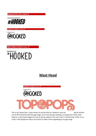
This document discusses font choices for a magazine masthead. The author has chosen a "Mast Head" font because they believe it suits their genre and the use of '@' makes it eye-catching for their target age range. Their masthead shares similar aspects to real media magazines, such as the curled 'S' and circular text. The author plans to change the color of the font to make it more appealing to their target audience.


