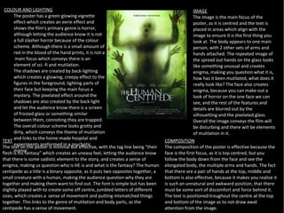
THE HUMAN CENTIPEDE POSTER
        ANALYSIS
COLOUR AND LIGHTING                                                                              IMAGE
      The poster has a green glowing vignette                                                     The image is the main focus of the
      effect which creates an eerie effect and                                                    poster, as it is centred and the text is
      shows the film's primary genre is horror,                                                   placed in areas which align with the
      although letting the audience know it is not                                                image to ensure it is the first thing you
      a full slasher horror because of the colour                                                 look at. The body appears to one main
      scheme. Although there is a small amount of                                                 person, with 2 other sets of arms and
      red in the blood of the hand prints, it is not a                                            hands attached. The repeated image of
       main focus which conveys there is an                                                       the spread out hands on the glass looks
      element of sci -fi and mutilation.                                                          like something unusual and creates
      The shadows are created by back-lighting                                                    enigma, making you question what it is,
      which creates a glowing, creepy effect to the                                               how has it been mutilated, what does it
      figures in the foreground, lighting parts of                                                really look like? The face also creates
      their face but keeping the main focus a                                                     enigma, because you can make out a
      mystery. The pixelated effect around the                                                    look of horror on the one face we can
      shadows are also created by the back light                                                  see, and the rest of the features and
      and let the audience know there is a screen                                                 details are blurred out by the
      of frosted glass or something similar                                                       silhouetting and the pixelated glass.
      between them, connoting they are trapped.                                                   Overall the image conveys the film will
      The overall colour scheme looks grotty and                                                  be disturbing and there will be elements
      dirty, which conveys the theme of mutilation                                                of mutilation in it.
      and links to the home-made hospital and
TEXT                                                                              COMPOSITION
      experiments preformed in a psychotic
The text on the poster is minimal but effective, with the tag line being “their   The composition of the poster is effective because the
      manor.
flesh is his fantasy” which creates an uneasy feel, letting the audience know     face is the first focus, as it is top centred, but you
that there is some sadistic element to the story, and creates a sense of          follow the body down from the face and see the
enigma, making us question who is HE is and what is the fantasy? The human        elongated body, the multiple arms and hands. The fact
centipede as a title is a binary opposite, as it puts two opposites together, a   that there are a pair of hands at the top, middle and
small creature with a human, making the audience question why they are            bottom is also effective, because it makes you realise it
together and making them want to find out. The font is simple but has been        is such an unnatural and awkward position, that there
slightly played with to create some off centre, jumbled letters of different      must be some sort of discomfort and force behind it.
sizes, which creates a sense of movement and putting mismatched things            The text is positioned troughout the centre at the top
together. This links to the genre of mutilation and body parts, as the            and bottom of the image as to not draw awat
centipede has a sense of movement.                                                attention from the image.

The human centipede poster analysis

  • 1.
    THE HUMAN CENTIPEDEPOSTER ANALYSIS
  • 2.
    COLOUR AND LIGHTING IMAGE The poster has a green glowing vignette The image is the main focus of the effect which creates an eerie effect and poster, as it is centred and the text is shows the film's primary genre is horror, placed in areas which align with the although letting the audience know it is not image to ensure it is the first thing you a full slasher horror because of the colour look at. The body appears to one main scheme. Although there is a small amount of person, with 2 other sets of arms and red in the blood of the hand prints, it is not a hands attached. The repeated image of main focus which conveys there is an the spread out hands on the glass looks element of sci -fi and mutilation. like something unusual and creates The shadows are created by back-lighting enigma, making you question what it is, which creates a glowing, creepy effect to the how has it been mutilated, what does it figures in the foreground, lighting parts of really look like? The face also creates their face but keeping the main focus a enigma, because you can make out a mystery. The pixelated effect around the look of horror on the one face we can shadows are also created by the back light see, and the rest of the features and and let the audience know there is a screen details are blurred out by the of frosted glass or something similar silhouetting and the pixelated glass. between them, connoting they are trapped. Overall the image conveys the film will The overall colour scheme looks grotty and be disturbing and there will be elements dirty, which conveys the theme of mutilation of mutilation in it. and links to the home-made hospital and TEXT COMPOSITION experiments preformed in a psychotic The text on the poster is minimal but effective, with the tag line being “their The composition of the poster is effective because the manor. flesh is his fantasy” which creates an uneasy feel, letting the audience know face is the first focus, as it is top centred, but you that there is some sadistic element to the story, and creates a sense of follow the body down from the face and see the enigma, making us question who is HE is and what is the fantasy? The human elongated body, the multiple arms and hands. The fact centipede as a title is a binary opposite, as it puts two opposites together, a that there are a pair of hands at the top, middle and small creature with a human, making the audience question why they are bottom is also effective, because it makes you realise it together and making them want to find out. The font is simple but has been is such an unnatural and awkward position, that there slightly played with to create some off centre, jumbled letters of different must be some sort of discomfort and force behind it. sizes, which creates a sense of movement and putting mismatched things The text is positioned troughout the centre at the top together. This links to the genre of mutilation and body parts, as the and bottom of the image as to not draw awat centipede has a sense of movement. attention from the image.