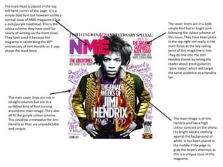
1. The mast head is placed in the top
left hand corner of the page. It is a
simple bold font but however unlike a
normal issue of NME magazine it has
a pink/purple masthead. This is the
colour scheme they have used for
nearly all writing on the front cover.
They have used it because the
magazine is celebrating the 40th
anniversary of Jimi Hendrix as it says
above the mast head.
The main cover lines are not in
straight columns but are in a
scribbled kind of font curving
around the main image. They also
all fit the purple colour scheme.
This could be a metaphor for Jimi
Hendrix as they are unpredictable
and unique.
The cover liners are in a bold
simple font but in bright pink
following the colour scheme of
this issue. They have been place
in the top right not really in the
main focus as the key selling
point of this magazine is Jimi.
They do link into the Jimi
Hendrix theme by telling the
reader about great guitarists
“alive today” which will target
the same audience as a Hendrix
fan.
The main image is of Jimi
Hendrix and has a high
colour contrast on the photo.
His bright vibrant clothing
against the background of
white. It has been placed in
the middle if the page to
grab the buyers attention as
this is a unique issue of the
magazine.