Fonts powerpoint
•Download as PPT, PDF•
0 likes•202 views
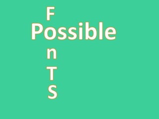
The document discusses the connotations of different font styles for the title of an action film about the battle between good and evil. It analyzes how a bold title font connotes that evil is strong but may be misleading since evil does not actually triumph in the end. A font with irregular letter shapes is seen as disruptive but difficult to read, lacking the intensity needed. An even font where letters are the same size conveys that good and evil are equally matched, suggesting an intense battle without predictable outcomes.
Report
Share
Report
Share

Recommended
Dredd
The poster uses a dark black background to set a gritty atmosphere and emphasize the mysterious main character who remains in shadow. The tagline "Judgment is coming" references both the film's title and suggests something bad will happen, implying the character has god-like power over judgment. The futuristic weapon and armor shown in light position the character as a dangerous yet hopeful force for retaliation or justice, while the red text and hidden identity further position him as a superior figure associated with violence and bloodshed who judges from the shadows in a potentially future setting.
Analysis of a teaser trailer & a poster.odp start
The document analyzes frames from the teaser trailer for the movie "The Girl on the Train".
The trailer uses conventions of the crime thriller genre including mysterious dialogue, depictions of affairs and secrets, police investigating a crime, and crime scene tape at a murder location. Silhouettes and close-ups are employed to build tension. Low-key lighting, music, and facial expressions effectively set the mood throughout. The poster features the main character with a shocked expression, drawing viewers in, and maintains branding consistency with font and color scheme used in the trailer. The document concludes key techniques were learned about maintaining a strong brand identity across marketing materials and using montage editing and sound design to intrigue audiences without revealing full details
Adulthood
The document analyzes textual elements in a film clip about adulthood. It discusses how one character exerts powerful control over youth through abusive language. Close-up shots express this character's angry emotions when his money is wasted. The realistic slang language used by gangsters, like "blood" and "ting", helps establish a sense of regional identity. A close-up of an iron used to burn a failed youth indicates it will be used as a weapon, as the clenched fist holding it shows anger and rage felt by another gangster. This shot could be used as a template for coursework by slowing the pace of editing to draw attention to important details, like drugs or a character's sweat patch representing nerves.
Media assign 16
This document summarizes the opening title sequence of the film "The Shining". It discusses the order of credits with the director first, then actors, and the title in the middle. The font used is Arial, which is basic and doesn't reveal much about the film, implying mystery. The font moves up the screen as the shots are in long takes, implying a journey. The font color is a light blue, which is ironic for a horror film, and its strangeness foreshadows the film. The font size is big and in capital letters to show importance. While not a generic horror convention, the subtle irony of the title sequence makes it suitable for the genre.
Name of film 2 (W.A)
Three childhood best friends want to become famous rappers and pursue their dream of success and wealth in the music industry. They are given the business card of a famous music agent who could help them, but the pressure and temptation of fame leads them to start betraying and attempting to kill each other. The film proposes to tell the story of their friendship and rivalry through a plot involving the music business, with a trailer including gunshots, comedy, and their meeting with the agent.
Crime Mystery Research
This document discusses the key elements and conventions of the crime and mystery genre in film. It notes that crime fiction typically involves murders, detectives investigating crimes, and criminals being arrested or punished. Common characteristics of the genre include urban settings where crimes can be easily committed and covered up, titles that reference detectives or crimes, characters like criminals, victims, police, and families, mysteries for audiences to try and solve, the use of lighting, music, and props like weapons. The narrative typically follows a crime disruption, recognition, attempted repair, and new equilibrium.
Evaluation Question 1 Final
Our media product uses conventions of both conspiracy and political thriller genres. It conforms to some conventions such as the protagonist facing a powerful organization and being employed by the government to stop threats. However, it rejects some conventions like drugs, weapons, and cars which did not fit the storyline or characters. Narrative theory can also be applied, with binary oppositions between the protagonist and hackers that later shifts, and codes like cultural knowledge of the British government being used.
Media studies opening sequence analysis- Sophie O'Connell
The opening sequence introduces the main companies involved in production and the title of the film in simple font, establishing conventions. It then shows a long shot of a train approaching in a dark, smoky setting with low key lighting, conveying the dark and mysterious thriller genre. A close up of a sly-looking man on the train is accompanied by a tense, non-diagetic soundtrack. The extract ends with the man leaving the frame and a statue coming into focus, possibly foreshadowing events around injury in the film.
Iconography in crime thrillers
The document discusses common iconography in crime thrillers. Blood is often shown to demonstrate that no one is safe and add realism to injuries. Guns and weapons are frequently the cause of blood and injuries, building suspense. False accusations are also common, where characters are wrongly blamed for crimes to mislead the audience. Murder is a staple of the genre, shaping plots by creating danger and the sense that anyone could be killed.
Ross Kemp TA 2
This document discusses footage from a documentary about gangs in Los Angeles. It begins with an extreme long shot of the city at night to convey mystery, then cuts to a close-up of a police officer holding a gun to indicate danger. There are also aerial shots from a helicopter and handheld camera footage showing gang fights to demonstrate the scale and realness of the gang problem. The lighting in most shots is low-key and dark to emphasize that gang activity occurs at night when it is illegal. The document considers how some of this type of footage could be used while still representing a positive message, as the goal is to show how police work to control gangs.
Media blog post action genre - ripd
The opening sequence of the 2013 action film R.I.P.D establishes the action genre. It shows a team of police officers tracking down gangsters in a tense shootout. A tracking shot follows the police into the hideout. During the action, a low angle shot makes the police appear powerful while mid shots focus on the main character. The sequence ends with a close up of the main officer's shocked face as he is shot by his partner, a betrayal that hints the plot will involve revenge.
Film video analysis
The 15-minute video Postcode Wars aimed to raise awareness about and prevent wars between different areas in Wolverhampton. Through interviews and dramatized scenes, it showed how conflicts could arise when people from one area entered another and how rumors could spark arguments. The video featured characters from different areas interacting in various locations like pubs. It targeted at-risk groups like gang members and youth to promote unity across Wolverhampton's postcodes.
Question 1 video commentary
The film challenges conventions of film noir by not including a femme fatale and making one of the police officers the killer instead of a psychotic criminal. It incorporates aspects of film noir like two differing authoritative figures, black and white scenes, and dark shadows. The film also includes mystery through a flashback scene and crime through a final murder scene. It draws inspiration from Frank Miller's Sin City and The Usual Suspects by using title sequences between action scenes rather than at the beginning or end.
Walter hill auteur
Walter Hill is known for directing films in the 1970s-1980s that featured themes of gang violence in major cities, betrayal, and characters always looking out for one another. His films such as The Warriors and Streets of Fire used techniques like dramatic lighting, slow motion shots, and a consistent style of opening credits. Hill also frequently incorporated references to older films and dialogue from the 1950s, and cast many of the same actors in his films to develop a signature style.
Casino royale essay shakir
The document provides an analysis of the opening scenes of the James Bond film Casino Royale. It summarizes that the black and white opening fight scene establishes this as a flashback. James Bond is shown talking confidently with another man who seems to be a villain. The animated title sequence features fighting and cards to set the tone. Both James Bond and the villain are dressed sharply and talk confidently, showing they have equal power and status. Various camera angles are used, like low shots on the villain, to convey meanings like power. Dark lighting and quiet sounds create tension. Themes of action, spying, violence, status and corruption are signaled.
Genre conventions
The document discusses the drama film genre and its conventions and subgenres. It notes that drama films focus on realistic storylines and settings that portray emotional themes audiences can relate to. Character development and a build up of tension are key conventions. Subgenres include biographies, courtroom drama, comedy-drama, historical drama, melodrama, period pieces, political drama, romance, tragedy, and dark comedy. Each subgenre explores a particular theme or context. Monodrama, a single-actor drama, is highlighted as a subgenre choice for a short film due to its psychological focus and representation of loneliness.
How ethnicity is shown during game of thrones
The document analyzes how ethnicity is portrayed in Game of Thrones through visual cues. It notes that Dothraki characters wear more revealing outfits to appear more savage and violent, while white characters dress more formally to seem wealthy and important. Fights are shown to be more natural and enjoyed among the Dothraki, portraying them as barbaric. Camera angles are used to depict power dynamics between characters of different ethnicities and genders.
Media evaluation
This document provides an analysis of a student media project that aims to open like a typical thriller film. [1] The opening scene uses crosscutting between shots of characters being followed and graphic title credits to create suspense. [2] The narrative and themes of murder, police investigations, and the struggle between good and evil resemble those of crime thrillers like Seven and Lucky Number Slevin. [3] Various filming techniques like point-of-view shots, music, and dim lighting were used to further establish the thriller genre and build tension.
Media evaluation
This document provides an analysis of a student media project that aims to open like a typical thriller film. [1] The opening scene uses crosscutting between shots of characters being followed and credit titles to create suspense. [2] The narrative and themes of murder, police investigations, and the struggle between good and evil resemble those of crime thrillers. [3] Various filming techniques like point-of-view shots, music, and dim lighting were used to further establish the thriller genre and build tension.
Strangers (Short film analysis)
This 3 sentence summary provides the high level details about the short film "Strangers":
The film shows the relationship between two men from differing religious backgrounds, a Jewish man and an Arab man, who encounter trouble aboard a train yet ultimately help each other despite their cultural differences, conveying a message of overcoming divisions and "loving thy neighbor". It uses minimal dialogue and symbolic visuals like religious necklaces and newspapers to depict the tension between the characters and their cultures without words in a way that can be understood globally.
Film theorists
This document summarizes several film theorists and their theories:
- Roland Barthes proposed that pleasure comes from repetition with difference in genres and manipulating genre conventions.
- Steven Neale believed meaning depends on understanding binaries like young/old and good/bad.
- Tzvetan Todorov said narratives follow five stages: equilibrium, disruption, recognition, attempt to repair, new equilibrium.
- Vladimir Propp argued narratives use character archetypes like hero, villain, and mentor.
- The document discusses applying these theories to the romantic comedy genre.
Question 1 media powwrpoint
Questions 1- in what ways does your media product use, develop or challenge forms and conventions or real media products? on PowerPoint with pictures
Q2
The opening sequence introduces three main characters - the lawyer, her boss Saroop, and the shooter Charlotte. The lawyer is shown to have a well-paid job as a lawyer through her clothing. Saroop wears a formal suit showing his professional role, but is portrayed as afraid and weak during a conversation with the lawyer, indicating she holds power over him. Charlotte is only seen holding a gun, introducing her as a scary and powerful woman, though her face is not shown. The sequence subverts typical gender stereotypes by portraying the female characters as strong and in charge over the weaker male character.
Drama Genre: Film
Drama films typically feature realistic narratives and settings that portray characters and conflicts audiences can relate to. They aim to emotionally engage viewers through portrayals of difficult life situations and character development. While dramas usually resolve conflicts with happy endings, some examples like Titanic and A Serious Man break conventions by ending tragically or using dramatic irony. Elements like mise-en-scene, lighting, color, and age ratings may vary depending on the specific hybrid genre and intended audience.
Enigma
The document provides details about a proposed thriller film called "Enigma". It begins by summarizing the plot, which follows a police chief investigating the disappearances of children in town. It then discusses setting the target audience at age 16 to provide motivation and drama. Bruce Willis and Robert Downey Jr. are proposed for the roles of detectives with different investigative styles. The estimated budget is $19 million, with the goal of making $28 million in the first weekend. Sony Pictures is proposed as the studio to fund and distribute the film.
Analysis of the short film Strangers
The short film "Strangers" uses very little dialogue and relies on facial expressions and religious symbols to communicate between characters. Close-up camera shots are used to emphasize who is more threatening, the gang dressed in black. Because it deals with mature themes like racism and religious crimes, the film is aimed at older audiences. The handheld camera reflects the film's setting on a train to make interactions between characters seem awkward. Dark lighting throughout enhances suspense and makes the gang appear more intimidating, as religious chanting increases tension through unknown meanings.
Thief Title sequence
The title sequence of the film "Thief" aims to attract a male audience aged 18-50. It sets a dark and ominous mood through the music, dark lighting, and lack of character introductions. This grim feeling introduces the audience to the crime and robbery themes of the film. The sound of raindrops and tense music further build suspense. Shots of a character getting into a foggy car without context, followed by a small robbery, provide just enough narrative to hint at the story to come without giving too much away. The dark representation of the criminal characters contrasts with how some other crime films have portrayed criminals in a brighter light.
Typeface
This document discusses font ideas for the title of a thriller film called "Framed". It previews 3 fonts - "Lost Lubbock Motels", "Face Your Fears", and "Anarchy" - and analyzes how each font could establish themes for the film. The author selects "Anarchy" as their favorite font because it has a thin and imperceptible style that gives a sense of being enigmatic and written with a sharp object, fitting the film's themes of violence and uncertainty.
Font of titles analysis
The document analyzes and summarizes the fonts used for titles of different films. It discusses how the bold gothic font of The Godfather title stands out against a black background and could represent the mafia's control. It also describes how the thin typewriter-like font of another film fits the hard themes of gangster genre. For another title, the large bold lowercase black font enhanced by a red background is eye-catching and could imply violence, like blood. A final title uses a yellow curved font on a hazard sign background, hinting the film involves stealing jewels.
Title analysis
The document analyzes the titles from the trailers of three horror films: Grave Encounters, Insidious, and The Devil Inside. For Grave Encounters, the titles establish the setting as a haunted psychiatric hospital and build mystery around unseen terrifying footage. The Insidious titles emphasize themes of mystery and danger through the use of bold fonts, dark colors and increasing text sizes. The Devil Inside titles feature a non-confrontational style but reference religious and supernatural themes through symbols of crosses and death in the dull backgrounds.
More Related Content
What's hot
Iconography in crime thrillers
The document discusses common iconography in crime thrillers. Blood is often shown to demonstrate that no one is safe and add realism to injuries. Guns and weapons are frequently the cause of blood and injuries, building suspense. False accusations are also common, where characters are wrongly blamed for crimes to mislead the audience. Murder is a staple of the genre, shaping plots by creating danger and the sense that anyone could be killed.
Ross Kemp TA 2
This document discusses footage from a documentary about gangs in Los Angeles. It begins with an extreme long shot of the city at night to convey mystery, then cuts to a close-up of a police officer holding a gun to indicate danger. There are also aerial shots from a helicopter and handheld camera footage showing gang fights to demonstrate the scale and realness of the gang problem. The lighting in most shots is low-key and dark to emphasize that gang activity occurs at night when it is illegal. The document considers how some of this type of footage could be used while still representing a positive message, as the goal is to show how police work to control gangs.
Media blog post action genre - ripd
The opening sequence of the 2013 action film R.I.P.D establishes the action genre. It shows a team of police officers tracking down gangsters in a tense shootout. A tracking shot follows the police into the hideout. During the action, a low angle shot makes the police appear powerful while mid shots focus on the main character. The sequence ends with a close up of the main officer's shocked face as he is shot by his partner, a betrayal that hints the plot will involve revenge.
Film video analysis
The 15-minute video Postcode Wars aimed to raise awareness about and prevent wars between different areas in Wolverhampton. Through interviews and dramatized scenes, it showed how conflicts could arise when people from one area entered another and how rumors could spark arguments. The video featured characters from different areas interacting in various locations like pubs. It targeted at-risk groups like gang members and youth to promote unity across Wolverhampton's postcodes.
Question 1 video commentary
The film challenges conventions of film noir by not including a femme fatale and making one of the police officers the killer instead of a psychotic criminal. It incorporates aspects of film noir like two differing authoritative figures, black and white scenes, and dark shadows. The film also includes mystery through a flashback scene and crime through a final murder scene. It draws inspiration from Frank Miller's Sin City and The Usual Suspects by using title sequences between action scenes rather than at the beginning or end.
Walter hill auteur
Walter Hill is known for directing films in the 1970s-1980s that featured themes of gang violence in major cities, betrayal, and characters always looking out for one another. His films such as The Warriors and Streets of Fire used techniques like dramatic lighting, slow motion shots, and a consistent style of opening credits. Hill also frequently incorporated references to older films and dialogue from the 1950s, and cast many of the same actors in his films to develop a signature style.
Casino royale essay shakir
The document provides an analysis of the opening scenes of the James Bond film Casino Royale. It summarizes that the black and white opening fight scene establishes this as a flashback. James Bond is shown talking confidently with another man who seems to be a villain. The animated title sequence features fighting and cards to set the tone. Both James Bond and the villain are dressed sharply and talk confidently, showing they have equal power and status. Various camera angles are used, like low shots on the villain, to convey meanings like power. Dark lighting and quiet sounds create tension. Themes of action, spying, violence, status and corruption are signaled.
Genre conventions
The document discusses the drama film genre and its conventions and subgenres. It notes that drama films focus on realistic storylines and settings that portray emotional themes audiences can relate to. Character development and a build up of tension are key conventions. Subgenres include biographies, courtroom drama, comedy-drama, historical drama, melodrama, period pieces, political drama, romance, tragedy, and dark comedy. Each subgenre explores a particular theme or context. Monodrama, a single-actor drama, is highlighted as a subgenre choice for a short film due to its psychological focus and representation of loneliness.
How ethnicity is shown during game of thrones
The document analyzes how ethnicity is portrayed in Game of Thrones through visual cues. It notes that Dothraki characters wear more revealing outfits to appear more savage and violent, while white characters dress more formally to seem wealthy and important. Fights are shown to be more natural and enjoyed among the Dothraki, portraying them as barbaric. Camera angles are used to depict power dynamics between characters of different ethnicities and genders.
Media evaluation
This document provides an analysis of a student media project that aims to open like a typical thriller film. [1] The opening scene uses crosscutting between shots of characters being followed and graphic title credits to create suspense. [2] The narrative and themes of murder, police investigations, and the struggle between good and evil resemble those of crime thrillers like Seven and Lucky Number Slevin. [3] Various filming techniques like point-of-view shots, music, and dim lighting were used to further establish the thriller genre and build tension.
Media evaluation
This document provides an analysis of a student media project that aims to open like a typical thriller film. [1] The opening scene uses crosscutting between shots of characters being followed and credit titles to create suspense. [2] The narrative and themes of murder, police investigations, and the struggle between good and evil resemble those of crime thrillers. [3] Various filming techniques like point-of-view shots, music, and dim lighting were used to further establish the thriller genre and build tension.
Strangers (Short film analysis)
This 3 sentence summary provides the high level details about the short film "Strangers":
The film shows the relationship between two men from differing religious backgrounds, a Jewish man and an Arab man, who encounter trouble aboard a train yet ultimately help each other despite their cultural differences, conveying a message of overcoming divisions and "loving thy neighbor". It uses minimal dialogue and symbolic visuals like religious necklaces and newspapers to depict the tension between the characters and their cultures without words in a way that can be understood globally.
Film theorists
This document summarizes several film theorists and their theories:
- Roland Barthes proposed that pleasure comes from repetition with difference in genres and manipulating genre conventions.
- Steven Neale believed meaning depends on understanding binaries like young/old and good/bad.
- Tzvetan Todorov said narratives follow five stages: equilibrium, disruption, recognition, attempt to repair, new equilibrium.
- Vladimir Propp argued narratives use character archetypes like hero, villain, and mentor.
- The document discusses applying these theories to the romantic comedy genre.
Question 1 media powwrpoint
Questions 1- in what ways does your media product use, develop or challenge forms and conventions or real media products? on PowerPoint with pictures
Q2
The opening sequence introduces three main characters - the lawyer, her boss Saroop, and the shooter Charlotte. The lawyer is shown to have a well-paid job as a lawyer through her clothing. Saroop wears a formal suit showing his professional role, but is portrayed as afraid and weak during a conversation with the lawyer, indicating she holds power over him. Charlotte is only seen holding a gun, introducing her as a scary and powerful woman, though her face is not shown. The sequence subverts typical gender stereotypes by portraying the female characters as strong and in charge over the weaker male character.
Drama Genre: Film
Drama films typically feature realistic narratives and settings that portray characters and conflicts audiences can relate to. They aim to emotionally engage viewers through portrayals of difficult life situations and character development. While dramas usually resolve conflicts with happy endings, some examples like Titanic and A Serious Man break conventions by ending tragically or using dramatic irony. Elements like mise-en-scene, lighting, color, and age ratings may vary depending on the specific hybrid genre and intended audience.
Enigma
The document provides details about a proposed thriller film called "Enigma". It begins by summarizing the plot, which follows a police chief investigating the disappearances of children in town. It then discusses setting the target audience at age 16 to provide motivation and drama. Bruce Willis and Robert Downey Jr. are proposed for the roles of detectives with different investigative styles. The estimated budget is $19 million, with the goal of making $28 million in the first weekend. Sony Pictures is proposed as the studio to fund and distribute the film.
Analysis of the short film Strangers
The short film "Strangers" uses very little dialogue and relies on facial expressions and religious symbols to communicate between characters. Close-up camera shots are used to emphasize who is more threatening, the gang dressed in black. Because it deals with mature themes like racism and religious crimes, the film is aimed at older audiences. The handheld camera reflects the film's setting on a train to make interactions between characters seem awkward. Dark lighting throughout enhances suspense and makes the gang appear more intimidating, as religious chanting increases tension through unknown meanings.
Thief Title sequence
The title sequence of the film "Thief" aims to attract a male audience aged 18-50. It sets a dark and ominous mood through the music, dark lighting, and lack of character introductions. This grim feeling introduces the audience to the crime and robbery themes of the film. The sound of raindrops and tense music further build suspense. Shots of a character getting into a foggy car without context, followed by a small robbery, provide just enough narrative to hint at the story to come without giving too much away. The dark representation of the criminal characters contrasts with how some other crime films have portrayed criminals in a brighter light.
What's hot (19)
Similar to Fonts powerpoint
Typeface
This document discusses font ideas for the title of a thriller film called "Framed". It previews 3 fonts - "Lost Lubbock Motels", "Face Your Fears", and "Anarchy" - and analyzes how each font could establish themes for the film. The author selects "Anarchy" as their favorite font because it has a thin and imperceptible style that gives a sense of being enigmatic and written with a sharp object, fitting the film's themes of violence and uncertainty.
Font of titles analysis
The document analyzes and summarizes the fonts used for titles of different films. It discusses how the bold gothic font of The Godfather title stands out against a black background and could represent the mafia's control. It also describes how the thin typewriter-like font of another film fits the hard themes of gangster genre. For another title, the large bold lowercase black font enhanced by a red background is eye-catching and could imply violence, like blood. A final title uses a yellow curved font on a hazard sign background, hinting the film involves stealing jewels.
Title analysis
The document analyzes the titles from the trailers of three horror films: Grave Encounters, Insidious, and The Devil Inside. For Grave Encounters, the titles establish the setting as a haunted psychiatric hospital and build mystery around unseen terrifying footage. The Insidious titles emphasize themes of mystery and danger through the use of bold fonts, dark colors and increasing text sizes. The Devil Inside titles feature a non-confrontational style but reference religious and supernatural themes through symbols of crosses and death in the dull backgrounds.
Font and title research and planning
This document discusses the analysis of titles and fonts used in horror films. It analyzes 4 different horror film titles, noting symbolism and meanings conveyed through visual design elements. Specific observations included are that an enlarged "D" refers to the word "Devil", dots on the word could represent blood, a reflected letter suggests hallucinations or blurred reality, a rusty title refers to a decaying skeleton, and scratched letters written in rage imply a psychopathic killer. Overall, the document examines how titles visually establish tones of evil, darkness, and violence for horror genres.
Final research
The document discusses four different horror genre fonts and their suitability for conveying supernatural themes. Font 1 is simple with a childlike style, conveying a young main character but not strong horror vibes. Font 2 is the most dramatic with bold lettering, clearly conveying horror. Fonts 3 and 4 have irregular lettering and incomplete endings that could suggest paralysis, harm, or slasher themes instead of the supernatural. In conclusion, Fonts 1 and 2 are best suited to subtly convey supernatural horror through their simplicity and childlike styles without strongly suggesting other genres like gothic or slasher themes.
The letter
The short film 'The Letter' analyzes the emotional impact of war through the story of a soldier. It begins with the gradual appearance of a yellow carnation, symbolic of the disappointment and rejection felt by many during war. The film follows the soldier as he writes a letter, expressing guilt over something immoral he did. When another soldier confronts him, the first soldier is shot while reaching for the letter in his pocket. The film uses techniques like music, lighting, camerawork and symbolism to portray the soldier's emotions and the devastating effects of war.
Typography
The document discusses several fonts under consideration for the title of a film project centered around children and psychological horror. It analyzes how each font choice could potentially match or not match the film's themes. The fonts range from one resembling scratched metal to denote indelible marks, to ones resembling childlike or adult handwriting, to one that looks like writing on a whiteboard. Ultimately, a font is chosen that matches both the film's theme of ambiguity and its psychological horror subgenre through an uneven, messy effect.
Final research
The document discusses various fonts and title sequences that could work for a supernatural horror film. It analyzes fonts used in films like "Blair Witch Project", "Paranormal Activity", and "Scream" that connote danger, loneliness, and screaming through visual elements of the fonts. Placement of credits in films like "Monsters Inc", "Panic Room", and "Psycho" are also examined for how they relate to the narrative. Potential scores using instruments like violins, atonal music, and cello/viola are suggested that could set the right mood and appeal to the intended audience.
Poster analysis 3
This poster promotes the horror film "The Last Exorcism" about a little girl who is possessed by an evil spirit. The poster image shows the girl bent backwards in an unnatural position, covered in blood with her hair tangled and limbs contorted to appear lifeless. Religious symbols like a crucifix placed over the girl and the tagline "Believe in Him" imply either God or the devil could help or harm her. The poster effectively uses frightening imagery and religious themes to intrigue audiences and promote the horror film's narrative of possession and exorcism.
Mortal kombat summer project
The document provides an analysis of the video game Mortal Kombat and how it represents men and women in stereotypical ways. Women are depicted aesthetically to appeal to male audiences, while men are powerful and violent. The female characters are objectified and their fatalities are shown in close-up to emphasize their bodies. Alternatively, female characters could be portrayed as powerful and dangerous. The levels are designed to draw attention to the suggestive outfits of characters. Violence through finishing attacks is a recurring dominant element. Mortal Kombat is a fighting game where humans and super beings battle in a tournament to determine the strongest fighter, with the villain Shao Kahn as the final opponent.
Final research
The document discusses various fonts and title sequences that could work for a supernatural horror film. It analyzes fonts like "Scary.TTF" that use bold letters that attract attention and connote drama. It also examines title sequences like in "Panic Room" that suggest realism through dull colors and big font on buildings, giving a sense of invasion of personal space. Overall, the document considers fonts and placements of credits that set an unsettling tone through simplicity, confusion, or relating to themes in the narrative like insanity or invasion in order to engage the target audience.
Darkknightrisesreport
The movie poster depicts a character in the foreground against a bright background with fire in the distance, suggesting danger, injury, and death in the film's action scenes. Clenched fists and no expression on the character indicate serious emotion and an upcoming confrontation with lots of fighting. Explosions behind the idle character without fear suggests they and the villain will cause havoc and destruction. The iconic main image is more important than the simple font.
Font
The document discusses font choices for an action film title. It examines 3 fonts:
1) "College" font which is meant to seem classic and reputable to entice audiences.
2) "American Captain" font which is bold but seems too oriented towards the army.
3) "Market Deco" font which uses red and black contrast like the title and a red bullet to make audiences think and reflect, following genre conventions of capitalized, bold letters for action films. This font was deemed the most appropriate choice.
Title sequence2 mean girls
The opening titles of Mean Girls use various typographic and color techniques to subtly convey important narrative themes and character details to the audience. Through the positioning, colors, sizes and styles of the different title text, cues are given about the social hierarchies, conflicts, emotions and character arcs that the protagonist will experience in her new high school. These visual clues help set audience expectations about the plot and allow viewers, particularly teenage girls, to relate to and identify with the feelings of social anxiety, pressure to fit in, and challenges of high school social dynamics that will be portrayed.
Typefaces
This document evaluates four different fonts for their suitability as a masthead font for a horror magazine:
1. Feast of Flesh BB font is chosen for its consistency with the font used in the film trailer and its rough, edgy style evoking the character in the film.
2. The Bloody font is rejected because it does not look like real blood and would not work well with the chosen magazine cover image.
3. Action of the Time New font is considered effective due to its distorted, scratched appearance that helps create a horror atmosphere, but it may be too difficult to read if faded or at a distance.
4. The last font is rejected as too thin and long,
A Clean Well Lighted Place Essay
A Clean Well Lighted Place: Symbolism Analysis Essay Sample - 1184 .... Analysis: A Clean, Well-lighted Place by Ernest Hemingway - A-Level .... A Clean, Well-Lighted Place Study Guide Literature Guide LitCharts. A Clean Well Lighted Place by Ernest Hemingway Reviews, Discussion .... A Clean Well Lighted Place Analysis: Summary, Characters, amp; Themes. A Clean, Well-Lighted Place: Critical Analysis Free Essay Example. Hemingways quot;A Clean, Well-lighted placequot; analysis - A-Level English .... Story A Clean, Well Lighted Place Analysis Essay Example GraduateWay. ᐅ Essays On A Clean Well Lighted Place Free Argumentative, Persuasive .... A Clean Well-Lighted Place Text by Ernest Hemingway. A Clean Well Lighted Place Annotations. quot;A Clean, Well-Lighted Placequot;editable, AP Style Passage Test,Essay .... PPT A Clean Well-lighted Place Ghulam Mustafa - Academia.edu. Clean, Well-Lighted Place Tone And Style Summary And Analysis Example .... A Clean, Well-Lighted Place by Ernest Hemingway Plot Summary LitCharts. A Clean, Well-lighted Place and Hills like White Elephants Free Essay .... A Clean, Well-Lighted Place as Depiction of Meaningless Life: Essay .... Analysis of A Clean, Well-Lighted Place by Ernest Hemingway Essay. Cathedral and a Clean Well-Lighted Place Essay Example Topics and .... A clean well lighted place essay. A Clean Well Lighted Place Essay .... A Clean Well Lighted Place Analysis Free Essay Example. A Clean Well Lighted Place PDF - By Ernest Hemingway FREE. Short Story: A Clean, Well-Lighted Place Free Essay Example. A clean well lighted world is an English Essay - A clean well lighted .... A Critical Analysis of Hemingways A Clean, Well-lighted Place Essay. A Clean Well Lighted Place Analysis - slidesharetrick. A Clean Well lighted place by Ernest Hemingway Essay 400 Words .... A Clean Well-Lighted Place by Hemingway, Ernest: Near Fine Hardcover .... A Clean Well Lighted Place - A-Level English - Marked by Teachers.com. A Clean Well Lighted Place - Ernest Hemmingway Summary - PHDessay.com. Analysis of A Clean Well-lighted Place Essay Example GraduateWay. A clean well lighted place essay by Payne Leslie - Issuu. A Clean, Well-Lighted Place Summary and Analysis A Clean Well Lighted Place Essay A Clean Well Lighted Place Essay
Research into ideas, mise en scene, shooting & editing styles and fonts
The document discusses techniques for creating an intense horror scene, including the use of montage, sound, and facial expressions. Specifically, it proposes using Eisenstein's rhythmic and tonal methods of montage by increasing the pace of cuts and manipulating shot lengths to influence emotions. Prolonging a shot of a sleeping baby could create calmness before contrasting it with a disturbing scene to intensify the atmosphere. The killer's face would be concealed using dark clothing and shadowed shots to build suspense about their identity.
Poster Analysis 2
This poster for the slasher film "Stage Fright" effectively conveys key elements of the film's narrative and tone through its visual design and use of symbolic imagery and text. The poster features the main character and antagonist's weapon, set against a theatrical stage backdrop in dark tones. Though the antagonist's face is hidden, clues about the character and brutal killings are provided through the glove, knife, and tagline "Sing your heart out." Overall, the poster draws viewers in through its unconventional yet cohesive presentation of slasher genre elements tied to the film's theatrical setting.
Poster Analysis 2
This poster for the slasher film "Stage Fright" effectively conveys key elements of the film's narrative and tone through its visual design and use of symbolic colors. The poster features the main character and antagonist's weapon but not his face, teasing viewers. Red dominates to symbolize blood and danger. Though few costume details are shown, the antagonist's black leather glove implies a mysterious and threatening killer. The theatrical stage setting and tagline "Sing your heart out" foreshadow brutal killings during a performance. Overall the poster provides just enough intrigue to draw in viewers while leaving some mystery unresolved.
Title sequence1 easy a
The opening titles sequence of the film establishes the setting of a high school in California through the use of colors and natural imagery. The positioning and styling of the white title text against various blue, green, orange and red backgrounds draws attention to the themes of social cliques, coming of age, and nonconformity that will be explored. Subtle changes in the size and placement of the text throughout the sequence foreshadow the protagonist's journey of gaining confidence and status among her peers over the course of the narrative.
Similar to Fonts powerpoint (20)
Research into ideas, mise en scene, shooting & editing styles and fonts
Research into ideas, mise en scene, shooting & editing styles and fonts
More from rkotak789
Analysis of q air
After conducting a survey of 10 people in their target audience about 3 new products, the results showed that the products met quality standards. The survey gathered feedback on strengths, weaknesses, and room for improvement. Most respondents said the teaser trailer fit the action genre conventions well through its use of weapons, fights, and suspenseful elements like car chases and bombs. However, people analyzed it in different ways. Similarly, respondents agreed the magazine cover was conventionally structured through its design elements, though some were unsure of certain character roles in the narrative from the poster alone without seeing the trailer first.
Analysis of q air
After surveying 10 people in their target audience about 3 new products, the results showed that the products met quality standards. The survey identified strengths and weaknesses and potential improvements. It analyzed how successful the products were at following conventions. The analysis found that a movie trailer fit action genre conventions well through its use of weapons, fights, and suspenseful scenes. A magazine cover was also conventionally structured with features like teasers and a masthead that attracted viewers.
Analysis of q air
After conducting a survey of 10 people in their target audience about 3 new products, the results showed that the products met quality standards. The survey gathered feedback on strengths, weaknesses, and opportunities for improvement. An analysis of the survey found that the products were largely successful. It will present the key findings about how well the teaser trailer fit the conventions of the action genre and the magazine cover fit conventions of form. Respondents unanimously agreed the teaser trailer effectively used elements like weapons, fights, and car chases to build suspense and intensity as expected in the action genre. They also agreed the magazine cover was conventionally structured with features like teasers and a masthead that identified it as part of a magazine.
Analysis of q air
After conducting a survey of 10 people in their target audience about 3 new products, the results showed that the products met quality standards. The survey gathered feedback on strengths, weaknesses, and opportunities for improvement. An analysis found that the products were largely successful in terms of design and features. Respondents felt that a teaser trailer fit the conventions of the action genre well through its use of weapons, fights, car chases, and hostages with bombs. They also agreed that a magazine cover was conventionally structured with its use of teasers, masthead, splash line, and other typical cover elements.
Research and planning task
The group sourced their own book on horror conventions to broaden their knowledge for their production. They took annotations and key points from the text to ensure relevance. A location release form was used to analyze filming locations and prepare for health and safety. A weather report was produced to choose suitable filming days with the right conditions for an action genre. However, relying on specific weather was risky for time management. The animatic remake of Captain America was not fully followed, so shot planning was not done well and ideas changed, meaning not enough research was done on teaser trailer form.
Analysis of q air
After surveying 10 people in their target audience about 3 new products, the results showed that the products met quality standards. The survey identified strengths and weaknesses and potential improvements. It analyzed how successful the products were at following conventions. The analysis found that a movie trailer fit action genre conventions well through its use of weapons, fights, and suspenseful scenes. A magazine cover was also conventionally structured with features like teasers and a masthead that followed expectations.
Filming space
The document outlines the filming plan for a movie scene, including the placement of characters, cameras, and props. Camera positions are numbered and will face in the directions of the arrows. Actors will be in certain marked areas, like hostages in Barn 2. Shots of a car chase on a road are also planned.
Analysis of poster
The document analyzes a movie poster and provides suggestions for improvements. It recommends using lesser job titles instead of names at the bottom, adding the required 15 rating certification, and placing the main star's name at the top in a conventional way. It also suggests adding more images related to the narrative, such as hostages, terrorists, or a bomb, to convey a sense of urgency and risk to people's lives.
Questionnaire
This document discusses a teaser trailer and poses questions about it. It provides a percentage of 60% but does not give any additional context about what the trailer, questions, or percentage refer to.
Props slide
Three iPod touches will act as bomb timers strapped to hostages, creating suspense through quick cuts of the countdown. Two harmless pistols will be used as props by agents, keeping them on safety to film successfully. An air rifle with safety on and empty magazine will also be used for some scenes, keeping it secure since working with school friends. The rifle size and color connotes mass destruction, making it fitting for the intimidating terrorist character.
Storyboard slideshare
Storyboards are a visual planning tool used in film and video production. They consist of a series of illustrations or images displayed in sequence to demonstrate the key scenes, shots, and progression of a proposed motion picture or interactive media project. Storyboards are designed to provide an idea of how a scene will be filmed and help directors and cinematographers visualize the end result during pre-production when shooting has not yet begun.
Equipment and resources
The document summarizes key equipment and resources available for editing a film project, including a school Mac computer that requires advance booking and has video editing software, a personal MacBook Pro laptop as a backup that can be used anywhere and has additional software like Adobe After Effects, and a camera tripod from the school that also needs advance booking and is portable.
Students work
The student was tasked with creating a teaser trailer for a film in the action genre. Strengths of the trailer included good camera movements that were smooth and well-placed. It also took a brave post-modern approach with direct address to the camera. However, weaknesses included locations that did not match the genre, audio issues where speech was unclear, and lack of color correction in some shots. Lessons learned are the importance of planning, matching locations to the genre, time management for editing, and ensuring consistent quality throughout.
Captain america ting
The star symbol featured prominently on merchandise for the Captain America film, including posters, magazines, and the teaser trailer, serves as an iconic representation of the patriotic superhero. It appears in the center of the poster and magazine to signify its significance, and represents Captain America's mission to protect his country while wearing the star on his clothing like the American flag. The repetition of the star symbol across different materials links them all to the same Captain America film.
Captain america ting
The star symbol featured prominently on merchandise for the Captain America film, including posters, magazines, and the teaser trailer, serves as an iconic representation of the patriotic superhero. It appears in the center of the poster and magazine to signify its significance, and also resembles the star on the American flag worn by Captain America, representing his commitment to protecting his country.
Quiet world analysis
This document analyzes shots from a film to illustrate how they convey a sense of quietness and isolation through lack of human activity and interaction. The long shots show an empty, isolated location. Medium shots show an individual alone without distraction, and the railway in the background that would normally be noisy. Wider shots depict the emptiness and isolation of the character's surroundings. A close-up highlights the character living in their own quiet, lonely world separated from others by a cage. The character's confused stare suggests they are looking for any activity to end the surrounding silence.
Quiet world analysis
This document analyzes shots from a film to illustrate how it conveys a sense of quietness and loneliness through lack of human activity and isolation of the individual. Long shots show an empty, isolated location. Medium shots reveal an individual alone with his attention downward, suggesting the quiet surroundings. Further shots depict the individual in an empty, isolated setting without others, emphasizing the quiet, lonely world he inhabits.
Age representation 2
The document discusses how age is represented in a film clip through two characters, Mark and John. Mark, the younger boss, has achieved a higher position than John, the older employee, despite John having more experience. This challenges the stereotype that young people are immature, lazy, and irresponsible, as Mark has overcome other employees through his knowledge and work.
More from rkotak789 (20)
Recently uploaded
Video Streaming: Then, Now, and in the Future
In his public lecture, Christian Timmerer provides insights into the fascinating history of video streaming, starting from its humble beginnings before YouTube to the groundbreaking technologies that now dominate platforms like Netflix and ORF ON. Timmerer also presents provocative contributions of his own that have significantly influenced the industry. He concludes by looking at future challenges and invites the audience to join in a discussion.
“I’m still / I’m still / Chaining from the Block”
“An Outlook of the Ongoing and Future Relationship between Blockchain Technologies and Process-aware Information Systems.” Invited talk at the joint workshop on Blockchain for Information Systems (BC4IS) and Blockchain for Trusted Data Sharing (B4TDS), co-located with with the 36th International Conference on Advanced Information Systems Engineering (CAiSE), 3 June 2024, Limassol, Cyprus.
Enchancing adoption of Open Source Libraries. A case study on Albumentations.AI
Enchancing adoption of Open Source Libraries. A case study on Albumentations.AIVladimir Iglovikov, Ph.D.
Presented by Vladimir Iglovikov:
- https://www.linkedin.com/in/iglovikov/
- https://x.com/viglovikov
- https://www.instagram.com/ternaus/
This presentation delves into the journey of Albumentations.ai, a highly successful open-source library for data augmentation.
Created out of a necessity for superior performance in Kaggle competitions, Albumentations has grown to become a widely used tool among data scientists and machine learning practitioners.
This case study covers various aspects, including:
People: The contributors and community that have supported Albumentations.
Metrics: The success indicators such as downloads, daily active users, GitHub stars, and financial contributions.
Challenges: The hurdles in monetizing open-source projects and measuring user engagement.
Development Practices: Best practices for creating, maintaining, and scaling open-source libraries, including code hygiene, CI/CD, and fast iteration.
Community Building: Strategies for making adoption easy, iterating quickly, and fostering a vibrant, engaged community.
Marketing: Both online and offline marketing tactics, focusing on real, impactful interactions and collaborations.
Mental Health: Maintaining balance and not feeling pressured by user demands.
Key insights include the importance of automation, making the adoption process seamless, and leveraging offline interactions for marketing. The presentation also emphasizes the need for continuous small improvements and building a friendly, inclusive community that contributes to the project's growth.
Vladimir Iglovikov brings his extensive experience as a Kaggle Grandmaster, ex-Staff ML Engineer at Lyft, sharing valuable lessons and practical advice for anyone looking to enhance the adoption of their open-source projects.
Explore more about Albumentations and join the community at:
GitHub: https://github.com/albumentations-team/albumentations
Website: https://albumentations.ai/
LinkedIn: https://www.linkedin.com/company/100504475
Twitter: https://x.com/albumentationsUnlock the Future of Search with MongoDB Atlas_ Vector Search Unleashed.pdf
Discover how MongoDB Atlas and vector search technology can revolutionize your application's search capabilities. This comprehensive presentation covers:
* What is Vector Search?
* Importance and benefits of vector search
* Practical use cases across various industries
* Step-by-step implementation guide
* Live demos with code snippets
* Enhancing LLM capabilities with vector search
* Best practices and optimization strategies
Perfect for developers, AI enthusiasts, and tech leaders. Learn how to leverage MongoDB Atlas to deliver highly relevant, context-aware search results, transforming your data retrieval process. Stay ahead in tech innovation and maximize the potential of your applications.
#MongoDB #VectorSearch #AI #SemanticSearch #TechInnovation #DataScience #LLM #MachineLearning #SearchTechnology
Uni Systems Copilot event_05062024_C.Vlachos.pdf
Unlocking Productivity: Leveraging the Potential of Copilot in Microsoft 365, a presentation by Christoforos Vlachos, Senior Solutions Manager – Modern Workplace, Uni Systems
Essentials of Automations: The Art of Triggers and Actions in FME
In this second installment of our Essentials of Automations webinar series, we’ll explore the landscape of triggers and actions, guiding you through the nuances of authoring and adapting workspaces for seamless automations. Gain an understanding of the full spectrum of triggers and actions available in FME, empowering you to enhance your workspaces for efficient automation.
We’ll kick things off by showcasing the most commonly used event-based triggers, introducing you to various automation workflows like manual triggers, schedules, directory watchers, and more. Plus, see how these elements play out in real scenarios.
Whether you’re tweaking your current setup or building from the ground up, this session will arm you with the tools and insights needed to transform your FME usage into a powerhouse of productivity. Join us to discover effective strategies that simplify complex processes, enhancing your productivity and transforming your data management practices with FME. Let’s turn complexity into clarity and make your workspaces work wonders!
Observability Concepts EVERY Developer Should Know -- DeveloperWeek Europe.pdf
Monitoring and observability aren’t traditionally found in software curriculums and many of us cobble this knowledge together from whatever vendor or ecosystem we were first introduced to and whatever is a part of your current company’s observability stack.
While the dev and ops silo continues to crumble….many organizations still relegate monitoring & observability as the purview of ops, infra and SRE teams. This is a mistake - achieving a highly observable system requires collaboration up and down the stack.
I, a former op, would like to extend an invitation to all application developers to join the observability party will share these foundational concepts to build on:
Artificial Intelligence for XMLDevelopment
In the rapidly evolving landscape of technologies, XML continues to play a vital role in structuring, storing, and transporting data across diverse systems. The recent advancements in artificial intelligence (AI) present new methodologies for enhancing XML development workflows, introducing efficiency, automation, and intelligent capabilities. This presentation will outline the scope and perspective of utilizing AI in XML development. The potential benefits and the possible pitfalls will be highlighted, providing a balanced view of the subject.
We will explore the capabilities of AI in understanding XML markup languages and autonomously creating structured XML content. Additionally, we will examine the capacity of AI to enrich plain text with appropriate XML markup. Practical examples and methodological guidelines will be provided to elucidate how AI can be effectively prompted to interpret and generate accurate XML markup.
Further emphasis will be placed on the role of AI in developing XSLT, or schemas such as XSD and Schematron. We will address the techniques and strategies adopted to create prompts for generating code, explaining code, or refactoring the code, and the results achieved.
The discussion will extend to how AI can be used to transform XML content. In particular, the focus will be on the use of AI XPath extension functions in XSLT, Schematron, Schematron Quick Fixes, or for XML content refactoring.
The presentation aims to deliver a comprehensive overview of AI usage in XML development, providing attendees with the necessary knowledge to make informed decisions. Whether you’re at the early stages of adopting AI or considering integrating it in advanced XML development, this presentation will cover all levels of expertise.
By highlighting the potential advantages and challenges of integrating AI with XML development tools and languages, the presentation seeks to inspire thoughtful conversation around the future of XML development. We’ll not only delve into the technical aspects of AI-powered XML development but also discuss practical implications and possible future directions.
How to Get CNIC Information System with Paksim Ga.pptx
Pakdata Cf is a groundbreaking system designed to streamline and facilitate access to CNIC information. This innovative platform leverages advanced technology to provide users with efficient and secure access to their CNIC details.
Removing Uninteresting Bytes in Software Fuzzing
Imagine a world where software fuzzing, the process of mutating bytes in test seeds to uncover hidden and erroneous program behaviors, becomes faster and more effective. A lot depends on the initial seeds, which can significantly dictate the trajectory of a fuzzing campaign, particularly in terms of how long it takes to uncover interesting behaviour in your code. We introduce DIAR, a technique designed to speedup fuzzing campaigns by pinpointing and eliminating those uninteresting bytes in the seeds. Picture this: instead of wasting valuable resources on meaningless mutations in large, bloated seeds, DIAR removes the unnecessary bytes, streamlining the entire process.
In this work, we equipped AFL, a popular fuzzer, with DIAR and examined two critical Linux libraries -- Libxml's xmllint, a tool for parsing xml documents, and Binutil's readelf, an essential debugging and security analysis command-line tool used to display detailed information about ELF (Executable and Linkable Format). Our preliminary results show that AFL+DIAR does not only discover new paths more quickly but also achieves higher coverage overall. This work thus showcases how starting with lean and optimized seeds can lead to faster, more comprehensive fuzzing campaigns -- and DIAR helps you find such seeds.
- These are slides of the talk given at IEEE International Conference on Software Testing Verification and Validation Workshop, ICSTW 2022.
GraphSummit Singapore | The Future of Agility: Supercharging Digital Transfor...
Leonard Jayamohan, Partner & Generative AI Lead, Deloitte
This keynote will reveal how Deloitte leverages Neo4j’s graph power for groundbreaking digital twin solutions, achieving a staggering 100x performance boost. Discover the essential role knowledge graphs play in successful generative AI implementations. Plus, get an exclusive look at an innovative Neo4j + Generative AI solution Deloitte is developing in-house.
Large Language Model (LLM) and it’s Geospatial Applications
Large Language Model (LLM) and it’s Geospatial Applications.
“Building and Scaling AI Applications with the Nx AI Manager,” a Presentation...
“Building and Scaling AI Applications with the Nx AI Manager,” a Presentation...Edge AI and Vision Alliance
For the full video of this presentation, please visit: https://www.edge-ai-vision.com/2024/06/building-and-scaling-ai-applications-with-the-nx-ai-manager-a-presentation-from-network-optix/
Robin van Emden, Senior Director of Data Science at Network Optix, presents the “Building and Scaling AI Applications with the Nx AI Manager,” tutorial at the May 2024 Embedded Vision Summit.
In this presentation, van Emden covers the basics of scaling edge AI solutions using the Nx tool kit. He emphasizes the process of developing AI models and deploying them globally. He also showcases the conversion of AI models and the creation of effective edge AI pipelines, with a focus on pre-processing, model conversion, selecting the appropriate inference engine for the target hardware and post-processing.
van Emden shows how Nx can simplify the developer’s life and facilitate a rapid transition from concept to production-ready applications.He provides valuable insights into developing scalable and efficient edge AI solutions, with a strong focus on practical implementation.Generative AI Deep Dive: Advancing from Proof of Concept to Production
Join Maher Hanafi, VP of Engineering at Betterworks, in this new session where he'll share a practical framework to transform Gen AI prototypes into impactful products! He'll delve into the complexities of data collection and management, model selection and optimization, and ensuring security, scalability, and responsible use.
TrustArc Webinar - 2024 Global Privacy Survey
How does your privacy program stack up against your peers? What challenges are privacy teams tackling and prioritizing in 2024?
In the fifth annual Global Privacy Benchmarks Survey, we asked over 1,800 global privacy professionals and business executives to share their perspectives on the current state of privacy inside and outside of their organizations. This year’s report focused on emerging areas of importance for privacy and compliance professionals, including considerations and implications of Artificial Intelligence (AI) technologies, building brand trust, and different approaches for achieving higher privacy competence scores.
See how organizational priorities and strategic approaches to data security and privacy are evolving around the globe.
This webinar will review:
- The top 10 privacy insights from the fifth annual Global Privacy Benchmarks Survey
- The top challenges for privacy leaders, practitioners, and organizations in 2024
- Key themes to consider in developing and maintaining your privacy program
Communications Mining Series - Zero to Hero - Session 1
This session provides introduction to UiPath Communication Mining, importance and platform overview. You will acquire a good understand of the phases in Communication Mining as we go over the platform with you. Topics covered:
• Communication Mining Overview
• Why is it important?
• How can it help today’s business and the benefits
• Phases in Communication Mining
• Demo on Platform overview
• Q/A
GraphSummit Singapore | The Art of the Possible with Graph - Q2 2024
Neha Bajwa, Vice President of Product Marketing, Neo4j
Join us as we explore breakthrough innovations enabled by interconnected data and AI. Discover firsthand how organizations use relationships in data to uncover contextual insights and solve our most pressing challenges – from optimizing supply chains, detecting fraud, and improving customer experiences to accelerating drug discoveries.
Goodbye Windows 11: Make Way for Nitrux Linux 3.5.0!
As the digital landscape continually evolves, operating systems play a critical role in shaping user experiences and productivity. The launch of Nitrux Linux 3.5.0 marks a significant milestone, offering a robust alternative to traditional systems such as Windows 11. This article delves into the essence of Nitrux Linux 3.5.0, exploring its unique features, advantages, and how it stands as a compelling choice for both casual users and tech enthusiasts.
GraphSummit Singapore | Neo4j Product Vision & Roadmap - Q2 2024
Maruthi Prithivirajan, Head of ASEAN & IN Solution Architecture, Neo4j
Get an inside look at the latest Neo4j innovations that enable relationship-driven intelligence at scale. Learn more about the newest cloud integrations and product enhancements that make Neo4j an essential choice for developers building apps with interconnected data and generative AI.
Recently uploaded (20)
Enchancing adoption of Open Source Libraries. A case study on Albumentations.AI
Enchancing adoption of Open Source Libraries. A case study on Albumentations.AI
Unlock the Future of Search with MongoDB Atlas_ Vector Search Unleashed.pdf
Unlock the Future of Search with MongoDB Atlas_ Vector Search Unleashed.pdf
Essentials of Automations: The Art of Triggers and Actions in FME
Essentials of Automations: The Art of Triggers and Actions in FME
Observability Concepts EVERY Developer Should Know -- DeveloperWeek Europe.pdf
Observability Concepts EVERY Developer Should Know -- DeveloperWeek Europe.pdf
How to Get CNIC Information System with Paksim Ga.pptx
How to Get CNIC Information System with Paksim Ga.pptx
GraphSummit Singapore | The Future of Agility: Supercharging Digital Transfor...
GraphSummit Singapore | The Future of Agility: Supercharging Digital Transfor...
Large Language Model (LLM) and it’s Geospatial Applications
Large Language Model (LLM) and it’s Geospatial Applications
“Building and Scaling AI Applications with the Nx AI Manager,” a Presentation...
“Building and Scaling AI Applications with the Nx AI Manager,” a Presentation...
Generative AI Deep Dive: Advancing from Proof of Concept to Production
Generative AI Deep Dive: Advancing from Proof of Concept to Production
Communications Mining Series - Zero to Hero - Session 1
Communications Mining Series - Zero to Hero - Session 1
GraphSummit Singapore | The Art of the Possible with Graph - Q2 2024
GraphSummit Singapore | The Art of the Possible with Graph - Q2 2024
Goodbye Windows 11: Make Way for Nitrux Linux 3.5.0!
Goodbye Windows 11: Make Way for Nitrux Linux 3.5.0!
GraphSummit Singapore | Neo4j Product Vision & Roadmap - Q2 2024
GraphSummit Singapore | Neo4j Product Vision & Roadmap - Q2 2024
Fonts powerpoint
- 2. The thick and bold title connotes there is mass amounts of evil and potentially that evil triumphs over good. It also connotes that evil is strong and powerful. Evil doesn’t triumph over good, therefore it may be wrong to choose this font type. The range of capital and lower case letters which connotes that evil is formed in a hierarchy with very powerful people at the top (terrorist) and people a bit lower down in the hierarchy, e.g. agent Luke.
- 3. This font connotes that the film is disrupted and unpredictable hence the missing lines on the ‘H’ & ‘E’ Despite this, it is also difficult to read at first sight This could lead to confusion to our audience. I feel that this font alone lacks killer instinct in terms of the initial representation of violence and action. Therefore it would not suit a film of this genre as its aim is to entail mass amount of high speed intense action.
- 4. The fact that each of the letters are equal in size and height and with the font to be placed against a white background, it connotes that both good and evil are equally matched. This therefore would lead to a conclusion that the battle between both will be tough and intense. The fact that there are no missing gaps, it connotes that there is a clear beginning and end. This we can associate with Todorov’s equilibrium theory.