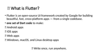
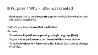
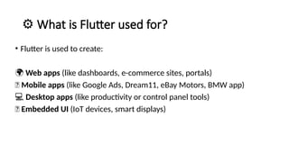
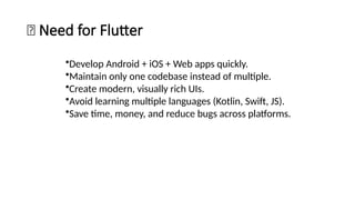
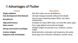
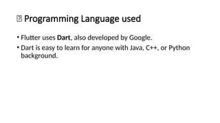
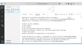
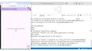
Flutter is an open-source user interface software development kit created by Google, designed to build beautiful, fast, and native-compiled applications for multiple platforms from a single codebase. Introduced publicly in 2017 after its initial beta releases, Flutter has revolutionized the world of cross-platform app development by allowing developers to write one set of Dart code and deploy it seamlessly across Android, iOS, Web, Windows, macOS, and Linux platforms. The main goal of Flutter is to simplify app creation by providing a consistent UI and high performance on every device, without requiring multiple codebases or platform-specific adjustments. Before Flutter’s introduction, developers traditionally had to maintain separate projects for Android (using Java or Kotlin) and iOS (using Swift or Objective-C), which increased time, cost, and complexity. Flutter eliminates this barrier by offering a unified framework that combines expressive and flexible UI with native performance, significantly speeding up development cycles and reducing maintenance overhead. Built using Google’s Dart programming language, Flutter leverages Dart’s ability to compile both ahead-of-time (AOT) and just-in-time (JIT), enabling fast startup times and the famous “hot reload” feature, which allows developers to see code changes instantly on the emulator or real device without restarting the app. This makes experimentation, debugging, and UI refinement remarkably efficient.
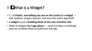
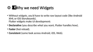
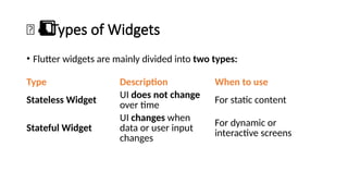
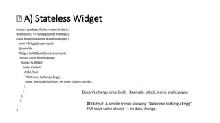
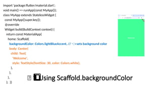
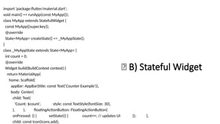
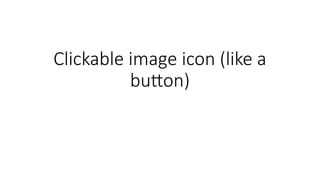
Flutter’s design philosophy revolves around widgets, where everything visible on the screen—from text and buttons to layouts and animations—is a widget. These widgets can be combined, nested, or customized to create complex interfaces that respond to user input or data changes. The framework offers two primary types of widgets: Stateless widgets, which represent static, unchanging elements, and Stateful widgets, which can dynamically change based on user interactions or data updates. Flutter’s widget tree structure allows developers to visualize their app as a hierarchy of UI components, making it both intuitive and modular. The pre-built widget sets—Material Design (for Android-like look and feel) and Cupertino (for iOS-style design)—allow developers to create platform-consistent UIs effortlessly while maintaining a shared logic layer. In addition to these, Flutter also enables developers to design highly customized widgets to achieve unique branding or design aesthetics.
Technically, Flutter’s architecture consists of three main layers: the Framework, the Engine, and the Embedder. The Framework, written in Dart, provides high-level APIs for building layouts, gestures, animations, and other UI features. The Engine, primarily written in C++, uses the Skia graphics library to render every pixel directly on the screen, bypassing native UI components. This direct rendering approach gives Flutter full control over the look and feel of the app, ensuring consistent performance across devices.


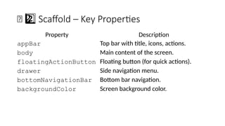

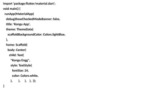
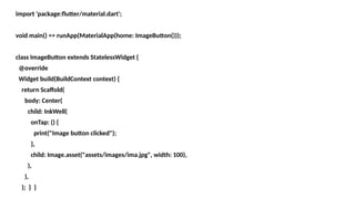
![🔹 Example
AppBar(
title: Text('Kongu Engg'),
backgroundColor: Colors.blueAccent,
actions: [
IconButton(onPressed: () {}, icon: Icon(Icons.search)),
],
)](https://image.slidesharecdn.com/flutterforbeginners1-251024183609-a004adc5/85/Flutter-for-Beginners-widgets-types-pptx-35-320.jpg)


![Flutter_Workshop-_From_Zero_to_App_Hero[1]-1[1].pptx](https://cdn.slidesharecdn.com/ss_thumbnails/flutterworkshop-fromzerotoapphero1-11-251227081205-a99e85f6-thumbnail.jpg?width=640&height=640&fit=bounds)


![[ABC2018Spring]Flutterアプリ開発入門](https://cdn.slidesharecdn.com/ss_thumbnails/abc2018sflutterkenichikambara-180609052604-thumbnail.jpg?width=640&height=640&fit=bounds)