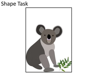
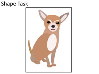
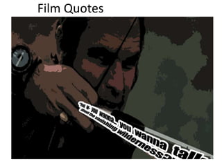
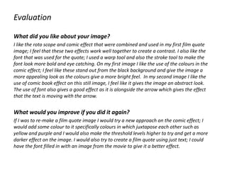
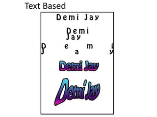
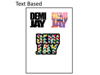
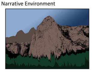
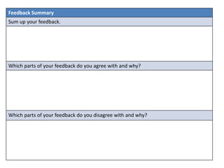
SlideShare a Scribd company logo
Digital Graphic Narrative
Development
Demi Broadhead
Shape Task
Shape Task
Evaluation
What did you like about your image?
I liked that my image included colours that were almost identical to the ones in which were
included on the original image. This helped my image to create a realistic feel and make the
shapes represent the animal more. In addition, I like that the shapes I have included in my
Image aren’t just standard shapes; the use of the warp tool helped me to change the shape of
some of my shapes to make them look more similar to the shape of the animals body parts.
The use of texture on my panda shape task is effective; it helps the ears to look like they have
fur on them rather than just using a solid colour. This use of texture can also be seen in my
second shape task of a Chihuahua on its paws; this shows the fur on them and makes the
animal have more realistic features apposed to just flat colour.
What would you improve if you did it again?
If I were to recreate my image I would choose a more difficult animal such as an insect;
particular these animals have a lot more body parts and details. Insects are also small meaning
that their would be a lot of intricate detail which would need to be carried out meaning it
would be more of a challenge to create. Additionally, I would add some more texture to certain
parts of the animals body to give it a more realistic feel and to add some more depth to the
image so It didn’t look as flat.
Rotoscope
Evaluation
What did you like about your image?
In my rotoscope I particular like the amount of detail in which I included into the face a and
hair; I feel that by adding extra amounts of detail in different colours it has helped to sculpt
the image more. I feel like my image portrays the chosen celebrity of Matt Healy well; the
choice of colours is almost exact to the ones used In the original image. This use of colour
helps to give the image a more realistic feel; the colour overlay tool was helpful when making
this image as I could use the colour choosing tool to pick a colour from the original image and
it would match it up as best as possible. I was then able to amend this and change the tone
of the colour to make it slightly more light or dark until I felt it displayed the original image
better.
What would you improve if you did it again?
If I was to recreate a rotoscope then I would spend some more time on the facial features
especially the mouth and eyes; I feel like the shape of these features aren't’t very accurate. In
addition, I would add some texture to my image to make the image appear more realistic;
the use of more detail on the skin and hair would allow my image to have more depth and
not appear as flat to the page. The jacket and shirt of my rotoscope also lacks detail and
depth; it appears to look flat and it’s just one block of solid colour therefore, I would add
more detail to the clothing aspects of the image to be on par with the detail added to the
face.
Film Quotes
Film Quotes
Evaluation
What did you like about your image?
I like the roto scope and comic effect that were combined and used in my first film quote
image; I feel that these two effects work well together to create a contrast. I also like the
font that was used for the quote; I used a warp tool and also the stroke tool to make the
font look more bold and eye catching. On my first image I like the use of the colours in the
comic effect; I feel like these stand out from the black background and give the image a
more appealing look as the colours give a more bright feel. In my second image I like the
use of comic book effect on this still image, I feel like it gives the image an abstract look.
The use of font also gives a good effect as it is alongside the arrow which gives the effect
that the text is moving with the arrow.
What would you improve if you did it again?
If I was to re-make a film quote image I would try a new approach on the comic effect; I
would add some colour to it specifically colours in which juxtapose each other such as
yellow and purple and I would also make the threshold levels higher to try and get a more
darker effect on the image. I would also try to create a film quote using just text; I could
have the font filled in with an image from the movie to give it a better effect.
Text Based
Text Based
Evaluation
What did you like about your image?
I like the use of stoke on some of my font; I feel like this made the font look more bold and
stand out better. I like the use of the warp tool on this font also, I feel like it can help to give
the font more of an abstract look as you can move certain parts of the font. In addition,
using an image and putting it in the font can make your font more interesting and give it
more of a vibrant feel depending on what you want to place in the font. I like the use of
space in which you can add between the lettering in the font; this can give it more of an
abstract look and help to fill up space on a page, or help to fit the font into smaller places by
compressing the letters closer together.
What would you improve if you did it again?
If I was to create some more text based images again I would experiment using different
colours and a range of more techniques. Rather than just using the extremes of each effect
in which you can add to the font I would create some text based images in different sizes
and styles. . I would also choose various different fonts to see how these would work with
various effects such as paragraphing; in addition, I would type up some more text to see
how these effects worked when using more words rather than just a small amount.
Comic Book
Comic Book
Comic Book
Evaluation
What did you like about your image?
In my first image I like that you can still see the original colours from the original image as
well as the threshold and darker tones in which were added. This helped to give a more
realistic look to the character in the comic book effect and allows you to define the facial
features well. In the second image I like the use of colour; I feel that these colours all work
well together and give the comic image a more artistic and abstract look apposed to a
normal comic image. I also like the use of the speech bubble as it helps to add to the comic
effect by adding more comic book stereotypical features. In the last image I like that the
darker tones fit the mood of the shot; these darker tones still give you enough detail to
identify the character but at the same time the darkened tones gives a more mysterious and
abstract look.
What would you improve if you did it again?
If I were to create one of these images again I would use the extremes of the threshold tool
by making it really high and then really low; this would allow me to work with very abstract
images by having a lot of detail and then hardly any detail at all. I would also experiment
with various other colour overlays by using colours in which juxtapose each other such as
very bright colours for a dark image and darker colours for a brighter image.
Photo Story
Evaluation
What did you like about your image?
What would you improve if you did it again?
Illustration
Evaluation
What did you like about your image?
What would you improve if you did it again?
Narrative Environment
Evaluation
What did you like about your image?
What would you improve if you did it again?
Initial Ideas
Idea Generation
Mood board summary
• Cat / Xander : I decided to have my character of Domingo’s cat black; I feel like this color
will help represent his personality. As the cat murders the giant I feel that black helps to
reflect death and darkness. I wanted to have a thin black cat as these are more like
shadows and darkness opposed to a fluffy black kitten.
• Domingo : I decided to have Domingo as a homeless man, in the story it tells us that he
isn’t wealthy and he has nothing left apart from his cat. Therefore, I feel like the images
which I picked of a homeless man looking dirty and wearing brown reflects someone
with no wealth and someone struggling.
• King : I wanted to have a stereotypical fairy tale king therefore, I have collected images
of a large king wearing reds and purples which are typical colors that represent wealth.
I have made the king look happy and jolly as in the story he is getting diamonds and
gold delivered to him therefore he is a happy character.
• Giant : I collected images of big green giants; I want my giant to be reflective of those
from a normal fairytale, the colors of green and brown which I will include symbolize
greed, jealousy and cowardice.
• Kings daughter : These images show a princess wearing pink, as the princess is to get
married in the story I feel that pink helps to symbolize the love. I have included a
princess with blonde hair as this is a bright glowing color to show the importance of this
character.
Proposal
Dimensions
8 pages, landscape format; “10x”10 large square.
Story Overview
1; Domingo is homeless and he tells his cat that even though he is the last thing left he has he will
never sell him.
2; Xander the cat is going to go and make money so he goes to a cave and digs up the ground.
3; Xander digs up some silver, he goes and gives it to Domingo and some of the silver to the king.
4; Xander does the same again and digs up some gold and some diamond he gives this to the king
and the king is very grateful.
5; The king then organises a wedding for Domingo and his daughter.
6; Xander goes and asks the king for a suit for Domingo as the ‘suit store burned down’.
7; Xander goes and eats the giant so he can use his castle for the wedding venue.
8; Xander goes off to help another poor person.
Export Format
JPEG
Advantages: when exporting it has full colour information which means that the images in the
book will be of good quality colour wise. In addition, this file format has a large compression ratio
which means that it won’t take long to compress the file.
Disadvantages: a disadvantage of using JPEG as the file export format is that there can be a loss of
image quality which means when exporting the images may become blurred or pixelated.
Deadline
15th of June 2016.
Audience
My book will be aimed towards any gender; as this story isn’t a stereotypical story for any
gender and it includes characters in which both genders would like. The age range for my book
would be children around the age of 4/5 years old as the story is quite simple however there is
some context such as the vat eating the giant which is quite violent. The target audience is also
adults who have children at this age as they would need to read the story to the children due
to them not being able to read. The book would be aimed at children and adults living in the
UK as the story is written in English and follows an English folk tale.
Production Methods
To make my children's book I will use a variety of methods on Photoshop to create the images
for the book; I will use rotoscoping to create the pictures. I will also take some pictures of some
of my subjects and then rotoscope on top of the images. I will also use some shapes on
Photoshop to make certain characters and subjects for the photos. I will use some font on
Photoshop to type up the text for the story; I will use the warp tool to make the front appear
more appealing and also add a stroke effect to make It bold and stand out more.
What are the strengths of the proposal? What areas of the proposal need further work?
What are the strengths of the idea generation? What areas of idea generation could have been
further developed?
What are the strengths of the proposal? What areas of the proposal need further work?
What are the strengths of the idea generation? What areas of idea generation could have been
further developed?
What are the strengths of the proposal? What areas of the proposal need further work?
What are the strengths of the idea generation? What areas of idea generation could have been
further developed?
Feedback Summary
Sum up your feedback.
Which parts of your feedback do you agree with and why?
Which parts of your feedback do you disagree with and why?
Original Script
Original Script goes here with link to where it came from
Original Script
Original Script goes here with link to where it came from
Story Breakdown
Final script goes here.
Draft Script
Final script goes here.
Final Script
Final script goes here.
Digital Flat Plans

More Related Content

What's hot

Development pro forma
Development pro formaDevelopment pro forma
Development pro forma
Ellie Marsh
 
Development pro forma
Development pro formaDevelopment pro forma
Development pro formaEmma Wells
 
Pro forma
Pro formaPro forma
Pro forma
Pro formaPro forma
Development pro forma
Development pro formaDevelopment pro forma
Development pro forma
KellySteer
 
Development pro forma 2
Development pro forma 2Development pro forma 2
Development pro forma 2
lili-brewin
 
Development pro-forma
Development pro-formaDevelopment pro-forma
Development pro-forma
Libby-Wright1
 
Development Pro forma
Development Pro formaDevelopment Pro forma
Development Pro forma
jessstanton17
 
Development Pro Forma
Development Pro FormaDevelopment Pro Forma
Development Pro Forma
jessstanton17
 
99 development pro forma
99 development pro forma99 development pro forma
99 development pro forma
retroflex1
 
Development pro forma improved
Development pro forma improvedDevelopment pro forma improved
Development pro forma improved
Alisha Marie Harrison
 
Development pro forma(3)
Development pro forma(3)Development pro forma(3)
Development pro forma(3)
Alisha Marie Harrison
 
Development pro forma improved
Development pro forma improvedDevelopment pro forma improved
Development pro forma improved
Alisha Marie Harrison
 
Development pro forma
Development pro formaDevelopment pro forma
Development pro forma
Emily Shaw
 
Development pro forma
Development pro formaDevelopment pro forma
Development pro forma
Cara_Taylor
 
Digital graphics evaluation pro forma
Digital graphics evaluation pro formaDigital graphics evaluation pro forma
Digital graphics evaluation pro forma
Jack Sullivan
 
Digital graphics evaluation pro forma
Digital graphics evaluation pro formaDigital graphics evaluation pro forma
Digital graphics evaluation pro forma
Jack Sullivan
 

What's hot (18)

Development pro forma
Development pro formaDevelopment pro forma
Development pro forma
 
Development pro forma
Development pro formaDevelopment pro forma
Development pro forma
 
Pro forma
Pro formaPro forma
Pro forma
 
Pro forma
Pro formaPro forma
Pro forma
 
Development pro forma
Development pro formaDevelopment pro forma
Development pro forma
 
Development pro forma 2
Development pro forma 2Development pro forma 2
Development pro forma 2
 
Development pro-forma
Development pro-formaDevelopment pro-forma
Development pro-forma
 
Development Pro forma
Development Pro formaDevelopment Pro forma
Development Pro forma
 
Development Pro Forma
Development Pro FormaDevelopment Pro Forma
Development Pro Forma
 
99 development pro forma
99 development pro forma99 development pro forma
99 development pro forma
 
Development pro forma improved
Development pro forma improvedDevelopment pro forma improved
Development pro forma improved
 
Development pro forma(3)
Development pro forma(3)Development pro forma(3)
Development pro forma(3)
 
Development pro forma improved
Development pro forma improvedDevelopment pro forma improved
Development pro forma improved
 
Evaluation
EvaluationEvaluation
Evaluation
 
Development pro forma
Development pro formaDevelopment pro forma
Development pro forma
 
Development pro forma
Development pro formaDevelopment pro forma
Development pro forma
 
Digital graphics evaluation pro forma
Digital graphics evaluation pro formaDigital graphics evaluation pro forma
Digital graphics evaluation pro forma
 
Digital graphics evaluation pro forma
Digital graphics evaluation pro formaDigital graphics evaluation pro forma
Digital graphics evaluation pro forma
 

Similar to Development

Development pro forma
Development pro formaDevelopment pro forma
Development pro formaEmma Wells
 
Development pro forma
Development pro formaDevelopment pro forma
Development pro formaEmma Wells
 
Development pro forma
Development pro formaDevelopment pro forma
Development pro formaEmma Wells
 
Development pro forma improved
Development pro forma improvedDevelopment pro forma improved
Development pro forma improved
Rachel Louise Hewitson
 
Development
DevelopmentDevelopment
Development
Demi Jay
 
Development pro forma(3)
Development pro forma(3)Development pro forma(3)
Development pro forma(3)
Richard Acaster
 
Development pro forma(3) 09 24-46-138
Development pro forma(3) 09 24-46-138Development pro forma(3) 09 24-46-138
Development pro forma(3) 09 24-46-138
Fraeya Snaith
 
Development pro forma
Development pro formaDevelopment pro forma
Development pro formaEmma Wells
 
Development pro forma
Development pro formaDevelopment pro forma
Development pro formaEmma Wells
 
Development pro forma(3)
Development pro forma(3)Development pro forma(3)
Development pro forma(3)
Richard Acaster
 
Digital Grahics
Digital GrahicsDigital Grahics
Digital Grahics
emilyap1
 
Development graphics scott wilson 1
Development graphics scott wilson 1Development graphics scott wilson 1
Development graphics scott wilson 1
ScottWilson977
 
Development graphics scott wilson
Development graphics scott wilsonDevelopment graphics scott wilson
Development graphics scott wilson
ScottWilson977
 
Digital Graphics Development pro formal
Digital Graphics Development pro formalDigital Graphics Development pro formal
Digital Graphics Development pro formal
MaximLancaster12345
 
Development pro forma 11/12/14
Development pro forma 11/12/14Development pro forma 11/12/14
Development pro forma 11/12/14
MisterWill123
 
Development Graphic Narrative
Development Graphic NarrativeDevelopment Graphic Narrative
Development Graphic Narrative
FrankieHall0
 
Development pro forma
Development pro formaDevelopment pro forma
Development pro forma
Emily Shaw
 

Similar to Development (20)

Development pro forma
Development pro formaDevelopment pro forma
Development pro forma
 
Development pro forma
Development pro formaDevelopment pro forma
Development pro forma
 
Development pro forma
Development pro formaDevelopment pro forma
Development pro forma
 
Development pro forma improved
Development pro forma improvedDevelopment pro forma improved
Development pro forma improved
 
Development pro forma
Development pro formaDevelopment pro forma
Development pro forma
 
Development pro forma(3)
Development pro forma(3)Development pro forma(3)
Development pro forma(3)
 
Development pro forma
Development pro formaDevelopment pro forma
Development pro forma
 
Development
DevelopmentDevelopment
Development
 
Development pro forma(3)
Development pro forma(3)Development pro forma(3)
Development pro forma(3)
 
Development pro forma(3) 09 24-46-138
Development pro forma(3) 09 24-46-138Development pro forma(3) 09 24-46-138
Development pro forma(3) 09 24-46-138
 
Development pro forma
Development pro formaDevelopment pro forma
Development pro forma
 
Development pro forma
Development pro formaDevelopment pro forma
Development pro forma
 
Development pro forma(3)
Development pro forma(3)Development pro forma(3)
Development pro forma(3)
 
Digital Grahics
Digital GrahicsDigital Grahics
Digital Grahics
 
Development graphics scott wilson 1
Development graphics scott wilson 1Development graphics scott wilson 1
Development graphics scott wilson 1
 
Development graphics scott wilson
Development graphics scott wilsonDevelopment graphics scott wilson
Development graphics scott wilson
 
Digital Graphics Development pro formal
Digital Graphics Development pro formalDigital Graphics Development pro formal
Digital Graphics Development pro formal
 
Development pro forma 11/12/14
Development pro forma 11/12/14Development pro forma 11/12/14
Development pro forma 11/12/14
 
Development Graphic Narrative
Development Graphic NarrativeDevelopment Graphic Narrative
Development Graphic Narrative
 
Development pro forma
Development pro formaDevelopment pro forma
Development pro forma
 

More from Demi Jay

Stop motion powerpoint
Stop motion powerpointStop motion powerpoint
Stop motion powerpoint
Demi Jay
 
Domingo's cat book
Domingo's cat bookDomingo's cat book
Domingo's cat book
Demi Jay
 
Childrens book research
Childrens book researchChildrens book research
Childrens book research
Demi Jay
 
Evaluation
EvaluationEvaluation
Evaluation
Demi Jay
 
File types
File typesFile types
File types
Demi Jay
 
Final Product (BOOK)
Final Product (BOOK)Final Product (BOOK)
Final Product (BOOK)
Demi Jay
 

More from Demi Jay (6)

Stop motion powerpoint
Stop motion powerpointStop motion powerpoint
Stop motion powerpoint
 
Domingo's cat book
Domingo's cat bookDomingo's cat book
Domingo's cat book
 
Childrens book research
Childrens book researchChildrens book research
Childrens book research
 
Evaluation
EvaluationEvaluation
Evaluation
 
File types
File typesFile types
File types
 
Final Product (BOOK)
Final Product (BOOK)Final Product (BOOK)
Final Product (BOOK)
 

Recently uploaded

原版定做(penn毕业证书)美国宾夕法尼亚大学毕业证文凭学历证书原版一模一样
原版定做(penn毕业证书)美国宾夕法尼亚大学毕业证文凭学历证书原版一模一样原版定做(penn毕业证书)美国宾夕法尼亚大学毕业证文凭学历证书原版一模一样
原版定做(penn毕业证书)美国宾夕法尼亚大学毕业证文凭学历证书原版一模一样
gpffo76j
 
Portfolio.pdf
Portfolio.pdfPortfolio.pdf
Portfolio.pdf
garcese
 
一比一原版(NCL毕业证书)纽卡斯尔大学毕业证成绩单如何办理
一比一原版(NCL毕业证书)纽卡斯尔大学毕业证成绩单如何办理一比一原版(NCL毕业证书)纽卡斯尔大学毕业证成绩单如何办理
一比一原版(NCL毕业证书)纽卡斯尔大学毕业证成绩单如何办理
7sd8fier
 
projectreportnew-170307082323 nnnnnn(1).pdf
projectreportnew-170307082323 nnnnnn(1).pdfprojectreportnew-170307082323 nnnnnn(1).pdf
projectreportnew-170307082323 nnnnnn(1).pdf
farazahmadas6
 
20 slides of research movie and artists .pdf
20 slides of research movie and artists .pdf20 slides of research movie and artists .pdf
20 slides of research movie and artists .pdf
ameli25062005
 
RTUYUIJKLDSADAGHBDJNKSMAL,D
RTUYUIJKLDSADAGHBDJNKSMAL,DRTUYUIJKLDSADAGHBDJNKSMAL,D
RTUYUIJKLDSADAGHBDJNKSMAL,D
cy0krjxt
 
Коричневый и Кремовый Деликатный Органический Копирайтер Фрилансер Марке...
Коричневый и Кремовый Деликатный Органический Копирайтер Фрилансер Марке...Коричневый и Кремовый Деликатный Органический Копирайтер Фрилансер Марке...
Коричневый и Кремовый Деликатный Органический Копирайтер Фрилансер Марке...
ameli25062005
 
Borys Sutkowski portfolio interior design
Borys Sutkowski portfolio interior designBorys Sutkowski portfolio interior design
Borys Sutkowski portfolio interior design
boryssutkowski
 
一比一原版(LSE毕业证书)伦敦政治经济学院毕业证成绩单如何办理
一比一原版(LSE毕业证书)伦敦政治经济学院毕业证成绩单如何办理一比一原版(LSE毕业证书)伦敦政治经济学院毕业证成绩单如何办理
一比一原版(LSE毕业证书)伦敦政治经济学院毕业证成绩单如何办理
jyz59f4j
 
一比一原版(Brunel毕业证书)布鲁内尔大学毕业证成绩单如何办理
一比一原版(Brunel毕业证书)布鲁内尔大学毕业证成绩单如何办理一比一原版(Brunel毕业证书)布鲁内尔大学毕业证成绩单如何办理
一比一原版(Brunel毕业证书)布鲁内尔大学毕业证成绩单如何办理
smpc3nvg
 
Common Designing Mistakes and How to avoid them
Common Designing Mistakes and How to avoid themCommon Designing Mistakes and How to avoid them
Common Designing Mistakes and How to avoid them
madhavlakhanpal29
 
一比一原版(Glasgow毕业证书)格拉斯哥大学毕业证成绩单如何办理
一比一原版(Glasgow毕业证书)格拉斯哥大学毕业证成绩单如何办理一比一原版(Glasgow毕业证书)格拉斯哥大学毕业证成绩单如何办理
一比一原版(Glasgow毕业证书)格拉斯哥大学毕业证成绩单如何办理
n0tivyq
 
一比一原版(UNUK毕业证书)诺丁汉大学毕业证如何办理
一比一原版(UNUK毕业证书)诺丁汉大学毕业证如何办理一比一原版(UNUK毕业证书)诺丁汉大学毕业证如何办理
一比一原版(UNUK毕业证书)诺丁汉大学毕业证如何办理
7sd8fier
 
Transforming Brand Perception and Boosting Profitability
Transforming Brand Perception and Boosting ProfitabilityTransforming Brand Perception and Boosting Profitability
Transforming Brand Perception and Boosting Profitability
aaryangarg12
 
White wonder, Work developed by Eva Tschopp
White wonder, Work developed by Eva TschoppWhite wonder, Work developed by Eva Tschopp
White wonder, Work developed by Eva Tschopp
Mansi Shah
 
Exploring the Future of Smart Garages.pdf
Exploring the Future of Smart Garages.pdfExploring the Future of Smart Garages.pdf
Exploring the Future of Smart Garages.pdf
fastfixgaragedoor
 
一比一原版(UCB毕业证书)伯明翰大学学院毕业证成绩单如何办理
一比一原版(UCB毕业证书)伯明翰大学学院毕业证成绩单如何办理一比一原版(UCB毕业证书)伯明翰大学学院毕业证成绩单如何办理
一比一原版(UCB毕业证书)伯明翰大学学院毕业证成绩单如何办理
h7j5io0
 
Book Formatting: Quality Control Checks for Designers
Book Formatting: Quality Control Checks for DesignersBook Formatting: Quality Control Checks for Designers
Book Formatting: Quality Control Checks for Designers
Confidence Ago
 
一比一原版(Bristol毕业证书)布里斯托大学毕业证成绩单如何办理
一比一原版(Bristol毕业证书)布里斯托大学毕业证成绩单如何办理一比一原版(Bristol毕业证书)布里斯托大学毕业证成绩单如何办理
一比一原版(Bristol毕业证书)布里斯托大学毕业证成绩单如何办理
smpc3nvg
 
一比一原版(RHUL毕业证书)伦敦大学皇家霍洛威学院毕业证如何办理
一比一原版(RHUL毕业证书)伦敦大学皇家霍洛威学院毕业证如何办理一比一原版(RHUL毕业证书)伦敦大学皇家霍洛威学院毕业证如何办理
一比一原版(RHUL毕业证书)伦敦大学皇家霍洛威学院毕业证如何办理
9a93xvy
 

Recently uploaded (20)

原版定做(penn毕业证书)美国宾夕法尼亚大学毕业证文凭学历证书原版一模一样
原版定做(penn毕业证书)美国宾夕法尼亚大学毕业证文凭学历证书原版一模一样原版定做(penn毕业证书)美国宾夕法尼亚大学毕业证文凭学历证书原版一模一样
原版定做(penn毕业证书)美国宾夕法尼亚大学毕业证文凭学历证书原版一模一样
 
Portfolio.pdf
Portfolio.pdfPortfolio.pdf
Portfolio.pdf
 
一比一原版(NCL毕业证书)纽卡斯尔大学毕业证成绩单如何办理
一比一原版(NCL毕业证书)纽卡斯尔大学毕业证成绩单如何办理一比一原版(NCL毕业证书)纽卡斯尔大学毕业证成绩单如何办理
一比一原版(NCL毕业证书)纽卡斯尔大学毕业证成绩单如何办理
 
projectreportnew-170307082323 nnnnnn(1).pdf
projectreportnew-170307082323 nnnnnn(1).pdfprojectreportnew-170307082323 nnnnnn(1).pdf
projectreportnew-170307082323 nnnnnn(1).pdf
 
20 slides of research movie and artists .pdf
20 slides of research movie and artists .pdf20 slides of research movie and artists .pdf
20 slides of research movie and artists .pdf
 
RTUYUIJKLDSADAGHBDJNKSMAL,D
RTUYUIJKLDSADAGHBDJNKSMAL,DRTUYUIJKLDSADAGHBDJNKSMAL,D
RTUYUIJKLDSADAGHBDJNKSMAL,D
 
Коричневый и Кремовый Деликатный Органический Копирайтер Фрилансер Марке...
Коричневый и Кремовый Деликатный Органический Копирайтер Фрилансер Марке...Коричневый и Кремовый Деликатный Органический Копирайтер Фрилансер Марке...
Коричневый и Кремовый Деликатный Органический Копирайтер Фрилансер Марке...
 
Borys Sutkowski portfolio interior design
Borys Sutkowski portfolio interior designBorys Sutkowski portfolio interior design
Borys Sutkowski portfolio interior design
 
一比一原版(LSE毕业证书)伦敦政治经济学院毕业证成绩单如何办理
一比一原版(LSE毕业证书)伦敦政治经济学院毕业证成绩单如何办理一比一原版(LSE毕业证书)伦敦政治经济学院毕业证成绩单如何办理
一比一原版(LSE毕业证书)伦敦政治经济学院毕业证成绩单如何办理
 
一比一原版(Brunel毕业证书)布鲁内尔大学毕业证成绩单如何办理
一比一原版(Brunel毕业证书)布鲁内尔大学毕业证成绩单如何办理一比一原版(Brunel毕业证书)布鲁内尔大学毕业证成绩单如何办理
一比一原版(Brunel毕业证书)布鲁内尔大学毕业证成绩单如何办理
 
Common Designing Mistakes and How to avoid them
Common Designing Mistakes and How to avoid themCommon Designing Mistakes and How to avoid them
Common Designing Mistakes and How to avoid them
 
一比一原版(Glasgow毕业证书)格拉斯哥大学毕业证成绩单如何办理
一比一原版(Glasgow毕业证书)格拉斯哥大学毕业证成绩单如何办理一比一原版(Glasgow毕业证书)格拉斯哥大学毕业证成绩单如何办理
一比一原版(Glasgow毕业证书)格拉斯哥大学毕业证成绩单如何办理
 
一比一原版(UNUK毕业证书)诺丁汉大学毕业证如何办理
一比一原版(UNUK毕业证书)诺丁汉大学毕业证如何办理一比一原版(UNUK毕业证书)诺丁汉大学毕业证如何办理
一比一原版(UNUK毕业证书)诺丁汉大学毕业证如何办理
 
Transforming Brand Perception and Boosting Profitability
Transforming Brand Perception and Boosting ProfitabilityTransforming Brand Perception and Boosting Profitability
Transforming Brand Perception and Boosting Profitability
 
White wonder, Work developed by Eva Tschopp
White wonder, Work developed by Eva TschoppWhite wonder, Work developed by Eva Tschopp
White wonder, Work developed by Eva Tschopp
 
Exploring the Future of Smart Garages.pdf
Exploring the Future of Smart Garages.pdfExploring the Future of Smart Garages.pdf
Exploring the Future of Smart Garages.pdf
 
一比一原版(UCB毕业证书)伯明翰大学学院毕业证成绩单如何办理
一比一原版(UCB毕业证书)伯明翰大学学院毕业证成绩单如何办理一比一原版(UCB毕业证书)伯明翰大学学院毕业证成绩单如何办理
一比一原版(UCB毕业证书)伯明翰大学学院毕业证成绩单如何办理
 
Book Formatting: Quality Control Checks for Designers
Book Formatting: Quality Control Checks for DesignersBook Formatting: Quality Control Checks for Designers
Book Formatting: Quality Control Checks for Designers
 
一比一原版(Bristol毕业证书)布里斯托大学毕业证成绩单如何办理
一比一原版(Bristol毕业证书)布里斯托大学毕业证成绩单如何办理一比一原版(Bristol毕业证书)布里斯托大学毕业证成绩单如何办理
一比一原版(Bristol毕业证书)布里斯托大学毕业证成绩单如何办理
 
一比一原版(RHUL毕业证书)伦敦大学皇家霍洛威学院毕业证如何办理
一比一原版(RHUL毕业证书)伦敦大学皇家霍洛威学院毕业证如何办理一比一原版(RHUL毕业证书)伦敦大学皇家霍洛威学院毕业证如何办理
一比一原版(RHUL毕业证书)伦敦大学皇家霍洛威学院毕业证如何办理
 

Development

  • 4. Evaluation What did you like about your image? I liked that my image included colours that were almost identical to the ones in which were included on the original image. This helped my image to create a realistic feel and make the shapes represent the animal more. In addition, I like that the shapes I have included in my Image aren’t just standard shapes; the use of the warp tool helped me to change the shape of some of my shapes to make them look more similar to the shape of the animals body parts. The use of texture on my panda shape task is effective; it helps the ears to look like they have fur on them rather than just using a solid colour. This use of texture can also be seen in my second shape task of a Chihuahua on its paws; this shows the fur on them and makes the animal have more realistic features apposed to just flat colour. What would you improve if you did it again? If I were to recreate my image I would choose a more difficult animal such as an insect; particular these animals have a lot more body parts and details. Insects are also small meaning that their would be a lot of intricate detail which would need to be carried out meaning it would be more of a challenge to create. Additionally, I would add some more texture to certain parts of the animals body to give it a more realistic feel and to add some more depth to the image so It didn’t look as flat.
  • 6. Evaluation What did you like about your image? In my rotoscope I particular like the amount of detail in which I included into the face a and hair; I feel that by adding extra amounts of detail in different colours it has helped to sculpt the image more. I feel like my image portrays the chosen celebrity of Matt Healy well; the choice of colours is almost exact to the ones used In the original image. This use of colour helps to give the image a more realistic feel; the colour overlay tool was helpful when making this image as I could use the colour choosing tool to pick a colour from the original image and it would match it up as best as possible. I was then able to amend this and change the tone of the colour to make it slightly more light or dark until I felt it displayed the original image better. What would you improve if you did it again? If I was to recreate a rotoscope then I would spend some more time on the facial features especially the mouth and eyes; I feel like the shape of these features aren't’t very accurate. In addition, I would add some texture to my image to make the image appear more realistic; the use of more detail on the skin and hair would allow my image to have more depth and not appear as flat to the page. The jacket and shirt of my rotoscope also lacks detail and depth; it appears to look flat and it’s just one block of solid colour therefore, I would add more detail to the clothing aspects of the image to be on par with the detail added to the face.
  • 9. Evaluation What did you like about your image? I like the roto scope and comic effect that were combined and used in my first film quote image; I feel that these two effects work well together to create a contrast. I also like the font that was used for the quote; I used a warp tool and also the stroke tool to make the font look more bold and eye catching. On my first image I like the use of the colours in the comic effect; I feel like these stand out from the black background and give the image a more appealing look as the colours give a more bright feel. In my second image I like the use of comic book effect on this still image, I feel like it gives the image an abstract look. The use of font also gives a good effect as it is alongside the arrow which gives the effect that the text is moving with the arrow. What would you improve if you did it again? If I was to re-make a film quote image I would try a new approach on the comic effect; I would add some colour to it specifically colours in which juxtapose each other such as yellow and purple and I would also make the threshold levels higher to try and get a more darker effect on the image. I would also try to create a film quote using just text; I could have the font filled in with an image from the movie to give it a better effect.
  • 12. Evaluation What did you like about your image? I like the use of stoke on some of my font; I feel like this made the font look more bold and stand out better. I like the use of the warp tool on this font also, I feel like it can help to give the font more of an abstract look as you can move certain parts of the font. In addition, using an image and putting it in the font can make your font more interesting and give it more of a vibrant feel depending on what you want to place in the font. I like the use of space in which you can add between the lettering in the font; this can give it more of an abstract look and help to fill up space on a page, or help to fit the font into smaller places by compressing the letters closer together. What would you improve if you did it again? If I was to create some more text based images again I would experiment using different colours and a range of more techniques. Rather than just using the extremes of each effect in which you can add to the font I would create some text based images in different sizes and styles. . I would also choose various different fonts to see how these would work with various effects such as paragraphing; in addition, I would type up some more text to see how these effects worked when using more words rather than just a small amount.
  • 16. Evaluation What did you like about your image? In my first image I like that you can still see the original colours from the original image as well as the threshold and darker tones in which were added. This helped to give a more realistic look to the character in the comic book effect and allows you to define the facial features well. In the second image I like the use of colour; I feel that these colours all work well together and give the comic image a more artistic and abstract look apposed to a normal comic image. I also like the use of the speech bubble as it helps to add to the comic effect by adding more comic book stereotypical features. In the last image I like that the darker tones fit the mood of the shot; these darker tones still give you enough detail to identify the character but at the same time the darkened tones gives a more mysterious and abstract look. What would you improve if you did it again? If I were to create one of these images again I would use the extremes of the threshold tool by making it really high and then really low; this would allow me to work with very abstract images by having a lot of detail and then hardly any detail at all. I would also experiment with various other colour overlays by using colours in which juxtapose each other such as very bright colours for a dark image and darker colours for a brighter image.
  • 18. Evaluation What did you like about your image? What would you improve if you did it again?
  • 20. Evaluation What did you like about your image? What would you improve if you did it again?
  • 22. Evaluation What did you like about your image? What would you improve if you did it again?
  • 25.
  • 26.
  • 27. Mood board summary • Cat / Xander : I decided to have my character of Domingo’s cat black; I feel like this color will help represent his personality. As the cat murders the giant I feel that black helps to reflect death and darkness. I wanted to have a thin black cat as these are more like shadows and darkness opposed to a fluffy black kitten. • Domingo : I decided to have Domingo as a homeless man, in the story it tells us that he isn’t wealthy and he has nothing left apart from his cat. Therefore, I feel like the images which I picked of a homeless man looking dirty and wearing brown reflects someone with no wealth and someone struggling. • King : I wanted to have a stereotypical fairy tale king therefore, I have collected images of a large king wearing reds and purples which are typical colors that represent wealth. I have made the king look happy and jolly as in the story he is getting diamonds and gold delivered to him therefore he is a happy character. • Giant : I collected images of big green giants; I want my giant to be reflective of those from a normal fairytale, the colors of green and brown which I will include symbolize greed, jealousy and cowardice. • Kings daughter : These images show a princess wearing pink, as the princess is to get married in the story I feel that pink helps to symbolize the love. I have included a princess with blonde hair as this is a bright glowing color to show the importance of this character.
  • 28. Proposal Dimensions 8 pages, landscape format; “10x”10 large square. Story Overview 1; Domingo is homeless and he tells his cat that even though he is the last thing left he has he will never sell him. 2; Xander the cat is going to go and make money so he goes to a cave and digs up the ground. 3; Xander digs up some silver, he goes and gives it to Domingo and some of the silver to the king. 4; Xander does the same again and digs up some gold and some diamond he gives this to the king and the king is very grateful. 5; The king then organises a wedding for Domingo and his daughter. 6; Xander goes and asks the king for a suit for Domingo as the ‘suit store burned down’. 7; Xander goes and eats the giant so he can use his castle for the wedding venue. 8; Xander goes off to help another poor person. Export Format JPEG Advantages: when exporting it has full colour information which means that the images in the book will be of good quality colour wise. In addition, this file format has a large compression ratio which means that it won’t take long to compress the file. Disadvantages: a disadvantage of using JPEG as the file export format is that there can be a loss of image quality which means when exporting the images may become blurred or pixelated.
  • 29. Deadline 15th of June 2016. Audience My book will be aimed towards any gender; as this story isn’t a stereotypical story for any gender and it includes characters in which both genders would like. The age range for my book would be children around the age of 4/5 years old as the story is quite simple however there is some context such as the vat eating the giant which is quite violent. The target audience is also adults who have children at this age as they would need to read the story to the children due to them not being able to read. The book would be aimed at children and adults living in the UK as the story is written in English and follows an English folk tale. Production Methods To make my children's book I will use a variety of methods on Photoshop to create the images for the book; I will use rotoscoping to create the pictures. I will also take some pictures of some of my subjects and then rotoscope on top of the images. I will also use some shapes on Photoshop to make certain characters and subjects for the photos. I will use some font on Photoshop to type up the text for the story; I will use the warp tool to make the front appear more appealing and also add a stroke effect to make It bold and stand out more.
  • 30. What are the strengths of the proposal? What areas of the proposal need further work? What are the strengths of the idea generation? What areas of idea generation could have been further developed?
  • 31. What are the strengths of the proposal? What areas of the proposal need further work? What are the strengths of the idea generation? What areas of idea generation could have been further developed?
  • 32. What are the strengths of the proposal? What areas of the proposal need further work? What are the strengths of the idea generation? What areas of idea generation could have been further developed?
  • 33. Feedback Summary Sum up your feedback. Which parts of your feedback do you agree with and why? Which parts of your feedback do you disagree with and why?
  • 34. Original Script Original Script goes here with link to where it came from
  • 35. Original Script Original Script goes here with link to where it came from