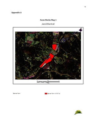
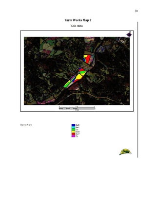
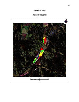
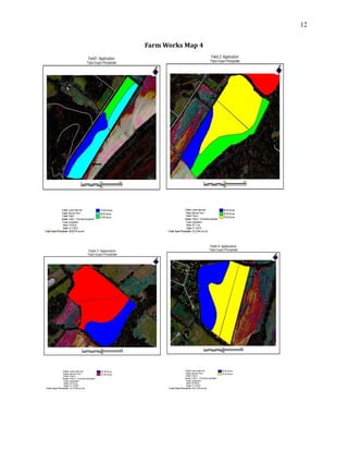
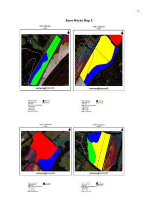
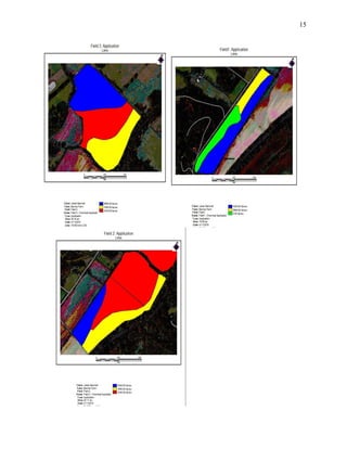
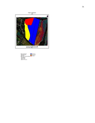
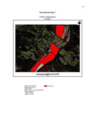
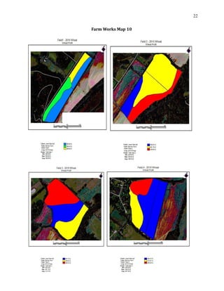
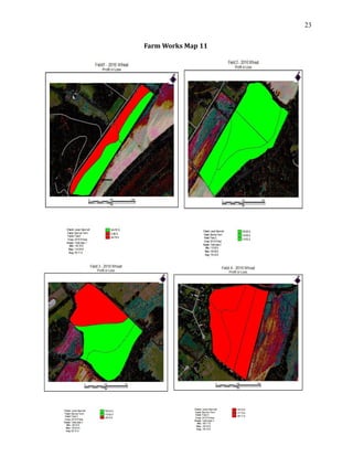
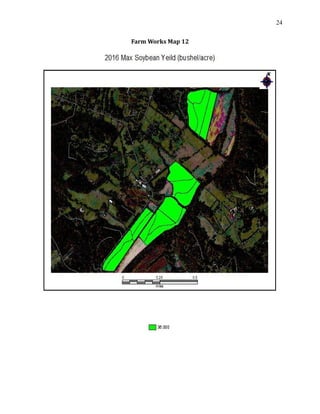
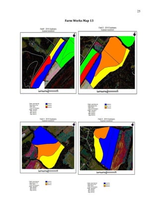
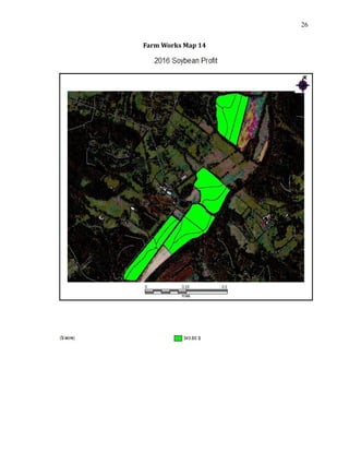
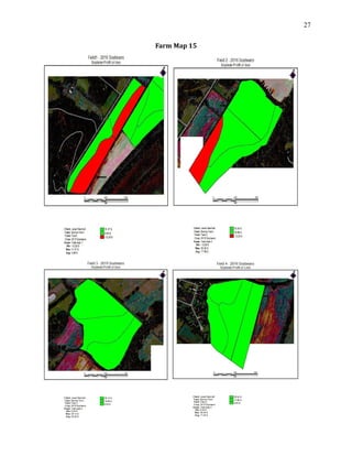
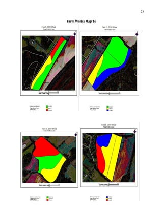
1
Farm Works Final Project
Jared Marshall
04/21/2016
Submitted To:
H. F. Massey
AGM 410
2
Introduction
I was presented the task of creating 16 management maps for a double crop system
of Soybeans and Wheat for 4 fields located in Hendersonville, North Carolina. The first
maps include field boundaries with soil data so we can propose how to effetely manage the
fields by using zone management. Once the zones have been created we will make maps
that show variable rate Phosphate, Potassium, Nitrogen, and Lime requirements for each
zone in the fields. This is necessary over whole field management because it can cut the
farmers cost down a lot if properly managed. The next step will be to find the yield data for
each zone and place it into the management zones so you can see which parts of the field
are being productive and which parts need some work on. After the yield data has been
processed we can then find out how money each zone is making in $ per acre and see how
much it costs to produce the commodity in each zone. After all of this has been determined
we can see what zones are making or losing money for each crop. In the end we will be able
to combine the two crops on each zone to see if they are making a profit or a loss for the
double crop system. This way educated decisions can be made on what zones need to
continue to be farmed and which zones need to be cut out.
Methods
For this project a couple of different things go into account to be able to successfully
complete the tasks. Knowledge of farm works, excel, fertilizer requirement calculations,
and cost analysis are the most important. Knowledge of how to import excel files into farm
works by using job data is one of the most important things also excel will be used for all
calculations/data that need to be presented on the maps. Fertilizer calculations play a huge
role in zone management that will be used on this project, without them cost would sky
rocket. Finally cost analysis will be used to see if profit or loss is being made off of the farm.
Map 1
To make the first set of maps I first selected the background imagery button on the
tool bar, then I zoomed into Hendersonville NC and found Banner farm. I then selected new
field and then went to edit boundaries. Once I was in the edit boundaries tab I selected the
include polygon tool and traced over the field. To make sure the field was over 15 acres I
3
then went to properties and looked at the mapped area section and then hit save and close.
I repeated those steps three more times for the three remaining fields.
Map 2
To make the second set of maps I first needed to obtain the soil data from the web
soil survey site. To obtain this I found my county on the web site and selected the button
that would send me the data over an email. Once I had obtained this data I selected field 1
and went to properties, then import background, then I selected the soil data and checked
the box so it would import the data only into my field boundaries. I then repeated this step
for the three remaining fields.
Map 3
To make the third set of maps I started by selecting the field and making the soils
data the displayed layer. Then I selected the edit tool and clicked on each zone to see how
many acres each zone was. For the zones that were smaller than 2.5 acres I would select it
and hold shift and select a zone beside it to merge them together. For the zones where
larger than 10 acres I needed to cut them into smaller zones so they could be managed. To
do this I would select the zone in the field that was too large and go into the edit tool, then
select split polygon and run a line through the zone I wanted to make smaller. I completed
these steps for every field until all the zones were in a range from 2.5 to 10 acres.
Map 4
To make this set of maps I first had to download the projected soil sample results
from blackboard. I then had to delete the data in column 1 and replace it with the different
soil types I had throughout the 4 fields, and delete the extra rows that were in the excel file
and then saved the file in .CSV format. The next step was to export the boundary of my field
and save it as a shape file. Once that was completed I selected read job data and selected
generic import. I then joined that data to the existing shape file and since I used soil type
zones I selected MUSYM and ID for the column and Hit OK, and selected the Field Name to
link this file too. Once those steps were completed I could import my prescription for
Phosphate we used 0-45-0 fertilizer and since this uses P2O5 we know that only 43.6% of
that is actual P I needed to see how much P was in 100 lbs. of 0-45-0 so I multiplied 45 by
43.6% and got 19.62 lbs. of P for 100 lbs. of 0-45-0. I then went to the inputs tab and made
4
a new supply that was Triple Super Phosphate and made 1lb = 0.1962 lbs. and brought it
into my working groups. I then created a simple application that would multiply the
amount of P needed for each zone by 0.1962, which would show how many pounds of 0-45-
0 were needed per acre per zone.
Map 5
Since the .CSV file had all of the nutrient requirements in it I didn’t need to import it
again for Potassium. However, I could import my prescription for Potassium now since we
used 0-0-60 fertilizer and since this uses K2O we know that only 83% of that is actual K I
needed to see how much K was in 100 lbs. of 0-0-60 so I multiplied 60 by 83% and got
37.35 lbs. of K for 100 lbs. of 0-0-60. I then went to the inputs tab and made a new supply
that was Potassium and made 1lb = 0.3735 lbs. and brought it into my working groups. I
then created a simple application that would multiply the amount of K needed for each
zone by 0.3735, which would show how many pounds of 0-0-60 were needed per acre per
zone. Once this was completed I could select Potassium requirement, as my top layer and
the legend would show how many lbs. per acre each zone needed
Map 6
To make the lime requirement map I used the CEC from the nutrient requirement
excel file and used the equation
(BS needed – BS actual) X CEC X 0.02 g Ca X 20,000lbs Ca)/(40g/100g)
This equation was used because we’re using CaCO3 for lime. Once I had calculated all of the
lime requirements for each zone instead of importing it in as a new .CSV file I added a new
supply for lime and brought it into my working groups then I selected a field and hit the
edit button and would select the zone I wanted and hit properties and manually typed in
the lime requirement amount in the box for lime. I repeated this for each field and each
zone until complete. Once this was completed I could select lime requirement, as my top
layer and the legend would show how many lbs. per acre each zone needed.
Map 7
For lime requirement we used a base rate of 90 lbs. per acre to put this into my
zones I created a excel file with all my different soil types I had throughout the 4 fields and
after each soil type I would have 90 lbs. of nitrogen needed and then saved the file in .CSV
5
format. Once that was completed I selected read job data and selected generic import. I
then joined that data to the existing shape file and since I used soil type zones I selected
MUSYM and ID for the column and Hit OK, and selected the Field Name to link the file. Once
I selected the check under job data and made nitrogen requirement my top layer it showed
in the legend that each zone needed 90 lbs./acre of Nitrogen.
Map 8
For the Wheat yield data I downloaded the yield data excel file from blackboard and
I then had to delete the data in column 1 and replace it with the different soil types I had
throughout the 4 fields and delete the extra rows that were in the excel file and then save
the file in .CSV format. Once that was completed I selected read job data and selected
generic import. I then joined that data to the existing shape file and since I used soil type
zones I selected MUSYM and ID for the column and Hit OK, and selected the Field Name to
link this file too. Once this was completed I could select Wheat yield, as my top layer and
the legend would show how many bushel per acre each zone was producing
Map 9
To create an investment map for Wheat I first had to go to Clemson Extension
budget and I selected Wheat for grain. Once I downloaded this I needed to change the
Nitrogen rate to 90 lbs. per acre and for each zones needs I would put in the required
amount of Lime in tons per acre, Potassium in lbs. per acre, and Phosphate in lbs. per acre.
Once this was complete it would give me a total cost per acre to produce Wheat for grain, I
then would divide that in half because I wanted to apply half of the fertilizers for Wheat
and half for Soybeans. Once I obtained the amount per acre to produce Wheat I made
another excel file that had all of the soil types in the first column and the cost in the second
column. I then changed it into a .CSV file and used the same steps as before to import the
job into each zone. Once this was completed I could select Wheat investment, as my top
layer and the legend would show how much each zone was costing to produce Wheat.
Map 10
To create a Wheat yield receipt map I first had to find the current selling price of
Wheat per bushel, to do this I went to the Chicago board of trade website and found that
6
Wheat was selling for $4.47 per bushel. I then looked at the yield excel sheet and made a
calculation that would multiply the current sell price by the bushels per acre. This gave me
the amount of money per acre each zone was producing in this year. Instead of importing
this in as a .CSV file I selected the tab that had Wheat yield on it and went to properties and
clicked add, this allowed me to type in Wheat receipts in the column and $ in the next
column. Once I closed that out and selected the edit tool I could select each zone and
manually type in how much each zone was making per acre from my spreadsheet that I had
made. Once this was completed I could select Wheat yield as my top layer and click on
Wheat receipts in the views box and the legend would show how much each zone was
making off of the Wheat sell price in $ per acre.
Map 11
Since I now had Wheat total cost and Wheat yield receipts on the same excel sheet I
made a simple subtraction equation that would take my Wheat receipts minus the Wheat
cost to give me a profit or a loss number for each zone. Again instead of importing this in as
a .CSV file I selected the tab that had Wheat yield on it and went to properties and clicked
add, this allowed me to type in Wheat profit or loss in the column and $ in the next column.
Once I closed that out and selected the edit tool I could select each zone and manually type
in how much each zone was making per acre wither it was a profit or a loss from my
spreadsheet that I had made. Once this was completed I could select Wheat yield as my top
layer and click on Wheat profit or loss in the views box and the legend would show how
much each zone was making or losing off of the Wheat. I then clicked on the legend button
and if the zone was making a profit I made it green and if it was losing money I made it red.
Map 12
For the Soybean yield map I had to look online at the average max yield in my area
after some researching I found out that the average max yield in 2015 was reported to be
36 bushel per acre. For the yield data I created an excel file that had soil type in the first
column and Soybean yield in the second column, I used 36 bushel per acre for each
different soil type and then saved the file in .CSV format. Once that was completed I
selected read job data and selected generic import. I then joined that data to the existing
shape file and since I used soil type zones I selected MUSYM and ID for the column and Hit
7
OK, and selected the Field Name to link this file too. Once this was completed I could select
Soybean yield, as my top layer and the legend would show how many bushel per acre each
zone was producing.
Map 13
To create an investment map for Soybean I first had to go to Clemson Extension
budget and I selected conventional tillage (roundup ready). Once I downloaded this I
needed to change the Nitrogen rate to 90 lbs. per acre and for each zones needs I would put
in the required amount of Lime in tons per acre, Potassium in lbs. per acre, and Phosphate
in lbs. per acre. Once this was complete it would give me a total cost per acre to produce
Soybeans, I then would divide that in half because I already applied half of the fertilizers for
Wheat. Once I obtained the amount per acre to produce Soybeans I made another excel file
that had all of the soil types in the first column and the cost in the second column. I then
changed it into a .CSV file and used the same steps as before to import the job into each
zone. Once this was completed I could select Soybean investment, as my top layer and the
legend would show how much each zone was costing to produce Soybeans.
Map 14
To create a Soybean yield receipt map I first had to find the current selling price of
Soybeans per bushel, to do this I went to the Chicago board of trade website and found that
Soybeans was selling for $9.55 per bushel. I then looked at the yield excel sheet and made a
calculation that would multiply the current sell price by the bushels per acre. This gave me
the amount of money per acre each zone was producing in this year. Instead of importing
this in as a .CSV file I selected the tab that had Soybean yield on it and went to properties
and clicked add, this allowed me to type in Soybean receipts in the column and $ in the next
column. Once I closed that out and selected the edit tool I could select each zone and
manually type in how much each zone was making per acre from my spreadsheet that I had
made. Once this was completed I could select Soybean yield as my top layer and click on
Soybean receipts in the views box and the legend would show how much each zone was
making off of the current Soybean sell price in $ per acre.
Map 15
8
Since I now had Soybean total cost and Soybean yield receipts on the same excel
sheet I made a simple subtraction equation that would take my Soybean receipts minus the
Soybean cost to give me a profit or a loss number for each zone. Again instead of importing
this in as a .CSV file I selected the tab that had Soybean yield on it and went to properties
and clicked add, this allowed me to type in Soybean profit or loss in the column and $ in the
next column. Once I closed that out and selected the edit tool I could select each zone and
manually type in how much each zone was making per acre wither it was a profit or a loss
from my spreadsheet that I had made. Once this was completed I could select Soybean yield
as my top layer and click on Soybean profit or loss in the views box and the legend would
show how much each zone was making or losing off of the Soybeans in $ per acre. I then
clicked on the legend button and if the zone was making a profit I made it green and if it
was losing money I made it red.
Map 16
To create a profit map for the double crop system I used the profit or loss maps from
Wheat and Soybeans. I created a linked excel file that would add the profit or loss from
each zone together so it would give me the total profit or loss for each zone and soil type.
Once I knew what the profit or loss was for each soil type changed it into a .CSV file and
imported in into the fields the same way as stated earlier. Once the data was imported in I
went into the legend and changed the colors for each profit or loss so you could easily see if
each zone was making or losing money and how much profit or loss each zone was
producing in $ per acre.
Conclusion
After map 16 the final cost analysis of the double crop system were evaluated and
Field 1 had an overall profit of $1,445.10 for the year, Field 2 had a total profit of $4,594.85
for the year, Field 3 had a total profit of $2.065.75 for the year, and Field 4 had a total loss
of $-541.81 on the year resulting in a total profit of $7,563.89 for the entire farm of 90.91
acres. If it weren’t for precision agriculture the profit would have never been this high for
the farm because fertilizer cost would have been higher thus resulting in a lower profit.
Field 4 needs to be cut out of production for this farm or it needs to be planted with
something different because it is losing money in every zone possible.
9
Appendix A
Farm Works Map 1
10
Farm Works Map 2
11
Farm Works Map 3
12
Farm Works Map 4
13
Farm Works Map 5
14
Farm Works Map 6
15
16
17
Farm Works Map 7
18
Farm Works Map 8
19
20
Farm Works Map 9
21
22
Farm Works Map 10
23
Farm Works Map 11
24
Farm Works Map 12
25
Farm Works Map 13
26
Farm Works Map 14
27
Farm Map 15
28
Farm Works Map 16

Final Paper precision!!!!!!!!!!!!!!!

  • 1.
    1 Farm Works FinalProject Jared Marshall 04/21/2016 Submitted To: H. F. Massey AGM 410
  • 2.
    2 Introduction I was presentedthe task of creating 16 management maps for a double crop system of Soybeans and Wheat for 4 fields located in Hendersonville, North Carolina. The first maps include field boundaries with soil data so we can propose how to effetely manage the fields by using zone management. Once the zones have been created we will make maps that show variable rate Phosphate, Potassium, Nitrogen, and Lime requirements for each zone in the fields. This is necessary over whole field management because it can cut the farmers cost down a lot if properly managed. The next step will be to find the yield data for each zone and place it into the management zones so you can see which parts of the field are being productive and which parts need some work on. After the yield data has been processed we can then find out how money each zone is making in $ per acre and see how much it costs to produce the commodity in each zone. After all of this has been determined we can see what zones are making or losing money for each crop. In the end we will be able to combine the two crops on each zone to see if they are making a profit or a loss for the double crop system. This way educated decisions can be made on what zones need to continue to be farmed and which zones need to be cut out. Methods For this project a couple of different things go into account to be able to successfully complete the tasks. Knowledge of farm works, excel, fertilizer requirement calculations, and cost analysis are the most important. Knowledge of how to import excel files into farm works by using job data is one of the most important things also excel will be used for all calculations/data that need to be presented on the maps. Fertilizer calculations play a huge role in zone management that will be used on this project, without them cost would sky rocket. Finally cost analysis will be used to see if profit or loss is being made off of the farm. Map 1 To make the first set of maps I first selected the background imagery button on the tool bar, then I zoomed into Hendersonville NC and found Banner farm. I then selected new field and then went to edit boundaries. Once I was in the edit boundaries tab I selected the include polygon tool and traced over the field. To make sure the field was over 15 acres I
  • 3.
    3 then went toproperties and looked at the mapped area section and then hit save and close. I repeated those steps three more times for the three remaining fields. Map 2 To make the second set of maps I first needed to obtain the soil data from the web soil survey site. To obtain this I found my county on the web site and selected the button that would send me the data over an email. Once I had obtained this data I selected field 1 and went to properties, then import background, then I selected the soil data and checked the box so it would import the data only into my field boundaries. I then repeated this step for the three remaining fields. Map 3 To make the third set of maps I started by selecting the field and making the soils data the displayed layer. Then I selected the edit tool and clicked on each zone to see how many acres each zone was. For the zones that were smaller than 2.5 acres I would select it and hold shift and select a zone beside it to merge them together. For the zones where larger than 10 acres I needed to cut them into smaller zones so they could be managed. To do this I would select the zone in the field that was too large and go into the edit tool, then select split polygon and run a line through the zone I wanted to make smaller. I completed these steps for every field until all the zones were in a range from 2.5 to 10 acres. Map 4 To make this set of maps I first had to download the projected soil sample results from blackboard. I then had to delete the data in column 1 and replace it with the different soil types I had throughout the 4 fields, and delete the extra rows that were in the excel file and then saved the file in .CSV format. The next step was to export the boundary of my field and save it as a shape file. Once that was completed I selected read job data and selected generic import. I then joined that data to the existing shape file and since I used soil type zones I selected MUSYM and ID for the column and Hit OK, and selected the Field Name to link this file too. Once those steps were completed I could import my prescription for Phosphate we used 0-45-0 fertilizer and since this uses P2O5 we know that only 43.6% of that is actual P I needed to see how much P was in 100 lbs. of 0-45-0 so I multiplied 45 by 43.6% and got 19.62 lbs. of P for 100 lbs. of 0-45-0. I then went to the inputs tab and made
  • 4.
    4 a new supplythat was Triple Super Phosphate and made 1lb = 0.1962 lbs. and brought it into my working groups. I then created a simple application that would multiply the amount of P needed for each zone by 0.1962, which would show how many pounds of 0-45- 0 were needed per acre per zone. Map 5 Since the .CSV file had all of the nutrient requirements in it I didn’t need to import it again for Potassium. However, I could import my prescription for Potassium now since we used 0-0-60 fertilizer and since this uses K2O we know that only 83% of that is actual K I needed to see how much K was in 100 lbs. of 0-0-60 so I multiplied 60 by 83% and got 37.35 lbs. of K for 100 lbs. of 0-0-60. I then went to the inputs tab and made a new supply that was Potassium and made 1lb = 0.3735 lbs. and brought it into my working groups. I then created a simple application that would multiply the amount of K needed for each zone by 0.3735, which would show how many pounds of 0-0-60 were needed per acre per zone. Once this was completed I could select Potassium requirement, as my top layer and the legend would show how many lbs. per acre each zone needed Map 6 To make the lime requirement map I used the CEC from the nutrient requirement excel file and used the equation (BS needed – BS actual) X CEC X 0.02 g Ca X 20,000lbs Ca)/(40g/100g) This equation was used because we’re using CaCO3 for lime. Once I had calculated all of the lime requirements for each zone instead of importing it in as a new .CSV file I added a new supply for lime and brought it into my working groups then I selected a field and hit the edit button and would select the zone I wanted and hit properties and manually typed in the lime requirement amount in the box for lime. I repeated this for each field and each zone until complete. Once this was completed I could select lime requirement, as my top layer and the legend would show how many lbs. per acre each zone needed. Map 7 For lime requirement we used a base rate of 90 lbs. per acre to put this into my zones I created a excel file with all my different soil types I had throughout the 4 fields and after each soil type I would have 90 lbs. of nitrogen needed and then saved the file in .CSV
  • 5.
    5 format. Once thatwas completed I selected read job data and selected generic import. I then joined that data to the existing shape file and since I used soil type zones I selected MUSYM and ID for the column and Hit OK, and selected the Field Name to link the file. Once I selected the check under job data and made nitrogen requirement my top layer it showed in the legend that each zone needed 90 lbs./acre of Nitrogen. Map 8 For the Wheat yield data I downloaded the yield data excel file from blackboard and I then had to delete the data in column 1 and replace it with the different soil types I had throughout the 4 fields and delete the extra rows that were in the excel file and then save the file in .CSV format. Once that was completed I selected read job data and selected generic import. I then joined that data to the existing shape file and since I used soil type zones I selected MUSYM and ID for the column and Hit OK, and selected the Field Name to link this file too. Once this was completed I could select Wheat yield, as my top layer and the legend would show how many bushel per acre each zone was producing Map 9 To create an investment map for Wheat I first had to go to Clemson Extension budget and I selected Wheat for grain. Once I downloaded this I needed to change the Nitrogen rate to 90 lbs. per acre and for each zones needs I would put in the required amount of Lime in tons per acre, Potassium in lbs. per acre, and Phosphate in lbs. per acre. Once this was complete it would give me a total cost per acre to produce Wheat for grain, I then would divide that in half because I wanted to apply half of the fertilizers for Wheat and half for Soybeans. Once I obtained the amount per acre to produce Wheat I made another excel file that had all of the soil types in the first column and the cost in the second column. I then changed it into a .CSV file and used the same steps as before to import the job into each zone. Once this was completed I could select Wheat investment, as my top layer and the legend would show how much each zone was costing to produce Wheat. Map 10 To create a Wheat yield receipt map I first had to find the current selling price of Wheat per bushel, to do this I went to the Chicago board of trade website and found that
  • 6.
    6 Wheat was sellingfor $4.47 per bushel. I then looked at the yield excel sheet and made a calculation that would multiply the current sell price by the bushels per acre. This gave me the amount of money per acre each zone was producing in this year. Instead of importing this in as a .CSV file I selected the tab that had Wheat yield on it and went to properties and clicked add, this allowed me to type in Wheat receipts in the column and $ in the next column. Once I closed that out and selected the edit tool I could select each zone and manually type in how much each zone was making per acre from my spreadsheet that I had made. Once this was completed I could select Wheat yield as my top layer and click on Wheat receipts in the views box and the legend would show how much each zone was making off of the Wheat sell price in $ per acre. Map 11 Since I now had Wheat total cost and Wheat yield receipts on the same excel sheet I made a simple subtraction equation that would take my Wheat receipts minus the Wheat cost to give me a profit or a loss number for each zone. Again instead of importing this in as a .CSV file I selected the tab that had Wheat yield on it and went to properties and clicked add, this allowed me to type in Wheat profit or loss in the column and $ in the next column. Once I closed that out and selected the edit tool I could select each zone and manually type in how much each zone was making per acre wither it was a profit or a loss from my spreadsheet that I had made. Once this was completed I could select Wheat yield as my top layer and click on Wheat profit or loss in the views box and the legend would show how much each zone was making or losing off of the Wheat. I then clicked on the legend button and if the zone was making a profit I made it green and if it was losing money I made it red. Map 12 For the Soybean yield map I had to look online at the average max yield in my area after some researching I found out that the average max yield in 2015 was reported to be 36 bushel per acre. For the yield data I created an excel file that had soil type in the first column and Soybean yield in the second column, I used 36 bushel per acre for each different soil type and then saved the file in .CSV format. Once that was completed I selected read job data and selected generic import. I then joined that data to the existing shape file and since I used soil type zones I selected MUSYM and ID for the column and Hit
  • 7.
    7 OK, and selectedthe Field Name to link this file too. Once this was completed I could select Soybean yield, as my top layer and the legend would show how many bushel per acre each zone was producing. Map 13 To create an investment map for Soybean I first had to go to Clemson Extension budget and I selected conventional tillage (roundup ready). Once I downloaded this I needed to change the Nitrogen rate to 90 lbs. per acre and for each zones needs I would put in the required amount of Lime in tons per acre, Potassium in lbs. per acre, and Phosphate in lbs. per acre. Once this was complete it would give me a total cost per acre to produce Soybeans, I then would divide that in half because I already applied half of the fertilizers for Wheat. Once I obtained the amount per acre to produce Soybeans I made another excel file that had all of the soil types in the first column and the cost in the second column. I then changed it into a .CSV file and used the same steps as before to import the job into each zone. Once this was completed I could select Soybean investment, as my top layer and the legend would show how much each zone was costing to produce Soybeans. Map 14 To create a Soybean yield receipt map I first had to find the current selling price of Soybeans per bushel, to do this I went to the Chicago board of trade website and found that Soybeans was selling for $9.55 per bushel. I then looked at the yield excel sheet and made a calculation that would multiply the current sell price by the bushels per acre. This gave me the amount of money per acre each zone was producing in this year. Instead of importing this in as a .CSV file I selected the tab that had Soybean yield on it and went to properties and clicked add, this allowed me to type in Soybean receipts in the column and $ in the next column. Once I closed that out and selected the edit tool I could select each zone and manually type in how much each zone was making per acre from my spreadsheet that I had made. Once this was completed I could select Soybean yield as my top layer and click on Soybean receipts in the views box and the legend would show how much each zone was making off of the current Soybean sell price in $ per acre. Map 15
  • 8.
    8 Since I nowhad Soybean total cost and Soybean yield receipts on the same excel sheet I made a simple subtraction equation that would take my Soybean receipts minus the Soybean cost to give me a profit or a loss number for each zone. Again instead of importing this in as a .CSV file I selected the tab that had Soybean yield on it and went to properties and clicked add, this allowed me to type in Soybean profit or loss in the column and $ in the next column. Once I closed that out and selected the edit tool I could select each zone and manually type in how much each zone was making per acre wither it was a profit or a loss from my spreadsheet that I had made. Once this was completed I could select Soybean yield as my top layer and click on Soybean profit or loss in the views box and the legend would show how much each zone was making or losing off of the Soybeans in $ per acre. I then clicked on the legend button and if the zone was making a profit I made it green and if it was losing money I made it red. Map 16 To create a profit map for the double crop system I used the profit or loss maps from Wheat and Soybeans. I created a linked excel file that would add the profit or loss from each zone together so it would give me the total profit or loss for each zone and soil type. Once I knew what the profit or loss was for each soil type changed it into a .CSV file and imported in into the fields the same way as stated earlier. Once the data was imported in I went into the legend and changed the colors for each profit or loss so you could easily see if each zone was making or losing money and how much profit or loss each zone was producing in $ per acre. Conclusion After map 16 the final cost analysis of the double crop system were evaluated and Field 1 had an overall profit of $1,445.10 for the year, Field 2 had a total profit of $4,594.85 for the year, Field 3 had a total profit of $2.065.75 for the year, and Field 4 had a total loss of $-541.81 on the year resulting in a total profit of $7,563.89 for the entire farm of 90.91 acres. If it weren’t for precision agriculture the profit would have never been this high for the farm because fertilizer cost would have been higher thus resulting in a lower profit. Field 4 needs to be cut out of production for this farm or it needs to be planted with something different because it is losing money in every zone possible.
  • 9.
  • 10.
  • 11.
  • 12.
  • 13.
  • 14.
  • 15.
  • 16.
  • 17.
  • 18.
  • 19.
  • 20.
  • 21.
  • 22.
  • 23.
  • 24.
  • 25.
  • 26.
  • 27.
  • 28.