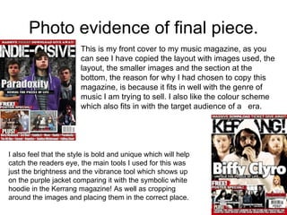
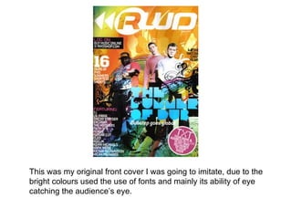
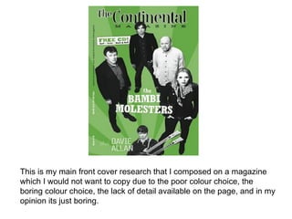
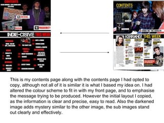
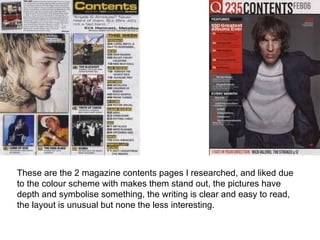
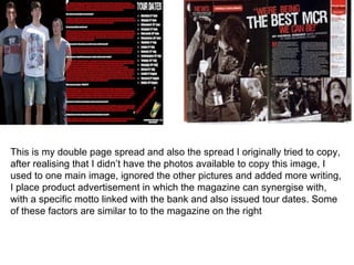
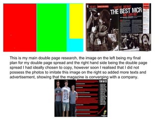
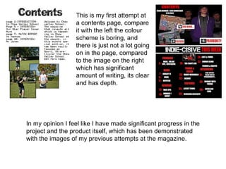
Media Year 12

MUSIC MAGAZINE
 JACK MORRIS
My music magazine is based on indie music, with a hint of rock, the
  way in which I have emulated this style of music is by copying a
  Kerrang magazine and its layout, the images used the layout of the
  images and writing, and the information used on there. With my
  final photos used I used a group shot of 3 people who I believe
  have the correct look and fit in with what the magazine is
  attempting to project. With my photos I lowered the brightness and
  contrast but increased the vibrance making the image stand out
  and appeal, it also allows you not to diverse attention away from
  the images and focus purely on the writing. I also copied the
  contents page and double pages spread from the magazine
  Kerrang which also fitted in with the type of audience I am trying to
  reach, the colours used are simple, in the form of black red and
  white, this in effect makes the other colours in the pictures more
   vibrant and stand them out.
Photo evidence of final piece.
                        This is my front cover to my music magazine, as you
                        can see I have copied the layout with images used, the
                        layout, the smaller images and the section at the
                        bottom, the reason for why I had chosen to copy this
                        magazine, is because it fits in well with the genre of
                        music I am trying to sell. I also like the colour scheme
                        which also fits in with the target audience of a era.


I also feel that the style is bold and unique which will help
catch the readers eye, the main tools I used for this was
just the brightness and the vibrance tool which shows up
on the purple jacket comparing it with the symbolic white
hoodie in the Kerrang magazine! As well as cropping
around the images and placing them in the correct place.
This was my original front cover I was going to imitate, due to the
bright colours used the use of fonts and mainly its ability of eye
catching the audience’s eye.
This is my main front cover research that I composed on a magazine
which I would not want to copy due to the poor colour choice, the
boring colour choice, the lack of detail available on the page, and in my
opinion its just boring.
This is my contents page along with the contents page I had opted to
copy, although not all of it is similar it is what I based my idea on. I had
altered the colour scheme to fit in with my front page, and to emphasise
the message trying to be produced. However the initial layout I copied,
as the information is clear and precise, easy to read. Also the darkened
image adds mystery similar to the other image, the sub images stand
out clearly and effectively.
These are the 2 magazine contents pages I researched, and liked due
to the colour scheme with makes them stand out, the pictures have
depth and symbolise something, the writing is clear and easy to read,
the layout is unusual but none the less interesting.
This are the 2 contents page magazines I researched and tried to avoid,
due to the poor layout, poor colour scheme, and amount of detail based on
each of them.
This is my double page spread and also the spread I originally tried to copy,
after realising that I didn’t have the photos available to copy this image, I
used to one main image, ignored the other pictures and added more writing,
I place product advertisement in which the magazine can synergise with,
with a specific motto linked with the bank and also issued tour dates. Some
of these factors are similar to to the magazine on the right
This is my main double page research, the image on the left being my final
plan for my double page spread and the right hand side being the double page
spread I had ideally chosen to copy, however soon I realised that I did not
possess the photos to imitate this image on the right so added more texts and
advertisement, showing that the magazine is converging with a company.
I would probably distribute and advertise my magazine, throughout
   other magazine in one big magazine conglomerate, due to that fact
   the magazine would be new on the block, therefore people would be
   unfamilar with it, which may keep sells at an all time low, however if
   I advertised in through a bigger magazine company in which people
   trust then it may increase sells, but nonetheless it must also fit in
   with the genre of the magazine. Finally I would also distribute and
   advertise on social websites such as Tumblr, Facebook and Twitter
   as a lot of people use these websites which makes them a good
   opportunity to reach out to audiences. The people that are aimed to
   be reached are ordinary people who enjoy a specific type of music,
   they don’t have to fit an expect image, just whether they enjoy the
   music or not. The written articles consist of experience that people
   may be able to link to, they language is clear and no challenging
   due to the fact that the magazine can be brought by any age, if there
   was a restriction on the ages, the an entire audience would be
   cancelled out, the text also comes across as humble and pleased to
   be in the position they as the band have been granted, which can
   make the audience enjoy and appreciate the band which may have
   a positive effect on the magazine.
Bauer media


        Kerrang                  Q                  Mojo


                         Indie-cisive.
This would be the marketing production line that I would consider, the
   conglomerate being beaur would distribute the renown magazines such
   as Kerrang, Q and Mojo these would then advertise Indie-cisive.
The magazine would also be available online due to the increase in
  technology meaning that more people can download and search on
  devices such as ipod, phones and ipads, I would produce a pre sells
  edition so people could see what the magazine may consume, but I
  wouldn’t let them see the magazine fully without paying, this is
  because a sustainable profit must be brought in to keep the
  company/magazine going. But that would be my main view on
  distribution and exhibition. However I would also marketise and
  advertise in universities and college, as I believe it fits in well with
  the magazines age range target, nevertheless I also feel it goes with
  the people personalities who go to universities or colleges,
  independent, different, and also act in the rebellious manner,
  rejecting the norms presented to them, acting as individual.
The main audfience attempting to be reach through my media product, can be
shown in my media package for example through the typical readers section, and
dalso by display the raegt audience


• Age- the ages range would be from 15-30 mainly due to the attitudes and ideas
presented by the magazine, in which I believe only this age range would
understand, it must also represent there age which the magazine does do.
•Gender- there is no specific gender specification, aslong as the individual enjoys
the type of music, ideas presented and can relate to the magazine there is not a
massive issue which gender buys the magazine
•Social background- the socila background would be either working class or middle
class, due to the ideas presented in the product but also due to the care free
atttudes and mottos presented, personally I feel would not fit in with higher class
individuals
•Interests and character types- the individuals interest would have to relate to the
magazine and the message that is trying to be transmitted, care free attitude,
constant fun, engaging, different and unique and have a love for the music
presented
•Religion and ethinicity- the product does not really relate to much religions or
ethnicities, due to the values and ideas presented in the product would not be
accept in a lot of religion, also it does not really speak for other ethnicities.
I feel I mainly attracted the audience, by demonstrating something that
they can all relate to, with a simple but yet bold colour scheme, image
revolving around their own age, the text was clearly and interesting to the
eye, the synergy with red bull which represent the magazine as energetic
which the audience can relate to and specifically people in the age range
obtain, the name of the product ‘indie-cisive’ meaning undecided, can
relate to the age group also in that they don’t quite know what individual
they want to be yet,
I have developed several new skill since starting the course, not only
developing them, but how to use them efficiently and to effect, they often
make the magazine look much more interesting and adds depth, one of the
main factors I liked the most is how you could alter a photo to make it
relate more to your magazine theme.
When developing these skills and placing them onto my product there
were two in particular which I used on my photos, which was the
brightness tool and vibrance tool


   The main reason for why I opted to use these 2 main tools more than any
   other as it adds as specific amount of darkness around the picture but
   nonetheless also makes it stand out with the vibrance tool,
In my opinion I have developed massively over the course of the year,
developing my skills and the amount of effect they have. I now have a
better understand of important factors such as layout, colour scheme,
font used and the pictures use ( which individual almost must have a
specific effect).


  This on the left is my first effort at making a magazine product, you
  can clearly see it has a lack of writing, image depth and alteration, it
  just does not compare in my opinion to the image on the right.
This is my first attempt at
                  a contents page, compare
                  it with the left the colour
                  scheme is boring, and
                  there is just not a lot going
                  on in the page, compared
                  to the image on the right
                  which has significant
                  amount of writing, its clear
                  and has depth.


In my opinion I feel like I have made significant progress in the
project and the product itself, which has been demonstrated
with the images of my previous attempts at the magazine.

Media year 12

  • 1.
    Media Year 12 MUSICMAGAZINE JACK MORRIS
  • 2.
    My music magazineis based on indie music, with a hint of rock, the way in which I have emulated this style of music is by copying a Kerrang magazine and its layout, the images used the layout of the images and writing, and the information used on there. With my final photos used I used a group shot of 3 people who I believe have the correct look and fit in with what the magazine is attempting to project. With my photos I lowered the brightness and contrast but increased the vibrance making the image stand out and appeal, it also allows you not to diverse attention away from the images and focus purely on the writing. I also copied the contents page and double pages spread from the magazine Kerrang which also fitted in with the type of audience I am trying to reach, the colours used are simple, in the form of black red and white, this in effect makes the other colours in the pictures more vibrant and stand them out.
  • 3.
    Photo evidence offinal piece. This is my front cover to my music magazine, as you can see I have copied the layout with images used, the layout, the smaller images and the section at the bottom, the reason for why I had chosen to copy this magazine, is because it fits in well with the genre of music I am trying to sell. I also like the colour scheme which also fits in with the target audience of a era. I also feel that the style is bold and unique which will help catch the readers eye, the main tools I used for this was just the brightness and the vibrance tool which shows up on the purple jacket comparing it with the symbolic white hoodie in the Kerrang magazine! As well as cropping around the images and placing them in the correct place.
  • 4.
    This was myoriginal front cover I was going to imitate, due to the bright colours used the use of fonts and mainly its ability of eye catching the audience’s eye.
  • 5.
    This is mymain front cover research that I composed on a magazine which I would not want to copy due to the poor colour choice, the boring colour choice, the lack of detail available on the page, and in my opinion its just boring.
  • 6.
    This is mycontents page along with the contents page I had opted to copy, although not all of it is similar it is what I based my idea on. I had altered the colour scheme to fit in with my front page, and to emphasise the message trying to be produced. However the initial layout I copied, as the information is clear and precise, easy to read. Also the darkened image adds mystery similar to the other image, the sub images stand out clearly and effectively.
  • 7.
    These are the2 magazine contents pages I researched, and liked due to the colour scheme with makes them stand out, the pictures have depth and symbolise something, the writing is clear and easy to read, the layout is unusual but none the less interesting.
  • 8.
    This are the2 contents page magazines I researched and tried to avoid, due to the poor layout, poor colour scheme, and amount of detail based on each of them.
  • 9.
    This is mydouble page spread and also the spread I originally tried to copy, after realising that I didn’t have the photos available to copy this image, I used to one main image, ignored the other pictures and added more writing, I place product advertisement in which the magazine can synergise with, with a specific motto linked with the bank and also issued tour dates. Some of these factors are similar to to the magazine on the right
  • 10.
    This is mymain double page research, the image on the left being my final plan for my double page spread and the right hand side being the double page spread I had ideally chosen to copy, however soon I realised that I did not possess the photos to imitate this image on the right so added more texts and advertisement, showing that the magazine is converging with a company.
  • 11.
    I would probablydistribute and advertise my magazine, throughout other magazine in one big magazine conglomerate, due to that fact the magazine would be new on the block, therefore people would be unfamilar with it, which may keep sells at an all time low, however if I advertised in through a bigger magazine company in which people trust then it may increase sells, but nonetheless it must also fit in with the genre of the magazine. Finally I would also distribute and advertise on social websites such as Tumblr, Facebook and Twitter as a lot of people use these websites which makes them a good opportunity to reach out to audiences. The people that are aimed to be reached are ordinary people who enjoy a specific type of music, they don’t have to fit an expect image, just whether they enjoy the music or not. The written articles consist of experience that people may be able to link to, they language is clear and no challenging due to the fact that the magazine can be brought by any age, if there was a restriction on the ages, the an entire audience would be cancelled out, the text also comes across as humble and pleased to be in the position they as the band have been granted, which can make the audience enjoy and appreciate the band which may have a positive effect on the magazine.
  • 12.
    Bauer media Kerrang Q Mojo Indie-cisive. This would be the marketing production line that I would consider, the conglomerate being beaur would distribute the renown magazines such as Kerrang, Q and Mojo these would then advertise Indie-cisive.
  • 13.
    The magazine wouldalso be available online due to the increase in technology meaning that more people can download and search on devices such as ipod, phones and ipads, I would produce a pre sells edition so people could see what the magazine may consume, but I wouldn’t let them see the magazine fully without paying, this is because a sustainable profit must be brought in to keep the company/magazine going. But that would be my main view on distribution and exhibition. However I would also marketise and advertise in universities and college, as I believe it fits in well with the magazines age range target, nevertheless I also feel it goes with the people personalities who go to universities or colleges, independent, different, and also act in the rebellious manner, rejecting the norms presented to them, acting as individual.
  • 14.
    The main audfienceattempting to be reach through my media product, can be shown in my media package for example through the typical readers section, and dalso by display the raegt audience • Age- the ages range would be from 15-30 mainly due to the attitudes and ideas presented by the magazine, in which I believe only this age range would understand, it must also represent there age which the magazine does do. •Gender- there is no specific gender specification, aslong as the individual enjoys the type of music, ideas presented and can relate to the magazine there is not a massive issue which gender buys the magazine •Social background- the socila background would be either working class or middle class, due to the ideas presented in the product but also due to the care free atttudes and mottos presented, personally I feel would not fit in with higher class individuals •Interests and character types- the individuals interest would have to relate to the magazine and the message that is trying to be transmitted, care free attitude, constant fun, engaging, different and unique and have a love for the music presented •Religion and ethinicity- the product does not really relate to much religions or ethnicities, due to the values and ideas presented in the product would not be accept in a lot of religion, also it does not really speak for other ethnicities.
  • 15.
    I feel Imainly attracted the audience, by demonstrating something that they can all relate to, with a simple but yet bold colour scheme, image revolving around their own age, the text was clearly and interesting to the eye, the synergy with red bull which represent the magazine as energetic which the audience can relate to and specifically people in the age range obtain, the name of the product ‘indie-cisive’ meaning undecided, can relate to the age group also in that they don’t quite know what individual they want to be yet,
  • 16.
    I have developedseveral new skill since starting the course, not only developing them, but how to use them efficiently and to effect, they often make the magazine look much more interesting and adds depth, one of the main factors I liked the most is how you could alter a photo to make it relate more to your magazine theme. When developing these skills and placing them onto my product there were two in particular which I used on my photos, which was the brightness tool and vibrance tool The main reason for why I opted to use these 2 main tools more than any other as it adds as specific amount of darkness around the picture but nonetheless also makes it stand out with the vibrance tool,
  • 17.
    In my opinionI have developed massively over the course of the year, developing my skills and the amount of effect they have. I now have a better understand of important factors such as layout, colour scheme, font used and the pictures use ( which individual almost must have a specific effect). This on the left is my first effort at making a magazine product, you can clearly see it has a lack of writing, image depth and alteration, it just does not compare in my opinion to the image on the right.
  • 18.
    This is myfirst attempt at a contents page, compare it with the left the colour scheme is boring, and there is just not a lot going on in the page, compared to the image on the right which has significant amount of writing, its clear and has depth. In my opinion I feel like I have made significant progress in the project and the product itself, which has been demonstrated with the images of my previous attempts at the magazine.