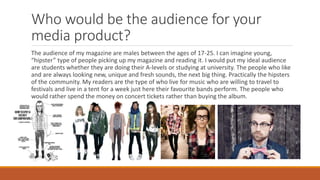
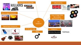
- The document describes the target audience for a proposed music magazine as males aged 17-25, particularly students, "hipsters," and people passionate about discovering new music.
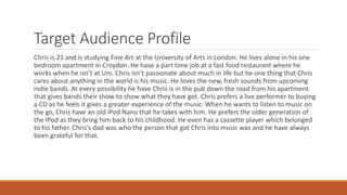
- It provides an example target audience profile of "Chris," a 21-year-old art student who loves live music and discovering new indie bands.
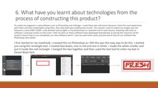
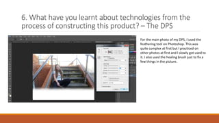
- In developing the magazine, the creator learned new software skills in Photoshop, Illustrator, and InDesign and improved existing skills to construct the cover, spreads, and other elements of the magazine professionally.
The document summarizes the evaluation of a music magazine created by the student for a class project. It discusses several ways the magazine challenged conventions of real music magazines, such as placing page numbers at the top of pages rather than the bottom. It also targeted an older age range of 16-24 rather than the typical younger audience. The student learned about technologies like Photoshop and survey tools in creating the magazine. Overall, the student felt their final product was a major improvement over their preliminary task, with better design, layout, and ability to attract readers.
1) The document describes the process and techniques used to create an indie rock music magazine as part of a school assignment, including conducting research on existing magazines and reader surveys.
2) Key techniques included using simple color schemes, many images as preferred by readers, informal language to connect with the target audience of teenagers and young adults, and featuring new band releases and concert dates.
3) The intended distribution methods included both print and digital formats at music venues, festivals, and retailers to reach the target audience who have a passion for music.
The document summarizes a student's media project creating a music magazine. The student used conventions from real music magazines like NME in their magazine's design but also challenged some conventions. They included a front cover, contents page, and double page interview spread that drew inspiration from NME in terms of layout, images, and use of color while also making some unique design choices. The magazine's target audience is described as males and females aged 15-25 interested in indie music.
The document summarizes how the author created a music magazine by researching and analyzing existing magazines like VIBE, RAP-UP, and Billboard. The author followed the layout, design conventions, and codes of VIBE magazine because it targeted a similar audience. Key elements copied from VIBE included the masthead design, placement of the model and text on the cover, contents page layout, and double page spread format. The author's magazine challenged conventions by using original article fonts and banners. The intended audience was described as 16-25 year olds interested in hip hop/R&B music, fashion, and partying.
- The document describes a student's process of creating a music magazine as a class project. They wrote an article, took photos, and designed the front cover, contents page, and layout.
- They surveyed 10 people about the magazine. Respondents said the photos made it look professional and the article seemed genuine and journalistic.
- The student learned about using InDesign, Photoshop, blogging and researching online to design and produce their magazine. They improved at using fonts, colors and images cohesively from their initial task.
The document describes a student's music magazine project. They produced a front cover, contents page, and double-page article. They conducted audience testing with 10 people and received feedback on various aspects of the magazine like the title, genre, layout, and authenticity. The majority of testers felt the magazine looked professional and was engaging.
The document describes the design elements used in a magazine product that were meant to attract its target audience. Conventions like mastheads, cover lines, and contents pages were used. Photographs were a key design element, and effects like fog and color splashes were used. Feedback indicated the target audience engaged with the band featured, the color scheme, and language used. Technologies like digital cameras and Photoshop were used to take and edit photographs and design magazine elements like titles.
The document discusses the media student Victoria Montague's media evaluation assignment. It summarizes how her magazine product uses conventions of real magazines, such as including a masthead, main image, and cover lines on the front cover. It represents younger audiences who enjoy indie music by featuring an indie rock band called PostFace on the cover. The target audience is teenagers and young adults aged 15-24, mostly from working to middle class backgrounds. A suitable media institution to distribute the magazine would be Bauer Media, as they currently distribute similar magazines aimed at the same audience.
The document summarizes a critical evaluation of a media product called "MuseMe" magazine created by Lois Hill. Some key points:
1) The magazine uses conventions of real magazines like clear headings and color schemes, but challenges some conventions like placing the heading in the middle of a double page spread.
2) The magazine targets 16-18 year olds by featuring music genres they like and using language appropriate for teenagers.
3) The front cover image of two teenage artists in casual poses is intended to attract the target audience by relating to their style.
4) Through creating the magazine, the author learned skills with Photoshop and how to choose appropriate photos to reflect the magazine's style
The document is a reflection on a student's media studies assignment to create a music magazine. Some key points:
1) The student incorporated common magazine conventions like mastheads, cover lines, and barcodes to make the magazine look professional.
2) The contents page and double page spread were influenced by the magazine Vibe for their layout and typography.
3) Photoshop skills improved in editing images and creating a cohesive design.
4) The target audience of 16-25 year olds interested in hip hop/R&B was addressed with attention-grabbing cover lines and articles on popular artists.
The document discusses the design of a magazine cover, contents page, and article spread. It addresses how these designs follow conventions of real magazines in their genres or challenge conventions. The cover follows conventions like prominent masthead and placement of key information. The contents page lists articles clearly but uses an unconventional layout. The article spread places a large image on one page as is typical but includes an atypical teaser.
The student created a music magazine called N/A for a media studies evaluation. They used both conventional and unconventional conventions from other music magazines in their front cover and contents page layout. To attract their target audience of 13-18 year old rock music fans, primarily male, they used red coloring prominently based on audience research. Through the process, the student learned new skills in Adobe Photoshop and the importance of elements like image quality and lighting when designing the magazine. They felt their final product was an improvement over the preliminary task by using more professional design elements.
The document summarizes a student's evaluation of their music magazine project. It discusses the various conventions and techniques used in different sections of the magazine, including the cover, contents page, double page spread, and how the magazine represents and attracts its target audience. The student learned various technologies in constructing the magazine, including using Photoshop, blogs, and online research to develop the concept and visual style of the magazine.
The document summarizes how the magazine uses, develops, and challenges conventions of real magazines in its design. For the front cover, it follows conventions like including a masthead, main image, price and date, but challenges conventions by placing the masthead sideways and not including additional design elements. For the contents page, it uses conventional elements like columns and main images but challenges conventions by omitting the editor's letter. The double page spread develops conventions through the main image but also follows conventions with design choices like drop caps and bylines.
The document discusses the process of creating a magazine and what was learned. Key points include:
- Researching conventions of existing magazines helped in challenging conventions, such as using a non-sexualized female image and positioning the barcode.
- Technologies like Photoshop, InDesign, digital cameras and the internet were used and taught skills like photo lighting and combining programs.
- Research is important before creating a magazine to understand the audience, representation, institutions and conventions to make a professional product.
- Learning new software programs and the importance of research has helped improve skills and create a higher quality magazine compared to the preliminary version.
The document describes the design and layout choices made for the Repeat magazine. It discusses how the Repeat magazine uses the layout conventions of the NME magazine, such as the cover image placement and bold sans serif fonts. It also describes design choices made to make the Repeat magazine distinct from NME, such as the use of additional colors in the masthead. The document also discusses layout choices for the contents page and double page spread, and how these challenge conventions by reducing clutter compared to NME.
This document contains an evaluation of a media product created by the author. It discusses several ways in which the author's media product both uses conventions of real media products and challenges some conventions. It addresses how the product represents a particular social group (young people aged 16-18) through techniques like cover images and bright colors. The document also discusses what type of media institution might distribute the product and who the target audience is. It describes how the audience was attracted through elements like colors, images, and cover lines. Finally, it reflects on what was learned about technologies and the creative process through constructing this media product.
This document contains an evaluation of the student's final music magazine project. It discusses how the magazine challenged conventions by placing page numbers at the top of pages rather than the bottom. It also targeted an older age range of 16-24 rather than the typical 9-15. The magazine represented this social group through its mature design, language, and focus on pop/chart music. The student explains they would distribute the magazine through IPC Media/Time Inc. due to its large magazine portfolio and existing music titles like NME.
The document describes the development of a music magazine media product. It discusses conventions used such as placement of masthead, images, barcodes and page numbers. The target audience is identified as 16-24 year olds. Strategies to attract this audience included using relevant images and designs, and offering free items. The creator learned skills in using professional cameras, Photoshop, and InDesign to construct the magazine, and how to effectively edit images and follow conventions.
The document discusses the media product's use of conventions and challenges to magazine conventions. The cover follows conventions like magazine layout but uses an unconventional close-up image. The contents page generally follows conventions but has an unconventional layout. The double page spread follows conventions like dominant images but challenges conventions through limited text.
The document discusses the design choices made for a magazine product. It describes using a close-up image of a model not looking at the camera on the front cover to make it unique. Inspiration was taken from other magazines found online, including using a bold box around the tagline and a bold white background. The double page spread uses color and photos of the model having fun to reflect her personality. Headlines are kept to the left for clarity. The contents page is designed simply for understandability compared to overcrowded examples. The target audience is identified as those interested in R&B music ages 13 to 25, represented through the female model, colors, and fresh font. Potential distribution outlets like iTunes and Facebook are mentioned.
AS Media Studies - Music Magazine Evaluation SundasBostan
The document discusses the author's choice to create a hip-hop music magazine targeted towards 16-24 year olds. A survey found this age group prefers hip-hop music because it relates to their generation and lifestyle. The magazine, called "Amplify", uses conventions from real music magazines such as positioning exclusive interviews in the left third and including a strap line under the masthead. Images on the cover and inside pages feature urban styles and poses to appeal to readers.
The document describes the process of creating a music magazine called "Grime Time" focused on the grime music genre. The creator analyzed existing magazines like RWD and Vibe to follow conventions of layout, design and target demographics. Photoshop was used to design the front cover, contents page and double page spread, applying techniques learned from other magazines. The magazine aims to represent its target audience of 16-19 year old males through the style of clothing worn by models and choice of setting near the Thames river.
This document discusses a music magazine media product created by the author. It provides details on the target audience, design conventions used, and what was learned from creating the magazine. The target audience was 16-26 year olds, represented through color scheme, fonts, images, and language focused on indie music. Distribution through a company like IPC Media was considered due to their success with similar magazines. The process taught the author about technologies like Photoshop, blogging, and how mobile/social media could engage the target audience.
The document discusses the target audience and goals for a proposed music magazine. The target audience is described as young adults and late teens, especially females, interested in music and attending concerts and festivals. The magazine aims to provide inspiration and attract a more literate audience. It also aims to challenge conventions by using a minimalist layout compared to most magazines. The magazine represents youth who listen to indie and rock music and enjoy live performances. It may be distributed as both a print and digital publication.
This document contains information about Emma Foley's media studies portfolio project on constructing a music magazine called "Rush". It includes details of her target audience for the magazine, which is primarily male students aged 15-25 who enjoy indie music. It also discusses how she addressed this audience through the visuals and content of the magazine, such as featuring a young male musician on the cover. The document outlines how Emma used technologies like Photoshop and page layout tools in Microsoft Word to design the magazine pages. It analyzes how the magazine represents the indie music genre and audience. Overall, the document evaluates how Emma's magazine uses conventions of real media formats and how she has developed her skills in media design and targeting audiences.
This document is a student's evaluation of their media coursework project creating a magazine. The student learned important skills like using Photoshop and different camera techniques. They conducted research on conventions of music magazines and the target genre. For their final project, the student photographed a friend's indie pop band for the cover to attract their intended teenage/young adult audience. Through completing this project, the student feels they have gained valuable experience with technologies like Photoshop and improved their skills in planning and researching for a realistic magazine.
The document describes a music magazine media product created by the author. It uses conventions of real magazines such as a masthead, cover lines, and table of contents. Images on the cover and inside pages represent young men and women in the target demographic. The magazine would be distributed online through websites like Issuu to reach a wide younger audience. Advertising could generate revenue. The intended audience is 18-25 year olds interested in dance music and clubbing. Feedback found most readers were female aged 18-20 and liked the images, style, and fonts used. The author learned new technologies like Photoshop and online survey tools through the process.
The document summarizes a student's media coursework project creating a print music magazine. Some key points:
- The student researched conventions of existing music magazines to design their magazine, including large headlines, feature photos, and catchy titles.
- The magazine genre chosen was indie/rock and targeted teenage male audiences based on research of popular music genres and demographics.
- Feedback from a questionnaire showed people correctly identified the genre and target age range from the magazine's visual design.
- The process taught the student skills in using software like Photoshop, InDesign, and creating a blog to develop their project from an initial concept to a more polished final product.
The document discusses what the student learned from constructing their media product. They were already familiar with Adobe programs from prior experience. They learned how to use Wordpress, SurveyMonkey, and Premiere for the first time. While familiar with design programs, they learned the importance of research, planning, and understanding the target audience when creating a magazine. The progression from their preliminary task taught them to use space better and how much work goes into the planning and research behind a successful media product.
The student created a magazine front cover for their media product evaluation. They researched conventions from real music magazines to incorporate into their design. Key conventions included the masthead, main image, banner, and barcode. The masthead "Symph Magazine" targeted teen female readers. Research informed layout and color choices. The main image featured a female model holding a guitar to represent the music focus. A banner advertised an exclusive interview to attract buyers. The technology of Photoshop and Blogger supported editing images and documenting the process.
- The document evaluates a magazine created by Edward Gough about dubstep music.
- It compares the design and conventions used in Gough's magazine to a real rock magazine, highlighting differences in color scheme, font, and how the artist on the cover is portrayed.
- The target audience of Gough's magazine is described as 18-year old, white, urban males interested in making technological music to share online.
- A large media company like IPC Media would be suited to distribute the magazine to tap into the growing but untapped dubstep market.
- The intended audience would be young music creators looking for advice and wanting to improve their skills on a budget.
The document discusses the student's final evaluation of their media magazine product. It covers how the product used conventions of real magazines, represented a particular social group of older teenagers and young adults, and could be distributed by a media company like Emap. The student also discusses what they learned about technologies like Photoshop through constructing the product and how their skills improved from their preliminary task.
My magazine challenges conventions of other music magazines by using bright colors in the masthead and cover lines instead of advertisements. It represents teenagers aged 16-19 by featuring artists that appeal to this audience and portray them in a positive light. The magazine would be distributed by Rewind Creative Media as they promote similar UK artists and have successfully targeted the same audience in the past.
The document describes the process of creating a magazine for a target audience of 16-25 year olds interested in grime/hip hop music. It discusses conventions used including manipulating artist images to appeal to readers, using eye contact on the front cover. Formats like the contents page are addressed, aiming to continue the theme and style. Representation of the target audience as "gangster" types through clothing and poses is covered. The language, colors and images are designed to attract this audience's attention.
The student created a music magazine as part of an assignment to practice skills needed for their final project. They received feedback on their preliminary magazine which helped them improve aspects like using vibrant colors, large eye-catching images, and concise yet engaging cover lines for their final music magazine cover. Key lessons included the importance of layout, style and visual design elements in attracting readers and sales.
The student created a music magazine as part of an assignment to practice applying the forms and conventions of real media products. They used techniques such as making the magazine name and headline story stand out, placing articles and titles on the left side, and using a large background image on the front cover. The student conducted research on their target audience of 14-19 year old females and aimed to appeal to various social and demographic groups. They learned various technologies for image editing and publication layout.
The student created a music magazine as part of an assignment to practice skills needed for their final project. They received feedback on their preliminary magazine which helped them improve aspects like using vibrant colors, large eye-catching images, and concise yet engaging text on the front cover of their final music magazine.
The document summarizes the student's process for creating a music magazine as a media product. Key points covered include conventions used from real music magazines like unique titles, articles on the left side, and large background pictures. The intended audience is described as 14-19 year old females, and research was done using surveys to determine popular music genres and topics of interest. Technologies used included photo editing software and online surveys. Potential publishers mentioned are IPC, known for magazines like NME.
The document summarizes the student's process for creating a music magazine as a media product. Key points covered include conventions used from real music magazines like unique titles, articles on the left side, and large background pictures. The intended target audience is discussed as 14-19 year old females, and technologies learned include image editing and online surveys. Potential publishers mentioned are IPC who produce magazines like NME.
The student created a music magazine as part of an assignment to practice skills needed for their final project. They received feedback on their preliminary magazine which helped them improve aspects like using vibrant colors, large eye-catching images, and concise yet attention-grabbing text on the front cover of their final music magazine.
My media product aims to attract a primary audience of music fans aged 16-21 who enjoy indie music, fashion, and lifestyle. It focuses exclusively on promoting the indie genre. Research showed the most popular artist among fans was Alex Turner, so featuring him exclusively could draw attention. I would pitch the product to media institutions like IPC, who are more open to funding new ideas from independent creators. The magazine uses conventions of real media products in its design, with a prominent cover image and article previews to engage readers. Informal language helps address the younger target audience. Creating the magazine helped me learn skills in using software like Photoshop and how to operate hardware like digital cameras.
My aims were to create a sophisticated pop music magazine for 15-18 year old girls, as I found a gap in the market for this type of magazine. I used conventions from real magazines such as a competition to make the magazine more attractive. I included bubble pop outs to emphasize celebrity quotes. The magazine represents popular culture through sophisticated coloring and features an attractive young male artist on the cover to attract the target audience. It would be advertised through a large media institution like ICP Media alongside their other magazines that the target audience reads. The audience are girls ages 15-18 who love music, fashion, and socializing. The magazine would attract them through the colors used in research, featuring Joseph Mendez on the cover, and advertising
This document contains evaluation questions for a media product created by Rory Dickson-Stringer. It also describes how Rory used various media technologies in constructing, researching, planning, and evaluating the project. Rory used Google for initial research, Photoshop to design a poster and magazine cover, and PremierePro, which was relatively new to Rory, to edit video clips and add text/transitions for a movie trailer.
The document contains evaluation questions for a media product created by Rory Dickson-Stringer. It asks how the media product uses or challenges real media conventions, how effective the main product and supplemental texts are, and what was learned from audience feedback. Based on the feedback provided, most responses to Rory's trailer on YouTube and poster were positive, with one person providing suggestions for improvements that Rory has considered.
The student created a film trailer called "Slugger" along with an accompanying magazine cover and poster as ancillary texts. To effectively combine these media products, the student maintained consistency across color palette, camera techniques, and font/text styles. Specifically, dull colors like grey, white and black were used throughout, close-ups featured prominently, and text remained in white, black or red only. This consistency helped tie the products together and establish a cohesive identity.
The document discusses how the media product uses, develops, and challenges conventions of real media products. It analyzes the film poster, magazine masthead, trailer, and shots within. The poster challenges conventions by having a vertical title but develops on showing the antagonist's mask. The masthead challenges bold fonts but follows an indie style. Shots in the trailer follow conventions like establishing the setting and using close-ups for reactions, while one shot challenges using a killer's point of view. Overall, the response examines both conforming to and innovating on standard media forms and styles.
Horror films typically feature isolated settings like abandoned buildings, forests, or small towns. Technical elements contribute to the horror genre, including unsteady camerawork, point-of-view shots that involve the viewer, and low lighting that emphasizes darkness. Common props include weapons, masks, and body parts. Slasher films conventions include an unknown killer who wears a mask, young teenage victims with an innocent "final girl" as the main character, and isolated small town locations that should feel safe but are not.
- The document provides information about the target audience and design choices for a music magazine called "Fresh".
- The target audience is described as male students aged 17-25 who enjoy live music, festivals, and discovering new indie bands.
- To attract this audience, the magazine cover features a model looking directly at the camera, a clear call-out to win concert tickets, and uses a "blood splat" shape and different colored text to make certain stories stand out.
This document outlines Rory Dickson-Stringer's planning for a media studies research project on magazine design. It includes details on the target audience as young music fans ages 17-25, analysis of a similar magazine (NME) for inspiration, proposed color scheme and name ideas. Example advertisements and feature story ideas are listed to appeal to the target demographic. An example profile is created to represent the ideal reader. Overall the document provides foundational research and planning for the magazine concept.
This document provides an overview of Rory Dickson-Stringer's planning for a media studies research project on creating a music magazine. It includes details on the target audience for the magazine such as being mainly male aged 17-25, descriptions of the magazine's design with a dark color scheme and informal writing style, potential names for the magazine, example advertisements, and ideas for feature stories. An example profile of a potential reader named Chris is also included to portray the intended audience.
This magazine contains a main feature story about an artist as well as other shorter articles. The main feature includes an introduction to the artist with photos and quotes, followed by an interview. Additional sections provide background on other topics covered in the magazine.
2. Who would be the audience for your
media product?
The audience of my magazine are males between the ages of 17-25. I can imagine young,
“hipster” type of people picking up my magazine and reading it. I would put my ideal audience
are students whether they are doing their A-levels or studying at university. The people who like
and are always looking new, unique and fresh sounds, the next big thing. Practically the hipsters
of the community. My readers are the type of who live for music who are willing to travel to
festivals and live in a tent for a week just here their favourite bands perform. The people who
would rather spend the money on concert tickets rather than buying the album.
3. My
Audience
Influenced by…
Lives in large Cities
like London,
Manchester etc…
Shops at….
Male
17-25 year olds
Spend their money on…
Goes to gigs & festivals…
They listen to music like…
4. Target Audience Profile
Chris is 21 and is studying Fine Art at the University of Arts in London. He lives alone in his one
bedroom apartment in Croydon. He have a part time job at a fast food restaurant where he
works when he isn’t at Uni. Chris isn’t passionate about much in life but he one thing that Chris
cares about anything in the world is his music. He loves the new, fresh sounds from upcoming
indie bands. At every possibility he have Chris is in the pub down the road from his apartment
that gives bands their show to show what they have got. Chris prefers a live performer to buying
a CD as he feels it gives a greater experience of the music. When he wants to listen to music on
the go, Chris have an old iPod Nano that he takes with him. He prefers the older generation of
the IPod as they bring him back to his childhood. He even has a cassette player which belonged
to his father. Chris’s dad was who the person that got Chris into music was and he have always
been grateful for that.
5. To attract my audience I got my model to look directly into the camera as this would catch
someone’s eye if they were walking past a shop or etc… Also I have a clear, distinctive patch in
the corner which shows how you can win concert tickets. This will draw in any people as they
want a chance to win free concert tickets. Furthermore, I held the information in a blood splat
shape to attract people in. My masthead also sticks out from the rest of the magazine. I have
made the my pull quotes from my DPS a different colour as well. I chose the more rebellious
quotes as this would attract the readers in. I made the more important story in a larger font as I
wanted that story to stand out to the others as I feel that is the story that would more appealing
to my audience.
Q2: How did you attract/address
your audience?
6. Q2: How did you attract/address your
audience?
I made my magazine considerably cheaper than other magazines as people have less money
especially my target audience. Most of my readers are going to be students at university or at
college so they will be living on a student’s income and they would only have a part time job.
This addresses and attracts my audience.
I made he other stories smaller and all in red, this is not very eye catching so I added my
masthead in to eye to address the reader of the other stories.
7. Q3. How does your media product
represent particular social groups?
Age is mainly represented in my magazine.
My target audience is are the sort of “rebels of society” who don’t follow with normal social conventions, practically “the burnouts” My
model is based on my reader, she is someone who they aspire to be. My magazine represents the young males of the UK to be rebellious
and wild. On my DPS, I have used a pull quote saying “Have you heard most of the CR*P that have come out this year?” I wanted the
readers to know that the young generation are wild, manic and in a form crazy. This are the people most likely to be buying my magazine.
I used for the concert ticket prize I used a blood splat shape to hold the information in. When people saw I wanted them to think of
violence and gore which I wanted them to think of young adults. I was using the stereotype of boys loving to fight to represent my male
readers. Also, I wanted my female readers to different from the “girly girls” out there. That is my model isn’t where wearing a dress but
skinny jeans and a t-shirt with “The Rolling Stones” written on it. Class is also represent in my magazine as well. As my readers will most
likely be working class I wanted to represent them as I did for age, that they are frantic, wild, crazy and etc…
8. Q4. In what ways does your media product use,
develop or challenge forms and conventions of real
media products?
NME was the product I based my own on as we
have similar audiences and share the same kind of
music. These were some of the covers I looked at
towards the beginning of creating my own.
9. This was my annotated version of NME’s cover on MIA.
10. Eye contact
Masthead and Pull Quote in
large red font.
Straight face , no smile.
Representing the “bad girl”
Masthead copied on the
bottom of the page to attract
attention to the other stories
My own magazine annotated.
11. Q4. In what ways does your media product use,
develop or challenge forms and conventions of real
media products?
The NME magazine doesn’t seem to have a lot of
information on what else is in the magazine. Also doesn’t
have a lot text. I noticed this in a lot of NME’s covers and I
challenge this by including more info, prizes and exclusive
stories on my cover. Also NME haven’t got a sort of slogan
and I wanted one to make my magazine unique and
different to it.
12. 5. What kind of media institution might distribute your
media product and why?
My magazine would be available in most shops but mostly in large companies like WH Smith, Tesco and
etc… Also my readers could subscribe to an app so they can read it digitally as well as a hard copy. Time
Inc will publish and disturb my magazine. They could easily do this as they can do the same for a large
company like NME. They also have the expertise to promote my magazine. A new issue of Fresh will come
out monthly as it gives the customer a good range of time to buy the issue before the next one comes
out. Also every year, Fresh will sponsor a festival/gig where the people choose who performs. The reason
for this is because my target audience are the kind of people who goes out to festivals and gigs. There will
also be a lot of merchandise available like clothing apparel, mugs, key rings and etc…
Fresh would have is own website, Twitter account and even a Facebook profile. The reason for this is
because this will be the easiest and cheapest way to promote Fresh also my target demographic are the
younger generation and will be on social media sites such as these or at least have access to the internet
to view the site. I wanted a large technological presence as I feel this is the easiest way to connect with
my readers and successfully promote my magazine efficiently.
Time Inc also produce
and distribute NME
magazines.
13. 5. What kind of media institution might
distribute your media product and why?
This is an example of
the app button and it
on a phone screen.
The reason for wanting clothing
apparel is because if people start
to wear the t-shirts, the hats and
etc. Then it is like having a
walking billboard. This is great for
promoting the magazine.
14. 6. What have you learnt about technologies from the
process of constructing this product?
To create my magazine I used software such as Photoshop and InDesign. I used these two soft wares because I have the most experience
with them and feel comfortable using them. Also they both give professional results. The camera I used to collect my images was the
Panasonic Lumix DMC-FZ200. I only wanted natural lights in my photoshoot as I wanted it all to look natural. Anything new tools or
software I used was mainly on the cover. I feel my skills on these software have developed dramatically as during the construct of the
project I learnt how to use completely use new software which I now can work with easily and also learnt how to use software like
Photoshop even better.
I first started on my masthead, I created this on Photoshop as I felt this was the easy way to do this. I started
just using the rectangle tool. I created two boxes, one in red and one in white. I made the white smaller and
put it inside the red rectangle. I merged the two together and then used the text tool to enter my text in
Daniel Black font.
15. 6. What have you learnt about technologies from the
process of constructing this product? – The Cover
Firstly, I just placed my cover photo
on InDesign. I edited my photo on
Photoshop. I used tools like healing
brush and the dodge and burn tool.
Secondly, I placed my masthead on
to the magazine with the issue
number and the price. I mainly just
used the text tool to add these
features.
After that, I then added my slogan
underneath the masthead which I
used text tool to create. I also used
the text tool to create my main
feature story. To create my splat in
the top right corner, I used Abode
Illustrator, this was quite a
challenge to me as I have never
used this before.
Finally, I placed smaller version of
my masthead into the cover to show
the other features and added more
text with stories. I pasted in a
barcode as well and then that was it
finished.
These are three examples of
the tool I used to create my
cover.
16. 6. What have you learnt about technologies from the
process of constructing this product? – The DPS
For the main photo of my DPS, I used the
feathering tool on Photoshop. This was
quite complex at first but I practiced on
other photos at first and I slowly got used to
it. I also used the healing brush just to fix a
few things in the picture.
17. 7. Looking back at your preliminary task, what do you
feel you have learnt in the progression from it to the
full product?
The two on the left are my school magazines pages. The cover and the contents and the two on the left are my music magazine pages. I can see how my skills have developed over
time. When I was constructing my school magazine I had only just started using InDesign and wasn’t too confident with it but when we moved on to the music magazine, I can clearly
see where my skills have developed . I feel my contents page for my music mag have dramatically improved, it is more engaging and feels more professionally than my contents page.
My feedback on the cover for the school mag said I should make it clear separation between each story and I feel like I have achieved this in my music mag by using bullet points.
Finally, I have shown which are the bigger stories in my music magazine by using font size and colour of text.