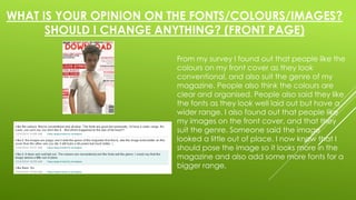
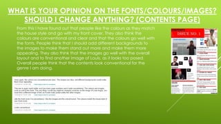
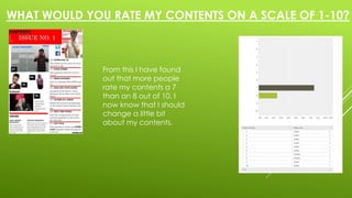
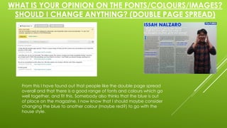
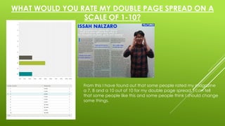
HOMEWORK- FEEDBACK ON 
FRONT PAGE, CONTENTS AND 
DOUBLE PAGE SPREAD
WHAT IS YOUR OPINION ON THE FONTS/COLOURS/IMAGES? 
SHOULD I CHANGE ANYTHING? (FRONT PAGE) 
From my survey I found out that people like the 
colours on my front cover as they look 
conventional, and also suit the genre of my 
magazine. People also think the colours are 
clear and organised. People also said they like 
the fonts as they look well laid out but have a 
wider range. I also found out that people like 
my images on the front cover, and that they 
suit the genre. Someone said the image 
looked a little out of place. I now know that I 
should pose the image so it looks more in the 
magazine and also add some more fonts for a 
bigger range,
WHAT WOULD YOU RATE THIS ON A SCALE OF 1-10? (FRONT 
COVER) 
From my feedback people have rated my 
magazine cover a 50% seven and a 50% eight out 
of 10. From this I can tell several people want me to 
change a few things about my cover.
WHAT IS YOUR OPINION ON THE FONTS/COLOURS/IMAGES? 
SHOULD I CHANGE ANYTHING? (CONTENTS PAGE) 
From this I have found out that people like the colours as they match 
the house style and go with my front cover. They also think the 
colours are conventional and clear and that the colours go well with 
the fonts. People think that I should add different backgrounds to 
the images to make them stand out more and make them more 
appealing. They also think that the images go well with the overall 
layout and to find another image of Louis, as it looks too posed. 
Overall people think that the contents look conventional for the 
genre I am doing.
WHAT WOULD YOU RATE MY CONTENTS ON A SCALE OF 1-10? 
From this I have found 
out that more people 
rate my contents a 7 
than an 8 out of 10. I 
now know that I should 
change a little bit 
about my contents.
WHAT IS YOUR OPINION ON THE FONTS/COLOURS/IMAGES? 
SHOULD I CHANGE ANYTHING? (DOUBLE PAGE SPREAD) 
From this I have found out that people like the double page spread 
overall and that there is a good range of fonts and colours which go 
well together, and fit this. Somebody also thinks that the blue is out 
of place on the magazine. I now know that I should maybe consider 
changing the blue to another colour (maybe red?) to go with the 
house style.
WHAT WOULD YOU RATE MY DOUBLE PAGE SPREAD ON A 
SCALE OF 1-10? 
From this I have found out that some people rated my magazine 
a 7, 8 and a 10 out of 10 for my double page spread. I can tell 
that some people like this and some people think I should change 
some things.

Feedback on front page, contents and double page spread.

  • 1.
    HOMEWORK- FEEDBACK ON FRONT PAGE, CONTENTS AND DOUBLE PAGE SPREAD
  • 2.
    WHAT IS YOUROPINION ON THE FONTS/COLOURS/IMAGES? SHOULD I CHANGE ANYTHING? (FRONT PAGE) From my survey I found out that people like the colours on my front cover as they look conventional, and also suit the genre of my magazine. People also think the colours are clear and organised. People also said they like the fonts as they look well laid out but have a wider range. I also found out that people like my images on the front cover, and that they suit the genre. Someone said the image looked a little out of place. I now know that I should pose the image so it looks more in the magazine and also add some more fonts for a bigger range,
  • 3.
    WHAT WOULD YOURATE THIS ON A SCALE OF 1-10? (FRONT COVER) From my feedback people have rated my magazine cover a 50% seven and a 50% eight out of 10. From this I can tell several people want me to change a few things about my cover.
  • 4.
    WHAT IS YOUROPINION ON THE FONTS/COLOURS/IMAGES? SHOULD I CHANGE ANYTHING? (CONTENTS PAGE) From this I have found out that people like the colours as they match the house style and go with my front cover. They also think the colours are conventional and clear and that the colours go well with the fonts. People think that I should add different backgrounds to the images to make them stand out more and make them more appealing. They also think that the images go well with the overall layout and to find another image of Louis, as it looks too posed. Overall people think that the contents look conventional for the genre I am doing.
  • 5.
    WHAT WOULD YOURATE MY CONTENTS ON A SCALE OF 1-10? From this I have found out that more people rate my contents a 7 than an 8 out of 10. I now know that I should change a little bit about my contents.
  • 6.
    WHAT IS YOUROPINION ON THE FONTS/COLOURS/IMAGES? SHOULD I CHANGE ANYTHING? (DOUBLE PAGE SPREAD) From this I have found out that people like the double page spread overall and that there is a good range of fonts and colours which go well together, and fit this. Somebody also thinks that the blue is out of place on the magazine. I now know that I should maybe consider changing the blue to another colour (maybe red?) to go with the house style.
  • 7.
    WHAT WOULD YOURATE MY DOUBLE PAGE SPREAD ON A SCALE OF 1-10? From this I have found out that some people rated my magazine a 7, 8 and a 10 out of 10 for my double page spread. I can tell that some people like this and some people think I should change some things.