Download to read offline


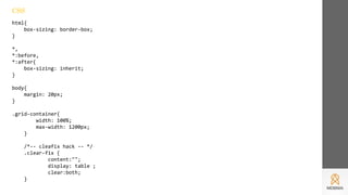
![[class*='col-'] {
float: left;
min-height: 1px;
width: 16.66%;
/*-- our gutter -- */
padding: 12px;
background-color: #FFDCDC;
}
.col-1{ width: 16.66%; }
.col-2{ width: 33.33%; }
.col-3{ width: 50%; }
.col-4{ width: 66.66%; }
.col-5{ width: 83.33%; }
.col-6{ width: 100%; }
.outline, .outline *{
outline: 1px solid #F6A1A1;
}](https://image.slidesharecdn.com/css-170725143611/85/CSS-14-320.jpg)
![/*-- some extra column content styling --*/
[class*='col-'] > p {
background-color: #FFC2C2;
padding: 10px;
margin: 0;
text-align: center;
color: white;
}](https://image.slidesharecdn.com/css-170725143611/85/CSS-15-320.jpg)


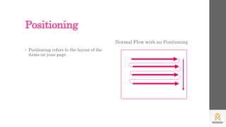
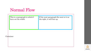
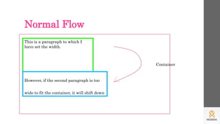
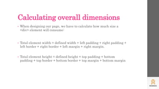
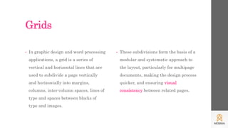
This document discusses CSS grids and layouts. It explains how positioning elements on a page allows for normal document flow and outlines the box model which treats each element as a box. Grids are then introduced as a way to subdivide pages into predictable rows and columns using CSS. Code examples are provided to demonstrate how to create a basic grid layout with different sized columns that respond to screen size.