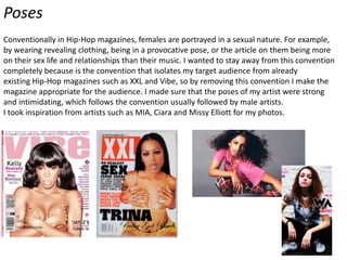
The document discusses conventions used in hip-hop magazines and how the product challenges or develops some of those conventions:
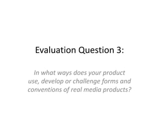
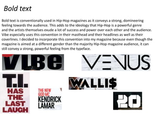
- Bold text and certain color schemes like red, black, and white are typically used but pink is used instead to appeal to a female audience.
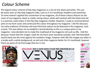
- Images are usually taken indoors but are taken outdoors against white walls to find a better scene with graffiti. Poses still aim to portray power and dominance however.
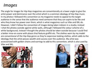
- Poses of the female artist are strong and intimidating rather than sexualized, challenging the convention of focusing on females' sex lives rather than their music.