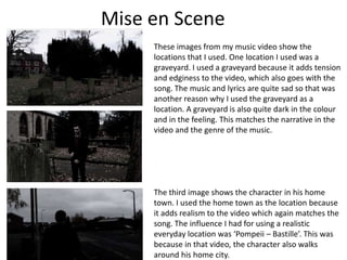
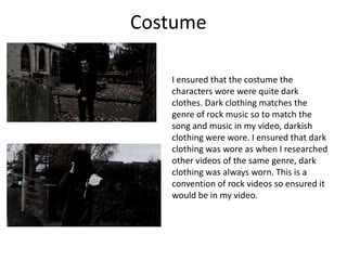
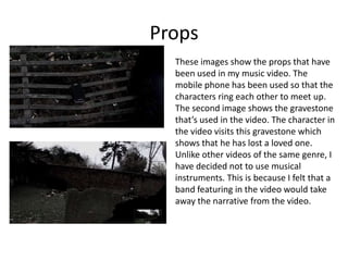
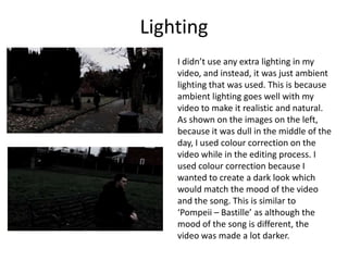
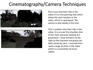
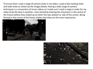
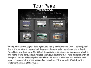
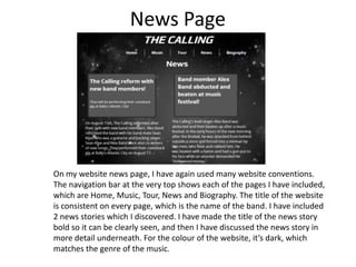
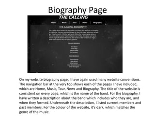
Evaluation Question1:

In what ways does your media
product use, develop or challenge
forms and conventions of real media
products?
Music Video
Mise en Scene
These images from my music video show the
locations that I used. One location I used was a
graveyard. I used a graveyard because it adds tension
and edginess to the video, which also goes with the
song. The music and lyrics are quite sad so that was
another reason why I used the graveyard as a
location. A graveyard is also quite dark in the colour
and in the feeling. This matches the narrative in the
video and the genre of the music.

The third image shows the character in his home
town. I used the home town as the location because
it adds realism to the video which again matches the
song. The influence I had for using a realistic
everyday location was ‘Pompeii – Bastille’. This was
because in that video, the character also walks
around his home city.
Costume
I ensured that the costume the
characters wore were quite dark
clothes. Dark clothing matches the
genre of rock music so to match the
song and music in my video, darkish
clothing were wore. I ensured that dark
clothing was wore as when I researched
other videos of the same genre, dark
clothing was always worn. This is a
convention of rock videos so ensured it
would be in my video.
Props
These images show the props that have
been used in my music video. The
mobile phone has been used so that the
characters ring each other to meet up.
The second image shows the gravestone
that’s used in the video. The character in
the video visits this gravestone which
shows that he has lost a loved one.
Unlike other videos of the same genre, I
have decided not to use musical
instruments. This is because I felt that a
band featuring in the video would take
away the narrative from the video.
Lighting
I didn’t use any extra lighting in my
video, and instead, it was just ambient
lighting that was used. This is because
ambient lighting goes well with my
video to make it realistic and natural.
As shown on the images on the left,
because it was dull in the middle of the
day, I used colour correction on the
video while in the editing process. I
used colour correction because I
wanted to create a dark look which
would match the mood of the video
and the song. This is similar to
‘Pompeii – Bastille’ as although the
mood of the song is different, the
video was made a lot darker.
Cinematography/Camera Techniques
This is one shot that I like in the
video. It is a nice panning shot which
shows the main location in the
video, which is a graveyard. The
camera is also steady in the shot.
This is another shot that I like in the
video. It is an over the shoulder shot
of the main character looking at a
gravestone. I have framed it at the
right so the character and grave can
both clearly be seen. I ensured that I
used a range of shots in the video
which is a convention of music
videos.
To ensure that I used a range of camera shots in my video, I used a few tracking shots
and wide shots as shown by the images below. Having a wide range of camera
techniques is a convention of music videos so I made sure I used a range in order for my
video to be the best it could be. I also started by framing the characters in the centre of
the frames before they ended up at either the top, bottom or side of the screen. Being
framed in the centre of the frame implies that they are the main importance.
Editing
The editing techniques that I used in the video were mainly straightforward cuts, fades in
and out of black, and transitions in between shots. I used straightforward cuts to show
passages of time. This is the simplest way to show passages of time so that the video’s
editing stays smooth. Fades in and out of black are used at the start and end of the video
which are used in most music videos. These both signify the start and end of videos. I used
fade transitions in between some shots, again to show passages of time. The editing pace
of my video depended on the pace of the song. The song was quite slow so I decided to
make the editing pace quite slow. If the song was quicker, I would have quickened up the
editing pace to match the pace of the song.
Narrative
My narrative was about a male character losing someone he loved. (a partner or a
family member) As the video and story progresses, we see that he has met someone
else. The story makes up the whole of my music video.
Other videos usually either involve just a bad and their instruments or the band
alongside a story. I have decided to just include a narrative, instead of the band in it
which I had previously planned.
Target Audience
I found that the target audience for my video is people aged from about 16 – 40. From my
audience research, I found that this age group mainly listened to rock music, and the gender
that mainly like this genre is Males.

This screenshot above shows who the people are that are
listening to The Calling now at this moment. The screenshot
shows how old the people are, where in the world they are
I didn't find any images of the band's gigs on google listening and what gender they are. From this, I can tell that
images but I did manage to find a video of a concert there are more males listening at the moment who are at the
ages of 21, 28 and 22. There is also 1 female listening and she
on youtube. I got a few glimpses of the audience.
There was a range of ages from both genders in the is aged 25. Each of the people are from a mix of countries such
audience, but I think it was mainly between 18-40. as France, USA, The Netherlands, Russia and Lithuania which
shows how wide The Calling's audience is From this I can tell
that The Calling have a wide audience in their 20s.
Digipak
My final digipak design was influenced by these images
of digipaks below. From looking at these, I wanted to
include photos from my music video on my digipak. The
image at the bottom right includes the band name and
album name at the top and bottom of the digipak. I
decided that I wanted to use this technique on my
digipak. The image at the bottom left shows a photo
from the music video as well as the track listing. Again,
this is what I wanted to include on my digipak design.
For the inside pane, I wanted to include some
information about the band, so, decided to include the
band members with what instruments they play. This is
inspired by this image on the left.
Final Digipak Design
I ensured that I used many digipak conventions on my digipak. I used photos
from my music video which are the main feature on each of my digipak panes.
These take up the whole of each of the 4 panes.
Outside Panels
On the front of the digipak, it’s a simple design where I have just included a
photo from the music video along with text of the band name and album name.
I made sure that the text stood out on the front cover.
On the back cover, I used several conventions. I used a photo from my music
video as the main image, the track listing, song timings, record label logo,
barcode, the band’s website, their facebook page and my name. I’ve added
effects to the text so that it isn’t too simple and so that the text stands out and
can be seen clearer.
Inside Panels
On the inside panels, I have used 2 main images again from the music video. On
the inside left panel, I made the CD design colour grey with text of the band and
album name. I put effects on this text to make it stand out. I have also included
the record label logo on the CD design. On the inside right panel, I added text of
the band members and what they play. Again, I put effects on this text to make
it stand out so it can be seen clearer.
Website
Home Page
On my website home page, I have
used many website conventions. The
navigation bar at the very top shows
each of the pages I have included,
which are Home, Music, Tour, News
and Biography. I have included latest
news on the home page, along with
some Tour locations. I have also
advertised the new album on their.
At the very bottom of the website, I
have included a couple of the band’s
songs. I have put these on the
website through Soundcloud so the
user can listen to the songs. For the
colour of the website, it’s dark, which
matches the genre of the music.
Music Page

On my website music page, I have used many website conventions. The
navigation bar at the very top shows each of the pages I have included, which
are Home, Music, Tour, News and Biography. I have described the new album
with more detail, as I have put the track listing and song timings. I have also
included my music video on this page for the user to view, and at the top right,
an iTunes button so the user can buy the song if they wish. At the very bottom
of the website, I have included a couple of the band’s songs. I have put these
on the website through Soundcloud so the user can listen to the songs. For the
colour of the website, it’s dark, which matches the genre of the music.
Tour Page

On my website tour page, I have again used many website conventions. The navigation
bar at the very top shows each of the pages I have included, which are Home, Music,
Tour, News and Biography. The title of the website is consistent on every page, which is
the name of the band. I have included the 6 tour locations that I have made up, with an
image of the arena showing the user where the tour is. I have also included the tour
dates underneath the arena images. For the colour of the website, it’s dark, which
matches the genre of the music.
News Page

On my website news page, I have again used many website conventions.
The navigation bar at the very top shows each of the pages I have included,
which are Home, Music, Tour, News and Biography. The title of the website
is consistent on every page, which is the name of the band. I have included
2 news stories which I discovered. I have made the title of the news story
bold so it can be clearly seen, and then I have discussed the news story in
more detail underneath. For the colour of the website, it’s dark, which
matches the genre of the music.
Biography Page

On my website biography page, I have again used many website conventions.
The navigation bar at the very top shows each of the pages I have included,
which are Home, Music, Tour, News and Biography. The title of the website is
consistent on every page, which is the name of the band. For the biography, I
have written a description about the band which includes who they are, and
when they formed. Underneath the description, I listed current members and
past members. For the colour of the website, it’s dark, which matches the
genre of the music.

Evaluation question 1

  • 1.
    Evaluation Question1: In whatways does your media product use, develop or challenge forms and conventions of real media products?
  • 2.
  • 3.
    Mise en Scene Theseimages from my music video show the locations that I used. One location I used was a graveyard. I used a graveyard because it adds tension and edginess to the video, which also goes with the song. The music and lyrics are quite sad so that was another reason why I used the graveyard as a location. A graveyard is also quite dark in the colour and in the feeling. This matches the narrative in the video and the genre of the music. The third image shows the character in his home town. I used the home town as the location because it adds realism to the video which again matches the song. The influence I had for using a realistic everyday location was ‘Pompeii – Bastille’. This was because in that video, the character also walks around his home city.
  • 4.
    Costume I ensured thatthe costume the characters wore were quite dark clothes. Dark clothing matches the genre of rock music so to match the song and music in my video, darkish clothing were wore. I ensured that dark clothing was wore as when I researched other videos of the same genre, dark clothing was always worn. This is a convention of rock videos so ensured it would be in my video.
  • 5.
    Props These images showthe props that have been used in my music video. The mobile phone has been used so that the characters ring each other to meet up. The second image shows the gravestone that’s used in the video. The character in the video visits this gravestone which shows that he has lost a loved one. Unlike other videos of the same genre, I have decided not to use musical instruments. This is because I felt that a band featuring in the video would take away the narrative from the video.
  • 6.
    Lighting I didn’t useany extra lighting in my video, and instead, it was just ambient lighting that was used. This is because ambient lighting goes well with my video to make it realistic and natural. As shown on the images on the left, because it was dull in the middle of the day, I used colour correction on the video while in the editing process. I used colour correction because I wanted to create a dark look which would match the mood of the video and the song. This is similar to ‘Pompeii – Bastille’ as although the mood of the song is different, the video was made a lot darker.
  • 7.
    Cinematography/Camera Techniques This isone shot that I like in the video. It is a nice panning shot which shows the main location in the video, which is a graveyard. The camera is also steady in the shot. This is another shot that I like in the video. It is an over the shoulder shot of the main character looking at a gravestone. I have framed it at the right so the character and grave can both clearly be seen. I ensured that I used a range of shots in the video which is a convention of music videos.
  • 8.
    To ensure thatI used a range of camera shots in my video, I used a few tracking shots and wide shots as shown by the images below. Having a wide range of camera techniques is a convention of music videos so I made sure I used a range in order for my video to be the best it could be. I also started by framing the characters in the centre of the frames before they ended up at either the top, bottom or side of the screen. Being framed in the centre of the frame implies that they are the main importance.
  • 9.
    Editing The editing techniquesthat I used in the video were mainly straightforward cuts, fades in and out of black, and transitions in between shots. I used straightforward cuts to show passages of time. This is the simplest way to show passages of time so that the video’s editing stays smooth. Fades in and out of black are used at the start and end of the video which are used in most music videos. These both signify the start and end of videos. I used fade transitions in between some shots, again to show passages of time. The editing pace of my video depended on the pace of the song. The song was quite slow so I decided to make the editing pace quite slow. If the song was quicker, I would have quickened up the editing pace to match the pace of the song.
  • 10.
    Narrative My narrative wasabout a male character losing someone he loved. (a partner or a family member) As the video and story progresses, we see that he has met someone else. The story makes up the whole of my music video. Other videos usually either involve just a bad and their instruments or the band alongside a story. I have decided to just include a narrative, instead of the band in it which I had previously planned.
  • 11.
    Target Audience I foundthat the target audience for my video is people aged from about 16 – 40. From my audience research, I found that this age group mainly listened to rock music, and the gender that mainly like this genre is Males. This screenshot above shows who the people are that are listening to The Calling now at this moment. The screenshot shows how old the people are, where in the world they are I didn't find any images of the band's gigs on google listening and what gender they are. From this, I can tell that images but I did manage to find a video of a concert there are more males listening at the moment who are at the ages of 21, 28 and 22. There is also 1 female listening and she on youtube. I got a few glimpses of the audience. There was a range of ages from both genders in the is aged 25. Each of the people are from a mix of countries such audience, but I think it was mainly between 18-40. as France, USA, The Netherlands, Russia and Lithuania which shows how wide The Calling's audience is From this I can tell that The Calling have a wide audience in their 20s.
  • 12.
  • 13.
    My final digipakdesign was influenced by these images of digipaks below. From looking at these, I wanted to include photos from my music video on my digipak. The image at the bottom right includes the band name and album name at the top and bottom of the digipak. I decided that I wanted to use this technique on my digipak. The image at the bottom left shows a photo from the music video as well as the track listing. Again, this is what I wanted to include on my digipak design. For the inside pane, I wanted to include some information about the band, so, decided to include the band members with what instruments they play. This is inspired by this image on the left.
  • 14.
  • 15.
    I ensured thatI used many digipak conventions on my digipak. I used photos from my music video which are the main feature on each of my digipak panes. These take up the whole of each of the 4 panes. Outside Panels On the front of the digipak, it’s a simple design where I have just included a photo from the music video along with text of the band name and album name. I made sure that the text stood out on the front cover. On the back cover, I used several conventions. I used a photo from my music video as the main image, the track listing, song timings, record label logo, barcode, the band’s website, their facebook page and my name. I’ve added effects to the text so that it isn’t too simple and so that the text stands out and can be seen clearer. Inside Panels On the inside panels, I have used 2 main images again from the music video. On the inside left panel, I made the CD design colour grey with text of the band and album name. I put effects on this text to make it stand out. I have also included the record label logo on the CD design. On the inside right panel, I added text of the band members and what they play. Again, I put effects on this text to make it stand out so it can be seen clearer.
  • 16.
  • 17.
    Home Page On mywebsite home page, I have used many website conventions. The navigation bar at the very top shows each of the pages I have included, which are Home, Music, Tour, News and Biography. I have included latest news on the home page, along with some Tour locations. I have also advertised the new album on their. At the very bottom of the website, I have included a couple of the band’s songs. I have put these on the website through Soundcloud so the user can listen to the songs. For the colour of the website, it’s dark, which matches the genre of the music.
  • 18.
    Music Page On mywebsite music page, I have used many website conventions. The navigation bar at the very top shows each of the pages I have included, which are Home, Music, Tour, News and Biography. I have described the new album with more detail, as I have put the track listing and song timings. I have also included my music video on this page for the user to view, and at the top right, an iTunes button so the user can buy the song if they wish. At the very bottom of the website, I have included a couple of the band’s songs. I have put these on the website through Soundcloud so the user can listen to the songs. For the colour of the website, it’s dark, which matches the genre of the music.
  • 19.
    Tour Page On mywebsite tour page, I have again used many website conventions. The navigation bar at the very top shows each of the pages I have included, which are Home, Music, Tour, News and Biography. The title of the website is consistent on every page, which is the name of the band. I have included the 6 tour locations that I have made up, with an image of the arena showing the user where the tour is. I have also included the tour dates underneath the arena images. For the colour of the website, it’s dark, which matches the genre of the music.
  • 20.
    News Page On mywebsite news page, I have again used many website conventions. The navigation bar at the very top shows each of the pages I have included, which are Home, Music, Tour, News and Biography. The title of the website is consistent on every page, which is the name of the band. I have included 2 news stories which I discovered. I have made the title of the news story bold so it can be clearly seen, and then I have discussed the news story in more detail underneath. For the colour of the website, it’s dark, which matches the genre of the music.
  • 21.
    Biography Page On mywebsite biography page, I have again used many website conventions. The navigation bar at the very top shows each of the pages I have included, which are Home, Music, Tour, News and Biography. The title of the website is consistent on every page, which is the name of the band. For the biography, I have written a description about the band which includes who they are, and when they formed. Underneath the description, I listed current members and past members. For the colour of the website, it’s dark, which matches the genre of the music.