1. Question 1:
MUSICBYTE used this utterly repulsive masthead, the colours for example yellow
doesn't go with the ethos of a music magazine, but its also big and bold which is what
I wanted to do for my magazine cover.
I chose to make it black because its a original magazine colour and it shouts out rock.
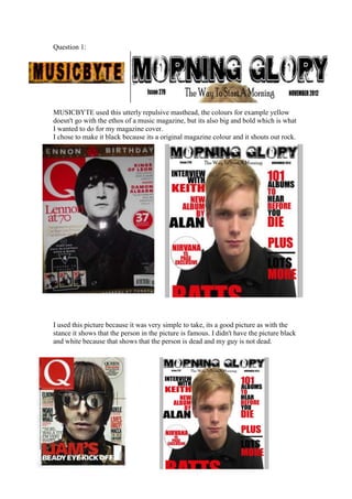
I used this picture because it was very simple to take, its a good picture as with the
stance it shows that the person in the picture is famous. I didn't have the picture black
and white because that shows that the person is dead and my guy is not dead.
2. I have kept the magazine simple with the colour scheme I have chosen to use red and
black because Q have and that they are original rock magazine colours. I have not
used gold though in my colour scheme because one I wanted to keep the magazine
simple and two I didn't think gold would fit in. I have also kept my magazine fonts
bold and in capital letters, I have done this because Q have and it really stands out and
makes people want to see it. I have also copied the layout of the main feature of the
magazine with the boldness and colour use.
I have used the Q contents page as my inspiration to use for my magazine. I have used
the basic layout of six columns across the double page, this allows me to have a lot of
images on the page and it makes it very nice and spread out. The use of the huge
numbers on each picture makes it easy to turn to that page when you open the
magazine. The use of red in the contents page makes it links to the front cover, and
sets the genre of the magazine.
The double page I've created is very similar to this, I like the use of space and
the single column of text. However mine is different because I've used a lot more
space and is easily spread on the page. There is a lot of self branding on this page
which I didn't like so the only thing that relates to the magazine title is the website
name at the bottom of the page.