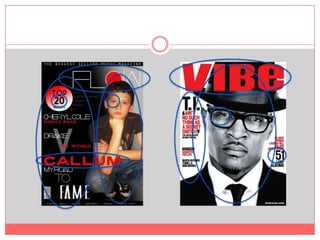
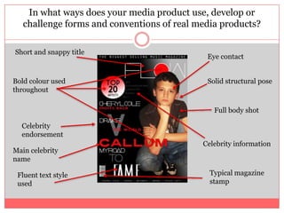
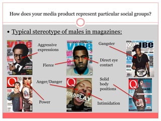
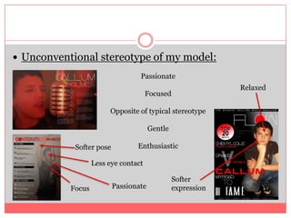
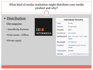
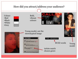
5. In what ways does your media product use, develop or challenge forms and conventions of real media products? Short and snappy title Eye contact Solid structural pose Bold colour used throughout Full body shot Celebrity endorsement Celebrity information Main celebrity name Typical magazine stamp Fluent text style used
6. Heading strip Consistent heading style Date and issue date present Bold headings Eye contact Typical page numbers Softer house style colours Celebrity information Unusual body position Long distance shot Fluent text styles
7. No eye contact Full image covering page Consistent text style House style is the same Bold text Face shot Typical page number Prop used for effect
8. Typical stereotype of males in magazines: How does your media product represent particular social groups? Gangster Aggressive expressions Direct eye contact Fierce Solid body positions Anger/Danger Power Intimidation
16. GreyBold, vibrant colours Young model, not the stereotypical image BUZZ words Young model Artists match chosen genre
17. What have you learnt about technologies from the process of constructing this product?
18. Looking back at your preliminary task, what do you feel you have learnt in the progression from it to the full product?
Editor's Notes
As you can see I have found a magazine cover that inspired me throughout the making of my own and highlighted the similarities between them both. I have done this to show how much of an impact this type and style of magazine had when creating and choosing the genre of my own magazine. Even though the layout is completely different, the basic foundations that magazines need are present in both.Firstly both magazine include the main heading and the name of the magazine. Both are bold and stand out on the magazine front. Both are in capitals and share similar style and colours. The font style is very modern and can suggest that the genre is something very modern.Both models are placed largely on the front cover standing out above most of the text. The image in my own magazine however is in colour in comparison to the black and white image used in ‘vibe’s’ magazine. Both have direct eye contact and reach out to the readers creating an immediate connection with the magazine.Both magazines include a strip of short story lines on the left hand side. This is where the eyes are drawn to first and therefore are very noticeable. This is a good rule to use as it grabs the attention of most people. The first third is what most people see due to the way we read.The house stlye of both magazines are very similar and therefore suggest the genre is the same. This is because red is a vibrant colour used and connotes many things such as ‘danger, emergency’ and therefore describes the artists inside the magazine, however this can be stereotypical.
Here is the comparison between my contents page and ‘Q’ contents page. Even though this magazine does not cover the genre I chose it still is a wanted layout of mine and therefore I chose this as inspiration. The washed out colours are very similar making it a softer feel instead of the bold block colours. The heading strip is very similar as this is one feature I was inspired by the most. The cover lines and pages are all down the left third along with the magazine I was influenced by.The image is on the same side of ‘Q’ even though it covers the whole magazine.
This is a comparison between my double page spread and the one of ‘vibe’. As you can see the colour schemes have been very influential and therefore are present in my magazine.The images cover the whole of the page and show movement or emotion and this is a feature I liked when researching.The story is on the opposite side of the page but still has the same layout: two columns and white bold text.The headings are very large and stand out over the background image.
This is my final front cover. I took inspiration from well known magazines such as ‘vibe’ and ‘billboard’. This is because the magazines cover the same musical genre that I chose to use. The colour red is inspired by the magazine ‘vibe’ due to it being a repetitive colour that the magazine chooses to use. Its a very masculine colour but also attracts women as it connotes many things. The masthead is large, short worded and easy to read, it is also a very modern font.The main headlines on this front cover are also large, bold and easy to read ensuring that the celebrity names help sell the magazine.I took tips from other well known magazines that I had researched and included an image showing the whole of my models body. The eyes connect with the audience which is a main feature that most magazines benefit from. This is due to it making the audience feel evolved and therefore they feel drawn to the magazine and want to read it more.
This is my contents page. This was a very different choice to the front cover as it adopts a softer tone of colour. This is due to the more washed out red instead of the bright red used in the front cover. The house style however is still current throughout both pages and therefore links together.The image is of the same model making acknowledgement that this is the main celebrity used. I took the fact that actions can be used in images in other well known magazines and therefore included a prop to make an action.The information and pages run on the left third of the page and draws the readers eyes.The background is the actual image and therefore there is no block colour used as there is on the front cover.The headings are on a block coloured rectangle making the headings stand out.The fonts and text styles are the same as the front cover therefore keeping a constant format in the magazine.
Here is my final double page spread. This is an interview with the main model used throughout the whole magazine. This is clearly shown as the image is an extreme close up of their face. This shows emotion and therefore makes the page feel completely different than the rest. I found this skill researching many different magazines.The red effect made on the image keeps the house style the same throughout the whole magazine without distorting the image.This image is very emotive and shows passion which enhances the value of the magazine.
Influential magazineSame genre of musicWill help to gain information on what distributors my magazine would need