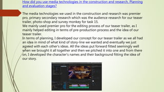
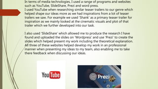
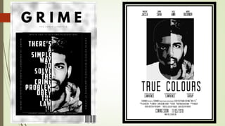
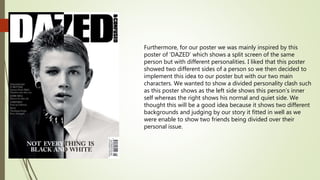
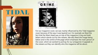
1. How did you use media technologies in the construction and research, Planning
and evaluation stages?
The media technologies we used in the construction and research was premier
pro, primary secondary research which was the audience research for our teaser
trailer, photo-shop and survey monkey for task 15.
We mainly used premier pro for the editing process of our teaser trailer, as I
mainly helped editing in terms of pre-production process and the idea of our
teaser trailer.
In terms of planning, I developed our concept for our teaser trailer as we all had
an idea in mind of what kind of story-line we wanted and eventually we just
agreed with each other's ideas. All the ideas put forward fitted seemingly well
when we brought it all together and then we pitched it into one and from there
on, I developed the character’s names and their background fitting the idea of
our story.
2. In terms of media technologies, I used a range of programs and websites
such as YouTube, SlideShare, Prezi and word press.
I used YouTube when researching similar teaser trailers to our genre which
helped shape our ideas more as we had inspirations from a lot of teaser
trailers we saw. For example we used ‘Shank’ as a primary teaser trailer for
inspiration as we mainly looked at the cinematic visuals and plot of that
trailer which we further developed into our task.
I also used ‘SlideShare’ which allowed me to produce the research I have
found and uploaded the slides on ‘Wordpress’ and use ‘Prezi’ to create the
slides which helped present my work including the theoretical explanation.
All three of these websites helped develop my work in an professional
manner when presenting my ideas to my team, also enabling me to take
there feedback when discussing our ideas.
3. Google, PowerPoint & Survey Monkey
I did most of my research through google when finding out key
information and details for our proposal. For example, Google allowed me
access to photos, locations and storylines which was another useful search
engine as I found a lot of distribution companies which I wasn’t familiar
with in the past. For example I learned about the distribution company
which we assigned to our film called ‘Revolver Entertainment’ which is a
distribution company that is attracted to urban style movies. I also found
the different fonts and images to use for my mood-board which related
well with our proposal.
For our primary research, I used survey monkey which is a free online
survey tool which captures information on what audiences likes or dislikes
in the world. I used this to capture feedback from our audiences which
made it easier for us to figure out our target audience using this survey. We
also used ‘Word’ when typing out our questions first in scratch which we
them imported to the survey to present our findings.
4. How effective is the combination of your main product and ancillary
texts?
The combination of our main product and ancillary text is effective because
they both compliment each other well in terms of style, objectives, and
essentially our theme. Our main product which is the teaser trailer has an
urban style attached to it with an dark and confusion fragment which suited
well as we were trying to portray a story of betrayal and friendship. This fits
in well with our ancillary texts because the magazine cover is seen as dark
and gloomy which portrays our antagonist well revealing his true colours as
the story goes on in the trailer.
The Second poster climaxes the divided friendship between both characters
as there is a line between their faces showing the binary oppositions of
‘Good vs Evil’ and ‘Hero vs Villian’. This poster is effective towards the end of
our teaser trailer when showing the betrayal of the antagonist and how
people change because of the circumstance and feelings the antagonist had.
This poster also has a dark edge to it as it mainly embarks on how jealousy
and envy ruined the so-long friendship between both characters which leads
to the antagonist revealing his true as he couldn’t put their differences aside
leaving them being against each other.
5.
6. Furthermore, for our poster we was mainly inspired by this
poster of ‘DAZED’ which shows a split screen of the same
person but with different personalities. I liked that this poster
showed two different sides of a person so we then decided to
implement this idea to our poster but with our two main
characters. We wanted to show a divided personality clash such
as this poster shows as the left side shows this person’s inner
self whereas the right shows his normal and quiet side. We
thought this will be a good idea because it shows two different
backgrounds and judging by our story it fitted in well as we
were enable to show two friends being divided over their
personal issue.
7. For our magazine cover, we was mainly influenced by this Tidal magazine
cover because of the way it was layered out. For example we liked the
fact that the Mast-Head was on top of the magazine in big and bold
letters which stands out for the viewers. We also liked the image being
below and in the centre of the page which emphases the main person of
the cover, which we wanted to portray for our antagonist. It appeals to
the viewers as they can identify who the magazine will be about.