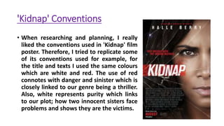
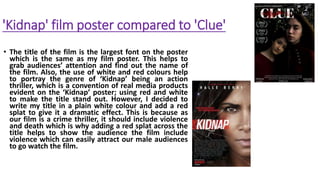
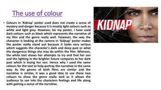
The document discusses conventions used in the film poster for "Kidnap" and how the author applied or challenged some of those conventions in their own film poster. Specifically:
1) They replicated the use of red and white text and colors from "Kidnap" to represent danger/violence and purity for their thriller genre.
2) They used a large title font at the top of the poster, like "Kidnap", but added a red splatter to represent violence in their crime thriller.
3) Dark colors like black were used instead of light colors to create more mystery and danger, while still using red and white text to portray the narrative in a similar way.
4)