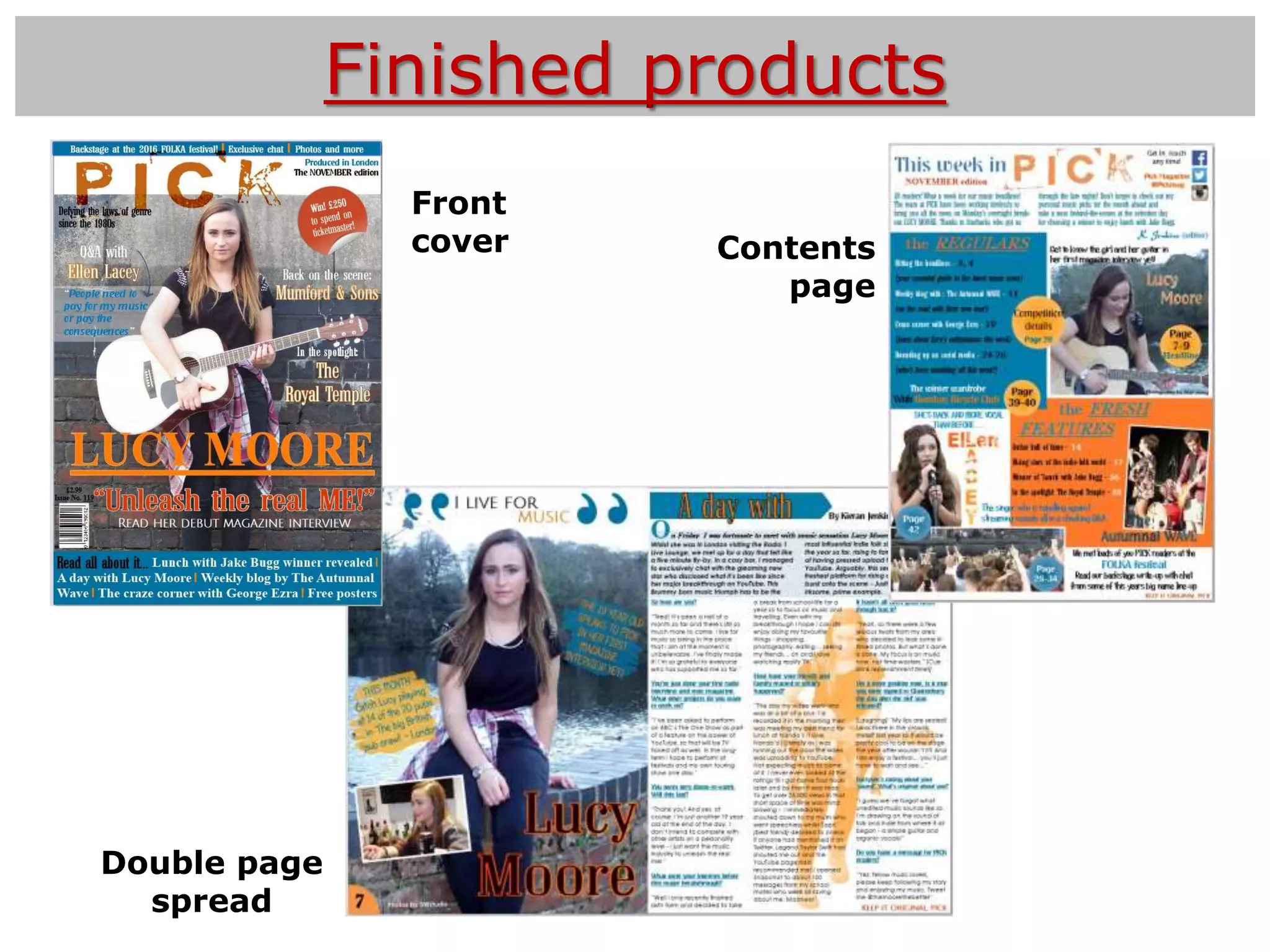
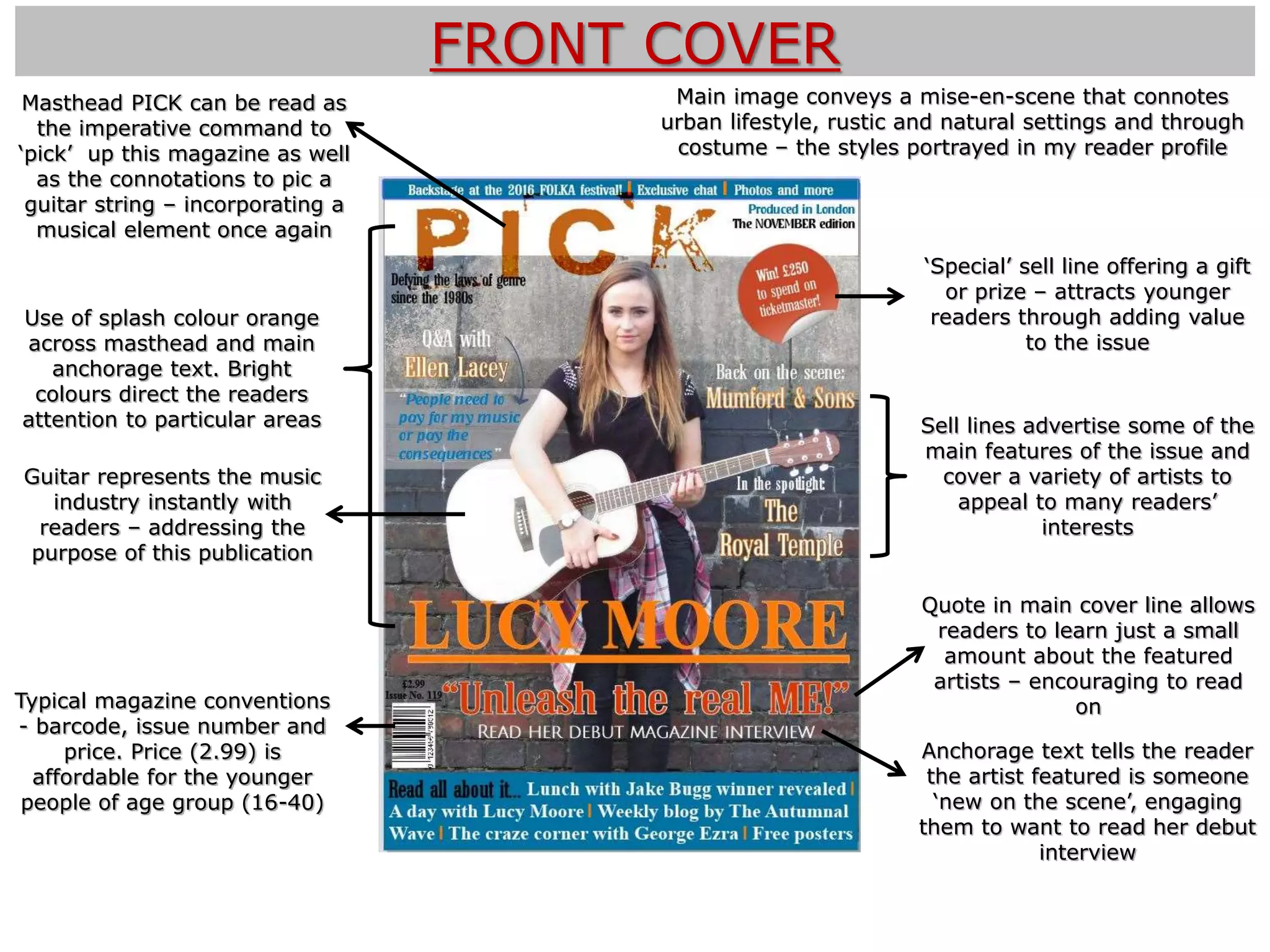
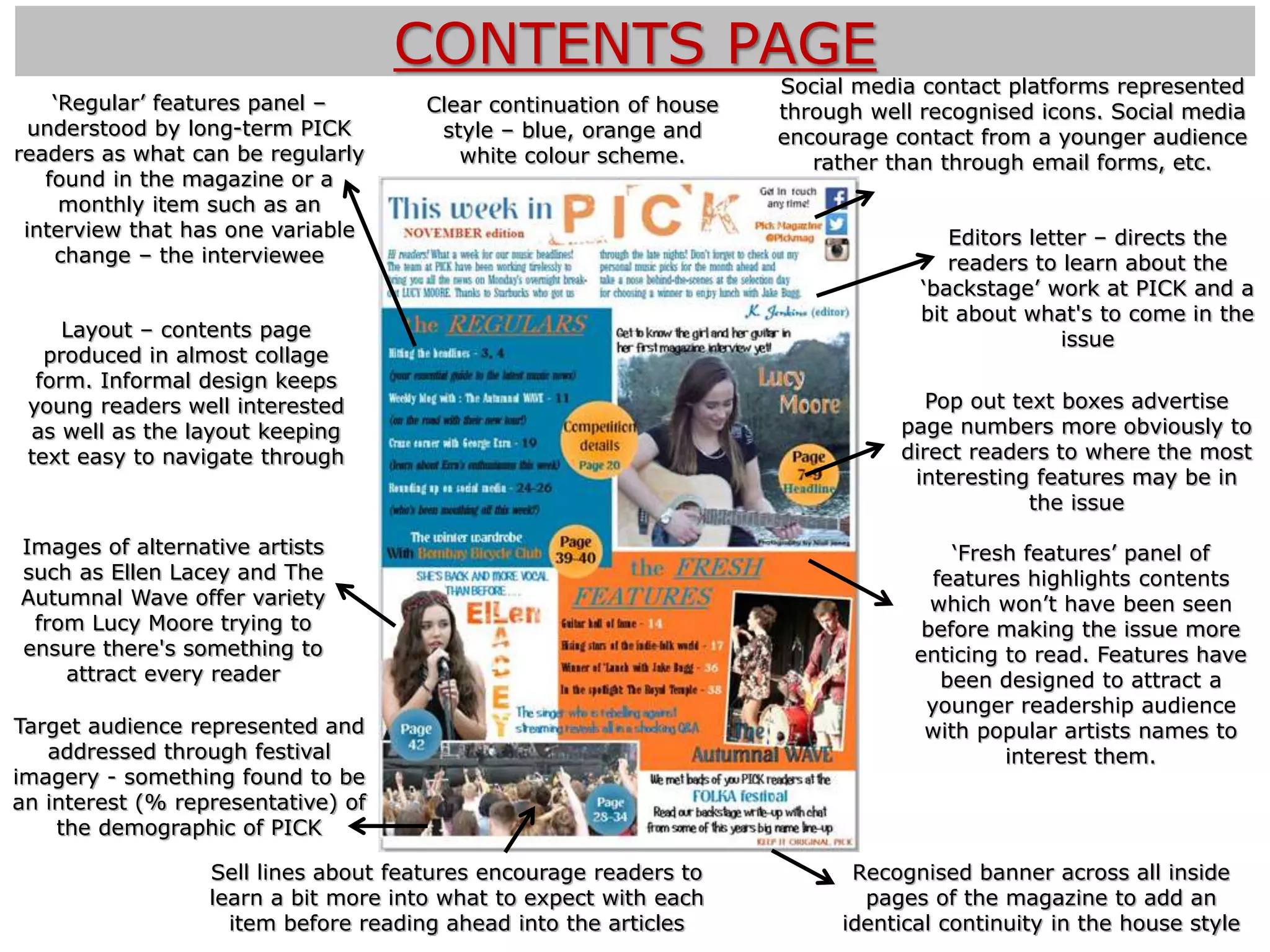
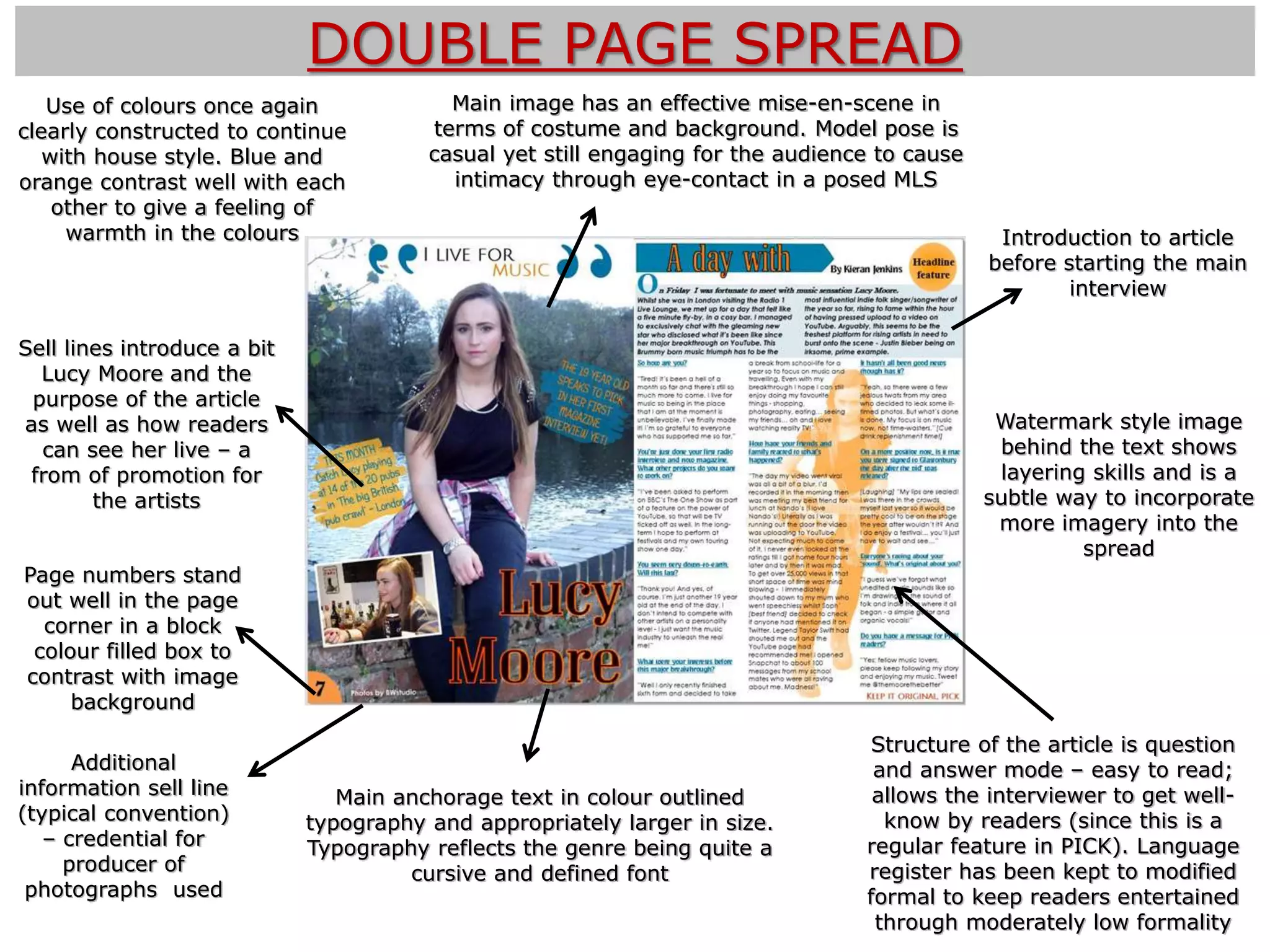
5) How did you attract/
address your audience?
Finished products
Front
cover Contents
page
Double page
spread
FRONT COVER
Guitar represents the music
industry instantly with
readers – addressing the
purpose of this publication
‘Special’ sell line offering a gift
or prize – attracts younger
readers through adding value
to the issue
Anchorage text tells the reader
the artist featured is someone
‘new on the scene’, engaging
them to want to read her debut
interview
Use of splash colour orange
across masthead and main
anchorage text. Bright
colours direct the readers
attention to particular areas
Typical magazine conventions
- barcode, issue number and
price. Price (2.99) is
affordable for the younger
people of age group (16-40)
Main image conveys a mise-en-scene that connotes
urban lifestyle, rustic and natural settings and through
costume – the styles portrayed in my reader profile
Masthead PICK can be read as
the imperative command to
‘pick’ up this magazine as well
as the connotations to pic a
guitar string – incorporating a
musical element once again
Sell lines advertise some of the
main features of the issue and
cover a variety of artists to
appeal to many readers’
interests
Quote in main cover line allows
readers to learn just a small
amount about the featured
artists – encouraging to read
on
CONTENTS PAGE
Images of alternative artists
such as Ellen Lacey and The
Autumnal Wave offer variety
from Lucy Moore trying to
ensure there's something to
attract every reader
Editors letter – directs the
readers to learn about the
‘backstage’ work at PICK and a
bit about what's to come in the
issue
Recognised banner across all inside
pages of the magazine to add an
identical continuity in the house style
Clear continuation of house
style – blue, orange and
white colour scheme.
Sell lines about features encourage readers to
learn a bit more into what to expect with each
item before reading ahead into the articles
Social media contact platforms represented
through well recognised icons. Social media
encourage contact from a younger audience
rather than through email forms, etc.
‘Regular’ features panel –
understood by long-term PICK
readers as what can be regularly
found in the magazine or a
monthly item such as an
interview that has one variable
change – the interviewee
Pop out text boxes advertise
page numbers more obviously to
direct readers to where the most
interesting features may be in
the issue
Layout – contents page
produced in almost collage
form. Informal design keeps
young readers well interested
as well as the layout keeping
text easy to navigate through
‘Fresh features’ panel of
features highlights contents
which won’t have been seen
before making the issue more
enticing to read. Features have
been designed to attract a
younger readership audience
with popular artists names to
interest them.
Target audience represented and
addressed through festival
imagery - something found to be
an interest (% representative) of
the demographic of PICK
DOUBLE PAGE SPREAD
Sell lines introduce a bit
Lucy Moore and the
purpose of the article
as well as how readers
can see her live – a
from of promotion for
the artists
Introduction to article
before starting the main
interview
Main image has an effective mise-en-scene in
terms of costume and background. Model pose is
casual yet still engaging for the audience to cause
intimacy through eye-contact in a posed MLS
Main anchorage text in colour outlined
typography and appropriately larger in size.
Typography reflects the genre being quite a
cursive and defined font
Additional
information sell line
(typical convention)
– credential for
producer of
photographs used
Structure of the article is question
and answer mode – easy to read;
allows the interviewer to get well-
know by readers (since this is a
regular feature in PICK). Language
register has been kept to modified
formal to keep readers entertained
through moderately low formality
Watermark style image
behind the text shows
layering skills and is a
subtle way to incorporate
more imagery into the
spread
Page numbers stand
out well in the page
corner in a block
colour filled box to
contrast with image
background
Use of colours once again
clearly constructed to continue
with house style. Blue and
orange contrast well with each
other to give a feeling of
warmth in the colours

Evaulation question 5

  • 1.
    5) How didyou attract/ address your audience?
  • 2.
  • 3.
    FRONT COVER Guitar representsthe music industry instantly with readers – addressing the purpose of this publication ‘Special’ sell line offering a gift or prize – attracts younger readers through adding value to the issue Anchorage text tells the reader the artist featured is someone ‘new on the scene’, engaging them to want to read her debut interview Use of splash colour orange across masthead and main anchorage text. Bright colours direct the readers attention to particular areas Typical magazine conventions - barcode, issue number and price. Price (2.99) is affordable for the younger people of age group (16-40) Main image conveys a mise-en-scene that connotes urban lifestyle, rustic and natural settings and through costume – the styles portrayed in my reader profile Masthead PICK can be read as the imperative command to ‘pick’ up this magazine as well as the connotations to pic a guitar string – incorporating a musical element once again Sell lines advertise some of the main features of the issue and cover a variety of artists to appeal to many readers’ interests Quote in main cover line allows readers to learn just a small amount about the featured artists – encouraging to read on
  • 4.
    CONTENTS PAGE Images ofalternative artists such as Ellen Lacey and The Autumnal Wave offer variety from Lucy Moore trying to ensure there's something to attract every reader Editors letter – directs the readers to learn about the ‘backstage’ work at PICK and a bit about what's to come in the issue Recognised banner across all inside pages of the magazine to add an identical continuity in the house style Clear continuation of house style – blue, orange and white colour scheme. Sell lines about features encourage readers to learn a bit more into what to expect with each item before reading ahead into the articles Social media contact platforms represented through well recognised icons. Social media encourage contact from a younger audience rather than through email forms, etc. ‘Regular’ features panel – understood by long-term PICK readers as what can be regularly found in the magazine or a monthly item such as an interview that has one variable change – the interviewee Pop out text boxes advertise page numbers more obviously to direct readers to where the most interesting features may be in the issue Layout – contents page produced in almost collage form. Informal design keeps young readers well interested as well as the layout keeping text easy to navigate through ‘Fresh features’ panel of features highlights contents which won’t have been seen before making the issue more enticing to read. Features have been designed to attract a younger readership audience with popular artists names to interest them. Target audience represented and addressed through festival imagery - something found to be an interest (% representative) of the demographic of PICK
  • 5.
    DOUBLE PAGE SPREAD Selllines introduce a bit Lucy Moore and the purpose of the article as well as how readers can see her live – a from of promotion for the artists Introduction to article before starting the main interview Main image has an effective mise-en-scene in terms of costume and background. Model pose is casual yet still engaging for the audience to cause intimacy through eye-contact in a posed MLS Main anchorage text in colour outlined typography and appropriately larger in size. Typography reflects the genre being quite a cursive and defined font Additional information sell line (typical convention) – credential for producer of photographs used Structure of the article is question and answer mode – easy to read; allows the interviewer to get well- know by readers (since this is a regular feature in PICK). Language register has been kept to modified formal to keep readers entertained through moderately low formality Watermark style image behind the text shows layering skills and is a subtle way to incorporate more imagery into the spread Page numbers stand out well in the page corner in a block colour filled box to contrast with image background Use of colours once again clearly constructed to continue with house style. Blue and orange contrast well with each other to give a feeling of warmth in the colours