Style sheet
•Download as PPTX, PDF•
0 likes•114 views
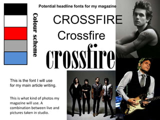
This document discusses potential fonts and a color scheme for a magazine, stating that Crossfire will be used for the main article writing and the magazine will use a combination of live and studio photos.
Report
Share
Report
Share
Recommended
Style sheet
This document discusses the layout and design elements of a magazine, including headers, main body text, pictures, straps/subheadings, and cover lines that will be written in the same text. It also lists types of images to include in the magazine such as live concert photos and location shots.
Photoshoot 2
The document discusses photos taken during a photoshoot for the main character of a short film. The photographer hopes to use some of the images from the shoot in additional supporting materials for the film.
Photoshoot 1
The document discusses photos taken during a photoshoot for the main character of a short film. The photographer hopes to use some of the images from the shoot in additional supporting materials for the film.
Evaluation Question 3
The document summarizes the effectiveness of ancillary materials created to accompany a short film production. Posters were made - a film magazine cover featuring manipulated cast images on an explosion background, and a single page magazine review spread. Conventions from real magazines were followed, such as using 3 main colors, common fonts, and including standard information like the film title, cast, and release details. Research ensured the posters reflected expectations of the action comedy genre and film magazine format. The materials were designed to work cohesively and promote the short film.
Evaluation Question 2
The document summarizes an evaluation of how effective the combination of a short film and two ancillary texts (posters). It describes how the images, fonts, colors, and elements on the posters were chosen to match conventions of action comedy and film magazine genres. Research was done on typical codes and conventions for film posters and reviews. The combination of the short film and ancillary texts that followed genre conventions was believed to work well together.
Media Studies - Forms and Conventions
The document describes how the author developed the form and style conventions for a magazine by drawing inspiration from existing magazines like Acoustic Magazine and Rock'n'Reel Magazine. Some of the elements copied include using Helvetica Bold for the masthead, putting the logo in front of the masthead in black contrasting color, using Georgia font for body text and boxes for quotes. Techniques like captioning photos and presenting them with borders were also adapted from Acoustic Magazine. A barcode was manually created to make the magazine look believable.
Research into ancillary texts
The document analyzes the cover art, typography, and ancillary texts used for Beyonce's single "Halo". It describes how the front cover features a plain image of Beyonce to portray her as innocent and naive. The back cover includes conventions like the artist and title but also advertises one of Beyonce's other albums. Both the front and back cover feature the same simple beach background image. The CD itself continues the typography and beach image from the cover art to clearly connect all parts of the single release.
O milagre da transformação
A União Europeia está preocupada com o impacto ambiental do plástico descartável e planeja proibir itens como talheres, pratos, copos e canudos plásticos até 2021. A proibição visa reduzir a poluição plástica nos oceanos e promover alternativas mais sustentáveis. Os países da UE terão até 2021 para implementar as novas diretrizes.
Evaluation
The document summarizes how the media product Crossfire magazine uses and develops conventions of real music magazines. It discusses design elements like the front cover photo, masthead, page numbers, and writing style. Crossfire's audience is described as mainly men and boys aged 14-30 who enjoy casual clothes and younger artists. Techniques used to attract this audience include offering prizes, using vibrant colors and large fonts, writing about popular bands, and including intense photos that create tension between the artist and viewer. The goal was to make Crossfire engaging while keeping it simple, neat, and affordable for its target demographic.
Evaluation
The document summarizes how the media product, a music magazine called Crossfire, uses and develops conventions of real music magazines to attract its target audience. Some conventions it follows include using a masthead, barcodes in standard locations, different fonts to divide sections, artist photos, and page numbers. It challenges some conventions by only having one photo on the cover instead of multiple, and placing issue numbers above rather than below the masthead. The target audience is described as mainly men and boys aged 14-30 who are interested in up-and-coming artists featured in the magazine. Ways of attracting this audience included offering contest prizes, using vibrant colors, writing about artists, and pricing the magazine affordably for its young demographic
Evaluation
This document summarizes how the media product uses, develops, and challenges conventions of real music magazines. It discusses design elements like the masthead, barcodes, fonts, page numbers, and photos. Photos on the cover and inside pages follow conventions by featuring the artist. Writing style and placement of articles, ads, and other text also emulate real magazines. Color choices aim to attract the target audience of 14-30 year old males and females interested in up-and-coming artists. The price point and prize competitions make the magazine accessible and engaging for its youthful readership.
Evaluation
The document provides an evaluation of a music magazine called Crossfire created by the author for a media studies assignment. It summarizes the key conventions and techniques used in constructing the magazine, including using props like guitars on photoshoots, including a masthead, barcode, and page numbers. It discusses design choices such as fonts, colors, and layout of photos. It also addresses representing the target audience of 14-30 year old males, and how the magazine was made accessible to different social groups and price points. Lastly, it reflects on the technologies and software used like Photoshop and what was learned in the process.
My magazine research
The document provides an analysis of the design elements used in music magazines NME and Rock Sound, including their covers and internal content pages. Key elements discussed include color schemes, photography, writing styles, use of fonts, and ratios of text to images. Across both magazines, dark colors and gritty photography aim to appeal to their target audiences of teenage to young adult music fans, especially those interested in genres like rock, punk, and goth. Short, informal writing keeps the content engaging for readers.
Stylesheet
This document discusses potential fonts and a color scheme for a magazine, stating that Crossfire will be used for the main article writing and the magazine will use a combination of live and studio photos.
Style sheet
This document discusses potential fonts and color schemes for a magazine, mentioning that Crossfire font will be used for main articles and that photos will combine live and studio shots.
Selection of pictures
This document discusses the selection and use of photos in a music magazine called Crossfire. It provides reasoning for why certain photos of artists were chosen for the cover, double page spread, and content page. Factors that influenced photo selection included eye contact and focus, simplicity that allows for text, reflecting the artist's appearance and passion for music, and using lighting and angles to draw attention. Photos that were not chosen did not have as strong eye contact or focus on the artist compared to props or did not allow the artist to stand out as clearly.
The election of photos
This document discusses the selection of photographs to feature in the magazine "Crossfire". It provides reasoning for the photos chosen to represent the main artist on the cover, double page, and content page. A photo of a female artist was also selected, using a red background and makeup to draw attention. Not all photos taken could be used, such as one of the main artist where his eyes were not focused and the guitar drew too much attention away from him. Another photo of the female artist was also passed over because the eye contact and lighting did not properly capture her intended presentation in the magazine.
Style sheet
This document discusses potential fonts and a color scheme for a magazine, stating that Crossfire will be used for the main article writing and the magazine will use a combination of live and studio photos.
Flat plan of cover and content
This article previews upcoming music award shows and concerts happening in the next 12 days, including an exclusive interview with John Mayer and a behind the scenes look at Kings of Leon. It also shares some quotes from the artists and provides coverage of the content and events.
My SurveyMonkey result
The document discusses the benefits of exercise for mental health. Regular physical activity can help reduce anxiety and depression and improve mood and cognitive functioning. Exercise causes chemical changes in the brain that may help boost feelings of calmness, happiness and focus.
My magazine research
The document analyzes and summarizes aspects of music magazine covers and content pages, including their color schemes, photography, writing styles, text-to-picture ratios, and fonts. Key aspects noted include the use of dark colors and photos on rock magazine covers to appeal to their target audiences, the inclusion of quotes and names to inform readers concisely, and variations in these design elements between covers meant to attract attention and interior pages meant for overview.
My magazine research
The document analyzes the design elements of music magazines NME and Rock Sound, including their covers, content pages, and double-page spreads. It discusses the color schemes, photography, writing styles, text-to-picture ratios, and fonts used and how they target younger audiences interested in rock, punk, and indie music genres. Key details like quotes, names of bands and albums, and live photos are used to engage readers in the 17-30 age range. Darker colors and edgier styles on Rock Sound differentiate it slightly from NME but they aim to attract similar demographics.
一比一原版(soton毕业证书)英国南安普顿大学毕业证在读证明如何办理
原版定制【微信:741003700】《(soton毕业证书)英国南安普顿大学毕业证学位证成绩单》【微信:741003700】成绩单 、雅思、外壳、留信学历认证永久存档查询,采用学校原版纸张、特殊工艺完全按照原版一比一制作(包括:隐形水印,阴影底纹,钢印LOGO烫金烫银,LOGO烫金烫银复合重叠,文字图案浮雕,激光镭射,紫外荧光,温感,复印防伪)行业标杆!精益求精,诚心合作,真诚制作!多年品质 ,按需精细制作,24小时接单,全套进口原装设备,十五年致力于帮助留学生解决难题,业务范围有加拿大、英国、澳洲、韩国、美国、新加坡,新西兰等学历材料,包您满意。
【业务选择办理准则】
一、工作未确定,回国需先给父母、亲戚朋友看下文凭的情况,办理一份毕业证【Q微信741003700】文凭即可
二、回国进私企、外企、自己做生意的情况,这些单位是不查询毕业证真伪的,而且国内没有渠道去查询国外文凭的真假,也不需要提供真实教育部认证。鉴于此,办理一份毕业证【Q微信741003700】即可
三、进国企,银行,事业单位,考公务员等等,这些单位是必需要提供真实教育部认证的,办理教育部认证所需资料众多且烦琐,所有材料您都必须提供原件,我们凭借丰富的经验,快捷的绿色通道帮您快速整合材料,让您少走弯路。
留信网认证的作用:
1:该专业认证可证明留学生真实身份
2:同时对留学生所学专业登记给予评定
3:国家专业人才认证中心颁发入库证书
4:这个认证书并且可以归档倒地方
5:凡事获得留信网入网的信息将会逐步更新到个人身份内,将在公安局网内查询个人身份证信息后,同步读取人才网入库信息
6:个人职称评审加20分
7:个人信誉贷款加10分
8:在国家人才网主办的国家网络招聘大会中纳入资料,供国家高端企业选择人才
【关于价格问题(保证一手价格)】
我们所定的价格是非常合理的,而且我们现在做得单子大多数都是代理和回头客户介绍的所以一般现在有新的单子 我给客户的都是第一手的代理价格,因为我想坦诚对待大家 不想跟大家在价格方面浪费时间
对于老客户或者被老客户介绍过来的朋友,我们都会适当给一些优惠。
哪里办理美国中央华盛顿大学毕业证双学位证书原版一模一样
原版一模一样【微信:741003700 】【美国中央华盛顿大学毕业证双学位证书】【微信:741003700 】学位证,留信认证(真实可查,永久存档)offer、雅思、外壳等材料/诚信可靠,可直接看成品样本,帮您解决无法毕业带来的各种难题!外壳,原版制作,诚信可靠,可直接看成品样本。行业标杆!精益求精,诚心合作,真诚制作!多年品质 ,按需精细制作,24小时接单,全套进口原装设备。十五年致力于帮助留学生解决难题,包您满意。
本公司拥有海外各大学样板无数,能完美还原海外各大学 Bachelor Diploma degree, Master Degree Diploma
1:1完美还原海外各大学毕业材料上的工艺:水印,阴影底纹,钢印LOGO烫金烫银,LOGO烫金烫银复合重叠。文字图案浮雕、激光镭射、紫外荧光、温感、复印防伪等防伪工艺。材料咨询办理、认证咨询办理请加学历顾问Q/微741003700
留信网认证的作用:
1:该专业认证可证明留学生真实身份
2:同时对留学生所学专业登记给予评定
3:国家专业人才认证中心颁发入库证书
4:这个认证书并且可以归档倒地方
5:凡事获得留信网入网的信息将会逐步更新到个人身份内,将在公安局网内查询个人身份证信息后,同步读取人才网入库信息
6:个人职称评审加20分
7:个人信誉贷款加10分
8:在国家人才网主办的国家网络招聘大会中纳入资料,供国家高端企业选择人才
Manual ISH (International Society of Hypertension)
Manual ISH (International Society of Hypertension)
More Related Content
More from adinewenner
Evaluation
The document summarizes how the media product Crossfire magazine uses and develops conventions of real music magazines. It discusses design elements like the front cover photo, masthead, page numbers, and writing style. Crossfire's audience is described as mainly men and boys aged 14-30 who enjoy casual clothes and younger artists. Techniques used to attract this audience include offering prizes, using vibrant colors and large fonts, writing about popular bands, and including intense photos that create tension between the artist and viewer. The goal was to make Crossfire engaging while keeping it simple, neat, and affordable for its target demographic.
Evaluation
The document summarizes how the media product, a music magazine called Crossfire, uses and develops conventions of real music magazines to attract its target audience. Some conventions it follows include using a masthead, barcodes in standard locations, different fonts to divide sections, artist photos, and page numbers. It challenges some conventions by only having one photo on the cover instead of multiple, and placing issue numbers above rather than below the masthead. The target audience is described as mainly men and boys aged 14-30 who are interested in up-and-coming artists featured in the magazine. Ways of attracting this audience included offering contest prizes, using vibrant colors, writing about artists, and pricing the magazine affordably for its young demographic
Evaluation
This document summarizes how the media product uses, develops, and challenges conventions of real music magazines. It discusses design elements like the masthead, barcodes, fonts, page numbers, and photos. Photos on the cover and inside pages follow conventions by featuring the artist. Writing style and placement of articles, ads, and other text also emulate real magazines. Color choices aim to attract the target audience of 14-30 year old males and females interested in up-and-coming artists. The price point and prize competitions make the magazine accessible and engaging for its youthful readership.
Evaluation
The document provides an evaluation of a music magazine called Crossfire created by the author for a media studies assignment. It summarizes the key conventions and techniques used in constructing the magazine, including using props like guitars on photoshoots, including a masthead, barcode, and page numbers. It discusses design choices such as fonts, colors, and layout of photos. It also addresses representing the target audience of 14-30 year old males, and how the magazine was made accessible to different social groups and price points. Lastly, it reflects on the technologies and software used like Photoshop and what was learned in the process.
My magazine research
The document provides an analysis of the design elements used in music magazines NME and Rock Sound, including their covers and internal content pages. Key elements discussed include color schemes, photography, writing styles, use of fonts, and ratios of text to images. Across both magazines, dark colors and gritty photography aim to appeal to their target audiences of teenage to young adult music fans, especially those interested in genres like rock, punk, and goth. Short, informal writing keeps the content engaging for readers.
Stylesheet
This document discusses potential fonts and a color scheme for a magazine, stating that Crossfire will be used for the main article writing and the magazine will use a combination of live and studio photos.
Style sheet
This document discusses potential fonts and color schemes for a magazine, mentioning that Crossfire font will be used for main articles and that photos will combine live and studio shots.
Selection of pictures
This document discusses the selection and use of photos in a music magazine called Crossfire. It provides reasoning for why certain photos of artists were chosen for the cover, double page spread, and content page. Factors that influenced photo selection included eye contact and focus, simplicity that allows for text, reflecting the artist's appearance and passion for music, and using lighting and angles to draw attention. Photos that were not chosen did not have as strong eye contact or focus on the artist compared to props or did not allow the artist to stand out as clearly.
The election of photos
This document discusses the selection of photographs to feature in the magazine "Crossfire". It provides reasoning for the photos chosen to represent the main artist on the cover, double page, and content page. A photo of a female artist was also selected, using a red background and makeup to draw attention. Not all photos taken could be used, such as one of the main artist where his eyes were not focused and the guitar drew too much attention away from him. Another photo of the female artist was also passed over because the eye contact and lighting did not properly capture her intended presentation in the magazine.
Style sheet
This document discusses potential fonts and a color scheme for a magazine, stating that Crossfire will be used for the main article writing and the magazine will use a combination of live and studio photos.
Flat plan of cover and content
This article previews upcoming music award shows and concerts happening in the next 12 days, including an exclusive interview with John Mayer and a behind the scenes look at Kings of Leon. It also shares some quotes from the artists and provides coverage of the content and events.
My SurveyMonkey result
The document discusses the benefits of exercise for mental health. Regular physical activity can help reduce anxiety and depression and improve mood and cognitive functioning. Exercise causes chemical changes in the brain that may help boost feelings of calmness, happiness and focus.
My magazine research
The document analyzes and summarizes aspects of music magazine covers and content pages, including their color schemes, photography, writing styles, text-to-picture ratios, and fonts. Key aspects noted include the use of dark colors and photos on rock magazine covers to appeal to their target audiences, the inclusion of quotes and names to inform readers concisely, and variations in these design elements between covers meant to attract attention and interior pages meant for overview.
My magazine research
The document analyzes the design elements of music magazines NME and Rock Sound, including their covers, content pages, and double-page spreads. It discusses the color schemes, photography, writing styles, text-to-picture ratios, and fonts used and how they target younger audiences interested in rock, punk, and indie music genres. Key details like quotes, names of bands and albums, and live photos are used to engage readers in the 17-30 age range. Darker colors and edgier styles on Rock Sound differentiate it slightly from NME but they aim to attract similar demographics.
More from adinewenner (16)
Recently uploaded
一比一原版(soton毕业证书)英国南安普顿大学毕业证在读证明如何办理
原版定制【微信:741003700】《(soton毕业证书)英国南安普顿大学毕业证学位证成绩单》【微信:741003700】成绩单 、雅思、外壳、留信学历认证永久存档查询,采用学校原版纸张、特殊工艺完全按照原版一比一制作(包括:隐形水印,阴影底纹,钢印LOGO烫金烫银,LOGO烫金烫银复合重叠,文字图案浮雕,激光镭射,紫外荧光,温感,复印防伪)行业标杆!精益求精,诚心合作,真诚制作!多年品质 ,按需精细制作,24小时接单,全套进口原装设备,十五年致力于帮助留学生解决难题,业务范围有加拿大、英国、澳洲、韩国、美国、新加坡,新西兰等学历材料,包您满意。
【业务选择办理准则】
一、工作未确定,回国需先给父母、亲戚朋友看下文凭的情况,办理一份毕业证【Q微信741003700】文凭即可
二、回国进私企、外企、自己做生意的情况,这些单位是不查询毕业证真伪的,而且国内没有渠道去查询国外文凭的真假,也不需要提供真实教育部认证。鉴于此,办理一份毕业证【Q微信741003700】即可
三、进国企,银行,事业单位,考公务员等等,这些单位是必需要提供真实教育部认证的,办理教育部认证所需资料众多且烦琐,所有材料您都必须提供原件,我们凭借丰富的经验,快捷的绿色通道帮您快速整合材料,让您少走弯路。
留信网认证的作用:
1:该专业认证可证明留学生真实身份
2:同时对留学生所学专业登记给予评定
3:国家专业人才认证中心颁发入库证书
4:这个认证书并且可以归档倒地方
5:凡事获得留信网入网的信息将会逐步更新到个人身份内,将在公安局网内查询个人身份证信息后,同步读取人才网入库信息
6:个人职称评审加20分
7:个人信誉贷款加10分
8:在国家人才网主办的国家网络招聘大会中纳入资料,供国家高端企业选择人才
【关于价格问题(保证一手价格)】
我们所定的价格是非常合理的,而且我们现在做得单子大多数都是代理和回头客户介绍的所以一般现在有新的单子 我给客户的都是第一手的代理价格,因为我想坦诚对待大家 不想跟大家在价格方面浪费时间
对于老客户或者被老客户介绍过来的朋友,我们都会适当给一些优惠。
哪里办理美国中央华盛顿大学毕业证双学位证书原版一模一样
原版一模一样【微信:741003700 】【美国中央华盛顿大学毕业证双学位证书】【微信:741003700 】学位证,留信认证(真实可查,永久存档)offer、雅思、外壳等材料/诚信可靠,可直接看成品样本,帮您解决无法毕业带来的各种难题!外壳,原版制作,诚信可靠,可直接看成品样本。行业标杆!精益求精,诚心合作,真诚制作!多年品质 ,按需精细制作,24小时接单,全套进口原装设备。十五年致力于帮助留学生解决难题,包您满意。
本公司拥有海外各大学样板无数,能完美还原海外各大学 Bachelor Diploma degree, Master Degree Diploma
1:1完美还原海外各大学毕业材料上的工艺:水印,阴影底纹,钢印LOGO烫金烫银,LOGO烫金烫银复合重叠。文字图案浮雕、激光镭射、紫外荧光、温感、复印防伪等防伪工艺。材料咨询办理、认证咨询办理请加学历顾问Q/微741003700
留信网认证的作用:
1:该专业认证可证明留学生真实身份
2:同时对留学生所学专业登记给予评定
3:国家专业人才认证中心颁发入库证书
4:这个认证书并且可以归档倒地方
5:凡事获得留信网入网的信息将会逐步更新到个人身份内,将在公安局网内查询个人身份证信息后,同步读取人才网入库信息
6:个人职称评审加20分
7:个人信誉贷款加10分
8:在国家人才网主办的国家网络招聘大会中纳入资料,供国家高端企业选择人才
Manual ISH (International Society of Hypertension)
Manual ISH (International Society of Hypertension)
一比一原版马里兰大学毕业证(UMD毕业证书)如何办理
学校原件一模一样【微信:6496090】【马里兰大学毕业证(UMD毕业证书)成绩单学位证】【微信:6496090】(留信学历认证永久存档查询)采用学校原版纸张、特殊工艺完全按照原版一比一制作(包括:隐形水印,阴影底纹,钢印LOGO烫金烫银,LOGO烫金烫银复合重叠,文字图案浮雕,激光镭射,紫外荧光,温感,复印防伪)行业标杆!精益求精,诚心合作,真诚制作!多年品质 ,按需精细制作,24小时接单,全套进口原装设备,十五年致力于帮助留学生解决难题,业务范围有加拿大、英国、澳洲、韩国、美国、新加坡,新西兰等学历材料,包您满意。
【业务选择办理准则】
一、工作未确定,回国需先给父母、亲戚朋友看下文凭的情况,办理一份就读学校的毕业证【微信:6496090】文凭即可
二、回国进私企、外企、自己做生意的情况,这些单位是不查询毕业证真伪的,而且国内没有渠道去查询国外文凭的真假,也不需要提供真实教育部认证。鉴于此,办理一份毕业证【微信:6496090】即可
三、进国企,银行,事业单位,考公务员等等,这些单位是必需要提供真实教育部认证的,办理教育部认证所需资料众多且烦琐,所有材料您都必须提供原件,我们凭借丰富的经验,快捷的绿色通道帮您快速整合材料,让您少走弯路。
留信网认证的作用:
1:该专业认证可证明留学生真实身份【微信:6496090】
2:同时对留学生所学专业登记给予评定
3:国家专业人才认证中心颁发入库证书
4:这个认证书并且可以归档倒地方
5:凡事获得留信网入网的信息将会逐步更新到个人身份内,将在公安局网内查询个人身份证信息后,同步读取人才网入库信息
6:个人职称评审加20分
7:个人信誉贷款加10分
8:在国家人才网主办的国家网络招聘大会中纳入资料,供国家高端企业选择人才
→ 【关于价格问题(保证一手价格)
我们所定的价格是非常合理的,而且我们现在做得单子大多数都是代理和回头客户介绍的所以一般现在有新的单子 我给客户的都是第一手的代理价格,因为我想坦诚对待大家 不想跟大家在价格方面浪费时间
对于老客户或者被老客户介绍过来的朋友,我们都会适当给一些优惠。
选择实体注册公司办理,更放心,更安全!我们的承诺:可来公司面谈,可签订合同,会陪同客户一起到教育部认证窗口递交认证材料,客户在教育部官方认证查询网站查询到认证通过结果后付款,不成功不收费!
办理马里兰大学毕业证(UMD毕业证书)【微信:6496090 】外观非常简单,由纸质材料制成,上面印有校徽、校名、毕业生姓名、专业等信息。
办理马里兰大学毕业证(UMD毕业证书)【微信:6496090 】格式相对统一,各专业都有相应的模板。通常包括以下部分:
校徽:象征着学校的荣誉和传承。
校名:学校英文全称
授予学位:本部分将注明获得的具体学位名称。
毕业生姓名:这是最重要的信息之一,标志着该证书是由特定人员获得的。
颁发日期:这是毕业正式生效的时间,也代表着毕业生学业的结束。
其他信息:根据不同的专业和学位,可能会有一些特定的信息或章节。
办理马里兰大学毕业证(UMD毕业证书)【微信:6496090 】价值很高,需要妥善保管。一般来说,应放置在安全、干燥、防潮的地方,避免长时间暴露在阳光下。如需使用,最好使用复印件而不是原件,以免丢失。
综上所述,办理马里兰大学毕业证(UMD毕业证书)【微信:6496090 】是证明身份和学历的高价值文件。外观简单庄重,格式统一,包括重要的个人信息和发布日期。对持有人来说,妥善保管是非常重要的。
Graphic Design Tools and Software .pptx
Explore the essential graphic design tools and software that can elevate your creative projects. Discover industry favorites and innovative solutions for stunning design results.
欧洲杯买球-欧洲杯买球买球网好的网站-欧洲杯买球哪里有正规的买球网站|【网址🎉ac123.net🎉】
【网址🎉ac123.net🎉】欧洲杯买球是独立的博彩公司。该公司最初专门从事在线体育博彩,现在合并了在线娱乐场。该公司最初成立时以其前董事长Victor Chandler的名字命名,之后更名为欧洲杯买球。欧洲杯买球现由商人和赛马主,迈克尔·塔博尔拥有,运营总部设在直布罗陀。平台拥有体育博彩(沙巴)、真人娱乐场、电子游戏、金融投注等游戏项目,支持手机投注,优惠活动很丰富。
AHMED TALAAT ARCHITECTURE PORTFOLIO .pdf
Architectural and constructions management experience since 2003 including 18 years located in UAE.
Coordinate and oversee all technical activities relating to architectural and construction projects,
including directing the design team, reviewing drafts and computer models, and approving design
changes.
Organize and typically develop, and review building plans, ensuring that a project meets all safety and
environmental standards.
Prepare feasibility studies, construction contracts, and tender documents with specifications and
tender analyses.
Consulting with clients, work on formulating equipment and labor cost estimates, ensuring a project
meets environmental, safety, structural, zoning, and aesthetic standards.
Monitoring the progress of a project to assess whether or not it is in compliance with building plans
and project deadlines.
Attention to detail, exceptional time management, and strong problem-solving and communication
skills are required for this role.
一比一原版(LaTrobe毕业证书)拉筹伯大学毕业证如何办理
原件一模一样【微信:WP101A】【(LaTrobe毕业证书)拉筹伯大学毕业证学位证成绩单】【微信:WP101A】(留信学历认证永久存档查询)采用学校原版纸张、特殊工艺完全按照原版一比一制作(包括:隐形水印,阴影底纹,钢印LOGO烫金烫银,LOGO烫金烫银复合重叠,文字图案浮雕,激光镭射,紫外荧光,温感,复印防伪)行业标杆!精益求精,诚心合作,真诚制作!多年品质 ,按需精细制作,24小时接单,全套进口原装设备,十五年致力于帮助留学生解决难题,业务范围有加拿大、英国、澳洲、韩国、美国、新加坡,新西兰等学历材料,包您满意。
【业务选择办理准则】
一、工作未确定,回国需先给父母、亲戚朋友看下文凭的情况,办理一份就读学校的毕业证【微信:WP101A】文凭即可
二、回国进私企、外企、自己做生意的情况,这些单位是不查询毕业证真伪的,而且国内没有渠道去查询国外文凭的真假,也不需要提供真实教育部认证。鉴于此,办理一份毕业证【微信:WP101A】即可
三、进国企,银行,事业单位,考公务员等等,这些单位是必需要提供真实教育部认证的,办理教育部认证所需资料众多且烦琐,所有材料您都必须提供原件,我们凭借丰富的经验,快捷的绿色通道帮您快速整合材料,让您少走弯路。
留信网认证的作用:
1:该专业认证可证明留学生真实身份【微信:WP101A】
2:同时对留学生所学专业登记给予评定
3:国家专业人才认证中心颁发入库证书
4:这个认证书并且可以归档倒地方
5:凡事获得留信网入网的信息将会逐步更新到个人身份内,将在公安局网内查询个人身份证信息后,同步读取人才网入库信息
6:个人职称评审加20分
7:个人信誉贷款加10分
8:在国家人才网主办的国家网络招聘大会中纳入资料,供国家高端企业选择人才
→ 【关于价格问题(保证一手价格)
我们所定的价格是非常合理的,而且我们现在做得单子大多数都是代理和回头客户介绍的所以一般现在有新的单子 我给客户的都是第一手的代理价格,因为我想坦诚对待大家 不想跟大家在价格方面浪费时间
对于老客户或者被老客户介绍过来的朋友,我们都会适当给一些优惠。
选择实体注册公司办理,更放心,更安全!我们的承诺:可来公司面谈,可签订合同,会陪同客户一起到教育部认证窗口递交认证材料,客户在教育部官方认证查询网站查询到认证通过结果后付款,不成功不收费!
办理(LaTrobe毕业证书)拉筹伯大学毕业证学位证【微信:WP101A 】外观非常精致,由特殊纸质材料制成,上面印有校徽、校名、毕业生姓名、专业等信息。
办理(LaTrobe毕业证书)拉筹伯大学毕业证学位证【微信:WP101A 】格式相对统一,各专业都有相应的模板。通常包括以下部分:
校徽:象征着学校的荣誉和传承。
校名:学校英文全称
授予学位:本部分将注明获得的具体学位名称。
毕业生姓名:这是最重要的信息之一,标志着该证书是由特定人员获得的。
颁发日期:这是毕业正式生效的时间,也代表着毕业生学业的结束。
其他信息:根据不同的专业和学位,可能会有一些特定的信息或章节。
办理(LaTrobe毕业证书)拉筹伯大学毕业证学位证【微信:WP101A 】价值很高,需要妥善保管。一般来说,应放置在安全、干燥、防潮的地方,避免长时间暴露在阳光下。如需使用,最好使用复印件而不是原件,以免丢失。
综上所述,办理(LaTrobe毕业证书)拉筹伯大学毕业证学位证【微信:WP101A 】是证明身份和学历的高价值文件。外观简单庄重,格式统一,包括重要的个人信息和发布日期。对持有人来说,妥善保管是非常重要的。
Divertidamente SLIDE.pptxufururururuhrurid8dj
Hsuehebvdhdueuw8wiiwieih3udud8e8wisbdydvw7wbidj38ehehdheuwjhdiwjwieheheueurhryrurhrgryd7eueue
Discovering the Best Indian Architects A Spotlight on Design Forum Internatio...
Discovering the Best Indian Architects A Spotlight on Design Forum Internatio...Designforuminternational
India’s architectural landscape is a vibrant tapestry that weaves together the country's rich cultural heritage and its modern aspirations. From majestic historical structures to cutting-edge contemporary designs, the work of Indian architects is celebrated worldwide. Among the many firms shaping this dynamic field, Design Forum International stands out as a leader in innovative and sustainable architecture. This blog explores some of the best Indian architects, highlighting their contributions and showcasing the most famous architects in India.Best Digital Marketing Strategy Build Your Online Presence 2024.pptx
This presentation provides a comprehensive guide to the best digital marketing strategies for 2024, focusing on enhancing your online presence. Key topics include understanding and targeting your audience, building a user-friendly and mobile-responsive website, leveraging the power of social media platforms, optimizing content for search engines, and using email marketing to foster direct engagement. By adopting these strategies, you can increase brand visibility, drive traffic, generate leads, and ultimately boost sales, ensuring your business thrives in the competitive digital landscape.
按照学校原版(UIUC文凭证书)伊利诺伊大学|厄巴纳-香槟分校毕业证快速办理
出售【(UIUC毕业证书)伊利诺伊大学|厄巴纳-香槟分校毕业证】【176555708微信号】海外认证成绩单、外壳、offer、留信学历认证(永久存档真实可查)采用学校原版纸张、特殊工艺完全按照原版一比一制作(包括:隐形水印,阴影底纹,钢印LOGO烫金烫银,LOGO烫金烫银复合重叠,文字图案浮雕,激光镭射,紫外荧光,温感,复印防伪)行业标杆!精益求精,诚心合作,真诚制作!多年品质 ,按需精细制作,24小时接单,全套进口原装设备,十五年致力于帮助留学生解决难题,业务范围有加拿大、英国、澳洲、韩国、美国、新加坡,新西兰等学历材料,包您满意。
【我们承诺采用的是学校原版纸张(纸质、底色、纹路),我们拥有全套进口原装设备,特殊工艺都是采用不同机器制作,仿真度基本可以达到100%,所有工艺效果都可提前给客户展示,不满意可以根据客户要求进行调整,直到满意为止!】
【业务选择办理准则】
一、工作未确定,回国需先给父母、亲戚朋友看下文凭的情况,办理一份就读学校的毕业证【微信176555708】文凭即可
二、回国进私企、外企、自己做生意的情况,这些单位是不查询毕业证真伪的,而且国内没有渠道去查询国外文凭的真假,也不需要提供真实教育部认证。鉴于此,办理一份毕业证【微信176555708】即可
三、进国企,银行,事业单位,考公务员等等,这些单位是必需要提供真实教育部认证的,办理教育部认证所需资料众多且烦琐,所有材料您都必须提供原件,我们凭借丰富的经验,快捷的绿色通道帮您快速整合材料,让您少走弯路。
留信网认证的作用:
1:该专业认证可证明留学生真实身份
2:同时对留学生所学专业登记给予评定
3:国家专业人才认证中心颁发入库证书
4:这个认证书并且可以归档倒地方
5:凡事获得留信网入网的信息将会逐步更新到个人身份内,将在公安局网内查询个人身份证信息后,同步读取人才网入库信息
6:个人职称评审加20分
7:个人信誉贷款加10分
8:在国家人才网主办的国家网络招聘大会中纳入资料,供国家高端企业选择人才
留信网服务项目:
1、留学生专业人才库服务(留信分析)
2、国(境)学习人员提供就业推荐信服务
3、留学人员区块链存储服务
→ 【关于价格问题(保证一手价格)】
我们所定的价格是非常合理的,而且我们现在做得单子大多数都是代理和回头客户介绍的所以一般现在有新的单子 我给客户的都是第一手的代理价格,因为我想坦诚对待大家 不想跟大家在价格方面浪费时间
对于老客户或者被老客户介绍过来的朋友,我们都会适当给一些优惠。
选择实体注册公司办理,更放心,更安全!我们的承诺:客户在留信官方认证查询网站查询到认证通过结果后付款,不成功不收费!
一比一原版(UoN毕业证书)纽卡斯尔大学毕业证如何办理
原件一模一样【微信:WP101A】【(UoN毕业证书)纽卡斯尔大学毕业证学位证成绩单】【微信:WP101A】(留信学历认证永久存档查询)采用学校原版纸张、特殊工艺完全按照原版一比一制作(包括:隐形水印,阴影底纹,钢印LOGO烫金烫银,LOGO烫金烫银复合重叠,文字图案浮雕,激光镭射,紫外荧光,温感,复印防伪)行业标杆!精益求精,诚心合作,真诚制作!多年品质 ,按需精细制作,24小时接单,全套进口原装设备,十五年致力于帮助留学生解决难题,业务范围有加拿大、英国、澳洲、韩国、美国、新加坡,新西兰等学历材料,包您满意。
【业务选择办理准则】
一、工作未确定,回国需先给父母、亲戚朋友看下文凭的情况,办理一份就读学校的毕业证【微信:WP101A】文凭即可
二、回国进私企、外企、自己做生意的情况,这些单位是不查询毕业证真伪的,而且国内没有渠道去查询国外文凭的真假,也不需要提供真实教育部认证。鉴于此,办理一份毕业证【微信:WP101A】即可
三、进国企,银行,事业单位,考公务员等等,这些单位是必需要提供真实教育部认证的,办理教育部认证所需资料众多且烦琐,所有材料您都必须提供原件,我们凭借丰富的经验,快捷的绿色通道帮您快速整合材料,让您少走弯路。
留信网认证的作用:
1:该专业认证可证明留学生真实身份【微信:WP101A】
2:同时对留学生所学专业登记给予评定
3:国家专业人才认证中心颁发入库证书
4:这个认证书并且可以归档倒地方
5:凡事获得留信网入网的信息将会逐步更新到个人身份内,将在公安局网内查询个人身份证信息后,同步读取人才网入库信息
6:个人职称评审加20分
7:个人信誉贷款加10分
8:在国家人才网主办的国家网络招聘大会中纳入资料,供国家高端企业选择人才
→ 【关于价格问题(保证一手价格)
我们所定的价格是非常合理的,而且我们现在做得单子大多数都是代理和回头客户介绍的所以一般现在有新的单子 我给客户的都是第一手的代理价格,因为我想坦诚对待大家 不想跟大家在价格方面浪费时间
对于老客户或者被老客户介绍过来的朋友,我们都会适当给一些优惠。
选择实体注册公司办理,更放心,更安全!我们的承诺:可来公司面谈,可签订合同,会陪同客户一起到教育部认证窗口递交认证材料,客户在教育部官方认证查询网站查询到认证通过结果后付款,不成功不收费!
办理(UoN毕业证书)纽卡斯尔大学毕业证学位证【微信:WP101A 】外观非常精致,由特殊纸质材料制成,上面印有校徽、校名、毕业生姓名、专业等信息。
办理(UoN毕业证书)纽卡斯尔大学毕业证学位证【微信:WP101A 】格式相对统一,各专业都有相应的模板。通常包括以下部分:
校徽:象征着学校的荣誉和传承。
校名:学校英文全称
授予学位:本部分将注明获得的具体学位名称。
毕业生姓名:这是最重要的信息之一,标志着该证书是由特定人员获得的。
颁发日期:这是毕业正式生效的时间,也代表着毕业生学业的结束。
其他信息:根据不同的专业和学位,可能会有一些特定的信息或章节。
办理(UoN毕业证书)纽卡斯尔大学毕业证学位证【微信:WP101A 】价值很高,需要妥善保管。一般来说,应放置在安全、干燥、防潮的地方,避免长时间暴露在阳光下。如需使用,最好使用复印件而不是原件,以免丢失。
综上所述,办理(UoN毕业证书)纽卡斯尔大学毕业证学位证【微信:WP101A 】是证明身份和学历的高价值文件。外观简单庄重,格式统一,包括重要的个人信息和发布日期。对持有人来说,妥善保管是非常重要的。
一比一原版亚利桑那大学毕业证(UA毕业证书)如何办理
学校原件一模一样【微信:6496090】【亚利桑那大学毕业证(UA毕业证书)成绩单学位证】【微信:6496090】(留信学历认证永久存档查询)采用学校原版纸张、特殊工艺完全按照原版一比一制作(包括:隐形水印,阴影底纹,钢印LOGO烫金烫银,LOGO烫金烫银复合重叠,文字图案浮雕,激光镭射,紫外荧光,温感,复印防伪)行业标杆!精益求精,诚心合作,真诚制作!多年品质 ,按需精细制作,24小时接单,全套进口原装设备,十五年致力于帮助留学生解决难题,业务范围有加拿大、英国、澳洲、韩国、美国、新加坡,新西兰等学历材料,包您满意。
【业务选择办理准则】
一、工作未确定,回国需先给父母、亲戚朋友看下文凭的情况,办理一份就读学校的毕业证【微信:6496090】文凭即可
二、回国进私企、外企、自己做生意的情况,这些单位是不查询毕业证真伪的,而且国内没有渠道去查询国外文凭的真假,也不需要提供真实教育部认证。鉴于此,办理一份毕业证【微信:6496090】即可
三、进国企,银行,事业单位,考公务员等等,这些单位是必需要提供真实教育部认证的,办理教育部认证所需资料众多且烦琐,所有材料您都必须提供原件,我们凭借丰富的经验,快捷的绿色通道帮您快速整合材料,让您少走弯路。
留信网认证的作用:
1:该专业认证可证明留学生真实身份【微信:6496090】
2:同时对留学生所学专业登记给予评定
3:国家专业人才认证中心颁发入库证书
4:这个认证书并且可以归档倒地方
5:凡事获得留信网入网的信息将会逐步更新到个人身份内,将在公安局网内查询个人身份证信息后,同步读取人才网入库信息
6:个人职称评审加20分
7:个人信誉贷款加10分
8:在国家人才网主办的国家网络招聘大会中纳入资料,供国家高端企业选择人才
→ 【关于价格问题(保证一手价格)
我们所定的价格是非常合理的,而且我们现在做得单子大多数都是代理和回头客户介绍的所以一般现在有新的单子 我给客户的都是第一手的代理价格,因为我想坦诚对待大家 不想跟大家在价格方面浪费时间
对于老客户或者被老客户介绍过来的朋友,我们都会适当给一些优惠。
选择实体注册公司办理,更放心,更安全!我们的承诺:可来公司面谈,可签订合同,会陪同客户一起到教育部认证窗口递交认证材料,客户在教育部官方认证查询网站查询到认证通过结果后付款,不成功不收费!
办理亚利桑那大学毕业证(UA毕业证书)【微信:6496090 】外观非常简单,由纸质材料制成,上面印有校徽、校名、毕业生姓名、专业等信息。
办理亚利桑那大学毕业证(UA毕业证书)【微信:6496090 】格式相对统一,各专业都有相应的模板。通常包括以下部分:
校徽:象征着学校的荣誉和传承。
校名:学校英文全称
授予学位:本部分将注明获得的具体学位名称。
毕业生姓名:这是最重要的信息之一,标志着该证书是由特定人员获得的。
颁发日期:这是毕业正式生效的时间,也代表着毕业生学业的结束。
其他信息:根据不同的专业和学位,可能会有一些特定的信息或章节。
办理亚利桑那大学毕业证(UA毕业证书)【微信:6496090 】价值很高,需要妥善保管。一般来说,应放置在安全、干燥、防潮的地方,避免长时间暴露在阳光下。如需使用,最好使用复印件而不是原件,以免丢失。
综上所述,办理亚利桑那大学毕业证(UA毕业证书)【微信:6496090 】是证明身份和学历的高价值文件。外观简单庄重,格式统一,包括重要的个人信息和发布日期。对持有人来说,妥善保管是非常重要的。
一比一原版(Vancouver毕业证书)温哥华岛大学毕业证如何办理
学校原件一模一样【微信:6496090 】【(Vancouver毕业证书)温哥华岛大学毕业证成绩单】【微信:6496090 】学位证,留信认证(真实可查,永久存档)原件一模一样纸张工艺/offer、雅思、外壳等材料/诚信可靠,可直接看成品样本,帮您解决无法毕业带来的各种难题!外壳,原版制作,诚信可靠,可直接看成品样本。行业标杆!精益求精,诚心合作,真诚制作!多年品质 ,按需精细制作,24小时接单,全套进口原装设备。十五年致力于帮助留学生解决难题,包您满意。
本公司拥有海外各大学样板无数,能完美还原。
1:1完美还原海外各大学毕业材料上的工艺:水印,阴影底纹,钢印LOGO烫金烫银,LOGO烫金烫银复合重叠。文字图案浮雕、激光镭射、紫外荧光、温感、复印防伪等防伪工艺。材料咨询办理、认证咨询办理请加学历顾问Q/微6496090
【主营项目】
一.毕业证【q微6496090】成绩单、使馆认证、教育部认证、雅思托福成绩单、学生卡等!
二.真实使馆公证(即留学回国人员证明,不成功不收费)
三.真实教育部学历学位认证(教育部存档!教育部留服网站永久可查)
四.办理各国各大学文凭(一对一专业服务,可全程监控跟踪进度)
如果您处于以下几种情况:
◇在校期间,因各种原因未能顺利毕业……拿不到官方毕业证【q/微6496090】
◇面对父母的压力,希望尽快拿到;
◇不清楚认证流程以及材料该如何准备;
◇回国时间很长,忘记办理;
◇回国马上就要找工作,办给用人单位看;
◇企事业单位必须要求办理的
◇需要报考公务员、购买免税车、落转户口
◇申请留学生创业基金
留信网认证的作用:
1:该专业认证可证明留学生真实身份
2:同时对留学生所学专业登记给予评定
3:国家专业人才认证中心颁发入库证书
4:这个认证书并且可以归档倒地方
5:凡事获得留信网入网的信息将会逐步更新到个人身份内,将在公安局网内查询个人身份证信息后,同步读取人才网入库信息
6:个人职称评审加20分
7:个人信誉贷款加10分
8:在国家人才网主办的国家网络招聘大会中纳入资料,供国家高端企业选择人才
办理(Vancouver毕业证书)温哥华岛大学毕业证【微信:6496090 】外观非常简单,由纸质材料制成,上面印有校徽、校名、毕业生姓名、专业等信息。
办理(Vancouver毕业证书)温哥华岛大学毕业证【微信:6496090 】格式相对统一,各专业都有相应的模板。通常包括以下部分:
校徽:象征着学校的荣誉和传承。
校名:学校英文全称
授予学位:本部分将注明获得的具体学位名称。
毕业生姓名:这是最重要的信息之一,标志着该证书是由特定人员获得的。
颁发日期:这是毕业正式生效的时间,也代表着毕业生学业的结束。
其他信息:根据不同的专业和学位,可能会有一些特定的信息或章节。
办理(Vancouver毕业证书)温哥华岛大学毕业证【微信:6496090 】价值很高,需要妥善保管。一般来说,应放置在安全、干燥、防潮的地方,避免长时间暴露在阳光下。如需使用,最好使用复印件而不是原件,以免丢失。
综上所述,办理(Vancouver毕业证书)温哥华岛大学毕业证【微信:6496090 】是证明身份和学历的高价值文件。外观简单庄重,格式统一,包括重要的个人信息和发布日期。对持有人来说,妥善保管是非常重要的。
Recently uploaded (20)
Manual ISH (International Society of Hypertension)
Manual ISH (International Society of Hypertension)
欧洲杯买球-欧洲杯买球买球网好的网站-欧洲杯买球哪里有正规的买球网站|【网址🎉ac123.net🎉】
欧洲杯买球-欧洲杯买球买球网好的网站-欧洲杯买球哪里有正规的买球网站|【网址🎉ac123.net🎉】
Discovering the Best Indian Architects A Spotlight on Design Forum Internatio...
Discovering the Best Indian Architects A Spotlight on Design Forum Internatio...
Best Digital Marketing Strategy Build Your Online Presence 2024.pptx
Best Digital Marketing Strategy Build Your Online Presence 2024.pptx
Style sheet
- 1. Potential headline fonts for my magazine CROSSFIRE Crossfire Colour scheme crossfire This is the font I will use for my main article writing. This is what kind of photos my magazine will use. A combination between live and pictures taken in studio.