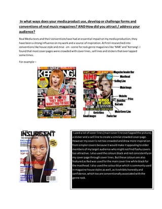
This document discusses how the author's media product uses and develops conventions of real music magazines to attract their target audience. The author researched conventions like crowded cover pages and color schemes from magazines like NME and Kerrang! and incorporated similar elements into their magazine cover. They used red, black, and blue consistently and featured a casual photo of the artist to make them seem relatable. The author also conformed to conventions of monthly issues costing less than £5 to appeal to their working class audience. By challenging stereotypes and featuring a female artist, the author made the magazine appealing to both male and female readers aged 15-30.