The document summarizes the student's music magazine project. It discusses how the magazine both conforms to and challenges conventions of real music magazines in its design, layout, and content. It describes how the magazine represents its target audience of modern, trendy youth. The student analyzes how the independent publisher Blaze would be a good fit to distribute the magazine nationally in the UK. The intended audience is identified as male, aged 18-22 with interests in dance music. The document also reflects on the various software, websites, and hardware used to create the magazine, and how the student's skills have progressed since an initial school magazine project.
N navas planificación de situación de aprendizajeNancy Navas
Planificación del Área de Pedagogía, la sub-área de Paradigmas Educativos para estudiantes de Bachillerato en Ciencias y Letras con Orientación en Educación
La Educación Física es un eficaz instrumento de la pedagogía, por cuanto ayuda a desarrollar las cualidades básicas del hombre como unidad bio-sico-social. Contribuye al accionar educativo con sus fundamentos científicos y sus vínculos interdisciplinarios apoyándose entonces en la filosofía, la psicología, la biología, etc.
Top 5 Indian Style Modular Kitchen DesignsFinzo Kitchens
Get the perfect modular kitchen in Gurgaon at Finzo! We offer high-quality, custom-designed kitchens at the best prices. Wardrobes and home & office furniture are also available. Free consultation! Best Quality Luxury Modular kitchen in Gurgaon available at best price. All types of Modular Kitchens are available U Shaped Modular kitchens, L Shaped Modular Kitchen, G Shaped Modular Kitchens, Inline Modular Kitchens and Italian Modular Kitchen.
Between Filth and Fortune- Urban Cattle Foraging Realities by Devi S Nair, An...Mansi Shah
This study examines cattle rearing in urban and rural settings, focusing on milk production and consumption. By exploring a case in Ahmedabad, it highlights the challenges and processes in dairy farming across different environments, emphasising the need for sustainable practices and the essential role of milk in daily consumption.
White wonder, Work developed by Eva TschoppMansi Shah
White Wonder by Eva Tschopp
A tale about our culture around the use of fertilizers and pesticides visiting small farms around Ahmedabad in Matar and Shilaj.
Transforming Brand Perception and Boosting Profitabilityaaryangarg12
In today's digital era, the dynamics of brand perception, consumer behavior, and profitability have been profoundly reshaped by the synergy of branding, social media, and website design. This research paper investigates the transformative power of these elements in influencing how individuals perceive brands and products and how this transformation can be harnessed to drive sales and profitability for businesses.
Through an exploration of brand psychology and consumer behavior, this study sheds light on the intricate ways in which effective branding strategies, strategic social media engagement, and user-centric website design contribute to altering consumers' perceptions. We delve into the principles that underlie successful brand transformations, examining how visual identity, messaging, and storytelling can captivate and resonate with target audiences.
Methodologically, this research employs a comprehensive approach, combining qualitative and quantitative analyses. Real-world case studies illustrate the impact of branding, social media campaigns, and website redesigns on consumer perception, sales figures, and profitability. We assess the various metrics, including brand awareness, customer engagement, conversion rates, and revenue growth, to measure the effectiveness of these strategies.
The results underscore the pivotal role of cohesive branding, social media influence, and website usability in shaping positive brand perceptions, influencing consumer decisions, and ultimately bolstering sales and profitability. This paper provides actionable insights and strategic recommendations for businesses seeking to leverage branding, social media, and website design as potent tools to enhance their market position and financial success.
Can AI do good? at 'offtheCanvas' India HCI preludeAlan Dix
Invited talk at 'offtheCanvas' IndiaHCI prelude, 29th June 2024.
https://www.alandix.com/academic/talks/offtheCanvas-IndiaHCI2024/
The world is being changed fundamentally by AI and we are constantly faced with newspaper headlines about its harmful effects. However, there is also the potential to both ameliorate theses harms and use the new abilities of AI to transform society for the good. Can you make the difference?
Book Formatting: Quality Control Checks for DesignersConfidence Ago
This presentation was made to help designers who work in publishing houses or format books for printing ensure quality.
Quality control is vital to every industry. This is why every department in a company need create a method they use in ensuring quality. This, perhaps, will not only improve the quality of products and bring errors to the barest minimum, but take it to a near perfect finish.
It is beyond a moot point that a good book will somewhat be judged by its cover, but the content of the book remains king. No matter how beautiful the cover, if the quality of writing or presentation is off, that will be a reason for readers not to come back to the book or recommend it.
So, this presentation points designers to some important things that may be missed by an editor that they could eventually discover and call the attention of the editor.
Book Formatting: Quality Control Checks for Designers
Evaluation
1. Evaluation
In What Ways Does Your Music Magazine Use, Develop or Challenge Forms and Conventions of Real
Music Magazines?
I believe that my final magazine does conform to the usual conventions used in music magazines,
although I have used a few features on the design that may not be commonly used conventions, I do
still think that they apply to the genre and audience of the product. I also have included many
features that are definitely applying to the codes and conventions, such as the masthead of my
magazine. When comparing it to another dance music magazine from ‘Mixmag’ I can see both of the
fonts used are fairly bold, although my font may be narrower it still shares other similarities such as
a white fill and how the image of the artist overlaps the actual masthead. Also both of the covers
have short tagline above the masthead which is a feature that I have seen been used commonly.
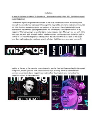
Looking at the rest of the magazine covers, I can also see that they both have used a digitally created
background, the backgrounds both consist of vector style drawings which I have seen to be a
common convention in dance magazine covers therefore showing that some elements of the
magazine conform to the conventions.
2. Looking at the double page spread I can also see some similarities when compared to a professional
magazine, looking at an extract from ‘NME’ magazine I can see that the choice of fonts is very
similar, also the overall colours of the page are also visually very close, this shows how the double
page spread links to the common themes seen throughout other magazines. However, one
difference that is visible is the use of the wave shape on my own magazine, this could show how
some features I have used are not conforming to conventions but it could just be because of the
different genres of the magazine since I have seen other double page spreads with similar designs
where there has been lines and shapes placed in the background of the image.
How does your music magazine represent particular social groups?
I had been planning to use a modern and contemporary design across my magazine and so that
would represent the modern and trendy person who would be the reader. By looking at the double
page spread and cover I think that I have achieved this look from the use of digitally created
elements such as the wave and face illustration, this gives connotations of modern and stylish
therefore representing my target audience.
Also the models that I used were trendy and young, this was deliberate to represent the younger
generations as I felt that it would suite my target audience. The clothes worn were fairly plain, this
3. was to make sure that it wouldn’t narrow the audience too much since that if too many brand
names were shown then It may have given off different connotations about the magazine since the
target audience would be quite brand wary.
What kind of media institution might distribute your music magazine and why?
Blaze Publishing
‘Blaze Publishing’ is a relatively small and new media distributor, they originally started publishing
shooting magazines but have now expanded into music magazines too. I think that Blaze Publishing
would be a great company to distribute my magazine since that they have shown to become a fairly
successful company and produce high quality magazines, their demographic is very broad since that
they have magazines covering all kind of types and genres, also as their popularity increases I’m sure
they will start to pick up on more magazines furthermore increasing their target audience.
The company is based in the UK so would be able to distribute my magazine nationally however
international distribution may not be possible such a small company but this shouldn’t be much of a
problem because most British magazines would only distribute within the UK anyway and the
demographic of my magazine has been based around the UK youth.
Who would be the audience for your music magazine?
The average reader of my magazine would be a male with 18-22 years of age with a large interest in
dance music and the artists associated, they would lead a fairly modern lifestyle and most likely have
an active online social life with a group of friends with similar interests, also they would attend
festivals and gigs quite regularly and probably follow their favourite artists on social media.
What have you learnt about technologies from the process of constructing this product?
During the construction of my product I have used a wide variety of tools, sources and websites, I
have listed all the technologies for a better way of showing what I have used;
Software:
4. Adobe Photoshop – Photoshop has been the main tool that I used to create the final magazine, with
previous knowledge and new techniques I have been able to use it to complete the task at hand a
create a magazine that I am happy with the look of.
Adobe Illustrator – I used Illustrator when creating the image for the front cover, the process was
very time consuming however I am very pleased with the outcome and personally think it looks very
professional.
Microsoft Word – Word has also been a big tool to use for my written pieces of work, it is a simple
program to use and gets what I need done.
Microsoft Powerpoint – I have used Powerpoint for a few parts of my work including the magazine
analysis and the planning tasks, it provides a similar use as Word does but displays it slightly
differently which was good so I could add different forms of media in my work.
Apple Pages – Pages was used from when I was working on a iMac and is very similar to word, the
only issue I faced was that if I had needed to complete the work away from the school iMacs it
caused problems since that I didn’t have access to a iMac elsewhere so it was a challenge to edit the
.pages files, this is why I started to use Microsoft Word as a replacement because it meant that I
could edit the document on PC or iMac.
Websites:
Wordpress – Wordpress was the main platform I used to showcase my work, it was great to use
since that I could implement other medias such as slideshows and questionnaires directly into the
blog.
Blogger – Blogger was the original site that was used to show my project, however I started to
encounter problems with uploading and editing posts which caused me to move to Wordpress as an
alternative.
Google – Google and Google images was my main source for finding any information that I required,
it was quick and easy to find a wide range of magazine examples and enabled me to research a huge
amount of data about my chosen genre and industry. Also the site Google Fonts provided me with a
huge selection of usable and royalty free fonts to use on my magazine.
Survey Monkey – Survey Monkey was used for my questionnaires, it was easy to use and I had no
issues with it, apart from some of the limited features that came with the free account plan.
Hardware:
Camera – The camera that I used was able to shoot high quality photographs and so was essential to
achieving a professional look.
Apple iMac – The iMacs used a school were how the majority of my tasks were completed, they
functioned almost perfectly well and was a great tool to use.
Laptop – My home laptop was also used to finish off any uncompleted tasks from lessons and could
run Photoshop perfectly fine, the only issue was the compatibility of some files when converted
from the iMac to PC.
5. Looking back at your preliminary task, what do you feel you have learnt in the progression from it to
the full product?
Looking back at my school magazine I can instantly see that there were many skills that I was missing
at the time, the cover had an extremely amateur design since that it was far too basic and didn’t
have enough features to fill up the page. The use of the barcode was an overall good idea to make
the magazine more plausible however the manner in which it was used actually retracted from the
overall design of the magazine, Also the typography and colour scheme clearly needed much more
thought, the font used did not represent a school at all and the colour of blue contrasted heavily
against the red logo of the school.
Although I was initially pleased with the design of the cover, after taking more time on a music
magazine and after comparing many times to professional magazines I can now see how the school
magazine could easily have been improved by changing the colour scheme to match the school logo,
also by maybe adding some images of students at the school it would make the cover a lot more
interesting since plain landscapes are not very eye-catching, one final thing that I would’ve changed
would be to add more small embellishments across the cover, this would make it slightly more
appealing and definitely make it less dull and boring.