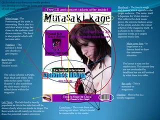
The document describes a magazine cover for a Japanese music magazine called Violet Shadow. It summarizes the design elements used on the cover that appeal to its target audience of Japanese music fans. These include the skewed font for the masthead that reflects the dark music genre. Images are used that bring the artist closer to audiences. Bold typeface is used for impact. Buzzwords and emotive language draw attention, while the layout does not overload readers. The color scheme, images, and positioning of elements on the cover were all chosen with the target audience in mind.


