Downloaded 229 times


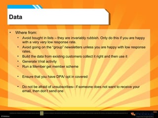
![The process – Data Checking You can do three basic things 1- dedupe - get rid of duplicates 2 – address validity – looking at the structure of the email address e.g. [email_address] So martincm@mobious.netto – would not be right Martincorlettmosshotmail.com – would not be right 3 – DNS SMTP checking – pings to the server which the address is at to see if it exists or not. You can get a 20% drop out rate before you’ve even started. (better for cost and real result analysis)](https://image.slidesharecdn.com/email-presentation-v1-1212140004247796-9/85/Merit-Event-E-Mail-Marketing-How-to-do-it-Right-28-320.jpg)


![Questions - and one sales ploy Remember we will do one “free” critique on your emails, so if you are interested. Email me first to tell me you want to Then add me to your next mail list so I see the email exactly as a punter would [email_address] You will NOT have opted in to further communication, so we will not bombard you with emails or “can we meet” messages.](https://image.slidesharecdn.com/email-presentation-v1-1212140004247796-9/85/Merit-Event-E-Mail-Marketing-How-to-do-it-Right-85-320.jpg)

The document provides a comprehensive guide on effective email marketing strategies, emphasizing the importance of understanding email limitations and best practices. Key recommendations include focusing on data quality, concise and engaging content, and clear calls to action, along with a well-thought-out design. The document also highlights the significance of analyzing competitors and staying updated with trends to improve email marketing efforts.


