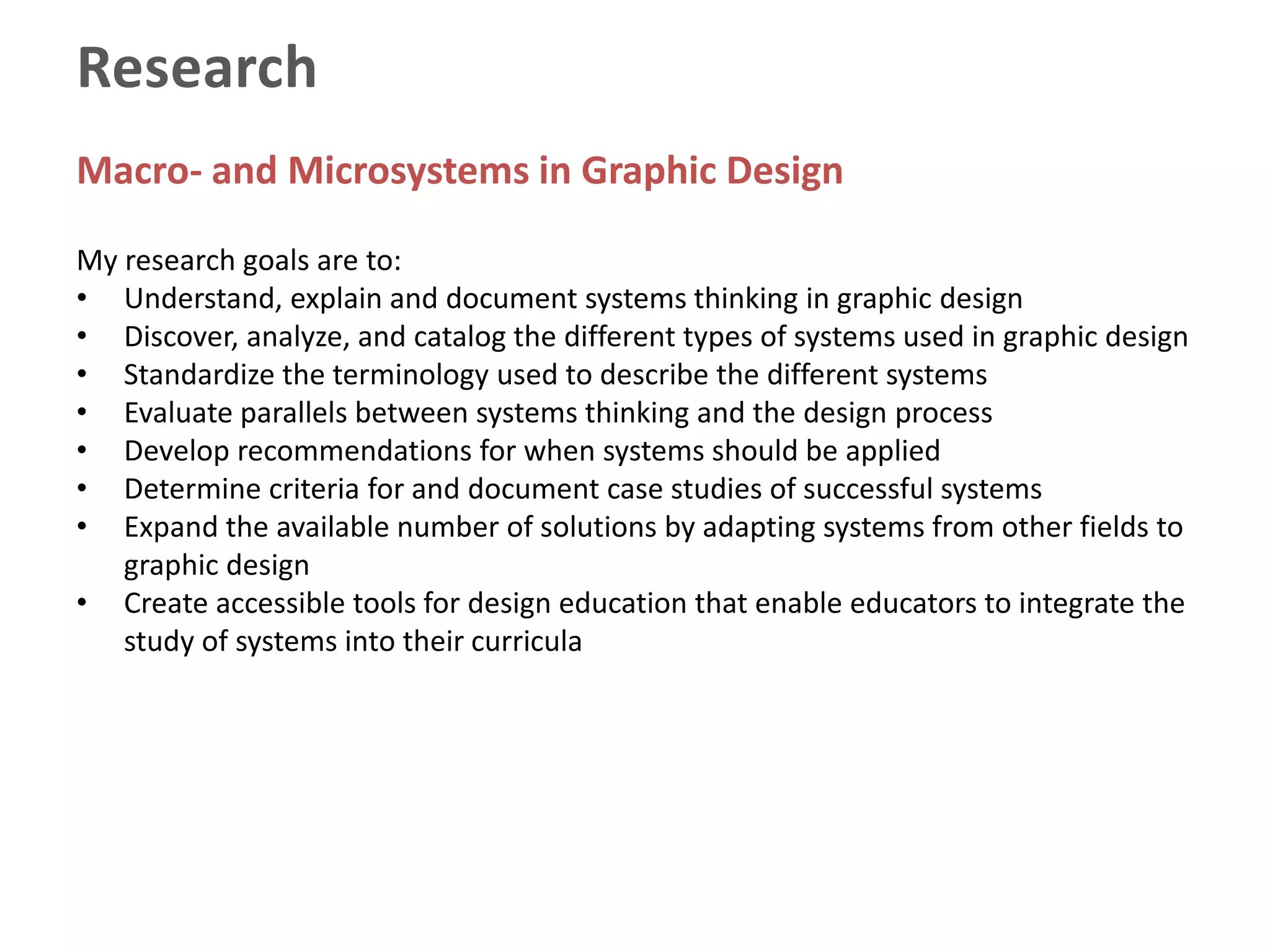
Ellen Lytle (Eichler), MA, MDes
PRINT | IDENTITY | INTERACTIVE | VIDEO | PUBLISHING | MARKETING COMMUNICATIONS
PORTFOLIO
CV HIGHLIGHTS
STUDENT WORK
SOFTWARE
EXPERTISE
LIST OF COURSES
CONTACT INFO
Selected Achievements
• Judge of the How Magazine Interactive Design Annual. Wrote judges’ article
reviewing the year's work.
• Author of best-selling design book: Click 1, The Brightest in Computer-generated
Design and Illustration
• Received the G. Theodore Mitau Award for Innovation and Change in Higher
Education from the American Association of State Colleges and Universities.
• Tapped by Atlanta’s Women’s Magazine WLA (2003) as one of the “100 Most
Influential and Powerful Women in Georgia”. Also honored were Coretta Scott King,
Jane Fonda, Mayor Shirley Franklin, and the presidents of Kennesaw State University
and Spelman College.
• Recognized with the Art Institute Award for Outstanding Faculty Contribution to
Student Success for creating weekend workshops to assist at-risk students with
design process, theory, ideation, clarity and confidence.
• Chairman of a National Design Conference
• Developed the national degree program in Illustration and led the team to develop
the curriculum for system-wide launch on 40 campuses.
• Commission for the U.S. Olympics in Atlanta
CV HIGHLIGHTS
ACADEMIC
EXPERIENCE
ACHIEVEMENTS EDUCATION
Master of Design, Graphic Design | 1989
University of Cincinnati, College of Design, Architecture, Art & Planning,
Cincinnati Terminal degree with thesis (MFA equivalent). Research areas: Electronic
publishing and design education. Full scholarship. Selected by U.S. News & World
Report as one of the top 25 graduate design programs in the world.
Master of Arts, Instructional Design & Technology | 1986
Miami University, Oxford, OH. Coursework in instructional design and development,
curriculum, educational technology, instructional theory and educational research.
Information design and development for broadcast and print media. Research area:
Computer-based Instruction.
Bachelor of Science, Graphic Design | 1979
University of Cincinnati, College of Design, Architecture, Art & Planning, Cincinnati
Curriculum integrates the study of typography, layout, photography, information,
systems, theory and design history. Internationally recognized, five-year graphic
design program alternating quarters of professional practice in the field with
coursework.
The Leys School, Cambridge University |
1973Cambridge, UK. Started college at age 15 studying studio arts, contemporary British
theater and European history.
University of
Cincinnati DAAP
CV HIGHLIGHTS
ACADEMIC
EXPERIENCE
ACHIEVEMENTS EDUCATION
The Medici Center| 2008 – 2009
Director of a Think Tank and Institute for Collaboration for Atlanta
universities, medical centers, government agencies and research
organizations.
Assistant Professor| 2000 – 2007
Dual Appt. Graphic Design and Multimedia/Web Design, Art Institute of
Atlanta
Assistant Professor, Graphic Design | 1985 – 1993
Northern Kentucky University, Coordinator of the Graphic Design
Program
Adjunct Instructor, Graphic Design | 1988
University of Cincinnati, College of Design, Architecture, Art and Planning.
The Medici Center
The
Medici
Center
CV HIGHLIGHTS
ACADEMIC
EXPERIENCE
ACHIEVEMENTS EDUCATION
Adjunct Faculty| 2012
Westwood College-Northlake
Adjunct Faculty| 2014 – present
Art Institute of Ohio-Cincinnati
Visiting Professor| 2015 – present
Eastern Kentucky University
Marketing Director | 1999
Tele-Track Credit Bureau, Atlanta, GA
Medical Illustrator | 1979-83
Biomedical Communications, University of Cincinnati Medical Center
Corporate Communications Designer | 1998
The Coca-Cola Company, Atlanta, GA
Publisher | 1995-98
Multifile Publishing Co., Cincinnati, OH
Smith & Nephew
Graphic
Design
Press
CV HIGHLIGHTS
PROFESSIONAL
EXPERIENCE
ACHIEVEMENTS EDUCATION
Marketing Communications Editor/Designer | 2009-10
Smith & Nephew/Johnson & Johnson, Atlanta, GA
Graphic Design Press | 1983 – present
Graphic Design, Publishing and Marketing Communications
Director of Marketing & Communications | 2013
Northern Kentucky Chamber of Commerce, Greater Cincinnati area
Senior Designer | 1995-96
Tischbein Design, Covington, KY
Bestselling Author
Click, The Brightest in Computer-generated Design and Illustration
Cincinnati, OH: Northlight Books, 1990.
Graphic Designers’ Book Club Alternative Selection of the Month
Research
Macro- and Microsystems in Graphic Design
My research focuses on the investigation of the systems that support graphic
design.
Microsystems are a set of connected things or parts forming a complex whole
such as the geometry used in a logo.
Macrosystems are a set of principles or procedures according to which
something is done such as a corporate identity system (an organized scheme
or methodology).
Systems thinking offers designers concepts and tools that support the
decision-making and critical thinking skills needed for the efficient and
profitable practice of design.
Research
Macro- and Microsystems in Graphic Design
My research goals are to:
• Understand, explain and document systems thinking in graphic design
• Discover, analyze, and catalog the different types of systems used in graphic design
• Standardize the terminology used to describe the different systems
• Evaluate parallels between systems thinking and the design process
• Develop recommendations for when systems should be applied
• Determine criteria for and document case studies of successful systems
• Expand the available number of solutions by adapting systems from other fields to
graphic design
• Create accessible tools for design education that enable educators to integrate the
study of systems into their curricula
Research
Book Title:
Systems Essentials, 100 Design Principles for Using Macro- and Microsystems in Design
Preparing book proposal for Rockport Publishers
Portfolio
| PRINT | IDENTITY | INTERACTIVE | VIDEO | PUBLISHING | MARKETING COMMUNICATIONS | PACKAGING |
Award-winning design work was selected for the following juried design annuals & shows:
• Silver, Linda. Print’s Best Logos & Symbols 3. New York, NY: RC Publications, 1994.
• Cincinnati Art Directors’ Club Show: Entries accepted in 1978, 1992, and 1994.
• Carter, David E. American Corporate Identity 5. New York, NY: Art Direction Book Co., 1989.
• Print Regional Design Annual, 1990.
PORTFOLIO
CV HIGHLIGHTS
STUDENT WORK
SOFTWARE
EXPERTISE
LIST OF COURSES
CONTACT INFO
CORPORATE
IDENTITY
PUBLICATIONS INTERACTIVE
THREE
DIMENSIONAL
PRINT &
MARCOMM
BEFORE
X
CORPORATE
IDENTITY
PUBLICATIONS INTERACTIVE
THREE
DIMENSIONAL
PRINT &
MARCOMM
X
CORPORATE
IDENTITY
PUBLICATIONS INTERACTIVE
THREE
DIMENSIONAL
PRINT &
MARCOMM
X
CORPORATE
IDENTITY
PUBLICATIONS INTERACTIVE
THREE
DIMENSIONAL
PRINT &
MARCOMM
X
CORPORATE
IDENTITY
PUBLICATIONS INTERACTIVE
THREE
DIMENSIONAL
PRINT &
MARCOMM
X
CORPORATE
IDENTITY
PUBLICATIONS INTERACTIVE
THREE
DIMENSIONAL
PRINT &
MARCOMM
X
CORPORATE
IDENTITY
PUBLICATIONS INTERACTIVE
THREE
DIMENSIONAL
PRINT &
MARCOMM
X
CORPORATE
IDENTITY
PUBLICATIONS INTERACTIVE
THREE
DIMENSIONAL
PRINT &
MARCOMM
X
CORPORATE
IDENTITY
PUBLICATIONS INTERACTIVE
THREE
DIMENSIONAL
PRINT &
MARCOMM
X
CORPORATE
IDENTITY
PUBLICATIONS INTERACTIVE
THREE
DIMENSIONAL
PRINT &
MARCOMM
X
CORPORATE
IDENTITY
PUBLICATIONS INTERACTIVE
THREE
DIMENSIONAL
PRINT &
MARCOMM
X
CORPORATE
IDENTITY
PUBLICATIONS INTERACTIVE
THREE
DIMENSIONAL
PRINT &
MARCOMM
X
CORPORATE
IDENTITY
PUBLICATIONS INTERACTIVE
THREE
DIMENSIONAL
PRINT &
MARCOMM
X
Work in Progress:
Carolina
Carolina Incised
Carolina Engraved
PRINT &
MARCOMM
PUBLICATIONS INTERACTIVE
THREE
DIMENSIONAL
CORPORATE
IDENTITY
X
PRINT &
MARCOMM
PUBLICATIONS INTERACTIVE
THREE
DIMENSIONAL
CORPORATE
IDENTITY
X
PRINT &
MARCOMM
PUBLICATIONS INTERACTIVE
THREE
DIMENSIONAL
CORPORATE
IDENTITY
X
PRINT &
MARCOMM
PUBLICATIONS INTERACTIVE
THREE
DIMENSIONAL
CORPORATE
IDENTITY
X
PRINT &
MARCOMM
PUBLICATIONS INTERACTIVE
THREE
DIMENSIONAL
CORPORATE
IDENTITY
X
PRINT &
MARCOMM
PUBLICATIONS INTERACTIVE
THREE
DIMENSIONAL
CORPORATE
IDENTITY
X
PRINT &
MARCOMM
PUBLICATIONS INTERACTIVE
THREE
DIMENSIONAL
CORPORATE
IDENTITY
X
PRINT &
MARCOMM
PUBLICATIONS INTERACTIVE
THREE
DIMENSIONAL
CORPORATE
IDENTITY
X
PRINT &
MARCOMM
CORPORATE
IDENTITY
INTERACTIVE
THREE
DIMENSIONAL
PUBLICATIONS X
PRINT &
MARCOMM
CORPORATE
IDENTITY
INTERACTIVE
THREE
DIMENSIONAL
PUBLICATIONS X
PRINT &
MARCOMM
CORPORATE
IDENTITY
INTERACTIVE
THREE
DIMENSIONAL
PUBLICATIONS X
PRINT &
MARCOMM
CORPORATE
IDENTITY
INTERACTIVE
THREE
DIMENSIONAL
PUBLICATIONS X
PRINT &
MARCOMM
CORPORATE
IDENTITY
INTERACTIVE
THREE
DIMENSIONAL
PUBLICATIONS X
PRINT &
MARCOMM
CORPORATE
IDENTITY
INTERACTIVE
THREE
DIMENSIONAL
PUBLICATIONS X
PRINT &
MARCOMM
CORPORATE
IDENTITY
INTERACTIVE
THREE
DIMENSIONAL
PUBLICATIONS X
PRINT &
MARCOMM
CORPORATE
IDENTITY
INTERACTIVE
THREE
DIMENSIONAL
PUBLICATIONS X
PRINT &
MARCOMM
CORPORATE
IDENTITY
INTERACTIVE
THREE
DIMENSIONAL
PUBLICATIONS X
PRINT &
MARCOMM
CORPORATE
IDENTITY
INTERACTIVE
THREE
DIMENSIONAL
PUBLICATIONS X
PRINT &
MARCOMM
CORPORATE
IDENTITY
INTERACTIVE
THREE
DIMENSIONAL
PUBLICATIONS X
PRINT &
MARCOMM
CORPORATE
IDENTITY
PUBLICATIONS
THREE
DIMENSIONAL
INTERACTIVE X
PRINT &
MARCOMM
CORPORATE
IDENTITY
PUBLICATIONS
THREE
DIMENSIONAL
INTERACTIVE X
PRINT &
MARCOMM
CORPORATE
IDENTITY
PUBLICATIONS
THREE
DIMENSIONAL
INTERACTIVE X
PRINT &
MARCOMM
CORPORATE
IDENTITY
PUBLICATIONS
THREE
DIMENSIONAL
INTERACTIVE X
Packaging
- Labels
- Plastics
- Flexible
- Paperboard
- Sustainable
PRINT &
MARCOMM
CORPORATE
IDENTITY
PUBLICATIONS INTERACTIVE
THREE
DIMENSIONAL
X
PRINT &
MARCOMM
CORPORATE
IDENTITY
PUBLICATIONS INTERACTIVE
THREE
DIMENSIONAL
X
PRINT &
MARCOMM
CORPORATE
IDENTITY
PUBLICATIONS INTERACTIVE
THREE
DIMENSIONAL
X
PRINT &
MARCOMM
CORPORATE
IDENTITY
PUBLICATIONS INTERACTIVE
THREE
DIMENSIONAL
X
XPHOTOGRAPHY
PHOTOGRAPHY XPHOTOGRAPHY
Student work from my classes has been selected for awards in the following juried design
annuals and shows:
• Silver Award, Student Division, ShowSouth, 2005
• Honorable Mention, 2003 Print Magazine International Student Cover Competition
• First Place, Student Competition, SIGGRAPH, 2004
• Grand Prize, 2003 Adobe National Student Competition
• Cincinnati Art Directors’ Club Scholarship Award, 1989, 1991 and 1992.
• Honorable Mention, 1992 Print Magazine International Student Cover Competition
• Third Place, 1989 Print Magazine International Student Cover Competition
FOUNDATIONS | IDENTITY | TYPOGRAPHY | INTERACTIVE | ILLUSTRATION | PUBLICATIONS | PACKAGING
Student Work
PORTFOLIO
CV HIGHLIGHTS
STUDENT WORK
SOFTWARE
EXPERTISE
LIST OF COURSES
CONTACT INFO
TYPOGRAPHY
PRINT &
PUBLICATIONS
SYMBOLISM &
IDENTITY
THREE
DIMENSIONAL
FOUNDATIONS X
TYPOGRAPHY
PRINT &
PUBLICATIONS
SYMBOLISM &
IDENTITY
THREE
DIMENSIONAL
FOUNDATIONS X
TYPOGRAPHY
PRINT &
PUBLICATIONS
SYMBOLISM &
IDENTITY
THREE
DIMENSIONAL
FOUNDATIONS X
TYPOGRAPHY
PRINT &
PUBLICATIONS
SYMBOLISM &
IDENTITY
THREE
DIMENSIONAL
FOUNDATIONS X
TYPOGRAPHY
PRINT &
PUBLICATIONS
SYMBOLISM &
IDENTITY
THREE
DIMENSIONAL
FOUNDATIONS X
TYPOGRAPHY
PRINT &
PUBLICATIONS
SYMBOLISM &
IDENTITY
THREE
DIMENSIONAL
FOUNDATIONS X
FOUNDATIONS
PRINT &
PUBLICATIONS
SYMBOLISM &
IDENTITY
THREE
DIMENSIONAL
TYPOGRAPHY X
FOUNDATIONS
PRINT &
PUBLICATIONS
SYMBOLISM &
IDENTITY
THREE
DIMENSIONAL
TYPOGRAPHY X
FOUNDATIONS
PRINT &
PUBLICATIONS
SYMBOLISM &
IDENTITY
THREE
DIMENSIONAL
TYPOGRAPHY X
FOUNDATIONS
PRINT &
PUBLICATIONS
SYMBOLISM &
IDENTITY
THREE
DIMENSIONAL
TYPOGRAPHY X
FOUNDATIONS
PRINT &
PUBLICATIONS
SYMBOLISM &
IDENTITY
THREE
DIMENSIONAL
TYPOGRAPHY X
FOUNDATIONS TYPOGRAPHY
SYMBOLISM &
IDENTITY
THREE
DIMENSIONAL
PRINT &
PUBLICATIONS
X
FOUNDATIONS TYPOGRAPHY
SYMBOLISM &
IDENTITY
THREE
DIMENSIONAL
PRINT &
PUBLICATIONS
X
FOUNDATIONS TYPOGRAPHY
SYMBOLISM &
IDENTITY
THREE
DIMENSIONAL
PRINT &
PUBLICATIONS
X
FOUNDATIONS TYPOGRAPHY
SYMBOLISM &
IDENTITY
THREE
DIMENSIONAL
PRINT &
PUBLICATIONS
X
FOUNDATIONS TYPOGRAPHY
SYMBOLISM &
IDENTITY
THREE
DIMENSIONAL
PRINT &
PUBLICATIONS
X
FOUNDATIONS TYPOGRAPHY
SYMBOLISM &
IDENTITY
THREE
DIMENSIONAL
PRINT &
PUBLICATIONS
X
FOUNDATIONS TYPOGRAPHY
SYMBOLISM &
IDENTITY
THREE
DIMENSIONAL
PRINT &
PUBLICATIONS
X
FOUNDATIONS TYPOGRAPHY
PRINT &
PUBLICATIONS
THREE
DIMENSIONAL
SYMBOLISM &
IDENTITY
X
FOUNDATIONS TYPOGRAPHY
PRINT &
PUBLICATIONS
THREE
DIMENSIONAL
SYMBOLISM &
IDENTITY
X
FOUNDATIONS TYPOGRAPHY
PRINT &
PUBLICATIONS
THREE
DIMENSIONAL
SYMBOLISM &
IDENTITY
X
FOUNDATIONS TYPOGRAPHY
PRINT &
PUBLICATIONS
THREE
DIMENSIONAL
SYMBOLISM &
IDENTITY
X
Corporate Identity
FOUNDATIONS TYPOGRAPHY
PRINT &
PUBLICATIONS
THREE
DIMENSIONAL
SYMBOLISM &
IDENTITY
X
FOUNDATIONS TYPOGRAPHY
PRINT &
PUBLICATIONS
THREE
DIMENSIONAL
SYMBOLISM &
IDENTITY
X
FOUNDATIONS TYPOGRAPHY
PRINT &
PUBLICATIONS
THREE
DIMENSIONAL
SYMBOLISM &
IDENTITY
X
FOUNDATIONS TYPOGRAPHY
PRINT &
PUBLICATIONS
SYMBOLISM &
IDENTITY
THREE
DIMENSIONAL
X
TYPOGRAPHY
PRINT &
PUBLICATIONS
SYMBOLISM &
IDENTITY
THREE
DIMENSIONAL
XFOUNDATIONS
TYPOGRAPHY
PRINT &
PUBLICATIONS
SYMBOLISM &
IDENTITY
THREE
DIMENSIONAL
XFOUNDATIONS
TYPOGRAPHY
PRINT &
PUBLICATIONS
SYMBOLISM &
IDENTITY
THREE
DIMENSIONAL
XFOUNDATIONS
TYPOGRAPHY
PRINT &
PUBLICATIONS
SYMBOLISM &
IDENTITY
THREE
DIMENSIONAL
XFOUNDATIONS
TYPOGRAPHY
PRINT &
PUBLICATIONS
SYMBOLISM &
IDENTITY
THREE
DIMENSIONAL
XFOUNDATIONS
TYPOGRAPHY
PRINT &
PUBLICATIONS
SYMBOLISM &
IDENTITY
THREE
DIMENSIONAL
XFOUNDATIONS
Packaging
TYPOGRAPHY
PRINT &
PUBLICATIONS
SYMBOLISM &
IDENTITY
THREE
DIMENSIONAL
XFOUNDATIONS
List of Courses Taught
Interactive
and Web Design
• Interface Design
• Web Marketing
• Introduction to HTML
• WordPress
Graphic Design,
Advertising and Illustration
• Art Appreciation
• Two-dimensional Design
• Intro to Graphic Design
• Intro to Typography
• Advanced Typography
• Layout
• Symbolism
• Printing and Production
• Environmental Graphics
• Intermediate Graphic
Design
• Packaging Design
• Rapid Visualization
• Advertising Concepts
• History of Graphic Design
• Corporate Identity
• Illustration
• Rendering
• Collateral Design
• Intro to Computer Graphics
• Publication Design
• Adv Graphic Design I & II
• Interdisciplinary Design
• Design Research
• Senior Project
• Portfolio
• Photoshop
• Sustainable Design
• Typographic Hierarchy
• Digital Imaging
• Digital Prepress
• Advertising Copywriting
• Conceptual and Strategic
Thinking
• Advanced Layout
• Intro to Computer Applications
• Visual Thinking
Online Courses
Instructional Design
• Portfolio
• Publication Design
• Advanced Layout
• Advertising Concepts
• Selected as a Beta Tester for the new Adobe Digital
Publishing Suite
• Tested at the Expert/Instructor Level on Adobe
Creative Cloud Illustrator, InDesign and Photoshop
– Adobe Muse and Experience
– WordPress
– EPUB for digital publishing on mobile and tablet
platforms
– Digital Video, Adobe Premiere Pro, Camtasia,
Adobe After Effects and Audacity (audio)
– Digital Photography
– FontLab/Fontographer font design software
– PowerPoint, Word and Microsoft Office
(Left) Entry for Olympic Packaging Competition
Software & Programming Expertise
PHONE:
859.308.8807
EMAIL:
ellenlytle@yahoo.com
PORTFOLIO SITE:
http://ellenlytle-portfolio.com
Contact
Information
PORTFOLIO
CV HIGHLIGHTS
STUDENT WORK
SOFTWARE
EXPERTISE
LIST OF COURSES
CONTACT INFO

Ellen Lytle Portfolio & Student Work

Editor's Notes

  • #10 My current research concentrates on collecting, analyzing and cataloging systems in use. Research continues. Next step is the book proposal and sample chapters.
  • #12 Complete Design Platform of Identity, Interactive and Marketing Collateral for an International Insurance Brokerage MCGRIFF SEIBELS + WILLIAMS This is what passed for a web site and logo at this large national insurance company. Every person in the company did whatever they wanted for proposals, sales information, and imagery. Every branch office created different materials without consistent branding. It was a huge undertaking to get everyone on board with new proposal templates, professionally printed sales collateral, a new web site, and complete identity guidelines to present a united front both visually and through its messaging.
  • #13 Complete Design Platform of Identity, Interactive and Marketing Collateral for an International Insurance Brokerage MCGRIFF SEIBELS + WILLIAMS The NEW web site uses embedded web fonts and a soft, approachable color scheme. Soft gray paper texture is used on interactive elements to reflect the soft textured gray paper used for printing. The tactile quality is soft and comforting.
  • #14 Left: Custom tabs for formal proposals to clients reinforce the key words associated with the new brand. My role was in leading strategy, copywriting, design, and print production. Top: New logo for McGriff focuses on one word that is easy to remember and a dominant color used on all materials (orange). Bottom: New “people pages” I wrote and designed for each person in the company stress personal attention, trust, and the individual’s area of expertise
  • #15 Individual capabilities brochures were designed for each division of the company. Each division was assigned its own color from the color palette plus the company orange. This is printed on white flecked felt cotton paper that creates a comforting texture when handled. This use of texture is in direct contrast to the coated paper (“slick”) that is used by almost all of the company’s competitors.
  • #16 PowerPoint presentation created for the company representatives to use when approaching new business. It uses the branding colors, charcoal gray type, soft felt textures, and soft imagery. Responsible for strategy, research, photography art direction, copywriting, and design.
  • #17 Complete Design Platform of Identity and Marketing Collateral for Real Estate Broker JAMES MAROTTA Responsible for strategy, copywriting, design, and printing production. Colors found in real estate were the basis of the color palette. Eight page brochure introduces services and staff.
  • #18 Ad for Magazine CLASSIC GARDENS Simplicity and high impact color are the aesthetics practiced by this landscape architecture firm and reflected in their magazine advertising.
  • #19 Design Competition for Architects Steelox Systems (Fabricated Buildings) Layers of information range from the lowest legibility at the bottom to the most important, most legible information on the top. The laurel wreath is a well-known classical symbol for achievement. Deeply grooved uncoated cotton paper appeals to the high end sensibilities of the target audience.
  • #20 Collateral Program – Logo, Stationery, Custom Folder, Staff Biographies, Brochure and Business Cards Sports Agents/Attorney Representing Athletes Wrote and designed a program that includes identity, branding, client presentation packets, and a brochure.
  • #21 Billboard and Bus Advertising Campaign for Radio Station WRRM-FM Radio The city skyline was used in the branding platform and shown in several different visual interpretations to keep it fresh. High contract imagery created by posterizing a photograph of the city skyline. I did the logo, too.
  • #22 Collateral Campaign for Auction House Smythe LTD Stock photography of high-end antiques was used to represent the quality and variety of merchandise handled by the dealer. The tan background texture is the pen-and-ink headline used on the front of the brochure – screened back and multiplied to create a pattern. The different business cards represent the specific areas of expertise of each of the staff members (e.g., Victorian period, colonial period).
  • #23 Typeface Design Developed typefaces starting from the idea to hand sketches through production. Used Fontographer software to develop fonts for marketing through an online type foundry.
  • #25 Corporate Identity for Online Travel Agency Four Corners Travel is an internet startup specializing in adventure vacations for groups. such as sailing cruises, arctic treks, mountain climbs, and safaris. The blue color and highlights are high tech and particularly suitable for online applications. A compass is a metaphor for adventure.
  • #26 Identity Platform for Permanent Makeup Technician Honey Secunda and Marietta Plastic Surgery The client’s name was an obvious choice for imagery. One color printing and thermography (raised ink) create a unique tactile quality. Printing on the back of the business card helps carry the pattern through all pieces.
  • #27 Logo for Design Conference University and College Designers’ Association Conference held in Cincinnati – famous for its pork-related industries The flying pig logo was awarded several design awards. It uses a strong system. The shapes of the ears is repeated in a proportional size on the eyes and hoofs. The shape of the head is repeated of the legs and shoulders. The same diameter line weight is used throughout with with circular endings.
  • #28 Identity Program and website for a corporate recruiter who fills the missing holes in organizations with just the right person.
  • #29 This is a corporate identity program for an interior designer. Two different colors for different applications. The orange logo goes on dark backgrounds and the black logo goes on light backgrounds.
  • #30 Logo for Roofing Repair Company Pitch + Patch Roofing Repair Concept: Remind Viewers that Loose Shingles Need Attention Created a professional, contemporary design and name for a new roofing company for applications on vehicles, business cards, yard signs, and email. The logo is bold to stand up outdoors in a visually cluttered environment.
  • #31 Corporate Identity program for an Atlanta Bar named Teazer. The bar is upscale and sophisticated.
  • #32 Logo for Nonprofit Organization Georgia Foundation for Youth Concept: Uplifting and Positive A horizontal version and vertical version were created for different applications such as signage, print, presentations, and a magazine. The color stripe was as a repeating element for borders and accents.
  • #33 Role Model Magazine Georgia Foundation for Youth Concept: Uplifting and Positive Bi-Monthly magazine for nonprofit organization. Designed grid systems, typographic treatments, and first issue.
  • #34 Cover of the Majors’ Cup Magazine Client: Maxum Communications Art director of a national magazine during its startup period. Secured PGA-licensed photography of golfers. The color green is usually used on any publication dealing with gold. The color palette I selected is sophisticated and subtle. A minimal amount of imagery is used to emphasize certain things (e.g., crowds removed to make swing and stance clearer). Art directed photo shoot of the Waterford Majors’ Cup trophy.
  • #35 Cover of the Majors’ Cup Magazine Client: Maxum Communications Art director of a national magazine during its startup period. Secured PGA-licensed photography of golfers. The color green is usually used on any publication dealing with gold. The color palette I selected is sophisticated and subtle. A minimal amount of imagery is used to emphasize certain things (e.g., crowds removed to make swing and stance clearer). Art directed photo shoot of the Waterford Majors’ Cup trophy.
  • #36 Table of Contents for the Majors’ Cup Magazine Maxum Communications Upscale typography and imagery Set up a five-column grid for the magazine’s editorial pages. The table of contents is designed to hold a lot of copy. The hierarchy of type is designed for quick scanning.
  • #37 Book and DVD Covers of Regional Restaurant Guide Interior Pages Intrepid Traveler Publishing Designed a series of handy pocket size guides to restaurants in different cities.
  • #38 Book and DVD Covers of Regional Restaurant Guide Interior Pages Intrepid Traveler Publishing Designed a series of handy pocket size guides to restaurants in different cities.
  • #39 Book and DVD Covers of Regional Restaurant Guide Interior Pages Intrepid Traveler Publishing Designed a series of handy pocket size guides to restaurants in different cities.
  • #40 Cover of Lifestyle Magazine Backed by Venture Capital Editorial to attract young professionals to the city Publisher and Art Director of local magazine. The magazine was developed and refined through research into lifestyles, demographics, and consumer testing. Designed the entire magazine, supervised pre-press and printing, wrote 30% of the editorial content, supervised freelance photographers and writers, and designed advertising.
  • #41 Custom Binder Smith & Nephew, a Division of Johnson & Johnson Editing, layout, design and illustration of product catalog, surgical technique guide, and anatomy reference in both print and electronic versions.
  • #42 Interior Page Layouts—Print Smith & Nephew, a Division of Johnson & Johnson Editing, layout, design and illustration of product catalog, surgical technique guide, and anatomy reference in both print and electronic versions.
  • #43 Custom Die-cut Tabs for Print Book Smith & Nephew, a Division of Johnson & Johnson Editing, layout, design and illustration of product catalog, surgical technique guide, and anatomy reference in both print and electronic versions.
  • #44 iPhone App Interface Smith & Nephew, a division of Johnson & Johnson Editing, layout, design and illustration of product catalog, surgical technique guide, and anatomy reference in both print and electronic versions. Developed the iPhone interface in compliance with Apple Developer Guidelines and Smith & Nephew branding guidelines.
  • #45 Free Font Website Developed a free font site using Wordpress on a six column grid. Image maps act as navigation in addition to the menu. Designed for students to use to access several hundred well-designed free fonts.
  • #46 App for Mahogany’s at the Banks, an upscale restaurant on the Ohio River Uses the Bizness Apps platform
  • #47 Website for Atlanta Bee Company uses natural colors to reflect the natural products and the packaging. I designed the packaging which is sold in recycled wine bottles.
  • #48  Packaging for Organic Olive Oil for Atlanta Bee Co. Placing the product in Whole Foods grocery store required an upgrade in packaging. It still uses wine bottles because it is part of their brand. The bright colors are different from the usual colors used by almost all competitors. I set up a packaging materials library for the students at the Art Institute of Atlanta with catalogs, sample packages, foams, and plastic bottles.
  • #49 Toy Packaging Libby Lee Toys Bright patterns and festive colors appeal to children. Toy makeup kits for little girls. Supervised photography of children, created die lines for printer, and oversaw printing of 21 packages.
  • #50 Toy Packaging Libby Lee Toys Bright patterns and festive colors appeal to children. Toy makeup kits for little girls. Supervised photography of children, created die lines for printer, and oversaw printing of 21 packages.
  • #51 Environmental Graphics and Identity Client: Redrock Properties Concept: Abstraction of Natural Beauty Kinetic identity program for timeshare condominium complexes screened on brushed steel and mounted in textured concrete. The materials and production processes will withstand long, harsh winters and temperature extremes in the Colorado climate. The height of the lettering matches the viewing distance from a car seat.
  • #52 “Atlanta Uses Brick Now” I like dramatic lighting and severe angles. I shoot a lot of architecture.
  • #53 I like to turn architecture into simple dramatic forms. It becomes a composition instead of a building.
  • #54 This is part of a series I did for the Chamber of Commerce magazine on several key manufacturing firms leaving the area.
  • #55 Second in the series “Northern Kentucky Industry Silenced”
  • #56 Third in the series “Northern Kentucky Industry Silenced”.
  • #58 In 2D Design, I have students hand-mix an 18 hue color wheel using gouache. They mix the hues, two tints and two shades from Cyan, Magenta, Yellow, White and Black tubes of paint. They are given a template for the color wheel. The color swatches are painted onto heavy paper then cut out with the template when they are dry. By the end of this project they have a thorough understanding of colors and the subtle differences between them.
  • #59 Line as Tonal Value Introduction to Graphic Design Students learn abstraction and develop a graphic language through the portrayal of objects. The square format is a new compositional problem for most students. Careful attention is paid maintaining a focal point and a dynamic composition. Students begin the process with outline drawings of their chosen object, progress to pencil drawings using values, then convert the values to line weights.
  • #60 Movement and Form Introduction to Graphic Design Train Wheels Introduction to the research process and abstracting images from life. Students are given only three words and the space to create a simple poster that implies activity, speed and motion
  • #61 Movement and Form Introduction to Graphic Design Train Wheels Project guidelines allow for only the wheels to be used in the poster on either a white or black background.
  • #62 Motion Graphics Using the work of Saul Bass as inspiration, students design a title sequence breaking the work into 24 separate steps.
  • #64 Drafting Letterforms Introduction to Typography Students integrate historical influences with the study of classical typographical proportions using Albrecht Dürer’s system for creating letterforms. Six letters, selected specifically for the challenges they present, are drafted completely by hand with traditional tools and pencil.
  • #65 Logotype with Two Letterforms Introduction to Typography A logotype is a single unified form joining two letters in a seamless, natural way.
  • #66 Type-Symbol Combination The negative space around letterforms is explored in this interaction between positive and negative spaces, and type and symbols.
  • #67 This is a typography project. Students create three variations of a poster. They write a report on the history of a typographic terms and incorporate the copy into the poster. They are limited to two colors and all the tints and shades of those two colors.
  • #68 Advanced Typography Students learn to mix and match 6 typefaces in a consumer catalog. The documents are prepared as if they are going to the printer and an e-version of the catalog is created. The e-version has links, page animations and bookmarks.
  • #69 Dingbat Brochures Collateral Design Students create a typeface sample using any print format that supports their concept. These have taken the form of brochures, catalogs, decks of cards, elaborately folded posters and books. This particular project won the honorable mention (student competition) at ShowSouth 2004/05. It is a 12 page spiral bound brochure with hidden pockets behind doors that hold cards. The theme is based on 1940s retro roadside motels.
  • #71 Print Magazine Student Cover Competition Publication Design My students placed third (left) and received an honorable mention (right) in the Print Magazine International Student Cover Competition.
  • #72 Magazine Cover, Table of Contents, and Two-page Spread Publication Design Consistency is one of the primary qualifiers as to the success of the project...do all the pieces look like they come from the same publication?
  • #73 Magazine Cover, Table of Contents, and Two-page Spread Publication Design Students are presented with the problem of developing a magazine for collectors. They are allowed to use any collectible objects that match their interests.
  • #74 Book Cover and Two Spreads Publication Design Students incorporate all of their skills into this one project in one of the last courses before graduation.
  • #75 Book Cover and Two Spreads Publication Design These two-page spreads require the organization of images and typography in a book format. This student chose to use an tall format to reflect the lava lamps in this oversize coffee table book.
  • #76 Monogram Shapes and letterforms are combined to create an abstract monogram. The underlying educational objective is to develop a methodical personal design process based on research, ideation, refinement, and production.
  • #77 Symbol Systems Symbolism Abstraction, reductionism, gestalt, and minimalism are introduced into this project using a symbol system. Students research the structure and forms of a prominent building and use a systems approach to simplify the structure into a symbol.
  • #78 Symbol Systems Symbolism Students developed a systems approach to organic forms (animal).
  • #79 Corporate Identity Program Students apply skills learned in all of their preliminary courses to create comprehensive branding platforms based on principles of marketing and branding.
  • #80 Corporate Identity Program Students apply skills learned in all of their preliminary courses to create comprehensive branding platforms based on principles of marketing and branding.
  • #81 Icon Design focuses on researching vintage radios and simplifying their forms into flat icons.
  • #82 Icon Design focuses on researching vintage radios and simplifying their forms into flat icons.
  • #83 Trade Show Exhibit for Parasails Environmental Graphic Design Project guidelines require the integration of typography, corporate identity, photography, and a product into a square trade show exhibit. The final presentation is a scale model in full color.
  • #84 Use mockups as a design tool for students.
  • #85 Conceptual Reimagineering – Can Labels Students were asked to redesign and re-imagine what the average can label could possibly become. The project guidelines required the use of hand-created elements.
  • #86 Conceptual Reimagineering – Can Labels
  • #87 Conceptual Reimagineering – Can Labels
  • #88 Conceptual Reimagineering – Can Labels
  • #89 Sustainable Packaging gets rid of wasteful packaging and replaces it with sustainable packaging.
  • #90 Advertising campaign for TEDx