5 Ways To Improve
Your Email Campaigns
(and Get Better Results)
Hello, my name is John.
@johnethies | @EmailonAcid
Tweet this session!
@johnethies @EmailonAcid
@eduwebconf
#eduweb16
What is Email on Acid?
@johnethies | @EmailonAcid
The feeling you
get after a day
of working with
Outlook…
EMAIL delivers
the highest ROI
for Marketers
@johnethies | @EmailonAcid*According to VentureBeat, email is the channel generating the highest ROI for marketers.
@johnethies | @EmailonAcid
68%OF TEENS OF MILLENNIALS
Prefer to receive communication from a business via email.
Source: Adestra
73%
RESOURCES are shifting…
@johnethies | @EmailonAcid
BUDGETS are following future needs
$40 return for every $1
spent in Email Marketing…
@johnethies | @EmailonAcid*According to VentureBeat, email is the channel generating the highest ROI for marketers.
if done CORRECTLY
@johnethies | @EmailonAcid
DON’TS of
Email Marketing01.
Purchasing + Buying LISTS
@johnethies | @EmailonAcid
NO-REPLY
NO-NO
@johnethies | @EmailonAcid
SPAM Laws
@johnethies | @EmailonAcid
NOT
TESTING
List
SEGMENTATION02.
EMAIL LIST SEGMENTATION RESULTS
@johnethies | @EmailonAcid*Segmentation results from Lyris
Be RELENTLESS about your RELEVENCY
@johnethies | @EmailonAcid
VS
DELIVERABILITY
@johnethies | @EmailonAcid
DELIVERY
@johnethies | @EmailonAcid*According to VentureBeat, email is the channel generating the highest ROI for marketers.
Whether or not a recipient accepts your message.
DELIVERY
Where the message ends up once its accepted: inbox, spam folder or
another folder.
DELIVERABILITY
@johnethies | @EmailonAcid
SURVEY RESULTS A
@johnethies | @EmailonAcid
DEMOGRAPHICSA
@johnethies | @EmailonAcid
Online traffic
increased by
250%
GEOLOCATIONA
@johnethies | @EmailonAcid
WEATHER PATTERNSA
The average shopping cart
abandonment rate is
approximately
PURCHASE CYCLE A
@johnethies | @EmailonAcid
67%
Remind your
inactive
subscribers why
they were attracted
to your brand.
RE-ENGAGEMENTA
From Name,
Subject Line +
Preheader Text03.
3
opportunities to
encourage a
subscriber to open
your email.
USE A TRUSTWORTHY & RECOGNIZABLE “FROM NAME”
@johnethies | @EmailonAcid
v
@johnethies | @EmailonAcid
SUBJECT LINES
of email recipients open
an email based on
subject line alone.35%
Subject lines with 61-70 characters get more reads.
KEEP THE SUBJECT SIMPLE
@johnethies | @EmailonAcid
WHAT ABOUT EMOJI?Brands using emoji’s in
their subject lines saw a
45%
increase in their unique
open rates.
EMOJI’s
@johnethies | @EmailonAcid
[continued]
*Represents activity on Appboy’s platform, broader industry metrics may vary.
Appboy, “The Appboy Emoji Study: The Rise and Rise of Emoji Marketing,” July 14, 2016
Preheaders are an EASY win!
@johnethies | @EmailonAcid
NO BUENO!
@johnethies | @EmailonAcid
CHARACTER
LIMITS
@johnethies | @EmailonAcid
Preheader Text: CODE EXAMPLE
@johnethies | @EmailonAcid
v
PERSONALIZED MESSAGE
@johnethies | @EmailonAcid
Personalization,
increases opens by
26%
Have FUN with it
Design for
MOBILE04.
50% of all emails are
opened on
mobile devices.
@johnethies | @EmailonAcid
v
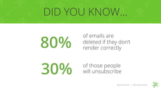
80%
of emails are
deleted if they don’t
render correctly
of those people
will unsubscribe30%
DID YOU KNOW…
@johnethies | @EmailonAcid
DESIGNfor
“every inbox, every device”
Mobile Friendly
Mobile First
SCALABLE
FLUID
RESPONSIVE
</STYLE>
Gmail doesn’t like your
@johnethies | @EmailonAcid
Spongy
FLUID-HYBRID
Gmail SUPPORTS your fluidity!
@johnethies | @EmailonAcid
Android Gmail
iOS Mail App
@johnethies | @EmailonAcidSource: @actionrocket
Make the BEST experience for each user
@johnethies | @EmailonAcidSource: @actionrocket
@johnethies | @EmailonAcid
simple
Styled ALT text
Animated GIFs
Button enhancements
CSS animation
Carousels, Hot spot animation
COMPLEX
of users view email
with images off
Styled ALT TEXT
43%
@johnethies | @EmailonAcid
Free shipping
No styling or background color
Free shipping
Background color
Free shipping
Styled alt text
Free shipping
Background color + styled alt text
Styled
ALT TEXT
[continued]
STYLED ALT TEXT [continued]
<img src="logo.jpg" width="400"
height="149" alt="Email on Acid"
style="font-family: Georgia;
color: #697c52; font-style:
italic; font-size: 30px;">
STYLED ALT TEXT [continued]
@johnethies | @EmailonAcid
Animated GIFS
26%
@johnethies | @EmailonAcid
GIF emails increase a
click through rate up to
Outlook 2007+ shows the 1st frame Other programs show the animation
Animated GIFS
@johnethies | @EmailonAcid
[continued]
NOT supported in
Outlook 2007,
2010, 2013, 2016
for Windows
First frame
should include
crucial info & CTA
Animated
GIFS
[continued]
Rounded cornersI am a button ➝
I am a button ➝
I am a button ➝I am a button ➝ Borders
I am a button ➝ Gradients
I am a button ➝ Web fonts
Hover effects
Button ENHANCEMENTS
@johnethies | @EmailonAcid
I am a button ➝
Progressively enhanced: Apple Mail
I am a button ➝
Graceful degradation: Outlook 2010
I am a button ➝
Lotus Notes
I am a button ➝
Scale to fit: iPhone
Button ENHANCEMENTS [continued]
@johnethies | @EmailonAcid
CSS
ANIMATION
FALLBACKINTERACTIVE
CAROUSEL {
Creative by RebelMail
HOT SPOT
ANIMATION
Simplified
CONTENT05.
You have approximately 8.25 seconds
to capture someone’s attention.
Emails are open, on average, 5-15 seconds.
@johnethies | @EmailonAcid
Keep it SIMPLE
ONE audience
ONE goal
The Rule of
ONE
v
50%
SIZE Matters
The sweet spot for email length
is between 50-125 words, with
response rates at just over
v
Write in PLAIN Language
@johnethies | @EmailonAcid
STICK THE LANDINGA
@johnethies | @EmailonAcid
48%
of marketers build a new
landing page for each of
their marketing campaigns
Incorporate RESPONSIVE Design
@johnethies | @EmailonAcid
Know the PLATFORM of the visitor.
@johnethies | @EmailonAcid
Low conversions on Mobile?
v
8 out of 10 people will
read headline copy,
but only 2 out of 10
will read the rest
Craft an Engaging HEADLINE
@johnethies | @EmailonAcid
Ensure that your CTA
button is centered
& visually distinct
Use ONE Call-to-Action
@johnethies | @EmailonAcid
Use Visual CUES
@johnethies | @EmailonAcid
BOTTOM LINE:
@johnethies | @EmailonAcid
Email is an AMAZING channel for marketers,
if done correctly.
THANK YOU!
@johnethies @emailonacid
@johnethies | @EmailonAcid
@eduwebconf

Edu web 2016 Presentation

Editor's Notes

  • #7 email marketing is going to remain a top priority for companies in 2016
  • #8 68 percent of teens and 73 percent of Millennials said they prefer to receive communication from a business via email. In addition, more than half rely on email to buy things online.
  • #9 71.8 percent) say they are planning to spend more time on email production and more than four out of five (86.7 percent) report that they will increase email marketing budgets this year.
  • #10 Additionally, of the 86.7 percent of the survey's respondents said they would spend more money on email marketing this year. The increased budget is expected to be spent on:
  • #15 lead to more spam complaints legally obliged to use a monitored email address makes you look arrogant
  • #16 Always provide a way for a subscriber to unsubscribe Falsify contact information or subject line Adestra kicked thim out of their platform Due to SPAM complaints
  • #17 Not testing an email prior to sending out a campaign
  • #19 research shows that segmented emaildoes outperform general, untargeted sends. 34% of marketers who segmented their email lists subscribers experienced better email relevance, 28% experienced lower unsubscribe rates, and 24% experienced better deliverability and greater revenue.
  • #20 In the midst of content overload Always find a way to be relevant Marketers and subscribers often define spam differently. Subscribers don’t think in terms of spam filter testing or algorithms , but in terms of relevance. Are you sending content that matters to them? This is ultimately the most important question to ask yourself before hitting "send" on any email.
  • #21 Making it into the inbox is one of the more ambiguous, misunderstood elements of sending great email. Marketers often mix up a key distinction: delivery vs. deliverability. Though the terms are often used interchangeably, they have very different meanings.
  • #24 By surveying your audience, you can tap into what motivates them or “analyze the psychographic makeup” of your audience and segment from there. Keep it simple: start with what you know such as age, gender, etc. Never underestimate how a slight change, like the one above, could impact your ROI. In order to dig deeper, find out what makes them tick. Send an email with a survey.
  • #25    Example: FitforMe switched out images of people used in email based on age to better resonate.
  • #26 Knowing where your contacts live can be powerful information. A company called S-Digital used geolocation and routing services to create dedicated travel directions to an upcoming event in an email campaign for each recipient.
  • #27 A company called Skymosity can track weather patterns and it allows you to create automated email campaigns that are deployed by weather-based email triggers. Brooks, an athletic shoe company, made fantastic use of this data by creating multiple campaigns, based on weather condition and temperature range that were triggered by Skymosity’s weather logic.
  • #28 To track where someone is in the buying journey, you have to look at their digital behavior: which pages of yours they visited, how long they stayed on your website and how you obtained their email. A great example of segmenting by purchase cycle is seen in cart abandonment emails. so it’s smart to trigger a card abandonment email 24 hours after they left the shopping cart.
  • #29 Reengagement campaigns are your opportunity to remind your inactive subscribers why they were attracted to your brand in the first place. Subscribers who have stopped opening your emails can have negative implications on your deliverability. Analyze your existing subscriber history. Use past data to determine the average amount of time between when subscribers sign up and when they stop engaging with emails, and strategize your reengagement program around that window of time.
  • #34 Return Path, 65 characters seems to be a sweet spot for email subject lines, which is about 15 characters more than the average subject line. When subject lines are 61-70 characters long, they tend to get read. However, most email subject lines are between 41 and 50 characters.
  • #41 Does your email include a special offer? Let your audience know in the preheader text what awaits them upon opening the email. The Honest Company also does a nice job of referencing a non-sale related incentive in their preheader tex Increased opens by 26%
  • #42 PetCareRx does a really nice job with this subject line + preheader text combination. They’ve personalized the message (with my dog’s name, Fenway), let me know about the 75% off discount being offered and referenced the classic Baha Men earworm, Who Let the Dogs Out.
  • #46 Keep it simple Single column layout is most-readable on mobile Keep important information at the top Get your “call to action” across quickly
  • #47 Scalable design can be defined as any design that works well across both desktop and mobile without using code to adjust table or image sizes, or display or hide content between the two platforms. typically the easiest to implement. Since scalable emails don’t adjust the widths of tables or images between devices, and don’t use CSS media queries
  • #48 Fluid emails use percentage-based sizing to make the width of tables and images adapt to the screen size on which they are viewed fluid designs typically work best for text-heavy layouts since there’s less control over how copy and images relate to each other.
  • #51 Fluid tables and elements by default Max-width CSS to constrain widths on desktop MSO conditional comments to constrain widths in Outlook
  • #64 support and how-to
  • #71 as your content is brief, entertaining, and fresh, Millennials very well might even share it with their friend group.
  • #72 This Clinique email is an excellent example of the Rule of One at work. It is clearly targeted at one audience, men, who are interested in one goal, getting their "skin in shape for summer." Not to mention, the CTAs are strong and actionable.
  • #77 Take a look at an example from GetResponse on how a landing page SHOULD look on your desktop and your mobile.
  • #79 This suggests smartphones are more of browse or research platform rather than a buy platform since many of the  Smartphone experiences should be personalized to show this different form of usage. Lead generation and acquisition Revisit on Desktop
  • #80 Below is a headline pulled from AirBnb that leverages the tips above to create a crystal clear headline that sets their readers expectations in seconds: Split test your headline to see which opener gets better conversion rates. Tell what’s inside instead of selling what’s inside. Clarity trumps cleverness, so make your headline is clear and concise. Ensure your headline refers directly to the place from which your visitor came or the ad copy that drove the click.
  • #81 Squareup’s landing page below is a great example of encompassing a singular, centered CTA that allows the visitor to jump into the copy with ease.
  • #82 Explicit directional cues could be seen with fingers or arrows pointing to the CTA. They want your eyes to move to where the finger or arrow is pointing to move your attention to the form or CTA. An implicit directional cue is less direct, for example a person on the landing page looking at the CTA. This is a more casual and subtle visual cue but still will get the job done! Below is a great example of an implicit directional cue as the woman’s eyes push you toward the form.