Introduction
We encounterdata and make conclusions based on data
every day.
Statistics is the scientific discipline that provides
methods to help us make sense of data.
Statistical methods, used intelligently, offer a set of
powerful tools for gaining insight into the world around
us.
The field of statistics teaches us how to make intelligent
judgments and informed decisions in the presence of
uncertainty and variation.
3.
Definition of Statistics
Statistics consists of a body of methods for collecting
analysing data.
In order to avoid confusion with the statistical constants of the
population (mean (), variance (), etc.), which are usually
referred to as parameters, statistical measures computed
from the sample observations along e.g., mean (), variance
(), etc., have been termed as statistics.
Let be random sampling of size from a population and let
be a real valued or vector valued function whose domain
includes the sample space of . Then the random variable or
random vector is called a statistics.
The probability distribution of a statistic is called the
sampling distribution of .
4.
Why Study Statistics?
Studying statistics will help us to collect data in a sensible
way and then use the data to answer questions of interest.
Studying statistics will allow us to critically evaluate the work
of others by providing with the tools we need to make
informed judgments.
Throughout our personal and professional life, we will need
to understand and use data to make decisions.
To do this, we must be able to
Decide whether existing data is adequate or whether additional
information is required.
If necessary, collect more information in a reasonable and thoughtful
way.
Summarize the available data in a useful and informative manner.
Analyze the available data.
Draw conclusions, make decisions, and assess the risk of an
incorrect decision.
5.
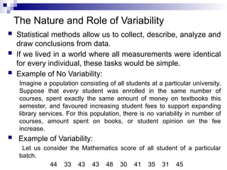
The Nature andRole of Variability
Statistical methods allow us to collect, describe, analyze and
draw conclusions from data.
If we lived in a world where all measurements were identical
for every individual, these tasks would be simple.
Example of No Variability:
Imagine a population consisting of all students at a particular university.
Suppose that every student was enrolled in the same number of
courses, spent exactly the same amount of money on textbooks this
semester, and favoured increasing student fees to support expanding
library services. For this population, there is no variability in number of
courses, amount spent on books, or student opinion on the fee
increase.
Example of Variability:
Let us consider the Mathematics score of all student of a particular
batch.
44 33 43 43 48 30 41 35 31 45
6.
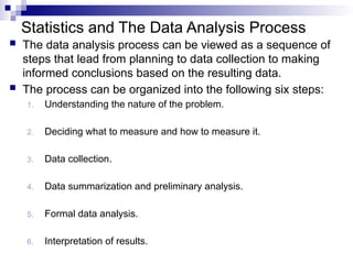
Statistics and TheData Analysis Process
The data analysis process can be viewed as a sequence of
steps that lead from planning to data collection to making
informed conclusions based on the resulting data.
The process can be organized into the following six steps:
1. Understanding the nature of the problem.
2. Deciding what to measure and how to measure it.
3. Data collection.
4. Data summarization and preliminary analysis.
5. Formal data analysis.
6. Interpretation of results.
7.
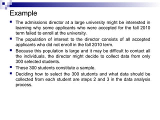
Example
The admissionsdirector at a large university might be interested in
learning why some applicants who were accepted for the fall 2010
term failed to enroll at the university.
The population of interest to the director consists of all accepted
applicants who did not enroll in the fall 2010 term.
Because this population is large and it may be difficult to contact all
the individuals, the director might decide to collect data from only
300 selected students.
These 300 students constitute a sample.
Deciding how to select the 300 students and what data should be
collected from each student are steps 2 and 3 in the data analysis
process.
8.
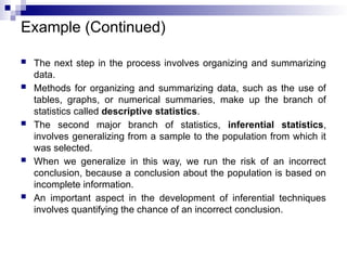
Example (Continued)
Thenext step in the process involves organizing and summarizing
data.
Methods for organizing and summarizing data, such as the use of
tables, graphs, or numerical summaries, make up the branch of
statistics called descriptive statistics.
The second major branch of statistics, inferential statistics,
involves generalizing from a sample to the population from which it
was selected.
When we generalize in this way, we run the risk of an incorrect
conclusion, because a conclusion about the population is based on
incomplete information.
An important aspect in the development of inferential techniques
involves quantifying the chance of an incorrect conclusion.
9.
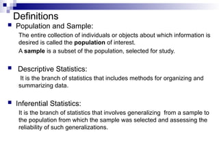
Definitions
Population andSample:
The entire collection of individuals or objects about which information is
desired is called the population of interest.
A sample is a subset of the population, selected for study.
Descriptive Statistics:
It is the branch of statistics that includes methods for organizing and
summarizing data.
Inferential Statistics:
It is the branch of statistics that involves generalizing from a sample to
the population from which the sample was selected and assessing the
reliability of such generalizations.
10.
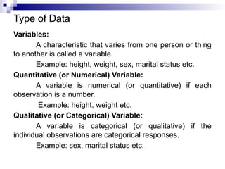
Type of Data
Variables:
Acharacteristic that varies from one person or thing
to another is called a variable.
Example: height, weight, sex, marital status etc.
Quantitative (or Numerical) Variable:
A variable is numerical (or quantitative) if each
observation is a number.
Example: height, weight etc.
Qualitative (or Categorical) Variable:
A variable is categorical (or qualitative) if the
individual observations are categorical responses.
Example: sex, marital status etc.
11.
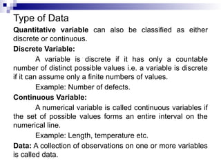
Type of Data
Quantitativevariable can also be classified as either
discrete or continuous.
Discrete Variable:
A variable is discrete if it has only a countable
number of distinct possible values i.e. a variable is discrete
if it can assume only a finite numbers of values.
Example: Number of defects.
Continuous Variable:
A numerical variable is called continuous variables if
the set of possible values forms an entire interval on the
numerical line.
Example: Length, temperature etc.
Data: A collection of observations on one or more variables
is called data.
12.
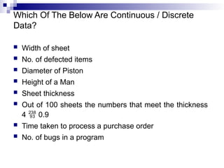
Which Of TheBelow Are Continuous / Discrete
Data?
Width of sheet
No. of defected items
Diameter of Piston
Height of a Man
Sheet thickness
Out of 100 sheets the numbers that meet the thickness
4 0.9
Time taken to process a purchase order
No. of bugs in a program
13.
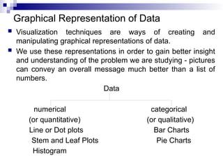
Graphical Representation ofData
Visualization techniques are ways of creating and
manipulating graphical representations of data.
We use these representations in order to gain better insight
and understanding of the problem we are studying - pictures
can convey an overall message much better than a list of
numbers.
Data
numerical categorical
(or quantitative) (or qualitative)
Line or Dot plots Bar Charts
Stem and Leaf Plots Pie Charts
Histogram
14.
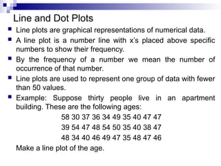
Line and DotPlots
Line plots are graphical representations of numerical data.
A line plot is a number line with x’s placed above specific
numbers to show their frequency.
By the frequency of a number we mean the number of
occurrence of that number.
Line plots are used to represent one group of data with fewer
than 50 values.
Example: Suppose thirty people live in an apartment
building. These are the following ages:
58 30 37 36 34 49 35 40 47 47
39 54 47 48 54 50 35 40 38 47
48 34 40 46 49 47 35 48 47 46
Make a line plot of the age.
15.
Line and DotPlots
Line plots allow several features of the data to become more
obvious. For example, outliers, clusters, and gaps are
apparent.
Outliers are data points whose values are significantly larger
or smaller than other values, such as the ages of 30, and 58.
Clusters are isolated groups of points, such as the ages of 46
through 50.
Gaps are large spaces between points, such as 41 and 45.
16.
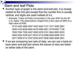
Stem and leafPlots
Another type of graph is the stem-and-leaf plot. It is closely
related to the line plot except that the number line is usually
vertical, and digits are used instead of x’s.
Example: Tuition at Public Universities in the year 2007 for the 50
U.S. states. The observations ranged from a low value of 2844 to a
high value of 9783.
4712 4422 4669 4937 4452 4634 7151 7417 3050 3851
3930 4155 8038 6284 6019 4966 5821 3778 6557 7106
7629 7504 7392 4457 6320 5378 5181 2844 9003 9333
3943 5022 4038 5471 9010 4176 5598 9092 6698 7914
5077 5009 5114 3757 9783 6447 5636 4063 6048 2951
If we are comparing two sets of data, we can use a back-to-
back stem and leaf plot where the leaves of sets are listed
on either side of the stem.
17.
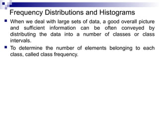
Frequency Distributions andHistograms
When we deal with large sets of data, a good overall picture
and sufficient information can be often conveyed by
distributing the data into a number of classes or class
intervals.
To determine the number of elements belonging to each
class, called class frequency.
18.
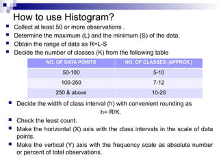
How to useHistogram?
Collect at least 50 or more observations .
Determine the maximum (L) and the minimum (S) of the data.
Obtain the range of data as R=L-S
Decide the number of classes (K) from the following table
Decide the width of class interval (h) with convenient rounding as
h= R/K.
Check the least count.
Make the horizontal (X) axis with the class intervals in the scale of data
points.
Make the vertical (Y) axis with the frequency scale as absolute number
or percent of total observations.
NO. OF DATA POINTS NO. OF CLASSES (APPROX.)
50-100 5-10
100-250 7-12
250 & above 10-20
19.
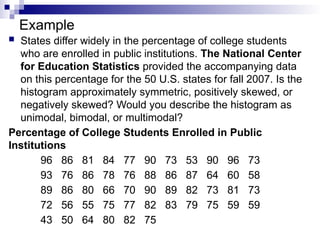
Example
States differwidely in the percentage of college students
who are enrolled in public institutions. The National Center
for Education Statistics provided the accompanying data
on this percentage for the 50 U.S. states for fall 2007. Is the
histogram approximately symmetric, positively skewed, or
negatively skewed? Would you describe the histogram as
unimodal, bimodal, or multimodal?
Percentage of College Students Enrolled in Public
Institutions
96 86 81 84 77 90 73 53 90 96 73
93 76 86 78 76 88 86 87 64 60 58
89 86 80 66 70 90 89 82 73 81 73
72 56 55 75 77 82 83 79 75 59 59
43 50 64 80 82 75
20.
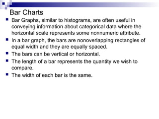
Bar Charts
BarGraphs, similar to histograms, are often useful in
conveying information about categorical data where the
horizontal scale represents some nonnumeric attribute.
In a bar graph, the bars are nonoverlapping rectangles of
equal width and they are equally spaced.
The bars can be vertical or horizontal.
The length of a bar represents the quantity we wish to
compare.
The width of each bar is the same.
21.
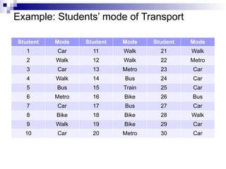
Example: Students’ modeof Transport
Student Mode Student Mode Student Mode
1 Car 11 Walk 21 Walk
2 Walk 12 Walk 22 Metro
3 Car 13 Metro 23 Car
4 Walk 14 Bus 24 Car
5 Bus 15 Train 25 Car
6 Metro 16 Bike 26 Bus
7 Car 17 Bus 27 Car
8 Bike 18 Bike 28 Walk
9 Walk 19 Bike 29 Car
10 Car 20 Metro 30 Car
22.
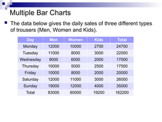
Multiple Bar Charts
The data below gives the daily sales of three different types
of trousers (Men, Women and Kids).
Day Men Women Kids Total
Monday 12000 10000 2700 24700
Tuesday 11000 8000 3000 22000
Wednesday 9000 6000 2000 17000
Thursday 10000 5000 2500 17500
Friday 10000 8000 2000 20000
Saturday 12000 11000 3000 26000
Sunday 19000 12000 4000 35000
Total 83000 60000 19200 162200
23.
Pie Charts
Acategorical data set can also be summarized using a
pie chart.
In a pie chart, a circle is used to represent the whole
data set, with “slices” of the pie representing the possible
categories.
The size of the slice for a particular category is
proportional to the corresponding frequency or relative
frequency.
Pie charts are most effective for summarizing data sets
when there are not too many different categories.
24.
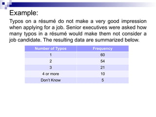
Example:
Typos on arésumé do not make a very good impression
when applying for a job. Senior executives were asked how
many typos in a résumé would make them not consider a
job candidate. The resulting data are summarized below.
Number of Typos Frequency
1 60
2 54
3 21
4 or more 10
Don’t Know 5
25.
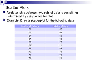
Scatter Plots
Arelationship between two sets of data is sometimes
determined by using a scatter plot.
Example: Draw a scatterplot for the following data
Heights of Fathers Heights of Sons
65 67
66 68
67 65
67 68
68 72
69 72
69 69
70 70
70 68
72 71
26.
Examples
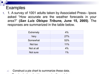
1. 1. Asurvey of 1001 adults taken by Associated Press– Ipsos
asked “How accurate are the weather forecasts in your
area?” (San Luis Obispo Tribune, June 15, 2005). The
responses are summarized in the table below.
a) Construct a pie chart to summarize these data.
Extremely 4%
Very 27%
Somewhat 53%
Not too 11%
Not at all 4%
Not sure 1%
27.
Examples
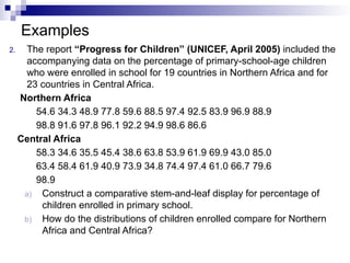
2. The report“Progress for Children” (UNICEF, April 2005) included the
accompanying data on the percentage of primary-school-age children
who were enrolled in school for 19 countries in Northern Africa and for
23 countries in Central Africa.
Northern Africa
54.6 34.3 48.9 77.8 59.6 88.5 97.4 92.5 83.9 96.9 88.9
98.8 91.6 97.8 96.1 92.2 94.9 98.6 86.6
Central Africa
58.3 34.6 35.5 45.4 38.6 63.8 53.9 61.9 69.9 43.0 85.0
63.4 58.4 61.9 40.9 73.9 34.8 74.4 97.4 61.0 66.7 79.6
98.9
a) Construct a comparative stem-and-leaf display for percentage of
children enrolled in primary school.
b) How do the distributions of children enrolled compare for Northern
Africa and Central Africa?
28.
Examples
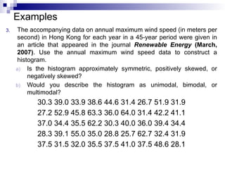
3. The accompanyingdata on annual maximum wind speed (in meters per
second) in Hong Kong for each year in a 45-year period were given in
an article that appeared in the journal Renewable Energy (March,
2007). Use the annual maximum wind speed data to construct a
histogram.
a) Is the histogram approximately symmetric, positively skewed, or
negatively skewed?
b) Would you describe the histogram as unimodal, bimodal, or
multimodal?
30.3 39.0 33.9 38.6 44.6 31.4 26.7 51.9 31.9
27.2 52.9 45.8 63.3 36.0 64.0 31.4 42.2 41.1
37.0 34.4 35.5 62.2 30.3 40.0 36.0 39.4 34.4
28.3 39.1 55.0 35.0 28.8 25.7 62.7 32.4 31.9
37.5 31.5 32.0 35.5 37.5 41.0 37.5 48.6 28.1
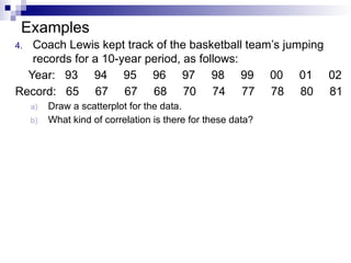
29.
Examples
4. Coach Lewiskept track of the basketball team’s jumping
records for a 10-year period, as follows:
Year: 93 94 95 96 97 98 99 00 01 02
Record: 65 67 67 68 70 74 77 78 80 81
a) Draw a scatterplot for the data.
b) What kind of correlation is there for these data?
30.
Examples
5. The report“Testing the Waters 2009” (www.nrdc.org) included
information on the water quality at the 82 most popular swimming
beaches in California. Thirty-eight of these beaches are in Los Angeles
County. For each beach, water quality was tested weekly and the data
below are the percent of the tests in 2008 that failed to meet water
quality standards.
Los Angeles County Other Counties
32 4 6 4 4 7 4 27 19 23 0 0 0 2 3 7 5 11 5 7
19 13 11 19 9 11 16 23 19 16 15 8 1 5 0 5 4 1 0 1
33 12 29 3 11 6 22 18 31 43 1 0 2 7 0 2 2 3 5 3
17 26 17 20 10 6 14 11 0 8 8 8 0 0 17 4 3 7
10 40 3
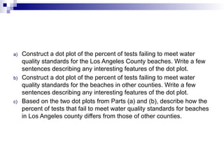
31.
a) Construct adot plot of the percent of tests failing to meet water
quality standards for the Los Angeles County beaches. Write a few
sentences describing any interesting features of the dot plot.
b) Construct a dot plot of the percent of tests failing to meet water
quality standards for the beaches in other counties. Write a few
sentences describing any interesting features of the dot plot.
c) Based on the two dot plots from Parts (a) and (b), describe how the
percent of tests that fail to meet water quality standards for beaches
in Los Angeles county differs from those of other counties.