E4 Channel Logo
By Alex Mason, Harry Stoodley
and Dan Thomas
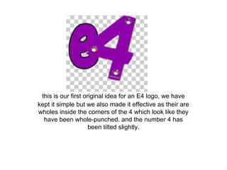
this is our first original idea for an E4 logo, we have
kept it simple but we also made it effective as their are
wholes inside the corners of the 4 which look like they
have been whole-punched. and the number 4 has
been tilted slightly.
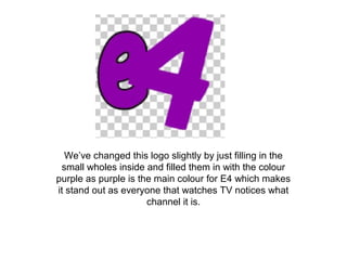
We’ve changed this logo slightly by just filling in the
small wholes inside and filled them in with the colour
purple as purple is the main colour for E4 which makes
it stand out as everyone that watches TV notices what
channel it is.
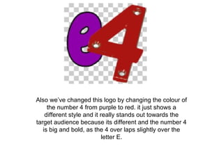
Also we’ve changed this logo by changing the colour of
the number 4 from purple to red. it just shows a
different style and it really stands out towards the
target audience because its different and the number 4
is big and bold, as the 4 over laps slightly over the
letter E.
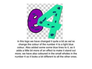
in this logo we have changed it quite a bit as we’ve
change the colour of the number 4 to a light blue
colour. Also added some some blue lines to it, as it
adds a little bit more of an effect to make it stand out
more; we have also coloured in the small wholes in the
number 4 so it looks a bit different to all the other ones.
for this logo all we've changed is the colour of the
wholes in the number 4 and in the centre of the 4 as
well to the colour red because its clearly different from
all of the other logos I've created.
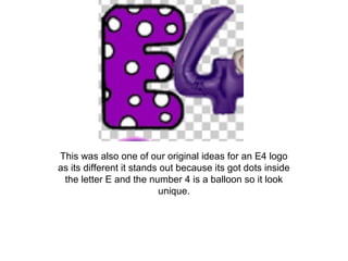
This was also one of our original ideas for an E4 logo
as its different it stands out because its got dots inside
the letter E and the number 4 is a balloon so it look
unique.
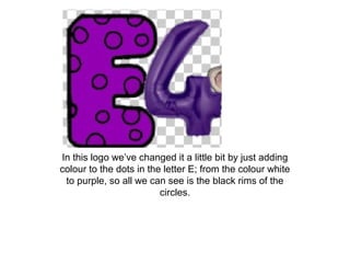
In this logo we’ve changed it a little bit by just adding
colour to the dots in the letter E; from the colour white
to purple, so all we can see is the black rims of the
circles.
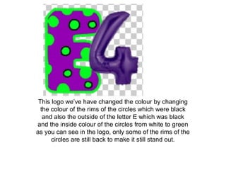
This logo we’ve have changed the colour by changing
the colour of the rims of the circles which were black
and also the outside of the letter E which was black
and the inside colour of the circles from white to green
as you can see in the logo, only some of the rims of the
circles are still back to make it still stand out.
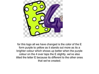
for this logo all we have changed is the color of the E
form purple to yellow as it stands out more as its a
brighter colour which shows up better when the purple
colour on the 4 over laps the E slightly. we've also
tilted the letter E because its different to the other ones
that we've created.
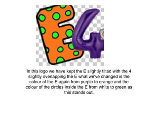
In this logo we have kept the E slightly tilted with the 4
slightly overlapping the E what we've changed is the
colour of the E again from purple to orange and the
colour of the circles inside the E from white to green as
this stands out.
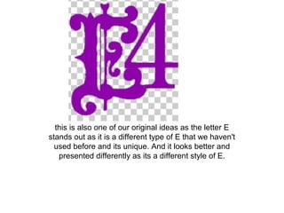
this is also one of our original ideas as the letter E
stands out as it is a different type of E that we haven't
used before and its unique. And it looks better and
presented differently as its a different style of E.
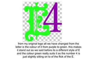
from my original logo all we have changed from the
letter is the colour of it from purple to green. this makes
it stand out as we said before its a different style of E
and the colour green really suits it as the number 4 is
just slightly sitting on to of the flick of the E.
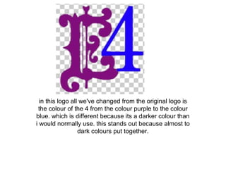
in this logo all we've changed from the original logo is
the colour of the 4 from the colour purple to the colour
blue. which is different because its a darker colour than
i would normally use. this stands out because almost to
dark colours put together.
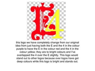
this logo we have completely change from our original
idea from just having both the E and the 4 in the colour
purple to have the E in the colour red and the 4 in the
colour yellow; they are to bright colours and I've
overlapped the 4 over the E slightly. This logo would
stand out to other logos because over logos have got
deep colours while this logo is bright and stands out.
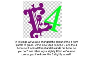
in this logo we've also changed the colour of the 4 from
purple to green. we've also tilted both the E and the 4
because it looks different and it stands out because
you don't see other logos slightly tilted. we've also
overlapped the 4 over the E slightly as well.
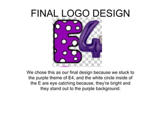
FINAL LOGO DESIGN
We chose this as our final design because we stuck to
the purple theme of E4, and the white circle inside of
the E are eye catching because, they’re bright and
they stand out to the purple background.

E4 channel logo designs powerpoint presentation By Alex, Dan and Harry

  • 1.
    E4 Channel Logo ByAlex Mason, Harry Stoodley and Dan Thomas
  • 3.
    this is ourfirst original idea for an E4 logo, we have kept it simple but we also made it effective as their are wholes inside the corners of the 4 which look like they have been whole-punched. and the number 4 has been tilted slightly.
  • 4.
    We’ve changed thislogo slightly by just filling in the small wholes inside and filled them in with the colour purple as purple is the main colour for E4 which makes it stand out as everyone that watches TV notices what channel it is.
  • 5.
    Also we’ve changedthis logo by changing the colour of the number 4 from purple to red. it just shows a different style and it really stands out towards the target audience because its different and the number 4 is big and bold, as the 4 over laps slightly over the letter E.
  • 6.
    in this logowe have changed it quite a bit as we’ve change the colour of the number 4 to a light blue colour. Also added some some blue lines to it, as it adds a little bit more of an effect to make it stand out more; we have also coloured in the small wholes in the number 4 so it looks a bit different to all the other ones.
  • 7.
    for this logoall we've changed is the colour of the wholes in the number 4 and in the centre of the 4 as well to the colour red because its clearly different from all of the other logos I've created.
  • 8.
    This was alsoone of our original ideas for an E4 logo as its different it stands out because its got dots inside the letter E and the number 4 is a balloon so it look unique.
  • 9.
    In this logowe’ve changed it a little bit by just adding colour to the dots in the letter E; from the colour white to purple, so all we can see is the black rims of the circles.
  • 10.
    This logo we’vehave changed the colour by changing the colour of the rims of the circles which were black and also the outside of the letter E which was black and the inside colour of the circles from white to green as you can see in the logo, only some of the rims of the circles are still back to make it still stand out.
  • 11.
    for this logoall we have changed is the color of the E form purple to yellow as it stands out more as its a brighter colour which shows up better when the purple colour on the 4 over laps the E slightly. we've also tilted the letter E because its different to the other ones that we've created.
  • 12.
    In this logowe have kept the E slightly tilted with the 4 slightly overlapping the E what we've changed is the colour of the E again from purple to orange and the colour of the circles inside the E from white to green as this stands out.
  • 13.
    this is alsoone of our original ideas as the letter E stands out as it is a different type of E that we haven't used before and its unique. And it looks better and presented differently as its a different style of E.
  • 14.
    from my originallogo all we have changed from the letter is the colour of it from purple to green. this makes it stand out as we said before its a different style of E and the colour green really suits it as the number 4 is just slightly sitting on to of the flick of the E.
  • 15.
    in this logoall we've changed from the original logo is the colour of the 4 from the colour purple to the colour blue. which is different because its a darker colour than i would normally use. this stands out because almost to dark colours put together.
  • 16.
    this logo wehave completely change from our original idea from just having both the E and the 4 in the colour purple to have the E in the colour red and the 4 in the colour yellow; they are to bright colours and I've overlapped the 4 over the E slightly. This logo would stand out to other logos because over logos have got deep colours while this logo is bright and stands out.
  • 17.
    in this logowe've also changed the colour of the 4 from purple to green. we've also tilted both the E and the 4 because it looks different and it stands out because you don't see other logos slightly tilted. we've also overlapped the 4 over the E slightly as well.
  • 18.
    FINAL LOGO DESIGN Wechose this as our final design because we stuck to the purple theme of E4, and the white circle inside of the E are eye catching because, they’re bright and they stand out to the purple background.