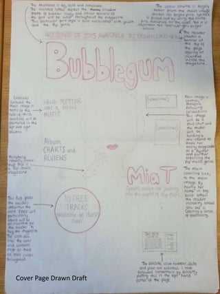
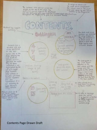
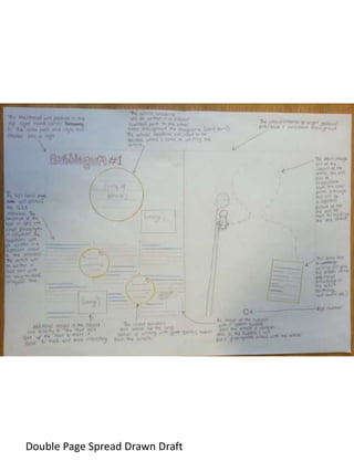
This document contains 3 draft pages for a book or publication including a cover page, contents page, and a double page spread. The pages provide initial drawn concepts or designs for the front matter and interior content of the written work.
This document contains drafts for the front cover, contents page, and a double page spread for a publication. It includes initial designs and layouts for the cover, table of contents, and a two-page article or feature. The drafts are meant to showcase the visual presentation and organization of information for the publication.
This document contains drafts for a publication including a front cover, contents page, and double page spread. The front cover and contents page provide basic identifying information for the publication. A double page spread is also included which likely features content from within the publication presented across two facing pages.
This document appears to be a book or magazine with only a front cover, contents page, and one double-page spread shown. The contents page lists the sections or chapters contained within but no other contextual information is provided.
This document contains two draft pages, a cover page and contents page. The cover page and contents page are drawn draft versions that are likely early versions prior to finalization for whatever publication or document they are intended. The drawn draft pages provide a basic outline of what will be included on the finalized cover and contents pages once complete.
This document contains a table of contents page with an image overlapping the text. The page numbers are listed and there is an image overlapping the text on the contents page. The heading "Contents" and page numbers are present on the page.
This document contains a table of contents page with an image overlapping the text. Page numbers are listed but an image overlaps some of the numbers. The heading "Contents" appears above a list of page numbers.
This document outlines a magazine planning draft that includes a front cover, contents page, and double page spread in the first draft. The second draft also includes a front cover, contents page, and double page spread.
This document appears to be a newspaper or magazine page layout with sections for images and main text. It includes a masthead, main images, and a page number but does not provide much other contextual information to summarize further in 3 sentences or less.
The document discusses skills developed and lessons learned from creating a magazine mock-up. The author learned Photoshop skills like layers and effects and how to use websites like Blogger, Scribd and Slideshare. Strengths included well-focused photos, an effective color scheme, use of strokes and drop shadows. Weaknesses were empty space on the contents page, a non-professional font, and uninteresting photos. The author felt they understood magazine composition better but did not progress as much as hoped. An action plan includes researching magazine design techniques.
This document provides research on potential publishers for a rock/alternative music magazine. It examines the British publisher Bauer Media Group, which publishes various magazines and operates radio stations and TV channels focused on genres like rock, pop, and R&B. The document outlines Bauer Media's revenues, employees, and history of acquiring and closing different music and entertainment magazines/TV channels over the years. It concludes that Bauer Media would be a suitable publisher due to its experience across multiple media platforms and genres like rock that match the intended magazine.
Music magazines are publications dedicated to specific music genres like pop, rock, and hip hop. They contain news, interviews, reviews and photos related to artists within that genre. Readers expect to see images of musicians associated with the genre as well as content reflecting the target audience. Magazine covers aim to attract their target readership through large mastheads indicating the genre, central images of famous artists, and headlines about featured content.
The document discusses the magazine design project and how it uses and develops conventions of the media form. Some key conventions that are used include a masthead at the top, highlighted cover lines, graphics relating to articles, and a barcode in the corner. The design challenges some conventions by using a long shot for the main image rather than a medium shot, and presenting the barcode on a box rather than blending it in. Overall, the design incorporates necessary codes and layout features from professional magazines but also includes additional elements like a publication date to develop its brand identity and connect with its target audience of young adults.
The magazine is the National Music Express (NME), which targets men aged 17-30 who are interested in rock, alternative, and indie music. It uses bold fonts, images of artists like Dizzee Rascal, and coverlines about concerts and artists like Kasabian to appeal to its target audience. The color scheme of red, black, and white is meant to appear masculine and attract male readers through connotations of aggression and danger. The layout follows techniques like the rule of thirds to make key elements pop out at readers.
This document discusses music magazines, including their content, images, and characteristics. It then focuses on analyzing music magazine covers. Key points:
- Music magazines contain articles, interviews, and images related to various music genres like pop, R&B, rock. They target specific demographics.
- Covers typically feature an artist's image with the magazine masthead. Coverlines promote topics and puffs advertise prizes. Layout follows the rule of thirds.
- These cover design elements are important to identify the publication, attract readers with the artist, and entice them with topics and prizes. Proper layout also improves visual appeal.
- An example R&B magazine cover is analyzed to show how
The document outlines 5 steps to forming a magazine front cover in Photoshop. Step 1 involves inserting the main image. Step 2 places the title and selling line on the left with text effects added. Step 3 inserts cover lines with alternating green and purple text for titles and descriptions. Step 4 adds the main cover line to the left. Step 5 finalizes the cover by adding visual elements like a puff, covered areas, barcode, and social media logos.
The document describes the layout and design elements of a magazine cover and interior pages. It explains how various elements like the masthead, coverlines, images, titles, subheadings, and barcodes are positioned according to design conventions to effectively promote the content and attract the target audience. Specific design choices are described for each element that help brand the magazine as a music publication focused on R&B and appeal to its 16-18 year old demographic.
This document is a media questionnaire about preferences for a proposed hip hop music magazine. It asks respondents about their demographics and opinions on design elements like cover artists, color schemes, and story types. The questionnaire aims to gather market research data to help pitch the magazine concept according to the target audience's interests.
The document discusses different music genres for a magazine article: pop, rock, and R&B. It notes strengths and weaknesses of each genre. A poll of 7 people showed preference for pop (3 votes), rock (2 votes), and R&B (2 votes). Therefore, the document decides on focusing the magazine on pop. Pop is described as more popular than rock due to its songs spreading quickly online. While rock has an easy color scheme, pop also allows for bright colors without strict adherence to a style. R&B risks potential conflict by being ethnically dominated, while pop is diverse and welcoming.
The document discusses the history and evolution of IPC Media, a magazine publisher in the UK. It notes that IPC originally targeted middle-class white men in the 1800s-early 1900s but then began targeting women in the early 1900s. In the 1950s, IPC launched music magazines as the music industry boomed. Over time, IPC has expanded its audiences to be more inclusive of various demographics. The document also examines IPC's experience in launching magazines and targeting diverse audiences.
Both the student's magazine and the professional magazine follow several common conventions of magazine design:
They both include a masthead at the top, color schemes using 3 main colors, and images on the contents page to showcase aspects of the magazine.
The student's magazine challenges some conventions by including social media links on the contents page and targeting both male and female audiences rather than just females. It also uses bordered images and a combination of fonts for the masthead rather than a single word.
Overall, the student's magazine develops conventions of consistent branding and layout while also challenging conventions in some small ways related to audience, added elements, and design choices.
The target audience for the media product (a rock music magazine) is males aged 16-26 from middle-class, white ethnic backgrounds. Research including questionnaires showed this group has the largest interest in rock music. Additionally, the magazine aims to target "hipsters" - younger males looking beyond mainstream media through coverage of lesser-known bands and styles representing that subculture. The age range was chosen as most interested in the music genres featured. Middle-class males also have more discretionary income to spend on magazine subscriptions. A white ethnicity was selected to follow conventions of existing successful rock magazines and have the best chance of success.
The document discusses the choices made for mastheads for a pop music magazine. Five potential masthead names are provided that link to the pop genre and would appeal to the target audience: Tophits, Popstar, Pop to the Top, Top Pops, and #1 Hits. Conventions for mastheads are described, such as being catchy, bold, and clearly visible at the top of the page. Color schemes and fonts are also discussed, with the choice being bright pinks, purples and blues to represent the pop genre and a sans serif font for readability. Representational issues with using blue are addressed to avoid confusing the target female audience.
The document discusses the effectiveness of combining images, sound, voiceovers, presenters, gender representation, and titles across a documentary, double-page magazine spread, and radio trailer about the topic of social media. Key points included using the same images, music, voxpops, and experts across all three mediums to maintain consistency and appeal to the target teenage audience. Both female and male perspectives were represented equally. The documentary and radio trailer used different voiceovers to avoid boredom, while the magazine spread quoted the documentary's presenters to create links between the pieces. All three linked back to the BBC for branding purposes.
The target audience for the media product is teenagers and young adults interested in rock and gothic/emo music and fashion. Both male and female audiences are targeted. The typical target audience member is shown in a video to be a female teenager dressed in black hair and dark clothing, reflecting the style of the genre. The author attracted this audience through the use of dark colors like purple and black in the magazine design, along with some yellow for visual interest, that relate to the rock genre aesthetic and appeal to both male and female readers. Feedback from a focus group provided ideas for colors, the target age range and ethnicity, and an appropriate magazine masthead to attract the intended audience.
The document discusses technologies used at different stages of constructing a magazine. PowerPoint and SlideShare were used to plan and publish content online. A mobile phone was used to record audio and video for focus groups. A professional camera was used to take clear photos for the magazine. Photoshop was used to design the front cover and contents page, though it took some learning to use its text tools. InDesign was used to design the double page spreads, and it took learning to properly insert high-quality images. Overall, the document discusses learning to use various software programs at different stages of planning and constructing the magazine.
The document discusses the effectiveness of combining images, sound, voiceovers, presenters, gender representation, and titles across a documentary, double-page magazine spread, and radio trailer about the topic of social media. Key points included using the same images, music, voxpops, and experts across all three mediums to consistently target teenagers. Voiceovers differed between the documentary and radio trailer to avoid boredom. The products were also effectively linked through quoting presenters and including the documentary's broadcast details. Overall the combination of elements across the three products created an coherent advertising strategy.
This document provides a step-by-step guide for creating a magazine double page spread (DPS) in InDesign. Key steps included adding a background layer, designing the main title using social media logos, removing backgrounds from images, adding a sidebar with app icons and statistics, and formatting the text article by importing from Word and using drop caps and bylines. The overall process guided the reader through visually designing multiple elements to construct an engaging two-page magazine layout.
This document discusses different font styles and their suitability for different purposes in a magazine. It describes sans serif fonts as commonly used for body text and being suitable for attracting a teenage audience. Serif fonts are described as classic but less versatile and more suitable for older audiences. Script fonts are seen as adding personality but being difficult to read. Display fonts are meant to draw attention, such as for mastheads. Hand lettered fonts can provide a personal touch for things like editorials and bylines. Each font style has strengths and weaknesses for different target audiences and uses.
This documentary explores the effects of social media on everyday life, as social media plays an active part in the lives of 2.2 billion people, with over 12 new active mobile social users added every second. The one-hour documentary airs on BBC Three and examines both the negative and positive impacts of social media on society. It includes interviews with experts such as a curriculum leader who discusses using social media in education. While experts praise social media's usefulness, they also note it can become obsessive and cause students to be online late at night.
Student risk assessment- computers in libraryasmediad14
This risk assessment document evaluates the risks of students filming or taking photos in the college library. It identifies potential hazards such as tripping over wires or bags on the floor. The degree of risk is assessed as minor for students, staff, cleaners, visitors, and people with disabilities. Existing control measures are outlined, such as keeping wires tied together and spaced chairs. Further action plans are proposed, like filming in less cluttered areas and ensuring bags and unused chairs are tucked away. The overall risk rating for the assessed task is determined to be minimal.
This risk assessment document evaluates the risks of students filming and taking photos in the college refectory/canteen area. It identifies several hazards including a busy location with risk of slipping on spilled liquids, and a fire hazard due to the nearby kitchen. The worst potential outcomes are minor injuries from slips or major injuries from a kitchen fire. Existing controls include cleaning staff and clear pathways. The action plan is to film when fewer students are present to avoid noise disruptions but not block foot traffic or cause other issues. Filming locations should also avoid risks of injury or interference.
Social media is ubiquitous in everyday life, especially for students. The documentary will explore how social media affects both students and staff at a local college. It will include views from students on the most popular social media apps they use, how useful the apps are in their daily lives, and how social media impacts them overall. Interviews were conducted with students at Solihull Sixth Form College to understand their social media habits and perspectives on the role these platforms play in their everyday experiences.
Social networking has over 100 million daily users on Twitter alone. A report explores how social media affects both students and teachers at Solihull Sixth Form College, where interviews were conducted with Politics and Sociology teacher Mike Pattison about his views on social media, as well as students in the local Solihull town center.
This storyboard contains 16 shots for a documentary about social media and teenagers. Shot 1 introduces the documentary outside a college with narration about social networking. Shot 2 shows a teenager on a computer at the library while the narrator talks about social networking. Shot 3 shows an interview in the college canteen asking students their views on social media. The documentary examines how social media affects teenagers' lives and behaviors.
This document outlines a potential documentary topic on whether gaming makes people more violent. The documentary would film gamers playing and get their thoughts on violence in games. It would also use archival footage and ask experts in gaming shops their opinions. The documentary would discuss what types of games are most violent and how gaming affects violence. It proposes an expositional mode and multi-strand narrative style. The target audience would be mainly male teenagers, and filming would occur on the college grounds and in gaming shops. Experts from gaming shops would provide opinions, and vox pops from gamers and parents would also be collected.
The document discusses how the media product sticks to conventions of real magazines. It follows rules such as including a masthead at the top of pages, using a consistent color scheme and font for house style. It also includes coverlines, barcodes, dates and sticks to a stereotypical theme for its target audience. Throughout the contents page and double page spread, it maintains typical magazine conventions like listing page numbers and using images and colored fonts to engage readers.
Immediate Media Company publishes over 50 magazine titles and employs 750 staff. Top of the Pops magazine is published monthly focusing on pop music charts, gossip, fashion and more. Originally targeted between ages 12-15, it now reaches a wider audience including parents feeling nostalgic. The document discusses choosing a pop music genre for a magazine and researching Top of the Pops magazine published by Immediate Media Company.
I have learned about several new technologies during the construction of my magazine, including InDesign, Adobe Photoshop, Prezi, and the Snipping Tool. InDesign allowed me to properly resize images on pages. The Snipping Tool provided an efficient way to copy and paste parts of pages. I also expanded my knowledge of Microsoft Word and PowerPoint by using them to create presentations and simple documents.
The document lists and provides brief descriptions of several influential rock bands and artists. It includes profiles of R.E.M describing their formation and role in pioneering alternative rock. It also covers Nirvana's rise to fame and influence on grunge and alternative rock. The Smiths are highlighted as one of the most important British alternative rock bands of the 1980s. Evanescence is introduced with details on founding members Amy Lee and their status as a successful rock band led by a female singer-songwriter.
The document lists 10 influential alternative rock bands: R.E.M., The Smiths, U2, Radiohead, Nirvana, The Cure, Red Hot Chili Peppers, Joy Division, Pearl Jam, and Sonic Youth. It then provides more details on the founding and history of R.E.M., Nirvana, and The Smiths; describing them as pioneering and influential alternative rock bands from the 1980s.
This document compares the layout of a digital magazine to real print magazines. It notes key similarities such as bold mastheads at the top of pages, main cover lines related to central images, headers, page numbers, and drop caps to begin articles. Pictures and original images are also included to link to articles and sections. The digital magazine replicates features of real magazines to provide a similar user experience.
The document discusses the software and hardware used during the planning and construction stages of a coursework project. During planning, Microsoft PowerPoint was used to create slides that could be embedded on other platforms like blogger. New skills like embedding presentations were learned. More sophisticated presentation software like Powtoon and Emaze were also used. A Canon SLR camera was used to take professional quality photos for a magazine during construction. Adobe Photoshop was used to manipulate images for the magazine cover and contents page, though it had a learning curve. InDesign was used to layout double page spreads, though creating blur effects between pages required some troubleshooting.
The document discusses how a magazine cover and contents page conform to and challenge conventions of rock music magazines.
The magazine cover conforms by using dark colors and a model posing in a "rock out" style to appeal to rock fans. It challenges conventions by featuring a sole female artist rather than multiple images.
The contents page conforms through consistent branding, a letter from the editor, and categorized content similar to Kerrang! magazine. It provides page numbers and variety of smaller artist images organized neatly.
The double page feature conforms with a large central image, eye-catching title, and 3-box article format like Kerrang! to emphasize the focus artist and intrigue readers. Consistent branding is
The document provides design tips for a magazine spread. It recommends using a drop cap at the start of interviews or articles. The main image should be placed on one side with all text on the other to focus the reader. Non-traditional text is suggested to appeal to the target music genre audience. The masthead from the cover is faded for a more professional look.
SATTA MATKA | DPBOSS | KALYAN MAIN BAZAR | FAST MATKA RESULT KALYAN MATKA | MATKA RESULT | KALYAN MATKA TIPS | SATTA MATKA | MATKA COM | MATKA PANA JODI TODAY | BATTA SATKA | MATKA PATTI JODI NUMBER | MATKA RESULTS | MATKA CHART | MATKA JODI | SATTA COM | FULL RATE GAME | MATKA GAME | MATKA WAPKA | ALL MATKA RESULT LIVE ONLINE | MATKA RESULT | KALYAN MATKA RESULT | DPBOSS MATKA 143 | MAIN MATKA
MATKA NUMBER FIX MATKANUMBER FIX SATTAMATKA FIXMATKANUMBER SATTA MATKA ALL SATTA MATKA FREE GAME KALYAN MATKA TIPS KAPIL MATKA GAME SATTA MATKA KALYAN GAME DAILY FREE 4 ANK ALL MARKET PUBLIC SEVA WEBSITE FIX FIX MATKA NUMBER INDIA.S NO1 WEBSITE TTA FIX FIX FIX MATKA GURU INDIA MATKA KALYAN CHART MATKA GUESSING KALYAN FIX OPEN FINAL 3 ANK SATTAMATKA143 GUESSING SATTA BATTA MATKA FIX NUMBER TODAY WAPKA FIX AAPKA FIX FIX FIX FIX SATTA GURU NUMBER SATTA MATKA MATKA143 SATTA SATTA SATTA MATKA SATTAMATKA1438 FIX MATKA MATKA BOSS SATTA LIVE 3MATKA 143 FIX FIX FIX KALYAN JODI MATKA KALYAN FIX FIX WAP MATKA BOSS440 SATTA MATKA FIX FIX MATKA NUMBER SATTA MATKA FIXMATKANUMBER FIX MATKA MATKA RESULT FIX MATKA NUMBER FREE DAILY FIX MATKA NUMBER FIX FIX MATKA JODI SATTA MATKA FIX ANK MATKA ANK FIX KALYAN MUMBAI MATKA NUMBER FIXMATKANUMBER SATTA NUMBER FAST MATKA RESULT SATTA BATTA INDIAN SATTA SATTA RESULT MADHUR SATTA PRABHAT SATTA FIX FIX FIX SATTA NUMBER SATTAKING143 GUESSING SATTA CHART KALYAN PENAL CHART MATKA420 SATTA GUESSING NUMBER KALYAN NIGHT CHART SATTA FIX FIX FIX SATTA NUMBER FIX FIX FIX OPEN FIX FIX WAPKA MATKA DPBOSS FIX FIX 3ANK MATKA KALYAN CHART MATKA GUESSING TARA MATKA FIX FIXMATKANUMBER FINAL ANK MATKABOSS DUBAI SATTA MATKA GOLDEN MATKA FIX FIX MATKA NUMBER FIX MATKANUMBER FIX FIX FIX MATKA NUMBER FIX MATKANUMBER FIX SATTAMATKA FIXMATKANUMBER SATTA MATKA ALL SATTA MATKA FREE GAME KALYAN MATKA TIPS KAPIL MATKA GAME SATTA MATKA KALYAN GAME DAILY FREE 4 ANK ALL MARKET PUBLIC SEVA SATTA FIX FIX FIX MATKA GURU INDIA MATKA KALYAN CHART MATKA GUESSING KALYAN FIX OPEN FINAL 3 ANK SATTAMATKA143 GUESSING SATTA BATTA MATKA FIX NUMBER TODAY WAPKA FIX AAPKA FIX FIX FIX FIX SATTA GURU NUMBER SATTA MATKA MATKA143 SATTA SATTA SATTA MATKA SATTAMATKA1438 FIX MATKA MATKA BOSS SATTA LIVE 3MATKA 143 FIX FIX FIX KALYAN JODI MATKA KALYAN FIX FIX WAP MATKA BOSS440 SATTA MATKA FIX FIX MATKA NUMBER SATTA MATKA FIXMATKANUMBER FIX MATKA MATKA RESULT FIX MATKA NUMBER FREE DAILY FIX MATKA NUMBER FIX FIX MATKA JODI SATTA MATKA FIX ANK MATKA ANK FIX KALYAN MUMBAI MATKA NUMBER FIXMATKANUMBER SATTA NUMBER FAST MATKA RESULT SATTA BATTA INDIAN SATTA SATTA RESULT MADHUR SATTA PRABHAT SATTA FIX FIX FIX SATTA NUMBER SATTAKING143 GUESSING SATTA CHART KALYAN PENAL CHART MATKA420 SATTA GUESSING NUMBER KALYAN NIGHT CHART SATTA FIX FIX FIX SATTA NUMBER FIX FIX FIX OPEN FIX FIX WAPKA MATKA DPBOSS FIX FIX 3ANK MATKA KALYAN CHART MATKA GUESSING TARA MATKA FIX FIXMATKANUMBER FINAL ANK MATKABOSS DUBAI SATTA MATKA GOLDEN MATKA WAPKA.FIX FIX FIX
Mr. Brainwash ❤️ Beautiful Girl _ FRANK FLUEGEL GALERIE.pdfFrank Fluegel
Mr. Brainwash Beautiful Girl / Mixed Media / signed / Unique
Year: 2023
Format: 96,5 x 127 cm / 37.8 x 50 inch
Material: Fine Art Paper with hand-torn edges.
Method: Mixed Media, Stencil, Spray Paint.
Edition: Unique
Other: handsigned by Mr. Brainwash front and verso.
Beautiful Girl by Mr. Brainwash is a mixed media artwork on paper done in 2023. It is unique and of course signed by Mr. Brainwash. The picture is a tribute to his own most successful work of art, the Balloon Girl. In this new creation, however, the theme of the little girl is slightly modified.
In Mr. Brainwash’s mixed media artwork titled “Beautiful Girl,” we are presented with a captivating depiction of a little girl adorned in a summer dress, with two playful pigtails framing her face. The artwork exudes a sense of innocence and whimsy, as the girl is shown in a dreamy state, lifting one end of her skirt and looking down as if she were about to dance. Through the use of mixed media, Mr. Brainwash skillfully combines different artistic elements to create a visually striking composition. The vibrant colors and bold brushstrokes bring the artwork to life, evoking a sense of joy and happiness. The attention to detail in the girl’s expression and body language adds depth and character to the piece, allowing viewers to connect with the young protagonist on a personal and emotional level. “Beautiful Girl” is a testament to Mr. Brainwash’s unique artistic style, blending elements of street art, pop art, and contemporary art to create a visually captivating and emotionally resonant artwork.
The use of mixed media in “Beautiful Girl” adds an additional layer of complexity to the artwork. By combining different artistic techniques and materials, such as stencils, spray paint, and collage, Mr. Brainwash creates a dynamic and textured composition that grabs the viewer’s attention. The juxtaposition of different textures and patterns adds depth and visual interest to the piece, while also emphasizing the artist’s eclectic and experimental approach to art-making. The inclusion of collage elements, such as newspaper clippings and torn posters, further enhances the artwork’s urban and contemporary feel. Overall, “Beautiful Girl” is a visually captivating and thought-provoking artwork that showcases Mr. Brainwash’s talent for blending different artistic elements to create a truly unique and engaging piece.
➒➌➎➏➑➐➋➑➐➐ Matka Guessing Satta Matka Kalyan panel Chart Indian Matka Satta Matta Matka Dpboss KALYAN MATKA | MATKA RESULT | KALYAN MATKA TIPS | SATTA MATKA | MATKA.COM | MATKA PANA JODI TODAY | BATTA SATKA | MATKA PATTI JODI NUMBER | MATKA RESULTS | MATKA CHART | MATKA JODI | SATTA COM | FULL RATE GAME | MATKA GAME | MATKA WAPKA | ALL MATKA RESULT LIVE ONLINE | MATKA RESULT | KALYAN MATKA RESULT | DPBOSS MATKA 143 | MAIN MATKA
KALYAN MATKA | MATKA RESULT | KALYAN MATKA TIPS | SATTA MATKA | MATKA.COM | MATKA PANA JODI TODAY | BATTA SATKA | MATKA PATTI JODI NUMBER | MATKA RESULTS | MATKA CHART | MATKA JODI | SATTA COM | FULL RATE GAME | MATKA GAME | MATKA WAPKA | ALL MATKA RESULT LIVE ONLINE | MATKA RESULT | KALYAN MATKA RESULT | DPBOSS MATKA 143 | MAIN MATKA
➒➌➎➏➑➐➋➑➐➐ Satta Matka Dpboss Matka GuessingKALYAN MATKA | MATKA RESULT | KALYAN MATKA TIPS | SATTA MATKA | MATKA.COM | MATKA PANA JODI TODAY | BATTA SATKA | MATKA PATTI JODI NUMBER | MATKA RESULTS | MATKA CHART | MATKA JODI | SATTA COM | FULL RATE GAME | MATKA GAME | MATKA WAPKA | ALL MATKA RESULT LIVE ONLINE | MATKA RESULT | KALYAN MATKA RESULT | DPBOSS MATKA 143 | MAIN MATKA
KALYAN MATKA | MATKA RESULT | KALYAN MATKA TIPS | SATTA MATKA | MATKA.COM | MATKA PANA JODI TODAY | BATTA SATKA | MATKA PATTI JODI NUMBER | MATKA RESULTS | MATKA CHART | MATKA JODI | SATTA COM | FULL RATE GAME | MATKA GAME | MATKA WAPKA | ALL MATKA RESULT LIVE ONLINE | MATKA RESULT | KALYAN MATKA RESULT | DPBOSS MATKA 143 | MAIN MATKA