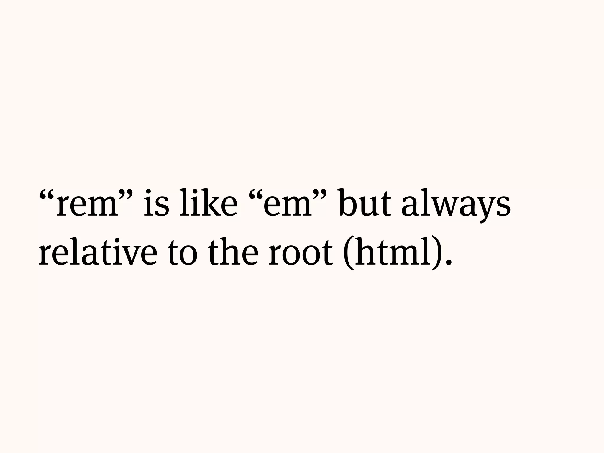
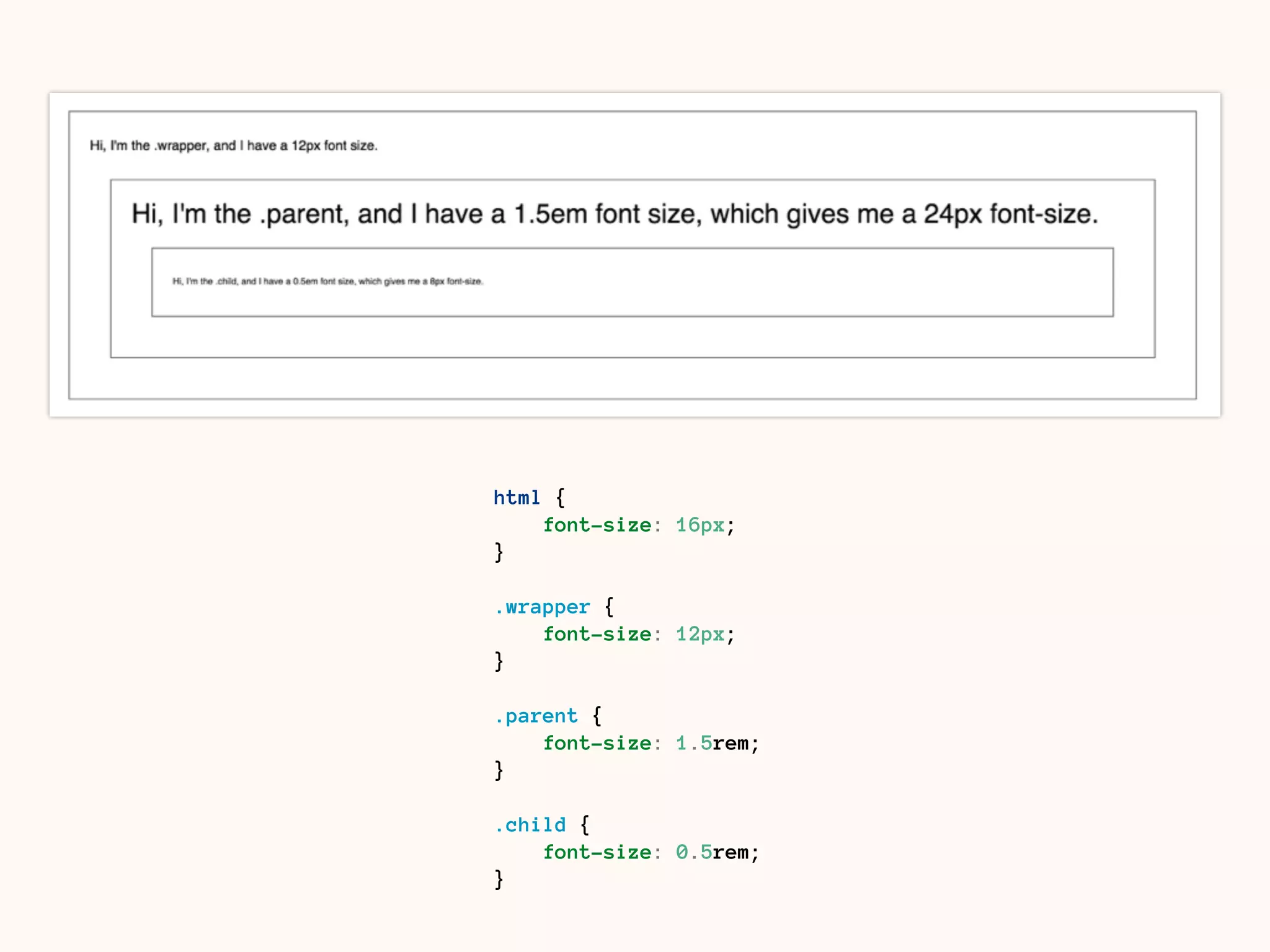
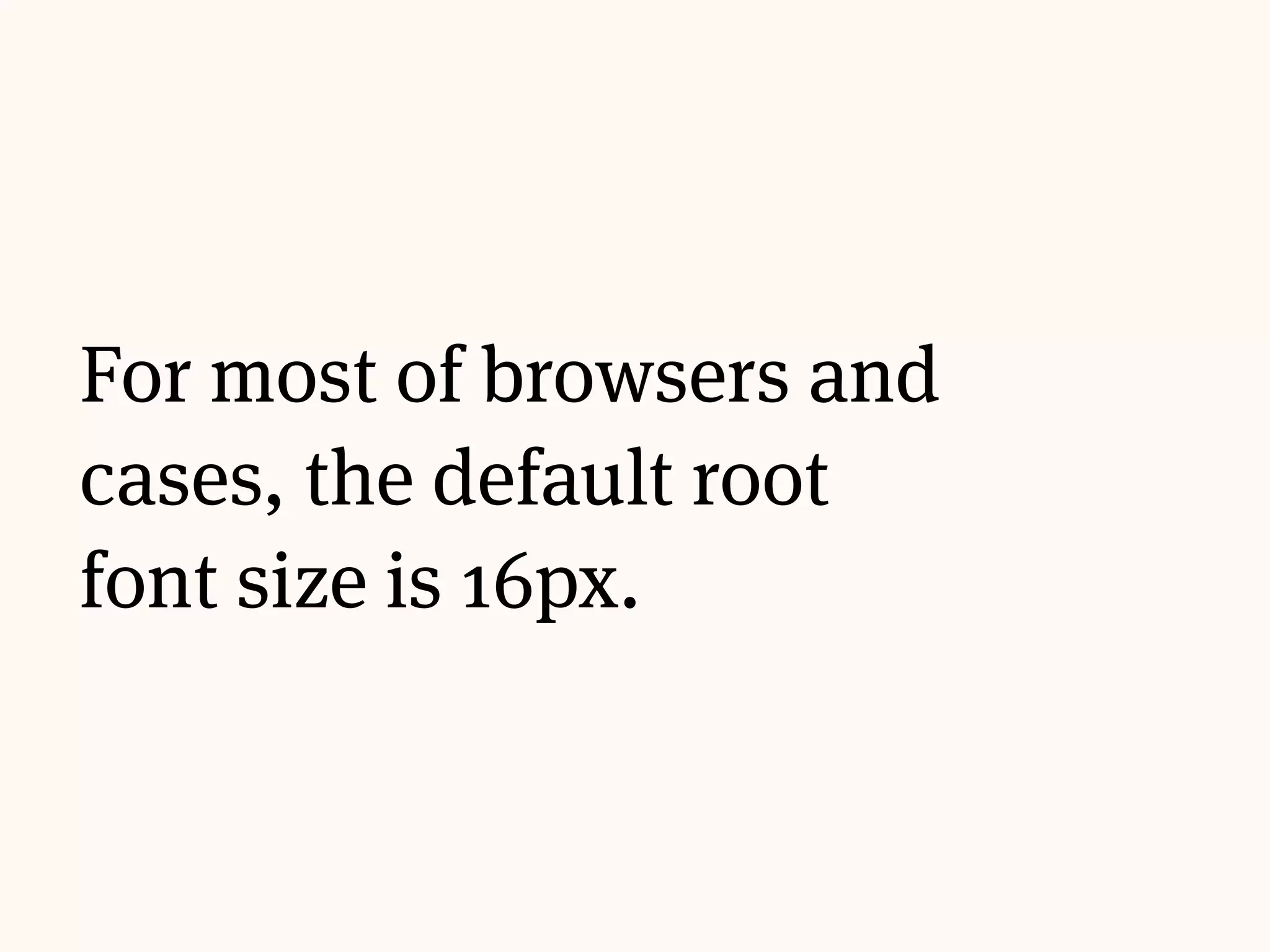
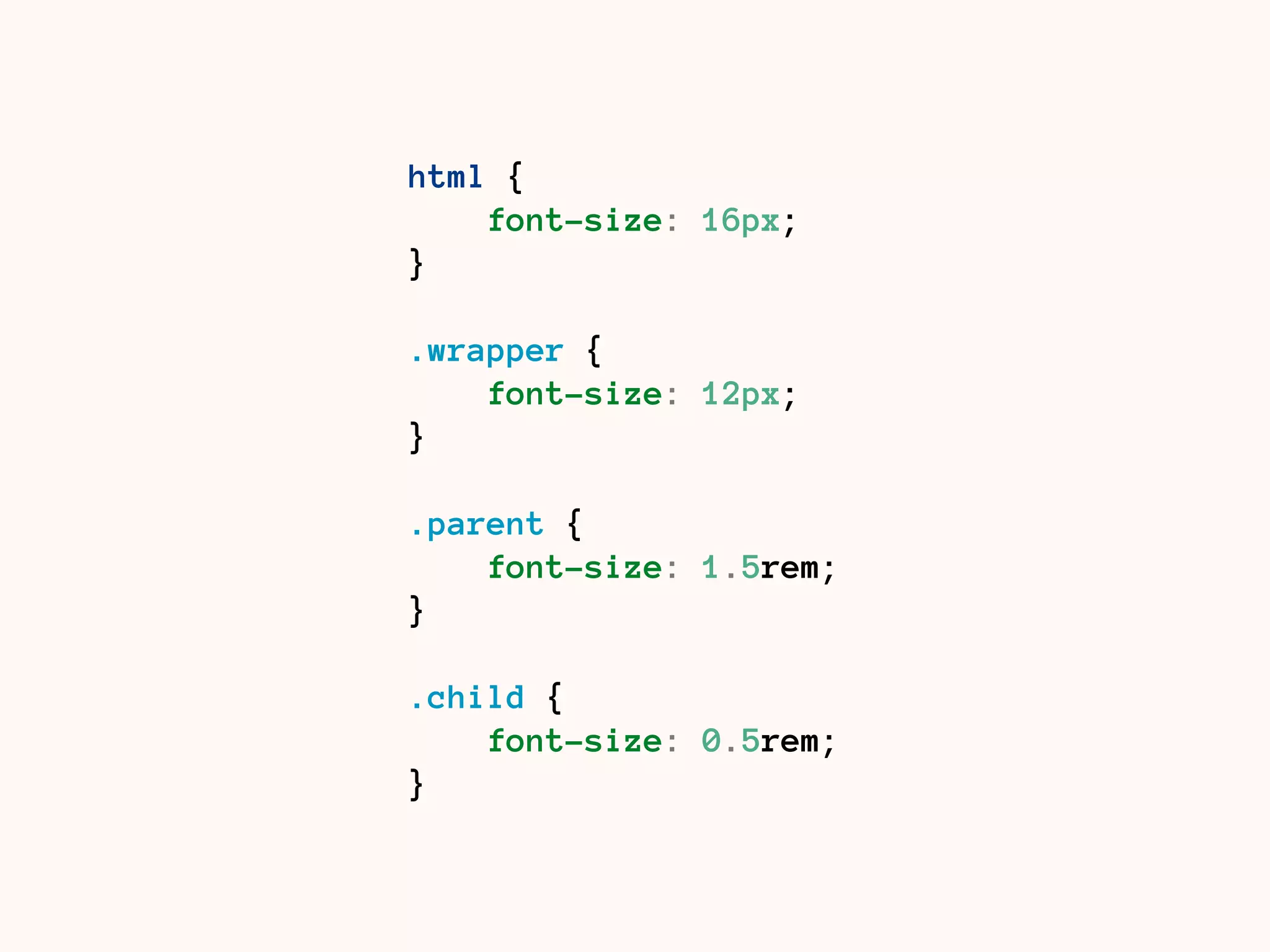
Downloaded 133 times


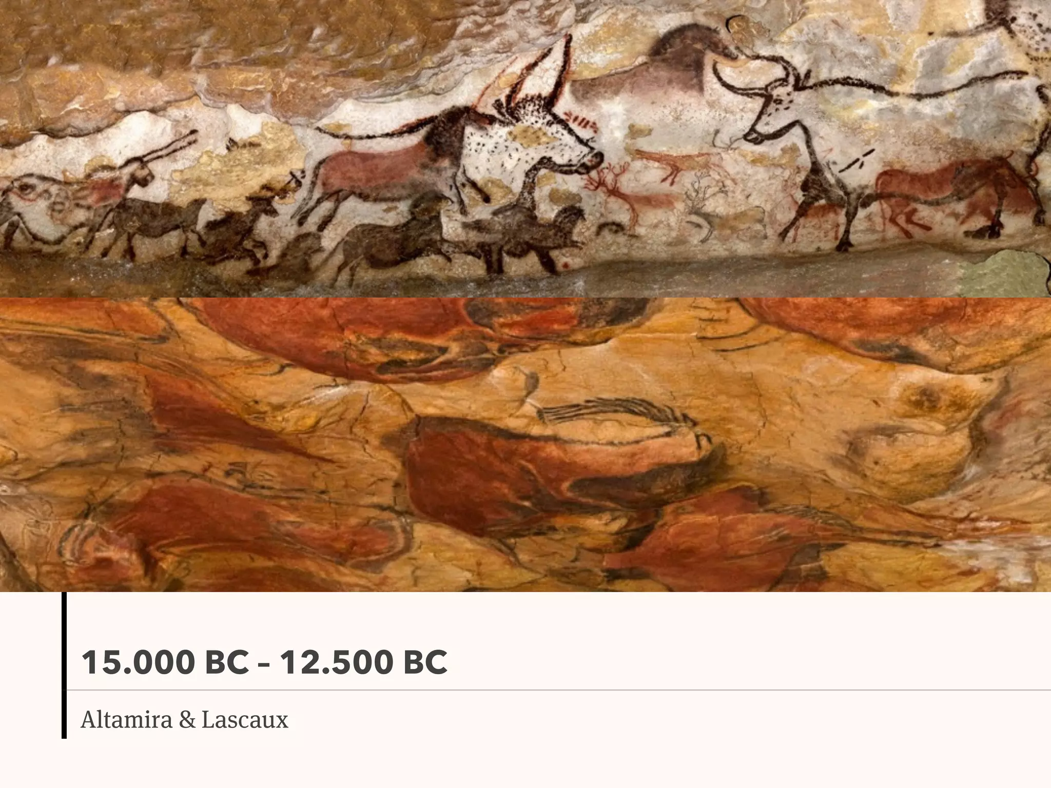
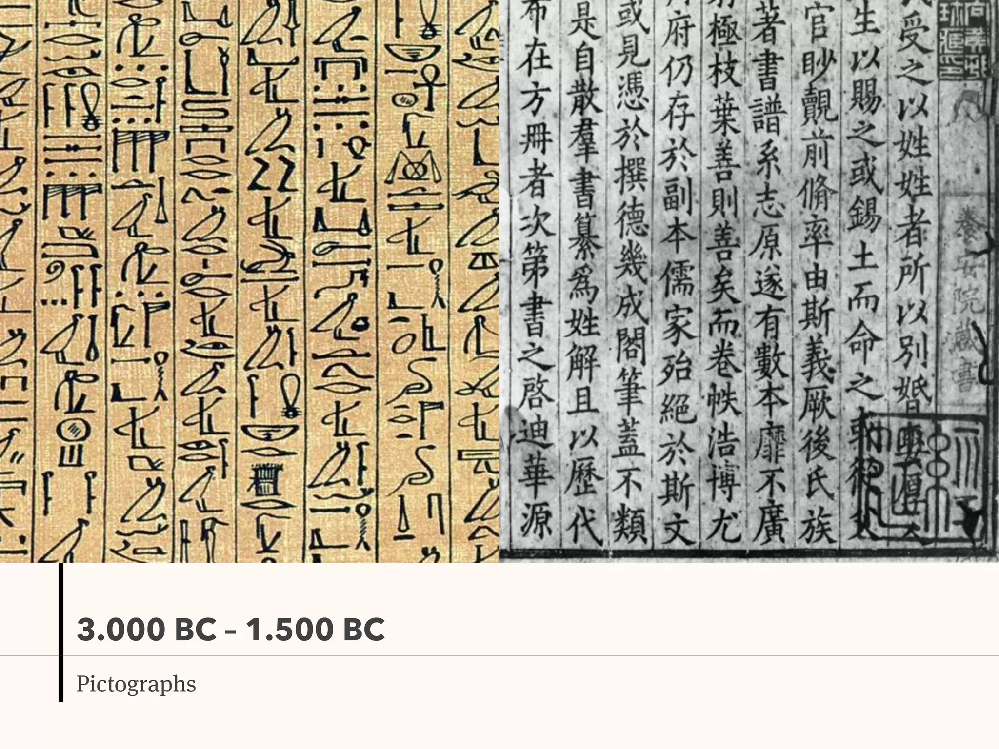
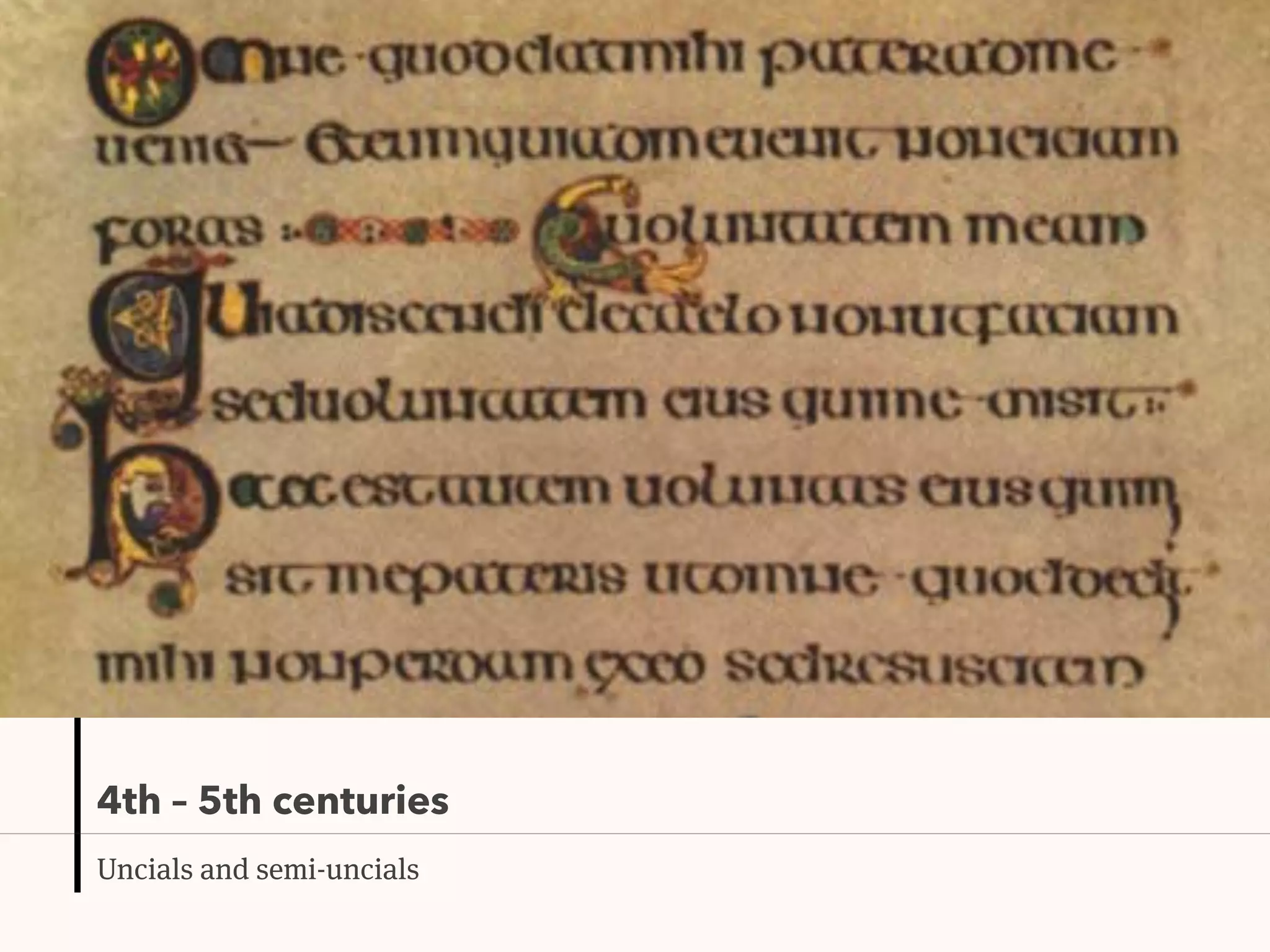
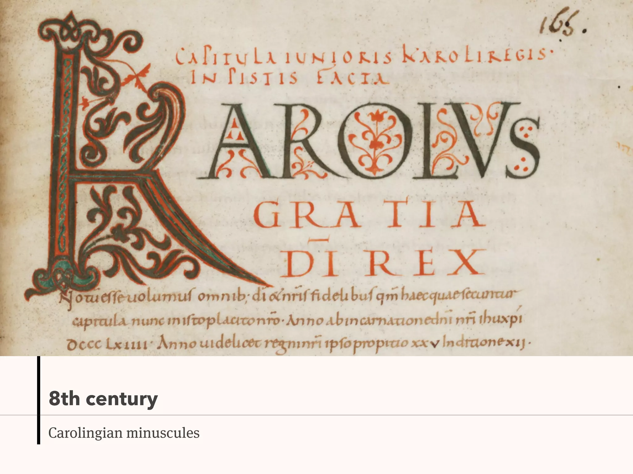
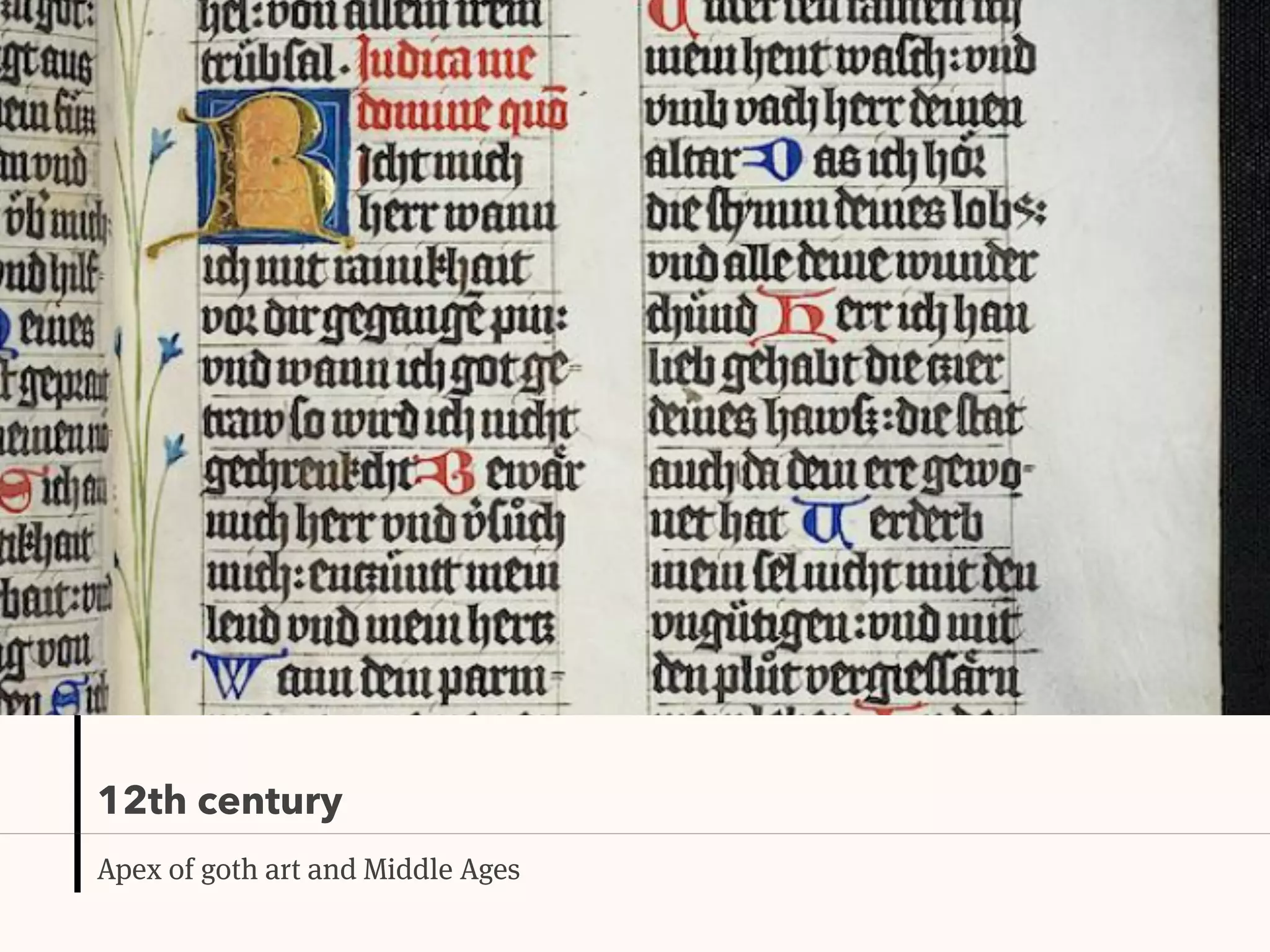
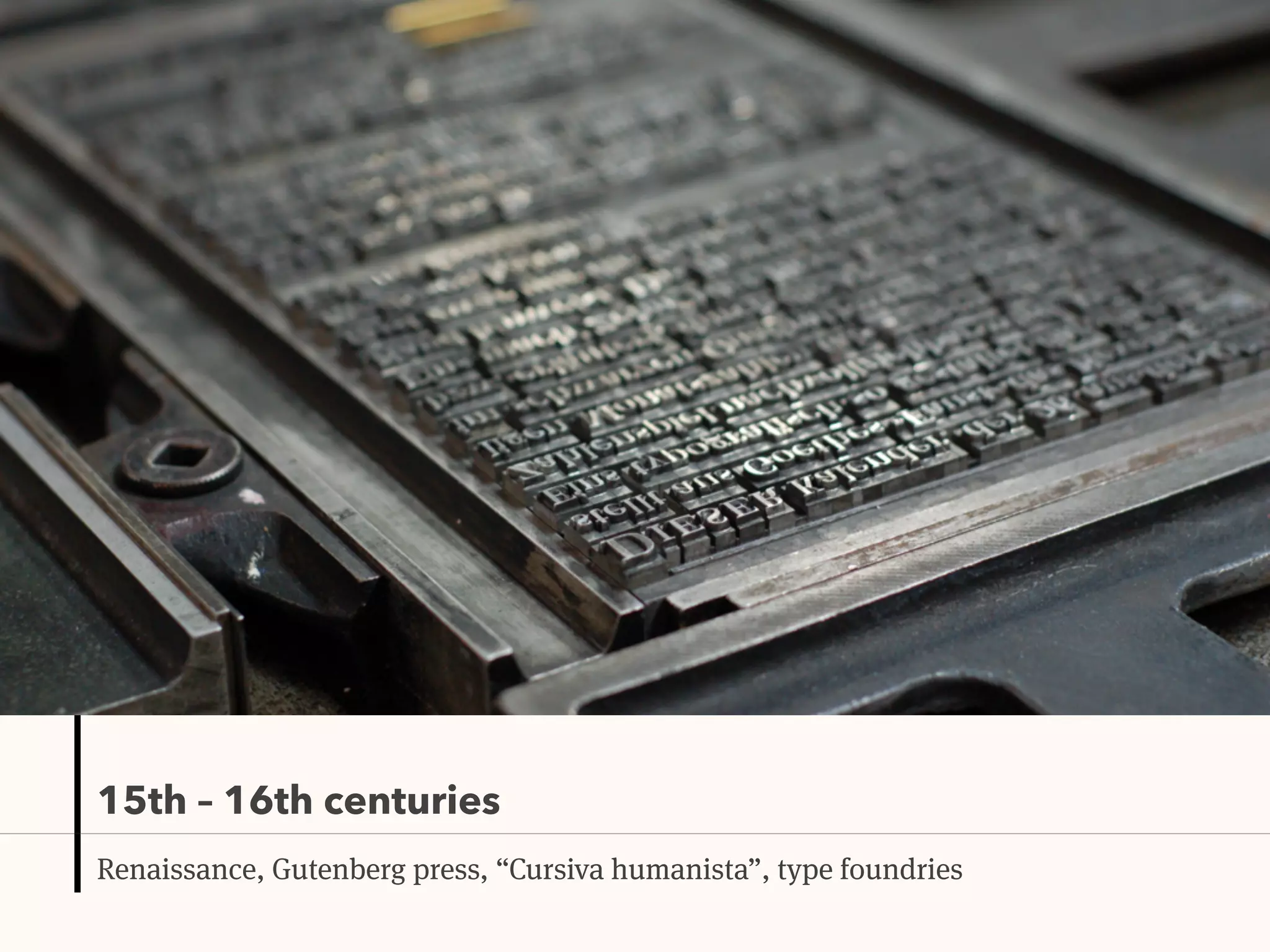
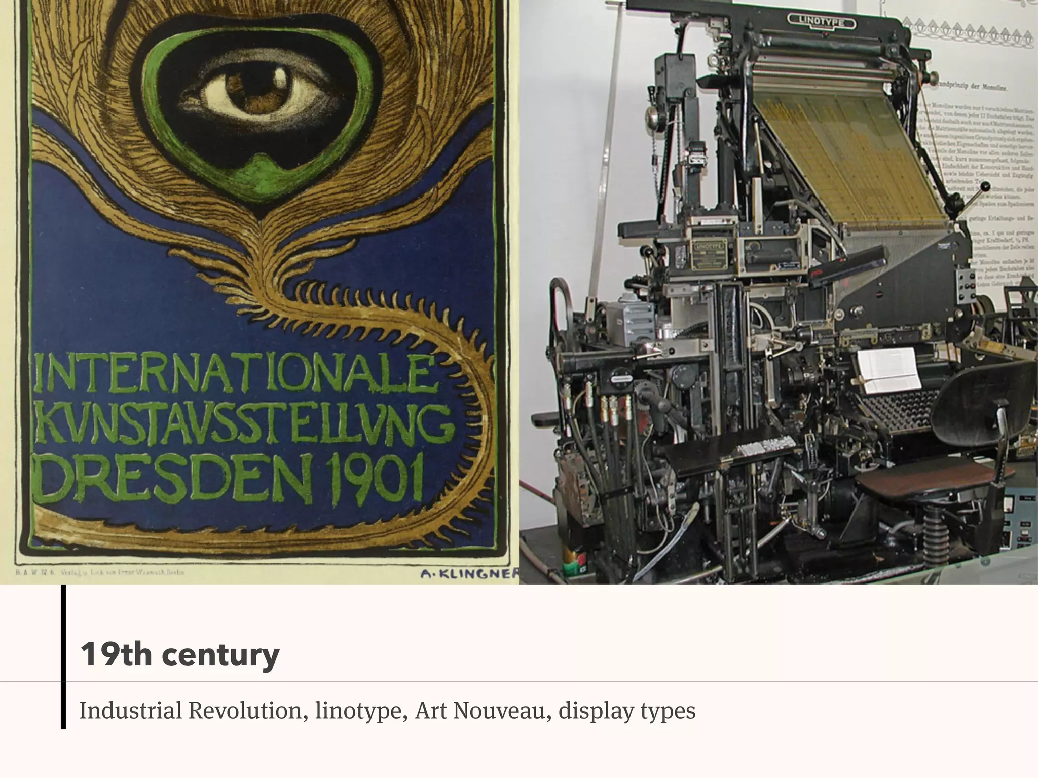
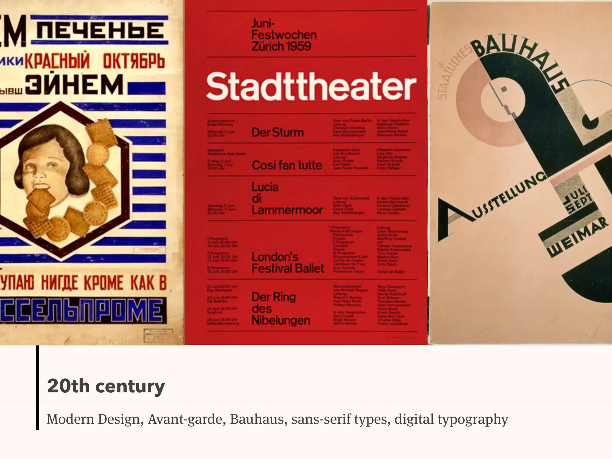
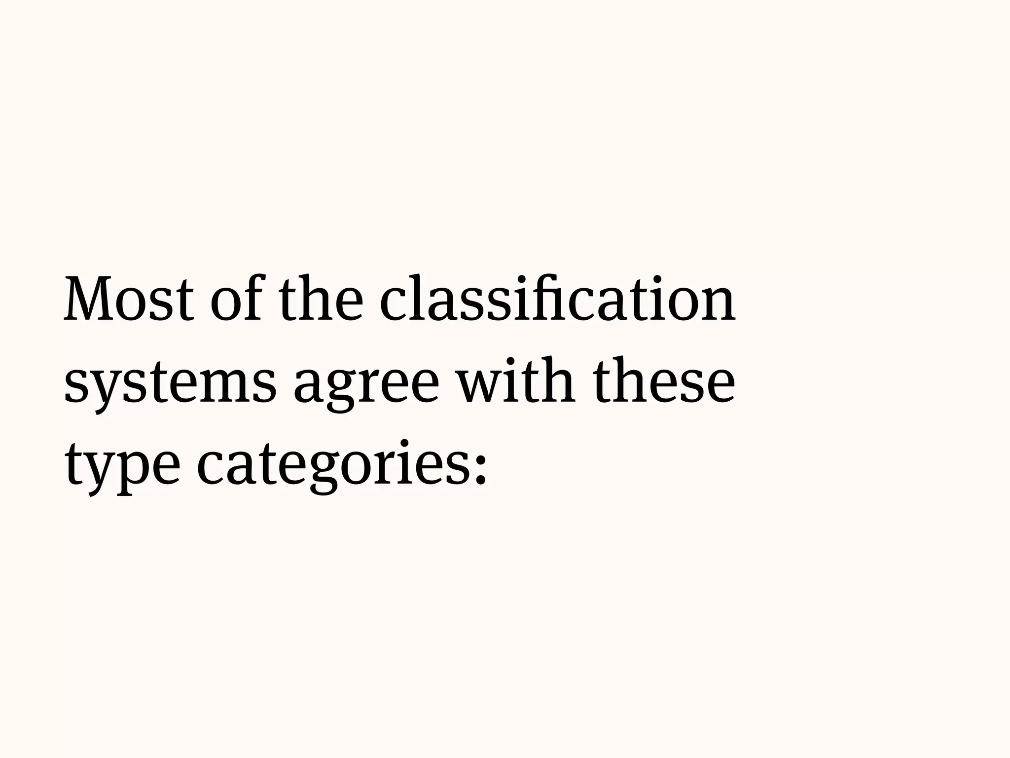

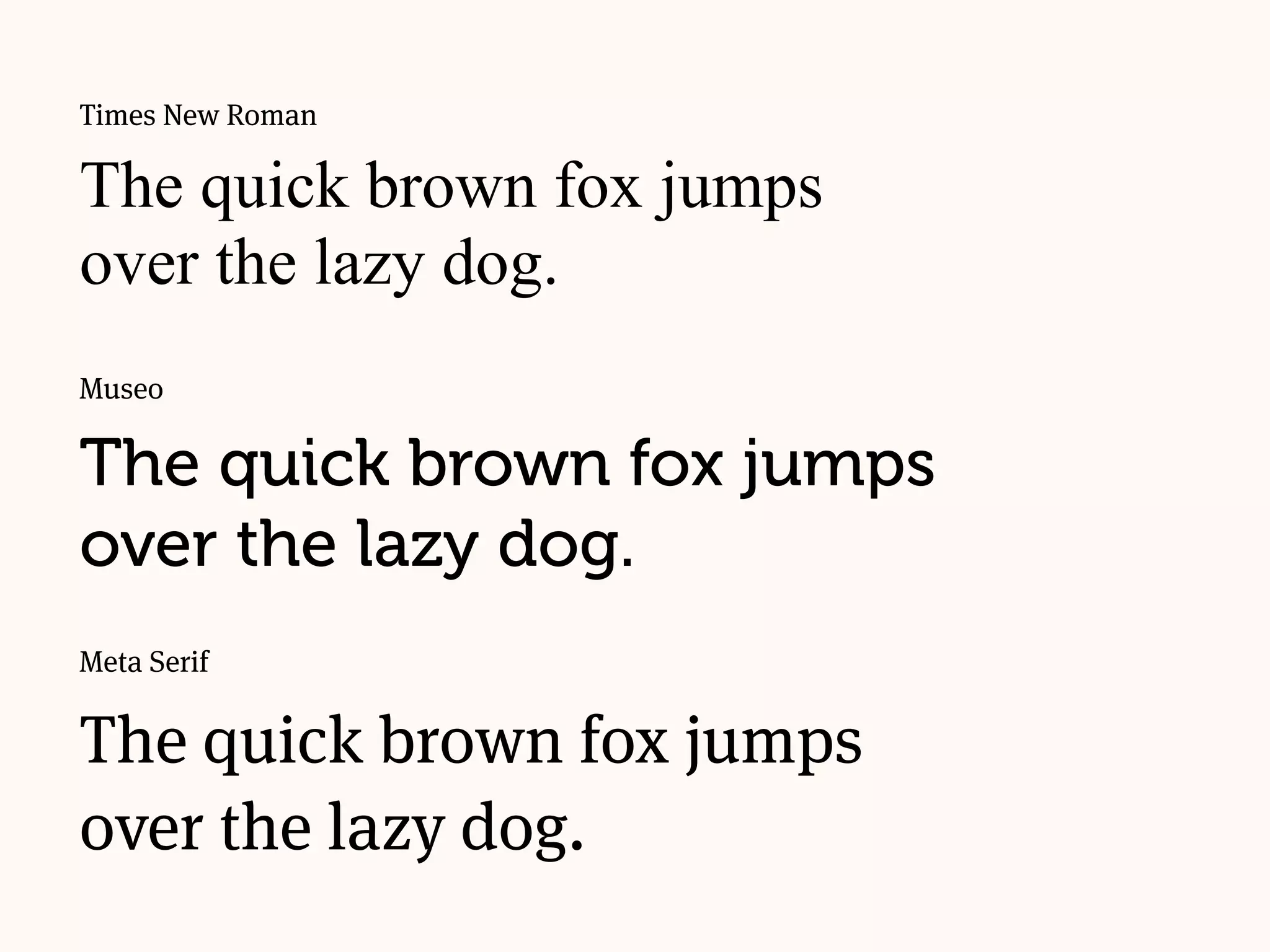

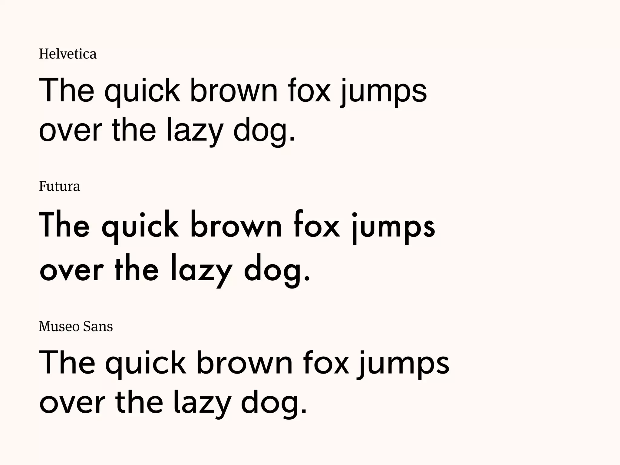


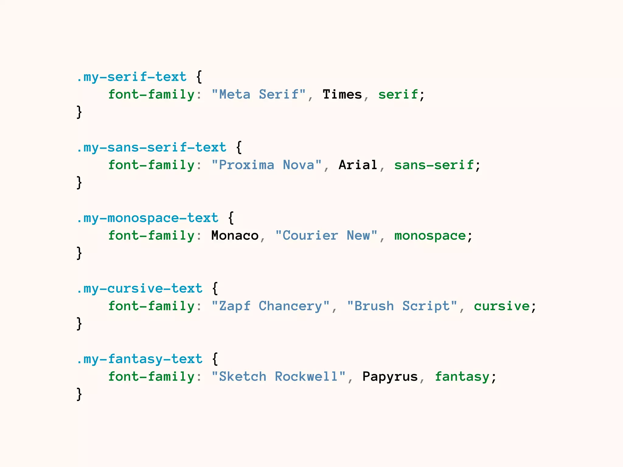

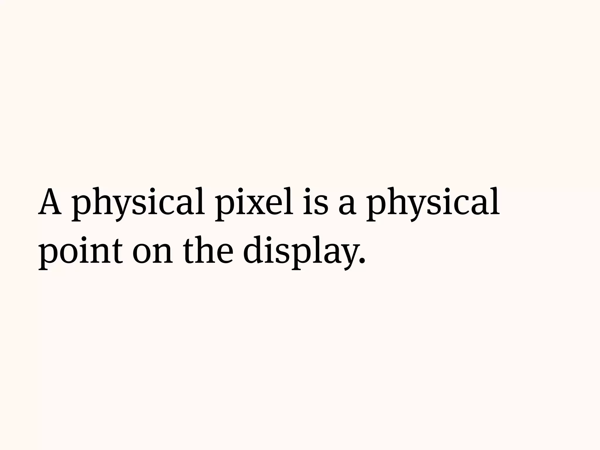

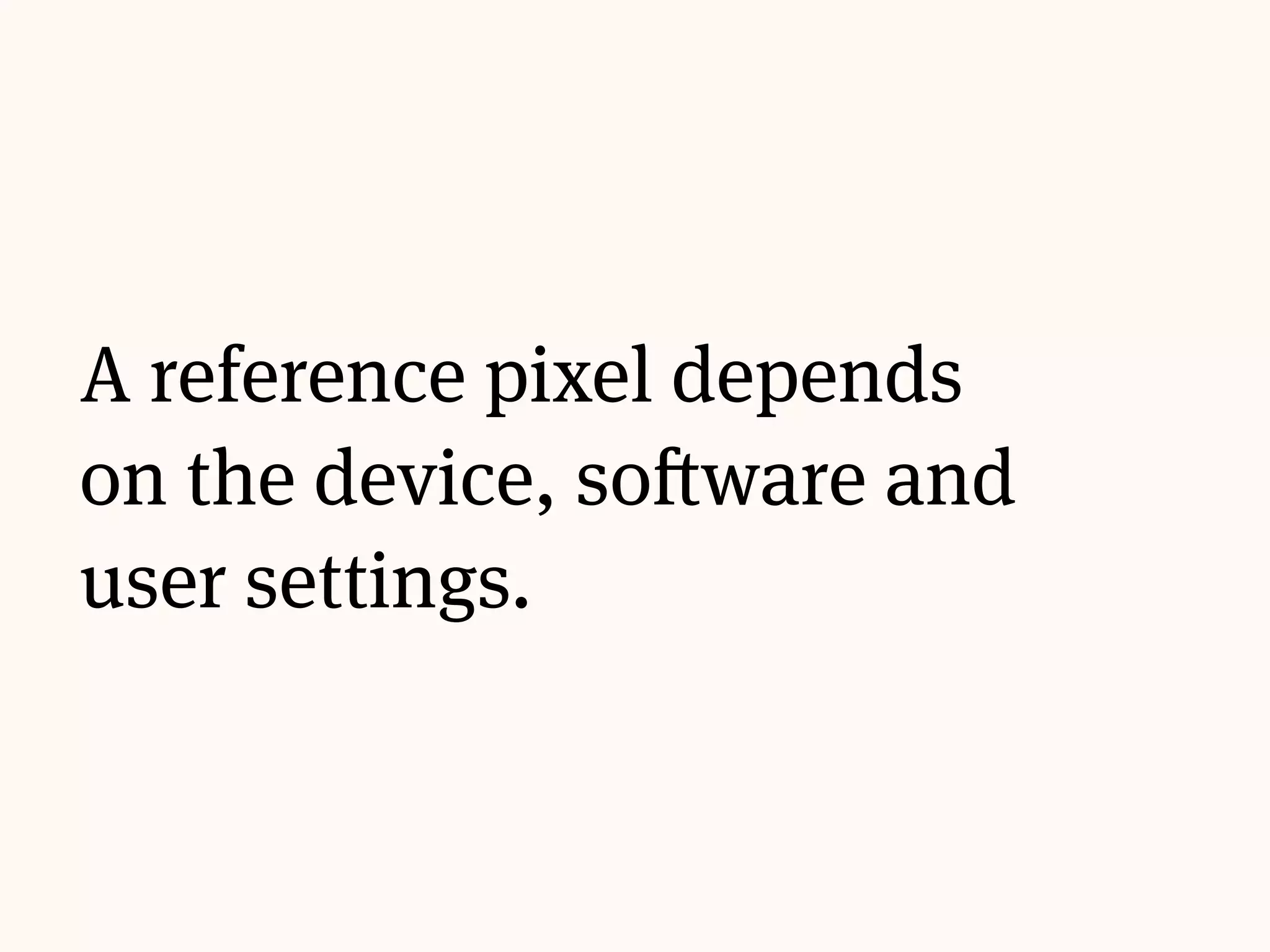

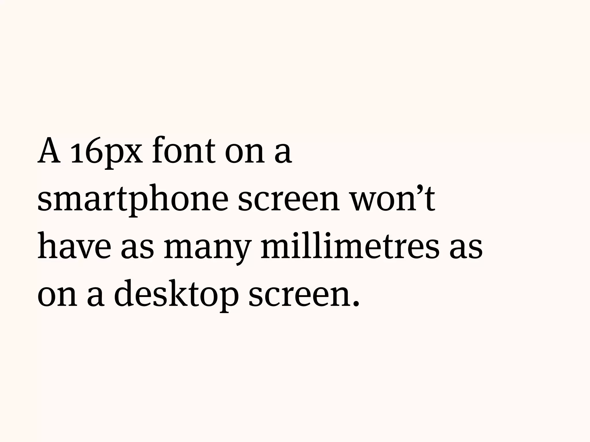
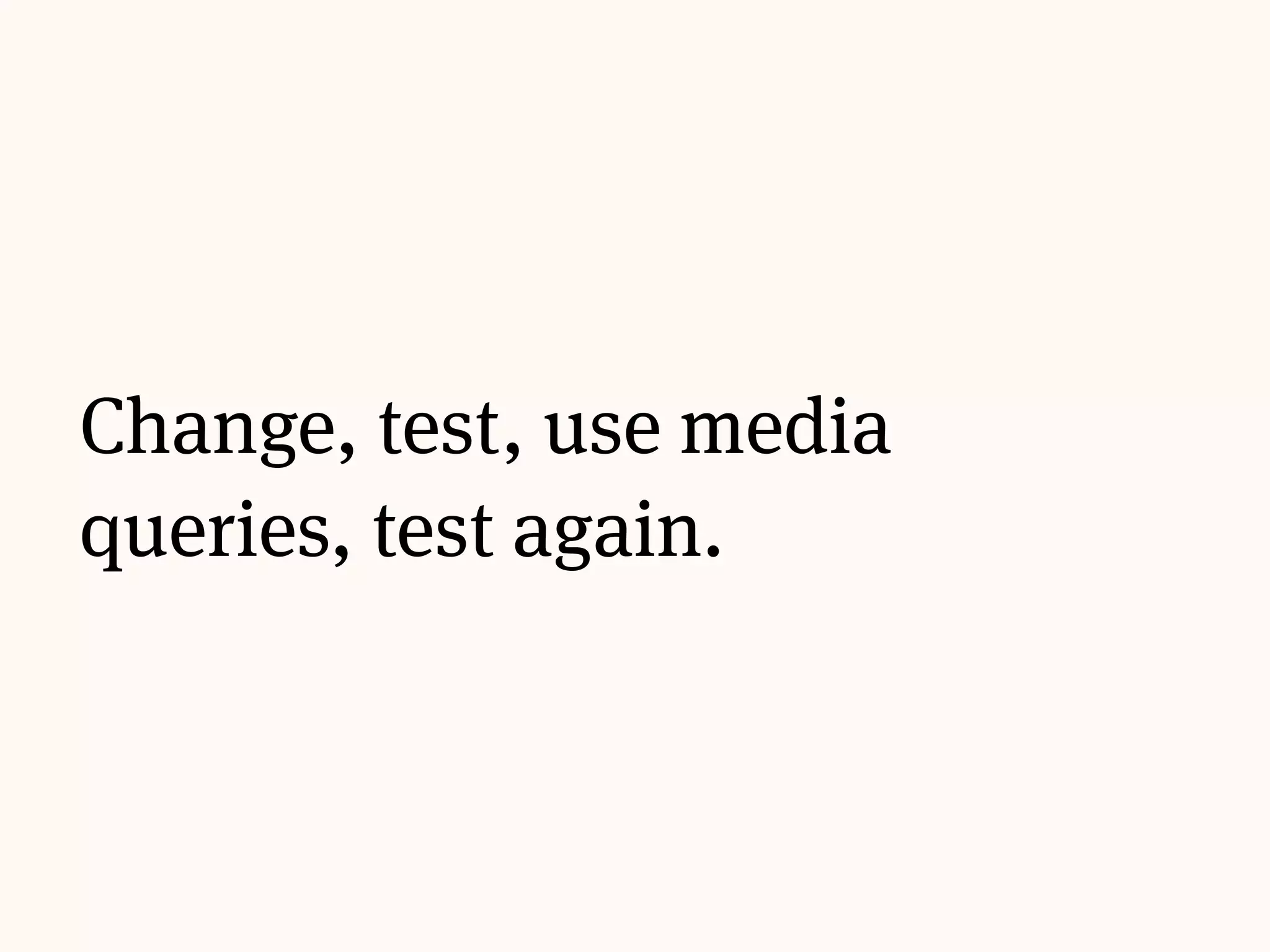
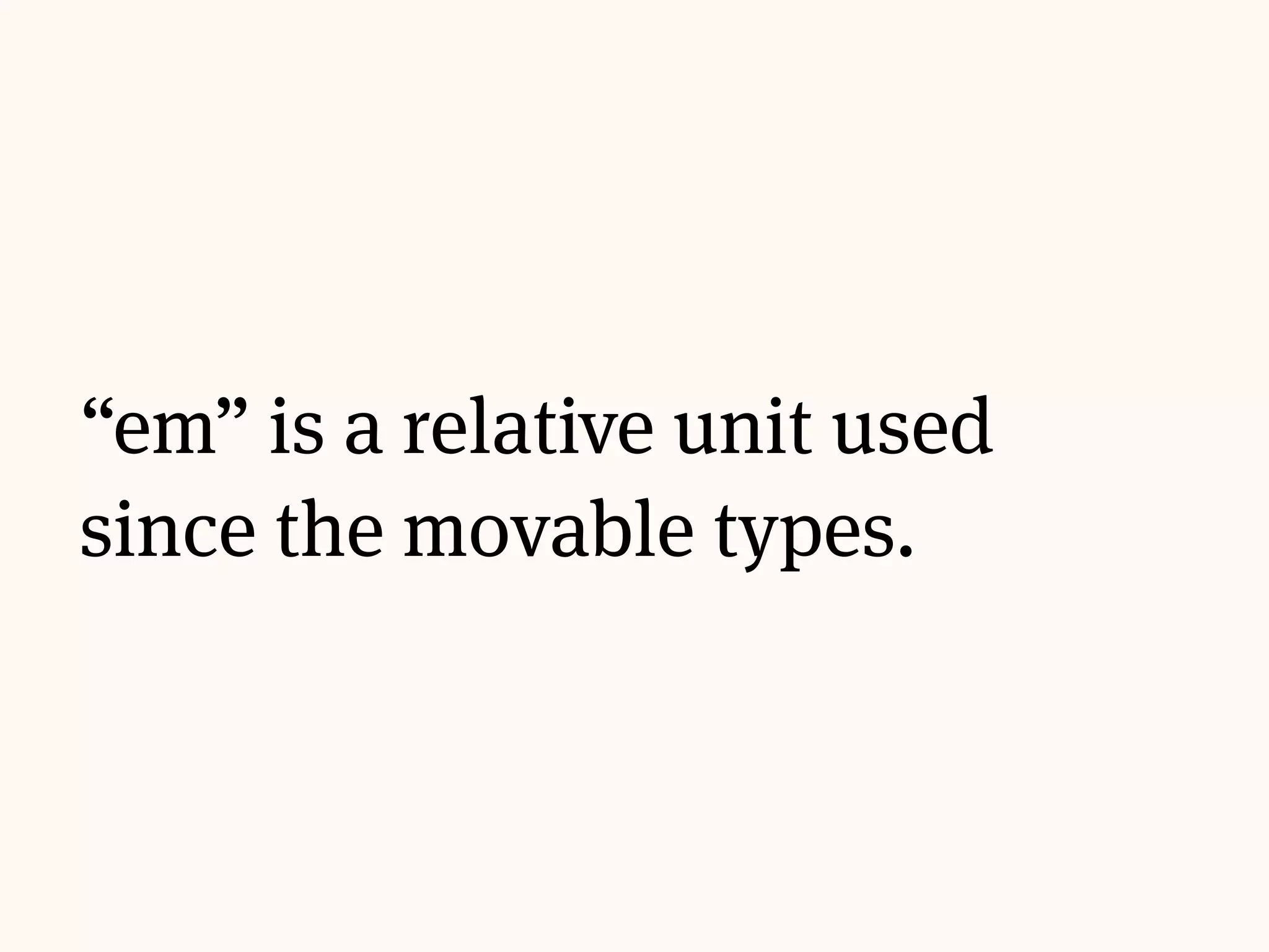
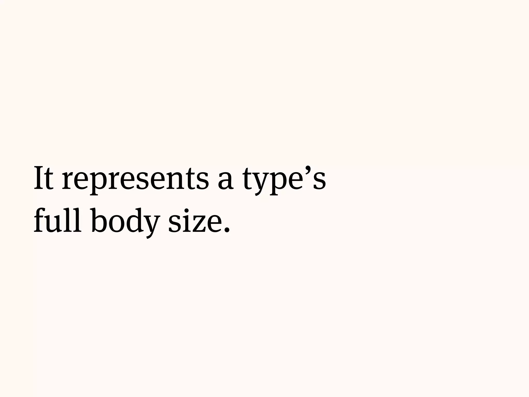
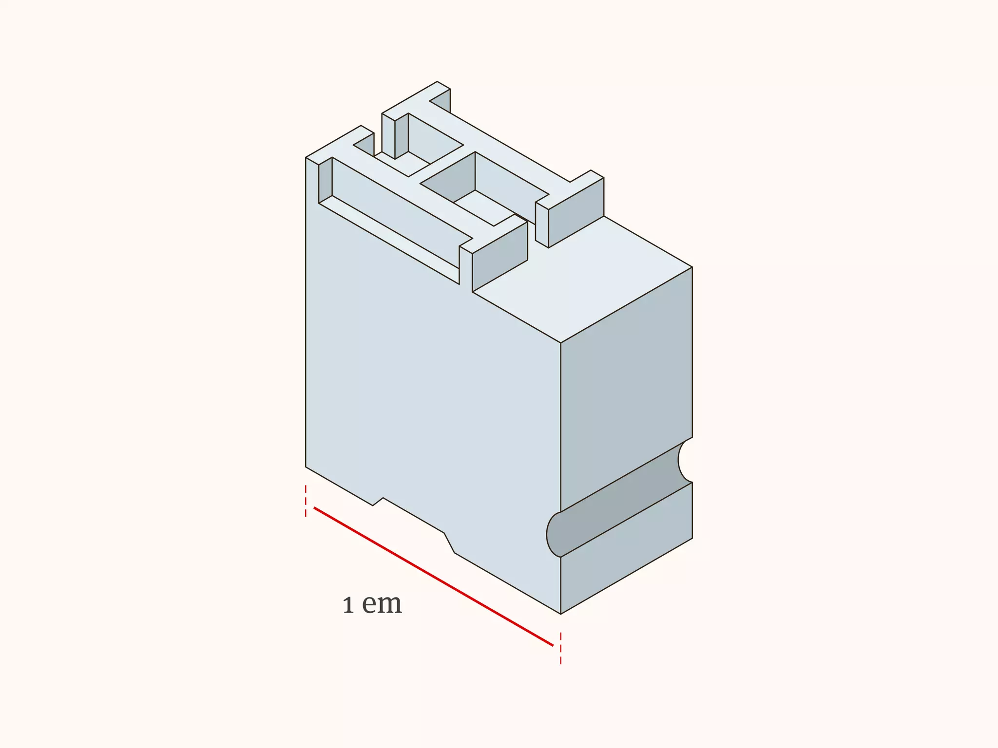


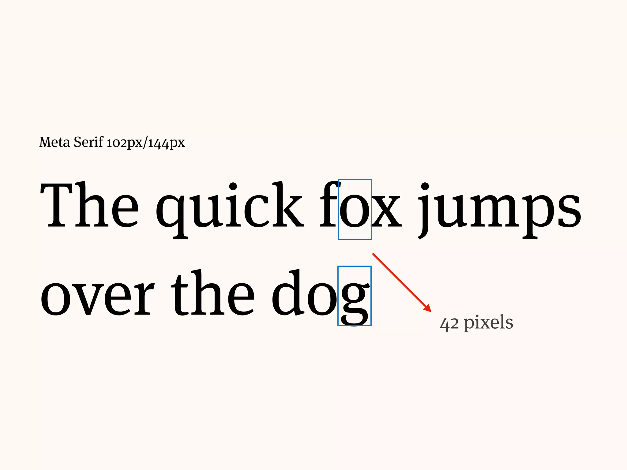
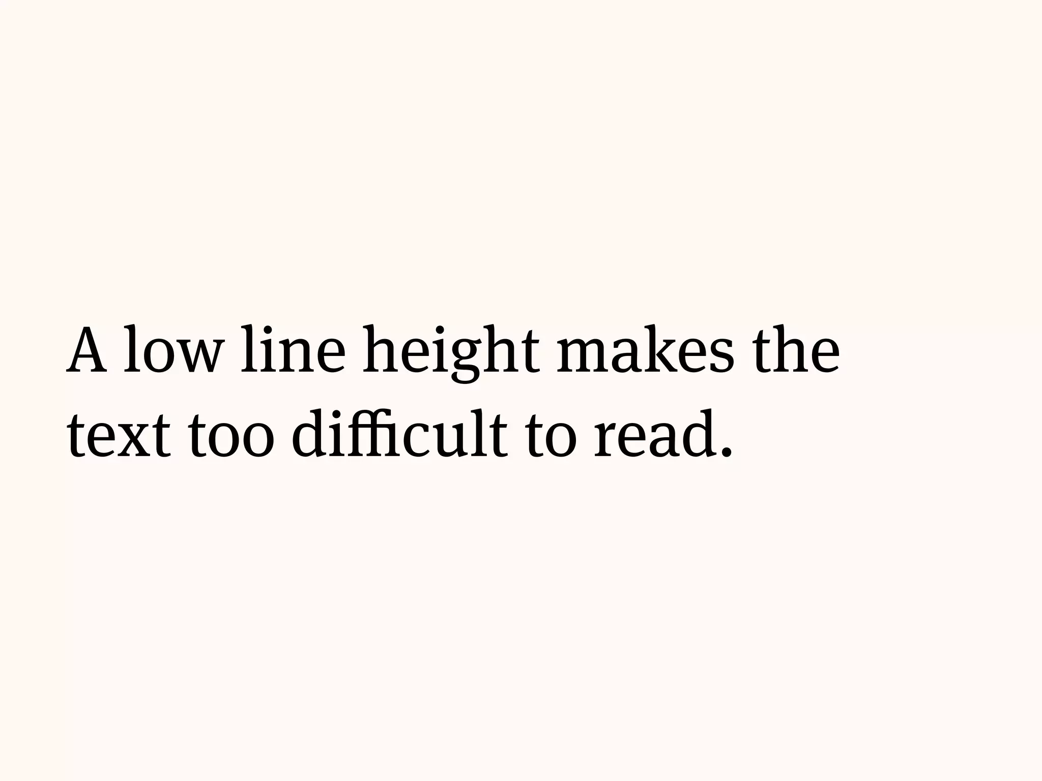
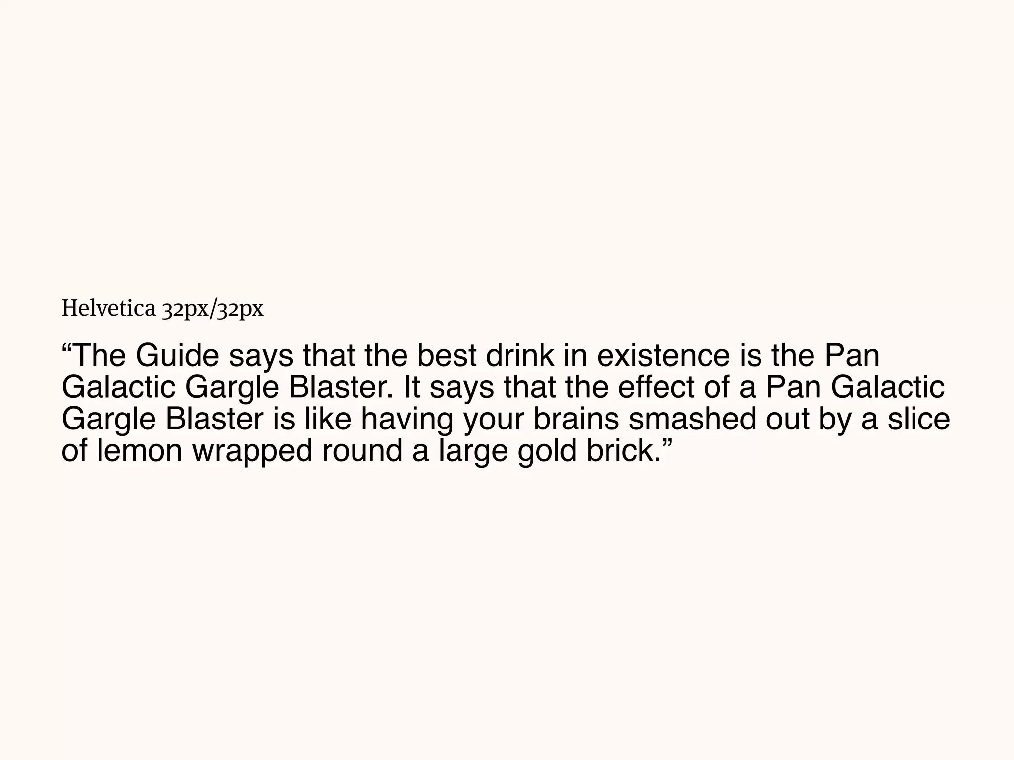
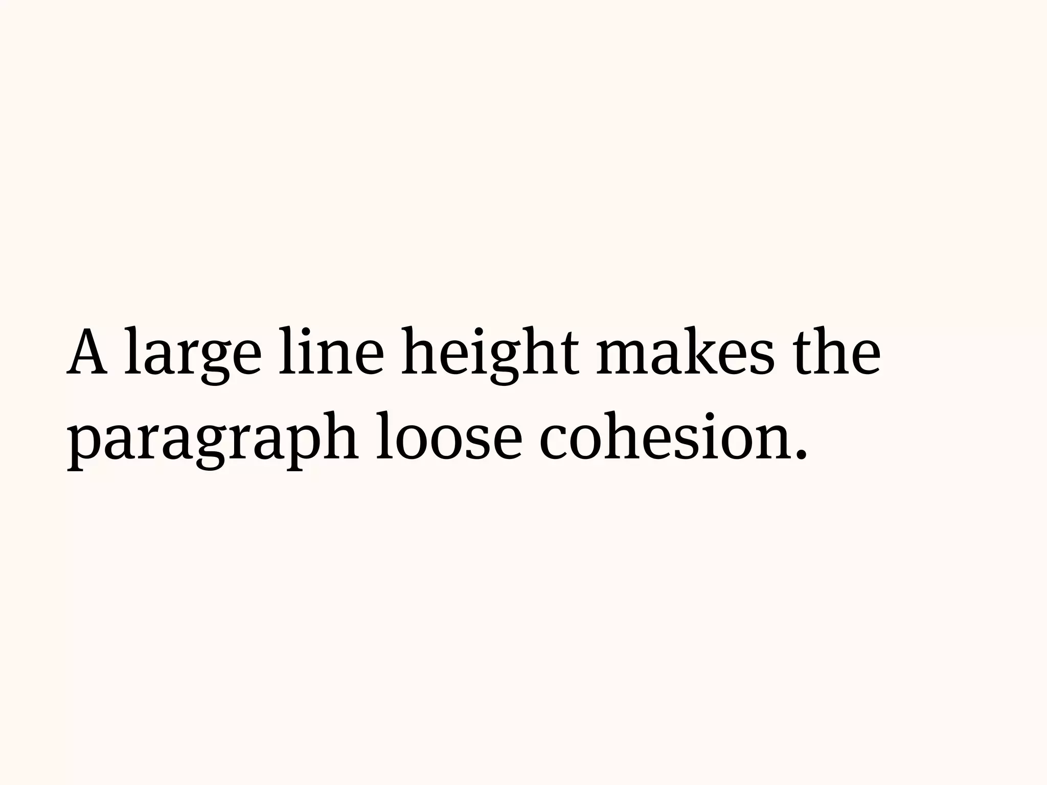


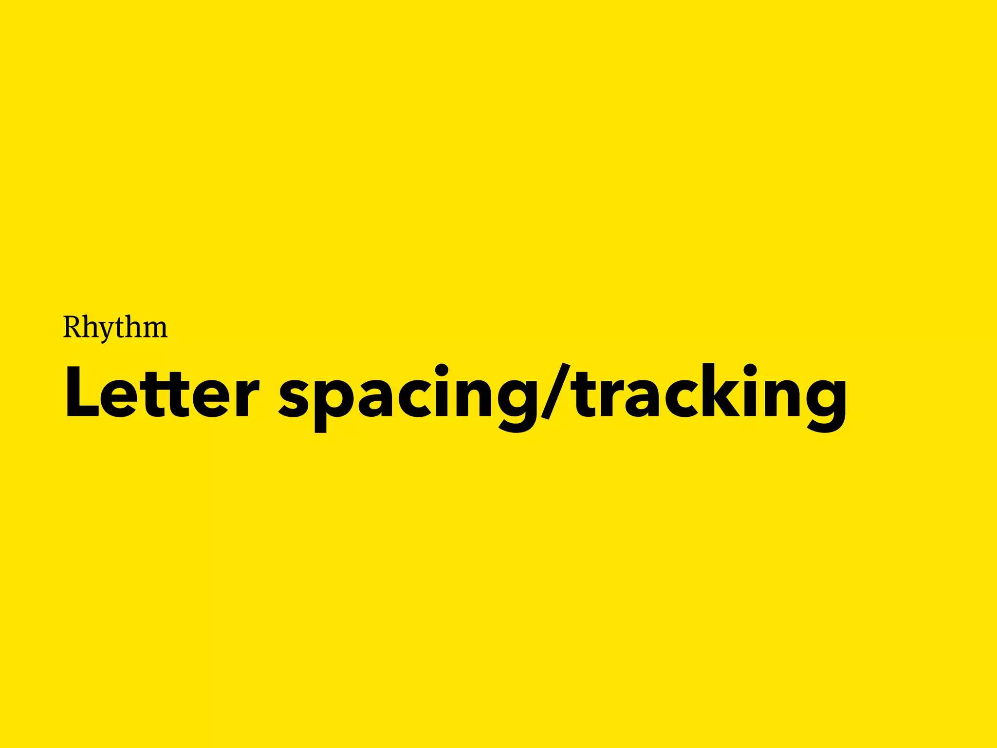
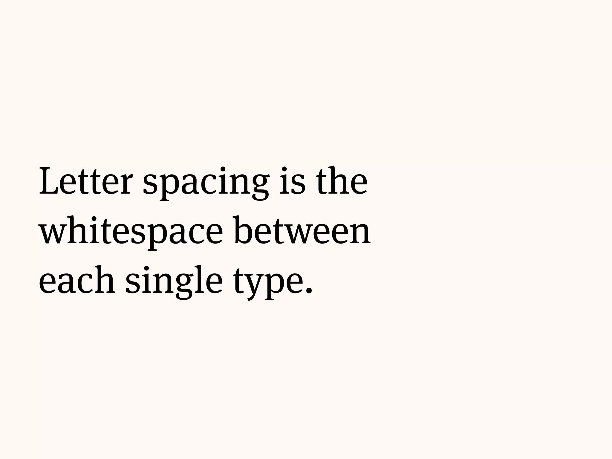
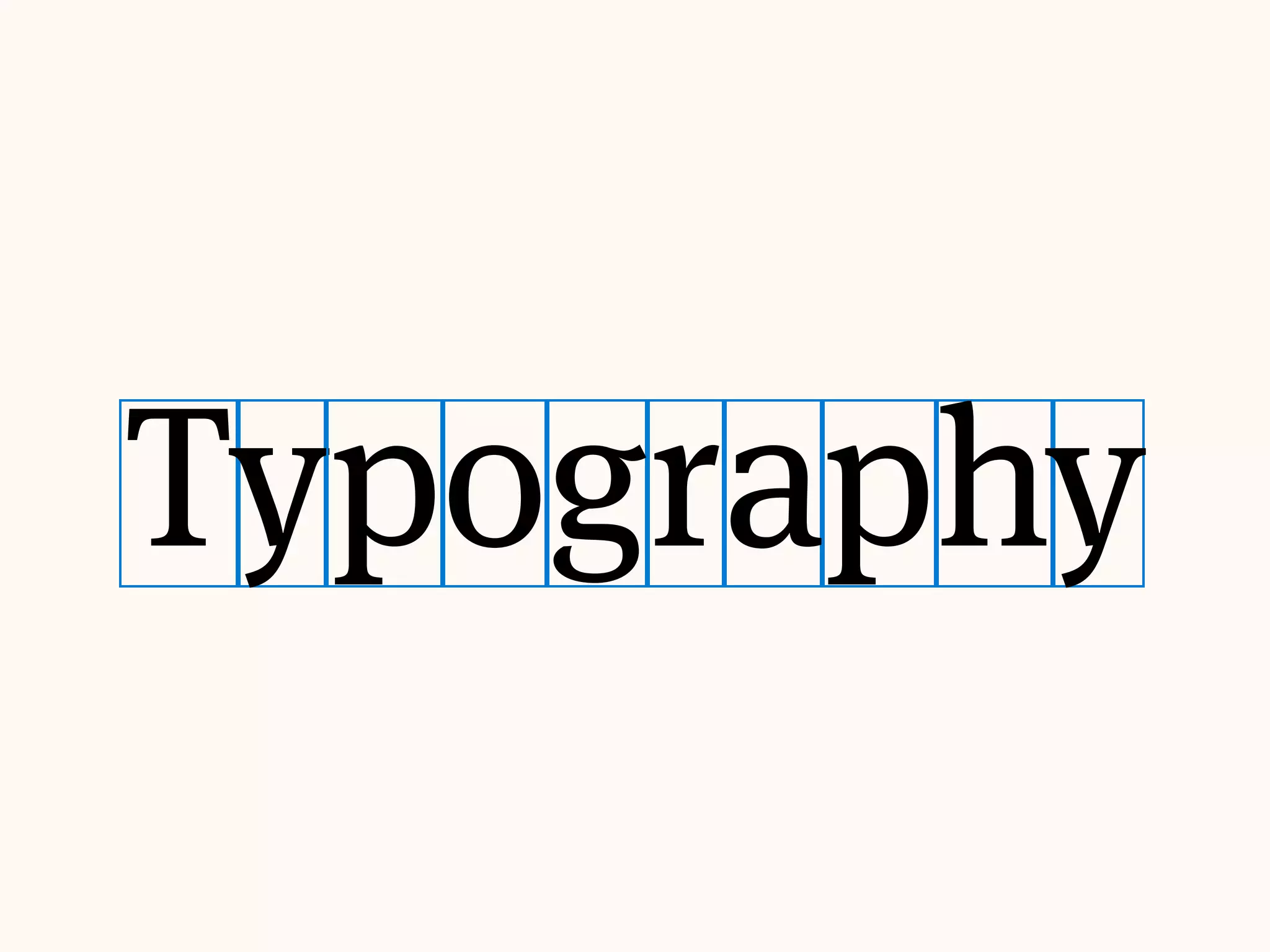
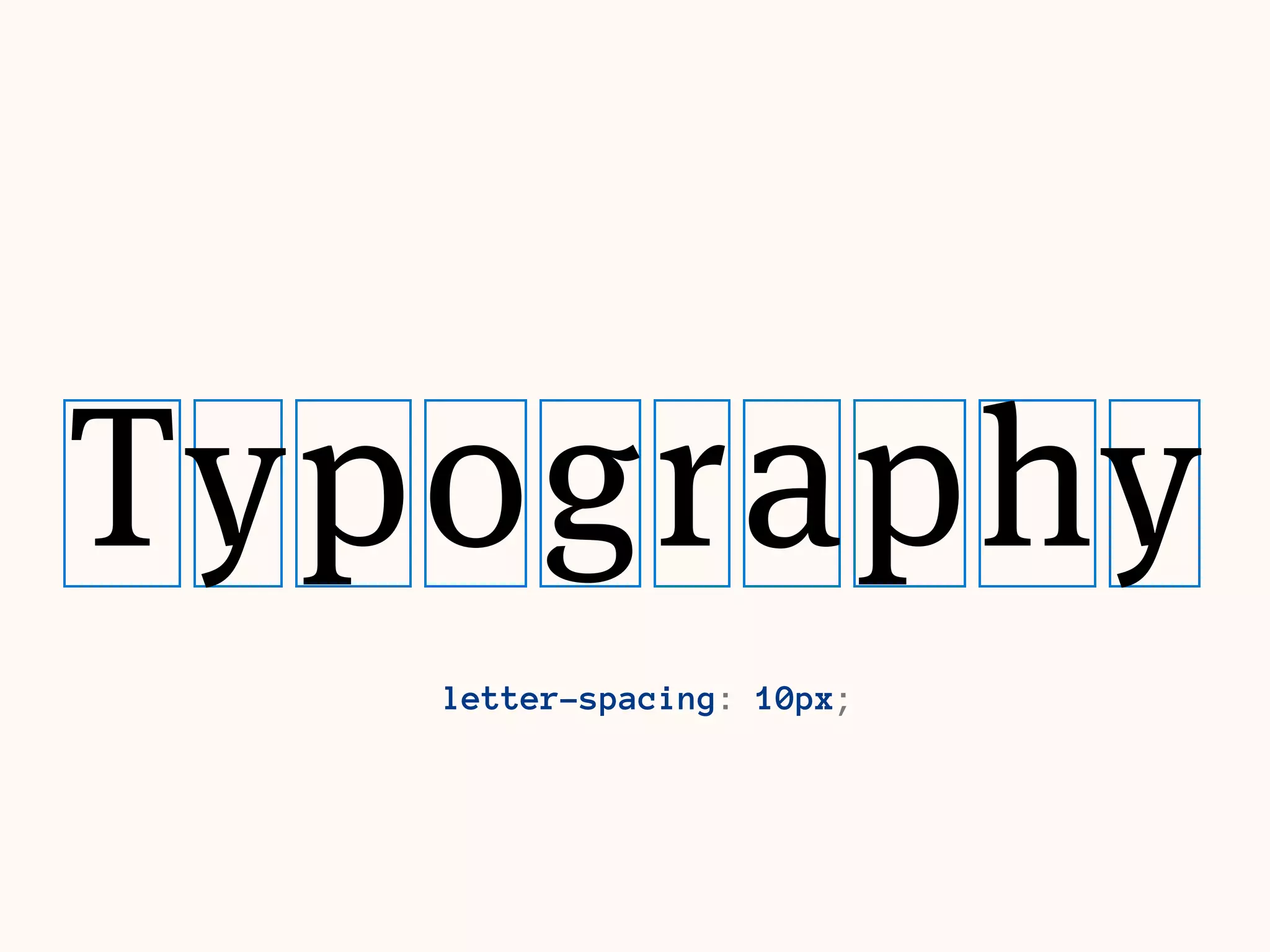
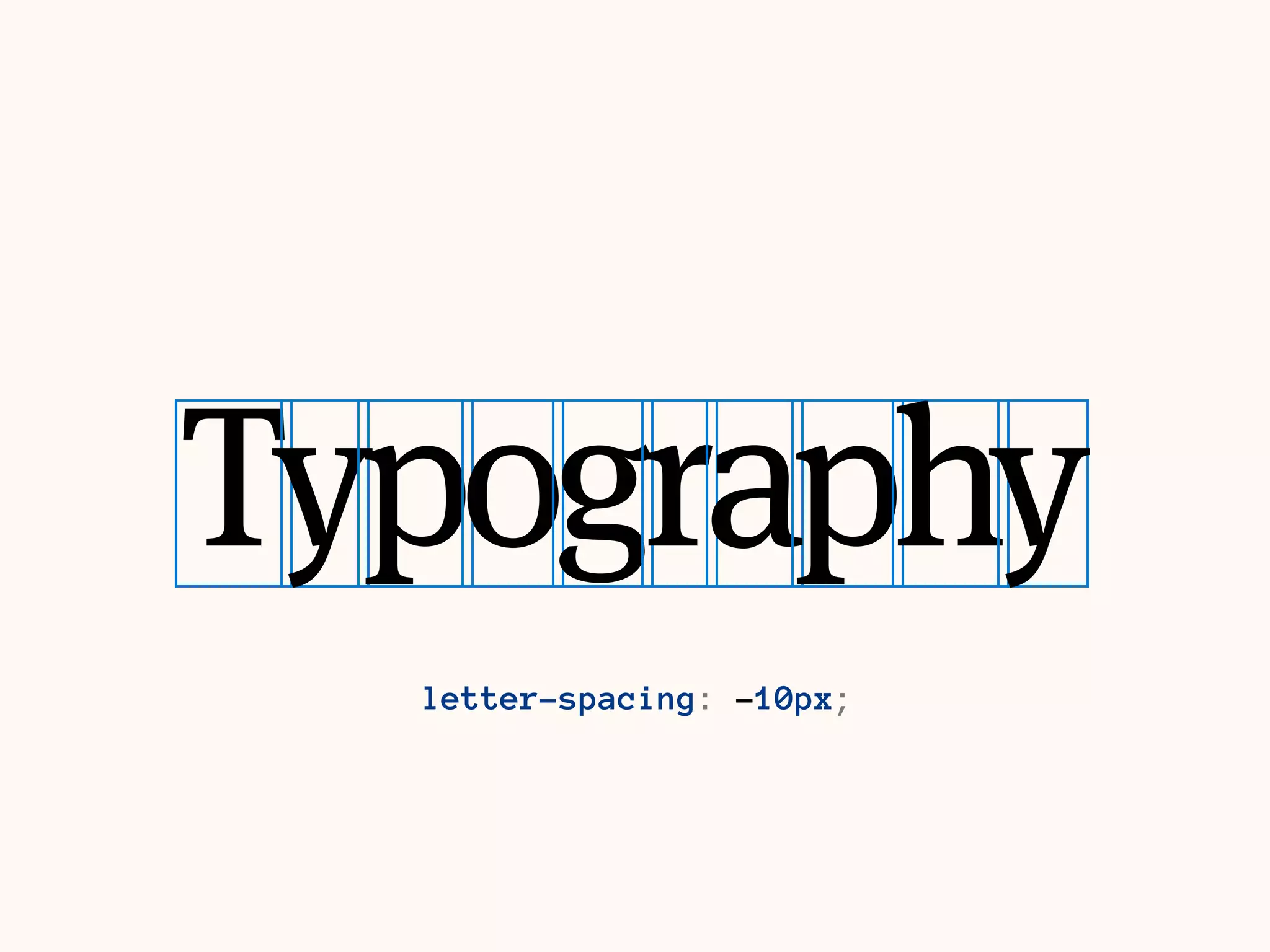
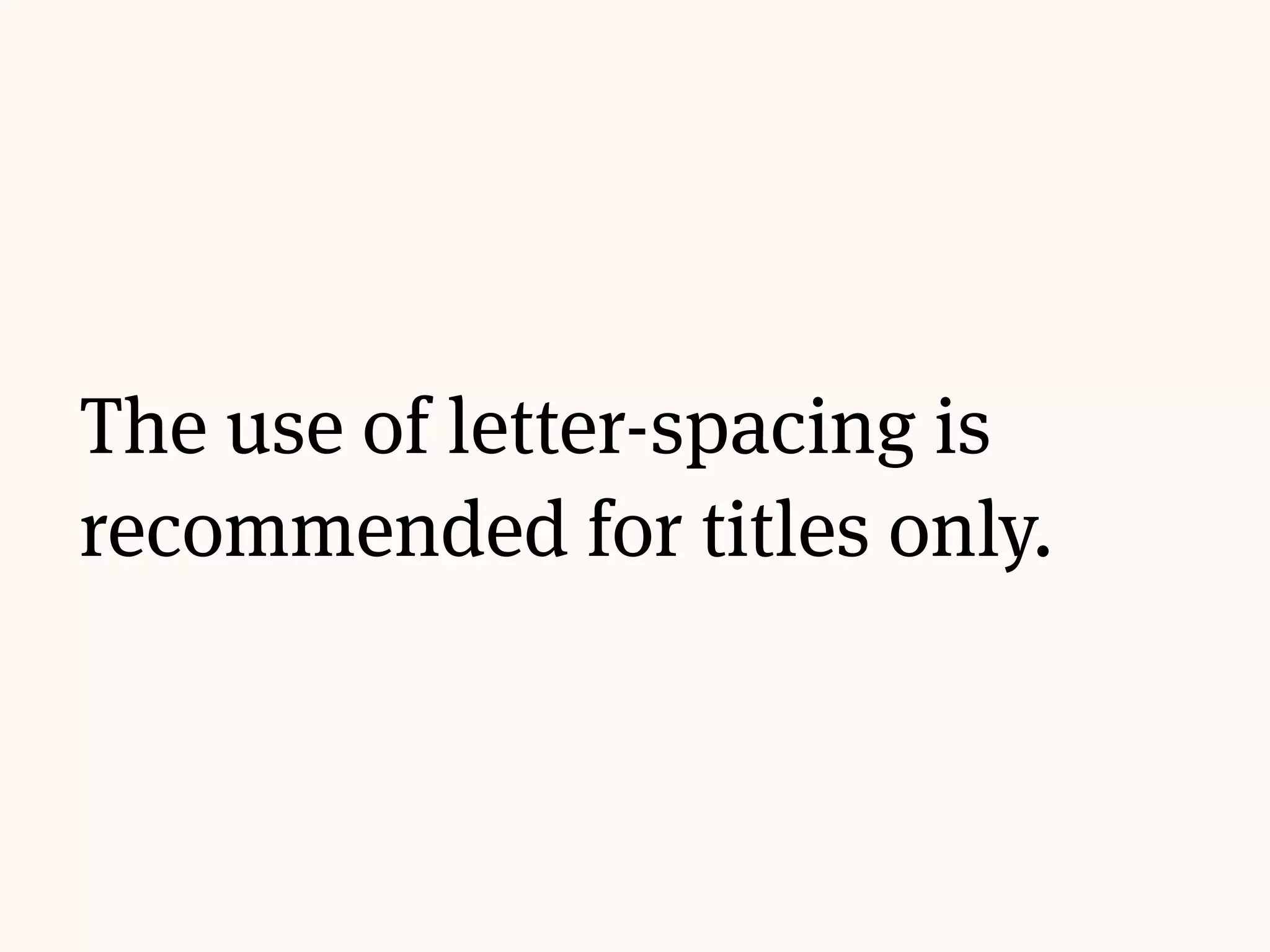
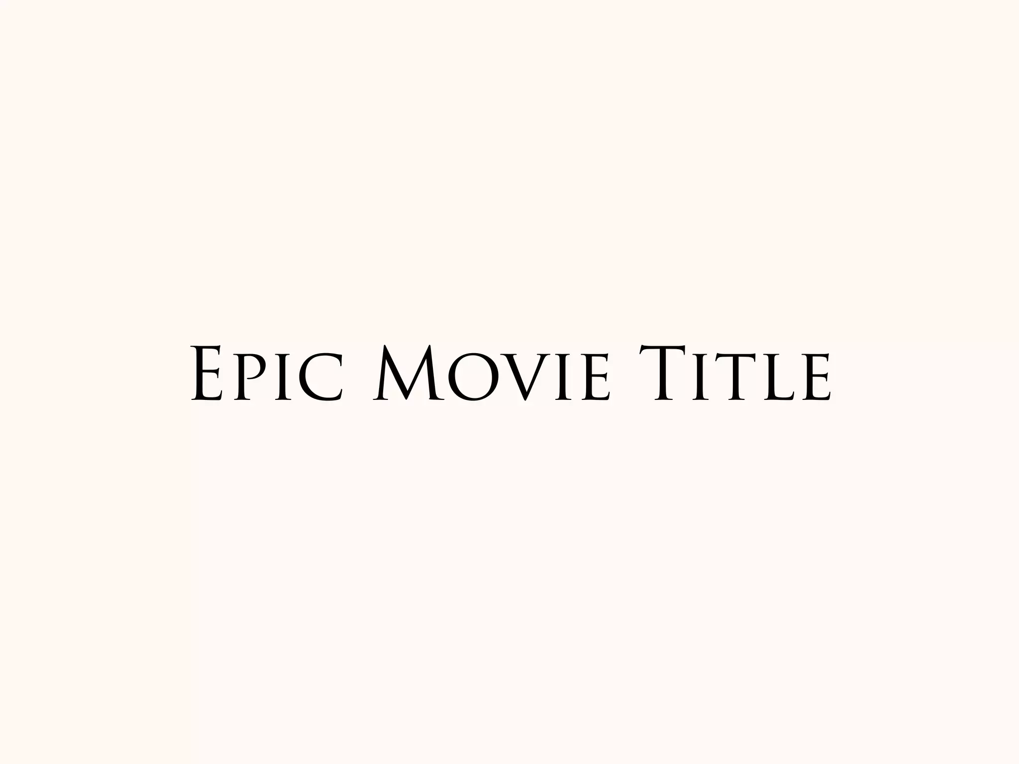


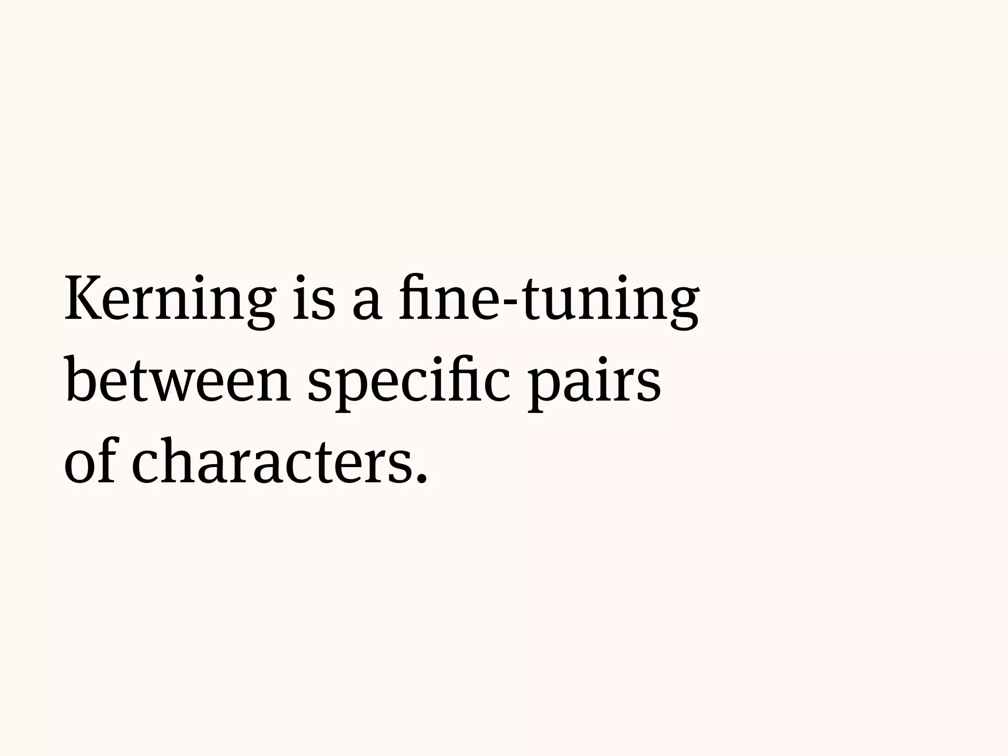


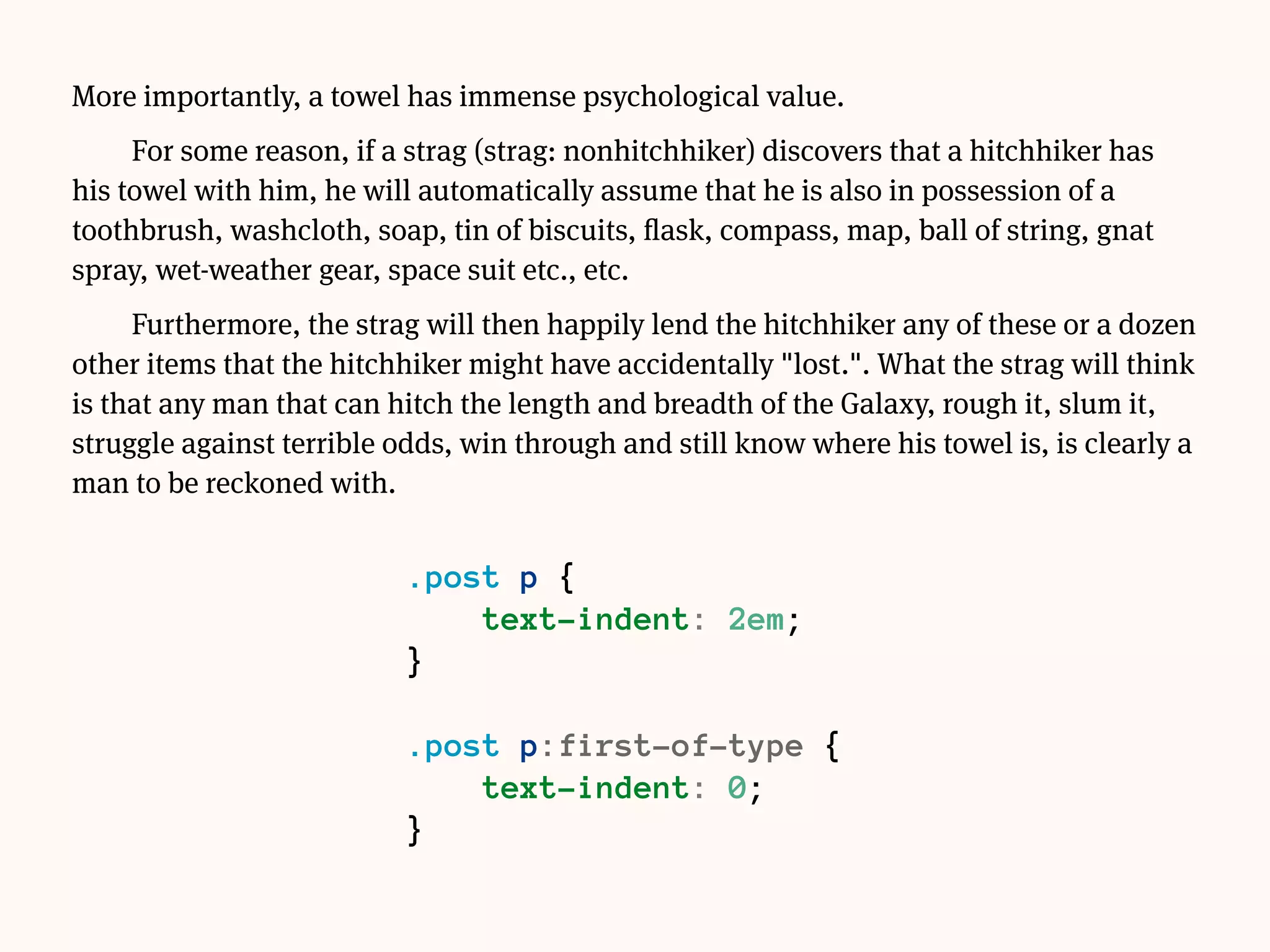
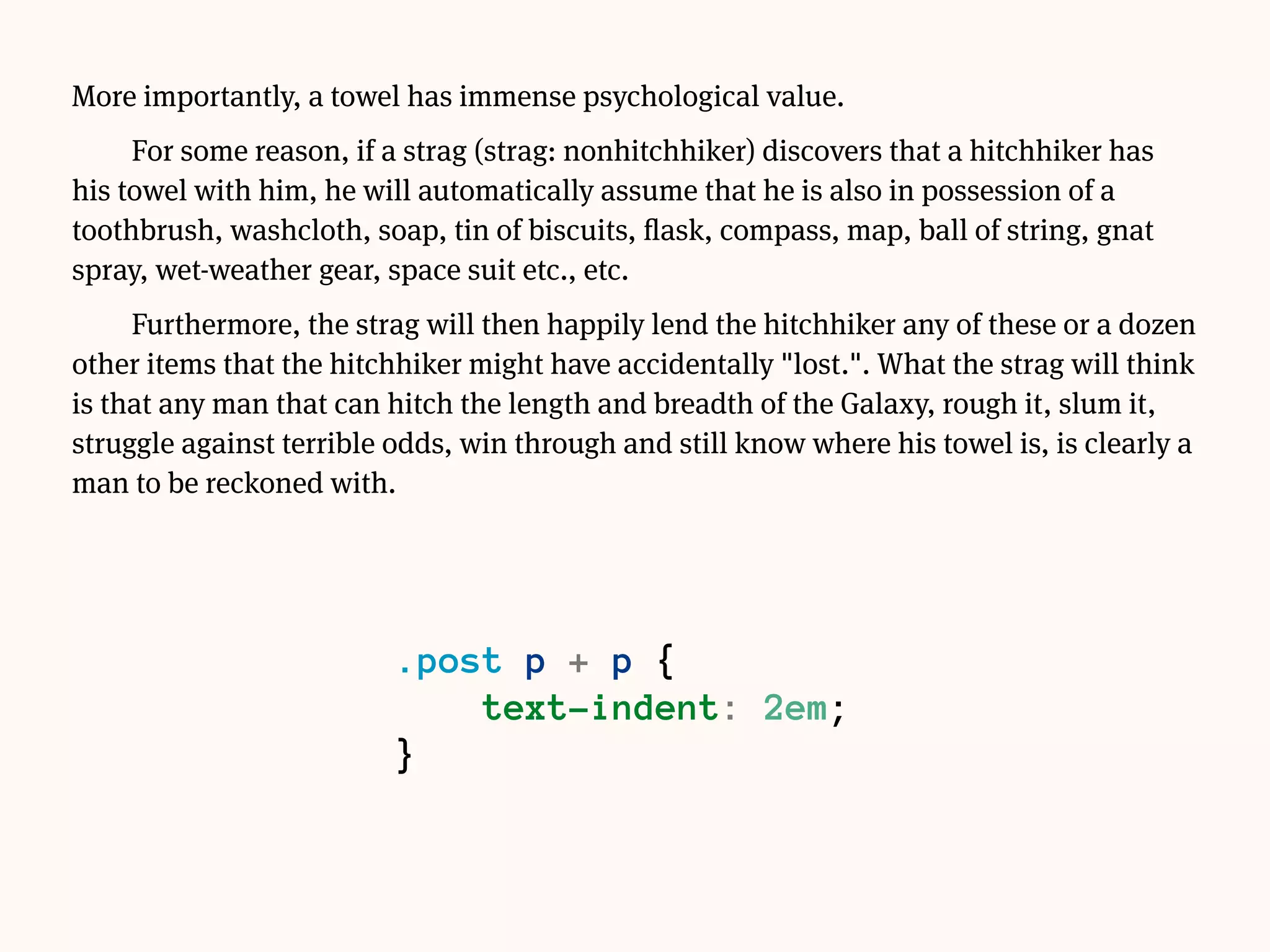


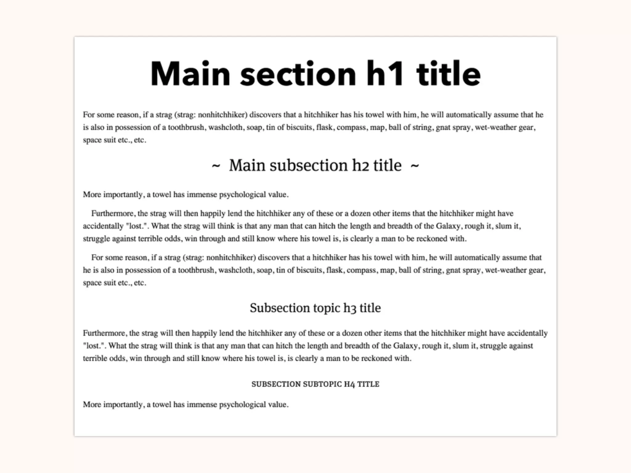


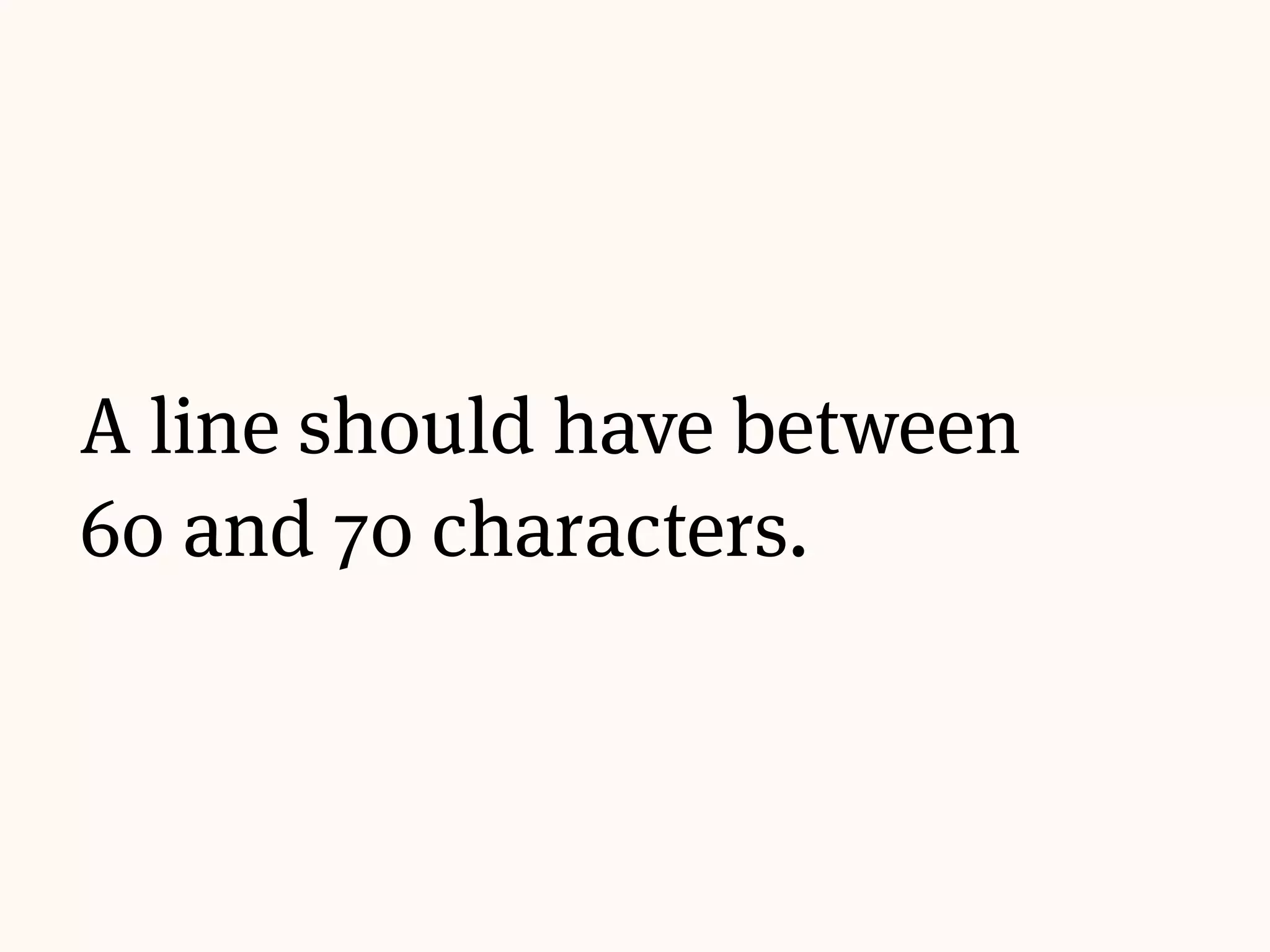
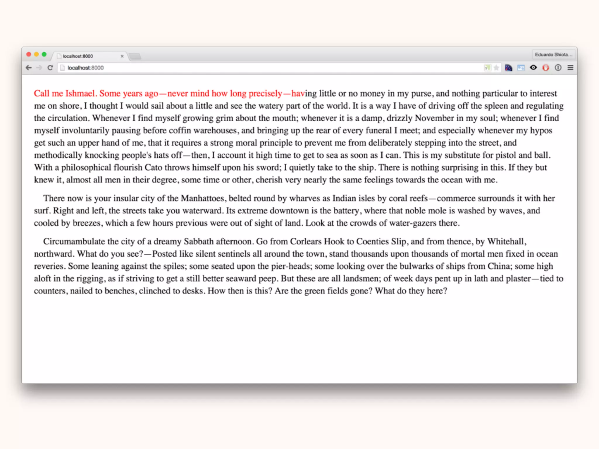
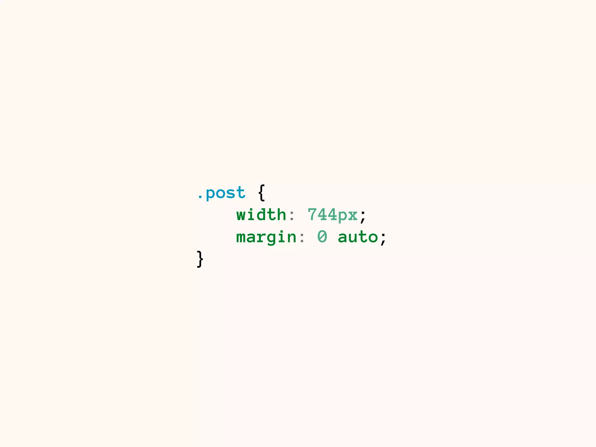
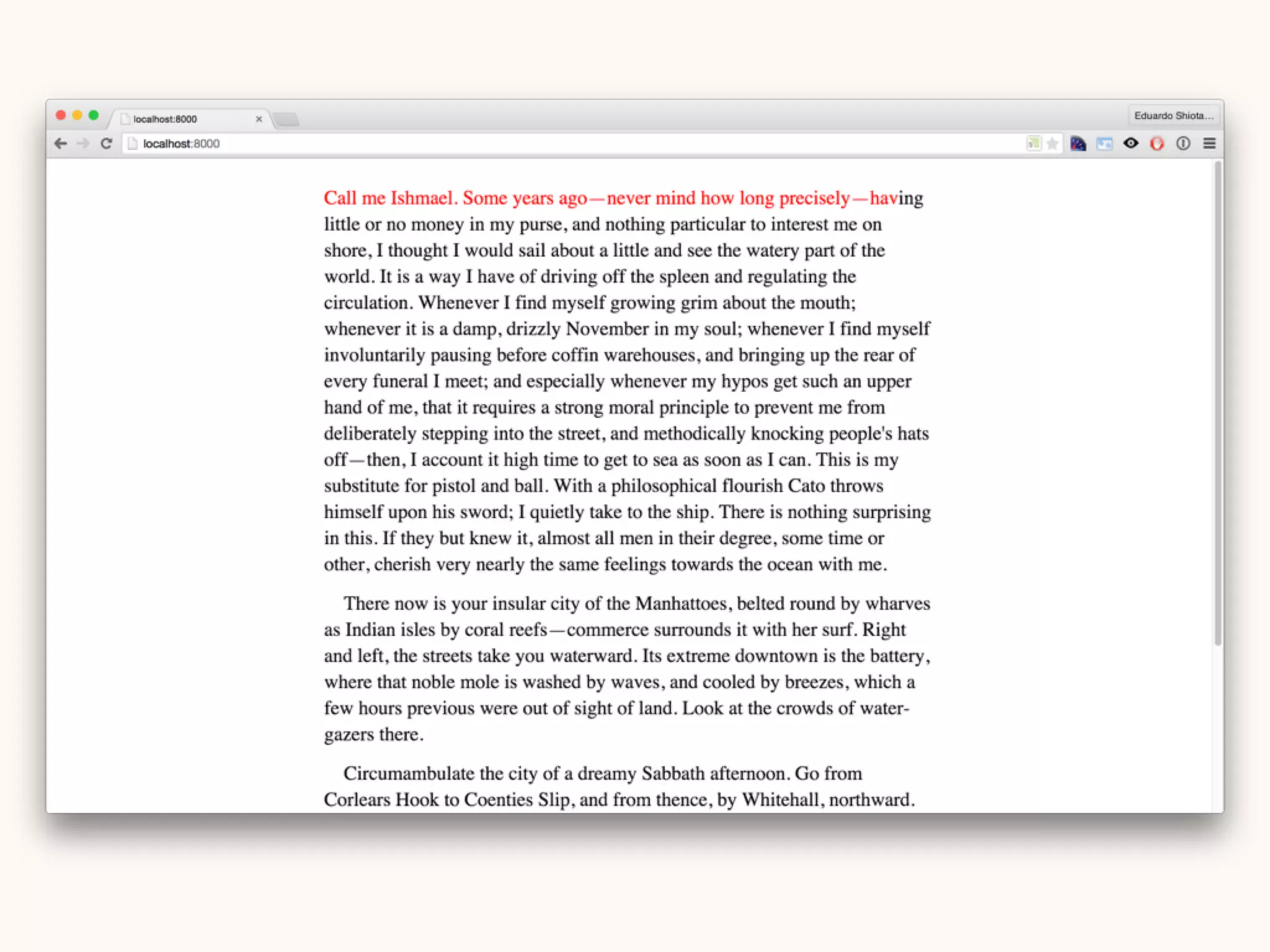


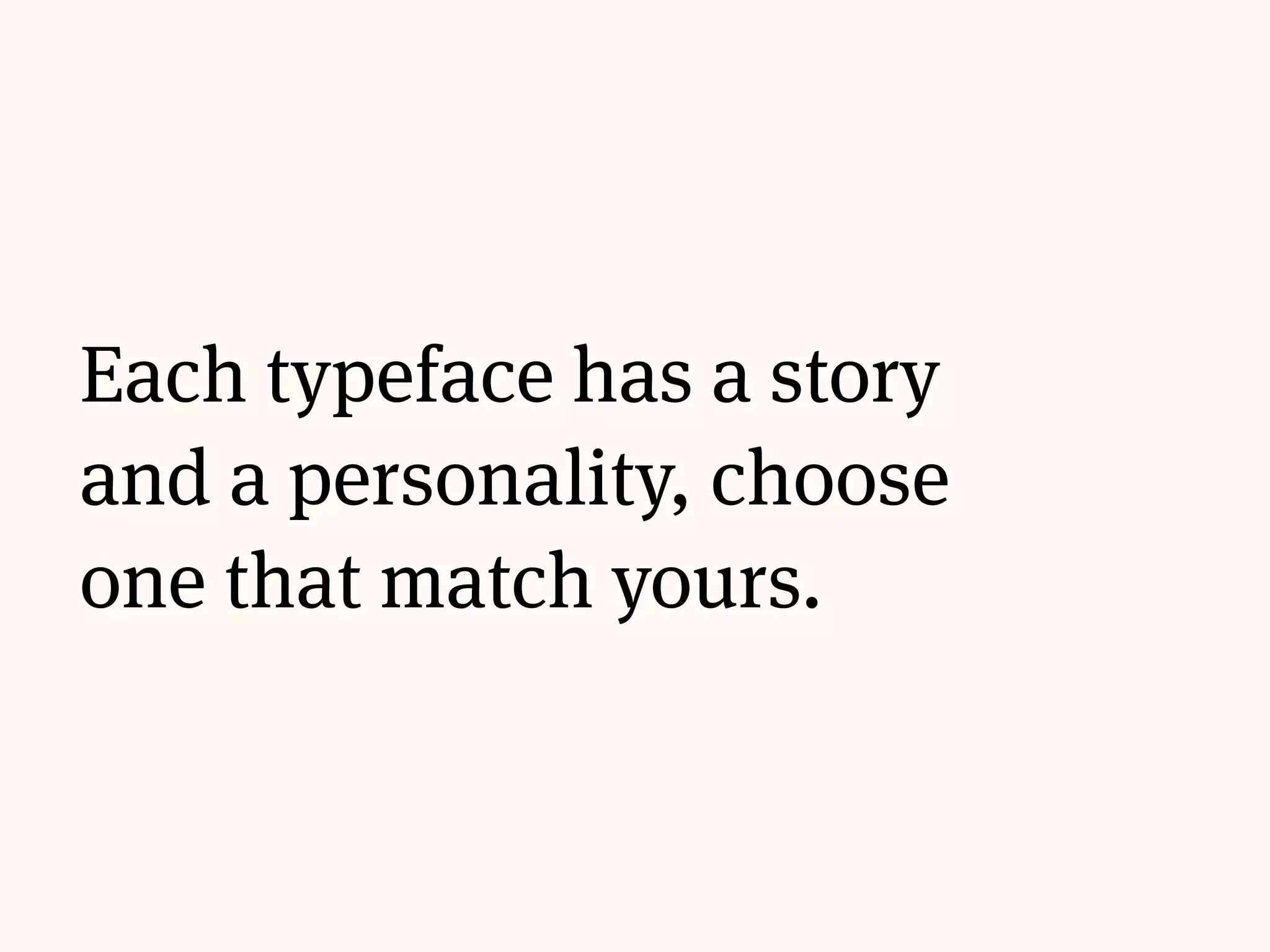
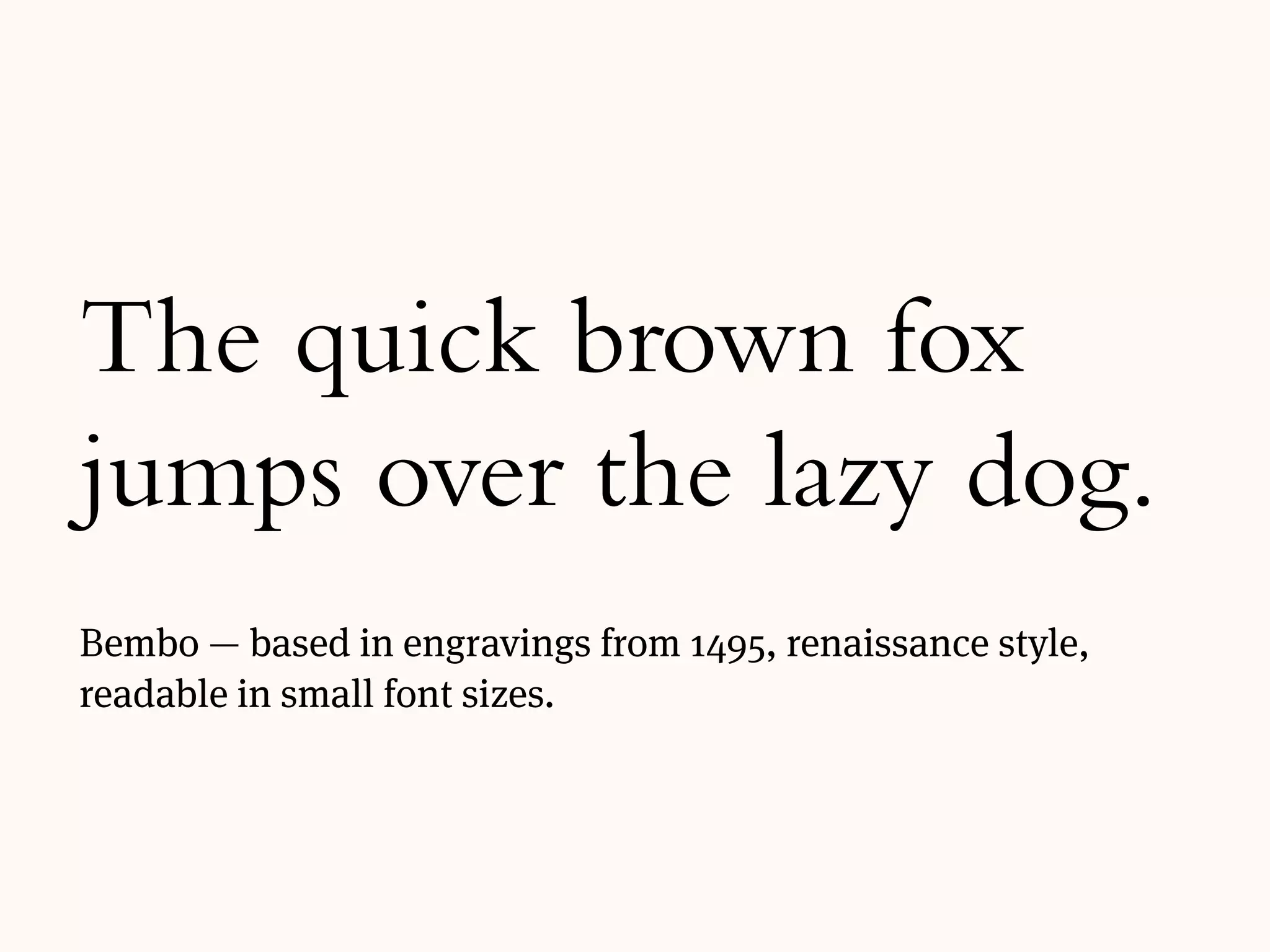
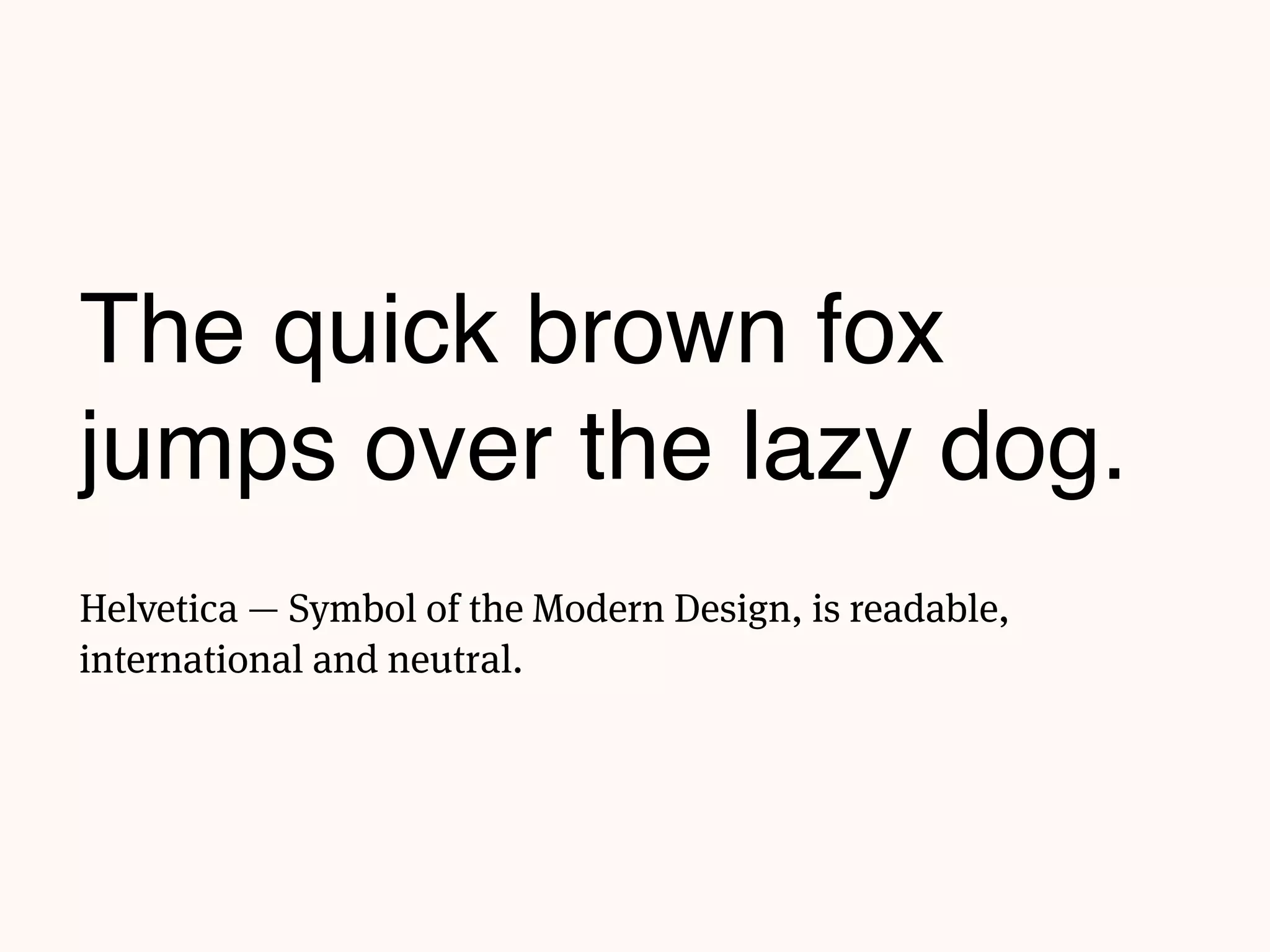
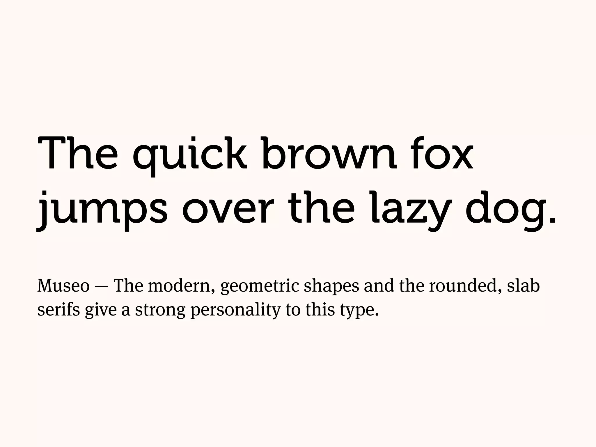
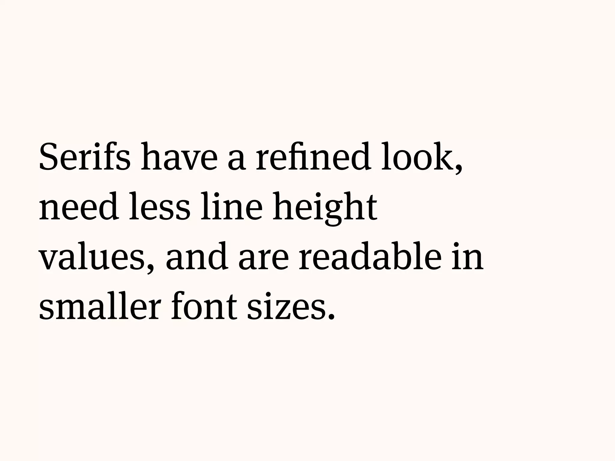
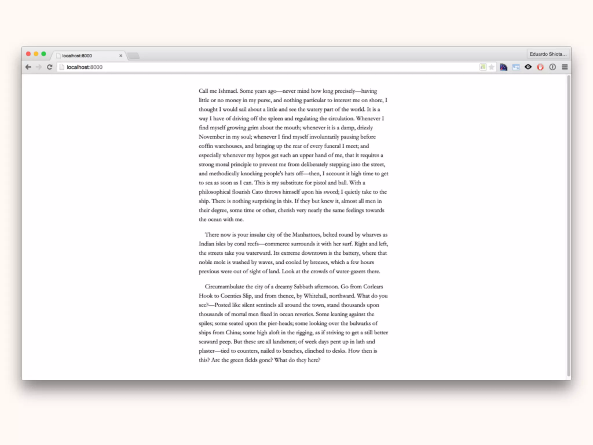
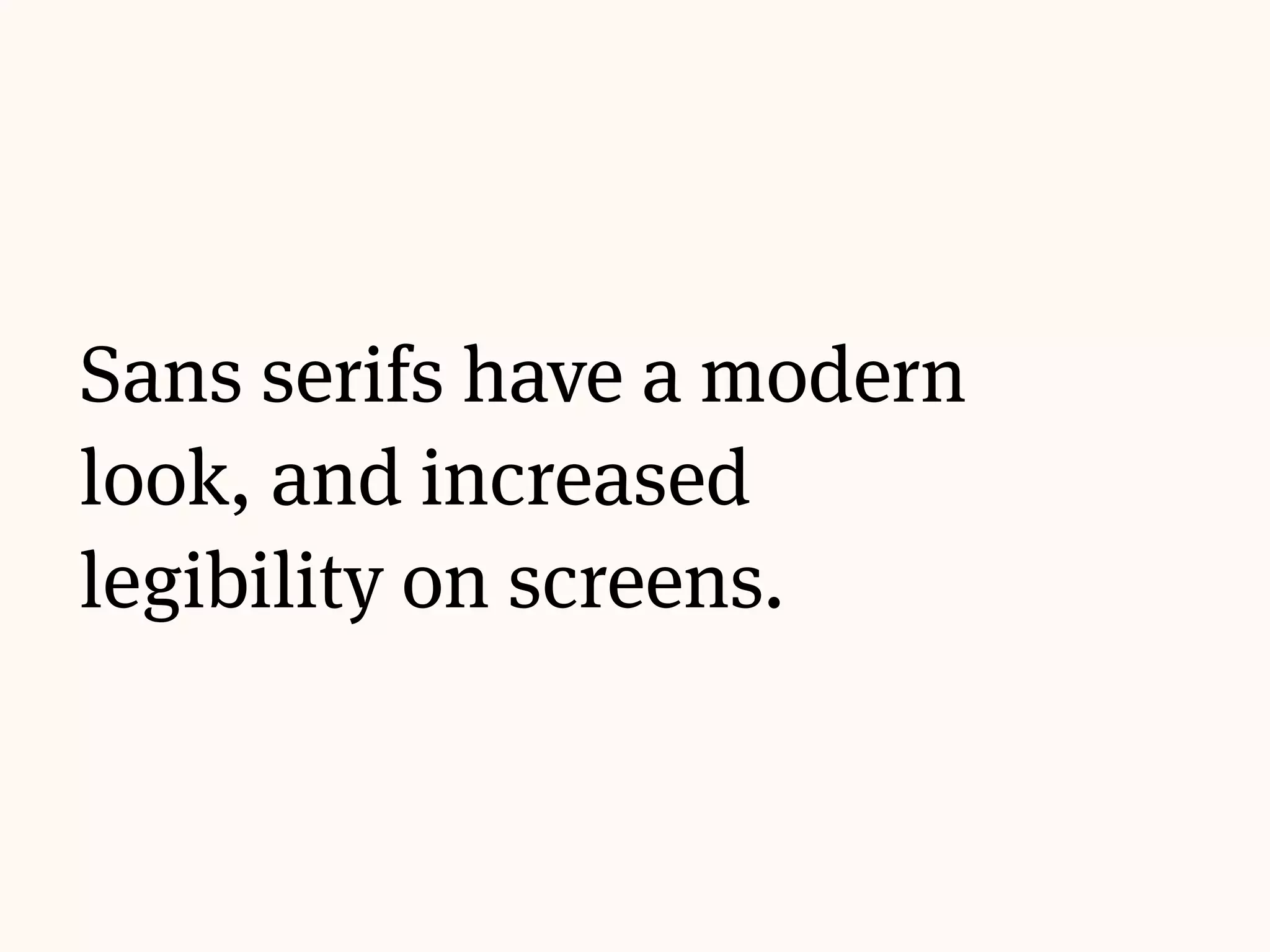
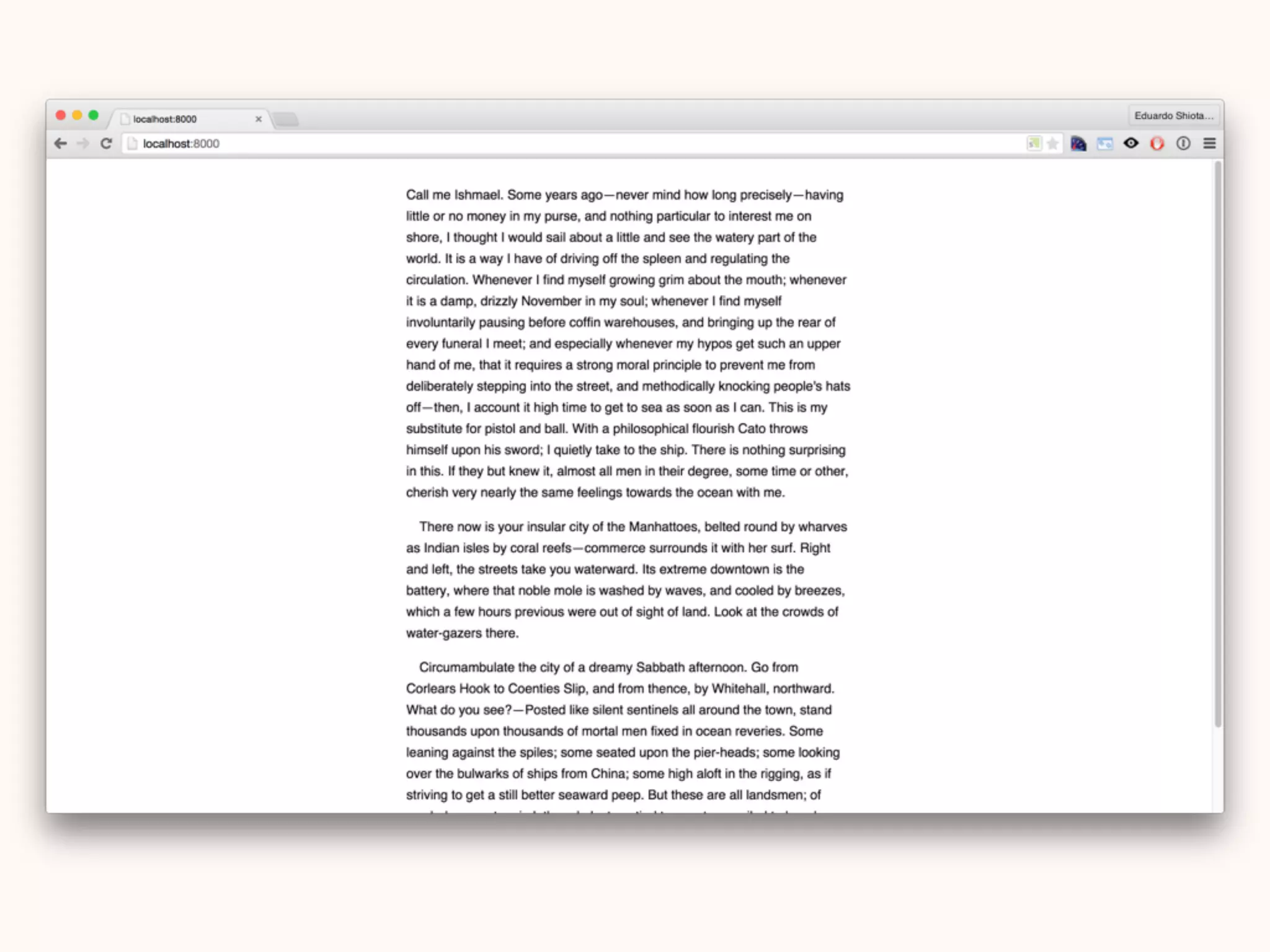


The document discusses the history and principles of typography, covering its evolution from ancient pictographs to modern web typography and CSS. It explains various type classifications, the anatomy of type, units of measurement, and guidelines on spacing, rhythm, and layout for optimal readability. Additionally, it provides practical CSS examples for styling text and fonts, emphasizing the importance of selecting appropriate typefaces and maintaining visual consistency.


![[DevDay2019] Spacing and Typography, keys to a professional UI design - By Ng...](https://cdn.slidesharecdn.com/ss_thumbnails/duongnguyen-typographyspacing-190408082945-thumbnail.jpg?width=640&height=640&fit=bounds)


![[BROCHURE] Italy Tour Project | @SlideON](https://cdn.slidesharecdn.com/ss_thumbnails/brochure8-251215152319-2805af68-thumbnail.jpg?width=640&height=640&fit=bounds)


