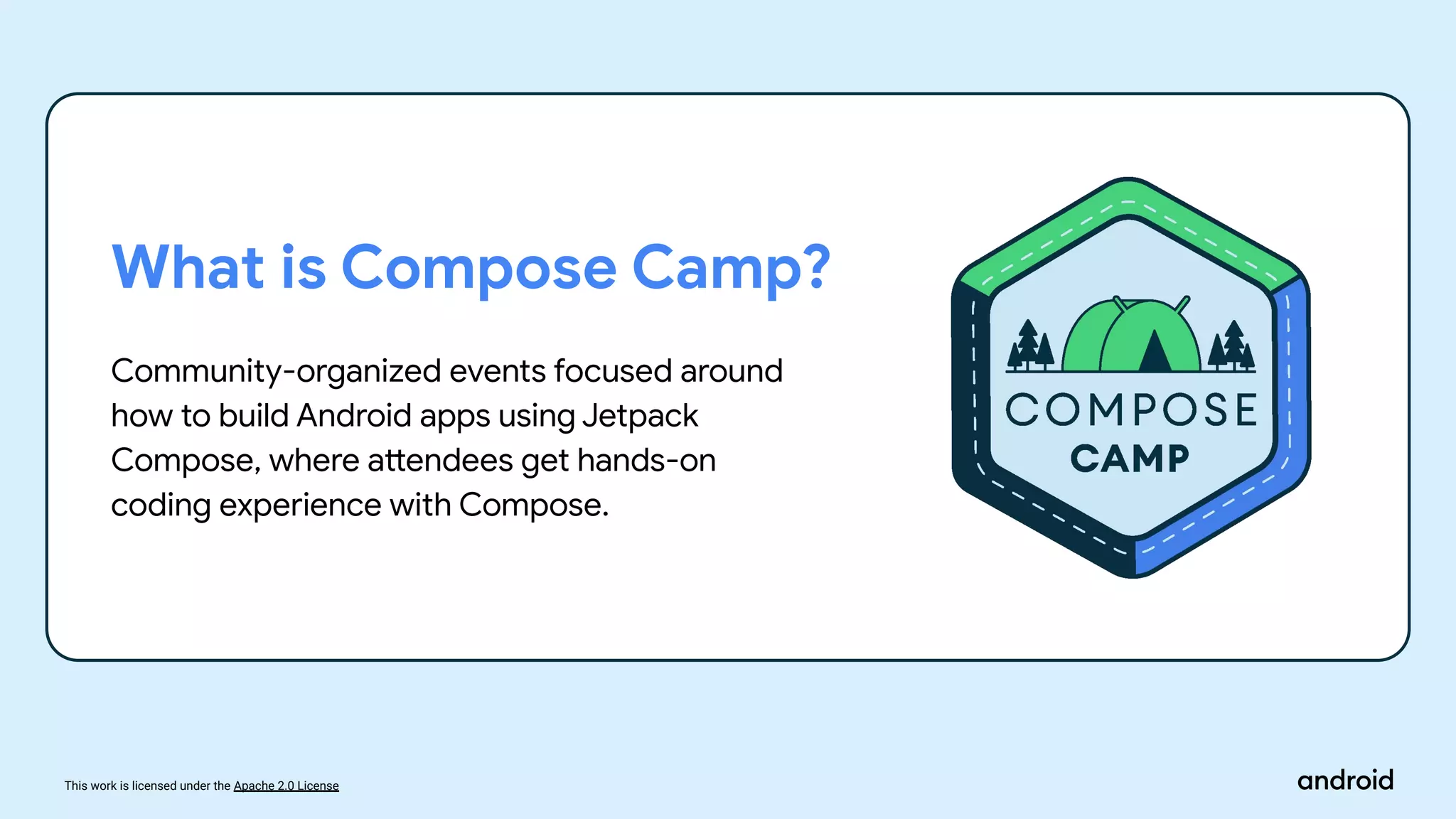
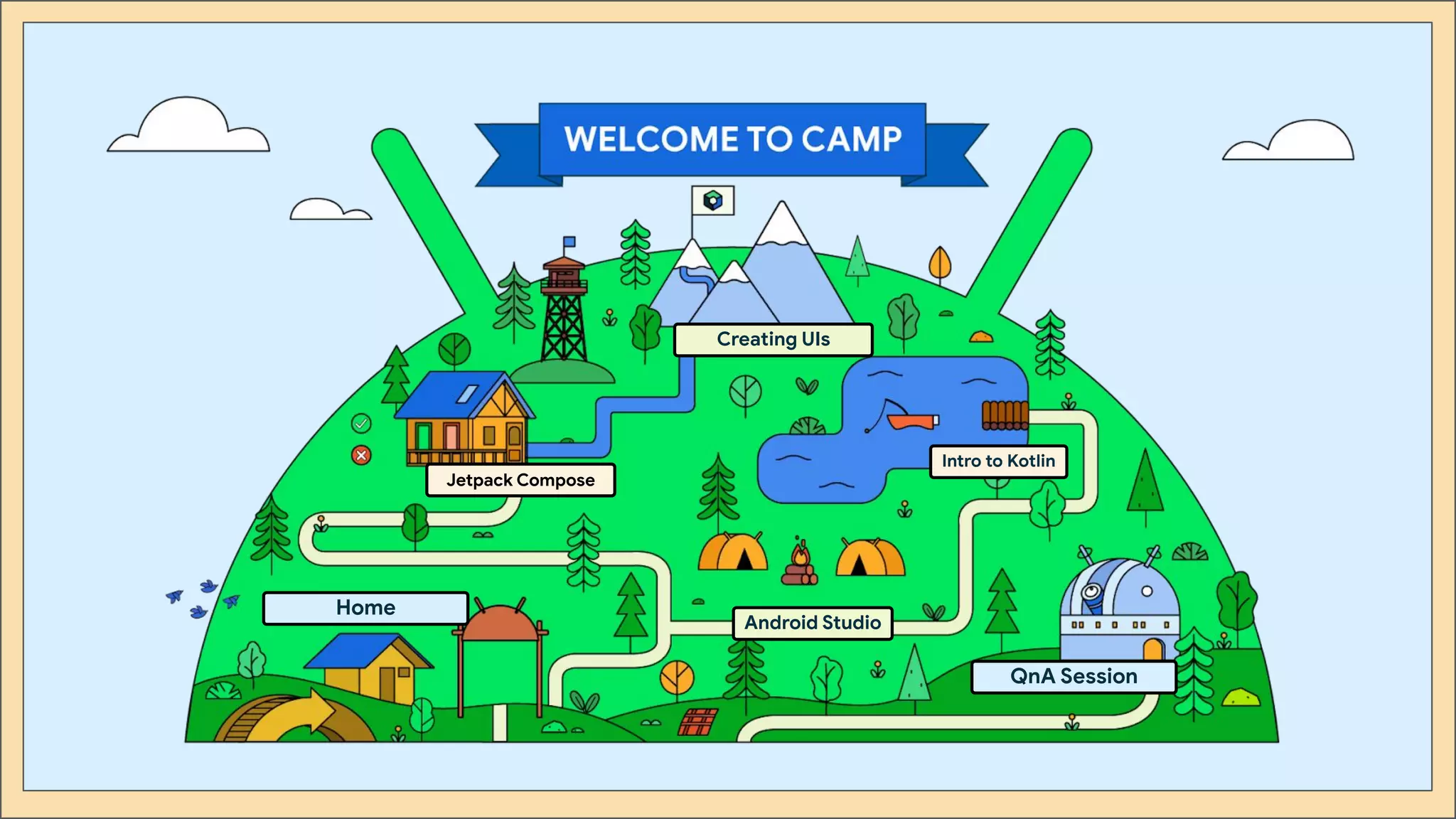
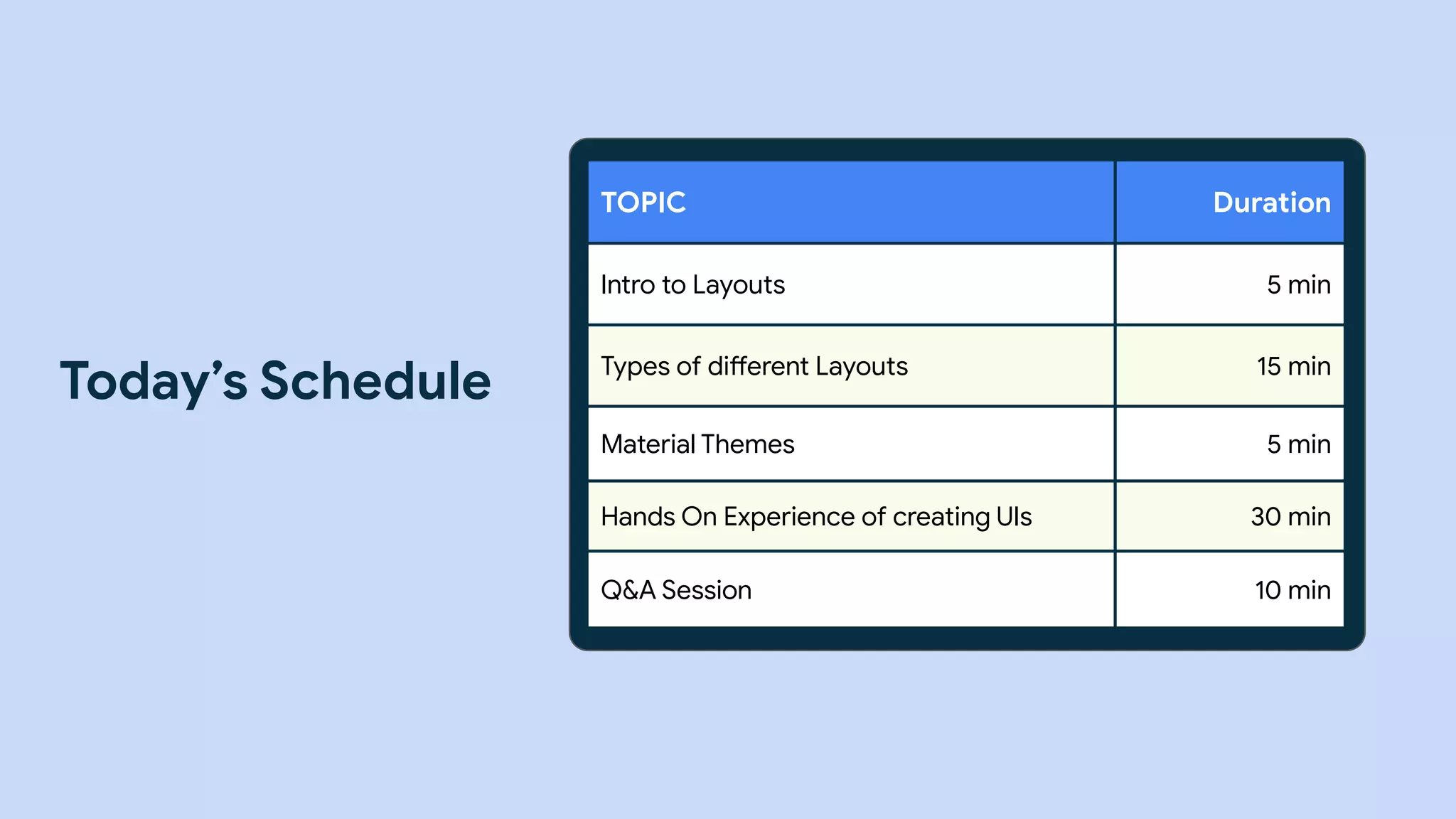
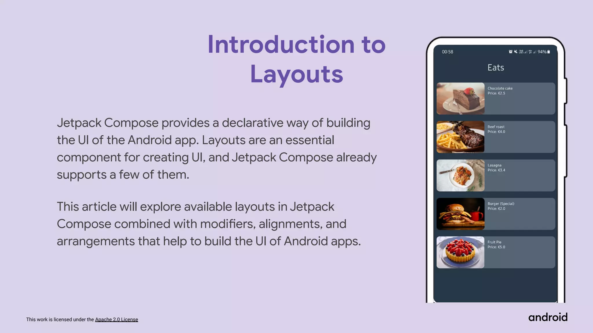
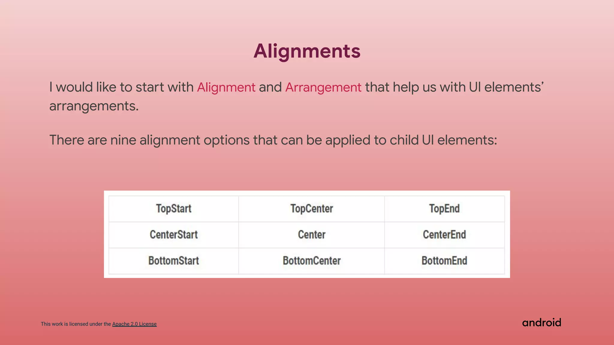
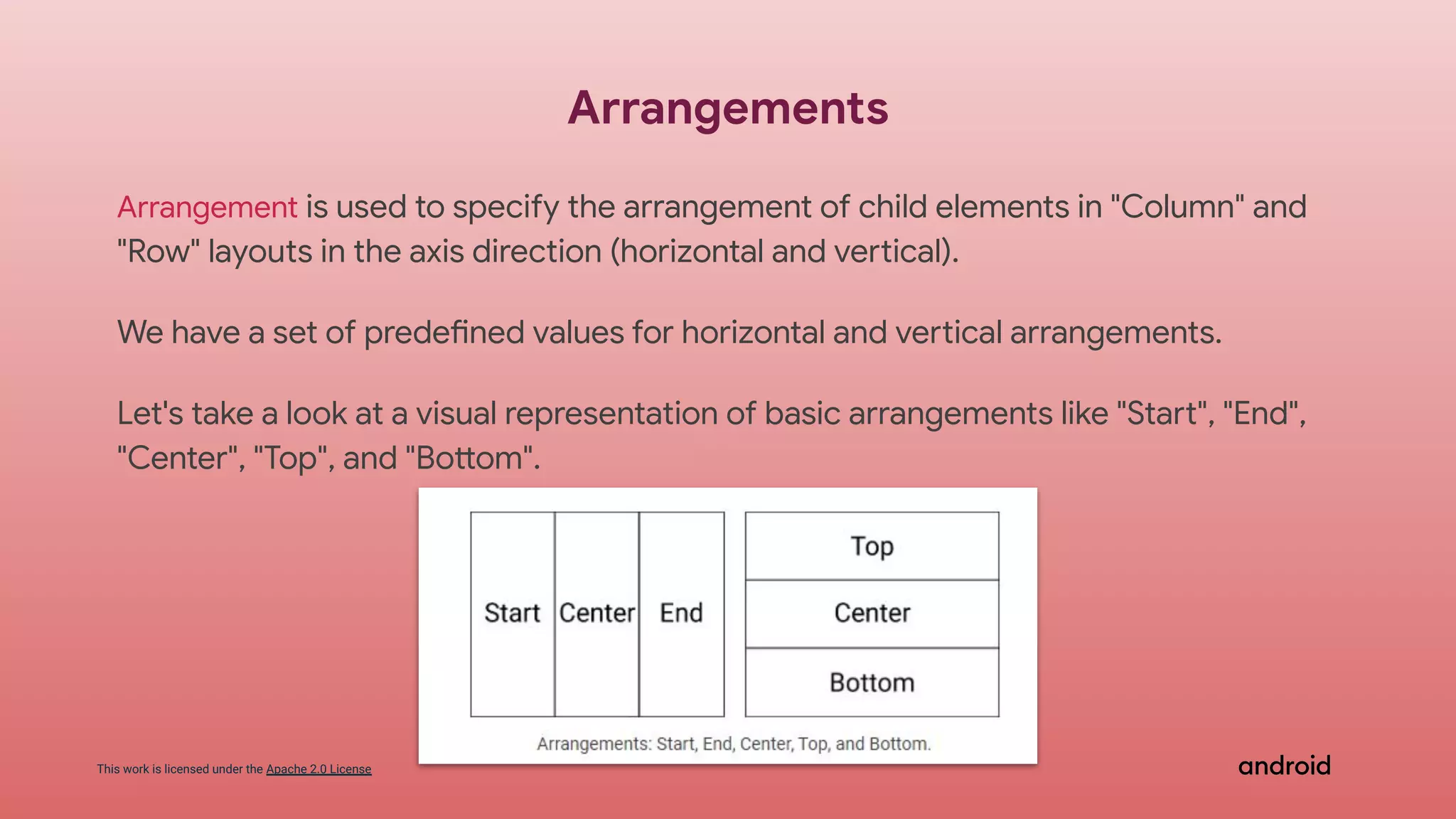
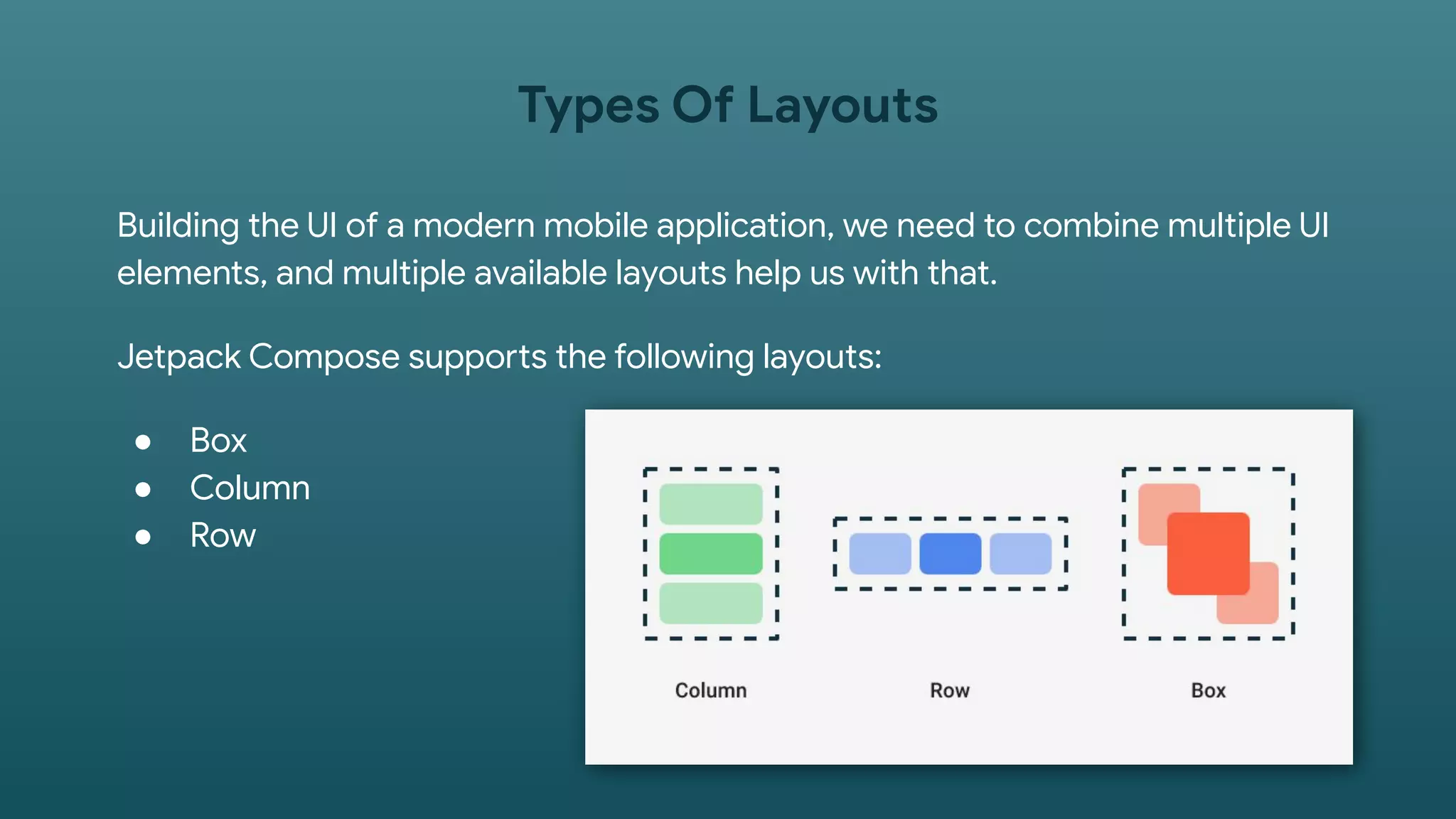
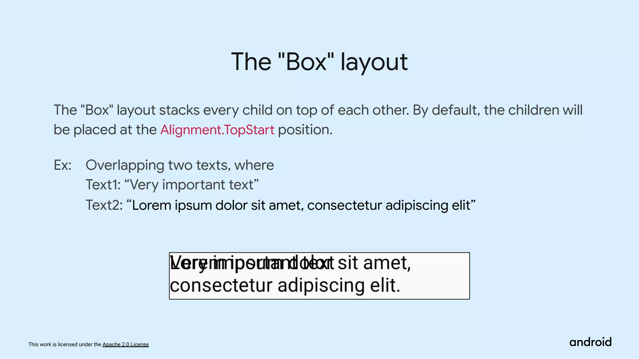
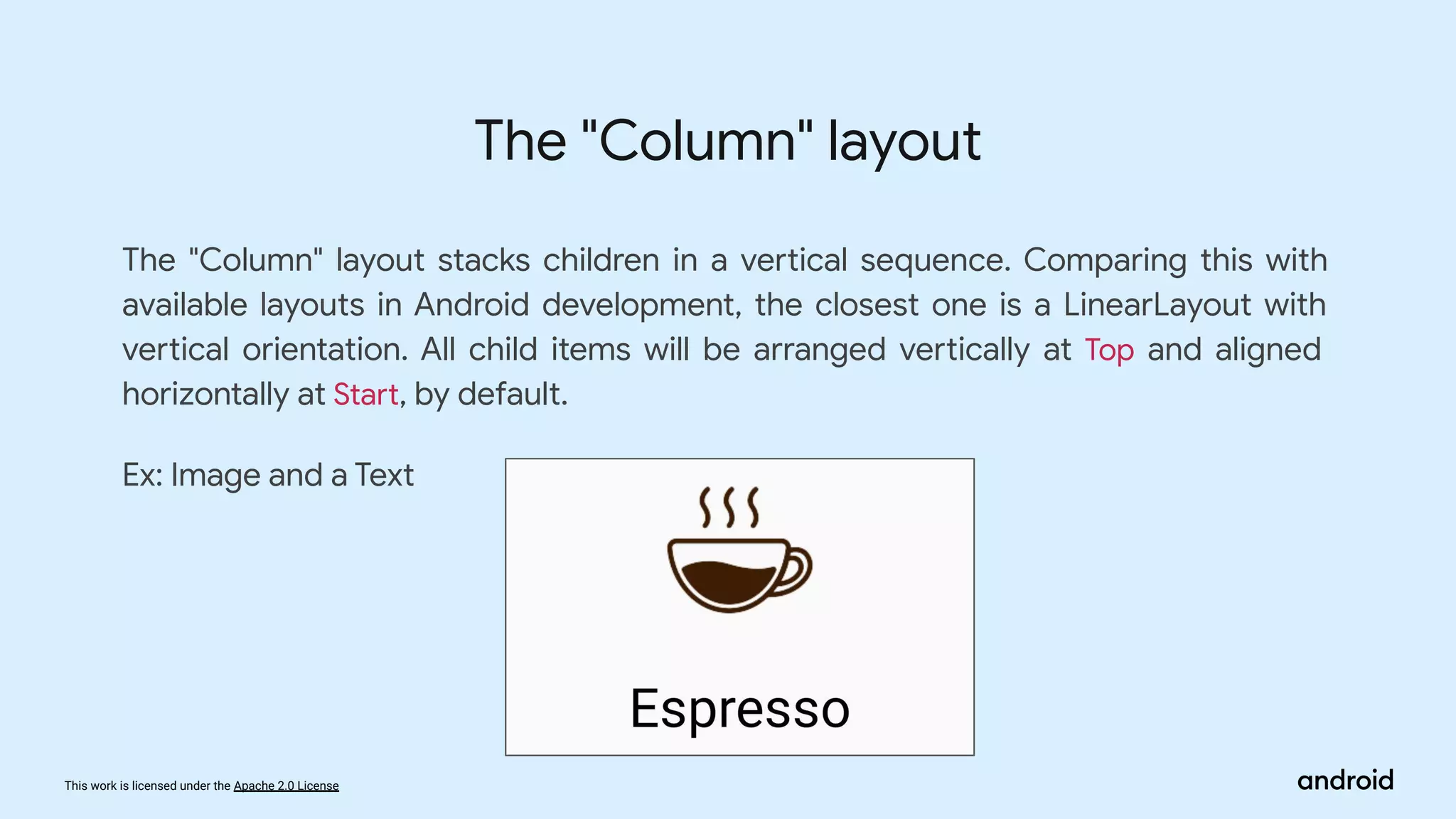
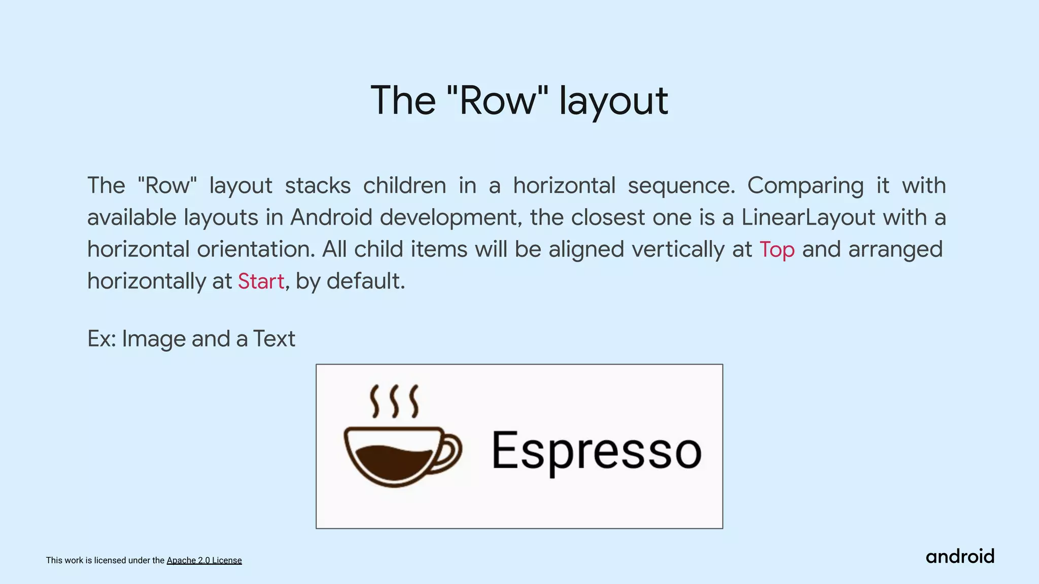
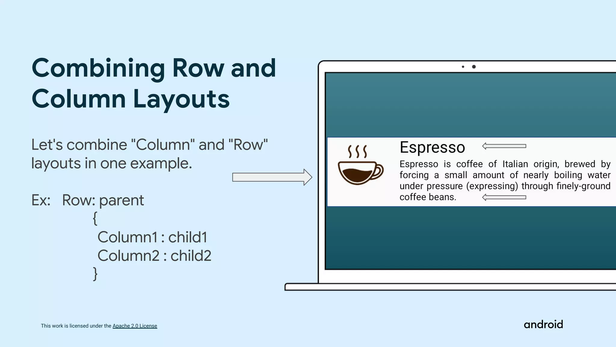
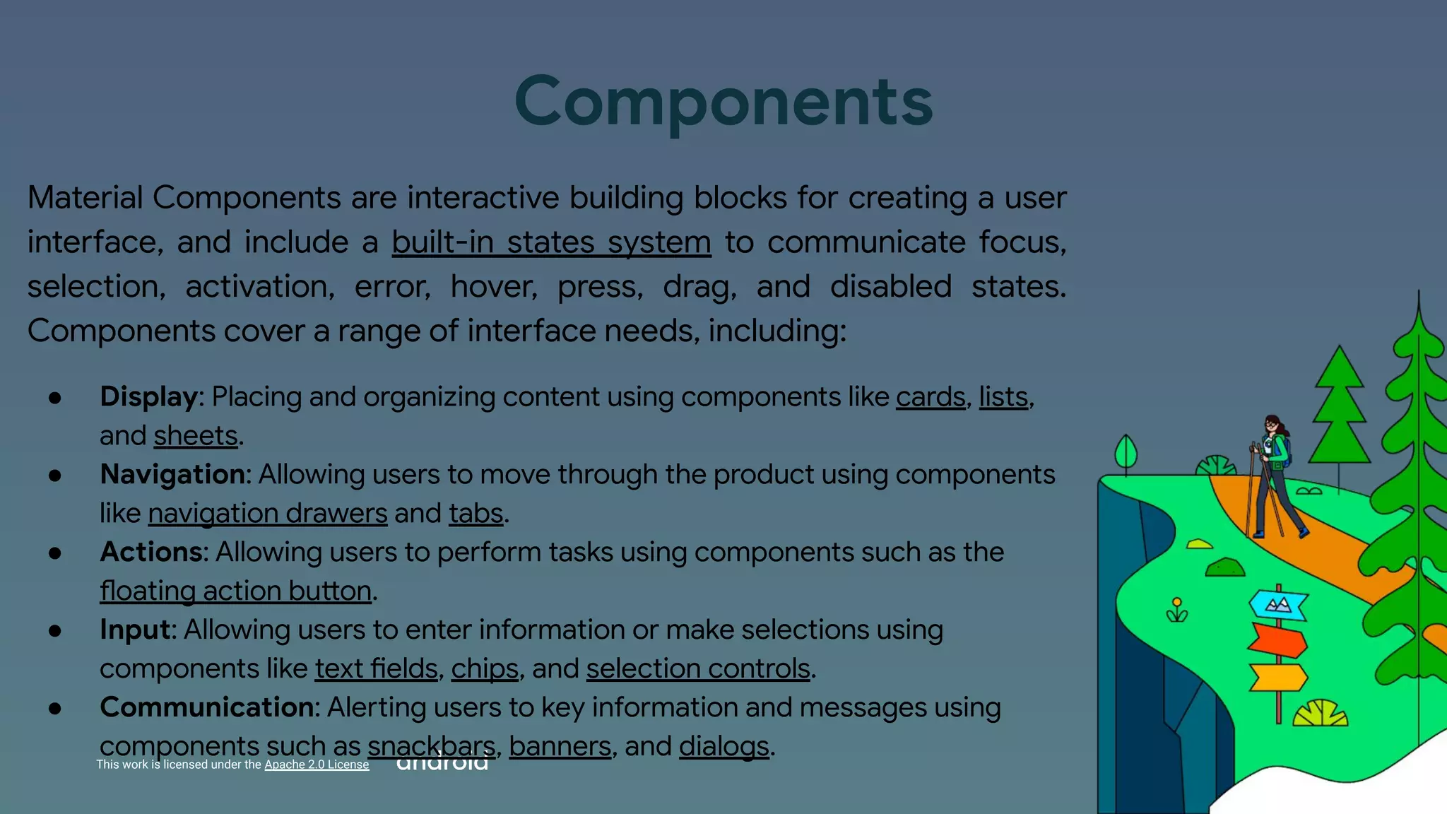
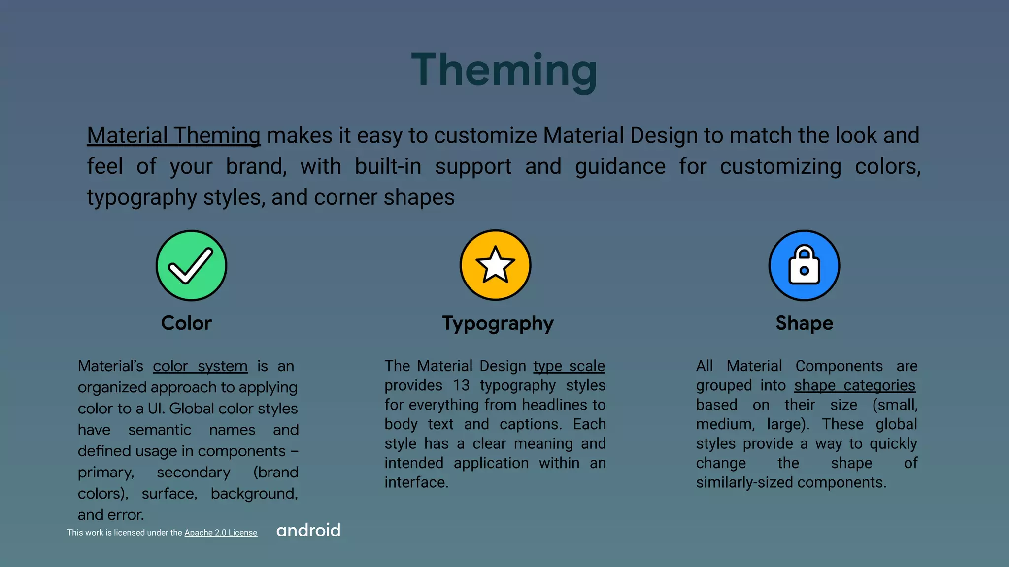
The document discusses Compose Camp, an event focused on building Android apps using Jetpack Compose. It includes an agenda covering introductory topics like layouts, themes, and hands-on experience creating UIs. Specific layouts covered are Box, Column, and Row. Modifiers, alignments, and arrangements help position UI elements. Material design themes are also discussed, including its emphasis on color, typography, and shape to customize UIs.
1. This work is licensed under the Apache 2.0 License
Welcome to Compose
Camp
2. This work is licensed under the Apache 2.0 License
What is Compose Camp?
Community-organized events focused around
how to build Android apps using Jetpack
Compose, where attendees get hands-on
coding experience with Compose.
4. TOPIC Duration
Intro to Layouts 5 min
Types of different Layouts 15 min
Material Themes 5 min
Hands On Experience of creating UIs 30 min
Q&A Session 10 min
Today’s Schedule
5. This work is licensed under the Apache 2.0 License
Layouts in Compose
6. This work is licensed under the Apache 2.0 License
Jetpack Compose provides a declarative way of building
the UI of the Android app. Layouts are an essential
component for creating UI, and Jetpack Compose already
supports a few of them.
This article will explore available layouts in Jetpack
Compose combined with modifiers, alignments, and
arrangements that help to build the UI of Android apps.
Introduction to
Layouts
7. This work is licensed under the Apache 2.0 License
I would like to start with Alignment and Arrangement that help us with UI elements’
arrangements.
There are nine alignment options that can be applied to child UI elements:
Alignments
8. This work is licensed under the Apache 2.0 License
Arrangement is used to specify the arrangement of child elements in "Column" and
"Row" layouts in the axis direction (horizontal and vertical).
We have a set of predefined values for horizontal and vertical arrangements.
Let's take a look at a visual representation of basic arrangements like "Start", "End",
"Center", "Top", and "Bottom".
Arrangements
9. This work is licensed under the Apache 2.0 License
Modifiers
The modifier is an ordered, immutable collection of modifier elements that
decorate or add behavior to Compose UI elements. For example, backgrounds,
padding, and click event listeners decorate or add behavior to rows, text, or
buttons.
We can explicitly set the height, width, and size to the UI element using one of the following
modifiers: Ex:
● height(height: Dp)sets the UI element’s height to a preferred value.
● width(width: Dp)sets the UI element’s width to a preferred value.
● size(size: Dp)sets the height and width of an element to a similar size value.
● size(width: Dp, height: Dp)sets the height and width of an element.
We can combine multiple modifiers: modifierA().modifierB()
.
10. Building the UI of a modern mobile application, we need to combine multiple UI
elements, and multiple available layouts help us with that.
Jetpack Compose supports the following layouts:
● Box
● Column
● Row
Types Of Layouts
11. This work is licensed under the Apache 2.0 License
The "Box" layout stacks every child on top of each other. By default, the children will
be placed at the Alignment.TopStart position.
Ex: Overlapping two texts, where
Text1: “Very important text”
Text2: “Lorem ipsum dolor sit amet, consectetur adipiscing elit”
The "Box" layout
12. This work is licensed under the Apache 2.0 License
The "Column" layout stacks children in a vertical sequence. Comparing this with
available layouts in Android development, the closest one is a LinearLayout with
vertical orientation. All child items will be arranged vertically at Top and aligned
horizontally at Start, by default.
Ex: Image and a Text
The "Column" layout
13. This work is licensed under the Apache 2.0 License
The "Row" layout stacks children in a horizontal sequence. Comparing it with
available layouts in Android development, the closest one is a LinearLayout with a
horizontal orientation. All child items will be aligned vertically at Top and arranged
horizontally at Start, by default.
Ex: Image and a Text
The "Row" layout
14. This work is licensed under the Apache 2.0 License
Let's combine "Column" and "Row"
layouts in one example.
Ex: Row: parent
{
Column1 : child1
Column2 : child2
}
Combining Row and
Column Layouts
15. This work is licensed under the Apache 2.0 License
Material Theme and
Design
16. This work is licensed under the Apache 2.0 License
Introduction
Material is a design system created by Google to help teams build
high-quality digital experiences for Android, iOS, Flutter, and the web.
Material is the metaphor
Material Design is inspired by the physical world and its textures,
including how they reflect light and cast shadows. Material surfaces
reimagine the mediums of paper and ink.
It has two subdivisions:
● Components
● Theming
17. This work is licensed under the Apache 2.0 License
Components
Material Components are interactive building blocks for creating a user
interface, and include a built-in states system to communicate focus,
selection, activation, error, hover, press, drag, and disabled states.
Components cover a range of interface needs, including:
● Display: Placing and organizing content using components like cards, lists,
and sheets.
● Navigation: Allowing users to move through the product using components
like navigation drawers and tabs.
● Actions: Allowing users to perform tasks using components such as the
floating action button.
● Input: Allowing users to enter information or make selections using
components like text fields, chips, and selection controls.
● Communication: Alerting users to key information and messages using
components such as snackbars, banners, and dialogs.
18. This work is licensed under the Apache 2.0 License
Theming
Material Theming makes it easy to customize Material Design to match the look and
feel of your brand, with built-in support and guidance for customizing colors,
typography styles, and corner shapes
Color
Material’s color system is an
organized approach to applying
color to a UI. Global color styles
have semantic names and
defined usage in components –
primary, secondary (brand
colors), surface, background,
and error.
Typography
The Material Design type scale
provides 13 typography styles
for everything from headlines to
body text and captions. Each
style has a clear meaning and
intended application within an
interface.
Shape
All Material Components are
grouped into shape categories
based on their size (small,
medium, large). These global
styles provide a way to quickly
change the shape of
similarly-sized components.
19. This work is licensed under the Apache 2.0 License
20. This work is licensed under the Apache 2.0 License
THANK YOU
More sessions coming soon!
Created by:
Saatvik Sethi
(App. Development Lead )
Google DSC IIITKOTA