Digipak: Production Process
•Download as DOCX, PDF•
0 likes•229 views
I made several changes to improve the design and readability of my music digipak based on feedback from my target audience: 1. I cropped the main picture to focus attention on the artist and changed formatting to make the thank you message and track list clearer. 2. I added effects like vibrancy and blurring to enhance the emotions conveyed in the pictures while changing fonts and colors to draw attention. 3. Minor design elements like borders and bright colors were removed after testing as they distracted from the overall professional and cohesive theme.
Report
Share
Report
Share

Recommended
The Evolution of a Sign
The designer created several iterations of a sign to promote participation in a neighborhood association. The first sign used a green background, short message, and pictures representing the community. Based on feedback, subsequent designs rearranged the pictures and added questions. Later versions experimented with different color schemes and fonts to improve readability and grab more attention. The final sign incorporated a neighborhood name, darker blue background, and loosened image layout.
How I edited the image Nubra glacier
The document summarizes editing an image of the Nubra Glacier in Adobe Photoshop Elements. It was converted to black and white to improve the shadows and highlights since the color palette was limited. The vivid landscape mode was selected and intensity adjusted until satisfied with the output. Contrast was lessened slightly and then increased along with decreasing brightness to make the highlights and shadows more visible without overexposing the image. The black and white gives a timeless effect, capturing the vastness of the glacier against the contrast of black and white.
Photoshop dps pp
The document describes the steps Chloe Burley took to create a double page spread in Photoshop. She added a picture of Louise as the main focus, highlighted her in a circle to be "in the spotlight", and softened the edge of the circle. Chloe then added the title tilted sideways and text in columns with highlighted questions in pink for an interview. Small pictures were added to fill gaps and a mask was used to blend the pictures into the background.
Editing magazine covers
The document describes the process taken to edit four photographs for magazine covers. For each cover, the background was removed and a new background was added. Additional edits included adjusting brightness, contrast, and colors. Text elements like the magazine title and cover lines were added. The goal was to feature the model prominently while establishing a color scheme and stylish design for an "urban" magazine.
Double page spread development
The document describes the creation process of a double page spread. The author began with three black and white main images to make the page more interesting and challenge conventions. Red was added to the color scheme to make it stand out against the black and white and tie into the front page colors. Two additional pictures were included using the same effect as the smaller ones, and a quote in red was added to make it stand out. Finally, a page number and "continued" text were included to indicate there was more of the interview left on the next page.
Construction pp
1. The document describes the process of designing an AMPED magazine cover and inside pages featuring artist Luke Combs. Key steps included cropping Luke from background images using masks and brushes, adding motion blur and adjusting colors.
2. For inside pages, additional artists were cropped from images and layouts were created featuring articles. Type was styled and pull quotes, social media icons and competitions were added.
3. Small tweaks were made such as changing colors, adding page numbers and adjusting text wrapping to complete the magazine pages featuring Luke Combs.
Development of dps
The document describes the process of developing a double page spread layout. The author scanned in a drawing but had to adjust it by removing shadows and inverting it for better quality. They initially did not like the layout as it did not fit the rock theme. Through rearrangement of images and text, making images more transparent, and adding inverted text, the layout improved. Interviews were added in Word. Images of band members were inserted which shifted the text around until a final design was reached.
Editied photo analysis
The document discusses editing photographs in Photoshop. In the first photo, the model's shadowed foot was removed using the cloning tool. The grey background was replaced with pink to complement the red bed sheets. For another photo, the sheet was pulled over to make the shot appear longer. Photoshop skills were used to apply the same background. The final photo had a lighting prop and white wall removed through selection and masking tools, replacing it with pink to match the digipak and create a warmer atmosphere.
Induction project 2021 pro forma
The document outlines an induction project focused on pop art. It includes tasks for researching pop art styles, planning products inspired by pop art, creating final products like a poster, and evaluating the process and final products. Strengths of the poster included accurate use of pop art colors, styles, and layout. Areas for improvement were increasing text size, adding background patterns, and filling space. Problems addressed were image and text visibility, which were solved using spacing and drop shadows. Feedback received suggested centering elements, which improved neatness.
O&c poster 1
This document outlines the 10 step process taken to create a campaign poster for Crossroads Foundation. Key points include:
1) The poster uses a limited color scheme of maroon (#7b3c3c), darker maroon (#8b5454), and white (#ffffff) to reflect the Crossroads brand identity.
2) The name "Crossroads Foundation" is repeatedly typed in a lighter maroon shade and tilted text to fill half the poster.
3) The text is then rasterized and overlaid with white to stand out from the background.
4) Additional information is added at the bottom about the food drive details and Crossroads website in two complementary fonts.
6. project pro forma(1)
The document discusses the student's photography project exploring different styles like street photography, architecture, and landscape photography. It includes contact sheets from two photo shoots, 8 final edited images with descriptions of the edits made, and an evaluation of the project covering composition, audience, technical qualities, influences, and skills learned. The student received mostly positive feedback and aims to focus more specifically on street photography for future work.
Slide6progression
Looking back on their preliminary task, the author feels they have improved in several key areas for their full music magazine product. They learned to incorporate more variety in color schemes and include thumbnail images to make the magazine more interesting. Researching journalistic conventions helped them ask better interview questions. The contents page was improved by including relevant details and splitting information into clear sections. Image quality was enhanced through learning better lighting, positioning, and using a higher quality camera.
Presentation slides for_research_planning_evaluation 2
This document summarizes a student's research and planning for their media studies foundation portfolio project on designing a student magazine. It discusses how the student considered their target audience of college students, used bright colors and images of college students for visual design. It also outlines what the student learned about using Adobe Photoshop and InDesign software and highlights areas for improvement, including managing time and learning new tools.
Photoshop front cover progress
The document describes the process of creating a magazine cover in Photoshop. It discusses creating a first draft by hand then a second draft digitally. Images were edited to remove backgrounds. Text was added layer by layer. Feedback suggested making the black font bolder, changing the star color, adding a background color, and spacing elements out more. The creator then made these changes digitally to improve readability and eye-catching design.
Film Poster Production
Danielle Duffy created the first draft of a film poster using Photoshop and InDesign. In Photoshop, she adjusted the levels and tones of the main image, erased the white background and added sinister text messages. She then exported the image into InDesign to add additional elements like the title, billing block and logo to create a layout that followed her red and white color scheme. While she was pleased with the overall result, she noted some weaknesses like difficulty optimizing some areas of the image in Photoshop.
6. [pro forma] project pro-forma
This document provides instructions for a photography project involving contact sheets and editing digital images. Students are instructed to download project files, create contact sheets of their images in Adobe Photoshop, and select their top 10-15 images to edit. The document then guides students through editing individual images and evaluating their work, including discussing successful elements of their shoot, potential post-production techniques, and feedback on composition, audience, influences, and technical skills developed.
Digipak Draft Three
Step 1: The font for "DJ SOTO" was changed to Bombing to match the website, and the font for "Escape" was changed from Bombing to an external font to differentiate it from "DJ SOTO".
Step 2: The strapline was updated to remove "Shadowinc" and add "DJ SOTO" following research that showed the artist's name is typically included.
Step 3: The bar code was made larger and icons were added.
Step 4: A cloud background was added to match the theme, and a bolder font was used for the thank you message to improve readability for the target audience, which also included more text.
Evaluation question 4 powerpoint
Myself and Josh created a band poster using Photoshop. They began with a rose image from Google, adding a glow effect and toning down the colors to look unnatural. Black paint splats were added below the rose to add chaos. Layering was useful to make the elements seem seamless. Finally, band information like title and contact details were added in inspired fonts, completing the poster. Photoshop's tools and layering allowed recreating desired visual effects to convey the band's style.
Planning and production
This document discusses layout plans for a fashion magazine focused on makeup and beauty.
The first layout uses a leopard print background with pink and red smudges to represent makeup products. Neutral colors are used to match an article about "animalistic makeup." Sample text and images are included but no final font is chosen.
The second layout uses a white background with a pink lipstick smudge. Bright pink, blue, white and red colors match a planned article. Polaroid photo effects and sample text and images are displayed without final font.
The first cover layout features a stock image of a model with orange hair and blue flowers. Bright colors and white space allow room for a title in a retro-
Editing the digipak
The document describes the process of editing images for a digipak cover. It discusses selecting two initial images, editing one in Photoshop Express to make the red facepaint pop against a monochrome background by increasing saturation and lowering exposure. Text was then added in Photoshop Pro and adjustments were made to positioning, spacing, sizing and colors until the designer was satisfied. Other images in the digipak were heavily edited to create variety and a feeling of recklessness. The final image chosen perfectly encapsulates the ideas behind the project by obscuring the model's face.
Question 7
1) For their preliminary task, the author lacked knowledge of photo editing software and used Microsoft Publisher instead of Photoshop. However, they taught themselves Photoshop for the final task and found it easier to edit layers and move elements.
2) In the final task, the author improved their font usage by including a variety of sizes, colors, and styles to make the magazine more professional and draw the reader's eye to important text.
3) The author also learned about using color effectively to establish genre, audience, and make the final product more eye-catching than the dull colors used previously.
4) Extensive research was done for the final task to enhance understanding of the magazine industry and produce a
Magazine listing & poster analysis
The document outlines 8 steps to creating a magazine listing. It describes choosing a masthead, subheading, positioning text and images, and adding catch phrases. Color schemes, fonts, sizing, and positioning of elements are considered in each step to complement the overall design. The goal is to create an advertisement that catches readers' attention and makes them want to read more about the documentary being promoted.
Magazine listing & Poster analysis final pieces
The document outlines 8 steps to creating a magazine listing. Step 1 describes inserting the masthead title at the top of the page and editing font, size, color, and positioning. Step 2 adds a catchy subheading below the masthead and edits its font, color, and positioning. Step 3 focuses on editing the text to have equal emphasis with images. Step 4 places the main image on the right side and edits it to stand out. Step 5 positions a second image to transition between text topics. Step 6 adds bold text in red to match the subheading color. Step 7 includes a location shot in the distance for context. Step 8 finishes with catch phrases in the top left corner to encourage reading.
Production process dps
The document outlines the 8 step process for creating a double page magazine spread in Quark Xpress. The steps include: 1) Creating facing pages with 3 text columns, 2) Importing text and images, 3) Adjusting text size to conventions, 4) Adding a drop cap and drop quotes, 5) Bolding text, 6) Cropping images, 7) Changing the standfirst, 8) Modifying the headline in Photoshop. The process results in a professional-looking double page magazine spread that meets publication codes and conventions.
Media q5
The document summarizes the design process for magazine covers and pages for an indie music magazine called enTune. It describes sketches, draft designs, and revisions made based on feedback from the target audience. Key points included making the masthead and cover image larger, adding more text on the covers for readability, aligning images on contents pages, and changing layouts and text formatting for double page spreads based on feedback. The document showed how audience feedback improved the draft designs at each stage.
Cmp induction project 2021 pro forma
This document outlines the tasks for an induction project using Photoshop. It includes researching web sources, producing final products like a print poster and blog post, and evaluating the project. For evaluation, it describes strengths like eye-catching colors and skills used. Areas for improvement include enhancing image exposure and layer naming. Working well with others benefited the project through font and background decisions. Feedback was received on font colors and text alignment, which was used to improve the project. Problems faced included low resolution images and a dotted overlay covering some images.
Front cover, contents and double page spread process
The document outlines the steps taken to design the front cover, contents page, and a double page spread for a magazine. For the front cover, the designer laid out the text and colors, imported an image, changed colors to improve readability, adjusted the image and text placement, and refined the colors and layout. For the contents page, the designer added photos and text, changed some images, and adjusted the layout. For the double page spread, the designer laid out columns, inserted the article, and spread the text over six columns across both pages to achieve the desired outcome.
Marissa Gimbel Portfolio
This portfolio document summarizes Marissa Gimbel's work including magazine covers, presentations, photo designs, montages, business identities, infographics, coding projects, web page mockups, and brochures. It provides details of the projects such as descriptions, processes, programs used, audiences, things learned, and critiques received. The portfolio is a showcase of Marissa's varied design, photography, and coding skills and was created to help obtain work.
Song shortlist & pitch
This document contains Sonali's shortlist and pitch for two songs - "Stay with Me" by Sam Smith and "Bad Day" by Daniel Powter. For "Stay with Me", she proposes narrative ideas about two couples who have broken up and are missing each other, or a man whose life falls apart without his partner. For "Bad Day", her ideas involve a teenage boy struggling with depression, bullying or drugs while facing difficulties at home or school. She will also consider appropriate cinematography shots for the narratives.
Mood board 2
The mood board depicts the challenges faced by a boy who is depressed, suicidal, and bullied. He argues daily with his parents and hates his home and school environments. Over time, with therapy and support from friends and family, he is able to overcome his problems and find happiness again, as shown through various shots of him boxing, being more social and participating in activities.
More Related Content
Similar to Digipak: Production Process
Induction project 2021 pro forma
The document outlines an induction project focused on pop art. It includes tasks for researching pop art styles, planning products inspired by pop art, creating final products like a poster, and evaluating the process and final products. Strengths of the poster included accurate use of pop art colors, styles, and layout. Areas for improvement were increasing text size, adding background patterns, and filling space. Problems addressed were image and text visibility, which were solved using spacing and drop shadows. Feedback received suggested centering elements, which improved neatness.
O&c poster 1
This document outlines the 10 step process taken to create a campaign poster for Crossroads Foundation. Key points include:
1) The poster uses a limited color scheme of maroon (#7b3c3c), darker maroon (#8b5454), and white (#ffffff) to reflect the Crossroads brand identity.
2) The name "Crossroads Foundation" is repeatedly typed in a lighter maroon shade and tilted text to fill half the poster.
3) The text is then rasterized and overlaid with white to stand out from the background.
4) Additional information is added at the bottom about the food drive details and Crossroads website in two complementary fonts.
6. project pro forma(1)
The document discusses the student's photography project exploring different styles like street photography, architecture, and landscape photography. It includes contact sheets from two photo shoots, 8 final edited images with descriptions of the edits made, and an evaluation of the project covering composition, audience, technical qualities, influences, and skills learned. The student received mostly positive feedback and aims to focus more specifically on street photography for future work.
Slide6progression
Looking back on their preliminary task, the author feels they have improved in several key areas for their full music magazine product. They learned to incorporate more variety in color schemes and include thumbnail images to make the magazine more interesting. Researching journalistic conventions helped them ask better interview questions. The contents page was improved by including relevant details and splitting information into clear sections. Image quality was enhanced through learning better lighting, positioning, and using a higher quality camera.
Presentation slides for_research_planning_evaluation 2
This document summarizes a student's research and planning for their media studies foundation portfolio project on designing a student magazine. It discusses how the student considered their target audience of college students, used bright colors and images of college students for visual design. It also outlines what the student learned about using Adobe Photoshop and InDesign software and highlights areas for improvement, including managing time and learning new tools.
Photoshop front cover progress
The document describes the process of creating a magazine cover in Photoshop. It discusses creating a first draft by hand then a second draft digitally. Images were edited to remove backgrounds. Text was added layer by layer. Feedback suggested making the black font bolder, changing the star color, adding a background color, and spacing elements out more. The creator then made these changes digitally to improve readability and eye-catching design.
Film Poster Production
Danielle Duffy created the first draft of a film poster using Photoshop and InDesign. In Photoshop, she adjusted the levels and tones of the main image, erased the white background and added sinister text messages. She then exported the image into InDesign to add additional elements like the title, billing block and logo to create a layout that followed her red and white color scheme. While she was pleased with the overall result, she noted some weaknesses like difficulty optimizing some areas of the image in Photoshop.
6. [pro forma] project pro-forma
This document provides instructions for a photography project involving contact sheets and editing digital images. Students are instructed to download project files, create contact sheets of their images in Adobe Photoshop, and select their top 10-15 images to edit. The document then guides students through editing individual images and evaluating their work, including discussing successful elements of their shoot, potential post-production techniques, and feedback on composition, audience, influences, and technical skills developed.
Digipak Draft Three
Step 1: The font for "DJ SOTO" was changed to Bombing to match the website, and the font for "Escape" was changed from Bombing to an external font to differentiate it from "DJ SOTO".
Step 2: The strapline was updated to remove "Shadowinc" and add "DJ SOTO" following research that showed the artist's name is typically included.
Step 3: The bar code was made larger and icons were added.
Step 4: A cloud background was added to match the theme, and a bolder font was used for the thank you message to improve readability for the target audience, which also included more text.
Evaluation question 4 powerpoint
Myself and Josh created a band poster using Photoshop. They began with a rose image from Google, adding a glow effect and toning down the colors to look unnatural. Black paint splats were added below the rose to add chaos. Layering was useful to make the elements seem seamless. Finally, band information like title and contact details were added in inspired fonts, completing the poster. Photoshop's tools and layering allowed recreating desired visual effects to convey the band's style.
Planning and production
This document discusses layout plans for a fashion magazine focused on makeup and beauty.
The first layout uses a leopard print background with pink and red smudges to represent makeup products. Neutral colors are used to match an article about "animalistic makeup." Sample text and images are included but no final font is chosen.
The second layout uses a white background with a pink lipstick smudge. Bright pink, blue, white and red colors match a planned article. Polaroid photo effects and sample text and images are displayed without final font.
The first cover layout features a stock image of a model with orange hair and blue flowers. Bright colors and white space allow room for a title in a retro-
Editing the digipak
The document describes the process of editing images for a digipak cover. It discusses selecting two initial images, editing one in Photoshop Express to make the red facepaint pop against a monochrome background by increasing saturation and lowering exposure. Text was then added in Photoshop Pro and adjustments were made to positioning, spacing, sizing and colors until the designer was satisfied. Other images in the digipak were heavily edited to create variety and a feeling of recklessness. The final image chosen perfectly encapsulates the ideas behind the project by obscuring the model's face.
Question 7
1) For their preliminary task, the author lacked knowledge of photo editing software and used Microsoft Publisher instead of Photoshop. However, they taught themselves Photoshop for the final task and found it easier to edit layers and move elements.
2) In the final task, the author improved their font usage by including a variety of sizes, colors, and styles to make the magazine more professional and draw the reader's eye to important text.
3) The author also learned about using color effectively to establish genre, audience, and make the final product more eye-catching than the dull colors used previously.
4) Extensive research was done for the final task to enhance understanding of the magazine industry and produce a
Magazine listing & poster analysis
The document outlines 8 steps to creating a magazine listing. It describes choosing a masthead, subheading, positioning text and images, and adding catch phrases. Color schemes, fonts, sizing, and positioning of elements are considered in each step to complement the overall design. The goal is to create an advertisement that catches readers' attention and makes them want to read more about the documentary being promoted.
Magazine listing & Poster analysis final pieces
The document outlines 8 steps to creating a magazine listing. Step 1 describes inserting the masthead title at the top of the page and editing font, size, color, and positioning. Step 2 adds a catchy subheading below the masthead and edits its font, color, and positioning. Step 3 focuses on editing the text to have equal emphasis with images. Step 4 places the main image on the right side and edits it to stand out. Step 5 positions a second image to transition between text topics. Step 6 adds bold text in red to match the subheading color. Step 7 includes a location shot in the distance for context. Step 8 finishes with catch phrases in the top left corner to encourage reading.
Production process dps
The document outlines the 8 step process for creating a double page magazine spread in Quark Xpress. The steps include: 1) Creating facing pages with 3 text columns, 2) Importing text and images, 3) Adjusting text size to conventions, 4) Adding a drop cap and drop quotes, 5) Bolding text, 6) Cropping images, 7) Changing the standfirst, 8) Modifying the headline in Photoshop. The process results in a professional-looking double page magazine spread that meets publication codes and conventions.
Media q5
The document summarizes the design process for magazine covers and pages for an indie music magazine called enTune. It describes sketches, draft designs, and revisions made based on feedback from the target audience. Key points included making the masthead and cover image larger, adding more text on the covers for readability, aligning images on contents pages, and changing layouts and text formatting for double page spreads based on feedback. The document showed how audience feedback improved the draft designs at each stage.
Cmp induction project 2021 pro forma
This document outlines the tasks for an induction project using Photoshop. It includes researching web sources, producing final products like a print poster and blog post, and evaluating the project. For evaluation, it describes strengths like eye-catching colors and skills used. Areas for improvement include enhancing image exposure and layer naming. Working well with others benefited the project through font and background decisions. Feedback was received on font colors and text alignment, which was used to improve the project. Problems faced included low resolution images and a dotted overlay covering some images.
Front cover, contents and double page spread process
The document outlines the steps taken to design the front cover, contents page, and a double page spread for a magazine. For the front cover, the designer laid out the text and colors, imported an image, changed colors to improve readability, adjusted the image and text placement, and refined the colors and layout. For the contents page, the designer added photos and text, changed some images, and adjusted the layout. For the double page spread, the designer laid out columns, inserted the article, and spread the text over six columns across both pages to achieve the desired outcome.
Marissa Gimbel Portfolio
This portfolio document summarizes Marissa Gimbel's work including magazine covers, presentations, photo designs, montages, business identities, infographics, coding projects, web page mockups, and brochures. It provides details of the projects such as descriptions, processes, programs used, audiences, things learned, and critiques received. The portfolio is a showcase of Marissa's varied design, photography, and coding skills and was created to help obtain work.
Similar to Digipak: Production Process (20)
Presentation slides for_research_planning_evaluation 2
Presentation slides for_research_planning_evaluation 2
Front cover, contents and double page spread process
Front cover, contents and double page spread process
More from Sonali Narane
Song shortlist & pitch
This document contains Sonali's shortlist and pitch for two songs - "Stay with Me" by Sam Smith and "Bad Day" by Daniel Powter. For "Stay with Me", she proposes narrative ideas about two couples who have broken up and are missing each other, or a man whose life falls apart without his partner. For "Bad Day", her ideas involve a teenage boy struggling with depression, bullying or drugs while facing difficulties at home or school. She will also consider appropriate cinematography shots for the narratives.
Mood board 2
The mood board depicts the challenges faced by a boy who is depressed, suicidal, and bullied. He argues daily with his parents and hates his home and school environments. Over time, with therapy and support from friends and family, he is able to overcome his problems and find happiness again, as shown through various shots of him boxing, being more social and participating in activities.
Mood board
The mood board depicts a character who is depressed and turns to drugs to cope with his problems at home. Scenes will show him taking drugs in the forest and waking up confused, as well as experiencing issues like scribbles and colors representing his emotions. Other shots include him feeling stuck while others move on with their lives, slamming a door in frustration, running from the forest to a church for help where he is shown praying in a low angle close up shot.
Digiptak ta
The document discusses research conducted to determine the target audience for an EDM music digipak. Surveys found that the target audience is primarily males aged 16-25. Key information like the album and artist names and tracklist were most wanted to see on the digipak. Respondents said they would pay £15 and preferred 3 images and the colors black, white and red on the digipak. This research will help design a digipak that appeals to the target EDM fan demographic.
Typography
The document summarizes research conducted with a target audience to determine font and color preferences for an electronic dance music (EDM) project. The research found that red, black and white colors received the most votes, aligning with EDM conventions. "Azoft Sans Bold" was the most popular font choice. "SF Arborcrest Light" also received high votes. Collecting this audience data will help ensure the digipak and website designs stand out using the preferred styles.
Website target research
The document discusses research conducted with a target audience of 16-25 year olds for an EDM music website. Based on survey responses, the key findings were that over 77% of respondents were 16-25, and the most popular content preferences were tour dates, merchandise, tracklists, artist images and videos. Respondents also indicated they frequently used social media and were drawn to websites with bright colors, images and exclusive news/songs. This research will inform the design and content of the EDM website to effectively engage the target demographic.
Digipak shortlist
Our artist, Alex Soto, will wear a red Beats headphones, white t-shirt, black jeans, trainers, and a gold chain for his photoshoot. Pictures will be taken during daytime on a green bridge to utilize natural lighting. A variety of shots will be taken including low angles to show emotion, long shots of Alex from front and back, and mid shots of Alex in front of a wall or sitting on steps. The photoshoot will primarily use black and white colors and fonts including Oswald Medium, Georgia, and Helvetica.
Evaluation planning
The document discusses evaluation planning for a media project. It includes questions about how the media product uses or challenges conventions, how effective the combination of the main product and ancillary texts are, and how media technologies were used in the construction and evaluation of the project. Feedback from audiences is also discussed, with examples of changes made based on feedback, such as matching shots more closely to the beat of the song. The importance of gathering audience feedback is highlighted to help ensure the final products are successful and appealing.
Website draft two feedback
The document provides feedback on a website draft. It is from Sonali and is focused on improving the second draft of a website. The feedback likely contains suggestions on content, design, structure or other areas to strengthen the draft website.
Evaluation question 3
The document summarizes the various media technologies used at different stages of the author's A2 coursework. Blogger was used throughout for uploading and organizing work. YouTube was used to upload videos, see examples from previous students, and receive feedback. Emaze and Prezi were used for presentations during research. Photoshop, Premier Pro, and After Effects were used for editing videos and ancillary tasks. Additional software like Wix, Canva, and Powtoon were used for creative tasks like websites and animations. Various hardware like cameras, drones, and laptops supported the work. Communication tools like WhatsApp helped coordinate with others.
Website draft three: Production Process
This document outlines the 5 steps taken to produce a website for an electronic dance music (EDM) DJ. The steps include: 1) Using bright colors on the contact page to follow EDM conventions. 2) Utilizing a template from Wix to create an organized photo gallery. 3) Adding an album to the music page to link the digital package and website. 4) Employing a Wix template to make booking tickets and finding event details easier. 5) Expanding the "About Me" section to provide audiences with clear background on the DJ.
Website: Production Process Draft Three
This document provides screenshots of various pages from a website including a home page, tour page, music page, gallery page, shop page, and contact page. Screenshots were taken to showcase the draft design and content of these core sections for a music artist's website. The pages cover important information for fans such as the artist's tour schedule, available music and merchandise, photos, and contact details.
Website: Production Process
The document outlines the 9 step production process for an EDM artist's website. It details changes made such as adding social media icons, removing tour dates and adding an "About Me" section. Pictures, effects, fonts and colors were modified. Pages for music, gallery and an online store were populated following conventions of EDM websites. Feedback was incorporated throughout the iterative design process.
Website: Second Draft
This document outlines the basic page structure for a website, including a Home Page, Tour Page, Music Page, Gallery Page, Shop Page, and Contact Page. The pages provide information about an artist or band and allow users to browse their music, view photos or videos, purchase merchandise, and contact the artist.
Website process first draft
The document outlines the 29 step process for creating a website from scratch for a DJ named Soto. It describes choosing backgrounds, fonts, layouts, and adding elements like pictures, logos, social media links, music playlists, and tour dates. Feedback was received along the way that influenced design choices. Photoshop was used to edit pictures and create elements like calendars and text effects. The goal was to create an informative website to promote Soto's music and tour dates.
Digipak: Production Process
The document outlines 12 steps to create a digital packaging (digipak) project in Photoshop, including uploading a script, color grading boxes, adding borders, arranging pictures, changing color settings, adding text, designing the front and back covers with additional elements, and including thank you messages. The final steps provide the completed front-facing and rotated views of the digipak without and with template.
Song breakdown
The song describes a person who feels unable to communicate effectively but remains resilient in the face of criticism and attacks. Though people try to "shoot her down", she is "bulletproof" and refuses to fall. She compares herself to the strong metal titanium, implying an ability to withstand attacks and pressure without being damaged or defeated.
Purpose of a music video
Music videos serve several purposes: to promote an artist and sell their image/merchandise to audiences; to provide entertainment and convey the song's message through visuals; and to generate income. By uploading videos to YouTube, artists can introduce themselves to worldwide audiences and increase views. Effective videos showcase an appealing image and relate visually to the lyrics to engage viewers and help them understand the song's meaning or story.
Purpose of a music video
Music videos can help promote artists and sell their image to audiences. They allow audiences to connect with the artist and understand the song's storyline. Producing high quality music videos that audiences enjoy watching can also help artists make money through views on platforms like YouTube. An effective music video should represent the artist's intended image and complement the song's lyrics and meaning.
More from Sonali Narane (20)
Recently uploaded
How to Make a Field Mandatory in Odoo 17
In Odoo, making a field required can be done through both Python code and XML views. When you set the required attribute to True in Python code, it makes the field required across all views where it's used. Conversely, when you set the required attribute in XML views, it makes the field required only in the context of that particular view.
Temple of Asclepius in Thrace. Excavation results
The temple and the sanctuary around were dedicated to Asklepios Zmidrenus. This name has been known since 1875 when an inscription dedicated to him was discovered in Rome. The inscription is dated in 227 AD and was left by soldiers originating from the city of Philippopolis (modern Plovdiv).
BÀI TẬP BỔ TRỢ TIẾNG ANH LỚP 9 CẢ NĂM - GLOBAL SUCCESS - NĂM HỌC 2024-2025 - ...
BÀI TẬP BỔ TRỢ TIẾNG ANH LỚP 9 CẢ NĂM - GLOBAL SUCCESS - NĂM HỌC 2024-2025 - ...Nguyen Thanh Tu Collection
https://app.box.com/s/tacvl9ekroe9hqupdnjruiypvm9rdaneBIOLOGY NATIONAL EXAMINATION COUNCIL (NECO) 2024 PRACTICAL MANUAL.pptx
Practical manual for National Examination Council, Nigeria.
Contains guides on answering questions on the specimens provided
Mule event processing models | MuleSoft Mysore Meetup #47
Mule event processing models | MuleSoft Mysore Meetup #47
Event Link:- https://meetups.mulesoft.com/events/details/mulesoft-mysore-presents-mule-event-processing-models/
Agenda
● What is event processing in MuleSoft?
● Types of event processing models in Mule 4
● Distinction between the reactive, parallel, blocking & non-blocking processing
For Upcoming Meetups Join Mysore Meetup Group - https://meetups.mulesoft.com/mysore/YouTube:- youtube.com/@mulesoftmysore
Mysore WhatsApp group:- https://chat.whatsapp.com/EhqtHtCC75vCAX7gaO842N
Speaker:-
Shivani Yasaswi - https://www.linkedin.com/in/shivaniyasaswi/
Organizers:-
Shubham Chaurasia - https://www.linkedin.com/in/shubhamchaurasia1/
Giridhar Meka - https://www.linkedin.com/in/giridharmeka
Priya Shaw - https://www.linkedin.com/in/priya-shaw
BBR 2024 Summer Sessions Interview Training
Qualitative research interview training by Professor Katrina Pritchard and Dr Helen Williams
Stack Memory Organization of 8086 Microprocessor
The stack memory organization of 8086 microprocessor.
How to deliver Powerpoint Presentations.pptx
"How to make and deliver dynamic presentations by making it more interactive to captivate your audience attention"
Wound healing PPT
This document provides an overview of wound healing, its functions, stages, mechanisms, factors affecting it, and complications.
A wound is a break in the integrity of the skin or tissues, which may be associated with disruption of the structure and function.
Healing is the body’s response to injury in an attempt to restore normal structure and functions.
Healing can occur in two ways: Regeneration and Repair
There are 4 phases of wound healing: hemostasis, inflammation, proliferation, and remodeling. This document also describes the mechanism of wound healing. Factors that affect healing include infection, uncontrolled diabetes, poor nutrition, age, anemia, the presence of foreign bodies, etc.
Complications of wound healing like infection, hyperpigmentation of scar, contractures, and keloid formation.
LAND USE LAND COVER AND NDVI OF MIRZAPUR DISTRICT, UP
This Dissertation explores the particular circumstances of Mirzapur, a region located in the
core of India. Mirzapur, with its varied terrains and abundant biodiversity, offers an optimal
environment for investigating the changes in vegetation cover dynamics. Our study utilizes
advanced technologies such as GIS (Geographic Information Systems) and Remote sensing to
analyze the transformations that have taken place over the course of a decade.
The complex relationship between human activities and the environment has been the focus
of extensive research and worry. As the global community grapples with swift urbanization,
population expansion, and economic progress, the effects on natural ecosystems are becoming
more evident. A crucial element of this impact is the alteration of vegetation cover, which plays a
significant role in maintaining the ecological equilibrium of our planet.Land serves as the foundation for all human activities and provides the necessary materials for
these activities. As the most crucial natural resource, its utilization by humans results in different
'Land uses,' which are determined by both human activities and the physical characteristics of the
land.
The utilization of land is impacted by human needs and environmental factors. In countries
like India, rapid population growth and the emphasis on extensive resource exploitation can lead
to significant land degradation, adversely affecting the region's land cover.
Therefore, human intervention has significantly influenced land use patterns over many
centuries, evolving its structure over time and space. In the present era, these changes have
accelerated due to factors such as agriculture and urbanization. Information regarding land use and
cover is essential for various planning and management tasks related to the Earth's surface,
providing crucial environmental data for scientific, resource management, policy purposes, and
diverse human activities.
Accurate understanding of land use and cover is imperative for the development planning
of any area. Consequently, a wide range of professionals, including earth system scientists, land
and water managers, and urban planners, are interested in obtaining data on land use and cover
changes, conversion trends, and other related patterns. The spatial dimensions of land use and
cover support policymakers and scientists in making well-informed decisions, as alterations in
these patterns indicate shifts in economic and social conditions. Monitoring such changes with the
help of Advanced technologies like Remote Sensing and Geographic Information Systems is
crucial for coordinated efforts across different administrative levels. Advanced technologies like
Remote Sensing and Geographic Information Systems
9
Changes in vegetation cover refer to variations in the distribution, composition, and overall
structure of plant communities across different temporal and spatial scales. These changes can
occur natural.
ISO/IEC 27001, ISO/IEC 42001, and GDPR: Best Practices for Implementation and...
Denis is a dynamic and results-driven Chief Information Officer (CIO) with a distinguished career spanning information systems analysis and technical project management. With a proven track record of spearheading the design and delivery of cutting-edge Information Management solutions, he has consistently elevated business operations, streamlined reporting functions, and maximized process efficiency.
Certified as an ISO/IEC 27001: Information Security Management Systems (ISMS) Lead Implementer, Data Protection Officer, and Cyber Risks Analyst, Denis brings a heightened focus on data security, privacy, and cyber resilience to every endeavor.
His expertise extends across a diverse spectrum of reporting, database, and web development applications, underpinned by an exceptional grasp of data storage and virtualization technologies. His proficiency in application testing, database administration, and data cleansing ensures seamless execution of complex projects.
What sets Denis apart is his comprehensive understanding of Business and Systems Analysis technologies, honed through involvement in all phases of the Software Development Lifecycle (SDLC). From meticulous requirements gathering to precise analysis, innovative design, rigorous development, thorough testing, and successful implementation, he has consistently delivered exceptional results.
Throughout his career, he has taken on multifaceted roles, from leading technical project management teams to owning solutions that drive operational excellence. His conscientious and proactive approach is unwavering, whether he is working independently or collaboratively within a team. His ability to connect with colleagues on a personal level underscores his commitment to fostering a harmonious and productive workplace environment.
Date: May 29, 2024
Tags: Information Security, ISO/IEC 27001, ISO/IEC 42001, Artificial Intelligence, GDPR
-------------------------------------------------------------------------------
Find out more about ISO training and certification services
Training: ISO/IEC 27001 Information Security Management System - EN | PECB
ISO/IEC 42001 Artificial Intelligence Management System - EN | PECB
General Data Protection Regulation (GDPR) - Training Courses - EN | PECB
Webinars: https://pecb.com/webinars
Article: https://pecb.com/article
-------------------------------------------------------------------------------
For more information about PECB:
Website: https://pecb.com/
LinkedIn: https://www.linkedin.com/company/pecb/
Facebook: https://www.facebook.com/PECBInternational/
Slideshare: http://www.slideshare.net/PECBCERTIFICATION
Benner "Expanding Pathways to Publishing Careers"
This presentation was provided by Rebecca Benner, Ph.D., of the American Society of Anesthesiologists, for the second session of NISO's 2024 Training Series "DEIA in the Scholarly Landscape." Session Two: 'Expanding Pathways to Publishing Careers,' was held June 13, 2024.
Recently uploaded (20)
NEWSPAPERS - QUESTION 1 - REVISION POWERPOINT.pptx
NEWSPAPERS - QUESTION 1 - REVISION POWERPOINT.pptx
BÀI TẬP BỔ TRỢ TIẾNG ANH LỚP 9 CẢ NĂM - GLOBAL SUCCESS - NĂM HỌC 2024-2025 - ...
BÀI TẬP BỔ TRỢ TIẾNG ANH LỚP 9 CẢ NĂM - GLOBAL SUCCESS - NĂM HỌC 2024-2025 - ...
BIOLOGY NATIONAL EXAMINATION COUNCIL (NECO) 2024 PRACTICAL MANUAL.pptx
BIOLOGY NATIONAL EXAMINATION COUNCIL (NECO) 2024 PRACTICAL MANUAL.pptx
Mule event processing models | MuleSoft Mysore Meetup #47
Mule event processing models | MuleSoft Mysore Meetup #47
LAND USE LAND COVER AND NDVI OF MIRZAPUR DISTRICT, UP
LAND USE LAND COVER AND NDVI OF MIRZAPUR DISTRICT, UP
ISO/IEC 27001, ISO/IEC 42001, and GDPR: Best Practices for Implementation and...
ISO/IEC 27001, ISO/IEC 42001, and GDPR: Best Practices for Implementation and...
REASIGNACION 2024 UGEL CHUPACA 2024 UGEL CHUPACA.pdf
REASIGNACION 2024 UGEL CHUPACA 2024 UGEL CHUPACA.pdf
Digipak: Production Process
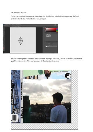
- 1. Seconddraftprocess: Step1: I createdthe diamondonPhotoshop,butdecidednottoinclude itinmyseconddraftas it didn’tfitinwiththe overall theme Iwasgoingfor. Step2: Listeningtothe feedbackIreceivedfrommytargetaudience,Idecide tocropthe picture and put Alex inthe centre.This wasto ensure all the attentionisonhim.
- 2. Step3: I addedmore to mythank youmessage,andchangedthe fontand colour,soit’sclear formy audience toread. Step4: I addedvibranttomy picture whichshowshispowerandemotions.
- 3. Step5: I thenchangedthe backgroundto black. Step6: I changedthe font for mytrack list,asmajorityof my targetaudience didn’tlikemyprevious fontand theyalsohad difficultiesreadingit.
- 4. Step7: I changedthe font for mystrapline aswell because majorityof my targetaudience didn’tlike the previousfont. Step8: I changedthe fontand colourof my maintitle andartistsname to ensure itgrabs the audience’s attention.
- 5. Step9: I wantedmydigipaktostandout and grab the audience’sattention,soIaddeda completely differenteffect. Step10: I decidedtoremove the greyborderaroundmydigipakas itdidn’tlookprofessional.
- 6. Step11: I wantedmydigipaktoPOP out,and grab the audience’sattention,soIdecidedtoadd colour,however,Ididn’tlike how itlookedatthe end,and therefore decidednottoincorporate it.
- 7. Step11: I decidedtoadda 3D effecttothispicture.
- 8. Step12: I wantedto addbrightcoloursto one of pictures,anddecidedtoaddit forthis picture; however,itmade mydigipaklookunprofessionalanddidn’tgowell withthe overall themeIwas goingfor. Step13: I thendecidedtoadda 3D effectandblurredthe background.