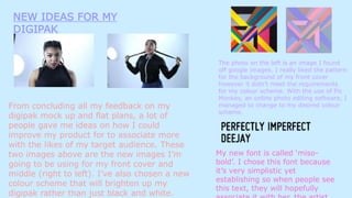
NEW IDEAS FOR MY
DIGIPAK
From concluding all my feedback on my
digipak mock up and flat plans, a lot of
people gave me ideas on how I could
improve my product for to associate more
with the likes of my target audience. These
two images above are the new images I’m
going to be using for my front cover and
middle (right to left). I’ve also chosen a new
colour scheme that will brighten up my
digipak rather than just black and white.
The photo on the left is an image I found
off google images. I really liked the pattern
for the background of my front cover
however it didn’t meet the requirements
for my colour scheme. With the use of Pic
Monkey, an online photo editing software, I
managed to change to my desired colour
scheme.
My new font is called ‘miso-
bold’. I chose this font because
it’s very simplistic yet
establishing so when people see
this text, they will hopefully

Digipak new ideas

  • 1.
    NEW IDEAS FORMY DIGIPAK From concluding all my feedback on my digipak mock up and flat plans, a lot of people gave me ideas on how I could improve my product for to associate more with the likes of my target audience. These two images above are the new images I’m going to be using for my front cover and middle (right to left). I’ve also chosen a new colour scheme that will brighten up my digipak rather than just black and white. The photo on the left is an image I found off google images. I really liked the pattern for the background of my front cover however it didn’t meet the requirements for my colour scheme. With the use of Pic Monkey, an online photo editing software, I managed to change to my desired colour scheme. My new font is called ‘miso- bold’. I chose this font because it’s very simplistic yet establishing so when people see this text, they will hopefully