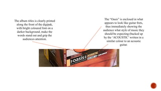
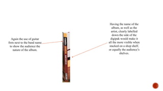
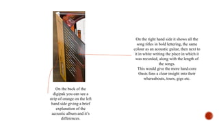
#1: Oasis Acoustic – Volume VI
The album titles is clearly printed
along the front of the digipak,
with bright coloured font on a
darker background, make the
words stand out and grip the
audiences attention.
The “Oasis” is enclosed in what
appears to look like guitar frets,
thus immediately showing the
audience what style of music they
should be expecting (backed up
by the ‘ACOUSTIC’ written in a
similar colour to an acoustic
guitar.
It’s clear the record label
wanted to ensure that the fact
the album is all acoustic comes
across, hence why the bottom
section of an acoustic guitar is
shown at the top of the front of
the digipak.
It could be said that the reason
only the bottom half was
photographed is because it
could be inviting the audience
‘in’ to see more.
The white wall background could symbolise purity
and clarity, something which acoustic versions of
songs give the audience.
One could argue
that because the
guitar itself isn’t in
a guitar holder, but
instead is leant
loosely up against
the wall, could be
suggesting the laid
back style acoustic
music.
Having the name of the
album, as well as the
artist, clearly labelled
down the side of the
digipak would make it
all the more visible when
stacked on a shop shelf,
or equally the audience’s
shelves.
Again the use of guitar
frets next to the band name
to show the audience the
nature of the album.
On the back of the
digipak you can see a
strip of orange on the left
hand side giving a brief
explanation of the
acoustic album and it’s
differences.
On the right hand side it shows all the
song titles in bold lettering, the same
colour as an acoustic guitar, then next to
it in white writing the place in which it
was recorded, along with the length of
the songs.
This would give the more hard-core
Oasis fans a clear insight into their
whereabouts, tours, gigs etc.

Digipak Deconstruction: #1 Oasis

  • 1.
    #1: Oasis Acoustic– Volume VI
  • 3.
    The album titlesis clearly printed along the front of the digipak, with bright coloured font on a darker background, make the words stand out and grip the audiences attention. The “Oasis” is enclosed in what appears to look like guitar frets, thus immediately showing the audience what style of music they should be expecting (backed up by the ‘ACOUSTIC’ written in a similar colour to an acoustic guitar.
  • 4.
    It’s clear therecord label wanted to ensure that the fact the album is all acoustic comes across, hence why the bottom section of an acoustic guitar is shown at the top of the front of the digipak. It could be said that the reason only the bottom half was photographed is because it could be inviting the audience ‘in’ to see more. The white wall background could symbolise purity and clarity, something which acoustic versions of songs give the audience. One could argue that because the guitar itself isn’t in a guitar holder, but instead is leant loosely up against the wall, could be suggesting the laid back style acoustic music.
  • 5.
    Having the nameof the album, as well as the artist, clearly labelled down the side of the digipak would make it all the more visible when stacked on a shop shelf, or equally the audience’s shelves. Again the use of guitar frets next to the band name to show the audience the nature of the album.
  • 6.
    On the backof the digipak you can see a strip of orange on the left hand side giving a brief explanation of the acoustic album and it’s differences. On the right hand side it shows all the song titles in bold lettering, the same colour as an acoustic guitar, then next to it in white writing the place in which it was recorded, along with the length of the songs. This would give the more hard-core Oasis fans a clear insight into their whereabouts, tours, gigs etc.