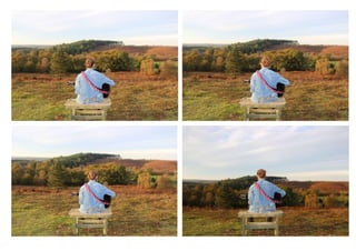
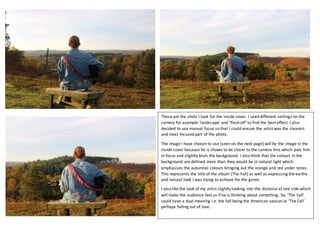
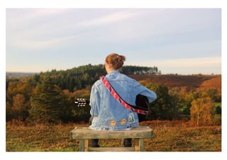
I took several photos for an album cover using different camera settings like 'landscape' and 'flash off' to find the best effect. The chosen photo shows the artist closer to the lens and in focus with the background blurred. The colors in the background are more defined than in natural light, emphasizing the autumn tones that represent the album title 'The Fall' and the earthy natural look sought for the genre. The artist also looks into the distance, making the audience feel he is thinking about something and giving 'The Fall' a dual meaning of the season or falling out of love.