House music originated in the late 1970s in Chicago and New York within the African American, gay, and Latino communities. It developed from genres like soul, jazz, gospel, and blues. House music then spread to the UK in the late 1980s via Ibiza, where it was embraced by youth and evolved into acid house. Some influential early clubs for house music included the Paradise Garage in New York, the Warehouse in Chicago, and the Hacienda in Manchester. Pioneering DJs and artists like Frankie Knuckles, Larry Levan, and the Jungle Brothers helped develop and popularize the new genre.
The document summarizes the results of a questionnaire about the target audience for a pop magazine. It found that the primary audience is 13-16 year olds, but 17-20 and 21+ are also interested. Females are the main readers. The interests of the audience include sports, music, reading, blogging, films, and drugs. To attract readers, the magazine should include good celebrity stories and articles, a prominent cover image, and a mix of serif and sans serif fonts. It should also feature popular celebrities, relevant artists, upcoming bands, and behind-the-scenes photos.
- The document discusses how the media product represents social groups through camerawork, images, mise-en-scene, colors, typography, and language on the front page, contents page, and double page spread.
- The front page represents the main artist, a young male, atypically through his mature dress and expression in order to subvert stereotypes of youth.
- The contents page similarly aims to represent the artists, both male and female, as fashionable yet unconventional through their poses, attire, and use of bright colors.
- The double page spread again features the main artist in atypical ways, through his mid-shot pose, smart clothing, and shocked expression to match
Brand identity and mode of address analysisginagoodall
The document analyzes the brand identity and mode of address of different pages from a Billboard magazine. It examines elements such as typography, layout, color, images, and language to understand how each component contributes to conveying the magazine's authoritative yet fun tone for a pop music genre audience. Key aspects noted include the use of bold fonts, bright colors, playful images of artists, and informal language discussing popular singers.
This Haiku Deck presentation consists of 5 slides with the credit "Photo by Leo Reynolds" on each slide. It suggests being inspired to create your own Haiku Deck presentation on SlideShare by including a prompt to "GET STARTED".
How does your media product represent particular social groupscjbennett10
This document discusses how a thriller media product represents social groups through its representations of gender, criminals, and victims. It notes that having a man kidnapped subverts expectations and adds tension. The victim is represented as an ordinary man saying goodbye to his wife, showing it is a normal day. The fast-paced editing is said to represent males as energetic and fast. In contrast to expectations, the criminal wears casual clothes rather than all black to hide his identity.
This magazine appeals to its target audience of 16-26 year olds through its use of language, images, colors and content. The language uses informal terms that would appeal to younger readers, and discusses topics of interest like music, celebrities and technology. Images feature popular artists dressed in cool, fashionable styles. Colors are bright and contrasting to appeal to younger eyes. A variety of content covers music charts, new artists and albums to keep readers up to date on the latest trends.
This still image analysis summarizes 5 stills from the film Annabelle. For each still, it describes the camerawork, mise-en-scene, conventions, narrative, and representation. Common conventions highlighted across the stills include low key lighting, threats to children, supernatural elements like ghosts or possessed dolls, and scenes that create tension, mystery or a sense of danger for the audience. The stills analyzed appear to depict scenes showing a possessed woman, the titular Annabelle doll, a woman being dragged or haunted, a baby in a pram near a truck, and a ghostly woman in a home with a mother and baby.
The document contains ideas for storylines, settings, characters, and key events for a horror movie trailer. Five potential storylines are outlined that involve a missing girl, supernatural occurrences in an abandoned place, strange happenings in a new house, unexplained events at a haunted school, and an encounter with a masked person while camping. Suggestions are also made to include production company logos, praise for previous films, claims of true events, and lighting/music techniques to set the mood for an effective horror trailer. Locations like an abandoned warehouse, school, forest, and house are listed as possible settings.
People who reviewed the magazine front cover draft provided feedback. They thought the images looked good but recommended adding more text on the left side. Respondents also suggested using a wider variety of brighter colors for the fonts. Overall, the feedback indicated making the cover more colorful, varied, and interesting by adding additional images and text.
This lesson plan is about physical changes. The teacher will present examples of physical changes to help students understand and demonstrate the concept. Students' previous knowledge of different types of changes will be reviewed. The teacher will provide labeled examples of physical changes and ask students to classify them as positive or negative examples. Additional unlabeled examples will then be presented for students to classify. The teacher will engage students in further discussion to analyze their understanding before reviewing the definition of a physical change. A follow-up activity requires students to record examples of physical changes they observe in different situations.
The opening sequence of a film or program usually lasts two minutes and includes production companies, directors, producers, cast, and title to engage audiences. A film's diegetic sounds are part of the story world and heard by characters, like dialogue or music, while non-diegetic sounds are added for audiences only, such as score or narration.
This document discusses the two types of mirrors: plane mirrors and spherical mirrors. Spherical mirrors are further divided into convex mirrors and concave mirrors. Concave mirrors have an inward curving reflecting surface and are used for applications like shaving mirrors, makeup mirrors, and as reflectors in searchlights and telescopes. Convex mirrors have an outward curving surface and are used as rear view mirrors in vehicles and street light reflectors.
This document discusses the two types of mirrors: plane mirrors and spherical mirrors. Spherical mirrors are further divided into convex mirrors and concave mirrors. Concave mirrors have an inward curving reflecting surface and are used for applications like shaving mirrors, makeup mirrors, and as reflectors in searchlights and telescopes. Convex mirrors have an outward curving reflecting surface and are used as rear view mirrors in vehicles and street light reflectors.
This short document promotes the creation of presentations using Haiku Deck, an online presentation tool. It includes three stock photos from freelance photographers to illustrate the variety of images available. The document encourages the reader to get started making their own Haiku Deck presentation on SlideShare.
The document discusses conventions used in movie posters and magazine covers. Some key conventions mentioned include:
1) The movie title is always the largest text to clearly identify the film.
2) Movie posters often use white text/background for contrast and visibility.
3) Horror posters commonly feature close-up or mid-shot facial images to showcase expressions.
4) Magazines consistently place the masthead as the largest text for brand recognition.
5) Both use prominent central images and text to attract attention and promote featured films/stories.
The document discusses potential risks associated with filming at different locations and recommendations for overcoming those risks. It identifies locations such as houses, a mall, abandoned warehouse, park, street, and field/forest. Common risks mentioned across locations include tripping over equipment like tripods and cables, people or vehicles interfering with filming, and hazardous objects or conditions in certain areas. The recommendations generally involve being aware of surroundings, properly securing equipment, clearing areas for filming, and having precautions for low-light situations.
This document contains a production schedule listing various locations, personnel, costumes, and equipment for filming scenes on October 13th. Locations included Mollie's house, Holly's house, an abandoned warehouse, a park, and a house. Characters included Mollie, Holly, Olivia, Frank, Charlotte, Kelly, and Emma Nolan. Equipment for filming at each location consisted of cameras, tripods, and props appropriate for the scene like casual clothing, boilersuits, ropes, duct tape, phones, knives, and a fake gun.
The document provides feedback from a survey on a film pitch. The feedback indicates that the pitch had some text but the ideas were clear. Suggestions are made to highlight key points and make it clearer how the film appeals to audiences. Most respondents said they would change nothing about the pitch but one wanted to know how the film will stand out. The characters were liked except by one respondent, so some character edits may be needed. All agreed the chosen film institution was a good fit and that the film would be successful.
The document outlines the shots planned for a film scene involving the kidnapping of Holly. It begins with establishing shots of Holly's house and her being watched by an unknown person. Holly is then kidnapped from her bedroom at night and taken to an abandoned warehouse. Subsequent shots show Holly's friends receiving messages about her kidnapping and Kelly cutting her finger in response. The document then outlines shots of Charlotte pointing a gun at Frank on the street and Holly still being held in the warehouse. It concludes with shots of Mollie running through fields towards the warehouse while being watched by the kidnapper.
1) Holly is kidnapped from her home and taken to an abandoned warehouse, where she is bound and beaten.
2) Holly's friends receive demands and threats from her kidnapper to complete tasks over 48 hours to earn clues to find her.
3) As the friends struggle with their tasks, one friend discovers a clue that Holly is in the Screaming Woods, leading her there to search for Holly while being watched by the kidnapper.
Chapter wise All Notes of First year Basic Civil Engineering.pptxDenish Jangid
Chapter wise All Notes of First year Basic Civil Engineering
Syllabus
Chapter-1
Introduction to objective, scope and outcome the subject
Chapter 2
Introduction: Scope and Specialization of Civil Engineering, Role of civil Engineer in Society, Impact of infrastructural development on economy of country.
Chapter 3
Surveying: Object Principles & Types of Surveying; Site Plans, Plans & Maps; Scales & Unit of different Measurements.
Linear Measurements: Instruments used. Linear Measurement by Tape, Ranging out Survey Lines and overcoming Obstructions; Measurements on sloping ground; Tape corrections, conventional symbols. Angular Measurements: Instruments used; Introduction to Compass Surveying, Bearings and Longitude & Latitude of a Line, Introduction to total station.
Levelling: Instrument used Object of levelling, Methods of levelling in brief, and Contour maps.
Chapter 4
Buildings: Selection of site for Buildings, Layout of Building Plan, Types of buildings, Plinth area, carpet area, floor space index, Introduction to building byelaws, concept of sun light & ventilation. Components of Buildings & their functions, Basic concept of R.C.C., Introduction to types of foundation
Chapter 5
Transportation: Introduction to Transportation Engineering; Traffic and Road Safety: Types and Characteristics of Various Modes of Transportation; Various Road Traffic Signs, Causes of Accidents and Road Safety Measures.
Chapter 6
Environmental Engineering: Environmental Pollution, Environmental Acts and Regulations, Functional Concepts of Ecology, Basics of Species, Biodiversity, Ecosystem, Hydrological Cycle; Chemical Cycles: Carbon, Nitrogen & Phosphorus; Energy Flow in Ecosystems.
Water Pollution: Water Quality standards, Introduction to Treatment & Disposal of Waste Water. Reuse and Saving of Water, Rain Water Harvesting. Solid Waste Management: Classification of Solid Waste, Collection, Transportation and Disposal of Solid. Recycling of Solid Waste: Energy Recovery, Sanitary Landfill, On-Site Sanitation. Air & Noise Pollution: Primary and Secondary air pollutants, Harmful effects of Air Pollution, Control of Air Pollution. . Noise Pollution Harmful Effects of noise pollution, control of noise pollution, Global warming & Climate Change, Ozone depletion, Greenhouse effect
Text Books:
1. Palancharmy, Basic Civil Engineering, McGraw Hill publishers.
2. Satheesh Gopi, Basic Civil Engineering, Pearson Publishers.
3. Ketki Rangwala Dalal, Essentials of Civil Engineering, Charotar Publishing House.
4. BCP, Surveying volume 1
Walmart Business+ and Spark Good for Nonprofits.pdfTechSoup
"Learn about all the ways Walmart supports nonprofit organizations.
You will hear from Liz Willett, the Head of Nonprofits, and hear about what Walmart is doing to help nonprofits, including Walmart Business and Spark Good. Walmart Business+ is a new offer for nonprofits that offers discounts and also streamlines nonprofits order and expense tracking, saving time and money.
The webinar may also give some examples on how nonprofits can best leverage Walmart Business+.
The event will cover the following::
Walmart Business + (https://business.walmart.com/plus) is a new shopping experience for nonprofits, schools, and local business customers that connects an exclusive online shopping experience to stores. Benefits include free delivery and shipping, a 'Spend Analytics” feature, special discounts, deals and tax-exempt shopping.
Special TechSoup offer for a free 180 days membership, and up to $150 in discounts on eligible orders.
Spark Good (walmart.com/sparkgood) is a charitable platform that enables nonprofits to receive donations directly from customers and associates.
Answers about how you can do more with Walmart!"
Main Java[All of the Base Concepts}.docxadhitya5119
This is part 1 of my Java Learning Journey. This Contains Custom methods, classes, constructors, packages, multithreading , try- catch block, finally block and more.
Leveraging Generative AI to Drive Nonprofit InnovationTechSoup
In this webinar, participants learned how to utilize Generative AI to streamline operations and elevate member engagement. Amazon Web Service experts provided a customer specific use cases and dived into low/no-code tools that are quick and easy to deploy through Amazon Web Service (AWS.)
ISO/IEC 27001, ISO/IEC 42001, and GDPR: Best Practices for Implementation and...PECB
Denis is a dynamic and results-driven Chief Information Officer (CIO) with a distinguished career spanning information systems analysis and technical project management. With a proven track record of spearheading the design and delivery of cutting-edge Information Management solutions, he has consistently elevated business operations, streamlined reporting functions, and maximized process efficiency.
Certified as an ISO/IEC 27001: Information Security Management Systems (ISMS) Lead Implementer, Data Protection Officer, and Cyber Risks Analyst, Denis brings a heightened focus on data security, privacy, and cyber resilience to every endeavor.
His expertise extends across a diverse spectrum of reporting, database, and web development applications, underpinned by an exceptional grasp of data storage and virtualization technologies. His proficiency in application testing, database administration, and data cleansing ensures seamless execution of complex projects.
What sets Denis apart is his comprehensive understanding of Business and Systems Analysis technologies, honed through involvement in all phases of the Software Development Lifecycle (SDLC). From meticulous requirements gathering to precise analysis, innovative design, rigorous development, thorough testing, and successful implementation, he has consistently delivered exceptional results.
Throughout his career, he has taken on multifaceted roles, from leading technical project management teams to owning solutions that drive operational excellence. His conscientious and proactive approach is unwavering, whether he is working independently or collaboratively within a team. His ability to connect with colleagues on a personal level underscores his commitment to fostering a harmonious and productive workplace environment.
Date: May 29, 2024
Tags: Information Security, ISO/IEC 27001, ISO/IEC 42001, Artificial Intelligence, GDPR
-------------------------------------------------------------------------------
Find out more about ISO training and certification services
Training: ISO/IEC 27001 Information Security Management System - EN | PECB
ISO/IEC 42001 Artificial Intelligence Management System - EN | PECB
General Data Protection Regulation (GDPR) - Training Courses - EN | PECB
Webinars: https://pecb.com/webinars
Article: https://pecb.com/article
-------------------------------------------------------------------------------
For more information about PECB:
Website: https://pecb.com/
LinkedIn: https://www.linkedin.com/company/pecb/
Facebook: https://www.facebook.com/PECBInternational/
Slideshare: http://www.slideshare.net/PECBCERTIFICATION
This document provides an overview of wound healing, its functions, stages, mechanisms, factors affecting it, and complications.
A wound is a break in the integrity of the skin or tissues, which may be associated with disruption of the structure and function.
Healing is the body’s response to injury in an attempt to restore normal structure and functions.
Healing can occur in two ways: Regeneration and Repair
There are 4 phases of wound healing: hemostasis, inflammation, proliferation, and remodeling. This document also describes the mechanism of wound healing. Factors that affect healing include infection, uncontrolled diabetes, poor nutrition, age, anemia, the presence of foreign bodies, etc.
Complications of wound healing like infection, hyperpigmentation of scar, contractures, and keloid formation.
हिंदी वर्णमाला पीपीटी, hindi alphabet PPT presentation, hindi varnamala PPT, Hindi Varnamala pdf, हिंदी स्वर, हिंदी व्यंजन, sikhiye hindi varnmala, dr. mulla adam ali, hindi language and literature, hindi alphabet with drawing, hindi alphabet pdf, hindi varnamala for childrens, hindi language, hindi varnamala practice for kids, https://www.drmullaadamali.com
How to Setup Warehouse & Location in Odoo 17 InventoryCeline George
In this slide, we'll explore how to set up warehouses and locations in Odoo 17 Inventory. This will help us manage our stock effectively, track inventory levels, and streamline warehouse operations.
How to Setup Warehouse & Location in Odoo 17 Inventory
Detailed analysis of music magazine
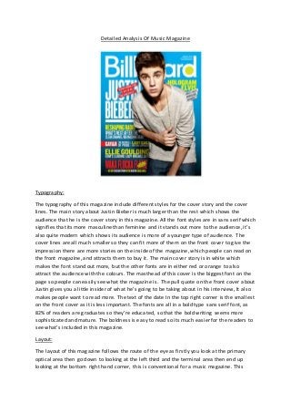
1. Detailed Analysis Of Music Magazine
Typography:
The typography of this magazine include different styles for the cover story and the cover
lines. The main story about Justin Bieber is much larger than the rest which shows the
audience that he is the cover story in this magazine. All the font styles are in sans serif which
signifies that its more masculine than feminine and it stands out more to the audience, it’s
also quite modern which shows its audience is more of a younger type of audience. The
cover lines are all much smaller so they can fit more of them on the front cover to give the
impression there are more stories on the inside of the magazine, which people can read on
the front magazine, and attracts them to buy it. The main cover story is in white which
makes the font stand out more, but the other fonts are in either red or orange to also
attract the audience with the colours. The masthead of this cover is the biggest font on the
page so people can easily see what the magazine is. The pull quote on the front cover about
Justin gives you a little insider of what he’s going to be taking about in his interview, It also
makes people want to read more. The text of the date In the top right corner is the smallest
on the front cover as it is less important. The fonts are all in a bold type sans serif font, as
82% of readers are graduates so they’re educated, so that the bold writing seems more
sophisticated and mature. The boldness is easy to read so its much easier for the readers to
see what’s included in this magazine.
Layout:
The layout of this magazine follows the route of the eye as firstly you look at the primary
optical area then go down to looking at the left third and the terminal area then end up
looking at the bottom right hand corner, this is conventional for a music magazine. This
2. magazine is also quite ordered to show that it’s quite neat and it’s not all squashed together
which sometimes can be really off-putting, this is conventional for a pop magazine. This
shows a detailed enough amount of stories what are on the inside of this magazine. All the
cover lines are in the left third which is conventional for a music magazine as it is a key area
of the page so more people will focus on that. The main image of the celebrity is used in the
layout as he is moved in front of all the text which is also conventional for a music magazine
as now he is the key area in this magazine.
Colour:
This magazine is a colourful front page, which attracts more people to it, especially the
younger audience because younger people like bright colours. The bright colours connote
happiness and pop. The blue background stands out as it is the brightest colour on the page
and it also contrasts to the other colours of the text on the cover. The white masthead
stands out and it also grabs people’s attention. The text background to the pull quote is red
which signifies passion which also contrasts with the blue background and the white text
within it. The mid shot of the artist on the front cover stands out to the other colours on the
page as the colours of his clothes are quite plain and normal. The masthead is in white and
it shows its more sophisticated and just look smarter. There is also a limited amount of
colours on this page, blue, yellow, white and red which makes it stand out even more, and
look better otherwise it will look a bit too much and too cluttered. The colours go well with
the main image which makes it stand out as a whole.
Images
The main image on this magazine makes it stand out, as it’s a new young popular celebrity,
that many people will want to read about and hear new stories about them, especially
younger females as he is a good looking person. It’s a mid-shot so it looks more professional
and it is conventional. The text also fits around Justin which is also typical for a magazine
cover, as it makes the whole magazine look better and not too cluttered. The way Justin is
dressed also makes the magazine target at a younger audience as it is quite fashionable and
in trend. He is also hunching over in this image which makes him seem cooler, which could
also attract a younger target audience, it also connects to the theme of the magazine as it’s
quite chilled and cool. Justin’s facial expression in this image shows it’s going to be a
passionate story and that the way he is pouting can also draw attention of younger girls, as
they see Justin as an icon and would want to buy this and read about him. The only feature
of mise-en-scene in this magazine is the piece of chain jewlerrey around Justin’s neck. This
connotes that he is quite fashionable and the way he has hold of it makes him seem like a
bit of a ‘gangster’, it also tells the audience that he’s quite ‘fresh’. Also the main image goes
over the masthead of this magazine which signifies importance and also its dominance, it
shows the audience that Justin will be the main piece and an important part in this
magazine, It also shows us that the magazine is very popular and people will recognise it
anyway. The serious facial expression shows that he wants to maybe be treated like more of
an adult and be more serious about his music, which maybe he wasn’t before.
3. Language
The language of this magazine has a friendly tone to it. It easily portrays it as a music
magazine. The pull quote ‘Everything I do, I do to be the greatest’ makes the main story
interesting and makes the audience want to read it. The mode of address for billboard is
quite informal, to appeal to the younger audience.
Conventions
One convention of this magazine is that the left third is filled with information. Another
convention is that the masthead is big and bold which attracts the audience as they can tell
which magazine it is, also the main image of Justin Bieber is going over the masthead, this is
also conventional for billboard magazine.
-
4. Typography
The typography on this contents page is all small so you can fit more text onto the page so
there is more information for the audience. There is a mixture of serif and sans serif fonts In
this to attract male and female audience, as serif fonts are more feminine and sans serif
fonts are more masculine. They use the serif fonts for the captions of the sections, for
example, ‘FEATURES’, and ‘MUSIC’. These are also bigger so you know what you’re reading
and it grabs your attention the first time you look at the page. ‘CONTENTS’ at the top is to
clearly display what this page contains, so it’s easier to locate the different sections and
different pages. This magazine also clearly display the music and the charts on the left third
of this page, because its aimed at younger audience who like new popular music, which
billboard includes. They’ve also split the typography into a lot of sections so it not too much
to read and its not too cluttered on the one page.
Layout
The layout of this contents page is using the route of the eye, which is conventional for a
music magazine. This contents page is quite ordered so its easier and clearer to read, this is
also quite sophisticated which will appeal to the more educated and sophisticated audience.
It is also using the left third which is conventional for music magazine, billboard uses this
section to show the top music charts which will appeal to the target audience as they will be
interested in new popular music, which is what this will tell you about. The photos are also
laid out on this neatly and ordered, which makes the page look better as a whole.
5. Colour
The colour of this contents page is quite plain, it’s got strips of bright colours (pink/blue) to
contrast with the main grey/white colour. The ‘CONTENTS’ at the top of the page is in black
which stands out and catches your eye. Some of the text is also in blue this shows the
audience that some of that text is more important than the plain black text. It also links in
with the colours of the front cover, which is conventional.
Images
There is a range of images on the contents page, this is just to show some of the popular
artists that will feature in this magazine, which will draw attention from the audience. The
medium long shot of the main image is to show you her body language, which is fun, as she
looks like she’s jumping in the air. She is also wearing dark clothes, which contrasts to the
white background and maybe goes with the music she sings? It also goes with the whole
vibe of the magazine, which isn’t too colourful. The other 3 images under the masthead is
conventional for billboard magazine as they are some of the artists that feature in this.
magazine. There are also various artists in the contents which appeal to a larger audience,
for example there are female artists, male artists, and groups, which can appeal to many
different people.
Language
The language in this is quite informal. It is also using quite short snappy language in this
which will attract to the younger audience as they wouldn’t want to read a lot. ‘MILEY
STRIKES BACK’ is using quite an aggressive tone to it, this is also quite an interesting caption
as people will be interested and want to find out more.
Conventions
One of the conventions in this contents page is the use of the left third, as there is normally
one, which includes the music an the charts which the audience (who are into music) will be
into. You will also have the smaller images at the top of the magazine, to show the audience
what’s in this issue.
6. Typography
All the typography is in serif, which is more informal and is also easier to read. There is also
a kicker in this piece of text, the ‘A’ which signifies the start of a sentence, is also breaks the
page up and draws the eye in. The headline and the stand first are much bigger than the rest
of the text, which catches the audience’s eye and to show that it’s going to be an important
part in this piece of text, the stand first is also acting as a ‘pull quote’ and therefore adding
more information and an insider of what’s going to be in this article. The rest of the text is
quite small as it is a full article about Katy Perry, and they want to fit more text onto the
page so it is more informative.
Layout
The layout is quite basic but also typical for a double page spread. All the text is in sections
which is quite conventional for a double page spread, this is so that you can fit more on a
page and that it looks formal and is quite ordered. Also on one side of the pages there is a
big image which grabs the audience’s attention and showing them who the articles about.
Colour
All the texts are in black which is standard and contrasts with the background which is easier
to read. The colour is also quite contemporary and modern which can attract the younger
audience. Katy Perry’s lipstick is bright red which is quite vibrant and sexual, this can also
attract the male audience. The brightness is coming in from behind makes Katy Perry stand
out more.
Images
7. The main image on this is of a popular singer, Katy Perry, which many people would be
interested in reading about. Her body language is quite sexy and sensual which will also
attract the male audience. Her facial expression is quite tense and quite aggressive which
also makes her to seem more sexual. Her clothes are quite revealing, which, again will
appeal to the male audience and grab their attention. Also the clothes are quite fashionable
which will attract the female audience. Her hair is blowing in the wind which makes her
stand out more, and blends in with the whole image.
Language
By the language on this double page spread, you can tell it’s aimed at a younger target
audience, as it says ‘I took mushrooms as a daft punk show’ which is associated with
drugs/violence which will make the audience more interested, it’s also in quite a formal
tone which will be aimed at the more sophisticated target audience.
Conventions
One convention of this is that half the page is filled with an image, which all double page
spreads will have. Also the headline and the stand first are in the middle of all the text which
is conventional, and it also makes the page look better as it gives you a little insider and
attracts more of the audience.