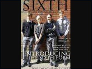
2. SIXTH magazine
• The title has been written in big bold letters to
attract the audience into buying the magazine, the
title shows what the magazine is about even before
you open the front cover. The picture is of some
students up against a school wall in normal clothes
which emphasises that the magazine is about school
but it is all about the best bits of school. The picture
really stands out because the background doesn’t
have too much going on which could put off the
audience. Also the picture shows both sexes this is a
key feature because it shows that the magazine can
be read by girls and boys.
3.
4. St.Andrew’s Magazine
• The title is written in blue coloured font which is their
colours of their school logo. This makes the title connect
with the school theme and also attract the audience. The
picture is a low shot from the floor of students in a
corridor which emphasises the theme of school but also
adds a twist to it by not using a boring angle that
wouldn’t attract their audience. The slogan on the page
also connects with the theme. The one thing that spoils
this magazine is the picture of the new head this doesn't
look very professional because it is in a dull yellow box
and the writing is hard to read.