Xamarin
Community
Toolkit:
Awesome Apps
with Less Code
Javier Suarez
@jsuarezruiz
Xamarin Community Toolkit
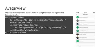
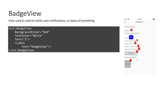
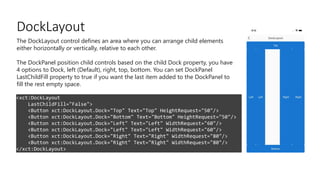
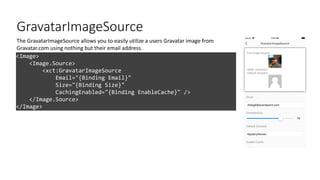
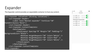
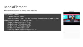
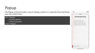
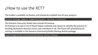
The Xamarin Community Toolkit is a collection of common
elements for mobile development with Xamarin.Forms that people
tend to replicate across multiple apps. It simplifies and
demonstrates common developer tasks when building apps with
Xamarin.Forms.
The library contains:
• Behaviors
• Converters
• Effects
• Views
Behaviors
Behaviors
Behaviors lets you add functionality to user interface controls without having to subclass them. Behaviors are
written in code and added to controls in XAML or code.
• EmailValidationBehavior
• EventToCommandBehavior
• NumericValidationBehavior
• AnimationBehavior
• MaskedBehavior
• UriValidationBehavior
• RequiredStringValidationBehavior
• UserStoppedTypingBehavior
• ImpliedOrderGridBehavior
• MaxLengthReachedBehavior
• CharactersValidationBehavior
Behaviors
DEMO: Let's
take a look at
the behaviors
Converters
Converters
Suppose you want to define a data binding where the source property is of type int but the target property is
a bool. You want this data binding to produce a false value when the integer source is equal to 0,
and true otherwise.
You can do this with a class that implements the IValueConverter creating something you probably know,
Converters.
In the XCT, we try to group those common Converters, which are repeated from app to app to simplify the process.
• ByteArrayToImageSourceConverter
• DateTimeOffsetConverter
• ItemSelectedEventArgsConverter
• ItemTappedEventArgsConverter
• MultiConverter
DEMO: Let's
take a look at
the converters
Effects
Effects
Effects allow the native controls on each platform to be customized, and are typically used for small styling
changes.
Available Effects:
• IconTintColorEffect
• LifecycleEffect
• RemoveBorderEffect
• ShadowEffect
• SafeAreaEffect
• SelectAllTextEffect
Effects
DEMO: Let's
take a look at
the effects
Views
AvatarView
<xct:AvatarView
ColorTheme="{x:Static xct:ColorTheme.Jungle}"
FontSize="Medium”>
<xct:AvatarView.Source>
<UriImageSource Uri="{Binding Source}" />
</xct:AvatarView.Source>
</xct:AvatarView>
The AvatarView represents a user's name by using the initials and a generated
background color.
BadgeView
<xct:BadgeView
BackgroundColor="Red"
TextColor="White"
Text="1">
<Label
Text="BadgeView"/>
</xct:BadgeView>
View used to used to notify users notifications, or status of something.
DockLayout
<xct:DockLayout
LastChildFill="False">
<Button xct:DockLayout.Dock="Top" Text="Top" HeightRequest="50"/>
<Button xct:DockLayout.Dock="Bottom" Text="Bottom" HeightRequest="50"/>
<Button xct:DockLayout.Dock="Left" Text="Left" WidthRequest="60"/>
<Button xct:DockLayout.Dock="Right" Text="Right" WidthRequest="80"/>
</xct:DockLayout>
The DockLayout control defines an area where you can arrange child elements
either horizontally or vertically, relative to each other.
The DockPanel position child controls based on the child Dock property, you have
4 options to Dock, left (Default), right, top, bottom. You can set DockPanel
LastChildFill property to true if you want the last item added to the DockPanel to
fill the rest empty space.
GravatarImageSource
<Image>
<Image.Source>
<xct:GravatarImageSource
Email="{Binding Email}"
Size="{Binding Size}"
CachingEnabled="{Binding EnableCache}" />
</Image.Source>
</Image>
The GravatarImageSource allows you to easily utilize a users Gravatar image from
Gravatar.com using nothing but their email address.
Expander
<xct:Expander IsEnabled="{Binding IsEnabled}">
<xct:Expander.Header>
<Label Text="Nested expander" FontSize="30"
FontAttributes="Bold"/>
</xct:Expander.Header>
<xct:Expander.ContentTemplate>
<DataTemplate>
<StackLayout Spacing="0" Margin="10" Padding="1"
BackgroundColor="Black">
<BoxView HeightRequest="50" Color="White" />
<BoxView HeightRequest="50" Color="Red" />
<BoxView HeightRequest="50" Color="White" />
</StackLayout>
</DataTemplate>
</xct:Expander.ContentTemplate>
</xct:Expander>
The Expander control provides an expandable container to host any content.
MediaElement
<xct:MediaElement
x:Name="mediaElement"
Source="https://sec.ch9.ms/ch9/5d93/a1eab4bf-3288-4faf-81c4-
294402a85d93/XamarinShow_mid.mp4"
ShowsPlaybackControls="True"
MediaOpened="OnMediaOpened"
MediaFailed="OnMediaFailed"
MediaEnded="OnMediaEnded"
SeekCompleted="OnSeekCompleted" />
MediaElement is a view for playing video and audio.
Popup
<xct:Popup>
<StackLayout>
</StackLayout>
</xct:Popup>
The Popup control provides a way to display content in a separate View that floats
over the current View.
RangeSlider
<xct:RangeSlider
x:Name="RangeSlider"
MaximumValue="10"
MinimumValue="-10"
StepValue="0.01"
LowerValue="-10"
UpperValue="10”>
<xct:RangeSlider.LowerThumbView>
<Label Text="L" VerticalTextAlignment="Center"
HorizontalTextAlignment="Center" IsVisible="{Binding IsToggled,
Source={x:Reference LowerThumbViewSwitch}}" />
</xct:RangeSlider.LowerThumbView>
<xct:RangeSlider.UpperThumbView>
<Label Text="U" VerticalTextAlignment="Center"
HorizontalTextAlignment="Center" IsVisible="{Binding IsToggled,
Source={x:Reference UpperThumbViewSwitch}}" />
</xct:RangeSlider.UpperThumbView>
</xct:RangeSlider>
The RangeSlider is a slider with two thumbs allowing to select numeric ranges.
SnackBar
var messageOptions = new MessageOptions
{
Message = GenerateLongText(5)
};
var actionOptions = new List<SnackBarActionOptions>
{
new SnackBarActionOptions
{
Text = "Action1",
Action = () =>
{
Debug.WriteLine("1");
return Task.CompletedTask;
}
},
new SnackBarActionOptions
{
Text = "Action2",
Action = () =>
{
Debug.WriteLine("2");
return Task.CompletedTask;
}
}
};
var options = new SnackBarOptions
{
MessageOptions = messageOptions,
Duration = TimeSpan.FromMilliseconds(5000),
Actions = actionOptions
};
var result = await this.DisplaySnackBarAsync(options);
Show SnackBar, Toast etc.
StateLayout
<xct:StateLayout.StateViews>
<xct:StateView StateKey="Loading" BackgroundColor="White"
VerticalOptions="FillAndExpand">
<StackLayout VerticalOptions="Center"
HorizontalOptions="Center">
<ActivityIndicator Color="#1abc9c" IsRunning="{Binding
MainState, Converter={StaticResource StateToBooleanConverter},
ConverterParameter={x:Static xct:LayoutState.Loading}}" />
<Label Text="Loading..." HorizontalOptions="Center" />
</StackLayout>
</xct:StateView>
</xct:StateLayout.StateViews>
A collection of attached properties that let you specify one or more state views for any of
your existing layouts.
SideMenuView
<xct:SideMenuView x:Name="SideMenuView">
<!-- MainView -->
<StackLayout
Orientation="Horizontal"
BackgroundColor="Gold">
<Button Style="{StaticResource BaseMenuButtonStyle}"
Clicked="OnLeftButtonClicked" />
<Button Style="{StaticResource BaseMenuButtonStyle}"
HorizontalOptions="EndAndExpand"
Clicked="OnRightButtonClicked" />
</StackLayout>
<!-- LeftMenu -->
<BoxView
BackgroundColor="Orange"
xct:SideMenuView.Position="LeftMenu"
xct:SideMenuView.MenuWidthPercentage=".5" />
<!-- RightMenu -->
<BoxView
BackgroundColor="LightGreen"
xct:SideMenuView.Position="RightMenu"
xct:SideMenuView.MenuWidthPercentage=".3" />
</xct:SideMenuView>
SideMenuView is a simple and flexible Right/Left menu control.
Shield
<xct:Shield
Subject="IDE"
Status="2019"
Color="DodgerBlue"
TextColor="White"
Margin="2,0" />
Shields can show some status information or call-to-action in a badge-like way.
UniformGrid
<xct:UniformGrid>
<BoxView Color="Red" />
<BoxView Color="Yellow" />
<BoxView Color="Orange" />
<BoxView Color="Purple" />
<BoxView Color="Blue" />
<BoxView Color="Green" />
<BoxView Color="LightGreen" />
<BoxView Color="Gray" />
<BoxView Color="Pink" />
</xct:UniformGrid>
The UniformGrid control is a responsive layout control which arranges items in a
evenly-spaced set of rows or columns to fill the total available display space. Each
cell in the grid, by default, will be the same size.
TabView
<xct:TabView
TabStripPlacement="Bottom"
TabStripBackgroundColor="Blue"
TabStripHeight="60"
TabIndicatorColor="Yellow"
TabContentBackgroundColor="Yellow">
<xct:TabViewItem
Icon="triangle.png"
Text="Tab 1"
TextColor="White"
TextColorSelected="Yellow"
FontSize="12">
<Grid
BackgroundColor="Gray">
<Label
HorizontalOptions="Center"
VerticalOptions="Center"
Text="TabContent1" />
</Grid>
</xct:TabViewItem>
<xct:TabViewItem
Icon="circle.png"
Text="Tab 2"
TextColor="White"
TextColorSelected="Yellow"
FontSize="12">
<Grid>
<Label
HorizontalOptions="Center"
VerticalOptions="Center"
Text="TabContent2" />
</Grid>
</xct:TabViewItem>
</xct:TabView>
Shields can show some status information or call-to-action in a badge-like way.
DEMO: Let's
take a look at
the controls
¿How to use the XCT?
The toolkit is available via NuGet, and should be installed into all your projects:
The Xamarin Comunity Toolkit also include C# markup.
C# markup is an opt-in set of fluent helper methods and classes to simplify the process of
building declarative Xamarin.Forms user interfaces in C#. The fluent API provided by C#
markup is available in the Xamarin.CommunityToolkit.Markup NuGet package.
Install-Package Xamarin.CommunityToolkit -Version 1.0.0-pre5
Install-Package Xamarin.CommunityToolkit.Markup -Version 1.0.0-pre5
C# Markup
C# markup is an opt-in set of fluent helper methods and classes to simplify the process of building declarative
Xamarin.Forms user interfaces in C#.
View Build() => new Grid
{
RowDefinitions = Rows.Define(
(BodyRow.Prompt , 170 ),
(BodyRow.CodeHeader, 75 ),
(BodyRow.CodeEntry , Auto),
(BodyRow.Button , Auto)
),
ColumnDefinitions = Columns.Define(
(BodyCol.FieldLabel , 160 ),
(BodyCol.FieldValidation, Star)
),
Children =
{
new Label { LineBreakMode = LineBreakMode.WordWrap } .Font (15) .Bold ()
.Row (BodyRow.Prompt) .ColumnSpan (All<BodyCol>()) .FillExpandHorizontal () .CenterVertical () .Margin (fieldNameMargin) .TextCenterHorizontal ()
.Bind (nameof(vm.RegistrationPrompt)),
new Label { Text = "Registration code" } .Bold ()
.Row (BodyRow.CodeHeader) .Column(BodyCol.FieldLabel) .Bottom () .Margin (fieldNameMargin),
new Label { } .Italic ()
.Row (BodyRow.CodeHeader) .Column (BodyCol.FieldValidation) .Right () .Bottom () .Margin (fieldNameMargin)
.Bind (nameof(vm.RegistrationCodeValidationMessage)),
new Entry { Placeholder = "E.g. 123456", Keyboard = Keyboard.Numeric, BackgroundColor = Color.AliceBlue, TextColor = Color.Black } .Font (15)
.Row (BodyRow.CodeEntry) .ColumnSpan (All<BodyCol>()) .Margin (fieldMargin) .Height (44)
.Bind (nameof(vm.RegistrationCode), BindingMode.TwoWay),
new Button { Text = "Verify" } .Style (FilledButton)
.Row (BodyRow.Button) .ColumnSpan (All<BodyCol>()) .FillExpandHorizontal () .Margin (PageMarginSize)
.Bind (Button.IsVisibleProperty, nameof(vm.CanVerifyRegistrationCode))
.Bind (nameof(vm.VerifyRegistrationCodeCommand)),
}
};
Let’s see how
to
collaborate
with the XCT
Thanks to the
Community!
#monkeyconf
Questions?

Cape Town MS Developer User Group: Xamarin Community Toolkit