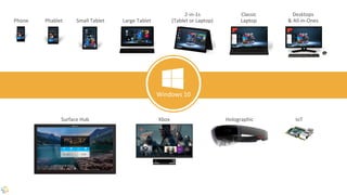
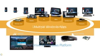
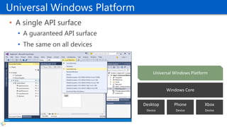
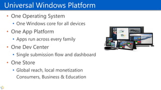
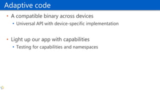
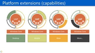
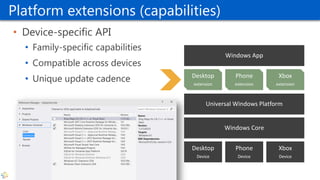
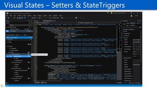
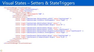
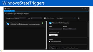
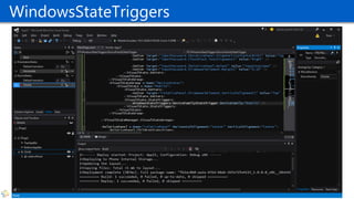
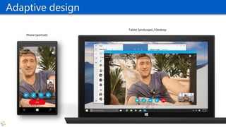
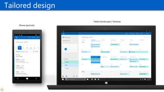
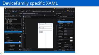
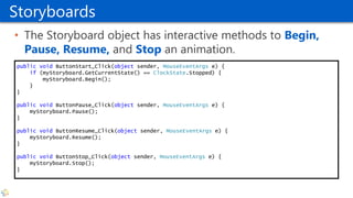
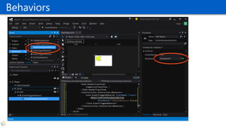
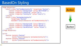
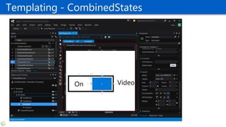
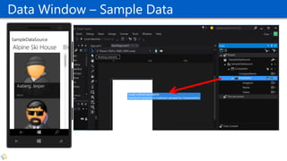
Fons Sonnemans
Reflection IT
Building & Designing Windows 10
Universal Windows Apps using
XAML and C#
@fonssonnemans
www.storeappsug.nl
@StoreAppsUG
Topics
• Universal Windows Apps
• Blend 2015
• Layout Controls
• Adaptive UI
• Resources
• Animations & Behaviors
• Styling & Templating
• Data Binding
Fons Sonnemans
• Software Development Consultant
• Programming Languages
• Clipper, Smalltalk, Visual Basic, C#
• Platforms
• Windows Forms, ASP.NET (Web Forms, MVC), XAML (WPF, Silverlight, Windows
Phone, Windows 8 & 10)
• Databases
• MS SQL Server, Oracle
• Role
• Trainer, Coach, Advisor, Architect, Designer, App Developer
• More info: www.reflectionit.nl
My Apps
4
http://reflectionit.nl/apps
Universal Windows Apps
Introducing the Universal Windows Platform (UWP)
Easy for users to get
& stay current
Unified core
and app platform
The convergence journey
Windows 10
Converged
OS kernel
Converged
app model
Phone Small Tablet
2-in-1s
(Tablet or Laptop)
Desktops
& All-in-OnesPhablet Large Tablet
Classic
Laptop
Xbox IoTSurface Hub Holographic
Windows 10
One Store +
One Dev Center
Reuse Existing
Code
One SDK +
Tooling
Adaptive
User Interface
Natural
User Inputs
One Universal Windows Platform
Universal Windows Platform
• A single API surface
• A guaranteed API surface
• The same on all devices
Phone
Device
Xbox
Device
Desktop
Device
Windows Core
Universal Windows Platform
• One Operating System
• One Windows core for all devices
• One App Platform
• Apps run across every family
• One Dev Center
• Single submission flow and dashboard
• One Store
• Global reach, local monetization
Consumers, Business & Education
Adaptive code
• A compatible binary across devices
• Universal API with device-specific implementation
• Light up our app with capabilities
• Testing for capabilities and namespaces
UAP
Windows Core Windows Core Windows Core Windows Core
UAP UAP UAP
Desktop Mobile Xbox More…
Adaptive codePlatform extensions (capabilities)
Platform extensions (capabilities)
• Device-specific API
• Family-specific capabilities
• Compatible across devices
• Unique update cadence
Phone
Device
Xbox
Device
Desktop
Device
Windows Core
Universal Windows Platform
Windows App
Phone
extension
Xbox
extension
Desktop
extension
Test capabilities at runtime
• Use Adaptive Code to light-up your app on specific devices
var api = "Windows.Phone.UI.Input.HardwareButtons";
if (Windows.Foundation.Metadata.ApiInformation.IsTypePresent(api))
{
Windows.Phone.UI.Input.HardwareButtons.CameraPressed
+= CameraButtonPressed;
}
Blend 2015
What’s new
Pre Blend 2015
• Blend is a tool for creating great user experiences, with deep
focus on best-in-class UI design capabilities.
• Visual Studio is a tool for creating great apps, with focus on
best-in-class code editing and debugging capabilities.
• Supports
• WPF, Silverlight (Phone), Windows 8 & 8.1
Feedback themes
• No XAML or C# IntelliSense
• File reload experiences when switching between VS and
Blend
• Inconsistent shell & project system experiences with VS
• Git and TFS
• Expand/collapse of project nodes
• Performance and scalability of large solutions
Blend for Visual Studio 2015
• Adds Windows 10 support
• Rebuilt from the ground up using VS technologies
• IntelliSense, GoTo Definition, Peek, Debugging, Window Layouts,
Reloading, Customizing
• Retains almost all of the unique Blend capabilities
• SketchFlow is killed
Blend 2015
UI Debugging for XAML
• Visual tree inspection and manipulation
• Live tracking of tree and property changes
• Fully integrated into debugging
• Upcoming
• Serializing edits back into source
• Edit-n-continue
• Data debugging visualizations
Live Visual Tree
Layout Controls
Panels
Layout Controls
• Canvas
• Simplest, placement relative to the top left edge
• Not scalable
• StackPanel
• Horizontal or vertical stacking
• RelativePanel
• You arrange child elements by specifying how they should be arranged in relationships to
each other, and how they should position relative to their content and/or their parent
• Grid
• Uses rows and columns
• Flexible Positioning (similar to <TABLE /> in HTML)
• More
• Border (“Obsolete”), ScrollViewer, Viewbox, VariableSizedWrapGrid
Canvas
• Is a Drawing Surface
• Children have fixed positions relative to top-left-corner
<Canvas Width="250" Height="200" Background="Gray">
<Rectangle Canvas.Top="25" Canvas.Left="25"
Width="200" Height="150" Fill="Yellow" />
</Canvas>
The Canvas
The Rectangle
XAML - Attached Properties
• Top & Left properties only make sense inside a Canvas
<Canvas Width="250" Height="200" Background="Gray">
<Rectangle Canvas.Top="25" Canvas.Left="25"
Width="200" Height="150" Fill="Yellow" />
</Canvas>
StackPanel
• The StackPanel will place its children in either a column
(default) or row. This is controlled by the Orientation
property.
<StackPanel Orientation="Horizontal"
BorderBrush="#FF0B77FD"
BorderThickness="2"
Padding="5">
<Button Content="Button1" FontSize="30" />
<Button Content="Button2" FontSize="30" Margin="5,0" />
<Button Content="Button3" FontSize="30" />
</StackPanel>
New Properties in Win10
Makes ‘Border’ obsolete
Nested Stackpanels
<StackPanel HorizontalAlignment="Center"
VerticalAlignment="Center">
<StackPanel Orientation="Horizontal" Margin="0,0,0,12">
<TextBlock Text="Username" FontSize="26.667" Width="240"
TextAlignment="Right" Margin="0,0,20,0"/>
<TextBox FontSize="26.667" Width="300"/>
</StackPanel>
<StackPanel Orientation="Horizontal" Margin="0,0,0,12">
<TextBlock Text="Password" Margin="0,0,20,0" FontSize="26.667"
Width="240" TextAlignment="Right"/>
<PasswordBox Margin="0" FontSize="26.667" Width="300"/>
</StackPanel>
<Button Content="Login" HorizontalAlignment="Left"
Margin="260,0,0,0" FontSize="26.667"/>
</StackPanel>
RelativePanel
• Decrease Tree size
<RelativePanel HorizontalAlignment="Center" VerticalAlignment="Center">
<TextBlock x:Name="labelUsername"
Text="Username"
RelativePanel.LeftOf="inputUsername"
TextAlignment="Right"
Margin="0,0,20,0"
FontSize="26.667" />
<TextBox x:Name="inputUsername"
RelativePanel.AlignRightWithPanel="True"
Width="300"
FontSize="26.667" />
<TextBlock x:Name="labelPassword“
Text="Password"
RelativePanel.LeftOf="inputPassword"
RelativePanel.AlignVerticalCenterWith="inputPassword"
TextAlignment="Right"
Margin="0,0,20,0"
FontSize="26.667" />
<PasswordBox x:Name="inputPassword"
RelativePanel.Below="inputUsername"
RelativePanel.AlignRightWithPanel="True"
Width="300"
Margin="0,10"
FontSize="26.667" />
<Button x:Name="buttonLogin"
Content="Login"
RelativePanel.Below="inputPassword"
RelativePanel.AlignLeftWith="inputPassword"
FontSize="26.667" />
</RelativePanel>
RelativePanel
• Vertical layout
<RelativePanel HorizontalAlignment="Center" VerticalAlignment="Center">
<TextBlock x:Name="labelUsername“
Text="Username“
Margin="0,0,20,0"
FontSize="26.667" />
<TextBox x:Name="inputUsername"
RelativePanel.Below="labelUsername"
Width="300"
Margin="0,0,0,10"
FontSize="26.667" />
<TextBlock x:Name="labelPassword"
Text="Password"
RelativePanel.Below="inputUsername"
Margin="0,0,20,0"
FontSize="26.667" />
<PasswordBox x:Name="inputPassword"
RelativePanel.Below="labelPassword"
Width="300"
Margin="0,0,0,10"
FontSize="26.667" />
<Button x:Name="buttonLogin"
Content="Login"
RelativePanel.Below="inputPassword"
RelativePanel.AlignLeftWith="inputPassword"
FontSize="26.667" />
</RelativePanel>
Grid
• The Grid is a powerful layout container.
• It acts as a placeholder for visual elements
• You specify the rows and columns, and those define the cells.
• The placement of an element in the Grid is specified using attached properties
that are set on the children of the Grid:
• Supports different types of row and column sizes in one Grid:
• Pixel size: Fixed value in pixels
• Auto size: The cell has the size of it’s contents
• Star size: whatever space is left over from fixed- and auto-sized columns is
allocated to all of the columns with star-sizing
<Image Grid.Column="3" Source="demo.png" Stretch="None"/>
Layout Properties
IsTextScaleFactorEnabled
<StackPanel Margin="10">
<Button Content="Button 1" />
<TextBlock Text="Hello World 1"
FontSize="20" Margin="0,10" />
<TextBox Text="TextBox 1" />
<Button Content="Button 2"
IsTextScaleFactorEnabled="False"
Margin="0,40,0,0" />
<TextBlock Text="Hello World 2"
IsTextScaleFactorEnabled="False"
FontSize="20" Margin="0,10" />
<TextBox Text="TextBox 2"
IsTextScaleFactorEnabled="False" />
</StackPanel>
33
Adaptive UI
Responsive Design
Adaptive UI
<RelativePanel HorizontalAlignment="Center"
VerticalAlignment="Center">
<TextBlock x:Name="labelUsername"
Text="Username"
RelativePanel.LeftOf="inputUsername"
TextAlignment="Right"
Margin="0,0,20,0"
FontSize="26.667" />
<TextBox x:Name="inputUsername"
RelativePanel.AlignRightWithPanel="True"
Width="300"
FontSize="26.667" />
<TextBlock x:Name="labelPassword“
Text="Password"
RelativePanel.LeftOf="inputPassword"
RelativePanel.AlignVerticalCenterWith="inputPassword"
TextAlignment="Right"
Margin="0,0,20,0"
FontSize="26.667" />
<PasswordBox x:Name="inputPassword"
RelativePanel.AlignRightWithPanel="True“
RelativePanel.Below="inputUsername"
Margin="0,10"
Width="300"
FontSize="26.667" />
<Button x:Name="buttonLogin"
Content="Login"
RelativePanel.Below="inputPassword"
RelativePanel.AlignLeftWith="inputPassword"
FontSize="26.667" />
</RelativePanel>
<RelativePanel HorizontalAlignment="Center"
VerticalAlignment="Center">
<TextBlock x:Name="labelUsername“
Text="Username“
Margin="0,0,20,0"
FontSize="26.667" />
<TextBox x:Name="inputUsername"
RelativePanel.AlignRightWithPanel="True"
RelativePanel.Below="labelUsername"
Margin="0,0,0,10"
Width="300"
FontSize="26.667" />
<TextBlock x:Name="labelPassword"
Text="Password"
RelativePanel.Below="inputUsername"
Margin="0,0,20,0"
FontSize="26.667" />
<PasswordBox x:Name="inputPassword"
RelativePanel.AlignRightWithPanel="True"
RelativePanel.Below="labelPassword"
Margin="0,0,0,10"
Width="300"
FontSize="26.667" />
<Button x:Name="buttonLogin"
Content="Login"
RelativePanel.Below="inputPassword"
RelativePanel.AlignLeftWith="inputPassword"
FontSize="26.667" />
</RelativePanel>
Visual States – Setters & StateTriggers
<VisualStateManager.VisualStateGroups>
<VisualStateGroup x:Name="VisualStateGroup">
<VisualState x:Name="Horizontal">
<VisualState.StateTriggers>
<AdaptiveTrigger MinWindowWidth="600" />
</VisualState.StateTriggers>
<VisualState.Setters>
<Setter Target="labelUsername.(RelativePanel.LeftOf)" Value="inputUsername" />
<Setter Target="labelUsername.(TextBlock.TextAlignment)" Value="Right" />
<Setter Target="inputUsername.(RelativePanel.Below)" Value="" />
<Setter Target="inputUsername.(FrameworkElement.Margin)" Value="0" />
<Setter Target="labelPassword.(RelativePanel.Below)" Value="" />
<Setter Target="labelPassword.(RelativePanel.LeftOf)" Value="inputPassword" />
<Setter Target="labelPassword.(RelativePanel.AlignVerticalCenterWith)" Value="inputPassword" />
<Setter Target="labelPassword.(TextBlock.TextAlignment)" Value="Right" />
<Setter Target="inputPassword.(RelativePanel.Below)" Value="inputUsername" />
<Setter Target="inputPassword.(FrameworkElement.Margin)" Value="0,10" />
</VisualState.Setters>
</VisualState>
</VisualStateGroup>
</VisualStateManager.VisualStateGroups>
WindowsStateTriggers
Adaptive design
Phone (portrait)
Tablet (landscape) / Desktop
Tailored design
Phone (portrait)
Tablet (landscape) / Desktop
DeviceFamily specific XAML
Resources
Reusable objects such as data, styles and templates
Resources
• Reusable objects such as data, styles and templates.
• Assigned a unique key (x:Key) so you can reference to it.
• Every element has a Resources property.
• Nesting Support
• All static resources are loaded on page load
• Resource is loaded even if not used
45
Convert to New Resource…
Resources in Blend
• Menu Window - Resources
• Shows all resources of all open XAML documents
• Link to Resource Dictionary
• Edit Resource
• Rename Resource
• Move Resource
• Delete Resource
• Apply Resource by Drag & Drop
47
Windows 10 - SystemAccentColor
• Reduces the need for a custom Theme
Animations & Behaviors
Storyboards & Transitions
Interactivity without Code
Key Frame Concept
• XAML supports key frames
• A key frame defines an objects target value on a moment in
an animation.
• A key frame has an interpolation method.
• A Key Frame target can be a:
• Double (X, Y, Height, Width, Opacity, Angle, etc.)
• Color (Fill, Stroke, etc.)
• Object (Visibility, Text, etc)
Storyboards
51
Record Storyboard animations
Storyboards
• The Storyboard object has interactive methods to Begin,
Pause, Resume, and Stop an animation.
public void ButtonStart_Click(object sender, MouseEventArgs e) {
if (myStoryboard.GetCurrentState() == ClockState.Stopped) {
myStoryboard.Begin();
}
}
public void ButtonPause_Click(object sender, MouseEventArgs e) {
myStoryboard.Pause();
}
public void ButtonResume_Click(object sender, MouseEventArgs e) {
myStoryboard.Resume();
}
public void ButtonStop_Click(object sender, MouseEventArgs e) {
myStoryboard.Stop();
}
Behaviors
Animation Library Transitions
<ItemsControl>
<Rectangle Fill="Red" Margin="10" />
<Rectangle Fill="Red" Margin="10"/>
<ItemsControl.ItemsPanel>
<ItemsPanelTemplate>
<ItemsWrapGrid ItemHeight="150" ItemWidth="150"
Orientation="Horizontal" />
</ItemsPanelTemplate>
</ItemsControl.ItemsPanel>
<ItemsControl.ItemContainerTransitions>
<TransitionCollection>
<ReorderThemeTransition />
</TransitionCollection>
</ItemsControl.ItemContainerTransitions>
</ItemsControl>
ShowMessageBox Action
public class ShowMessageAction : DependencyObject, IAction {
public string Text { get; set; }
public object Execute(object sender, object parameter) {
new MessageDialog(this.Text).ShowAsync();
return null;
}
}
Open Source Behaviors SDK XAML
• https://visualstudio.uservoice.com/forums/121579-visual-
studio/suggestions/5282131-open-source-behaviors-sdk-xaml-
for-visual-studio
Styling and Templating
Customize the look of an application without changing
it’s behavior
Styling and Templating
• Styling = Small Visual Changes on an Element (Font,
Background Color, etc.)
• Templating = Replacing Element’s entire Visual Tree
Styling
<Page.Resources>
<Style x:Key="HollandButtonStyle" TargetType="Button">
<Setter Property="Background" Value="#FFFF9E00"/>
<Setter Property="FontSize" Value="40"/>
<Setter Property="FontStyle" Value="Italic"/>
</Style>
</Page.Resources>
<Grid>
<Button Content="Button"
Style="{StaticResource HollandButtonStyle}"/>
</Grid>
Implicit Styling
• If you omit the Style’s Key and specify only the TargetType,
then the Style is automatically applied to all elements of
that target type within the same scope (it is implicitly
applied).
• This is typically called a typed style as opposed to a named
style.
<Style TargetType="TextBox">
<Setter Property="FontFamily" Value="Arial Black"/>
<Setter Property="FontSize" Value="16"/>
</Style>
BasedOn Styling
<Page.Resources>
<Style x:Key="HollandButtonStyle" TargetType="Button">
<Setter Property="Background" Value="#FFFF9E00"/>
<Setter Property="FontSize" Value="24"/>
<Setter Property="FontStyle" Value="Italic"/>
</Style>
<Style x:Key="GermanButtonStyle"
TargetType="Button"
BasedOn="{StaticResource HollandButtonStyle}">
<Setter Property="Background" Value="White"/>
<Setter Property="Foreground" Value="Black"/>
<Setter Property="BorderBrush" Value="Black"/>
</Style>
</Page.Resources>
<Grid>
<Button Content="Button"
Style="{StaticResource GermanButtonStyle}"/>
<Button Content="Button"
Style="{StaticResource HollandButtonStyle}"/>
</Grid>
Templating - CombinedStates
DataBinding
Data Binding
• Data binding is the process that establishes a connection, or binding,
between the UI and the business object which allows data to flow
between the two
• Enable clean view/model separation and binding
• Change UI presentation without code-behind modifications
• Every binding has a source and a target
• Source is the business object or another UI element
• Target is the UI element
• Binding Expressions can be one way or two way and supports
converters
Element to Element Binding
• Element binding is performed in the same manner as Data Binding
with one addition: the ElementName property. ElementName defines
the name of the binding source element.
<RelativePanel HorizontalAlignment="Center"
VerticalAlignment="Center">
<TextBlock Text="{Binding ElementName=mySlider, Path=Value}"
RelativePanel.RightOf="mySlider"
FontSize="32" Margin="20,0,0,0" />
<Slider x:Name="mySlider"
Maximum="10"
Value="6"
Width="400" />
</RelativePanel>
Compiled Binding {x:Bind}
• DataBind to a Property or Field of the Code Behind
• Databinding code is generated in the .g.cs file
• Up to 5x faster
• Default Mode = OneTime !!!
• Not tooling support yet!
• Use IntelliSense
<TextBlock Text="{x:Bind mySlider.Value, Mode=OneWay}"
RelativePanel.LeftOf=""
RelativePanel.RightOf="mySlider"
FontSize="32"
Margin="20,0,0,0" />
Data Window – Sample Data
@fonssonnemans
fons.sonnemans@reflectionit.nl
fonssonnemans
reflectionit.nl/blog

Building & Designing Windows 10 Universal Windows Apps using XAML and C#

  • 1.
    Fons Sonnemans Reflection IT Building& Designing Windows 10 Universal Windows Apps using XAML and C# @fonssonnemans www.storeappsug.nl @StoreAppsUG
  • 2.
    Topics • Universal WindowsApps • Blend 2015 • Layout Controls • Adaptive UI • Resources • Animations & Behaviors • Styling & Templating • Data Binding
  • 3.
    Fons Sonnemans • SoftwareDevelopment Consultant • Programming Languages • Clipper, Smalltalk, Visual Basic, C# • Platforms • Windows Forms, ASP.NET (Web Forms, MVC), XAML (WPF, Silverlight, Windows Phone, Windows 8 & 10) • Databases • MS SQL Server, Oracle • Role • Trainer, Coach, Advisor, Architect, Designer, App Developer • More info: www.reflectionit.nl
  • 4.
  • 5.
    Universal Windows Apps Introducingthe Universal Windows Platform (UWP)
  • 6.
    Easy for usersto get & stay current Unified core and app platform The convergence journey Windows 10 Converged OS kernel Converged app model
  • 7.
    Phone Small Tablet 2-in-1s (Tabletor Laptop) Desktops & All-in-OnesPhablet Large Tablet Classic Laptop Xbox IoTSurface Hub Holographic Windows 10
  • 8.
    One Store + OneDev Center Reuse Existing Code One SDK + Tooling Adaptive User Interface Natural User Inputs One Universal Windows Platform
  • 9.
    Universal Windows Platform •A single API surface • A guaranteed API surface • The same on all devices Phone Device Xbox Device Desktop Device Windows Core Universal Windows Platform
  • 10.
    Universal Windows Platform •One Operating System • One Windows core for all devices • One App Platform • Apps run across every family • One Dev Center • Single submission flow and dashboard • One Store • Global reach, local monetization Consumers, Business & Education
  • 11.
    Adaptive code • Acompatible binary across devices • Universal API with device-specific implementation • Light up our app with capabilities • Testing for capabilities and namespaces
  • 12.
    UAP Windows Core WindowsCore Windows Core Windows Core UAP UAP UAP Desktop Mobile Xbox More… Adaptive codePlatform extensions (capabilities)
  • 13.
    Platform extensions (capabilities) •Device-specific API • Family-specific capabilities • Compatible across devices • Unique update cadence Phone Device Xbox Device Desktop Device Windows Core Universal Windows Platform Windows App Phone extension Xbox extension Desktop extension
  • 14.
    Test capabilities atruntime • Use Adaptive Code to light-up your app on specific devices var api = "Windows.Phone.UI.Input.HardwareButtons"; if (Windows.Foundation.Metadata.ApiInformation.IsTypePresent(api)) { Windows.Phone.UI.Input.HardwareButtons.CameraPressed += CameraButtonPressed; }
  • 15.
  • 16.
    Pre Blend 2015 •Blend is a tool for creating great user experiences, with deep focus on best-in-class UI design capabilities. • Visual Studio is a tool for creating great apps, with focus on best-in-class code editing and debugging capabilities. • Supports • WPF, Silverlight (Phone), Windows 8 & 8.1
  • 17.
    Feedback themes • NoXAML or C# IntelliSense • File reload experiences when switching between VS and Blend • Inconsistent shell & project system experiences with VS • Git and TFS • Expand/collapse of project nodes • Performance and scalability of large solutions
  • 18.
    Blend for VisualStudio 2015 • Adds Windows 10 support • Rebuilt from the ground up using VS technologies • IntelliSense, GoTo Definition, Peek, Debugging, Window Layouts, Reloading, Customizing • Retains almost all of the unique Blend capabilities • SketchFlow is killed
  • 19.
  • 20.
    UI Debugging forXAML • Visual tree inspection and manipulation • Live tracking of tree and property changes • Fully integrated into debugging • Upcoming • Serializing edits back into source • Edit-n-continue • Data debugging visualizations
  • 21.
  • 22.
  • 23.
    Layout Controls • Canvas •Simplest, placement relative to the top left edge • Not scalable • StackPanel • Horizontal or vertical stacking • RelativePanel • You arrange child elements by specifying how they should be arranged in relationships to each other, and how they should position relative to their content and/or their parent • Grid • Uses rows and columns • Flexible Positioning (similar to <TABLE /> in HTML) • More • Border (“Obsolete”), ScrollViewer, Viewbox, VariableSizedWrapGrid
  • 24.
    Canvas • Is aDrawing Surface • Children have fixed positions relative to top-left-corner <Canvas Width="250" Height="200" Background="Gray"> <Rectangle Canvas.Top="25" Canvas.Left="25" Width="200" Height="150" Fill="Yellow" /> </Canvas> The Canvas The Rectangle
  • 25.
    XAML - AttachedProperties • Top & Left properties only make sense inside a Canvas <Canvas Width="250" Height="200" Background="Gray"> <Rectangle Canvas.Top="25" Canvas.Left="25" Width="200" Height="150" Fill="Yellow" /> </Canvas>
  • 26.
    StackPanel • The StackPanelwill place its children in either a column (default) or row. This is controlled by the Orientation property. <StackPanel Orientation="Horizontal" BorderBrush="#FF0B77FD" BorderThickness="2" Padding="5"> <Button Content="Button1" FontSize="30" /> <Button Content="Button2" FontSize="30" Margin="5,0" /> <Button Content="Button3" FontSize="30" /> </StackPanel> New Properties in Win10 Makes ‘Border’ obsolete
  • 27.
    Nested Stackpanels <StackPanel HorizontalAlignment="Center" VerticalAlignment="Center"> <StackPanelOrientation="Horizontal" Margin="0,0,0,12"> <TextBlock Text="Username" FontSize="26.667" Width="240" TextAlignment="Right" Margin="0,0,20,0"/> <TextBox FontSize="26.667" Width="300"/> </StackPanel> <StackPanel Orientation="Horizontal" Margin="0,0,0,12"> <TextBlock Text="Password" Margin="0,0,20,0" FontSize="26.667" Width="240" TextAlignment="Right"/> <PasswordBox Margin="0" FontSize="26.667" Width="300"/> </StackPanel> <Button Content="Login" HorizontalAlignment="Left" Margin="260,0,0,0" FontSize="26.667"/> </StackPanel>
  • 28.
    RelativePanel • Decrease Treesize <RelativePanel HorizontalAlignment="Center" VerticalAlignment="Center"> <TextBlock x:Name="labelUsername" Text="Username" RelativePanel.LeftOf="inputUsername" TextAlignment="Right" Margin="0,0,20,0" FontSize="26.667" /> <TextBox x:Name="inputUsername" RelativePanel.AlignRightWithPanel="True" Width="300" FontSize="26.667" /> <TextBlock x:Name="labelPassword“ Text="Password" RelativePanel.LeftOf="inputPassword" RelativePanel.AlignVerticalCenterWith="inputPassword" TextAlignment="Right" Margin="0,0,20,0" FontSize="26.667" /> <PasswordBox x:Name="inputPassword" RelativePanel.Below="inputUsername" RelativePanel.AlignRightWithPanel="True" Width="300" Margin="0,10" FontSize="26.667" /> <Button x:Name="buttonLogin" Content="Login" RelativePanel.Below="inputPassword" RelativePanel.AlignLeftWith="inputPassword" FontSize="26.667" /> </RelativePanel>
  • 29.
    RelativePanel • Vertical layout <RelativePanelHorizontalAlignment="Center" VerticalAlignment="Center"> <TextBlock x:Name="labelUsername“ Text="Username“ Margin="0,0,20,0" FontSize="26.667" /> <TextBox x:Name="inputUsername" RelativePanel.Below="labelUsername" Width="300" Margin="0,0,0,10" FontSize="26.667" /> <TextBlock x:Name="labelPassword" Text="Password" RelativePanel.Below="inputUsername" Margin="0,0,20,0" FontSize="26.667" /> <PasswordBox x:Name="inputPassword" RelativePanel.Below="labelPassword" Width="300" Margin="0,0,0,10" FontSize="26.667" /> <Button x:Name="buttonLogin" Content="Login" RelativePanel.Below="inputPassword" RelativePanel.AlignLeftWith="inputPassword" FontSize="26.667" /> </RelativePanel>
  • 30.
    Grid • The Gridis a powerful layout container. • It acts as a placeholder for visual elements • You specify the rows and columns, and those define the cells. • The placement of an element in the Grid is specified using attached properties that are set on the children of the Grid: • Supports different types of row and column sizes in one Grid: • Pixel size: Fixed value in pixels • Auto size: The cell has the size of it’s contents • Star size: whatever space is left over from fixed- and auto-sized columns is allocated to all of the columns with star-sizing <Image Grid.Column="3" Source="demo.png" Stretch="None"/>
  • 31.
  • 32.
    IsTextScaleFactorEnabled <StackPanel Margin="10"> <Button Content="Button1" /> <TextBlock Text="Hello World 1" FontSize="20" Margin="0,10" /> <TextBox Text="TextBox 1" /> <Button Content="Button 2" IsTextScaleFactorEnabled="False" Margin="0,40,0,0" /> <TextBlock Text="Hello World 2" IsTextScaleFactorEnabled="False" FontSize="20" Margin="0,10" /> <TextBox Text="TextBox 2" IsTextScaleFactorEnabled="False" /> </StackPanel> 33
  • 33.
  • 34.
    Adaptive UI <RelativePanel HorizontalAlignment="Center" VerticalAlignment="Center"> <TextBlockx:Name="labelUsername" Text="Username" RelativePanel.LeftOf="inputUsername" TextAlignment="Right" Margin="0,0,20,0" FontSize="26.667" /> <TextBox x:Name="inputUsername" RelativePanel.AlignRightWithPanel="True" Width="300" FontSize="26.667" /> <TextBlock x:Name="labelPassword“ Text="Password" RelativePanel.LeftOf="inputPassword" RelativePanel.AlignVerticalCenterWith="inputPassword" TextAlignment="Right" Margin="0,0,20,0" FontSize="26.667" /> <PasswordBox x:Name="inputPassword" RelativePanel.AlignRightWithPanel="True“ RelativePanel.Below="inputUsername" Margin="0,10" Width="300" FontSize="26.667" /> <Button x:Name="buttonLogin" Content="Login" RelativePanel.Below="inputPassword" RelativePanel.AlignLeftWith="inputPassword" FontSize="26.667" /> </RelativePanel> <RelativePanel HorizontalAlignment="Center" VerticalAlignment="Center"> <TextBlock x:Name="labelUsername“ Text="Username“ Margin="0,0,20,0" FontSize="26.667" /> <TextBox x:Name="inputUsername" RelativePanel.AlignRightWithPanel="True" RelativePanel.Below="labelUsername" Margin="0,0,0,10" Width="300" FontSize="26.667" /> <TextBlock x:Name="labelPassword" Text="Password" RelativePanel.Below="inputUsername" Margin="0,0,20,0" FontSize="26.667" /> <PasswordBox x:Name="inputPassword" RelativePanel.AlignRightWithPanel="True" RelativePanel.Below="labelPassword" Margin="0,0,0,10" Width="300" FontSize="26.667" /> <Button x:Name="buttonLogin" Content="Login" RelativePanel.Below="inputPassword" RelativePanel.AlignLeftWith="inputPassword" FontSize="26.667" /> </RelativePanel>
  • 35.
    Adaptive UI <RelativePanel HorizontalAlignment="Center" VerticalAlignment="Center"> <TextBlockx:Name="labelUsername" Text="Username" RelativePanel.LeftOf="inputUsername" TextAlignment="Right" Margin="0,0,20,0" FontSize="26.667" /> <TextBox x:Name="inputUsername" RelativePanel.AlignRightWithPanel="True" Width="300" FontSize="26.667" /> <TextBlock x:Name="labelPassword“ Text="Password" RelativePanel.LeftOf="inputPassword" RelativePanel.AlignVerticalCenterWith="inputPassword" TextAlignment="Right" Margin="0,0,20,0" FontSize="26.667" /> <PasswordBox x:Name="inputPassword" RelativePanel.AlignRightWithPanel="True“ RelativePanel.Below="inputUsername" Margin="0,10" Width="300" FontSize="26.667" /> <Button x:Name="buttonLogin" Content="Login" RelativePanel.Below="inputPassword" RelativePanel.AlignLeftWith="inputPassword" FontSize="26.667" /> </RelativePanel> <RelativePanel HorizontalAlignment="Center" VerticalAlignment="Center"> <TextBlock x:Name="labelUsername“ Text="Username“ Margin="0,0,20,0" FontSize="26.667" /> <TextBox x:Name="inputUsername" RelativePanel.AlignRightWithPanel="True" RelativePanel.Below="labelUsername" Margin="0,0,0,10" Width="300" FontSize="26.667" /> <TextBlock x:Name="labelPassword" Text="Password" RelativePanel.Below="inputUsername" Margin="0,0,20,0" FontSize="26.667" /> <PasswordBox x:Name="inputPassword" RelativePanel.AlignRightWithPanel="True" RelativePanel.Below="labelPassword" Margin="0,0,0,10" Width="300" FontSize="26.667" /> <Button x:Name="buttonLogin" Content="Login" RelativePanel.Below="inputPassword" RelativePanel.AlignLeftWith="inputPassword" FontSize="26.667" /> </RelativePanel>
  • 36.
    Visual States –Setters & StateTriggers
  • 37.
    Visual States –Setters & StateTriggers <VisualStateManager.VisualStateGroups> <VisualStateGroup x:Name="VisualStateGroup"> <VisualState x:Name="Horizontal"> <VisualState.StateTriggers> <AdaptiveTrigger MinWindowWidth="600" /> </VisualState.StateTriggers> <VisualState.Setters> <Setter Target="labelUsername.(RelativePanel.LeftOf)" Value="inputUsername" /> <Setter Target="labelUsername.(TextBlock.TextAlignment)" Value="Right" /> <Setter Target="inputUsername.(RelativePanel.Below)" Value="" /> <Setter Target="inputUsername.(FrameworkElement.Margin)" Value="0" /> <Setter Target="labelPassword.(RelativePanel.Below)" Value="" /> <Setter Target="labelPassword.(RelativePanel.LeftOf)" Value="inputPassword" /> <Setter Target="labelPassword.(RelativePanel.AlignVerticalCenterWith)" Value="inputPassword" /> <Setter Target="labelPassword.(TextBlock.TextAlignment)" Value="Right" /> <Setter Target="inputPassword.(RelativePanel.Below)" Value="inputUsername" /> <Setter Target="inputPassword.(FrameworkElement.Margin)" Value="0,10" /> </VisualState.Setters> </VisualState> </VisualStateGroup> </VisualStateManager.VisualStateGroups>
  • 38.
  • 39.
  • 40.
  • 41.
  • 42.
  • 43.
    Resources Reusable objects suchas data, styles and templates
  • 44.
    Resources • Reusable objectssuch as data, styles and templates. • Assigned a unique key (x:Key) so you can reference to it. • Every element has a Resources property. • Nesting Support • All static resources are loaded on page load • Resource is loaded even if not used 45
  • 45.
    Convert to NewResource…
  • 46.
    Resources in Blend •Menu Window - Resources • Shows all resources of all open XAML documents • Link to Resource Dictionary • Edit Resource • Rename Resource • Move Resource • Delete Resource • Apply Resource by Drag & Drop 47
  • 47.
    Windows 10 -SystemAccentColor • Reduces the need for a custom Theme
  • 48.
    Animations & Behaviors Storyboards& Transitions Interactivity without Code
  • 49.
    Key Frame Concept •XAML supports key frames • A key frame defines an objects target value on a moment in an animation. • A key frame has an interpolation method. • A Key Frame target can be a: • Double (X, Y, Height, Width, Opacity, Angle, etc.) • Color (Fill, Stroke, etc.) • Object (Visibility, Text, etc)
  • 50.
  • 51.
  • 52.
    Storyboards • The Storyboardobject has interactive methods to Begin, Pause, Resume, and Stop an animation. public void ButtonStart_Click(object sender, MouseEventArgs e) { if (myStoryboard.GetCurrentState() == ClockState.Stopped) { myStoryboard.Begin(); } } public void ButtonPause_Click(object sender, MouseEventArgs e) { myStoryboard.Pause(); } public void ButtonResume_Click(object sender, MouseEventArgs e) { myStoryboard.Resume(); } public void ButtonStop_Click(object sender, MouseEventArgs e) { myStoryboard.Stop(); }
  • 53.
  • 54.
    Animation Library Transitions <ItemsControl> <RectangleFill="Red" Margin="10" /> <Rectangle Fill="Red" Margin="10"/> <Rectangle Fill="Red" Margin="10"/> <Rectangle Fill="Red" Margin="10"/> <Rectangle Fill="Red" Margin="10"/> <Rectangle Fill="Red" Margin="10"/> <Rectangle Fill="Red" Margin="10"/> <Rectangle Fill="Red" Margin="10"/> <ItemsControl.ItemsPanel> <ItemsPanelTemplate> <ItemsWrapGrid ItemHeight="150" ItemWidth="150" Orientation="Horizontal" /> </ItemsPanelTemplate> </ItemsControl.ItemsPanel> <ItemsControl.ItemContainerTransitions> <TransitionCollection> <ReorderThemeTransition /> </TransitionCollection> </ItemsControl.ItemContainerTransitions> </ItemsControl>
  • 55.
    ShowMessageBox Action public classShowMessageAction : DependencyObject, IAction { public string Text { get; set; } public object Execute(object sender, object parameter) { new MessageDialog(this.Text).ShowAsync(); return null; } } Open Source Behaviors SDK XAML • https://visualstudio.uservoice.com/forums/121579-visual- studio/suggestions/5282131-open-source-behaviors-sdk-xaml- for-visual-studio
  • 56.
    Styling and Templating Customizethe look of an application without changing it’s behavior
  • 57.
    Styling and Templating •Styling = Small Visual Changes on an Element (Font, Background Color, etc.) • Templating = Replacing Element’s entire Visual Tree
  • 58.
    Styling <Page.Resources> <Style x:Key="HollandButtonStyle" TargetType="Button"> <SetterProperty="Background" Value="#FFFF9E00"/> <Setter Property="FontSize" Value="40"/> <Setter Property="FontStyle" Value="Italic"/> </Style> </Page.Resources> <Grid> <Button Content="Button" Style="{StaticResource HollandButtonStyle}"/> </Grid>
  • 59.
    Implicit Styling • Ifyou omit the Style’s Key and specify only the TargetType, then the Style is automatically applied to all elements of that target type within the same scope (it is implicitly applied). • This is typically called a typed style as opposed to a named style. <Style TargetType="TextBox"> <Setter Property="FontFamily" Value="Arial Black"/> <Setter Property="FontSize" Value="16"/> </Style>
  • 60.
    BasedOn Styling <Page.Resources> <Style x:Key="HollandButtonStyle"TargetType="Button"> <Setter Property="Background" Value="#FFFF9E00"/> <Setter Property="FontSize" Value="24"/> <Setter Property="FontStyle" Value="Italic"/> </Style> <Style x:Key="GermanButtonStyle" TargetType="Button" BasedOn="{StaticResource HollandButtonStyle}"> <Setter Property="Background" Value="White"/> <Setter Property="Foreground" Value="Black"/> <Setter Property="BorderBrush" Value="Black"/> </Style> </Page.Resources> <Grid> <Button Content="Button" Style="{StaticResource GermanButtonStyle}"/> <Button Content="Button" Style="{StaticResource HollandButtonStyle}"/> </Grid>
  • 61.
  • 62.
  • 63.
    Data Binding • Databinding is the process that establishes a connection, or binding, between the UI and the business object which allows data to flow between the two • Enable clean view/model separation and binding • Change UI presentation without code-behind modifications • Every binding has a source and a target • Source is the business object or another UI element • Target is the UI element • Binding Expressions can be one way or two way and supports converters
  • 64.
    Element to ElementBinding • Element binding is performed in the same manner as Data Binding with one addition: the ElementName property. ElementName defines the name of the binding source element. <RelativePanel HorizontalAlignment="Center" VerticalAlignment="Center"> <TextBlock Text="{Binding ElementName=mySlider, Path=Value}" RelativePanel.RightOf="mySlider" FontSize="32" Margin="20,0,0,0" /> <Slider x:Name="mySlider" Maximum="10" Value="6" Width="400" /> </RelativePanel>
  • 65.
    Compiled Binding {x:Bind} •DataBind to a Property or Field of the Code Behind • Databinding code is generated in the .g.cs file • Up to 5x faster • Default Mode = OneTime !!! • Not tooling support yet! • Use IntelliSense <TextBlock Text="{x:Bind mySlider.Value, Mode=OneWay}" RelativePanel.LeftOf="" RelativePanel.RightOf="mySlider" FontSize="32" Margin="20,0,0,0" />
  • 66.
    Data Window –Sample Data
  • 67.