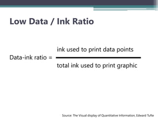
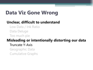
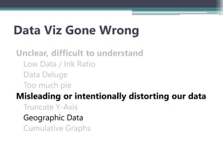
DATA VIZ GONE WRONG
WHAT NOT TO DO
Cory Jez
#DataViz15
San Jose, California
April 29, 2015
About Me
Over 4 years working as a
BI Analyst, Consultant, and Trainer
Tableau Desktop Certified, Tableau
Certified Trainer
Winner: 2014 Tableau Viz as Art
Fantasy Football & Data Viz
Data Viz is all around
Why Data Viz?
- Arthur Schopenhaur
Why Data Viz?
Why Data Viz?
Have you ever seen a “bad” infographic?
Source: @wtfviz
Survey
Unclear, difficult to understand
Low Data / Ink Ratio
Data Deluge
Too much pie
Misleading or intentionally distorting our data
Truncate Y-Axis
Geographic Data
Cumulative Graphs
Data Viz Gone Wrong
Unclear, difficult to understand
Low Data / Ink Ratio
Data Deluge
Too much pie
Misleading or intentionally distorting our data
Truncate Y-Axis
Geographic Data
Cumulative Graphs
Data Viz Gone Wrong
ink used to print data points
Data-ink ratio =
total ink used to print graphic
Source: The Visual display of Quantitative Information, Edward Tufte
Low Data / Ink Ratio
Redundant coloring
Redundant labeling
Background colors
Grid lines
Color legend
Low Data / Ink Ratio
Color signifies team of
interest
Remove axis, one
label for shots
No background
No grid lines
No color legend
Low Data / Ink Ratio
Remove
to
Improve
The Data / Ink Ratio
Unclear, difficult to understand
Low Data / Ink Ratio
Data Deluge
Too much pie
Misleading or intentionally distorting our data
Truncate Y-Axis
Geographic Data
Cumulative Graphs
Data Viz Gone Wrong
A lot of data in a tight space
Color scheme used to be congruent with the flag, not to highlight data
Should data about Americans always be represented by a flag?
All metrics are presented in-line with each other (race, age, citizenship)
Male / Female splits are automatically in 2% buckets (50 stars)
Source: junkcharts.com
Data Deluge
Unclear, difficult to understand
Low Data / Ink Ratio
Data Deluge
Too much pie
Misleading or intentionally distorting our data
Truncate Y-Axis
Geographic Data
Cumulative Graphs
Data Viz Gone Wrong
Source: buzzfeed.com
Too Much Pie
Issues:
Uninformative title
Too many pies make comparisons
difficult
Sort ordering
Names in ALL CAPS
Dem and Rep labels are switched
Not all pies add up to 100%
**You just end up reading numbers**
Source: buzzfeed.com
Too Much Pie
Solutions:
Title is more clear
Stacked bars make comparison
easier
Ordered by positive sentiment
Labeling is aligned
Visually see some bars +/- 100%
**You can visualize the winners/losers
and the trends now**
Pie isn’t always bad….
Unclear, difficult to understand
Low Data / Ink Ratio
Data Deluge
Too much pie
Misleading or intentionally distorting our data
Truncate Y-Axis
Geographic Data
Cumulative Graphs
Data Viz Gone Wrong
How much did R.A. Dickey’s Knuckleball velocity decrease in 2013?
Source: Heap Analytics
Truncated Y-axis
How much has his velocity decreased?
How much did R.A. Dickey’s Knuckleball velocity decrease in 2013?
Source: Heap Analytics
Truncated Y-axis
6% ?
2.6% ?
Source: Heap Analytics
Remove labels & tell the story…
2.6% ?
Source: Robinhood
Remove labels & tell the story…
Unclear, difficult to understand
Low Data / Ink Ratio
Data Deluge
Too much pie
Misleading or intentionally distorting our data
Truncate Y-Axis
Geographic Data
Cumulative Graphs
Data Viz Gone Wrong
Blue or Red? Who won?
Source: wikipedia
Geo’s are not sized by population
Some of the largest places: NYC, Boston
appear very small on a map
Solutions
Use “size” to denote population density
Accompany maps with aggregate data
Interactivity – allow for zooming and filtering
Geo Maps
Blue or Red? Who won?
Source: NY Times
Unclear, difficult to understand
Low Data / Ink Ratio
Data Deluge
Too much pie
Misleading or intentionally distorting our data
Truncate Y-Axis
Geographic Data
Cumulative Graphs
Data Viz Gone Wrong
Source: Heap Analytics
Cumulative Graphs: helpful or
misleading?
Source: Heap Analytics
Cumulative Graphs: helpful or
misleading?
Thanks!
cory.jez1@gmail.com
@jezlax
Linkedin.com/in/coryjez

Data Viz Gone Wrong

  • 1.
    DATA VIZ GONEWRONG WHAT NOT TO DO Cory Jez #DataViz15 San Jose, California April 29, 2015
  • 2.
    About Me Over 4years working as a BI Analyst, Consultant, and Trainer Tableau Desktop Certified, Tableau Certified Trainer Winner: 2014 Tableau Viz as Art Fantasy Football & Data Viz
  • 3.
    Data Viz isall around
  • 4.
    Why Data Viz? -Arthur Schopenhaur
  • 5.
  • 6.
  • 7.
    Have you everseen a “bad” infographic? Source: @wtfviz Survey
  • 8.
    Unclear, difficult tounderstand Low Data / Ink Ratio Data Deluge Too much pie Misleading or intentionally distorting our data Truncate Y-Axis Geographic Data Cumulative Graphs Data Viz Gone Wrong
  • 9.
    Unclear, difficult tounderstand Low Data / Ink Ratio Data Deluge Too much pie Misleading or intentionally distorting our data Truncate Y-Axis Geographic Data Cumulative Graphs Data Viz Gone Wrong
  • 10.
    ink used toprint data points Data-ink ratio = total ink used to print graphic Source: The Visual display of Quantitative Information, Edward Tufte Low Data / Ink Ratio
  • 11.
    Redundant coloring Redundant labeling Backgroundcolors Grid lines Color legend Low Data / Ink Ratio
  • 12.
    Color signifies teamof interest Remove axis, one label for shots No background No grid lines No color legend Low Data / Ink Ratio
  • 13.
  • 14.
    Unclear, difficult tounderstand Low Data / Ink Ratio Data Deluge Too much pie Misleading or intentionally distorting our data Truncate Y-Axis Geographic Data Cumulative Graphs Data Viz Gone Wrong
  • 16.
    A lot ofdata in a tight space Color scheme used to be congruent with the flag, not to highlight data Should data about Americans always be represented by a flag? All metrics are presented in-line with each other (race, age, citizenship) Male / Female splits are automatically in 2% buckets (50 stars) Source: junkcharts.com Data Deluge
  • 17.
    Unclear, difficult tounderstand Low Data / Ink Ratio Data Deluge Too much pie Misleading or intentionally distorting our data Truncate Y-Axis Geographic Data Cumulative Graphs Data Viz Gone Wrong
  • 18.
    Source: buzzfeed.com Too MuchPie Issues: Uninformative title Too many pies make comparisons difficult Sort ordering Names in ALL CAPS Dem and Rep labels are switched Not all pies add up to 100% **You just end up reading numbers**
  • 19.
    Source: buzzfeed.com Too MuchPie Solutions: Title is more clear Stacked bars make comparison easier Ordered by positive sentiment Labeling is aligned Visually see some bars +/- 100% **You can visualize the winners/losers and the trends now**
  • 20.
  • 21.
    Unclear, difficult tounderstand Low Data / Ink Ratio Data Deluge Too much pie Misleading or intentionally distorting our data Truncate Y-Axis Geographic Data Cumulative Graphs Data Viz Gone Wrong
  • 22.
    How much didR.A. Dickey’s Knuckleball velocity decrease in 2013? Source: Heap Analytics Truncated Y-axis How much has his velocity decreased?
  • 23.
    How much didR.A. Dickey’s Knuckleball velocity decrease in 2013? Source: Heap Analytics Truncated Y-axis 6% ?
  • 24.
    2.6% ? Source: HeapAnalytics Remove labels & tell the story…
  • 25.
    2.6% ? Source: Robinhood Removelabels & tell the story…
  • 26.
    Unclear, difficult tounderstand Low Data / Ink Ratio Data Deluge Too much pie Misleading or intentionally distorting our data Truncate Y-Axis Geographic Data Cumulative Graphs Data Viz Gone Wrong
  • 27.
    Blue or Red?Who won? Source: wikipedia
  • 28.
    Geo’s are notsized by population Some of the largest places: NYC, Boston appear very small on a map Solutions Use “size” to denote population density Accompany maps with aggregate data Interactivity – allow for zooming and filtering Geo Maps
  • 29.
    Blue or Red?Who won? Source: NY Times
  • 30.
    Unclear, difficult tounderstand Low Data / Ink Ratio Data Deluge Too much pie Misleading or intentionally distorting our data Truncate Y-Axis Geographic Data Cumulative Graphs Data Viz Gone Wrong
  • 31.
    Source: Heap Analytics CumulativeGraphs: helpful or misleading?
  • 32.
    Source: Heap Analytics CumulativeGraphs: helpful or misleading?
  • 34.

Editor's Notes

  • #19 Article done on Buzzfeed