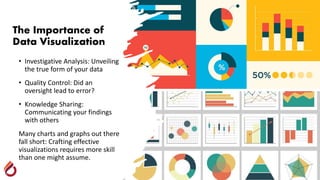
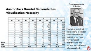
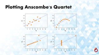
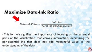
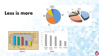
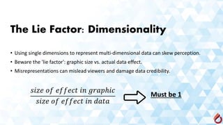
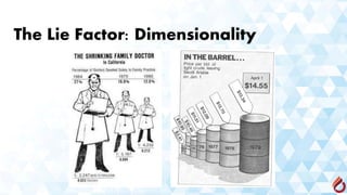
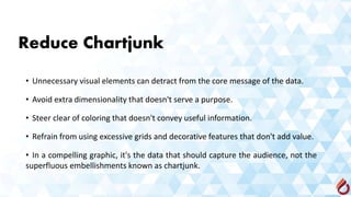
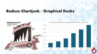
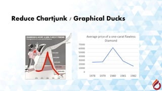
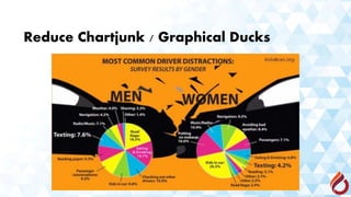
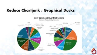
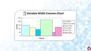
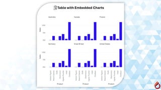
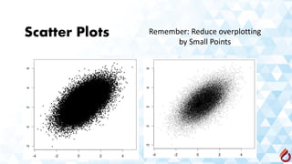
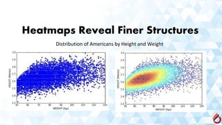
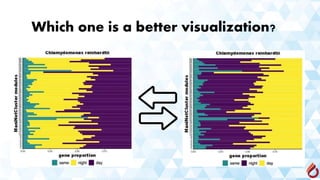
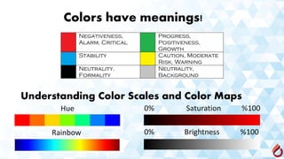
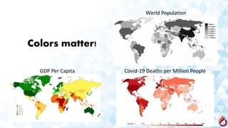
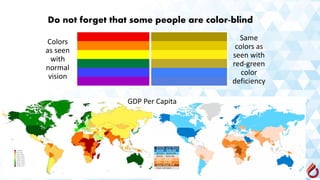
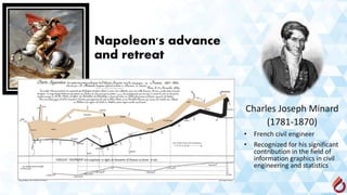
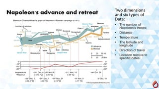
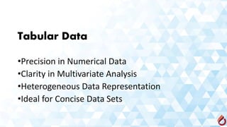
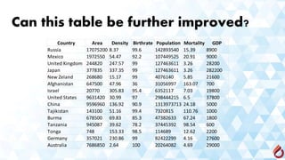
By:
Asst. Prof. Dr. Kian Jazayeri
The Importance of
Data Visualization
• Investigative Analysis: Unveiling
the true form of your data
• Quality Control: Did an
oversight lead to error?
• Knowledge Sharing:
Communicating your findings
with others
Many charts and graphs out there
fall short: Crafting effective
visualizations requires more skill
than one might assume.
I II III IV
X1 Y1 X2 Y2 X3 Y3 X4 Y4
10 8.04 10 9.14 10 7.46 8 6.58
8 6.95 8 8.14 8 6.77 8 5.76
13 7.58 13 8.74 13 12.74 8 7.71
9 8.81 9 8.77 9 7.11 8 8.84
11 8.33 11 9.26 11 7.81 8 8.47
14 9.96 14 8.1 14 8.84 8 7.04
6 7.24 6 6.13 6 6.08 8 5.25
4 4.26 4 3.1 4 5.39 19 12.5
12 10.84 12 9.13 12 8.15 8 5.56
7 4.82 7 7.26 7 6.42 8 7.91
5 5.68 5 4.74 5 5.73 8 6.89
MEAN 9 7.5 9 7.5 9 7.5 9 7.5
VAR 10 3.75 10 3.75 10 3.75 10 3.75
CORR. 8.16 8.16 8.16 8.16
Anscombe's Quartet Demonstrates
Visualization Necessity
Four data sets that
have nearly identical
simple descriptive
statistics, yet have
very different
distributions and
appear very different
when graphed.
Francis Anscombe
1918-2001
Plotting Anscombe's Quartet
Appreciating Art: Which One is Better?
Salvator Mundi (Latin for 'Savior of the World')
Artist Leonardo da Vinci
Year 1499–1510
Type Oil on walnut panel
Dimensions 45.7 cm × 65.7 cm
Sold for
US$ 450.3 Million
Number 17A
Artist Jackson Pollock
Year 1948
Type Oil paint on
fiberboard
Dimensions 112 cm × 86.5 cm
Sold for
US$ 200 Million
Sensible appreciation of art
requires developing a
particular visual aesthetic.
Appreciating Data Visualization Art
• Cultivate design sensibility and specialized vocabulary.
• Balance visual appeal with clear data interpretation.
• Merge artistic creativity and analytical precision for
impactful storytelling.
Tufte's Visualization
Aesthetic
•Maximize data ink-ratio
•Minimize lie factor
•Minimize chartjunk
•Use proper scales and clear
labeling
• Edward Rolf Tufte
• (Born 1942 -age 82)
• Also known as "ET", is an
American statistician and professor
emeritus of political science,
statistics, and computer science at
Yale University.
• He is noted as a pioneer in the
field of data visualization.
Maximize Data-Ink Ratio
• This formula signifies the importance of focusing on the essential
parts of the visualization that convey information, minimizing the
non-essential ink that does not add meaningful value to the
understanding of the data.
Less is more
The Lie Factor: Dimensionality
• Using single dimensions to represent multi-dimensional data can skew perception.
• Beware the 'lie factor': graphic size vs. actual data effect.
• Misrepresentations can mislead viewers and damage data credibility.
Must be 1
The Lie Factor: Dimensionality
Graphical Integrity: Scale Distortion
• Always start bar graphs at zero to avoid misrepresenting the data.
• Always properly label your axes to provide clear context for the
data displayed.
• Use continuous scales that are either linear or clearly labeled to
ensure the data's proportions are accurately represented.
Graphical Integrity: Scale Distortion
Aspect Ratios and Lie Factors
• The steepness of apparent cliffs in a chart is
influenced by the aspect ratio of the chart.
• It is recommended to target a 45-degree
angle for trend lines or to use the Golden Ratio
(approximately 1.618) for the most accurate
and interpretable visual representation.
Aspect Ratios and Lie Factors
Reduce Chartjunk
• Unnecessary visual elements can detract from the core message of the data.
• Avoid extra dimensionality that doesn't serve a purpose.
• Steer clear of coloring that doesn't convey useful information.
• Refrain from using excessive grids and decorative features that don't add value.
• In a compelling graphic, it's the data that should capture the audience, not the
superfluous embellishments known as chartjunk.
Reduce Chartjunk / Graphical Ducks
The term "ducks" is borrowed
a duck-shaped building that
sold ducks and duck-related
products.
Reduce Chartjunk / Graphical Ducks
Let’s play a game!
There are two different visualizations of the same data in the
next two slides. Look at each visualization for 10 seconds and
try to conclude what each visualization conveys.
0%
10%
20%
30%
40%
50%
60%
70%
Free & Rest
Time
Sports
and/or a
Hobby
Time with
Friends
Time with
Family
Community
&
Volunteer
Work
Further
Education
and
Keeping Up
with
Current
Events
Nothing at
all
WHAT ENTREPRENEURS SCARIFICED
TO START THEIR OWN BUSINESS
The 10-Second Rule
A good data visualization should allow different
people to come to the same conclusion about the
data in 10 seconds or less!
Chart
Suggestions
Dr. Andrew Abela
1965 (age 58 years)
• Chairman of the
Department of
Business &
Economics at the
Catholic University of
America in
Washington, DC
• Associate professor
of marketing
Data Maps and Cartograms
Cartograms distort regions to reflect an underlying variable
Scatter Plots Remember: Reduce overplotting
by Small Points
Heatmaps Reveal Finer Structures
Distribution of Americans by Height and Weight
Which one is a better visualization?
Colors have meanings!
Understanding Color Scales and Color Maps
Hue
Rainbow
0% Saturation %100
0% Brightness %100
Colors matter!
GDP Per Capita Covid-19 Deaths per Million People
World Population
Do not forget that some people are color-blind
GDP Per Capita
Colors
as seen
with
normal
vision
Same
colors as
seen with
red-green
color
deficiency
Exceptions!
Exceptions!
Do you remember this painting?
Do you see anything meaningful here?
Marey’s Train Schedule
Étienne-Jules Marey
(1830-1904)
French scientist,
physiologist and
chronophotographer
Marey’s Train Schedule
Never Imprison
Your Data!
Can be further enhanced with a lighter data grid
Charles Joseph Minard
(1781-1870)
• French civil engineer
• Recognized for his significant
contribution in the field of
information graphics in civil
engineering and statistics
Napoleon's advance
and retreat
Napoleon's advance and retreat Two dimensions
and six types of
Data:
• The number of
Napoleon's troops;
• Distance
• Temperature
• The latitude and
longitude
• Direction of travel
• Location relative to
specific dates
Tabular Data
•Precision in Numerical Data
•Clarity in Multivariate Analysis
•Heterogeneous Data Representation
•Ideal for Concise Data Sets
Can this table be further improved?
Country Area Density Birthrate Population Mortality GDP
Russia 17075200 8.37 99.6 142893540 15.39 8900
Mexico 1972550 54.47 92.2 107449525 20.91 9000
United Kingdom 244820 247.57 99 127463611 3.26 28200
Japan 377835 337.35 99 127463611 3.26 282200
New Zeland 268680 15.17 99 4076140 5.85 21600
Afghanistan 647500 47.96 36 31056997 163.07 700
Israel 20770 305.83 95.4 6352117 7.03 19800
United States 9631420 30.99 97 298444215 6.5 37800
China 9596960 136.92 90.9 1313973713 24.18 5000
Tajikistan 143100 51.16 99.4 7320815 110.76 1000
Burma 678500 69.83 85.3 47382633 67.24 1800
Tanzania 945087 39.62 78.2 37445392 98.54 600
Tonga 748 153.33 98.5 114689 12.62 2200
Germany 357021 230.86 99 82422299 4.16 27600
Australia 7686850 2.64 100 20264082 4.69 29000
How to Improve Tabular Data
•Facilitate Comparisons with Row Ordering
•Prioritize Data with Column Sequencing
•Align Numbers for Precision
•Highlight Key Data with Styling (bold, italic, color)
•Avoid excessive-length column descriptions
Improved Tabular Presentation
Country Population Area Density Mortality GDP Birthrate
Afghanistan 31,056,997 647,500 48.0 163.1 700 36.0
Australia 20,264,082 7,686,850 2.6 4.7 29,000 100.0
Burma 47,382,633 678,500 69.8 67.2 1,800 85.3
China 1,313,973,713 9,596,960 136.9 24.2 5,000 90.9
Germany 82,422,299 357,021 230.9 4.2 27,600 99.0
Israel 6,352,117 20,770 305.8 7.0 19,800 95.4
Japan 127,463,611 377,835 337.4 3.3 28,200 99.0
Mexico 107,449,525 1,972,550 54.5 20.9 9,000 92.2
New Zeland 4,076,140 268,680 15.2 5.9 21,600 99.0
Russia 142,893,540 17,075,200 8.4 15.4 8,900 99.6
Tajikistan 7,320,815 143,100 51.2 110.8 1,000 99.4
Tanzania 37,445,392 945,087 39.6 98.5 600 78.2
Tonga 114,689 748 153.3 12.6 2,200 98.5
United Kingdom 127,463,611 244,820 247.6 3.3 28,200 99.0
United States 298,444,215 9,631,420 31.0 6.5 37,800 97.0
Can you simplify this plot?
Principles and Practices of Data Visualization

Principles and Practices of Data Visualization

  • 1.
    By: Asst. Prof. Dr.Kian Jazayeri
  • 2.
    The Importance of DataVisualization • Investigative Analysis: Unveiling the true form of your data • Quality Control: Did an oversight lead to error? • Knowledge Sharing: Communicating your findings with others Many charts and graphs out there fall short: Crafting effective visualizations requires more skill than one might assume.
  • 3.
    I II IIIIV X1 Y1 X2 Y2 X3 Y3 X4 Y4 10 8.04 10 9.14 10 7.46 8 6.58 8 6.95 8 8.14 8 6.77 8 5.76 13 7.58 13 8.74 13 12.74 8 7.71 9 8.81 9 8.77 9 7.11 8 8.84 11 8.33 11 9.26 11 7.81 8 8.47 14 9.96 14 8.1 14 8.84 8 7.04 6 7.24 6 6.13 6 6.08 8 5.25 4 4.26 4 3.1 4 5.39 19 12.5 12 10.84 12 9.13 12 8.15 8 5.56 7 4.82 7 7.26 7 6.42 8 7.91 5 5.68 5 4.74 5 5.73 8 6.89 MEAN 9 7.5 9 7.5 9 7.5 9 7.5 VAR 10 3.75 10 3.75 10 3.75 10 3.75 CORR. 8.16 8.16 8.16 8.16 Anscombe's Quartet Demonstrates Visualization Necessity Four data sets that have nearly identical simple descriptive statistics, yet have very different distributions and appear very different when graphed. Francis Anscombe 1918-2001
  • 4.
  • 5.
  • 6.
    Salvator Mundi (Latinfor 'Savior of the World') Artist Leonardo da Vinci Year 1499–1510 Type Oil on walnut panel Dimensions 45.7 cm × 65.7 cm Sold for US$ 450.3 Million
  • 7.
    Number 17A Artist JacksonPollock Year 1948 Type Oil paint on fiberboard Dimensions 112 cm × 86.5 cm Sold for US$ 200 Million Sensible appreciation of art requires developing a particular visual aesthetic.
  • 8.
    Appreciating Data VisualizationArt • Cultivate design sensibility and specialized vocabulary. • Balance visual appeal with clear data interpretation. • Merge artistic creativity and analytical precision for impactful storytelling.
  • 9.
    Tufte's Visualization Aesthetic •Maximize dataink-ratio •Minimize lie factor •Minimize chartjunk •Use proper scales and clear labeling • Edward Rolf Tufte • (Born 1942 -age 82) • Also known as "ET", is an American statistician and professor emeritus of political science, statistics, and computer science at Yale University. • He is noted as a pioneer in the field of data visualization.
  • 10.
    Maximize Data-Ink Ratio •This formula signifies the importance of focusing on the essential parts of the visualization that convey information, minimizing the non-essential ink that does not add meaningful value to the understanding of the data.
  • 11.
  • 12.
    The Lie Factor:Dimensionality • Using single dimensions to represent multi-dimensional data can skew perception. • Beware the 'lie factor': graphic size vs. actual data effect. • Misrepresentations can mislead viewers and damage data credibility. Must be 1
  • 13.
    The Lie Factor:Dimensionality
  • 14.
    Graphical Integrity: ScaleDistortion • Always start bar graphs at zero to avoid misrepresenting the data. • Always properly label your axes to provide clear context for the data displayed. • Use continuous scales that are either linear or clearly labeled to ensure the data's proportions are accurately represented.
  • 15.
  • 16.
  • 17.
    Aspect Ratios andLie Factors • The steepness of apparent cliffs in a chart is influenced by the aspect ratio of the chart. • It is recommended to target a 45-degree angle for trend lines or to use the Golden Ratio (approximately 1.618) for the most accurate and interpretable visual representation.
  • 18.
    Aspect Ratios andLie Factors
  • 19.
    Reduce Chartjunk • Unnecessaryvisual elements can detract from the core message of the data. • Avoid extra dimensionality that doesn't serve a purpose. • Steer clear of coloring that doesn't convey useful information. • Refrain from using excessive grids and decorative features that don't add value. • In a compelling graphic, it's the data that should capture the audience, not the superfluous embellishments known as chartjunk.
  • 20.
    Reduce Chartjunk /Graphical Ducks The term "ducks" is borrowed a duck-shaped building that sold ducks and duck-related products.
  • 21.
    Reduce Chartjunk /Graphical Ducks
  • 22.
    Reduce Chartjunk /Graphical Ducks
  • 23.
    Reduce Chartjunk /Graphical Ducks
  • 24.
    Reduce Chartjunk /Graphical Ducks
  • 25.
    Let’s play agame! There are two different visualizations of the same data in the next two slides. Look at each visualization for 10 seconds and try to conclude what each visualization conveys.
  • 27.
    0% 10% 20% 30% 40% 50% 60% 70% Free & Rest Time Sports and/ora Hobby Time with Friends Time with Family Community & Volunteer Work Further Education and Keeping Up with Current Events Nothing at all WHAT ENTREPRENEURS SCARIFICED TO START THEIR OWN BUSINESS
  • 28.
    The 10-Second Rule Agood data visualization should allow different people to come to the same conclusion about the data in 10 seconds or less!
  • 29.
    Chart Suggestions Dr. Andrew Abela 1965(age 58 years) • Chairman of the Department of Business & Economics at the Catholic University of America in Washington, DC • Associate professor of marketing
  • 52.
    Data Maps andCartograms Cartograms distort regions to reflect an underlying variable
  • 53.
    Scatter Plots Remember:Reduce overplotting by Small Points
  • 54.
    Heatmaps Reveal FinerStructures Distribution of Americans by Height and Weight
  • 55.
    Which one isa better visualization?
  • 56.
    Colors have meanings! UnderstandingColor Scales and Color Maps Hue Rainbow 0% Saturation %100 0% Brightness %100
  • 57.
    Colors matter! GDP PerCapita Covid-19 Deaths per Million People World Population
  • 58.
    Do not forgetthat some people are color-blind GDP Per Capita Colors as seen with normal vision Same colors as seen with red-green color deficiency
  • 59.
  • 60.
  • 61.
    Do you rememberthis painting?
  • 62.
    Do you seeanything meaningful here?
  • 63.
    Marey’s Train Schedule Étienne-JulesMarey (1830-1904) French scientist, physiologist and chronophotographer
  • 64.
    Marey’s Train Schedule NeverImprison Your Data! Can be further enhanced with a lighter data grid
  • 65.
    Charles Joseph Minard (1781-1870) •French civil engineer • Recognized for his significant contribution in the field of information graphics in civil engineering and statistics Napoleon's advance and retreat
  • 66.
    Napoleon's advance andretreat Two dimensions and six types of Data: • The number of Napoleon's troops; • Distance • Temperature • The latitude and longitude • Direction of travel • Location relative to specific dates
  • 67.
    Tabular Data •Precision inNumerical Data •Clarity in Multivariate Analysis •Heterogeneous Data Representation •Ideal for Concise Data Sets
  • 68.
    Can this tablebe further improved? Country Area Density Birthrate Population Mortality GDP Russia 17075200 8.37 99.6 142893540 15.39 8900 Mexico 1972550 54.47 92.2 107449525 20.91 9000 United Kingdom 244820 247.57 99 127463611 3.26 28200 Japan 377835 337.35 99 127463611 3.26 282200 New Zeland 268680 15.17 99 4076140 5.85 21600 Afghanistan 647500 47.96 36 31056997 163.07 700 Israel 20770 305.83 95.4 6352117 7.03 19800 United States 9631420 30.99 97 298444215 6.5 37800 China 9596960 136.92 90.9 1313973713 24.18 5000 Tajikistan 143100 51.16 99.4 7320815 110.76 1000 Burma 678500 69.83 85.3 47382633 67.24 1800 Tanzania 945087 39.62 78.2 37445392 98.54 600 Tonga 748 153.33 98.5 114689 12.62 2200 Germany 357021 230.86 99 82422299 4.16 27600 Australia 7686850 2.64 100 20264082 4.69 29000
  • 69.
    How to ImproveTabular Data •Facilitate Comparisons with Row Ordering •Prioritize Data with Column Sequencing •Align Numbers for Precision •Highlight Key Data with Styling (bold, italic, color) •Avoid excessive-length column descriptions
  • 70.
    Improved Tabular Presentation CountryPopulation Area Density Mortality GDP Birthrate Afghanistan 31,056,997 647,500 48.0 163.1 700 36.0 Australia 20,264,082 7,686,850 2.6 4.7 29,000 100.0 Burma 47,382,633 678,500 69.8 67.2 1,800 85.3 China 1,313,973,713 9,596,960 136.9 24.2 5,000 90.9 Germany 82,422,299 357,021 230.9 4.2 27,600 99.0 Israel 6,352,117 20,770 305.8 7.0 19,800 95.4 Japan 127,463,611 377,835 337.4 3.3 28,200 99.0 Mexico 107,449,525 1,972,550 54.5 20.9 9,000 92.2 New Zeland 4,076,140 268,680 15.2 5.9 21,600 99.0 Russia 142,893,540 17,075,200 8.4 15.4 8,900 99.6 Tajikistan 7,320,815 143,100 51.2 110.8 1,000 99.4 Tanzania 37,445,392 945,087 39.6 98.5 600 78.2 Tonga 114,689 748 153.3 12.6 2,200 98.5 United Kingdom 127,463,611 244,820 247.6 3.3 28,200 99.0 United States 298,444,215 9,631,420 31.0 6.5 37,800 97.0
  • 71.
    Can you simplifythis plot?
  • 72.
    Can you simplifythis plot?
  • 73.
    Can you simplifythis plot?
  • 74.
    Can you simplifythis plot?
  • 75.
    Can you simplifythis plot?