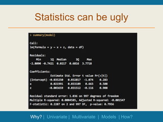
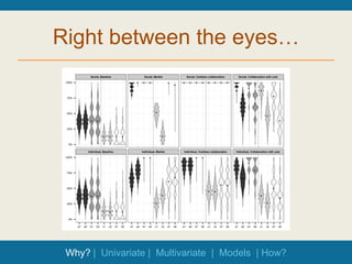
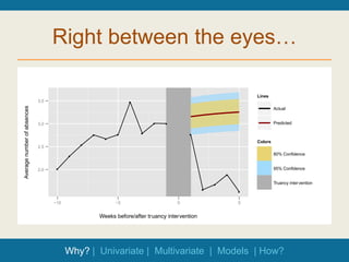
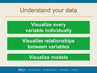
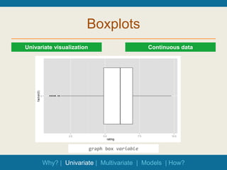
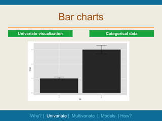
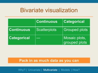
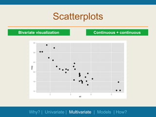
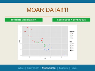
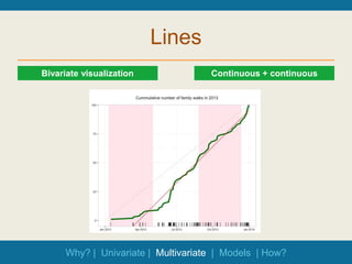
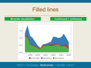
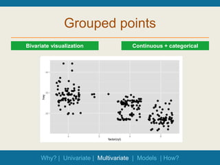
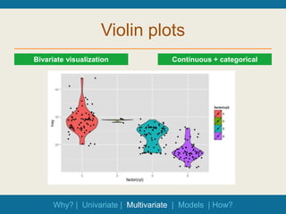
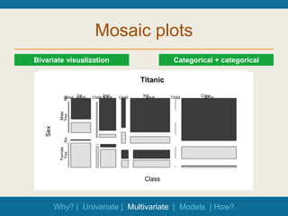
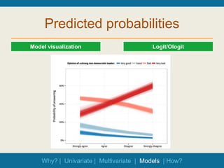
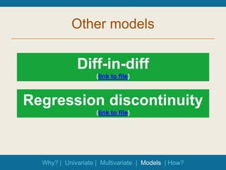
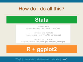
Data Visualization &
Exploratory Data
Analysis
Statistics can be ugly
Why? | Univariate | Multivariate | Models | How?
Numbers are scary
Why? | Univariate | Multivariate | Models | How?
Walls of numbers
Why? | Univariate | Multivariate | Models | How?
Exploratory Data Analysis
“Interocular
traumatic impact”
Enhance probabilistic analysis
Check shape and assumptions
Why? | Univariate | Multivariate | Models | How?
Right between the eyes…
● ● ● ●
● ● ● ●
●
● ● ●
●
●
●
●
● ● ● ● ● ● ● ●
●
●
●
●
●
●
●
●
● ● ● ●
● ● ● ●
●
●
● ●
●
●
●
●
● ●
● ●
● ●
● ●
●
●
●
●
●
●
●
●
Social, Baseline Social, Market Social, Costless collaboration Social, Collaboration with cost
Individual, Baseline Individual, Market Individual, Costless collaboration Individual, Collaboration with cost
0%
25%
50%
75%
100%
0%
25%
50%
75%
100%
a1 a2 b1 b2 c1 c2 d1 d2 a1 a2 b1 b2 c1 c2 d1 d2 a1 a2 b1 b2 c1 c2 d1 d2 a1 a2 b1 b2 c1 c2 d1 d2
Why? | Univariate | Multivariate | Models | How?
Right between the eyes…
2.0
2.5
3.0
3.5
●
●
●
●
●
●
●
●
●
●
●
●
●
●
●
−10 −5 0 5
Weeks before/after truancy intervention
Average
number
of
absences
Lines
Actual
Predicted
Colors
80% Confidence
95% Confidence
Truancy intervention
Why? | Univariate | Multivariate | Models | How?
Right between the eyes…
Why? | Univariate | Multivariate | Models | How?
Understand your data
Visualize every
variable individually
Visualize relationships
between variables
Why? | Univariate | Multivariate | Models | How?
Visualize models
Boxplots
Continuous data
Univariate visualization
graph box variable
Why? | Univariate | Multivariate | Models | How?
Histograms
Continuous data
Univariate visualization
histogram variable
Why? | Univariate | Multivariate | Models | How?
Density plots
Continuous data
Univariate visualization
kdensity variable
Why? | Univariate | Multivariate | Models | How?
Bar charts
Categorical data
Univariate visualization
Why? | Univariate | Multivariate | Models | How?
Bivariate visualization
Continuous Categorical
Continuous Scatterplots Grouped plots
Categorical — Mosaic plots,
grouped plots
Pack in as much data as you can
Why? | Univariate | Multivariate | Models | How?
Scatterplots
Continuous + continuous
Bivariate visualization
Why? | Univariate | Multivariate | Models | How?
MOAR DATA!!1!
Continuous + continuous
Bivariate visualization
Why? | Univariate | Multivariate | Models | How?
Lines
Continuous + continuous
Bivariate visualization
Why? | Univariate | Multivariate | Models | How?
Filled lines
Continuous + continuous
Bivariate visualization
0.0%
2.5%
5.0%
7.5%
Jan 2012 Apr 2012 Jul 2012 Oct 2012 Jan 2013 Apr 2013
Al−Ahram English Daily News Egypt Egypt Independent
Why? | Univariate | Multivariate | Models | How?
Grouped points
Continuous + categorical
Bivariate visualization
Why? | Univariate | Multivariate | Models | How?
Violin plots
Continuous + categorical
Bivariate visualization
Why? | Univariate | Multivariate | Models | How?
Mosaic plots
Categorical + categorical
Bivariate visualization
Why? | Univariate | Multivariate | Models | How?
Scatterplot matrices
Regression
Model diagnostics
Why? | Univariate | Multivariate | Models | How?
Coefficient plots
Regression
Model visualization
Why? | Univariate | Multivariate | Models | How?
Predicted probabilities
Logit/Ologit
Model visualization
Why? | Univariate | Multivariate | Models | How?
Other models
Why? | Univariate | Multivariate | Models | How?
Diff-in-diff
(link to file)
Regression discontinuity
(link to file)
How do I do all this?
Stata
R + ggplot2
sysuse auto
graph box mpg, by(rep78, cols(2))
install ssc vioplot
vioplot mpg, over(rep78) horizontal
install ssc catplot
catplot rep78, by(foreign) percent(foreign)
Why? | Univariate | Multivariate | Models | How?
How do I do all this?
Why? | Univariate | Multivariate | Models | How?
Ask for help!
Go make
pretty pictures.

Data visualization old.pptx

Editor's Notes

  • #4 How many of you read an article with regression coefficients in it in the past few days? Can you tell me what one of those coefficients was?
  • #6 John Tukey, William S. Cleveland, Joseph Berkson – “Sometimes visualization can fully replace the need for probabilistic inference. We visualize the data effectively and suddenly, there is what Joseph Berkson called interocular traumatic impact: a conclusion that hits us between the two eyes” (via http://development.thinkingwithdata.com/show.php?p=workshop.html)
  • #10 Before you run any models, check all the variables you’re using
  • #11 Shows important parts of the 5-number summary – quartiles + median + outliers (1.5 IQR, 1st–3rd quartiles)
  • #12 Sticks things in bins, but is dependent on the number of bins
  • #13 Better, shows a kernel density estimate of the data – better for seeing the actual distribution – best for continuous data
  • #14 Bar charts – must start at 0, must not be connected (otherwise it’s a histogram) – good for categorical data
  • #16 Standard visualization
  • #17 Add other parts of your data to get a better understanding of what’s going on qsec = ¼ mile time
  • #18 Add other parts of your data to get a better understanding of what’s going on qsec = ¼ mile time
  • #20 Add other parts of your data to get a better understanding of what’s going on – better than bar charts, since you can see all the data (bars hide the distribution)
  • #23 For collinearity
  • #25 Nobody understands odds ratios. Convert them to predicted probabilities and plot them
  • #26 Show stuff from PDFs?
  • #27 Stata menus are incredibly useful and contain pretty much every option you need to graph 80%ish of the stuff here. But Stata is not the greatest thing out there for graphics – it’s been discussed on their mailing lists R produces publication-worthy graphics, especially with the ggplot2 package – based on the Grammar of Graphics, lets you add layers of data, get really dense, beautiful plots R is another statistical programming language, but it’s fairly intuitive (and free and open source!). Plus you can technically do all your data cleaning and analysis in Stata and then just graph stuff in R – you just have to learn the basics of ggplot to get things working
  • #28 Stata menus are incredibly useful and contain pretty much every option you need to graph 80%ish of the stuff here. But Stata is not the greatest thing out there for graphics – it’s been discussed on their mailing lists R produces publication-worthy graphics, especially with the ggplot2 package – based on the Grammar of Graphics, lets you add layers of data, get really dense, beautiful plots R is another statistical programming language, but it’s fairly intuitive (and free and open source!). Plus you can technically do all your data cleaning and analysis in Stata and then just graph stuff in R – you just have to learn the basics of ggplot to get things working