Download to read offline


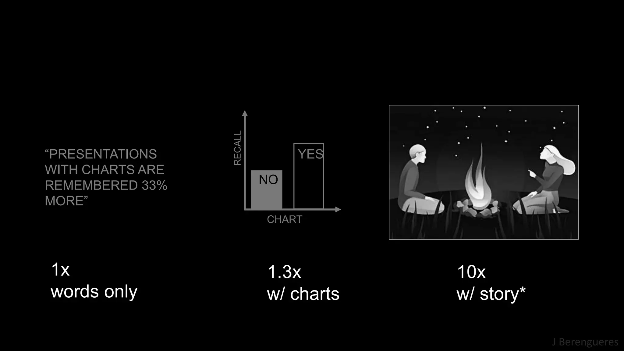


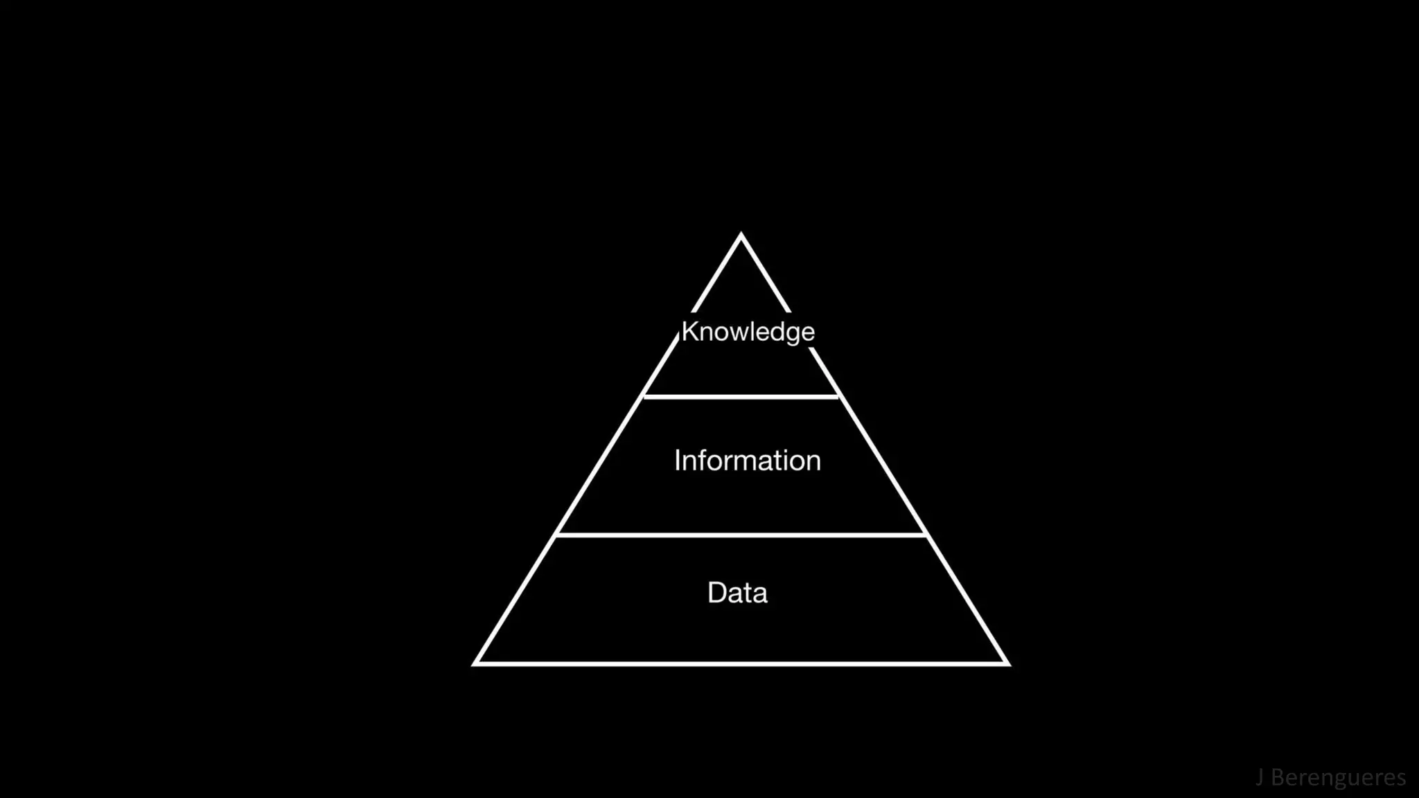
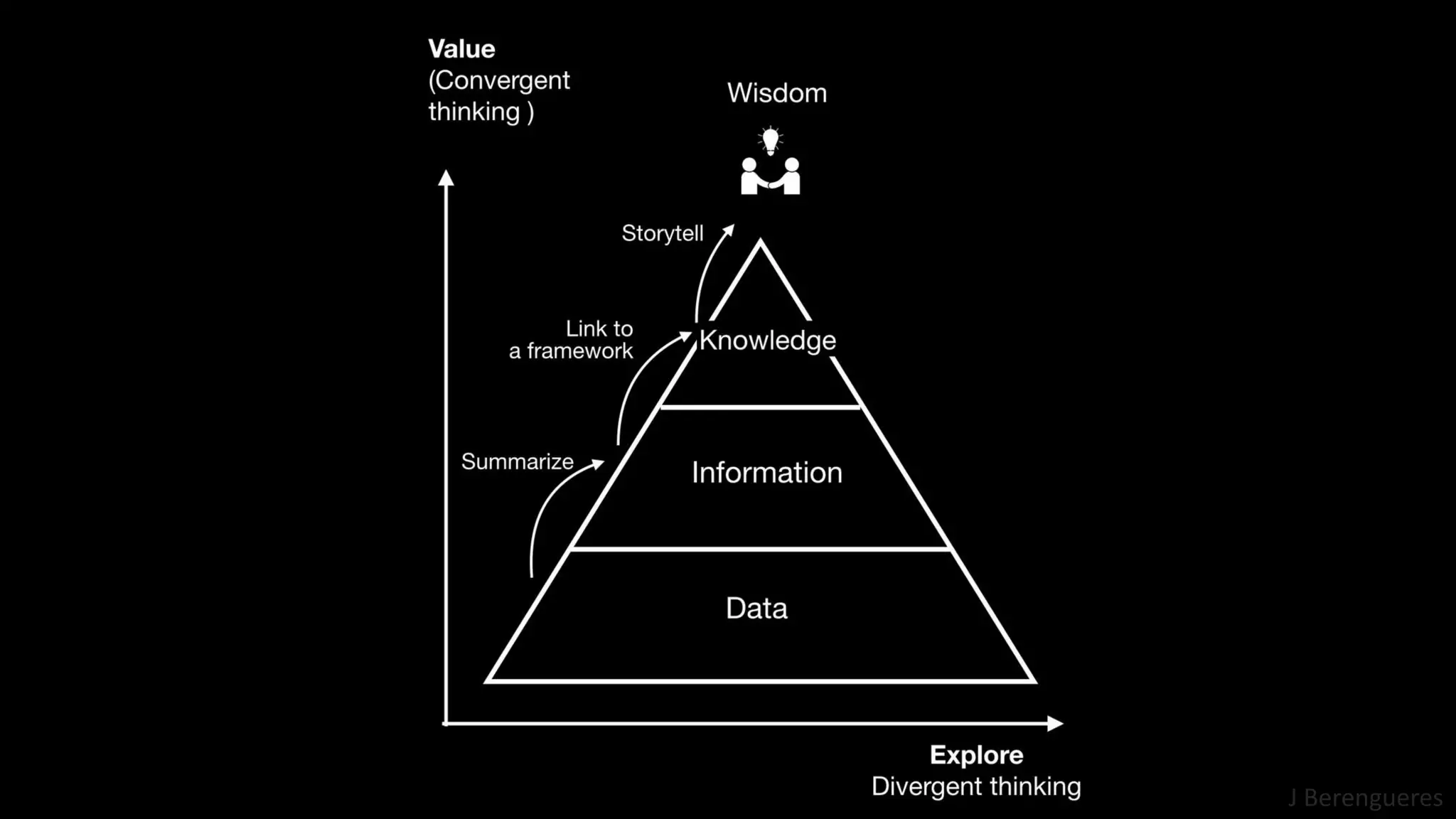


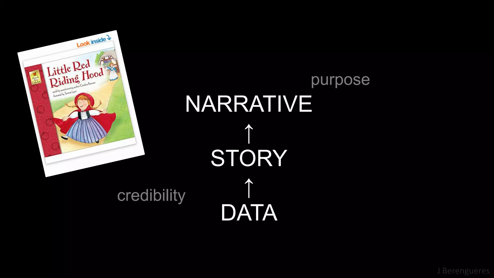


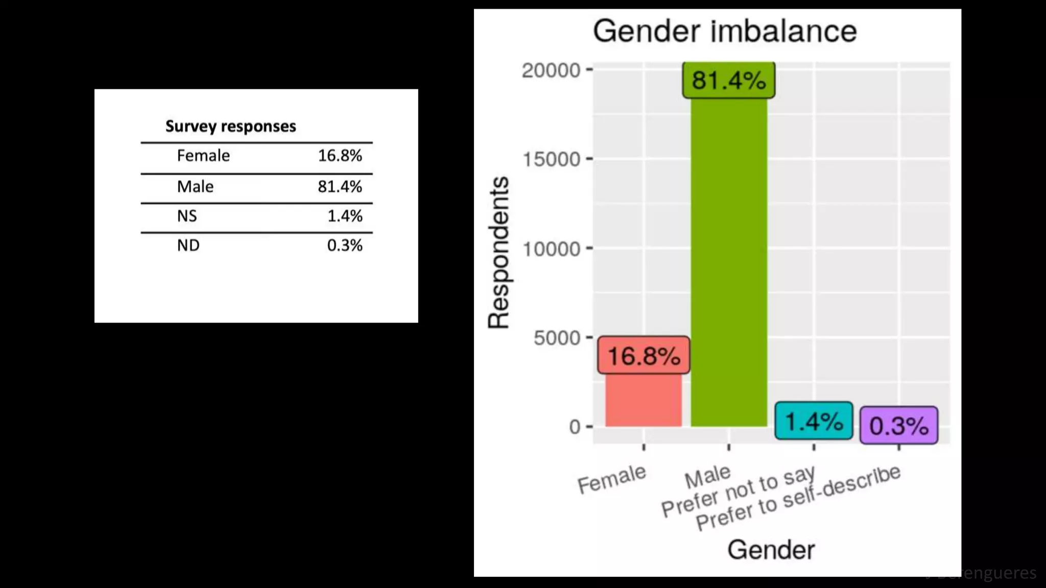


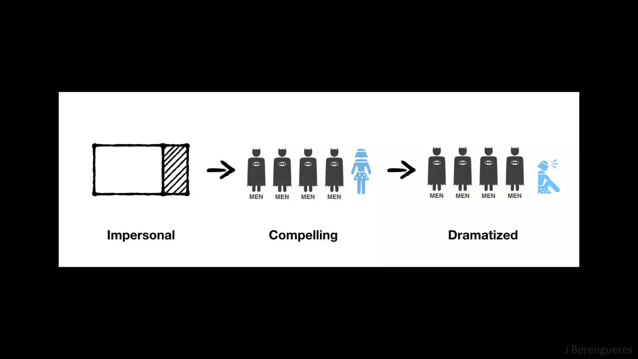


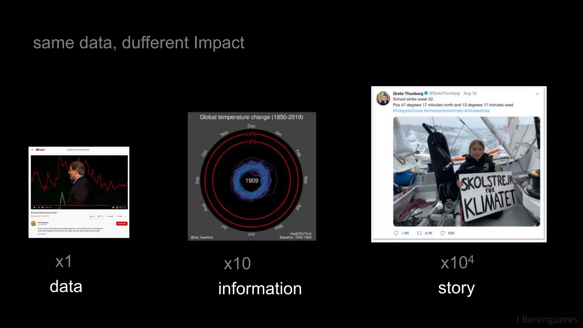


The document discusses principles of data visualization for enhancing policy decision-making, emphasizing storytelling in presentations with charts to improve retention. It outlines six key rules: tell a story, differentiate data from information, create knowledge, make it memorable, use narratives, and choose compatible charts. The author references previous works and examples to illustrate the importance of effective data communication.


![[0204]joohee](https://cdn.slidesharecdn.com/ss_thumbnails/0204joohee-200316024243-thumbnail.jpg?width=640&height=640&fit=bounds)


