Download to read offline


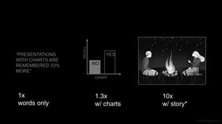


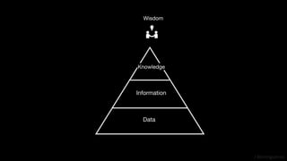
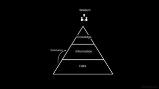
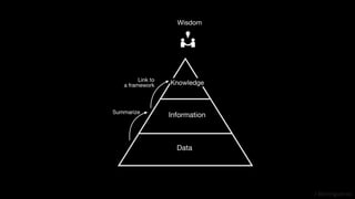
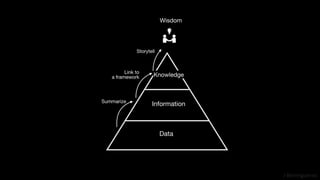
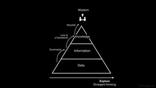
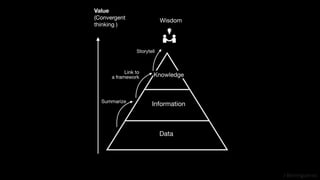


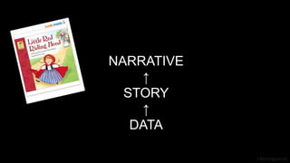
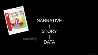
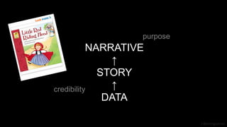


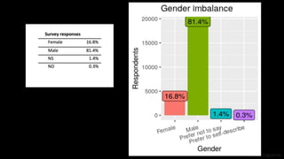

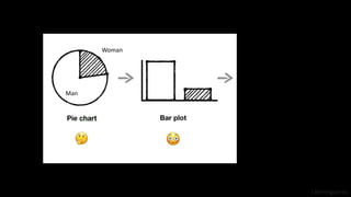
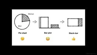


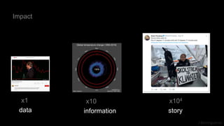


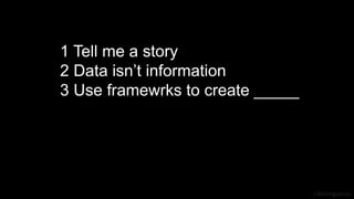
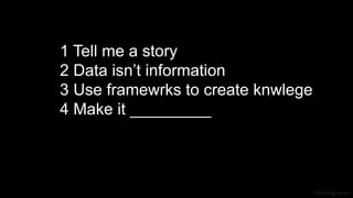
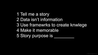
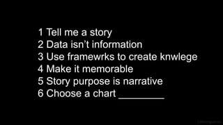
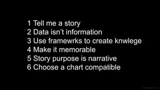


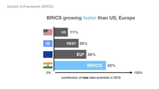
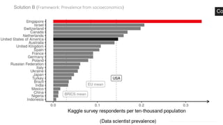
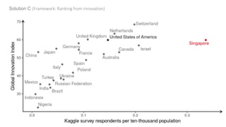

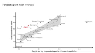


The document discusses storytelling through data visualization, emphasizing the importance of transforming data into meaningful information and knowledge. It outlines six key rules for effective data presentation, including the necessity of telling a story, making content memorable, and using compatible charts. Additionally, it highlights the progression from data to information to knowledge and suggests frameworks for creating impactful visual narratives.


