Responsive Design
•Download as KEY, PDF•
1 like•1,160 views

The document discusses responsive web design, which coordinates design and development based on screen size, platform, and orientation. It involves flexible grids, images, and media that adapt to different screen sizes using percentages and max-width properties. Media queries allow customizing presentations for specific device widths and features using CSS or stylesheets. The need for responsive design is shown through data on growing mobile usage and visitors who leave mobile-unfriendly sites. Separate mobile sites are discouraged due to complex content and link management required. Responsive design provides a flexible layout that adapts to different devices using fluid grids, flexible images and media, and media queries.

Recommended
Recommended
More Related Content
Similar to Responsive Design
Similar to Responsive Design (20)
Recently uploaded
Recently uploaded (20)
Responsive Design
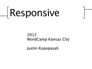
- 1. Responsive 2012 WordCamp Kansas City Justin Kopepasah
- 2. Responsive An approach to web design that coordinates design and development around a user’s behavior and environment based on screen size, platform and orientation. Responding to your user’s needs.
- 3. Responsive Flexible Grids (Smith)
- 4. Responsive Flexible Images & Media
- 5. Responsive Flexible Images & Media (Tabone, 2012)
- 6. Responsive Media Queries “A media query consists of a media type and zero or more expressions that check for the conditions of particular media features. Among the media features that can be used in media queries are ‘width’, ‘height’, and ‘color’. By using media queries, presentations can be tailored to a specific range of output devices without changing the content itself.” (W3C, 2012) Can be used with CSS or stylesheets within the head. Are more commonly used as CSS.
- 7. Why do we need responsive design?
- 8. Mobile Usage Grows Desktop Mobile 100% 75% 50% 25% 0% April, ‘11 (5.21%) July, ‘11 October, ‘11 (6.55%) January, ‘12 April, ‘12 (9.58%) (StatCounter, 2012)
- 9. Mobile Usage Grows Usage 20% 15% 16.1% 10% 8.5% 5% 4.3% 1.6% 0%0.7% 2009 2010 2011 2012 2013 (StatCounter, 2012)
- 10. Current Usage Loads of these visitors are trying to view the schedule. (StatCounter, 2012)
- 11. Current Usage Worldwide Mobile 10.14% Desktop 89.86% Loads of these visitors are trying to view the schedule. (StatCounter, 2012)
- 12. Current Usage Worldwide Dance Studio Mobile 10.14% Mobile 22.09% Desktop Desktop 77.91% 89.86% Loads of these visitors are trying to view the schedule. (StatCounter, 2012)
- 13. Current Usage Worldwide Dance Studio Personal Mobile Mobile 10.14% Mobile 7.59% 22.09% Desktop Desktop 77.91% Desktop 89.86% 92.41% Loads of these visitors are trying to view the schedule. (StatCounter, 2012)
- 14. But Justin, 10% is such a low number to worry about.
- 15. You’re right. Why worry. (Britt, 2005)
- 16. You’re right. Why worry. 00.09% - Fire (Britt, 2005)
- 17. You’re right. Why worry. 00.09% - Fire 00.005% - Airplane (Britt, 2005)
- 18. You’re right. Why worry. 00.09% - Fire 00.0017% - Tornado 00.005% - Airplane (Britt, 2005)
- 19. You’re right. Why worry. 00.09% - Fire 00.0017% - Tornado 0.0012% - Lightning Strike 00.005% - Airplane (Britt, 2005)
- 20. You’re right. Why worry. 00.09% - Fire 00.0017% - Tornado 0.0012% - Lightning Strike 00.001% - Bee Sting 00.005% - Airplane (Britt, 2005)
- 21. Visitors Don’t Come Back (Equation Research, 2011)
- 22. Visitors Don’t Come Back 22% 78% (Equation Research, 2011)
- 23. 10% Loss in Visitors
- 24. 10% Loss in Visitors
- 25. 10% Loss in $$$$$$$$$$ $
- 26. 10% Loss in $ $$$$$$$$ $
- 27. ... and so on. Yes. I just used fire in my Keynote.
- 28. Obviously we need a mobile friendly
- 29. Separate Mobile Website (Bloomberg Business Week, 2012) “Good mobile user experience requires a different design than what's needed to satisfy desktop users. Two designs, two sites, and cross-linking to make it all work.” (Nielsen, 2012)
- 31. Creates More Problems... -Who decides what content stays?
- 32. Creates More Problems... -Who decides what content stays? -Links are difficult to manage.
- 33. Creates More Problems... -Who decides what content stays? -Links do we considered ‘mobile’ are difficult to manage. -What devices?
- 34. Creates More Problems... -Who decides what content stays? -Links do we considered ‘mobile’ are difficult to manage. -What devices? -More code/content to manage.
- 35. Creates More Problems... -Who decides what content stays? -Links do we considered ‘mobile’ are difficult to manage. -What devices? -Too many user agents to test. -More code/content to manage.
- 38. Responsive Design. A design that responds to the needs of the users.
- 39. Responsive Design. A design that responds to the needs of the users. -Flexible Grid -Flexible Images & Media -Media Queries
- 42. 960px
- 43. 960px 120px
- 44. 960px 20px 120px
- 45. For a fixed width design these pixels would work perfectly. However, we need to use percentages.
- 46. For a fixed width design these pixels would work perfectly. However, we need to use percentages.
- 47. 960px For a fixed width design these pixels would work perfectly. However, we need to use percentages.
- 48. 960px 540px For a fixed width design these pixels would work perfectly. However, we need to use percentages.
- 49. 960px 400px 540px For a fixed width design these pixels would work perfectly. However, we need to use percentages.
- 50. 960px 400px 540px For a fixed width design these pixels would work perfectly. However, we need to use percentages. 470px
- 51. target = result context (Marcotte, 2011)
- 52. 700 =. 960 7291666666 (Marcotte, 2011)
- 53. 72.916666666666 % (Marcotte, 2011)
- 55. 960px 400px 540px 470px
- 56. 960/960 = 1 400/960 = .416666667 540/960 = .5625 470/960 = .489583333
- 57. 100% 41.666666666666% 56.25% 48.958333333333%
- 59. 20px 20px
- 60. 20/960 = .020833333 20/960 = .020833333
- 62. 100% 41.666666666666% 56.25% 2.0833333333333% 2.0833333333333% 48.958333333333%
- 63. Flexible Images & Other Media...
- 64. max-width: 100%; Compatible all the way back to IE7. Not going to cover IE6.
- 67. Morbi leo risus, porta ac consectetur ac, vestibulum at eros. Duis mollis, est non commodo luctus, nisi erat porttitor ligula, eget lacinia odio sem nec elit. Curabitur blandit tempus porttitor. Fusce dapibus, tellus ac cursus commodo, tortor mauris condimentum nibh, ut fermentum massa justo sit amet risus. Vivamus sagittis lacus vel augue laoreet rutrum faucibus dolor auctor. Cras mattis consectetur purus sit amet fermentum.Donec sed odio dui. Praesent commodo cursus magna, vel scelerisque nisl consectetur et. Integer posuere erat a ante venenatis dapibus posuere velit aliquet. Integer posuere erat a ante venenatis dapibus posuere velit aliquet. Maecenas sed diam eget risus varius blandit sit amet non magna. Maecenas faucibus mollis interdum. Donec id elit non mi porta gravida at eget metus. Aenean lacinia bibendum nulla sed consectetur. Donec ullamcorper nulla non metus auctor fringilla. Cras mattis consectetur purus sit amet fermentum. Lorem ipsum dolor sit amet, consectetur adipiscing elit. Cras justo odio, dapibus ac facilisis in, egestas eget quam. Cum sociis natoque penatibus et magnis dis parturient montes, nascetur ridiculus mus. Maecenas sed diam eget risus varius blandit sit amet non magna. Donec id elit non mi porta gravida at eget metus. Curabitur blandit tempus porttitor. Aenean eu leo quam. Pellentesque ornare sem lacinia quam venenatis vestibulum. Cras mattis consectetur purus sit amet fermentum. Sed posuere consectetur est at lobortis.
- 68. Morbi leo risus, porta ac consectetur ac, vestibulum at eros. Duis mollis, est non commodo luctus, nisi erat porttitor ligula, eget lacinia odio sem nec elit. Curabitur blandit tempus porttitor. Fusce dapibus, tellus ac cursus commodo, tortor mauris condimentum nibh, ut fermentum massa justo sit amet risus. Vivamus sagittis lacus vel augue laoreet rutrum faucibus dolor auctor. Cras mattis consectetur purus sit amet fermentum.Donec sed odio dui. Praesent commodo cursus magna, vel scelerisque nisl consectetur et. Integer posuere erat a ante venenatis dapibus posuere velit aliquet. Integer posuere erat a ante venenatis dapibus posuere velit aliquet. Maecenas sed diam eget risus varius blandit sit amet non magna. Maecenas faucibus mollis interdum. Donec id elit non mi porta gravida at eget metus. Aenean lacinia bibendum nulla sed consectetur. Donec ullamcorper nulla non metus auctor fringilla. Cras mattis consectetur purus sit amet fermentum. Lorem ipsum dolor sit amet, consectetur adipiscing elit. Cras justo odio, dapibus ac facilisis in, egestas eget quam. Cum sociis natoque penatibus et magnis dis parturient montes, nascetur ridiculus mus. Maecenas sed diam eget risus varius blandit sit amet non magna. Donec id elit non mi porta gravida at eget metus. Curabitur blandit tempus porttitor. Aenean eu leo quam. Pellentesque ornare sem lacinia quam venenatis vestibulum. Cras mattis consectetur purus sit amet fermentum. Sed posuere consectetur est at lobortis.
- 69. Morbi leo risus, porta ac consectetur ac, vestibulum at eros. Duis mollis, est non commodo luctus, nisi erat porttitor ligula, eget lacinia odio sem nec elit. Curabitur blandit tempus porttitor. Fusce dapibus, tellus ac cursus commodo, tortor mauris condimentum nibh, ut fermentum massa justo sit amet risus. Vivamus sagittis lacus vel augue laoreet rutrum faucibus dolor auctor. Cras mattis consectetur purus sit amet fermentum.Donec sed odio dui. Praesent commodo cursus magna, vel scelerisque nisl consectetur et. Integer posuere erat a ante venenatis dapibus posuere velit aliquet. Integer posuere erat a ante venenatis dapibus posuere velit aliquet. Maecenas sed diam eget risus varius blandit sit amet non magna. Maecenas faucibus mollis interdum. Donec id elit non mi porta gravida at eget metus. Aenean lacinia bibendum nulla sed consectetur. Donec ullamcorper nulla non metus auctor fringilla. Cras mattis consectetur purus sit amet fermentum. Lorem ipsum dolor sit amet, consectetur adipiscing elit. Cras justo odio, dapibus ac facilisis in, egestas eget quam. Cum sociis natoque penatibus et magnis dis parturient montes, nascetur ridiculus mus. Maecenas sed diam eget risus varius blandit sit amet non magna. Donec id elit non mi porta gravida at eget metus. Curabitur blandit tempus porttitor. Aenean eu leo quam. Pellentesque ornare sem lacinia quam venenatis vestibulum. Cras mattis consectetur purus sit amet fermentum. Sed posuere consectetur est at lobortis.
- 70. Morbi leo risus, porta ac consectetur ac, vestibulum at eros. Duis mollis, est non commodo luctus, nisi erat porttitor ligula, eget lacinia odio sem nec elit. Curabitur blandit tempus porttitor. Fusce dapibus, tellus ac cursus commodo, tortor mauris condimentum nibh, ut fermentum massa justo sit amet risus. Vivamus sagittis lacus vel augue laoreet rutrum faucibus dolor auctor. Cras mattis consectetur purus sit amet fermentum.Donec sed odio dui. Praesent commodo cursus magna, vel scelerisque nisl consectetur et. Integer posuere erat a ante venenatis dapibus posuere velit aliquet. Integer posuere erat a ante venenatis dapibus posuere velit aliquet. Maecenas sed diam eget risus varius blandit sit amet non magna. Maecenas faucibus mollis interdum. Donec id elit non mi porta gravida at eget metus. Aenean lacinia bibendum nulla sed consectetur. Donec ullamcorper nulla non metus auctor fringilla. Cras mattis consectetur purus sit amet fermentum. Lorem ipsum dolor sit amet, consectetur adipiscing elit. Cras justo odio, dapibus ac facilisis in, egestas eget quam. Cum sociis natoque penatibus et magnis dis parturient montes, nascetur ridiculus mus. Maecenas sed diam eget risus varius blandit sit amet non magna. Donec id elit non mi porta gravida at eget metus. Curabitur blandit tempus porttitor. Aenean eu leo quam. Pellentesque ornare sem lacinia quam venenatis vestibulum. Cras mattis consectetur purus sit amet fermentum. Sed posuere consectetur est at lobortis.
- 71. Morbi leo risus, porta ac consectetur ac, vestibulum at eros. Duis mollis, est non commodo luctus, nisi erat porttitor ligula, eget lacinia odio sem nec elit. Curabitur blandit tempus porttitor. Fusce dapibus, tellus ac cursus commodo, tortor mauris condimentum nibh, ut fermentum massa justo sit amet risus. Vivamus sagittis lacus vel augue laoreet rutrum faucibus dolor auctor. Cras mattis consectetur purus sit amet fermentum.Donec sed odio dui. Praesent commodo cursus magna, vel scelerisque nisl consectetur et. Integer posuere erat a ante venenatis dapibus posuere velit aliquet. Integer posuere erat a ante venenatis dapibus posuere velit aliquet. Maecenas sed diam eget risus varius blandit sit amet non magna. Maecenas faucibus mollis interdum. Donec id elit non mi porta gravida at eget metus. Aenean lacinia bibendum nulla sed consectetur. Donec ullamcorper nulla non metus auctor fringilla. Cras mattis consectetur purus sit amet fermentum. Lorem ipsum dolor sit amet, consectetur adipiscing elit. Cras justo odio, dapibus ac facilisis in, egestas eget quam. Cum sociis natoque penatibus et magnis dis parturient montes, nascetur ridiculus mus. Maecenas sed diam eget risus varius blandit sit amet non magna. Donec id elit non mi porta gravida at eget metus. Curabitur blandit tempus porttitor. Aenean eu leo quam. Pellentesque ornare sem lacinia quam venenatis vestibulum. Cras mattis consectetur purus sit amet fermentum. Sed posuere consectetur est at lobortis.
- 72. Let browsers resize images accordingly. Modern browsers have the ability to size and resize images. There is no need to declare an image width or height.
- 73. That little, easy to use insert button when editing content is the devil. Problem with WordPress...
- 74. That little, easy to use insert button when editing content is the devil. Problem with WordPress... <img src="http://example.com/wp-content/ uploads/2012/05/hearts.jpg" alt="Hearts" title="Hearts" width="1280" height="720" class="alignnone size-full wp- image-3520" />
- 75. That little, easy to use insert button when editing content is the devil. Problem with WordPress... <img src="http://example.com/wp-content/ uploads/2012/05/hearts.jpg" alt="Hearts" title="Hearts" width="1280" height="720" class="alignnone size-full wp- image-3520" />
- 76. max-width: 100%; works with other media, too! img embed object video
- 77. Media Queries... Those fun lines of code that give you control over the layout of your content.
- 78. Media Queries... Introduced in CSS 2.1. Used only for ‘screen’ or ‘print’ queries. <link rel="stylesheet" type="text/css" href="screen.css" media="screen" /> <link rel="stylesheet" type="text/css" href="print.css" media="print" />
- 79. Media Queries... Revamped in CSS3. <link rel="stylesheet" type="text/css" media="screen and (max-device-width: 480px)" href="style.css" /> The query contains two components: 1. a media type (screen), and 2. the actual query enclosed within parentheses, containing a particular media feature (max-device-width) to inspect, followed by the target value (480px).
- 80. Media Queries... Most commonly used in the stylesheet. @media screen and (max-device-width: 480px) { /* css code goes here */ } Some people used them everywhere, but I keep mine at the end.
- 81. Media Queries... Most commonly used in the stylesheet. @media screen and (max-device-width: 780px) and (min-device-width: 480px) { /* css code goes here */ } Some people used them everywhere, but I keep mine at the end.
- 82. Recap Mobile usage is on the rise. Separate mobile websites are a bust. Responsive design is the future.
- 83. Quiz What is the formula used to calculate the exact needed measurement for creating flexible fluid grids?
- 84. target = result context (Marcotte, 2011)
- 85. Q & A...
- 86. Acknowledgements. Credits. Cites. Et Cetera. Et Cetera. Week. http://images.businessweek.com/ss/ - Jakob Neilsen. Retrieved 05 Bloomberg Business 2012, from BusinessWeek: (2012). World's Most Influentual Designers 10/02/0201_worlds_most_influential_designers/21.htm Britt, R. R. (2005, 01 06). The Odds of Dying. Retrieved 05 2012, from LiveScience: http:// www.livescience.com/3780-odds-dying.html Equation Research. (2011). What users want from mobile. Compuware. Marcotte, E. (2011). Responsive Web Design. (M. Brown, Ed.) New York, NY: Jeffery Zeldman. Nielsen, J. (2012, 04 10). Mobile Site vs. Full Site. Retrieved 05 20, 2012, from Jakob Nielson's Alertbox: http://www.useit.com/alertbox/mobile-vs-full-sites.html Smith, N. (n.d.). 960 Grid System. Retrieved 05 2012, from 960 Grid System: http://960.gs/ StatCounter. (2012, 02). Mobile internet usage is doubling year on year . Retrieved 05 2012, from StatCounter Global Stats: http://gs.statcounter.com/press/mobile-internet-usage-is-doubling- year-on-year StatCounter. (2012, 04). Mobile vs. Desktop. Retrieved 05 2012, from StatCounter Global Stats: http://gs.statcounter.com/#mobile_vs_desktop-ww-monthly-201104-201204 Tabone, C. (2012). 365 PSD. Retrieved 05 2012, from New Youtube Interface: http://365psd.com/ day/2-182/ W3C. (2012, 04 26). Media Queries. Retrieved 05 20, 2012, from W3C: http://www.w3.org/TR/ css3-mediaqueries/
- 87. Random Notes •Do not presume you know what your users want when visiting your mobile site. •Do not presume you know your users broadband speeds. •Test. Test. Test. Purchase devices and also use some online testing sites. •The only thing we know about mobile users is that they are on a smaller screen. We cannot presume to know what user intent is from that. •Never strip out content from a device simply because it is mobile. If you are telling yourself “This can be stripped out for mobile users.”, then you should assess if you needed it in the first place. •Slow load time is a hugh problem.
- 88. Read These... Responsive Web Design - Ethan Marcotte 19 Articles, Info-Graphics & Research Publications http://goo.gl/dXA3s
Editor's Notes
- \n
- \n
- \n
- \n
- \n
- \n
- \n
- \n
- \n
- \n
- \n
- \n
- \n
- \n
- \n
- \n
- \n
- \n
- \n
- \n
- \n
- \n
- \n
- \n
- \n
- \n
- \n
- \n
- \n
- \n
- \n
- \n
- \n
- \n
- \n
- \n
- \n
- \n
- \n
- \n
- \n
- \n
- \n
- \n
- \n
- \n
- \n
- \n
- \n
- \n
- \n
- \n
- \n
- \n
- \n
- \n
- \n
- \n
- \n
- \n
- \n
- \n
- \n
- \n
- \n
- \n
- \n
- \n
- \n
- \n
- \n
- \n
- \n
- \n
- \n
- \n
- \n
- \n
- \n
- \n
- \n
- \n
- \n
- \n
- \n
- \n
- \n
- \n
- \n
- \n
- \n
- \n
- \n
- \n
- \n
- \n
- \n
- \n
- \n
- \n
- \n
- \n
- \n
- \n
- \n
- \n
- \n
- \n
- \n
- \n
- \n
- \n
- \n
- \n
- \n
- \n
- \n
- \n
- \n
- \n
- \n
- \n
- \n
- \n
- \n
- \n
- \n