Downloaded 126 times


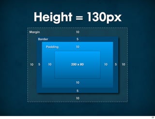
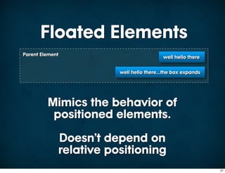
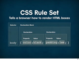
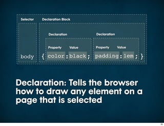
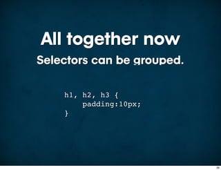
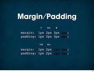
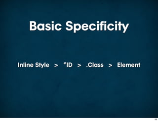

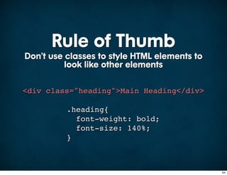
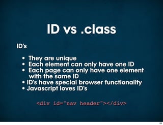
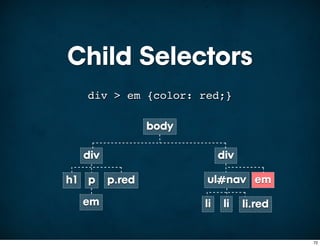
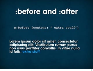
![Attribute Selectors
Select based on the attribute
<img src="image.png" width="100"
height="100" title="Main Image"
alt="Main Image"/>
img[title] { border: 1px solid #000; }
img[width] { border: 1px solid #000; }
img[alt] { border: 1px solid #000; }
75](https://image.slidesharecdn.com/csspresentation-090724103614-phpapp02/85/CSS-in-all-its-Glory-75-320.jpg)
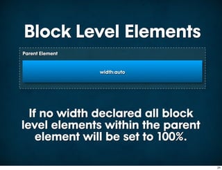
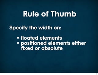
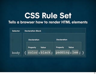
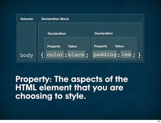
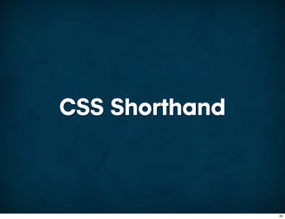
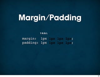
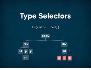
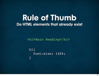
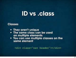
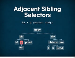
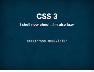
![Attribute Selectors
Select based on the attribute’s value
<img src="image.png" width="100"
height="100" title="Main Image"
alt="Main Image"/>
img[src="image.png"] {
border: 1px solid #000;
}
76](https://image.slidesharecdn.com/csspresentation-090724103614-phpapp02/85/CSS-in-all-its-Glory-76-320.jpg)
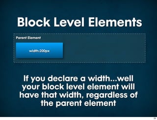
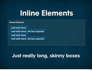
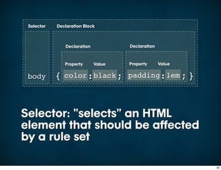
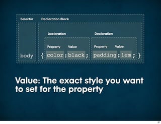
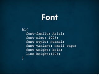
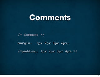
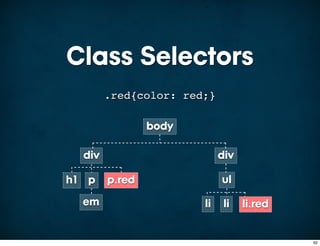
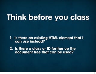
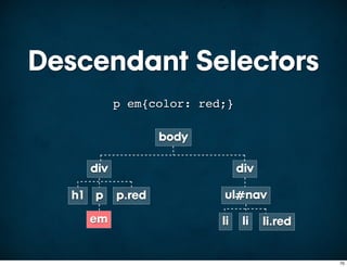
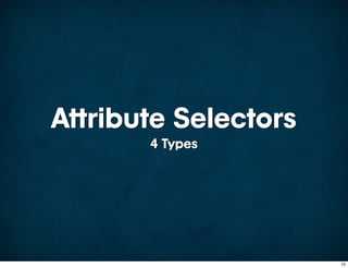
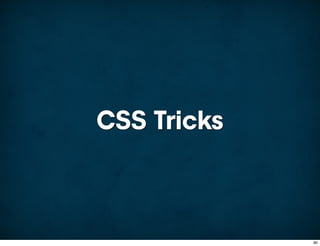
![Attribute Selectors
Select based on the space separated
instances of a value
<img src="image.png" width="100"
height="100" title="Main Image"
alt="Main Image"/>
img[alt~="Main"] {
border: 1px solid #000;
}
77](https://image.slidesharecdn.com/csspresentation-090724103614-phpapp02/85/CSS-in-all-its-Glory-77-320.jpg)
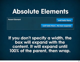
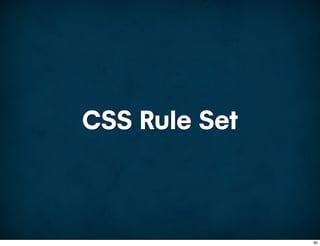
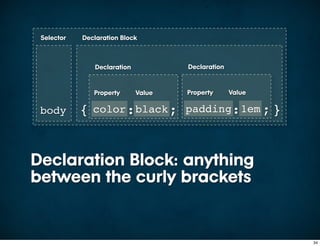
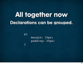
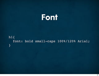
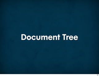
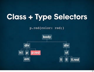
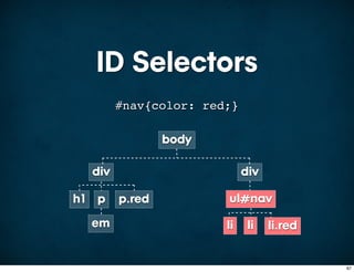
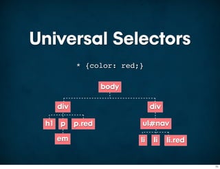
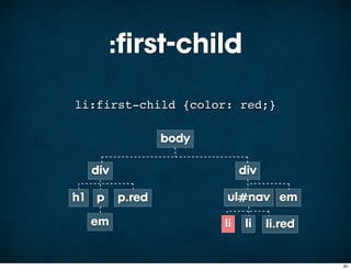
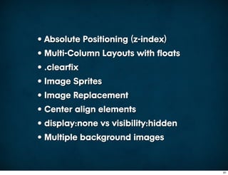
![Attribute Selectors
Select based on the hyphen separated
instances of a value
<img src="image.png" width="100"
height="100" title="Main Image"
alt="Main Image"/>
img[alt|="Main"] {
border: 1px solid #000;
}
78](https://image.slidesharecdn.com/csspresentation-090724103614-phpapp02/85/CSS-in-all-its-Glory-78-320.jpg)


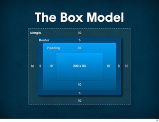
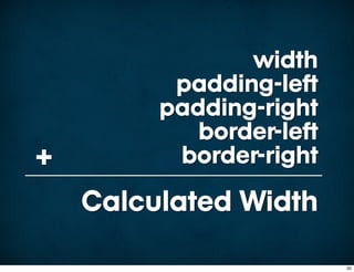
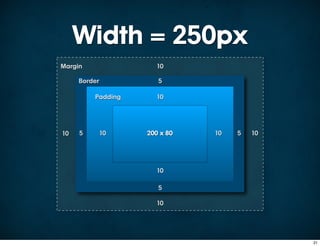
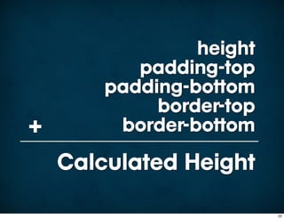
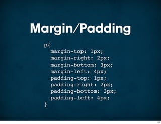
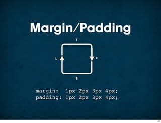
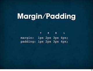
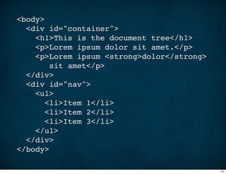
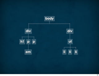
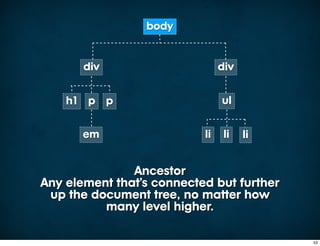
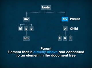
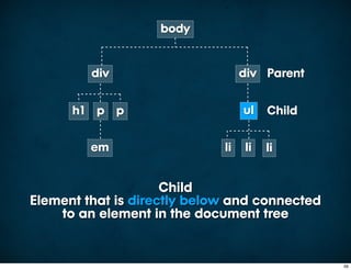
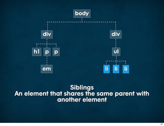
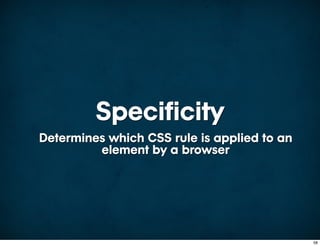
This document provides an overview of key CSS concepts including the box model, selectors, the document tree, specificity, shorthand properties, pseudo-classes, and CSS tricks. It explains how CSS rules are structured with selectors and declaration blocks. It covers different types of selectors like type, class, ID, descendant and child selectors. It also discusses the document tree, ancestors, descendants, siblings and parents. Properties like font, margin, and padding are demonstrated using shorthand. Pseudo-classes like :hover, :first-child and :before/:after are shown. The document concludes with recommendations for clean stylesheets and links to additional CSS resources.