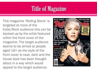
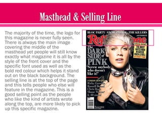
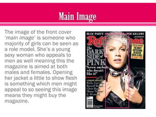
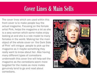
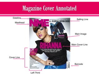
The document analyzes and summarizes the front covers of two magazines - Rolling Stone and NME. It finds that Rolling Stone seems targeted towards an older, more mature audience based on its darker, more sophisticated style. NME, in contrast, appears aimed at a younger demographic like teens. Both magazines put careful thought into their layout and cover lines to attract readers. In conclusion, the author would personally prefer to buy Rolling Stone as it seems to offer more in-depth content.
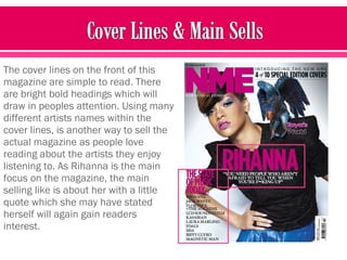


![Coveranalysis[1]](https://cdn.slidesharecdn.com/ss_thumbnails/coveranalysis1-130207060729-phpapp02-thumbnail.jpg?width=640&height=640&fit=bounds)


