Contents page research
•Download as DOCX, PDF•
0 likes•141 views
This documents consists of my research into contents pages which will hopefully help me gain an understanding of how I want my contents page to look.
Report
Share
Report
Share
Recommended
Contents page 1 annotations
The content page uses the same font and color as the cover page to maintain a consistent house style and link all the pages together. The main story image is featured prominently in the top left corner so readers immediately see the most appealing story. Below is the editor's letter, which is also an important feature to show readers the editor's favorite stories. The page numbers and other features are on the right side in a typical magazine layout for easy reading.
Contents page 2 annotations
This page layout keeps the design simple with large text and images to avoid overwhelming the reader with too much information. The contents title is on the left to draw the eye, and the main story image is on the right as that is the typical direction of reading. This placement of text and images is intended to guide the reader's eye across the page and encourage them to read further into the magazine.
Potential problems
The document discusses potential issues that may arise in creating a magazine spread and how they will be addressed:
1) Models and photoshoots may encounter issues like clashing colors or unavailable models, but backups and editing tools can address these problems.
2) Articles could be too long or short, lack professionalism, or get lost, but editing the content, drawing from research, and addressing the reader can improve the article.
3) Photos may not fill the space, but taking extra photos and adjusting sizes can ensure enough compelling images accompany the article.
Review on my front cover, double page spread and websites
The document provides reviews of a comic book front cover, double page spread, and two test websites. For the front cover, the reviewer likes the focus on a well-known character to grab attention, and the comic-like font, but thinks the red background is too much and something else should be added. For the double page spread, the layout and structure of writing is good but images get in the way of the text. The first test website has a clear header and footer but looks clunky, while the second has a simple black background, good image gallery, and perfect color contrast, though some images are cut off.
Magazine Evaluation
The document provides an in-depth evaluation of a magazine cover and double-page spread created by the author. The summary evaluates both the design elements and how well they appeal to the target audience. The cover uses a bold, stylized masthead in blue to fit the digital theme of the main story. The cover lines are well-formatted and catch the reader's eye. The color scheme is bright and fits the technological tone. The double-page spread continues the color scheme and features a large dominant image. Both the cover and spread are designed to be appealing visually and in content to the target audience of media enthusiasts aged 12-30.
Analysis of a double page spread
This is my analysis of a double page spread, through this I am able to see as to what my double page spread will have to look like.
Magazine progress 2
The document discusses the progress of designing a magazine. The writer labeled where writing would go, designed a barcode for the front cover, and started a double page spread as the front cover was nearly complete. References were made to using Thrasher magazine as inspiration for its appealing layout and plain front cover that catches attention without much text. A double page spread was added with screenshots of a skateboarder and edited stock images.
Audience feedback of mockups
The document summarizes feedback received from classmates on mock-ups created for the front cover, contents page, and double-page spreads of a magazine. For the front cover, they preferred the first mock-up for its simple yet eye-catching layout. For the contents page, they responded most positively to the third mock-up which featured headlines in the middle surrounded by images. For the double-page spreads, they liked the third mock-up but felt it could be improved with additional design elements. The document analyzes the feedback and decides on designs for each element based on the most effective mock-ups.
Evaluation q1
1. The document compares the conventions used in the student's magazine products to existing media products.
2. Key differences noted include things like the prominence of the main cover line, use of fonts, number of images, and inclusion of things like social media links and descriptions.
3. The student reflects on ways their products could be improved, such as making elements more prominent or consistent with the overall color scheme. Comparing to other media helped them identify enhancements.
Content page rationale
The document provides details on the layout and design of a content page for a fitness magazine. It discusses having the masthead in the top right to give more space to the dominant image. The dominant image will be of the model Andrew Paige in a standing pose looking directly at the camera to grab attention. There will be one paragraph of long-form content around size 10-12 font to allow breathing room. The content will be inspiring and motivational while also discussing healthy eating. No sub-images will be included to place focus on the single dominant image and follow conventions of the genre.
Eval revised
The document summarizes how the media product challenges and develops conventions of real magazines. It follows conventions like using the route of the eye on the cover to emphasize key elements. It challenges conventions by placing the masthead behind a transparent text box and using two pictures to advertise the main article. The product represents youth through topics, language, and images associated with youth stereotypes. The target audience is youth aged 14-21 interested in grime music. Ways of attracting this audience included topics on grime artists and using informal language.
Question 1
The document discusses how the media product uses and develops conventions from real media products. It analyzes the front cover, contents page, features page, and advertisements using examples from magazines like Essex Life and Dorset. Conventions that are used and developed include picturesque front cover images, bold mastheads, color schemes, page numbers, fonts, layouts, and limited text in ads. The goal is to create a recognizable brand, make information easily accessible, and appeal to the target 30-45 year old audience.
Evaluation for print
The document summarizes the evaluation of a student's magazine production project. The student researched existing magazines, then created a website and front cover for their magazine using Wix and Adobe Photoshop. They also created a double-page magazine spread using Adobe InDesign. The student analyzed the strengths and weaknesses of their work, noting where they followed or deviated from initial plans. They felt they succeeded in translating their plans into a quality final product, though saw room for improvement, like adding more original photography.
Evaluation - Question 1
This document analyzes how the media product uses, develops, and challenges conventions of real magazines. It summarizes the key design elements of the magazine's front cover, contents page, feature article layout, and website design. Overall, the magazine follows many typical magazine conventions like using a masthead, feature images, and columns but also takes some unconventional approaches like staggered text and asymmetrical placement of some design elements. The document discusses how these choices both conform to and challenge industry norms using communication theories like Uses and Gratification and ideas from scholars like Barthes and Hall.
Question one
The document discusses the conventions used in creating a mock magazine. It summarizes how the magazine follows conventions of existing indie magazines in its use of natural, unedited images and layout of the contents page. It also aims to challenge conventions by including a feature on an AIDS charity to raise awareness of real-world issues. The double-page spread layout keeps things simple with the image, headline, article, and page numbers, and uses a striking black-and-white image of the artist to identify them for readers.
Draft double page spread process
The document summarizes the creative process and decisions made in developing a double page magazine spread. Key points include: setting up the double page spread dimensions to fit into the spine; using white background and consistent margins; cropping and editing images slightly to make them stand out; choosing a bold font for the title; laying out the article in three columns with spacing between; including an image in the article to break up text; adding a pull quote to intrigue readers; using lines to separate elements cleanly; and being happy that the final spread looks appealing and engaging for the target audience.
Looking back at your preliminary task
The author learned several important lessons from their preliminary magazine task that helped improve their full magazine product. They learned that the magazine needs to look visually busy with multiple sell lines promoting the content to engage readers. The layout must be properly structured with a larger masthead and consistent placement of small details. An eye-catching color scheme used throughout helps create a unique look. Planning elements like the front cover and contents page in advance allows for better organization and design.
Evaluation 7
The document discusses the progression of the student's work from their preliminary task to their full product. They learned to better challenge magazine conventions to suit their music magazine. Their masthead is now smaller but stands out more. Their front cover now has varied fonts, banners, and a model addressing the reader. They improved photo editing skills and understand using different elements for specific reasons. Their contents page now follows conventions with page numbers by headlines and they no longer include the masthead. Overall they developed an understanding of magazine layout and design conventions.
Question 2
The document discusses how the author's media products use and challenge conventions of real magazine formats. For the magazine front cover, the author followed conventions like using multiple fonts but challenged conventions such as having the dominant image overlap the masthead. For the contents page, conventions like sectioning by page number were followed, but adding a grey column background challenged conventions. For the double page spread, conventions like using multiple fonts and images were followed, but challenging conventions by using alternative content and a textured background.
Eval q1
The document discusses how the student's magazine product uses and develops conventions of real media products.
It summarizes how the student followed conventions like including a masthead, front cover with a model, features list, contents page with images and page numbers, columns of text, numbered articles, and an editorial page with the editor's photo and signature.
However, the student also challenged some conventions by using unique fonts, more casual language in the editorial, and layouts that featured larger images than text. The goal was to make the magazine stand out while still appealing to expectations of the target audience.
Contents page analysis
The document analyzes the design elements of a magazine content page. It discusses how the main image of an attractive revealing model exploits human sexuality and gaze to attract readers. Smaller supporting images and consistent color scheme and formatting create cohesion across the page. Headlines stand out to draw attention after viewing the images. The target audience is intended to be male readers attracted to the model. Overall the page uses visual techniques and basic human instincts to entice readers to continue reading the magazine.
Evaluation (1)
In this document, the author summarizes how their media product uses, develops, and challenges conventions of real magazines. They used conventions like including a masthead on the front cover and contents page for branding. They developed conventions by using a drop shadow on the masthead and softer color scheme. The author challenged conventions by using muted colors instead of bright ones typically seen in rock magazines. Across multiple pages, the author both adopted typical magazine layouts but also developed them by using a more formal, structured style.
Personal learning and reflection
The document reflects on the analysis of front covers, contents pages, double page spreads, and audience research conducted for a magazine project. Key learnings include using bright colors and props to attract attention to the front cover image, employing a black and white image and muted colors for the contents page, and selecting a double page spread layout with a large image and 750+ words of text to properly represent the featured artist. The audience research revealed what attracts mass markets to covers and contents pages and perceptions of rap, informing design choices to create a consumer-friendly product.
Media evaluation
The document discusses how the magazine cover page challenges conventions of real magazines. It uses balanced layout with heavy and light elements distributed evenly. The model makes eye contact to grab attention. Bold text emphasizes headlines. The contents page does not follow the typical left-to-right eye movement pattern. White space is used positively to make images stand out. Layers and columns add depth. Iconography represents celebrities' lives.
Media question 1
My media product follows the conventions of real magazines and does not challenge or develop existing forms. The magazine contains banners, headlines, barcodes and mastheads like typical magazines. The contents page includes more images than examples but they are smaller and evenly spaced. This double page spread best fits conventions with big headlines, a full-page image, and direct eye contact to engage readers. Elements like drop caps, page numbers and bylines were included to look professional and complete by following researched industry standards.
Plans
The document discusses the design of a magazine cover and contents page for a teenage audience. It describes the use of a large masthead, bubble font for the title, and inclusion of engaging articles like a quiz and true story to attract readers. The contents page is organized into sections with photo references to help navigation. A double page spread is also discussed, with images on one side and an exclusive interview on the other, following conventions to intrigue readers.
Evaluation task 1
The document discusses the cover and contents pages of a student-created music magazine. On the cover, the student included branding elements like a masthead, barcode, issue details, and cover lines to attract readers, as well as a large main image and slogan. For the contents page, the student followed magazine conventions such as a masthead, images, and first edition offer, but could have included more images and a website to further brand the magazine. The double-page article features elements such as a large title, anchoring text, full-page image, drop cap, masthead and page numbers to look professional while adapting the image and text placement.
Question 1
The document discusses how the media product follows conventions of real magazines. It summarizes how each element of the cover, contents page, advertisements, and website follows conventions. These include using a cover image with direct address to engage readers, including barcodes and websites to add realism. Interior elements like the masthead, fonts, justified text, photos and numbers on the contents page also mimic real magazine conventions. Advertisements use images and logos to grab attention. The website replicates the digital version of the magazine and includes articles, surveys, stores and galleries as is common. Overall, the document shows how the media product adheres to real magazine formats and styles at each stage.
Question 4
Grace conducted research using Google and YouTube to understand music video genres and conventions. She created a survey to understand audience preferences and published the results on Tumblr. Grace and Sophie filmed a focus group discussion with their target audience to inform their music video planning. They created a storyboard and animatic in Premiere Pro to visualize the video. After filming and editing footage, they posted drafts on YouTube to gather feedback before finalizing the video.
Inspiration from george ezra
After studying George Ezra's music videos, the document discusses how they emulated some of his filming techniques. They used close-up, centered shots of their character to engage audiences and allow them to relate, as Ezra's videos did. They also experimented with angled close-up shots to make their character seem more powerful, as Ezra's videos sometimes did. Additionally, they included urban environments, as one of Ezra's videos did, to match their target audience's interests.
More Related Content
Similar to Contents page research
Evaluation q1
1. The document compares the conventions used in the student's magazine products to existing media products.
2. Key differences noted include things like the prominence of the main cover line, use of fonts, number of images, and inclusion of things like social media links and descriptions.
3. The student reflects on ways their products could be improved, such as making elements more prominent or consistent with the overall color scheme. Comparing to other media helped them identify enhancements.
Content page rationale
The document provides details on the layout and design of a content page for a fitness magazine. It discusses having the masthead in the top right to give more space to the dominant image. The dominant image will be of the model Andrew Paige in a standing pose looking directly at the camera to grab attention. There will be one paragraph of long-form content around size 10-12 font to allow breathing room. The content will be inspiring and motivational while also discussing healthy eating. No sub-images will be included to place focus on the single dominant image and follow conventions of the genre.
Eval revised
The document summarizes how the media product challenges and develops conventions of real magazines. It follows conventions like using the route of the eye on the cover to emphasize key elements. It challenges conventions by placing the masthead behind a transparent text box and using two pictures to advertise the main article. The product represents youth through topics, language, and images associated with youth stereotypes. The target audience is youth aged 14-21 interested in grime music. Ways of attracting this audience included topics on grime artists and using informal language.
Question 1
The document discusses how the media product uses and develops conventions from real media products. It analyzes the front cover, contents page, features page, and advertisements using examples from magazines like Essex Life and Dorset. Conventions that are used and developed include picturesque front cover images, bold mastheads, color schemes, page numbers, fonts, layouts, and limited text in ads. The goal is to create a recognizable brand, make information easily accessible, and appeal to the target 30-45 year old audience.
Evaluation for print
The document summarizes the evaluation of a student's magazine production project. The student researched existing magazines, then created a website and front cover for their magazine using Wix and Adobe Photoshop. They also created a double-page magazine spread using Adobe InDesign. The student analyzed the strengths and weaknesses of their work, noting where they followed or deviated from initial plans. They felt they succeeded in translating their plans into a quality final product, though saw room for improvement, like adding more original photography.
Evaluation - Question 1
This document analyzes how the media product uses, develops, and challenges conventions of real magazines. It summarizes the key design elements of the magazine's front cover, contents page, feature article layout, and website design. Overall, the magazine follows many typical magazine conventions like using a masthead, feature images, and columns but also takes some unconventional approaches like staggered text and asymmetrical placement of some design elements. The document discusses how these choices both conform to and challenge industry norms using communication theories like Uses and Gratification and ideas from scholars like Barthes and Hall.
Question one
The document discusses the conventions used in creating a mock magazine. It summarizes how the magazine follows conventions of existing indie magazines in its use of natural, unedited images and layout of the contents page. It also aims to challenge conventions by including a feature on an AIDS charity to raise awareness of real-world issues. The double-page spread layout keeps things simple with the image, headline, article, and page numbers, and uses a striking black-and-white image of the artist to identify them for readers.
Draft double page spread process
The document summarizes the creative process and decisions made in developing a double page magazine spread. Key points include: setting up the double page spread dimensions to fit into the spine; using white background and consistent margins; cropping and editing images slightly to make them stand out; choosing a bold font for the title; laying out the article in three columns with spacing between; including an image in the article to break up text; adding a pull quote to intrigue readers; using lines to separate elements cleanly; and being happy that the final spread looks appealing and engaging for the target audience.
Looking back at your preliminary task
The author learned several important lessons from their preliminary magazine task that helped improve their full magazine product. They learned that the magazine needs to look visually busy with multiple sell lines promoting the content to engage readers. The layout must be properly structured with a larger masthead and consistent placement of small details. An eye-catching color scheme used throughout helps create a unique look. Planning elements like the front cover and contents page in advance allows for better organization and design.
Evaluation 7
The document discusses the progression of the student's work from their preliminary task to their full product. They learned to better challenge magazine conventions to suit their music magazine. Their masthead is now smaller but stands out more. Their front cover now has varied fonts, banners, and a model addressing the reader. They improved photo editing skills and understand using different elements for specific reasons. Their contents page now follows conventions with page numbers by headlines and they no longer include the masthead. Overall they developed an understanding of magazine layout and design conventions.
Question 2
The document discusses how the author's media products use and challenge conventions of real magazine formats. For the magazine front cover, the author followed conventions like using multiple fonts but challenged conventions such as having the dominant image overlap the masthead. For the contents page, conventions like sectioning by page number were followed, but adding a grey column background challenged conventions. For the double page spread, conventions like using multiple fonts and images were followed, but challenging conventions by using alternative content and a textured background.
Eval q1
The document discusses how the student's magazine product uses and develops conventions of real media products.
It summarizes how the student followed conventions like including a masthead, front cover with a model, features list, contents page with images and page numbers, columns of text, numbered articles, and an editorial page with the editor's photo and signature.
However, the student also challenged some conventions by using unique fonts, more casual language in the editorial, and layouts that featured larger images than text. The goal was to make the magazine stand out while still appealing to expectations of the target audience.
Contents page analysis
The document analyzes the design elements of a magazine content page. It discusses how the main image of an attractive revealing model exploits human sexuality and gaze to attract readers. Smaller supporting images and consistent color scheme and formatting create cohesion across the page. Headlines stand out to draw attention after viewing the images. The target audience is intended to be male readers attracted to the model. Overall the page uses visual techniques and basic human instincts to entice readers to continue reading the magazine.
Evaluation (1)
In this document, the author summarizes how their media product uses, develops, and challenges conventions of real magazines. They used conventions like including a masthead on the front cover and contents page for branding. They developed conventions by using a drop shadow on the masthead and softer color scheme. The author challenged conventions by using muted colors instead of bright ones typically seen in rock magazines. Across multiple pages, the author both adopted typical magazine layouts but also developed them by using a more formal, structured style.
Personal learning and reflection
The document reflects on the analysis of front covers, contents pages, double page spreads, and audience research conducted for a magazine project. Key learnings include using bright colors and props to attract attention to the front cover image, employing a black and white image and muted colors for the contents page, and selecting a double page spread layout with a large image and 750+ words of text to properly represent the featured artist. The audience research revealed what attracts mass markets to covers and contents pages and perceptions of rap, informing design choices to create a consumer-friendly product.
Media evaluation
The document discusses how the magazine cover page challenges conventions of real magazines. It uses balanced layout with heavy and light elements distributed evenly. The model makes eye contact to grab attention. Bold text emphasizes headlines. The contents page does not follow the typical left-to-right eye movement pattern. White space is used positively to make images stand out. Layers and columns add depth. Iconography represents celebrities' lives.
Media question 1
My media product follows the conventions of real magazines and does not challenge or develop existing forms. The magazine contains banners, headlines, barcodes and mastheads like typical magazines. The contents page includes more images than examples but they are smaller and evenly spaced. This double page spread best fits conventions with big headlines, a full-page image, and direct eye contact to engage readers. Elements like drop caps, page numbers and bylines were included to look professional and complete by following researched industry standards.
Plans
The document discusses the design of a magazine cover and contents page for a teenage audience. It describes the use of a large masthead, bubble font for the title, and inclusion of engaging articles like a quiz and true story to attract readers. The contents page is organized into sections with photo references to help navigation. A double page spread is also discussed, with images on one side and an exclusive interview on the other, following conventions to intrigue readers.
Evaluation task 1
The document discusses the cover and contents pages of a student-created music magazine. On the cover, the student included branding elements like a masthead, barcode, issue details, and cover lines to attract readers, as well as a large main image and slogan. For the contents page, the student followed magazine conventions such as a masthead, images, and first edition offer, but could have included more images and a website to further brand the magazine. The double-page article features elements such as a large title, anchoring text, full-page image, drop cap, masthead and page numbers to look professional while adapting the image and text placement.
Question 1
The document discusses how the media product follows conventions of real magazines. It summarizes how each element of the cover, contents page, advertisements, and website follows conventions. These include using a cover image with direct address to engage readers, including barcodes and websites to add realism. Interior elements like the masthead, fonts, justified text, photos and numbers on the contents page also mimic real magazine conventions. Advertisements use images and logos to grab attention. The website replicates the digital version of the magazine and includes articles, surveys, stores and galleries as is common. Overall, the document shows how the media product adheres to real magazine formats and styles at each stage.
Similar to Contents page research (20)
More from GraceNewman96
Question 4
Grace conducted research using Google and YouTube to understand music video genres and conventions. She created a survey to understand audience preferences and published the results on Tumblr. Grace and Sophie filmed a focus group discussion with their target audience to inform their music video planning. They created a storyboard and animatic in Premiere Pro to visualize the video. After filming and editing footage, they posted drafts on YouTube to gather feedback before finalizing the video.
Inspiration from george ezra
After studying George Ezra's music videos, the document discusses how they emulated some of his filming techniques. They used close-up, centered shots of their character to engage audiences and allow them to relate, as Ezra's videos did. They also experimented with angled close-up shots to make their character seem more powerful, as Ezra's videos sometimes did. Additionally, they included urban environments, as one of Ezra's videos did, to match their target audience's interests.
Imagination shots
To distinguish the main character's imagined scenes with his "dream girl" from the original clips, the filmmakers decided to add a filtered effect and black outline to the imagined clips. They also believe filming the main character enjoying himself alone in the countryside expresses that the countryside is where he wants to be with the girl and represents him enjoying his time more in the country.
Construction of mise en-scene
Here is my explanation on how our mise-en-scene will be constructed and how it will fit with our chosen song.
Conventions of a music video
The document discusses conventions used in music videos. It explains that camera shots like long shots, close-ups, and mid shots are used to focus on artists and establish the mood. Mise-en-scene, or the visual elements of a video, reflect the song's emotions and message through settings and costumes. Genres also influence conventions - love videos depict relationships through bright colors and fashion, while indie videos emphasize authenticity with live performances. Edits switch between locations, artists, and scenes to tell the story and match the music. Lighting and sound also reflect the genre through bright versus dark tones and fast versus slow pacing.
Research into the music industry!
Music videos are generally made after a record label approves a budget. They go through pre-production, filming, editing, and adding special effects and sound editing. Directors come up with concepts and shot choices to represent the song visually through narrative or artistic elements. Footage is edited together and effects are added before being approved by the label. Famous directors like John Landis and Spike Jonze brought unique styles and concepts that made their videos stand out. Professional music video budgets can range from $20,000 to over $7 million for high-profile artists.
Blame it on me lyric analysis
This song is about wanting to leave one's current situation and head west with a romantic partner to find a new path. The singer tries to convince his partner to come with him and leave everything behind. He describes feeling trapped in the middle of a situation and longs to lose control. Throughout the song he insists that any problems that arise should be blamed on him alone.
Questionnaire analysis
A questionnaire asked about featuring an artist in a video, whether an actor suited the artist's role, and whether the video should have an abstract concept or storyline. It also polled preferences for shooting locations of a city, bus, house or along a street. The results were analyzed to help target the video's audience.
Target audience questionnaire
The document is a questionnaire for a target audience to provide feedback on a planned music video. It asks about the respondent's age, gender, favorite music videos and artists, preferred music genres, and whether they think the proposed storyline and artist depiction would suit the planned video for the song "Blame It On Me" by George Ezra. Respondents are also asked to provide any additional ideas they may have.
Target audience questionnaire
The document is a questionnaire for a target audience to provide feedback on a planned music video. It asks about the respondent's age, gender, favorite music videos and artists, preferred music genres, and whether they think the proposed storyline and artist depiction suit the song and artist. Respondents are also asked to provide any additional ideas for the music video.
Rock genre research
After researching the magazines which are labelled as 'rock' I have learned the typical conventions.
Question 1
The document discusses how a media product follows conventions of the dramedy genre. It focuses on one main character throughout with characters that challenge stereotypes. Small problems build to a climax and are resolved. The soundtrack is happy but also fits dramatic moments. Love Actually and Juno are examples that conform to these conventions. The media product also focuses on two non-stereotypical "hipster" characters that meet unexpectedly, and includes minimal dialogue to advance the plot subtly without distraction. The music is upbeat but relaxed, and titles are subtle but noticeable, conforming to dramedy conventions.
More from GraceNewman96 (13)
Recently uploaded
Top five deadliest dog breeds in America
Thinking of getting a dog? Be aware that breeds like Pit Bulls, Rottweilers, and German Shepherds can be loyal and dangerous. Proper training and socialization are crucial to preventing aggressive behaviors. Ensure safety by understanding their needs and always supervising interactions. Stay safe, and enjoy your furry friends!
Chapter 4 - Islamic Financial Institutions in Malaysia.pptx
Chapter 4 - Islamic Financial Institutions in Malaysia.pptxMohd Adib Abd Muin, Senior Lecturer at Universiti Utara Malaysia
This slide is special for master students (MIBS & MIFB) in UUM. Also useful for readers who are interested in the topic of contemporary Islamic banking.
Biological Screening of Herbal Drugs in detailed.
Biological screening of herbal drugs: Introduction and Need for
Phyto-Pharmacological Screening, New Strategies for evaluating
Natural Products, In vitro evaluation techniques for Antioxidants, Antimicrobial and Anticancer drugs. In vivo evaluation techniques
for Anti-inflammatory, Antiulcer, Anticancer, Wound healing, Antidiabetic, Hepatoprotective, Cardio protective, Diuretics and
Antifertility, Toxicity studies as per OECD guidelines
Digital Artifact 1 - 10VCD Environments Unit
Digital Artifact 1 - 10VCD Environments Unit - NGV Pavilion Concept Design
MATATAG CURRICULUM: ASSESSING THE READINESS OF ELEM. PUBLIC SCHOOL TEACHERS I...
In this research, it concludes that while the readiness of teachers in Caloocan City to implement the MATATAG Curriculum is generally positive, targeted efforts in professional development, resource distribution, support networks, and comprehensive preparation can address the existing gaps and ensure successful curriculum implementation.
June 3, 2024 Anti-Semitism Letter Sent to MIT President Kornbluth and MIT Cor...
Letter from the Congress of the United States regarding Anti-Semitism sent June 3rd to MIT President Sally Kornbluth, MIT Corp Chair, Mark Gorenberg
Dear Dr. Kornbluth and Mr. Gorenberg,
The US House of Representatives is deeply concerned by ongoing and pervasive acts of antisemitic
harassment and intimidation at the Massachusetts Institute of Technology (MIT). Failing to act decisively to ensure a safe learning environment for all students would be a grave dereliction of your responsibilities as President of MIT and Chair of the MIT Corporation.
This Congress will not stand idly by and allow an environment hostile to Jewish students to persist. The House believes that your institution is in violation of Title VI of the Civil Rights Act, and the inability or
unwillingness to rectify this violation through action requires accountability.
Postsecondary education is a unique opportunity for students to learn and have their ideas and beliefs challenged. However, universities receiving hundreds of millions of federal funds annually have denied
students that opportunity and have been hijacked to become venues for the promotion of terrorism, antisemitic harassment and intimidation, unlawful encampments, and in some cases, assaults and riots.
The House of Representatives will not countenance the use of federal funds to indoctrinate students into hateful, antisemitic, anti-American supporters of terrorism. Investigations into campus antisemitism by the Committee on Education and the Workforce and the Committee on Ways and Means have been expanded into a Congress-wide probe across all relevant jurisdictions to address this national crisis. The undersigned Committees will conduct oversight into the use of federal funds at MIT and its learning environment under authorities granted to each Committee.
• The Committee on Education and the Workforce has been investigating your institution since December 7, 2023. The Committee has broad jurisdiction over postsecondary education, including its compliance with Title VI of the Civil Rights Act, campus safety concerns over disruptions to the learning environment, and the awarding of federal student aid under the Higher Education Act.
• The Committee on Oversight and Accountability is investigating the sources of funding and other support flowing to groups espousing pro-Hamas propaganda and engaged in antisemitic harassment and intimidation of students. The Committee on Oversight and Accountability is the principal oversight committee of the US House of Representatives and has broad authority to investigate “any matter” at “any time” under House Rule X.
• The Committee on Ways and Means has been investigating several universities since November 15, 2023, when the Committee held a hearing entitled From Ivory Towers to Dark Corners: Investigating the Nexus Between Antisemitism, Tax-Exempt Universities, and Terror Financing. The Committee followed the hearing with letters to those institutions on January 10, 202
How to Add Chatter in the odoo 17 ERP Module
In Odoo, the chatter is like a chat tool that helps you work together on records. You can leave notes and track things, making it easier to talk with your team and partners. Inside chatter, all communication history, activity, and changes will be displayed.
South African Journal of Science: Writing with integrity workshop (2024)
South African Journal of Science: Writing with integrity workshop (2024)Academy of Science of South Africa
A workshop hosted by the South African Journal of Science aimed at postgraduate students and early career researchers with little or no experience in writing and publishing journal articles.The History of Stoke Newington Street Names
Presented at the Stoke Newington Literary Festival on 9th June 2024
www.StokeNewingtonHistory.com
Exploiting Artificial Intelligence for Empowering Researchers and Faculty, In...
Exploiting Artificial Intelligence for Empowering Researchers and Faculty, In...Dr. Vinod Kumar Kanvaria
Exploiting Artificial Intelligence for Empowering Researchers and Faculty,
International FDP on Fundamentals of Research in Social Sciences
at Integral University, Lucknow, 06.06.2024
By Dr. Vinod Kumar KanvariaA Strategic Approach: GenAI in Education
Artificial Intelligence (AI) technologies such as Generative AI, Image Generators and Large Language Models have had a dramatic impact on teaching, learning and assessment over the past 18 months. The most immediate threat AI posed was to Academic Integrity with Higher Education Institutes (HEIs) focusing their efforts on combating the use of GenAI in assessment. Guidelines were developed for staff and students, policies put in place too. Innovative educators have forged paths in the use of Generative AI for teaching, learning and assessments leading to pockets of transformation springing up across HEIs, often with little or no top-down guidance, support or direction.
This Gasta posits a strategic approach to integrating AI into HEIs to prepare staff, students and the curriculum for an evolving world and workplace. We will highlight the advantages of working with these technologies beyond the realm of teaching, learning and assessment by considering prompt engineering skills, industry impact, curriculum changes, and the need for staff upskilling. In contrast, not engaging strategically with Generative AI poses risks, including falling behind peers, missed opportunities and failing to ensure our graduates remain employable. The rapid evolution of AI technologies necessitates a proactive and strategic approach if we are to remain relevant.
Natural birth techniques - Mrs.Akanksha Trivedi Rama University
Natural birth techniques - Mrs.Akanksha Trivedi Rama UniversityAkanksha trivedi rama nursing college kanpur.
Natural birth techniques are various type such as/ water birth , alexender method, hypnosis, bradley method, lamaze method etcPCOS corelations and management through Ayurveda.
This presentation includes basic of PCOS their pathology and treatment and also Ayurveda correlation of PCOS and Ayurvedic line of treatment mentioned in classics.
ANATOMY AND BIOMECHANICS OF HIP JOINT.pdf
it describes the bony anatomy including the femoral head , acetabulum, labrum . also discusses the capsule , ligaments . muscle that act on the hip joint and the range of motion are outlined. factors affecting hip joint stability and weight transmission through the joint are summarized.
Thesis Statement for students diagnonsed withADHD.ppt
Presentation required for the master in Education.
Recently uploaded (20)
Chapter 4 - Islamic Financial Institutions in Malaysia.pptx
Chapter 4 - Islamic Financial Institutions in Malaysia.pptx
MATATAG CURRICULUM: ASSESSING THE READINESS OF ELEM. PUBLIC SCHOOL TEACHERS I...
MATATAG CURRICULUM: ASSESSING THE READINESS OF ELEM. PUBLIC SCHOOL TEACHERS I...
June 3, 2024 Anti-Semitism Letter Sent to MIT President Kornbluth and MIT Cor...
June 3, 2024 Anti-Semitism Letter Sent to MIT President Kornbluth and MIT Cor...
Pride Month Slides 2024 David Douglas School District
Pride Month Slides 2024 David Douglas School District
South African Journal of Science: Writing with integrity workshop (2024)
South African Journal of Science: Writing with integrity workshop (2024)
Exploiting Artificial Intelligence for Empowering Researchers and Faculty, In...
Exploiting Artificial Intelligence for Empowering Researchers and Faculty, In...
Natural birth techniques - Mrs.Akanksha Trivedi Rama University
Natural birth techniques - Mrs.Akanksha Trivedi Rama University
Thesis Statement for students diagnonsed withADHD.ppt
Thesis Statement for students diagnonsed withADHD.ppt
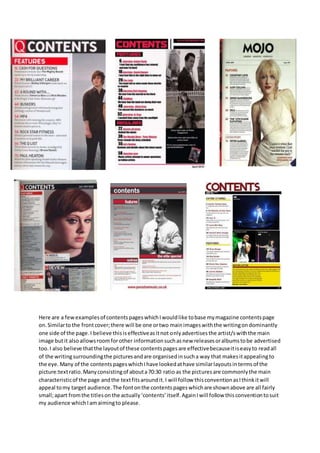
Contents page research
- 1. Here are a fewexamplesof contentspageswhichIwouldlike tobase mymagazine contentspage on.Similartothe frontcover;there will be one ortwo mainimageswiththe writingondominantly one side of the page.I believe thisiseffectiveasitnot onlyadvertisesthe artist/swiththe main image butit alsoallowsroomforother informationsuchasnew releasesoralbumstobe advertised too.I also believe thatthe layoutof these contentspagesare effectivebecauseitiseasyto readall of the writingsurroundingthe picturesandare organisedinsucha way that makesitappealingto the eye. Many of the contentspageswhichIhave lookedathave similarlayoutsintermsof the picture:textratio.Manyconsistingof abouta70:30 ratio as the picturesare commonlythe main characteristicof the page andthe textfitsaroundit.I will follow thisconventionasIthinkitwill appeal tomy target audience.The fontonthe contentspageswhichare shownabove are all fairly small;apart fromthe titlesonthe actually‘contents’itself.AgainIwill follow thisconventiontosuit my audience whichIamaimingto please.